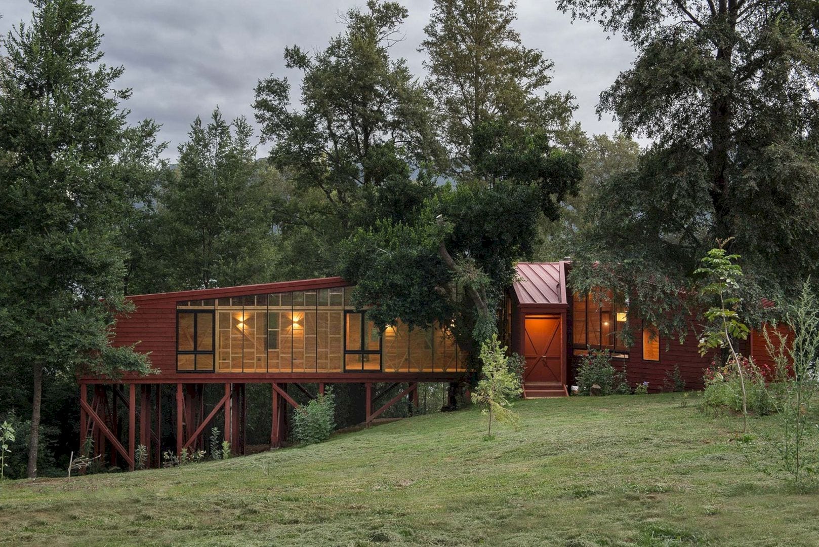
Completed in 2013 by Sebastián Irarrázaval, 2Y House is a project with a 2Y letters diagram to create double orientations. This diagram also exposes the inhabitant of the house to awesome surrounding views. Timber is chosen for the structure not only because it is a local material but it also can resemble the sense of infinity in forests.
Design
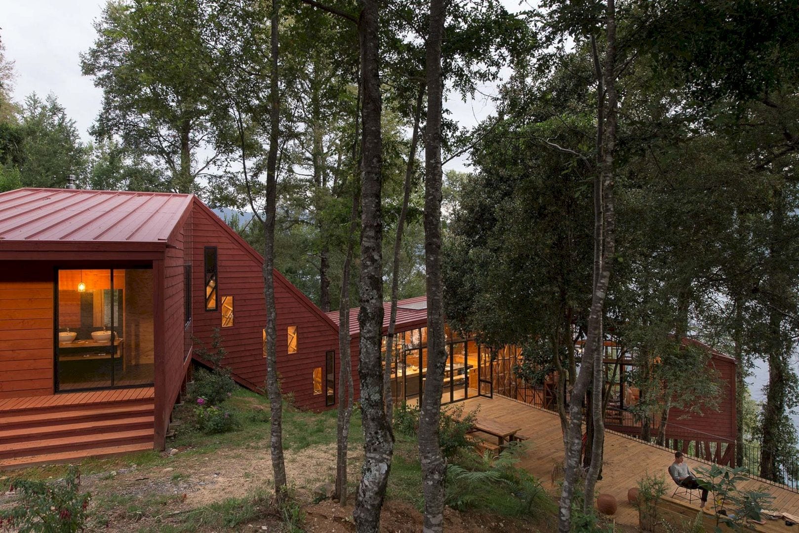
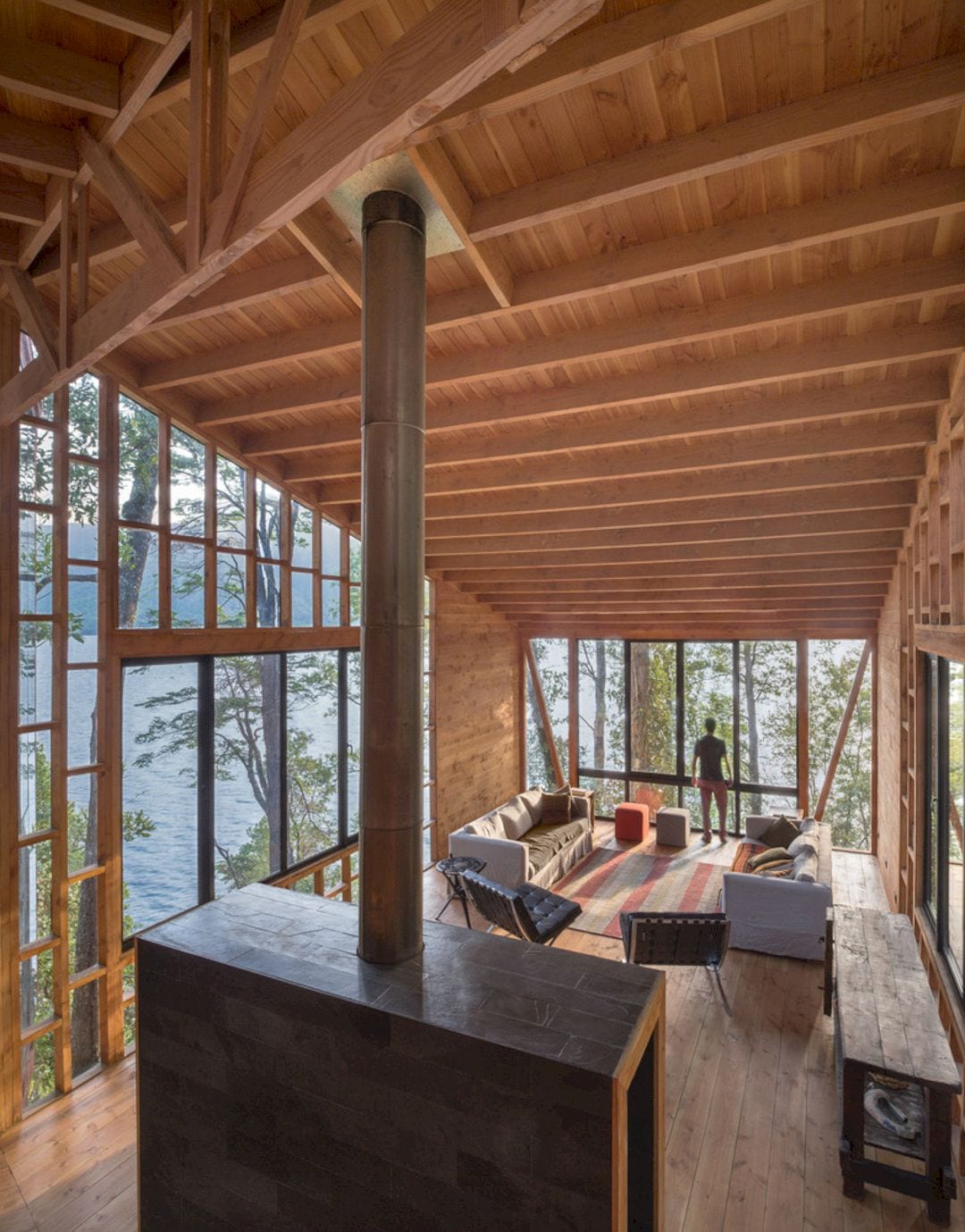
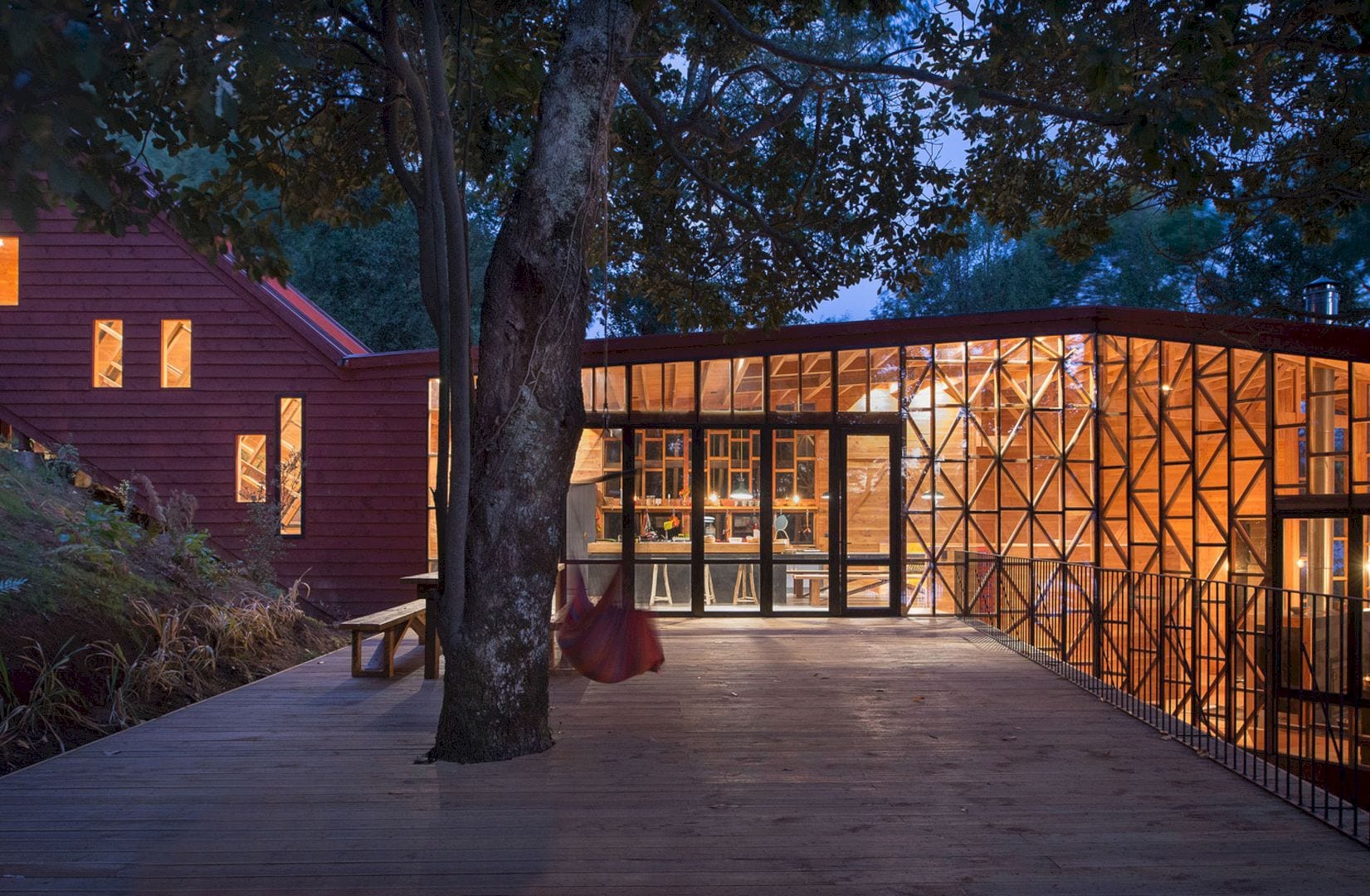
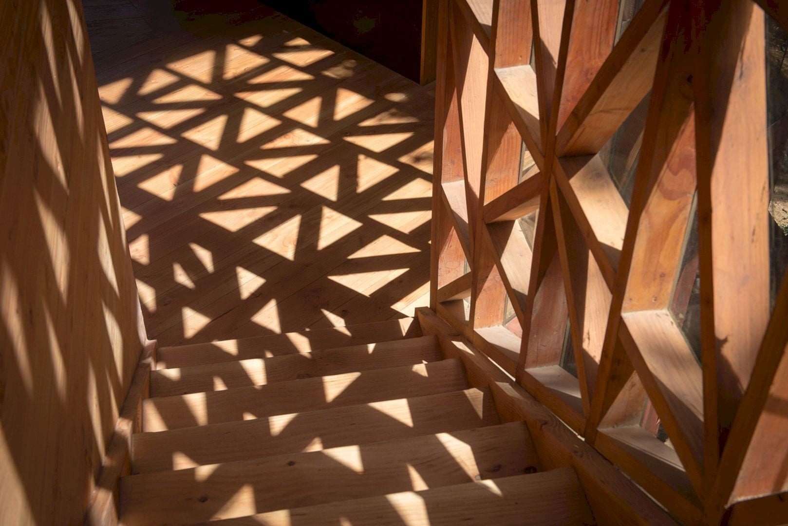
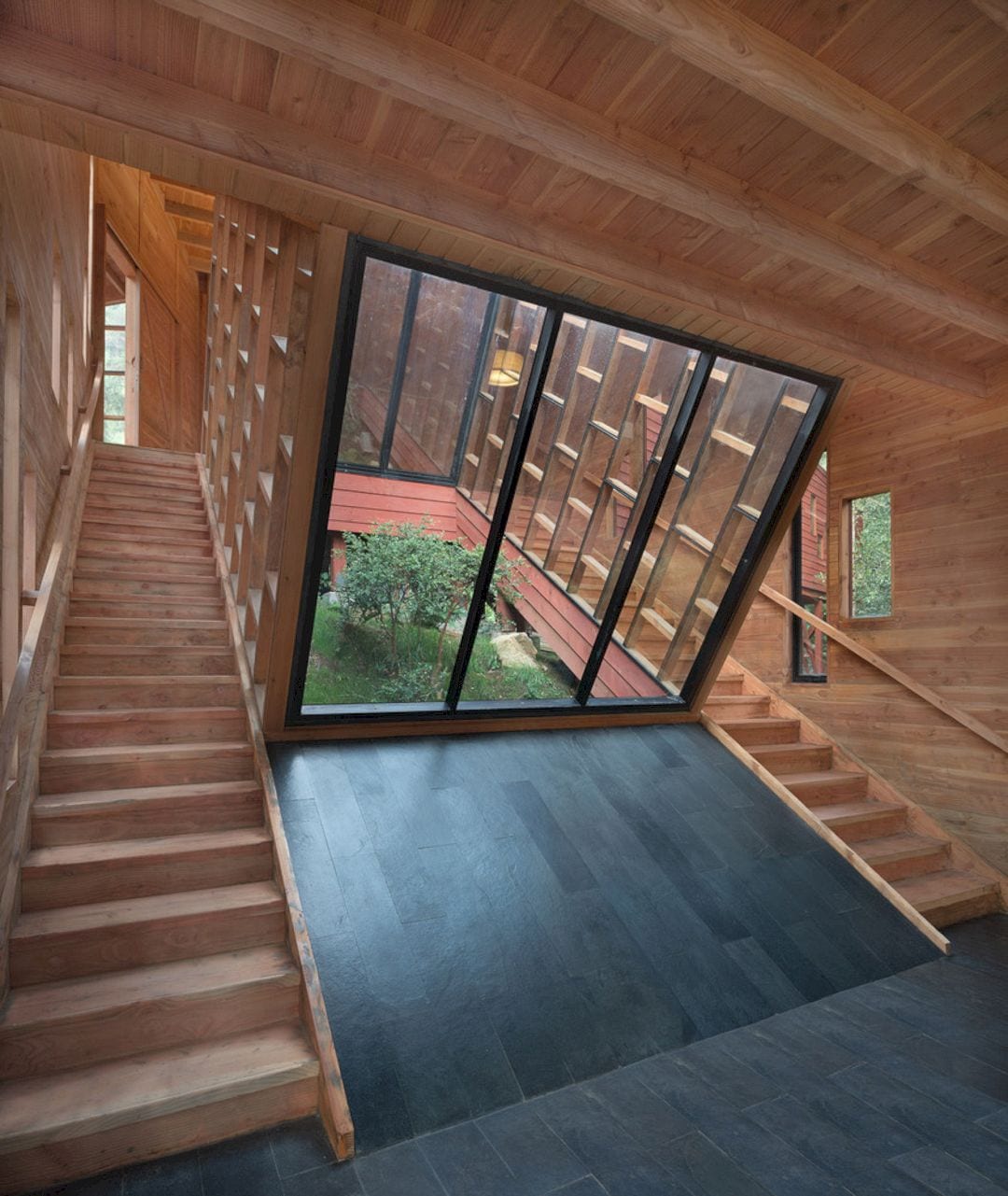
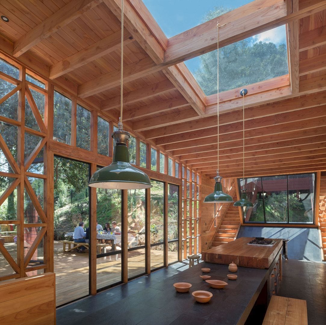
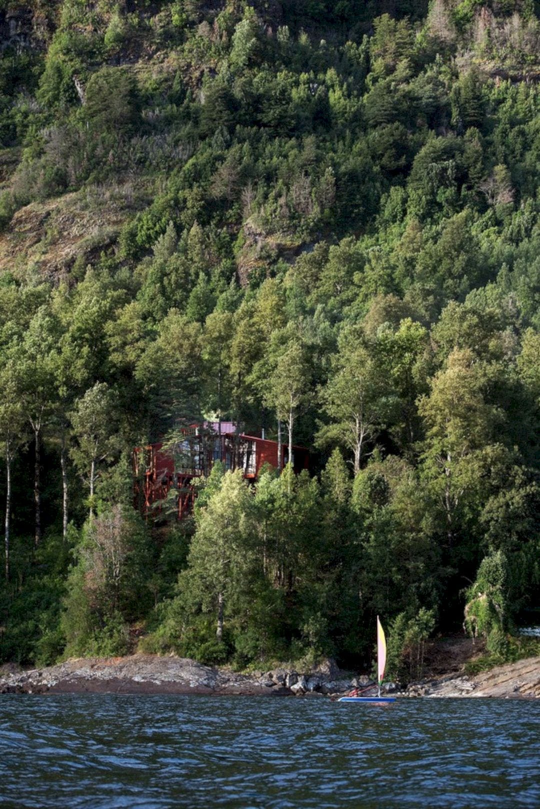
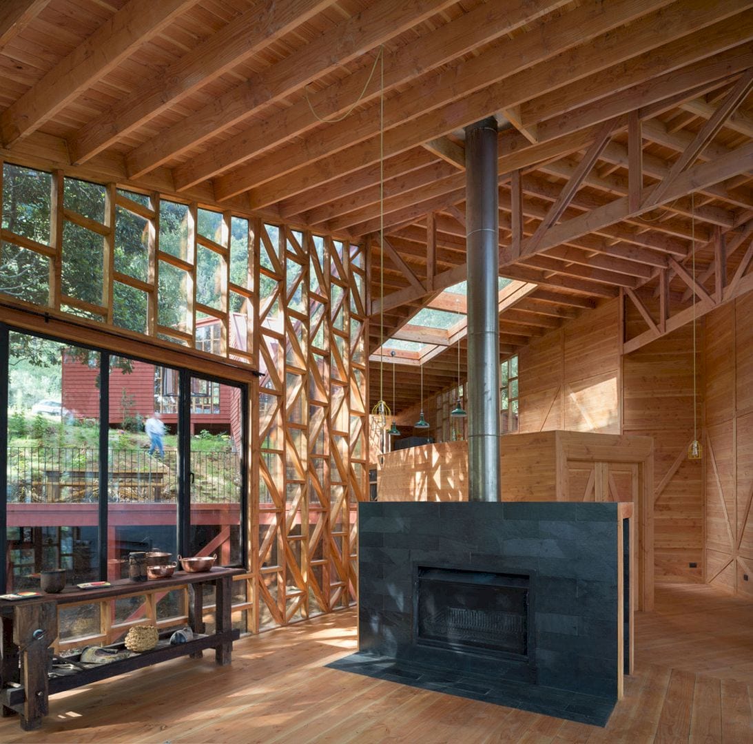
There are two main objectives of this house. The first is that the house receives a lot of light and sun as much as possible during the day. The second is that the house integrates the surrounding forest into the user’s daily experience.
For those main objectives, this project is fit in a 2Y letters diagram. This diagram can create double orientations for entering the sun at different times of the day and also exposes the inhabitant to awesome surrounding views.
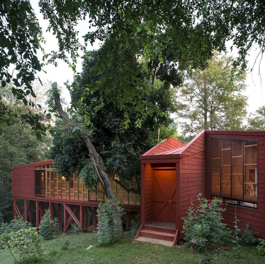
In opposition to a compact organization, the house’s extremely extended perimeter and its bifurcations potentiate the experience of being among the trees and sun in a parietal relationship. The shape of this house also makes it possible to fit into the surrounding existing trees.
Structure
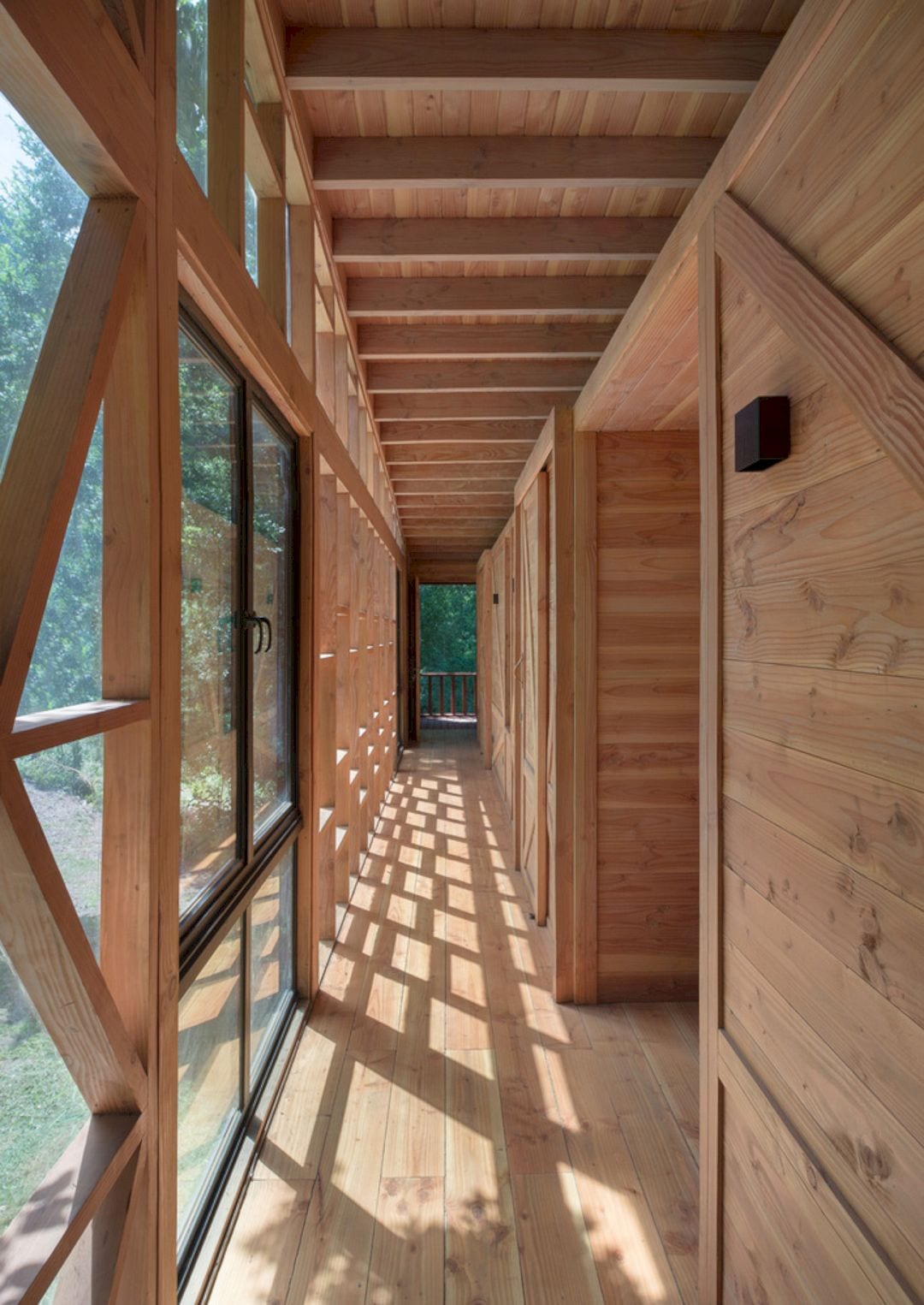
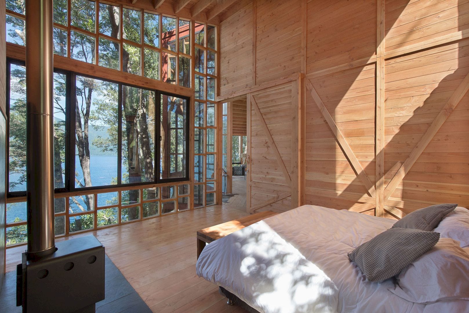
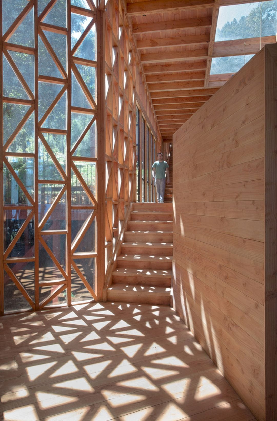
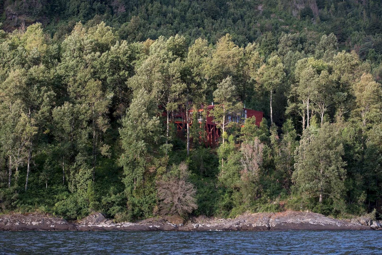
For the structure of this house, timber is used not only because it is a local material but also because of its ability to resemble the sense of infinity that is present in forests. As a local material, timber can anchor the house to the place by affiliations with the cultural and natural.
The wooden structure of this house is built using infinite linear elements naturally. As the result, a sense of infinity that is present in forests can be shown. The architectural and structural plans in this project are done in a permanent conversation and simultaneously.
Details
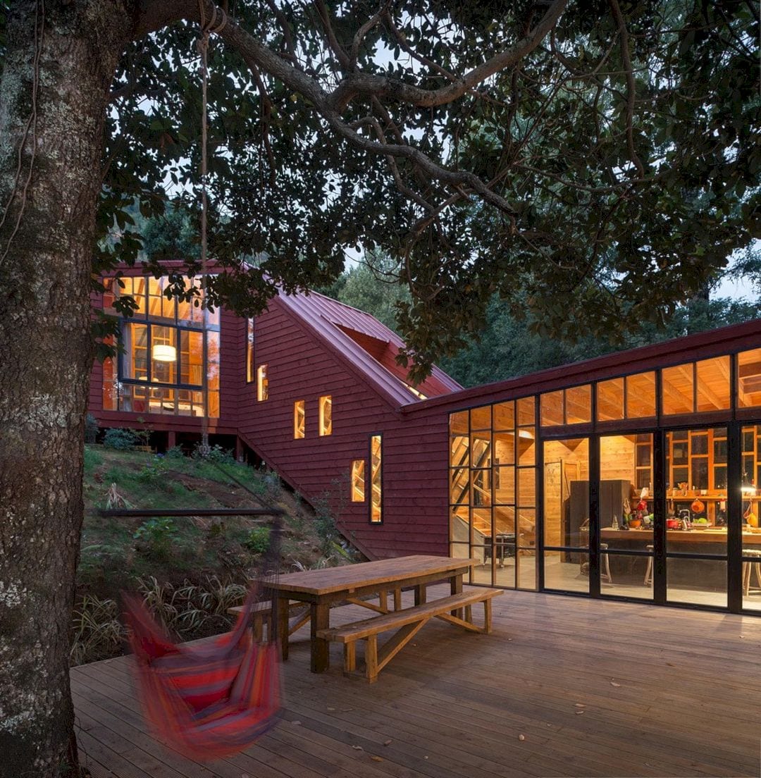
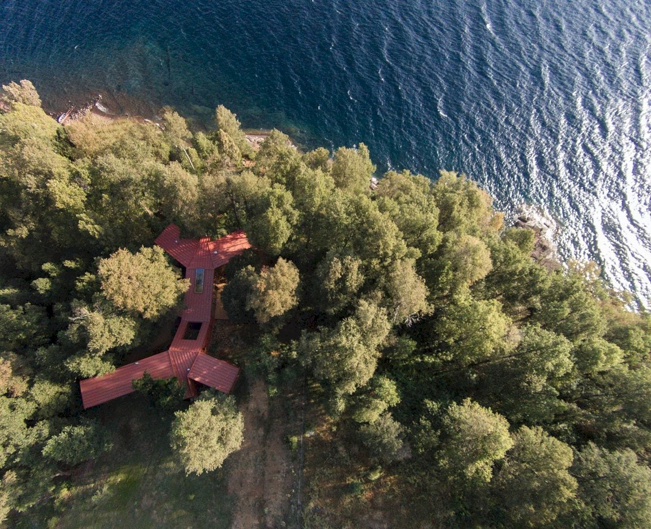
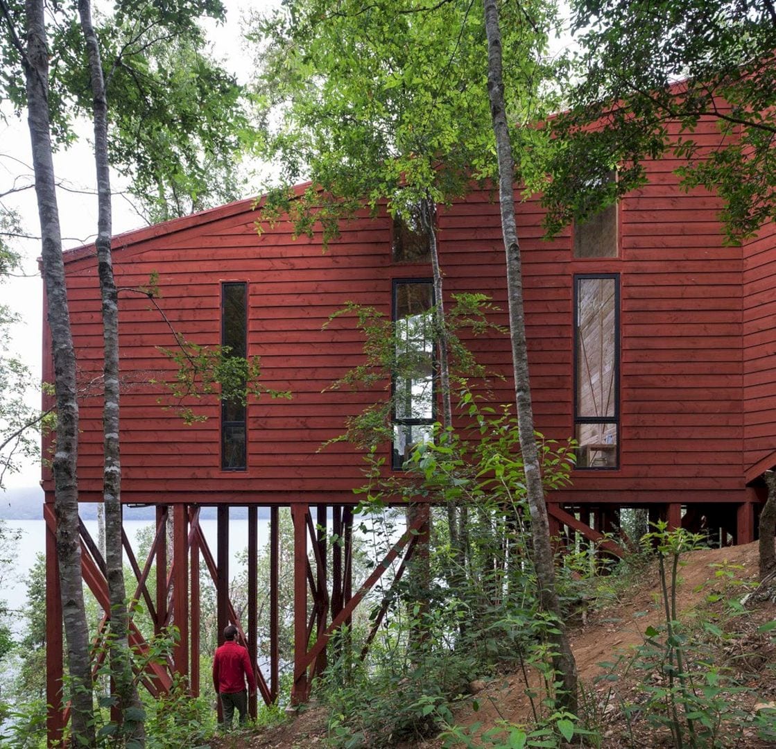
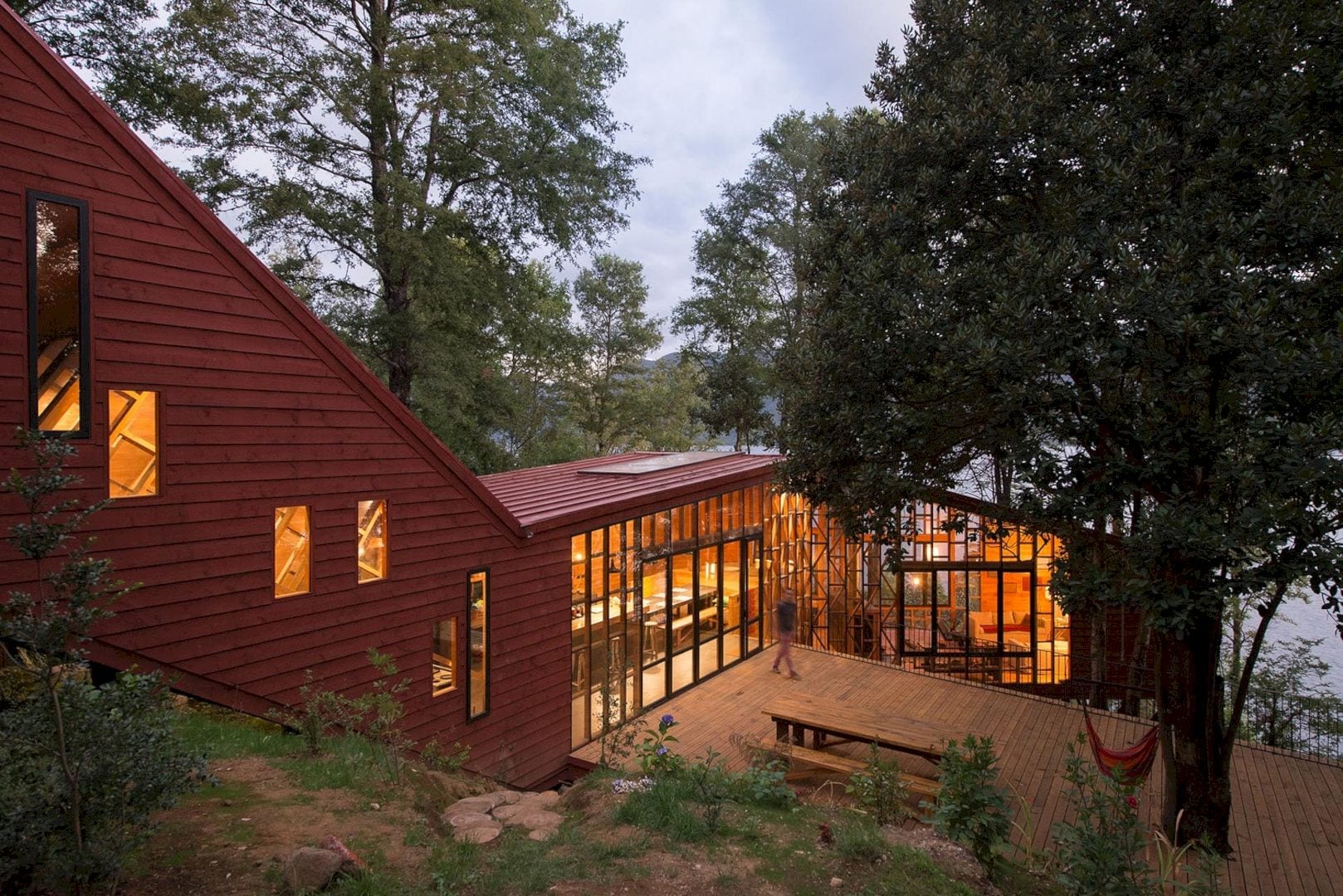
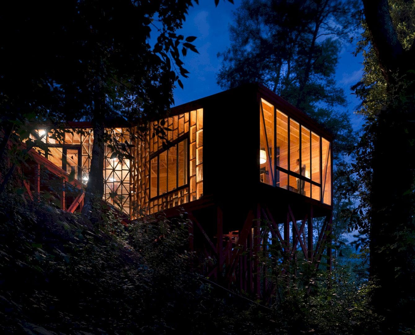
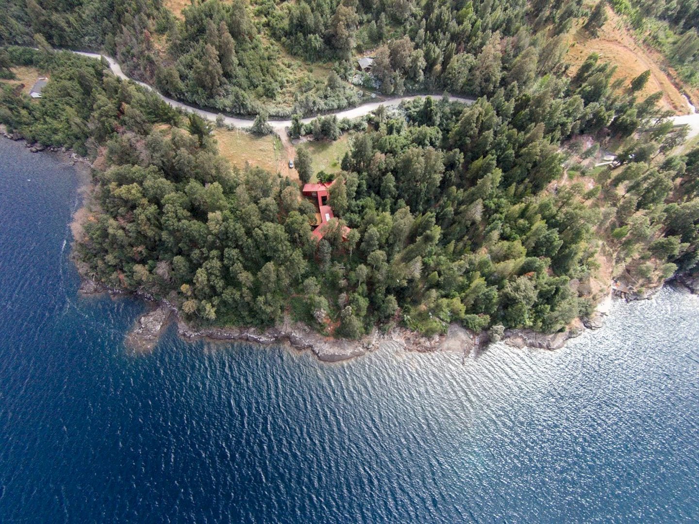
The 2Y diagram in this project negotiates the slope in different manners to the relation with the ground of the site. This diagram sometimes rests and underlines upon the ground and others that contrast with the soil.
For the exterior treatment of the skin, the objective of this project is also to create a constant vibration with the mostly green exterior that can be achieved well using a red color.
2Y House Gallery
Photographer: Felipe Díaz Contardo
Discover more from Futurist Architecture
Subscribe to get the latest posts sent to your email.
