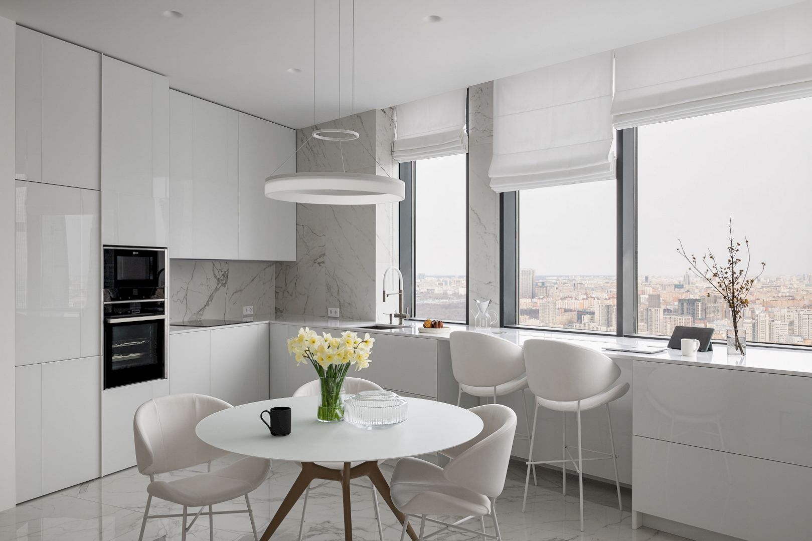
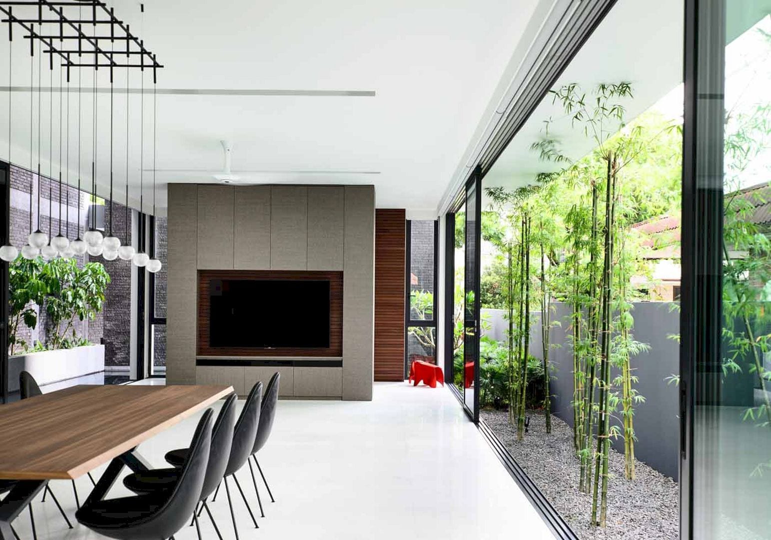
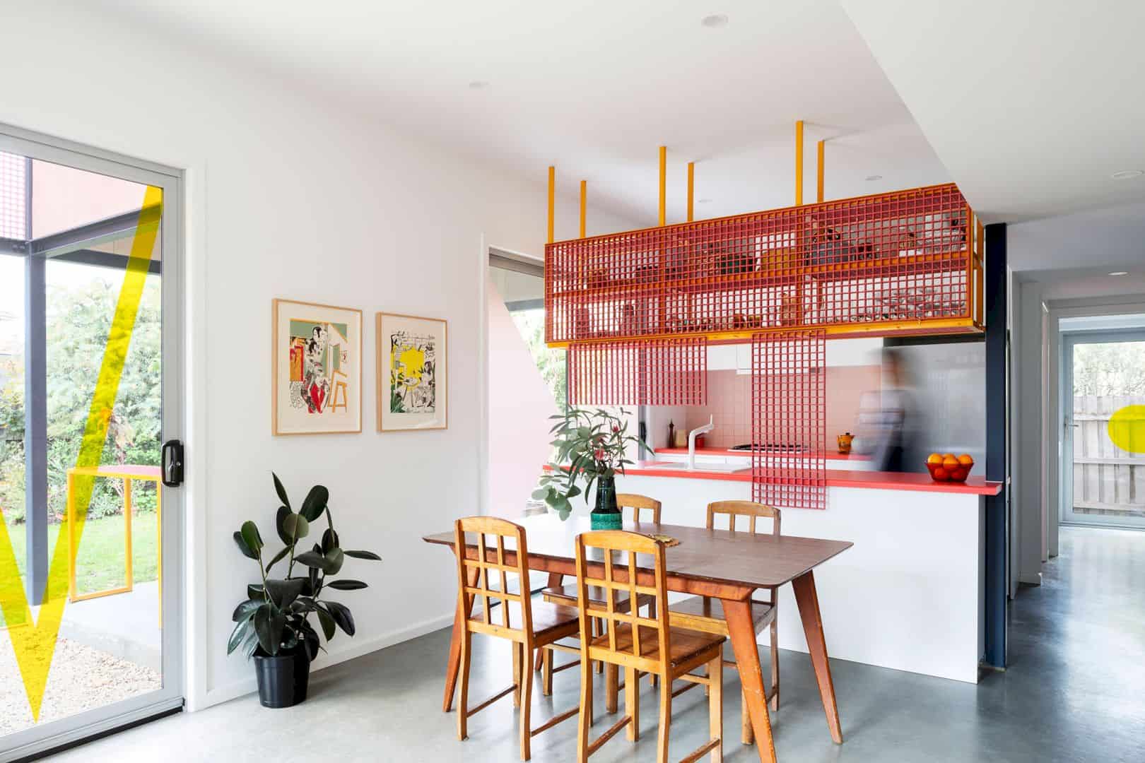
Completed in 2010 by Ian Moore Architects, Strelein Warehouse is a transformation project of the late 19th-century former grocery warehouse into a 2 level, one-bedroom residence. Located in Sydney, Australia, this house has a contrast between the precision of the steelwork and the patina of the original brickwork. This contrast summarises the transformation from industrial to residential.
Design
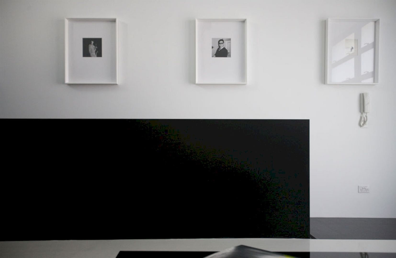
There are two street frontages of this property that allow clear separation of vehicle entries and pedestrians. Adjacent to a heritage-listed sandstone wall, the new front door of the residence can be found in the former loading dock at the end of a quiet cul-de-sac.
The entry of this residence is defined by a full-height steel plate portal while the 1.7-meter height difference between the two streets is utilized to make a tall volume in the living space of the residence with its’ floor to ceiling wall of books.
Rooms
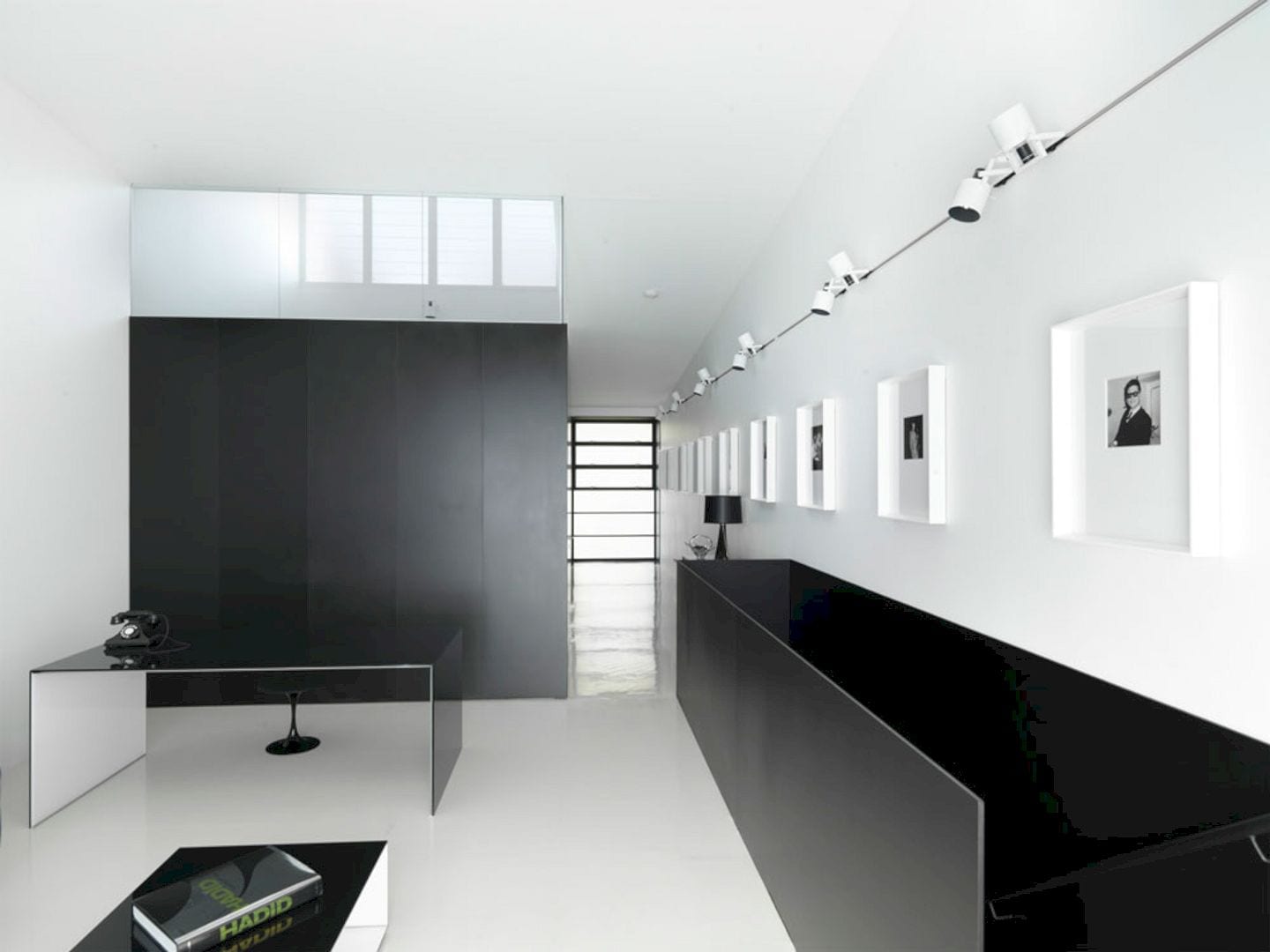
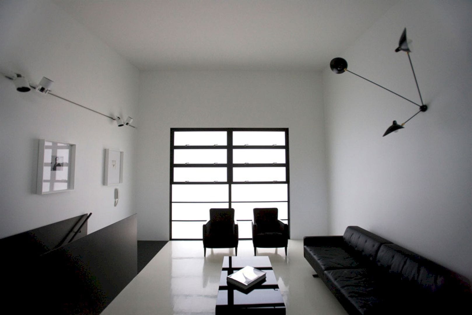
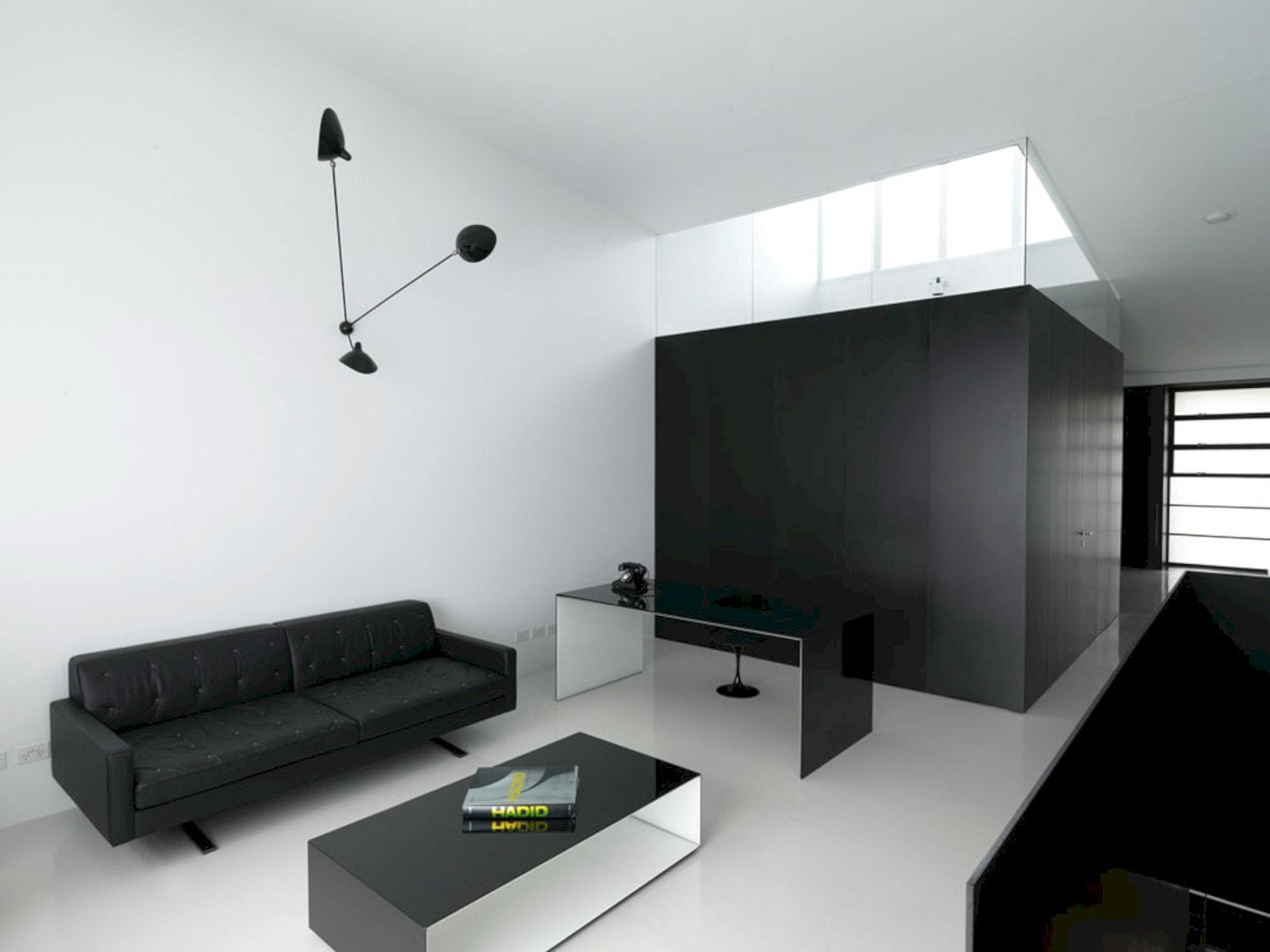
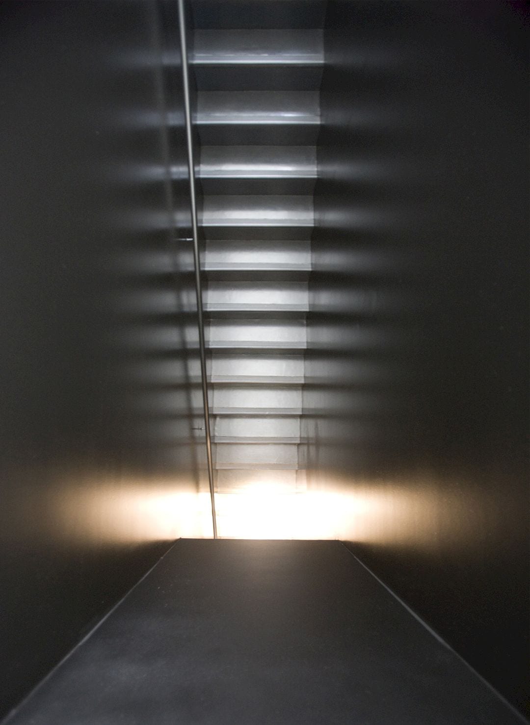
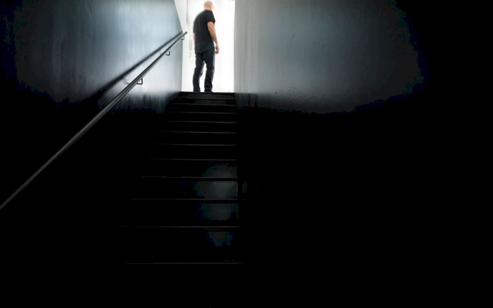
The kitchen is located on the half level above and it overlooks the living area. This kitchen is also screened by a black steel plate structure, completed with a built-in black leather bench seat. With internal dimensions defining the major strategic move within the design of the residence, the garage opens off the kitchen easily.
Together with the minimum width required for the garage, the guest bathroom/laundry/storage and the stair opposite are deducted from the internal width of the residence and the remainder is 10 millimeters that used to construct the wall between the stair and garage.
This deduction leads to the 10-millimeter thick steel plate structure, flowing through the portals of the entry, around the kitchen, and also the bookcase.
Structure
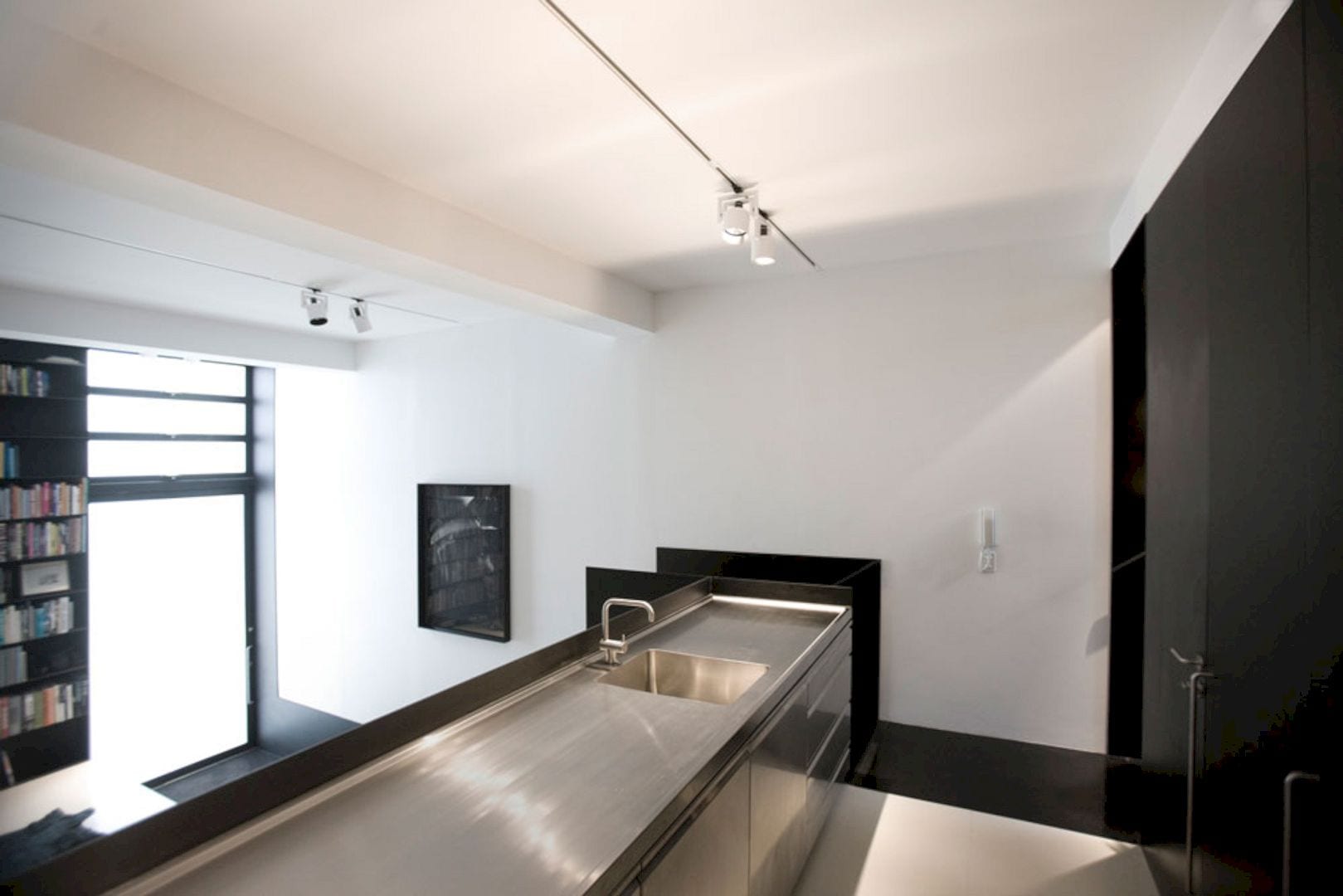
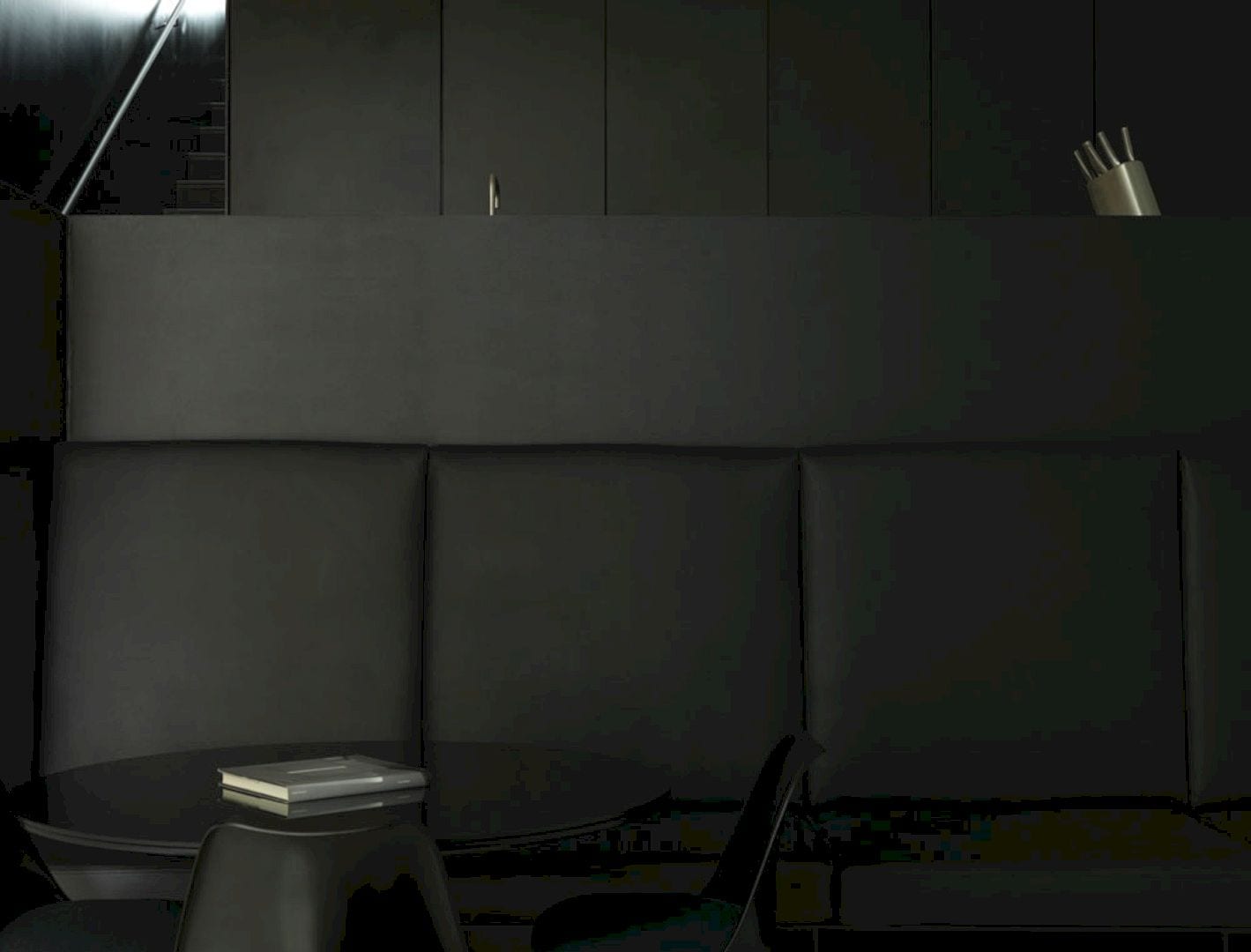
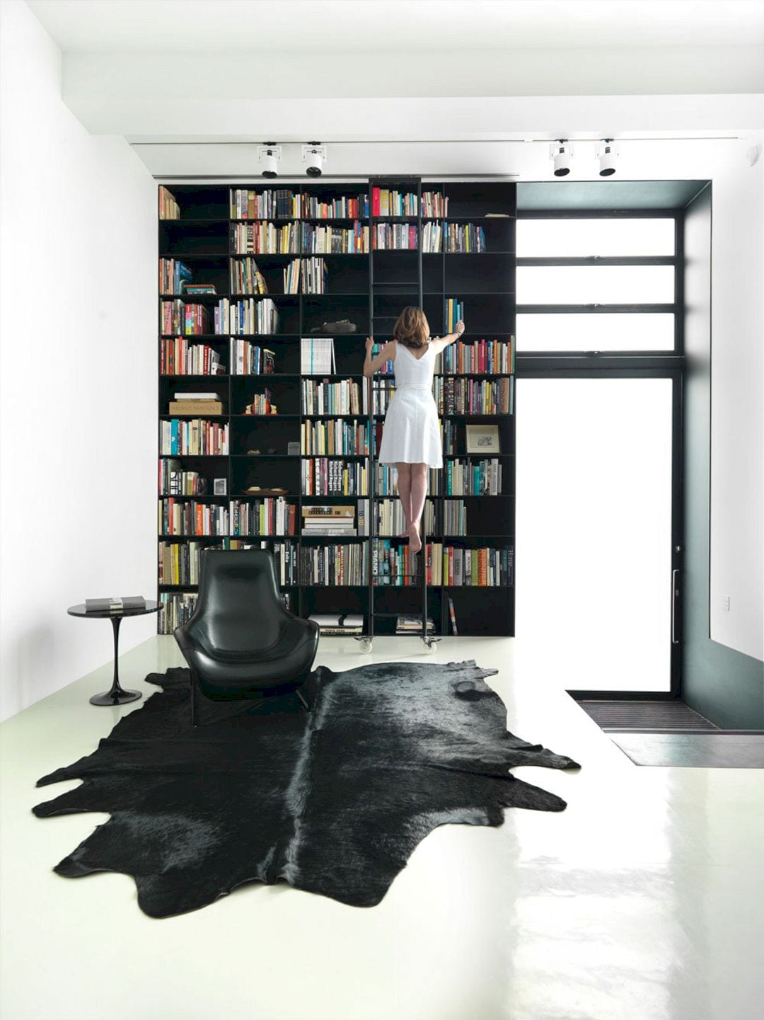
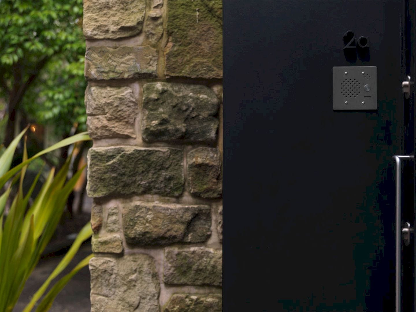
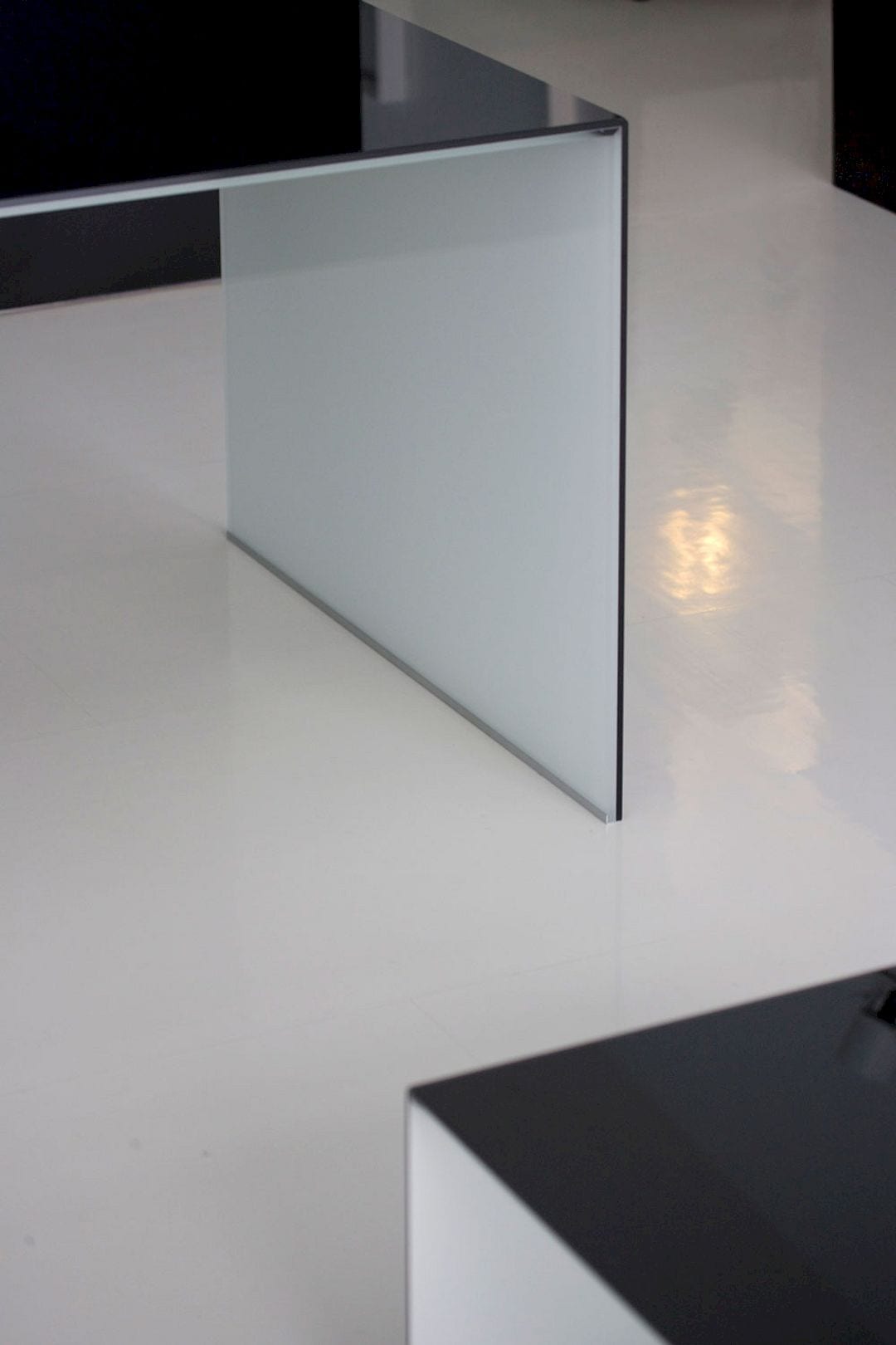
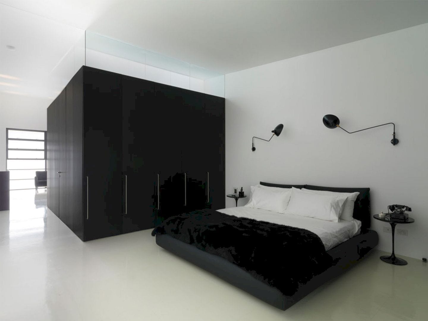
The existing structure of this residence has been lined, retained, and painted in white while all-new elements inside and outside are painted black. It is a concept that carried through to the white and black rubber flooring.
All residence joinery, including the bathroom on the upper floor, is finished in black anodized aluminum to maintain the datum established by the original window openings’ height. Above, the clear glazing allows natural light to illuminate the formerly dark center of the deep open planned space from the new clerestory window.
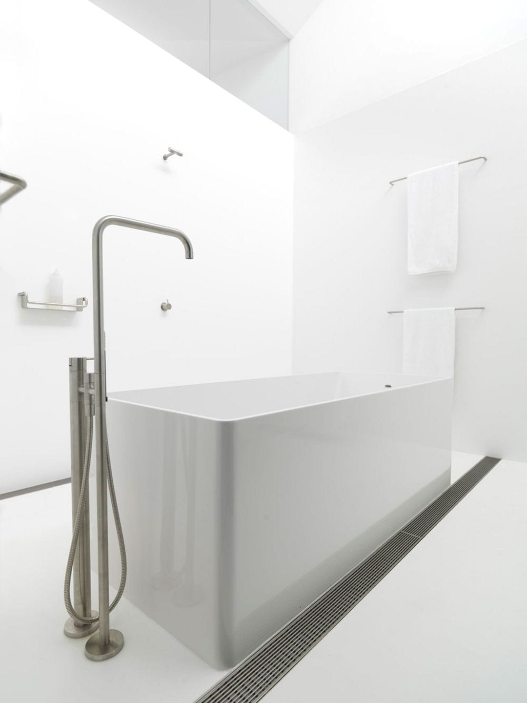
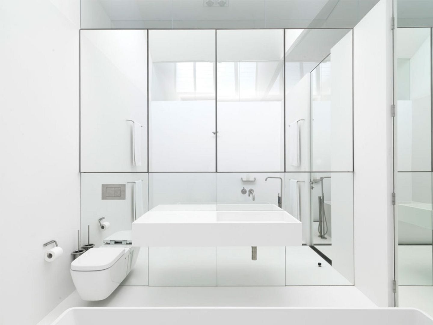
The bathroom is lined with Corian on its floor and walls.
Details
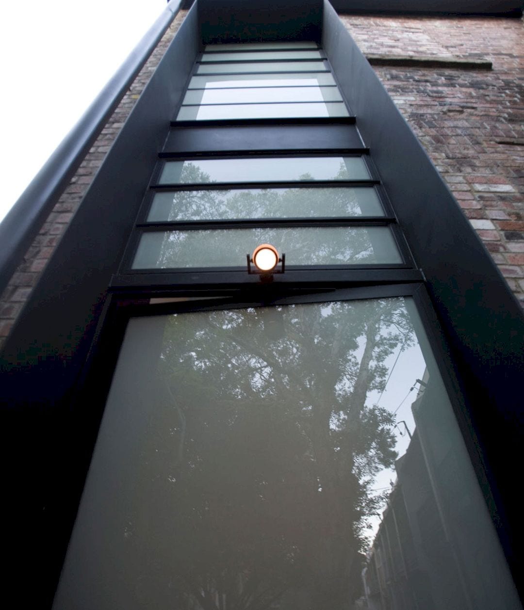
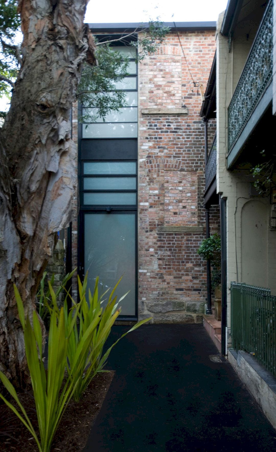
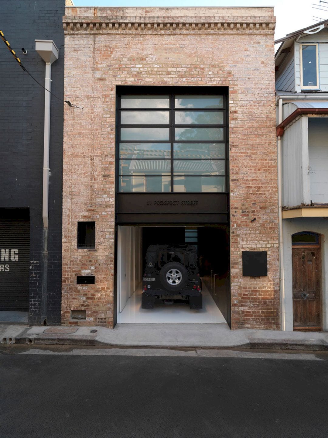
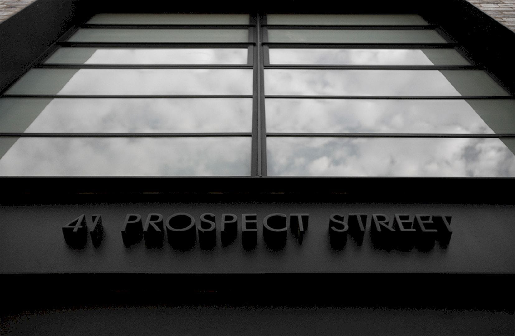
The original but in steel rather than timber is reinterpreted by the main street facade with the address spells out in water-jet cut steel letters that reflect the original engineering workshop signage.
It is an awesome project where the transformation from the 19th to 21st centuries is summarized by the contrast between the precision of the steelwork and the patina of the original brickwork.
Strelein Warehouse Gallery
Photographer: Iain D MacKenzie
Discover more from Futurist Architecture
Subscribe to get the latest posts sent to your email.
