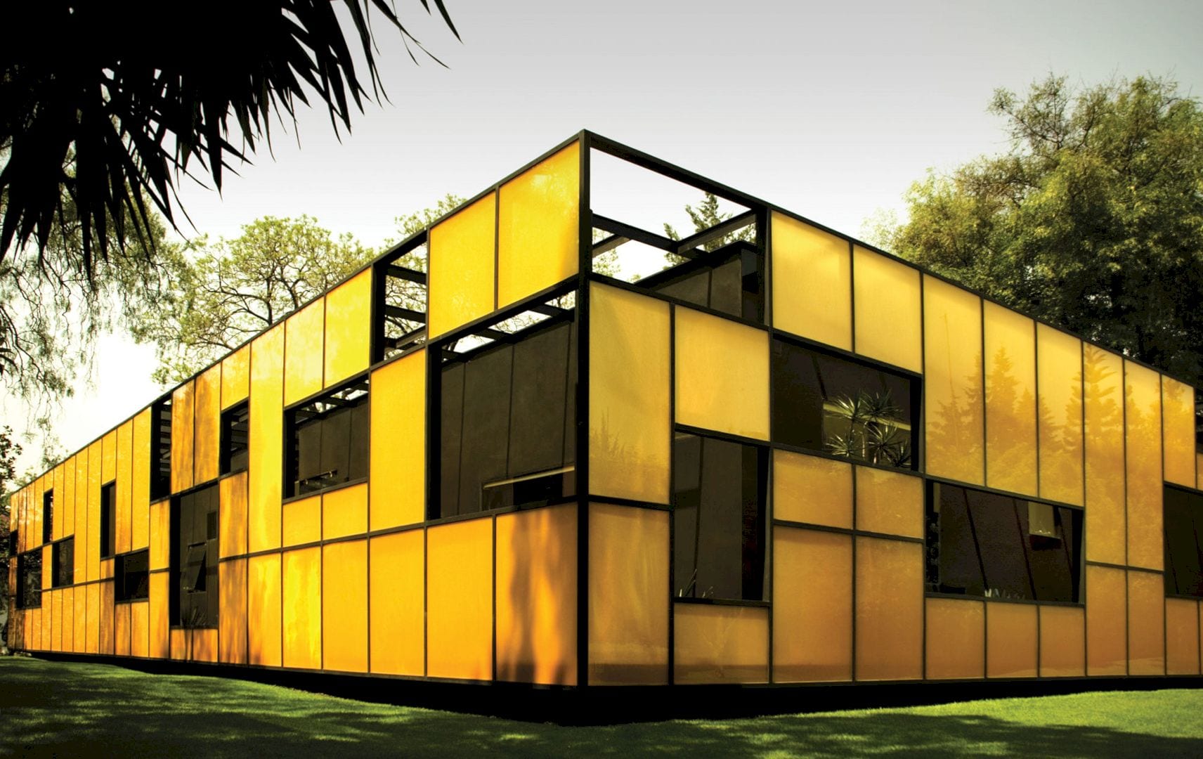
Rojkind Arquitectos works with Derek Dellekamp to complete this 2003 project of a headquarter building. Falcon I Headquarters offers an amazing blend of its interior and exterior. Located in Mexico City with 4,855 square feet in size, this building is designed as a glass box floating in a garden with edited relationships between the view and the space to blend the exterior and interior.
Concept
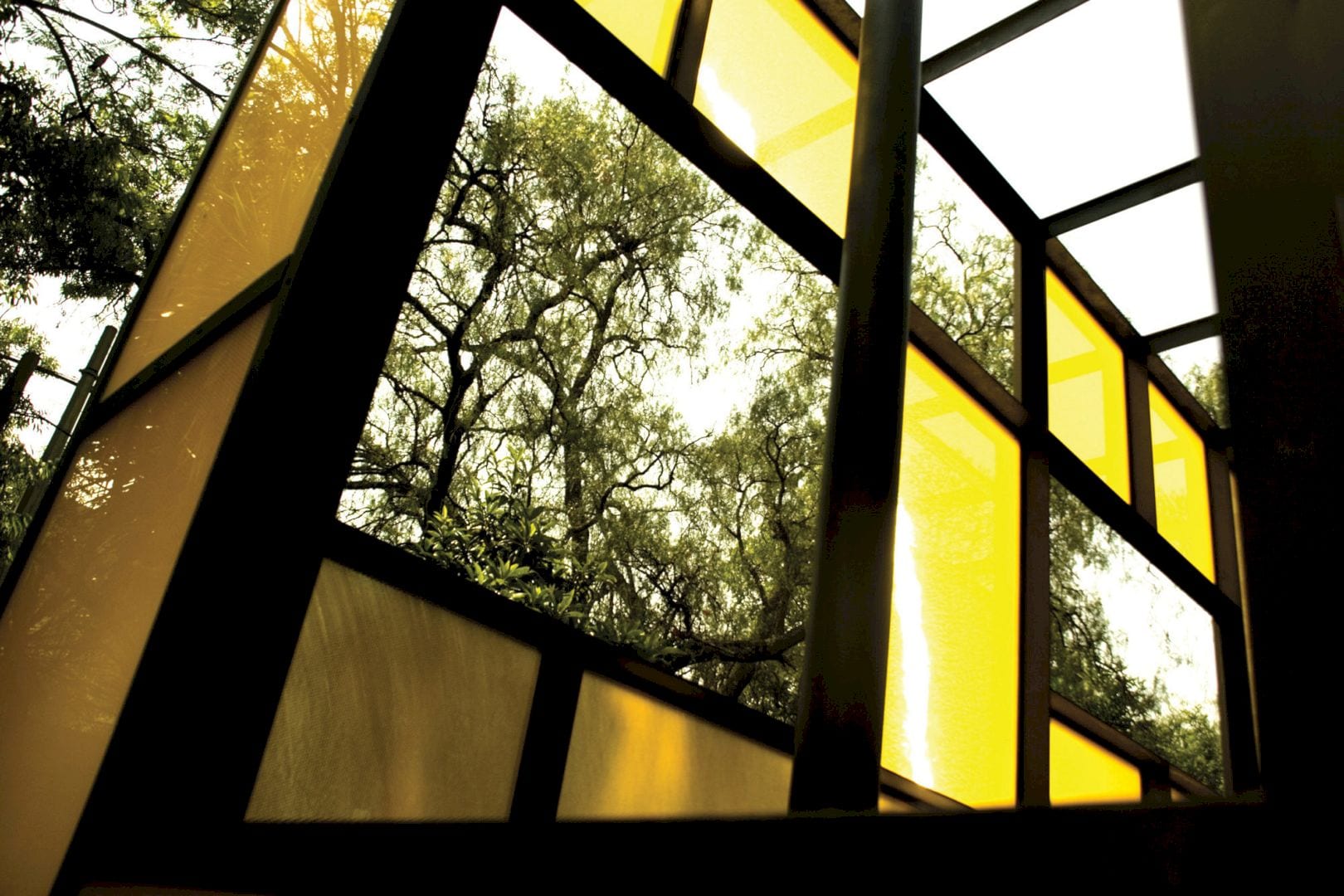
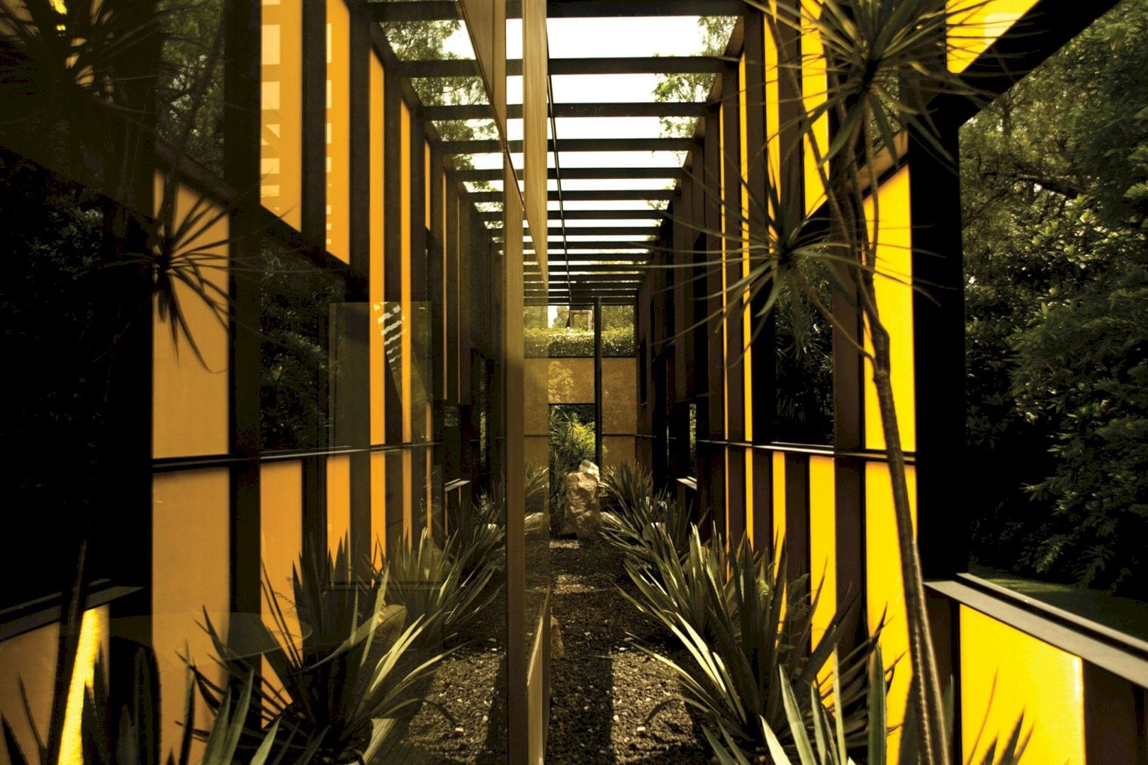
This project is designed for Corporativo Falcon, a company dedicated to selling medical equipment and instruments. They need new headquarters in Mexico City. The premise of this project is to cause a radical change to their business image through the new building besides the need for space and larger area. Their sales center will not only become a work area but also a perfect space to portray their image and welcome their clients.
Design
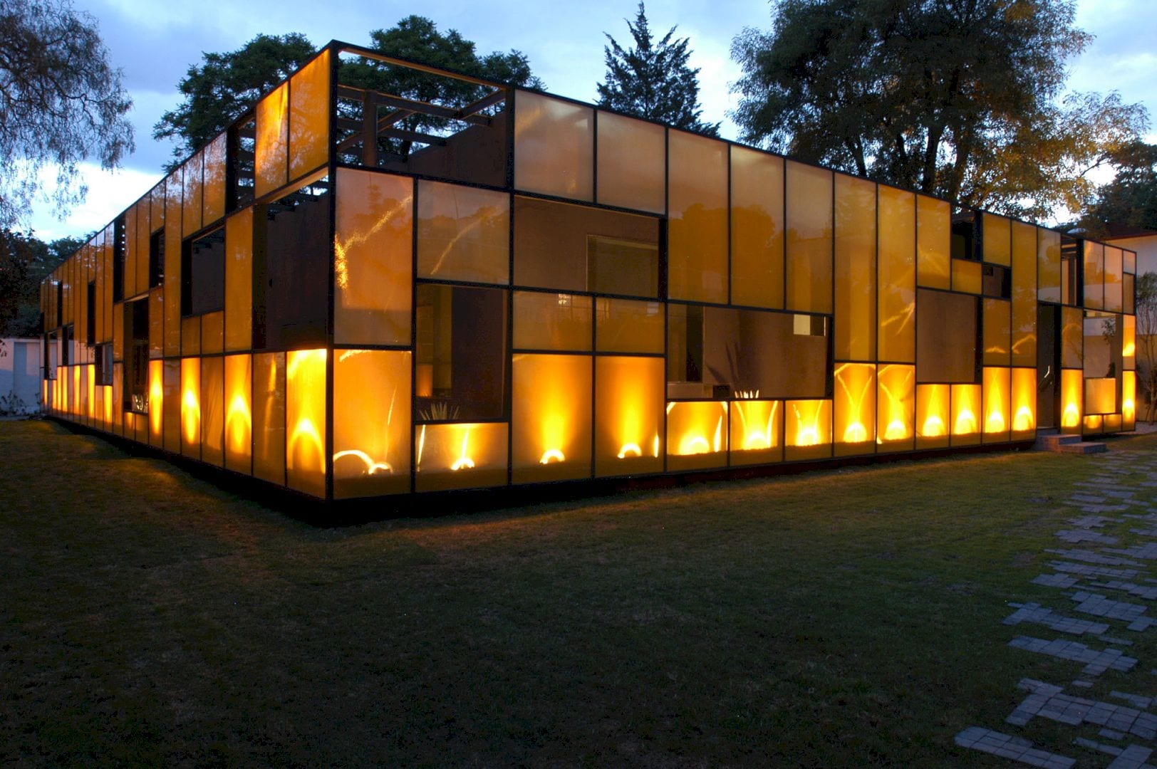
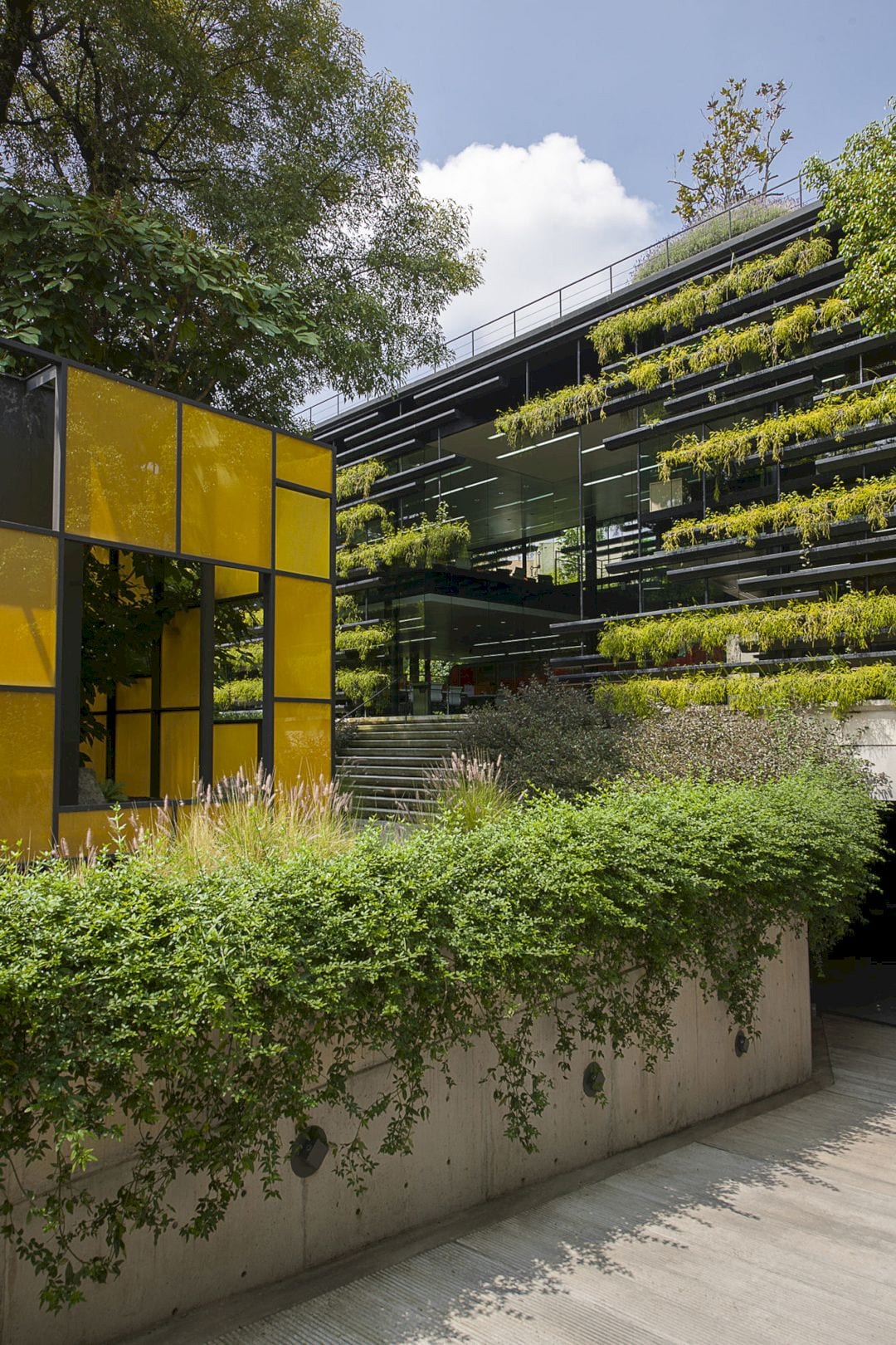
This property is located in close proximity to the San Angel district on a very quiet street. It already has three buildings, two of them at the perimeter while the third and the biggest one among them floating in the middle of the garden area. The different corporate areas are assigned by taking advantage of this perfect layout, concentrating the sales area of the company in the central building.
This project is designed as a glass box floating in the garden based on the main construction quality with evident gaps in its structure and cleared-out interior. The architect focuses on the relationship between exterior and interior spaces with a glass skin that cast before the solid primeter. This way is done to create a filter between the spaces’ polarity.
Details
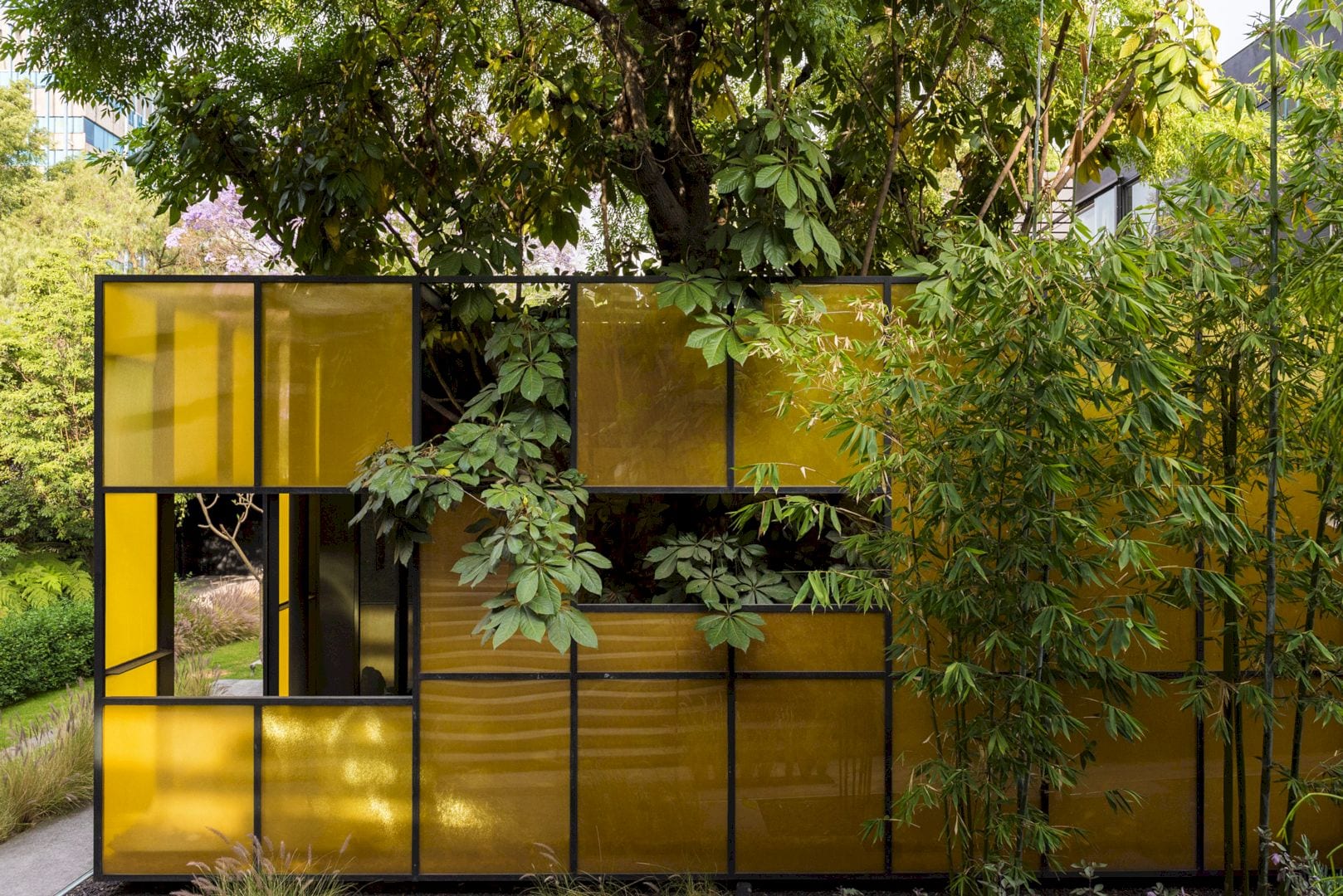
The relationship between exterior and interior is edited carefully to seek macrocosms that can represent the branches, the stones, the fragments, the fractions, or a single cloud traveling across the blue sky. The translucent material is also used to create a virtual sequence of exterior colors and spaces. With orange lighting, the interior of the building contrasts with the gray shades of paint, creating veils of color and also reflections.
The wall has perforations as a response to the editing view’s search. The aim of them is to have an apparently accidental, mysteriously cut, and also illuminated view of the surrounding exterior that capable of challenging gravity. Both skins are perforated as they are being unfolded, seen as a metaphor to describe the relationship between the clients and the business.
Falcon I Headquarters Gallery
Photographers: Guido Torres and Jaime Navarro
Discover more from Futurist Architecture
Subscribe to get the latest posts sent to your email.
