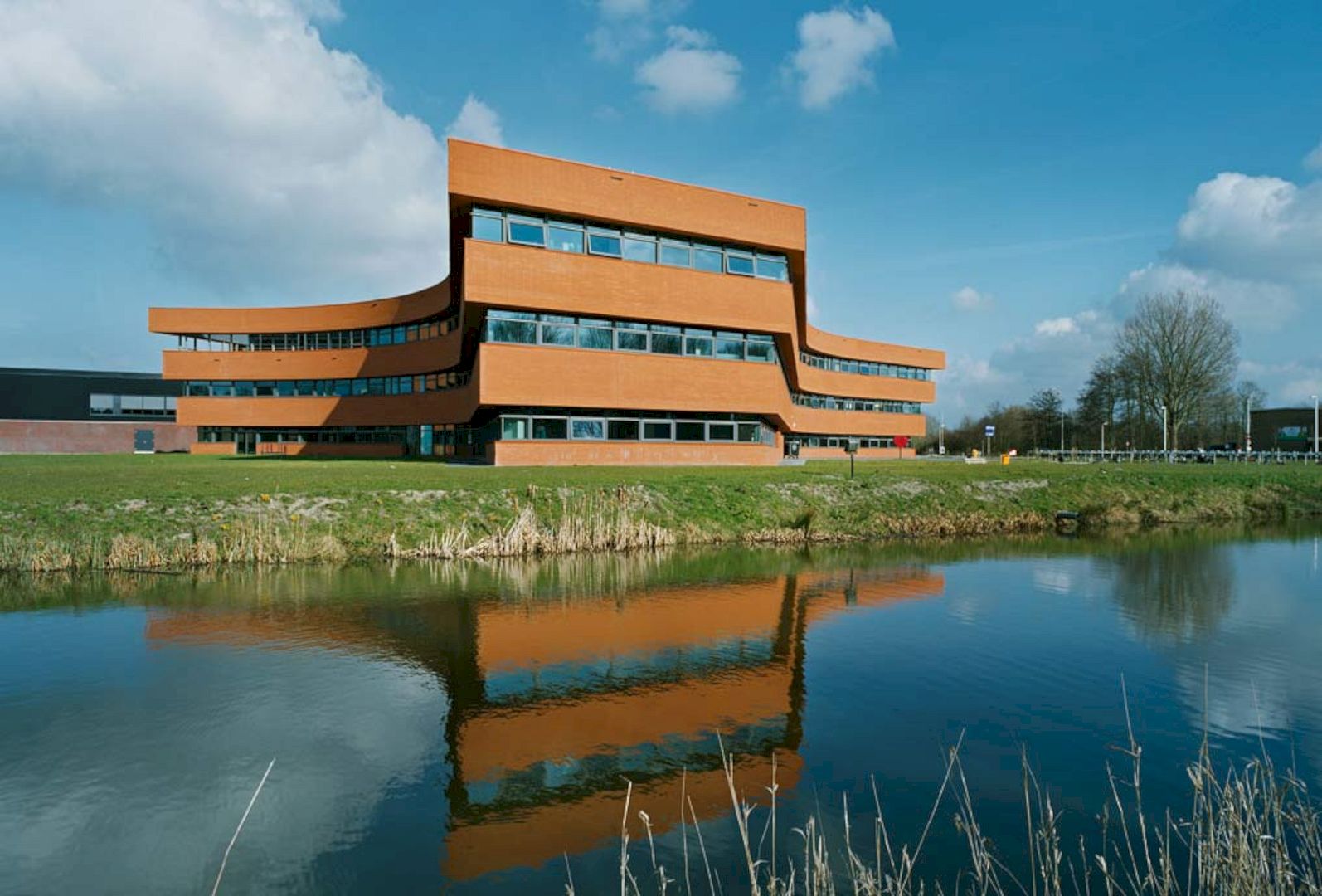
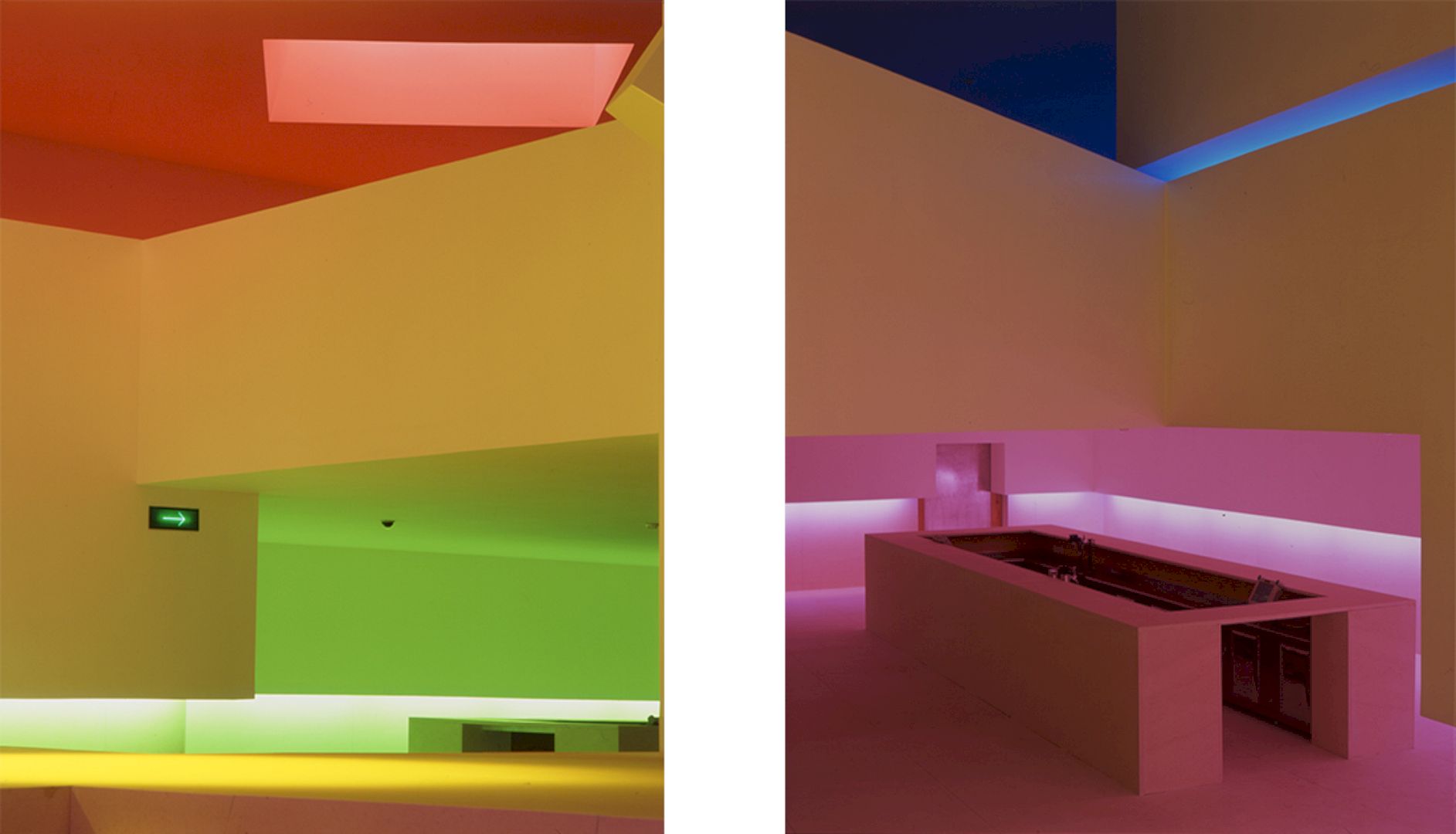
Designed by Álvaro Leite Siza, 1998 Discoteca Mantra is a project of a restaurant-bar and disco inside an old warehouse. The aim is to provide supporting equipment to the residential and service area. Located in Portugal, the main program is also to maintain the pre-existing building. The highlight of this project is the beautiful colorful interiors inside the building.
Design
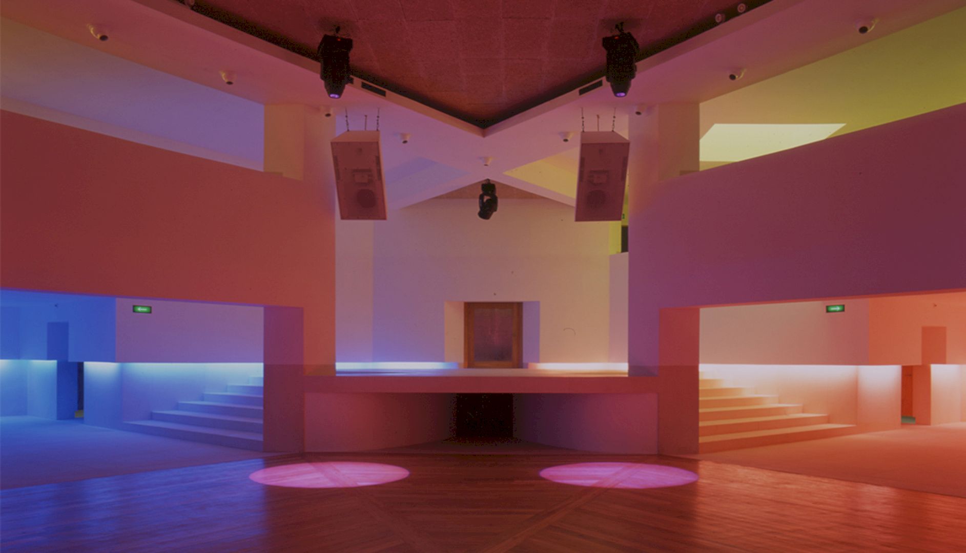
It is a project that provides supporting equipment to the residential and service area, anticipated in the Town Planning Scheme for the southern part of Matosinhos in Portugal. The goal is also to preserve the typical industrial memory features of the Matosinhos city, especially during the ate 19th and beginning of the 20th centuries.
The urban scale of the Praça da Fonte also can be safeguarded through this program which is counterbalanced by the Acia building. In the immediate vicinity of two other discos, the opening of this restaurant-bar and disco will bring new dynamics to the site spaces so the users can have a great possibility to park the cars, relax at the bar, and then go to the disco within walking distance.
Structure
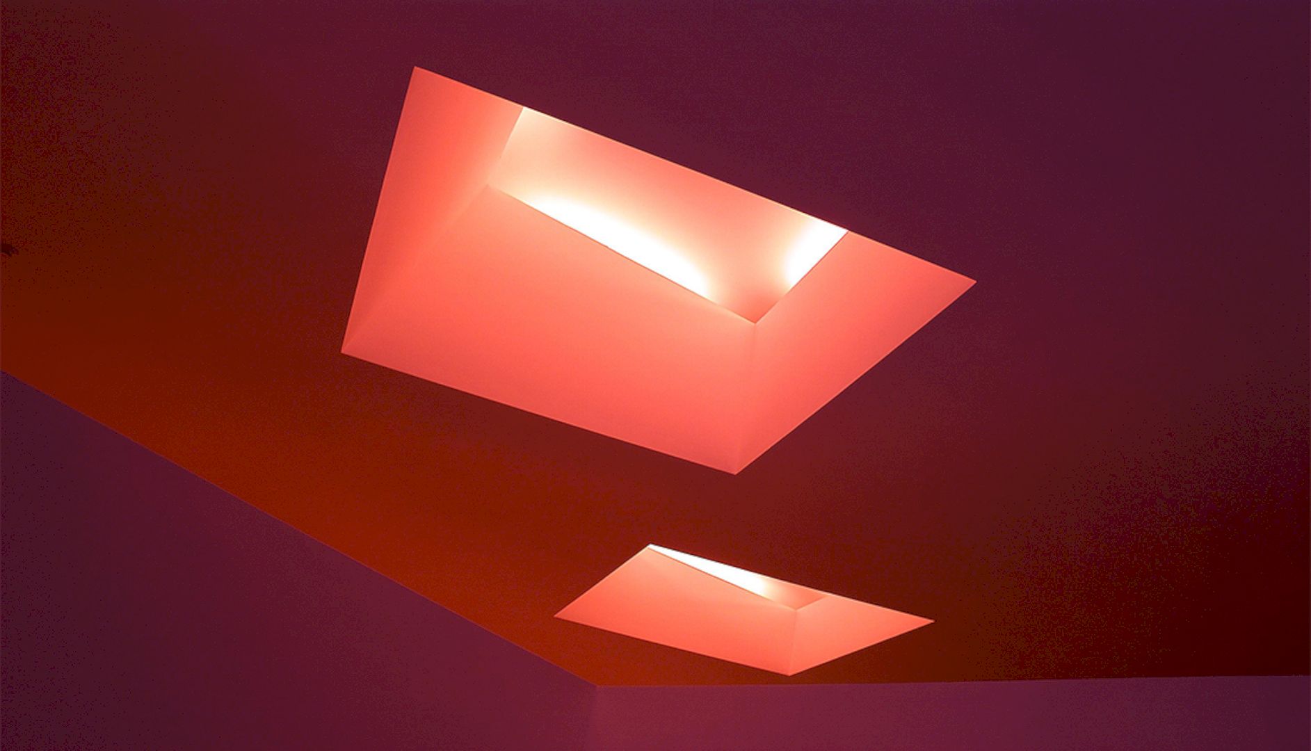
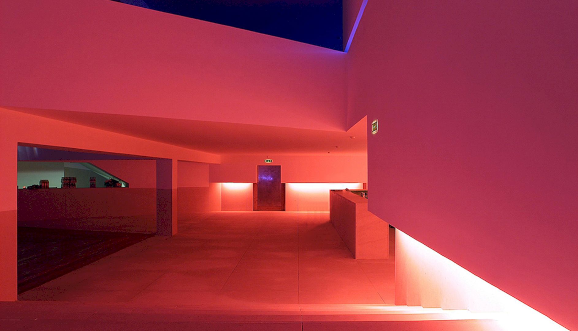
This awesome project systematizes and also organizes the existing structure, renovating, and modifying the interior space only. The proportion is made from an axis that defined by the perpendicular to the circumference’s arch of the warehouse’s facade and by the center of the roundabout-square. This work includes creating a new volume inside the old, a new path that duplicates the public pavement, and recreating in the interior two lobbies.
Inside the warehouse, the construction of new exterior halls derives from the need to isolate and soundproof the new interior volume that organized. There is access gained by two doors from two different lobbies to two symmetrical and similar spaces that connect in a distribution area. The dance floor has a hexagonal shape that designed to control the space arrangement, to captivate central attention, and good for the acoustic quality.
Details
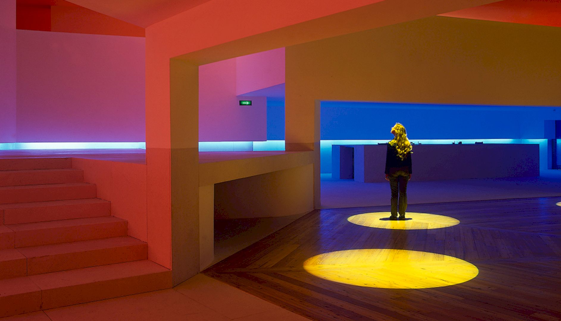
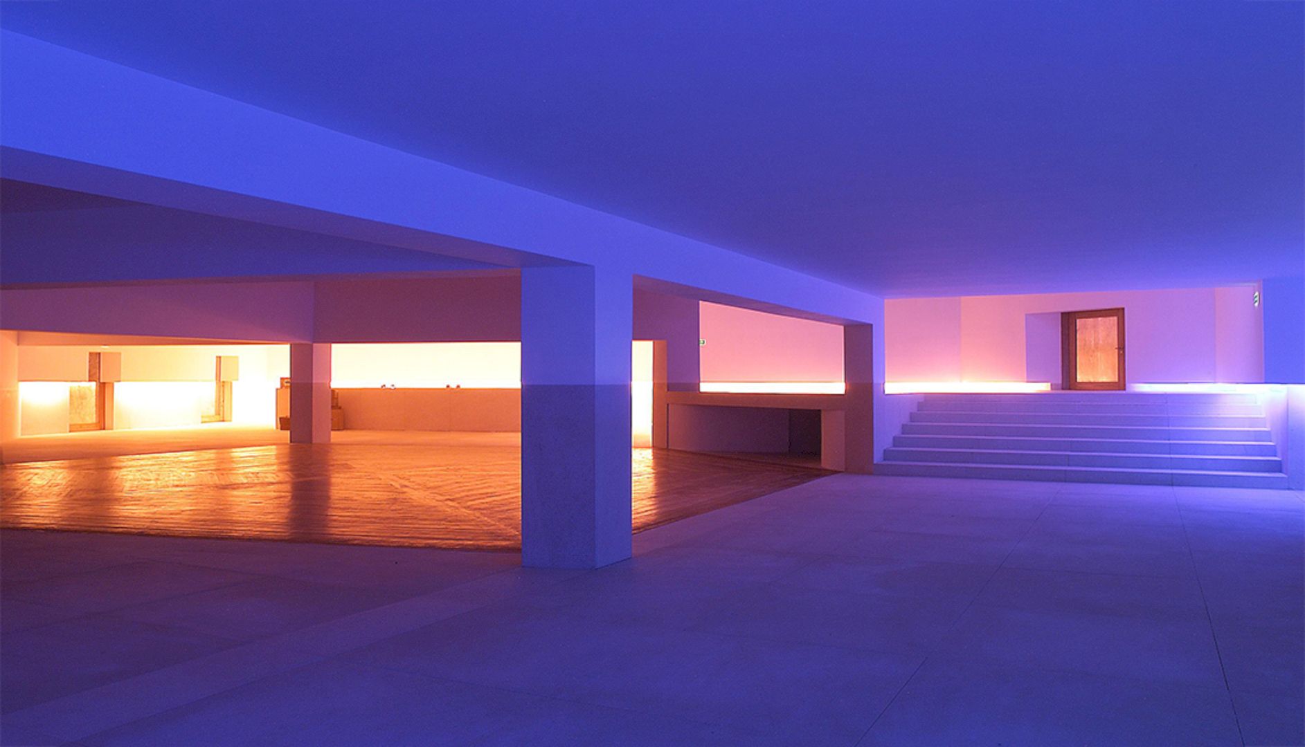
At the convergence point of the restaurant and bar to the back, there are some different amenities: toilets for the staff and for the public, pantries, utility rooms, and a kitchen. The restaurant and bar are located in two superimposed levels that connected by stairs, organizing the two other distribution lobbies inside.
This project supposes the construction of a ramp, facilitating the access of the physically disabled to the upper floor. There is also an emergency plan used based on two longitudinal passageways on the two parallelepipedic volumes that lead to the exits. Another ample gallery, with fire doors and locks with anti-panic function, serves as an emergency exit to the exterior lobby from the service area, leading to the entrance of the bar.
Materials
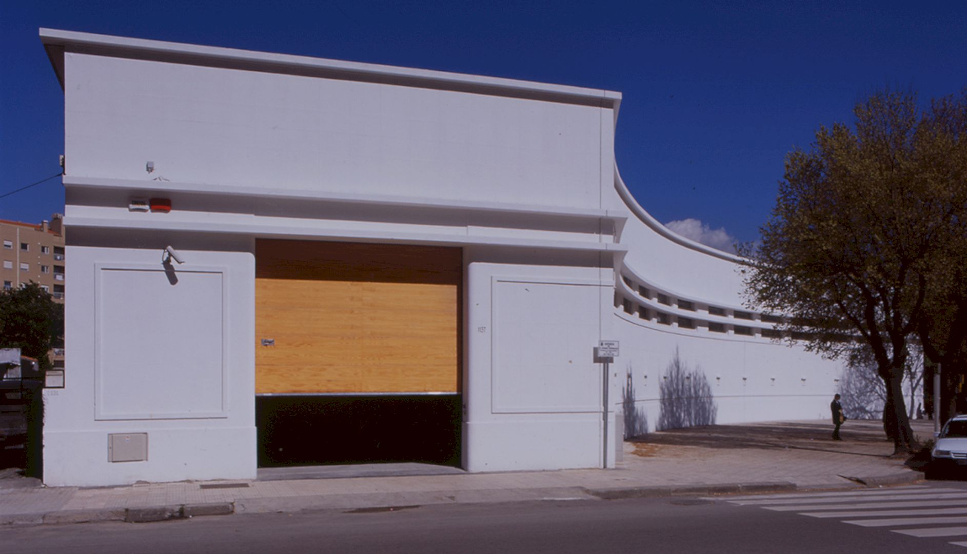
Semi-rigid limestone, pinewood, and Pladur® walls are used, combined contributed to explore maximal effects from the light. With an inner gap, the plasterboard walls are built to provide ventilation space and to install all technical infrastructures for the building, creating special and indirect lighting conditions for the whole space.
The air extraction system pipes have been discreetly installed up in the skylights and dance floor ceiling. The color presence is very important in this project, creating stimuli and a range of different emotions. Light and ambiance in a disco can transform and acquire a myriad of expressions while space expresses itself as if it had a soul of its own.
1998 Discoteca Mantra Gallery
Photography: Álvaro Leite Siza
Discover more from Futurist Architecture
Subscribe to get the latest posts sent to your email.
