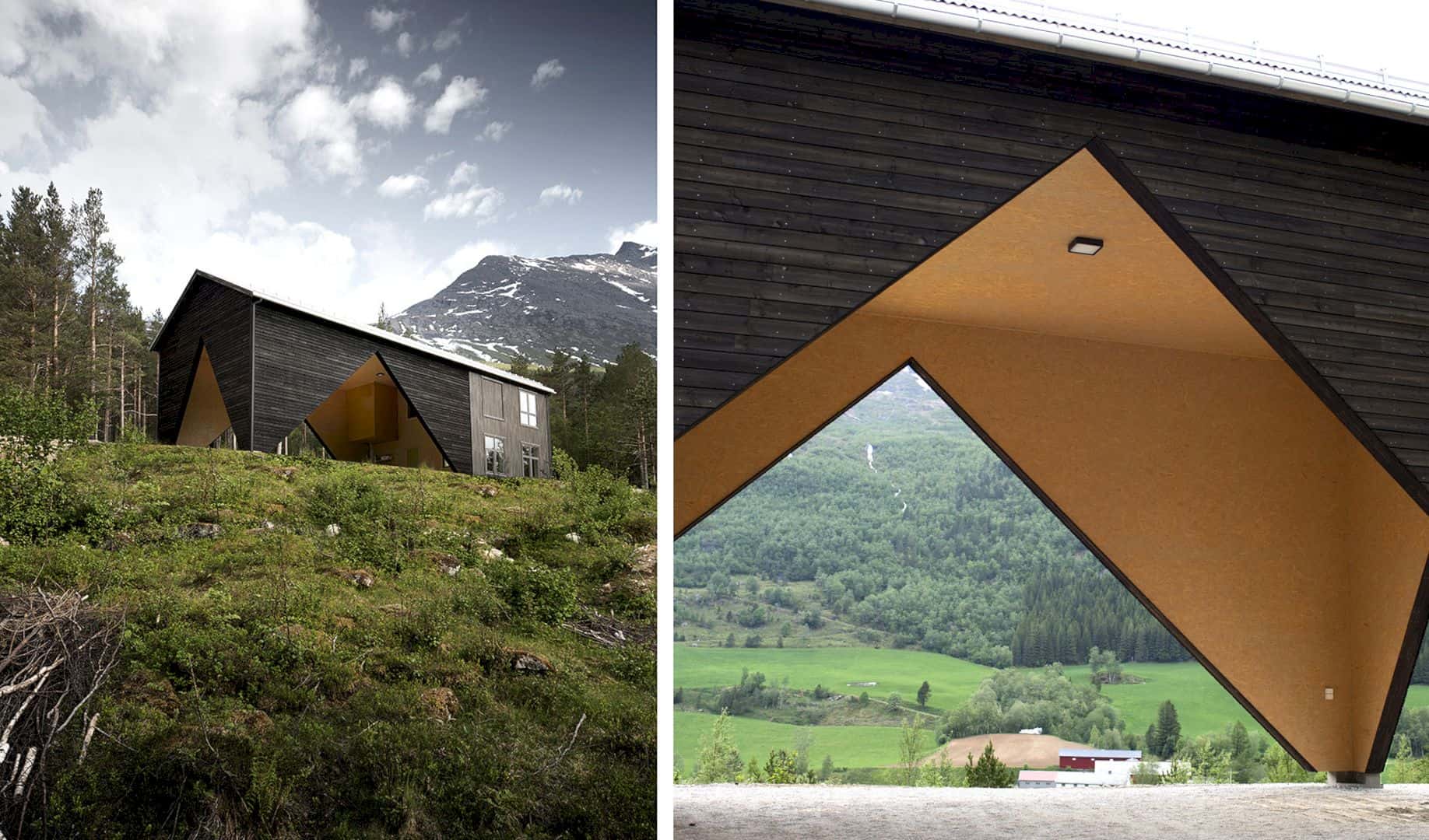
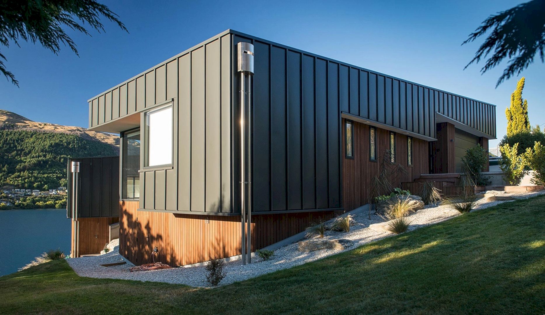
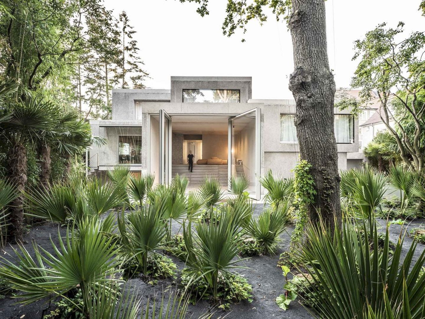
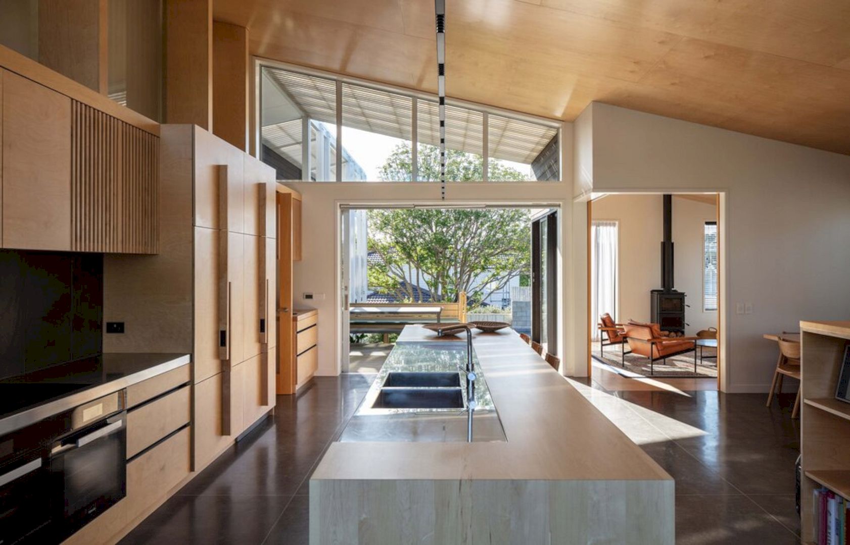
Designed by Rever & Drage Architects, 1/3 House is a detached house built for a young couple in Sunndal. It is a small home located in Norway that they can afford with limited funds. They want the house to be easily expandable depending on how life developed. Completed in 2019 with 100 m2 in size, the house has a simple design and also appears a little abstract.
Overview
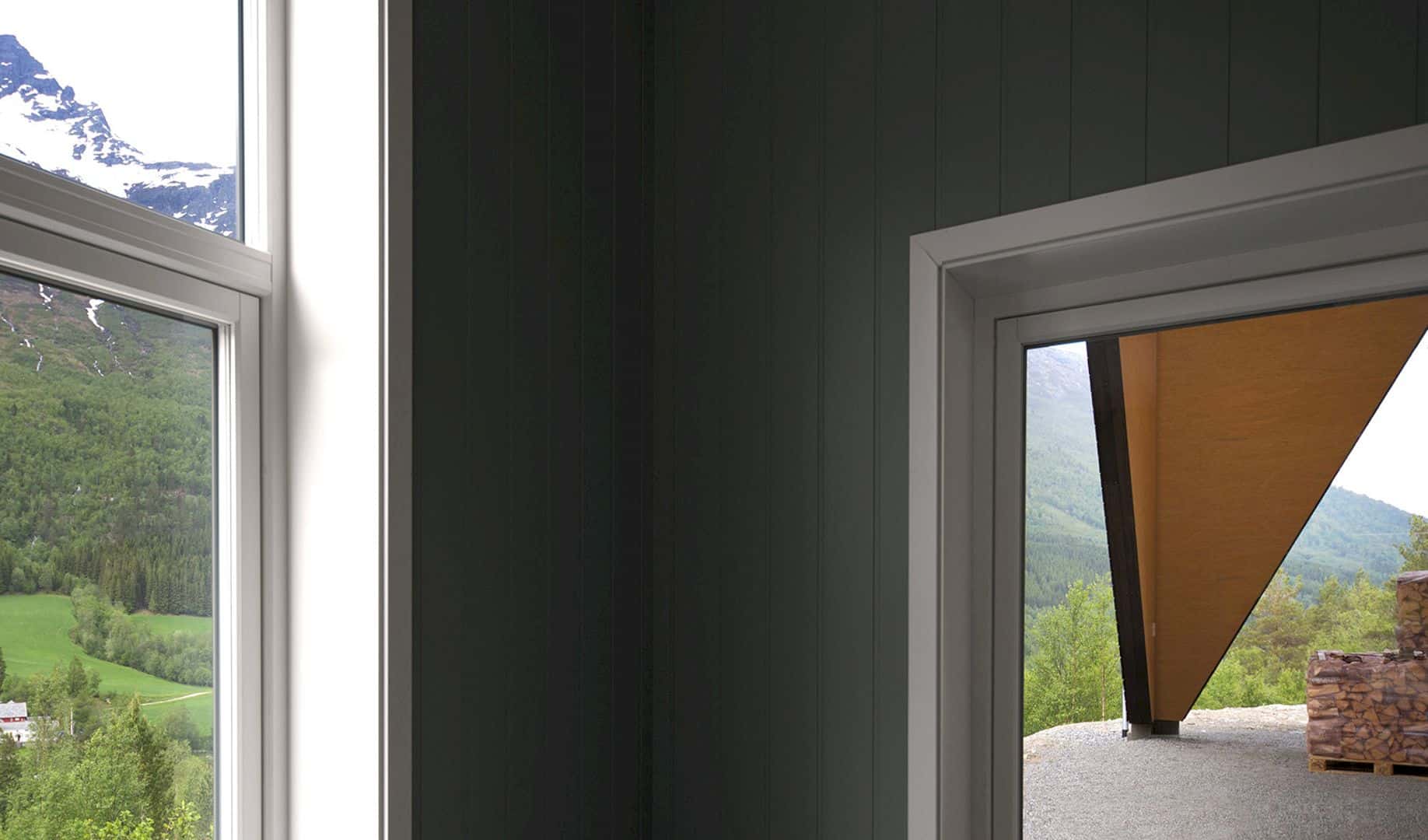
The man of the family wants a cozy and romantic building while his wife is a deer hunter and wants to have a practical building with room for guns and some hunting equipment. This family sees the need to think simple due to the economic concerns and at the same time, they also want to think about their future so there is no need to do a lot of changes as the family grows.
Rooms
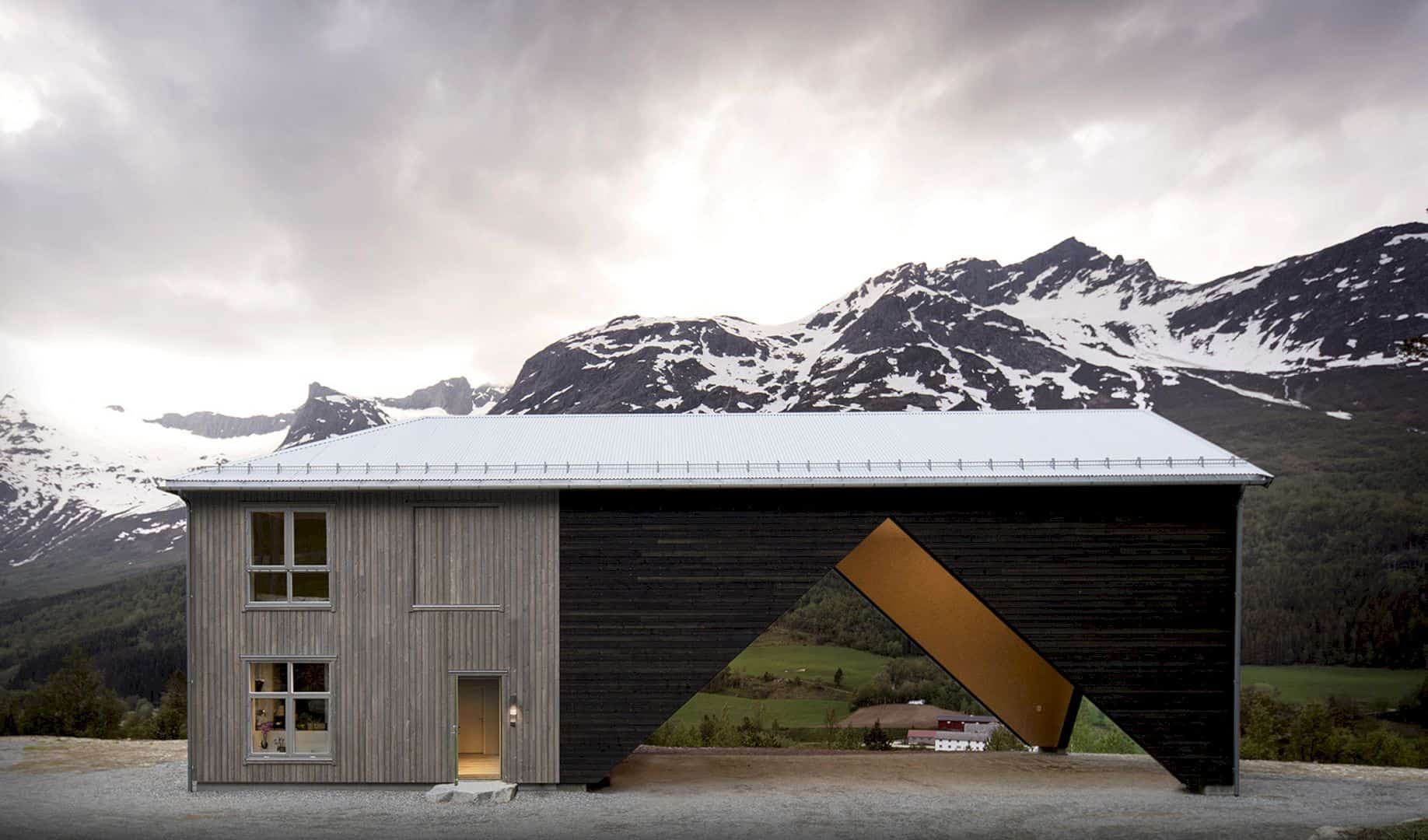
The building insulated part has two floors with an area of 50 square meters while the uninsulated utility space has about twice that area. The first part can meet the needs of the couple for living space and this area will be able to accommodate a family of one or two children. The latest part has the potential for expansion. The veranda can be used as space for butchering deer, banquet hall, workshop, garage, and also a storage room.
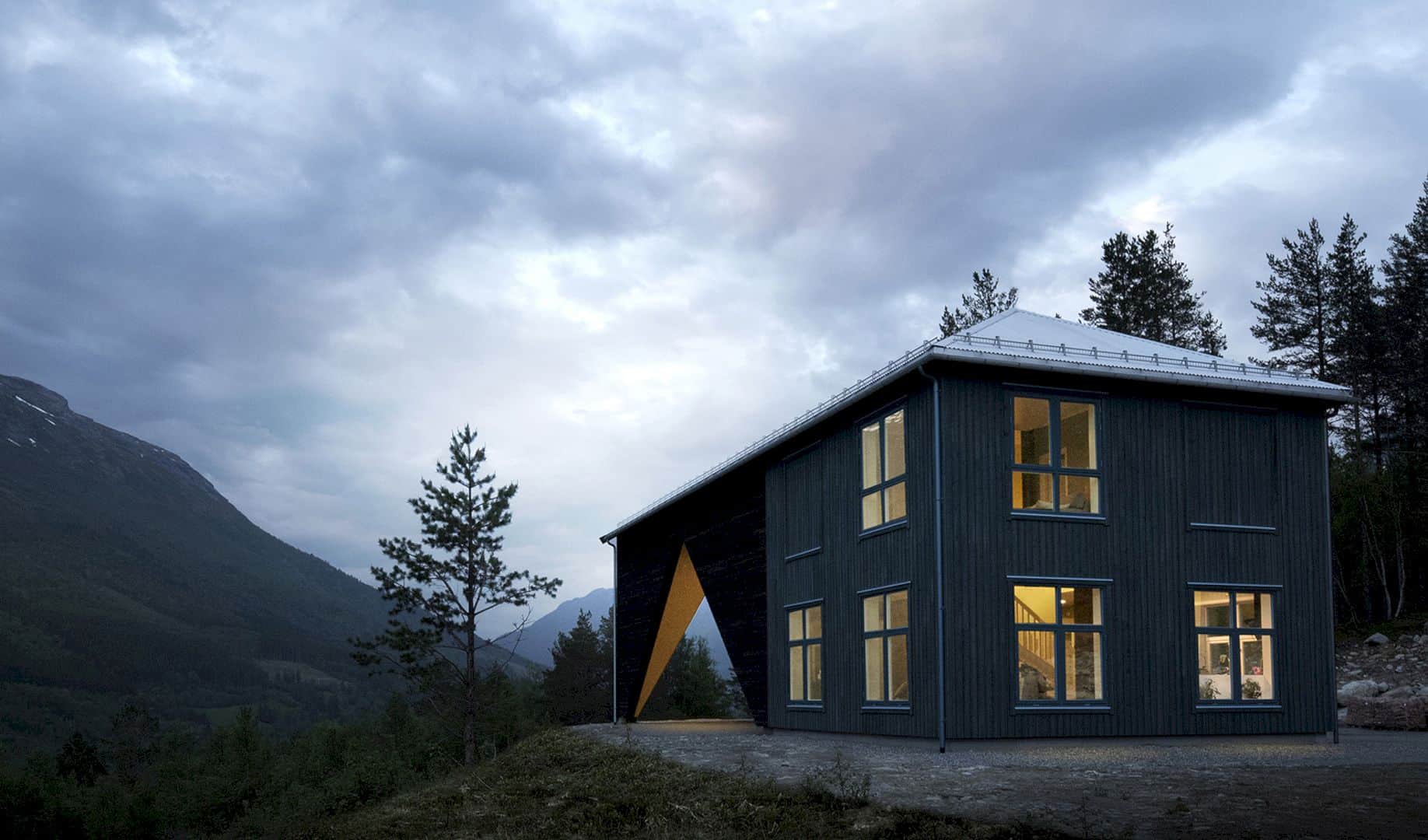
In the insulated section, the windows are organized in a traditional way while the veranda or the hall has a more temporary and industrial design. The economic concept for this project is simple that the owners have now built the part that they can afford while the rest has untapped potential. At the beginning of the project, the roof is completely extended so the family can reduce the work for adding needed space and they have the area under the roof as a resource too.
Rooms
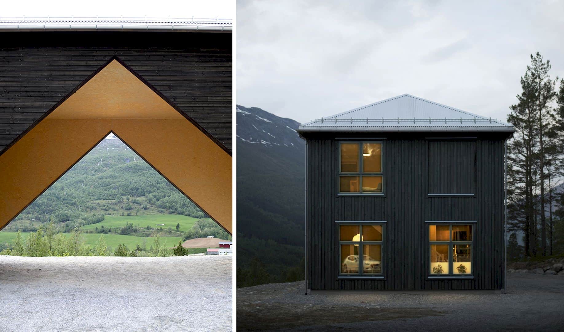
The insulated part of the floorplan is organized on both floors around a warm core. The living room, entrance, and kitchen encircle the laundry room on the ground floor while the storage space, TV room, second living room, and bedroom are arranged around the bathroom on the second floor. The back entrance is from the hall/veranda via the laundry room and the front door is facing the courtyard.
Details
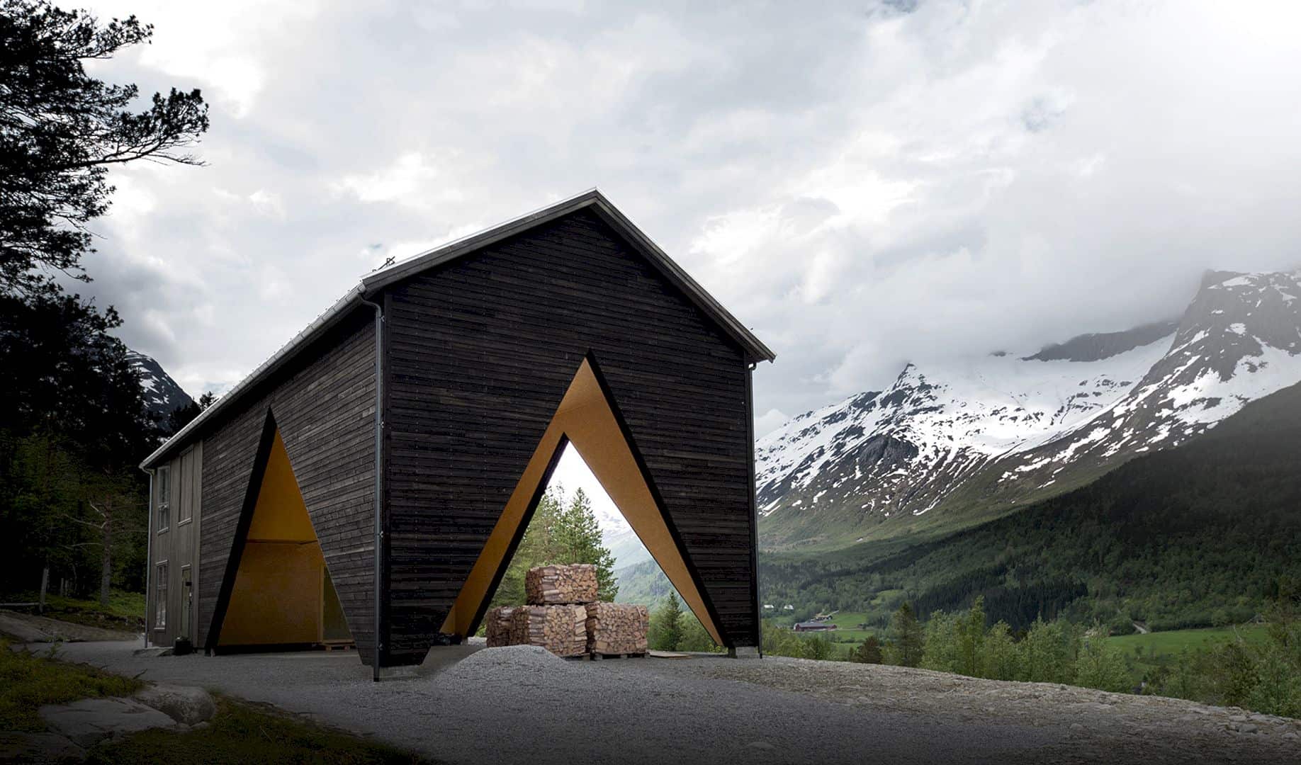
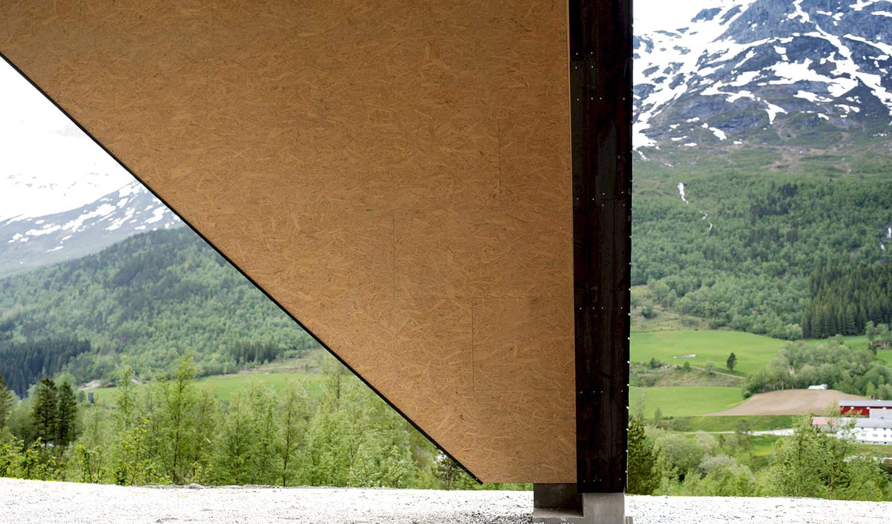
Helped up by tilted glulam columns, the building roof over the utility space supports the entire structure. These columns are built into the panels of the wall and also define the openings towards the landscape views. The family can have an indoor or outdoor feeling under this roof and the house space is both closed and open at the same time. There is also a dramatic framing of views in different directions due to the house’s expressive form.
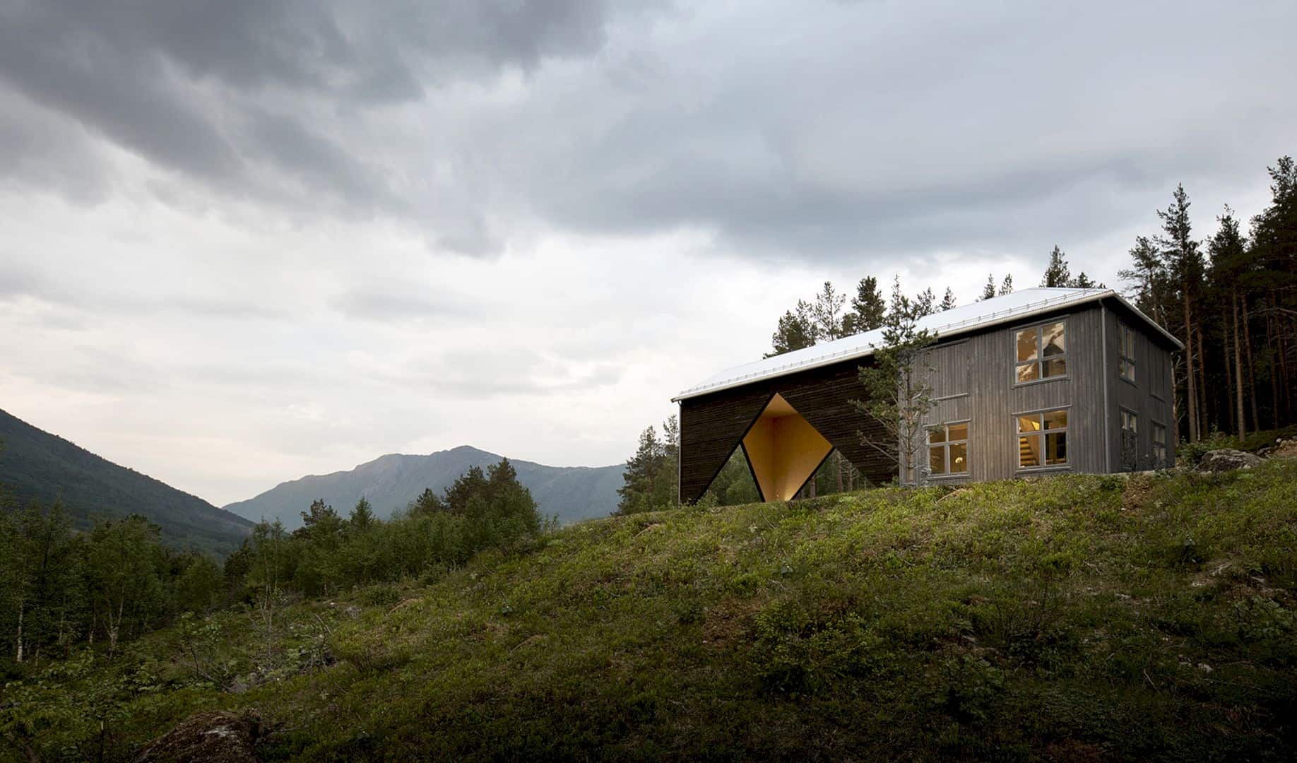
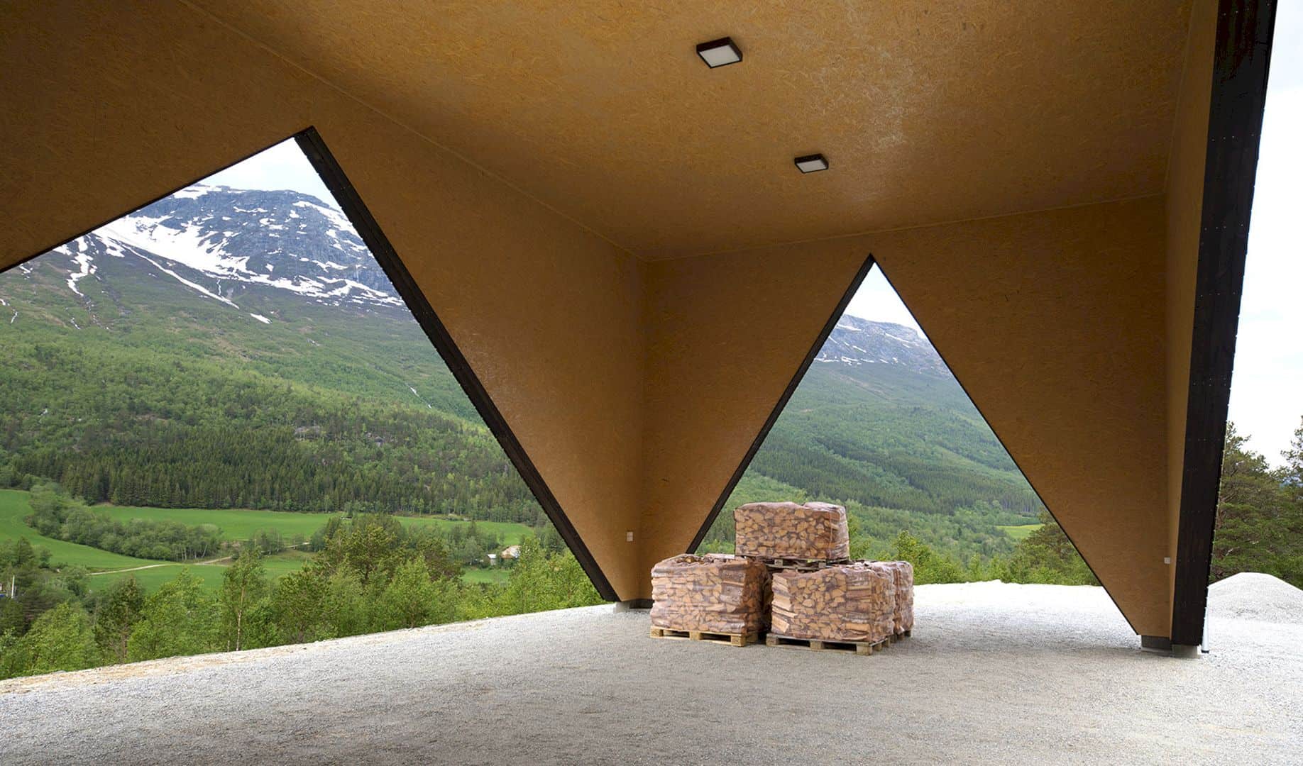
The utility space has a scale between the industrial and housing while the experience alternates between small and large. The building appears a little abstract because of the simple design. The similarity between the finished building and the concept model is striking. This house is dominated by the insulated part and the utility space disappears behind.
1/3 House Gallery
Photographer: Rever & Drage Architects
Discover more from Futurist Architecture
Subscribe to get the latest posts sent to your email.
