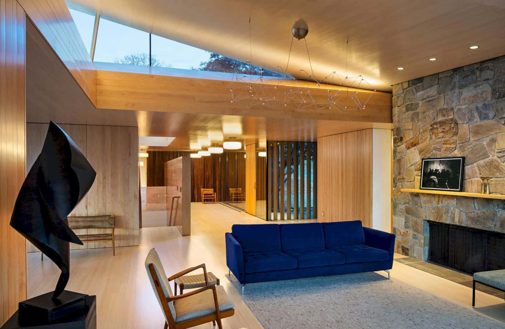
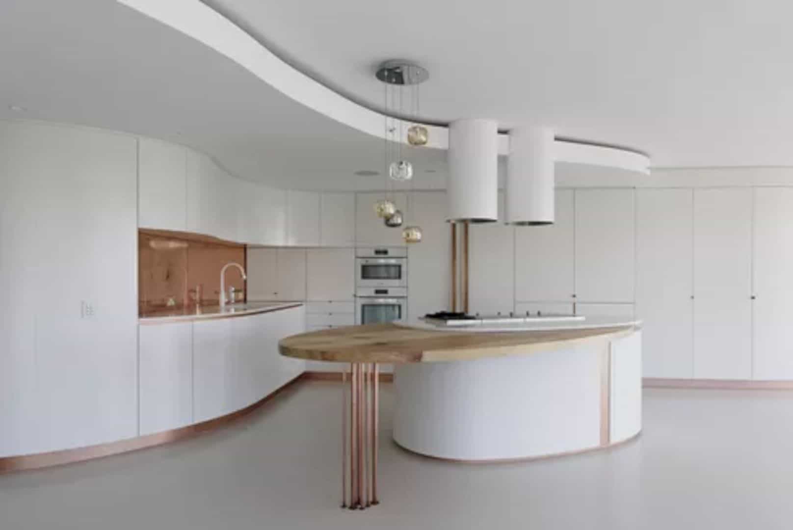
It only takes two years for Raul Sanchez Architects to complete this multipurpose project located in La Pobla de Cérvoles, Spain. GALLERY HOUSE is 300 sqm in size, offering an encounter between a family house, a small hotel, and an art gallery. This house is bought by the owners of the Mas Blanch i Jové close to the winery, reforming it to accommodate the growing number of visitors and also used it throughout the family.
Connection
The architect proposes to create a connection between the artistic experience of the winery and the house represented by the sculpture garden. A renowned artist-sculptor is invited every year to build a sculpture in the vineyards with total freedom of material, location, and subject. There are some works by Joan Brossa, Frederic Amat, Evru, and Eva Lootz around the garden.
Design

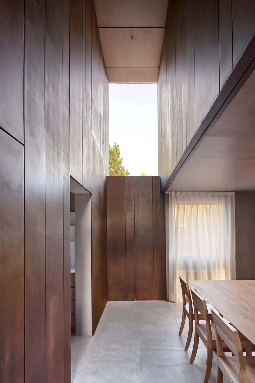
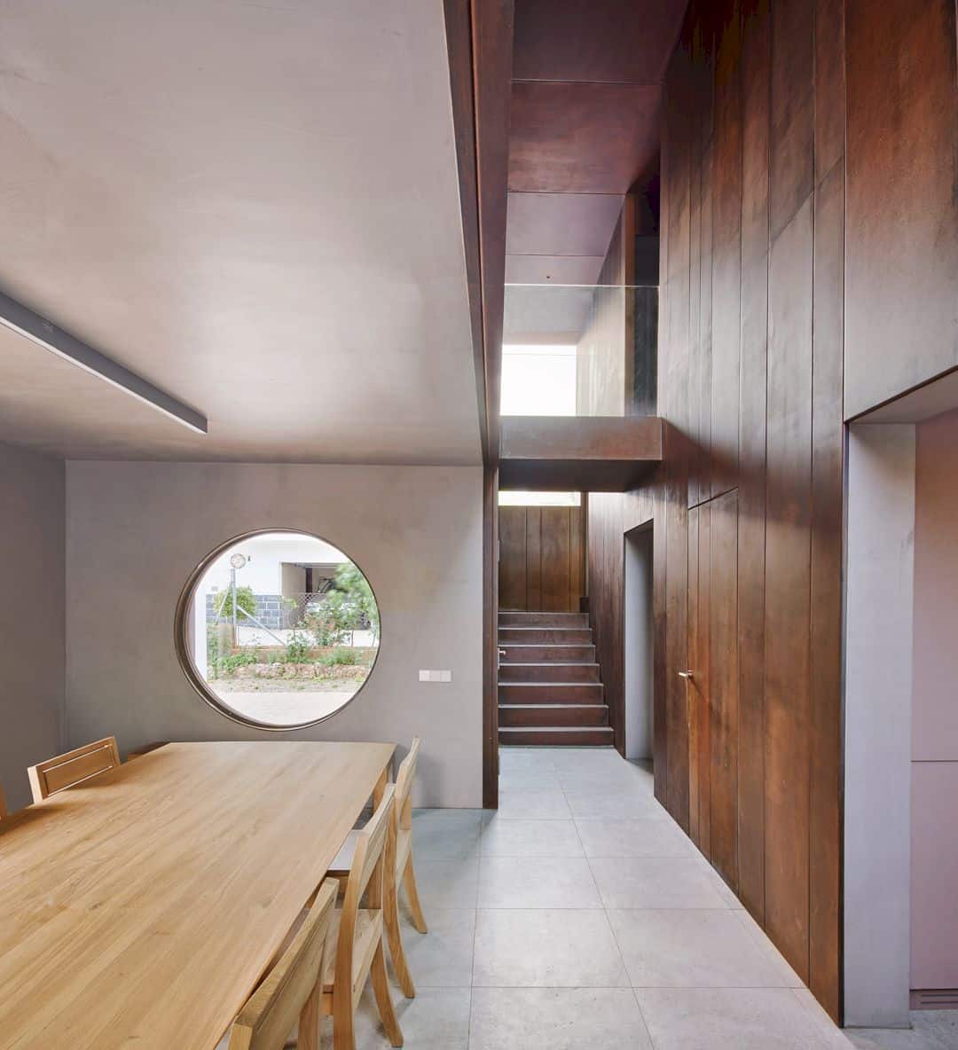
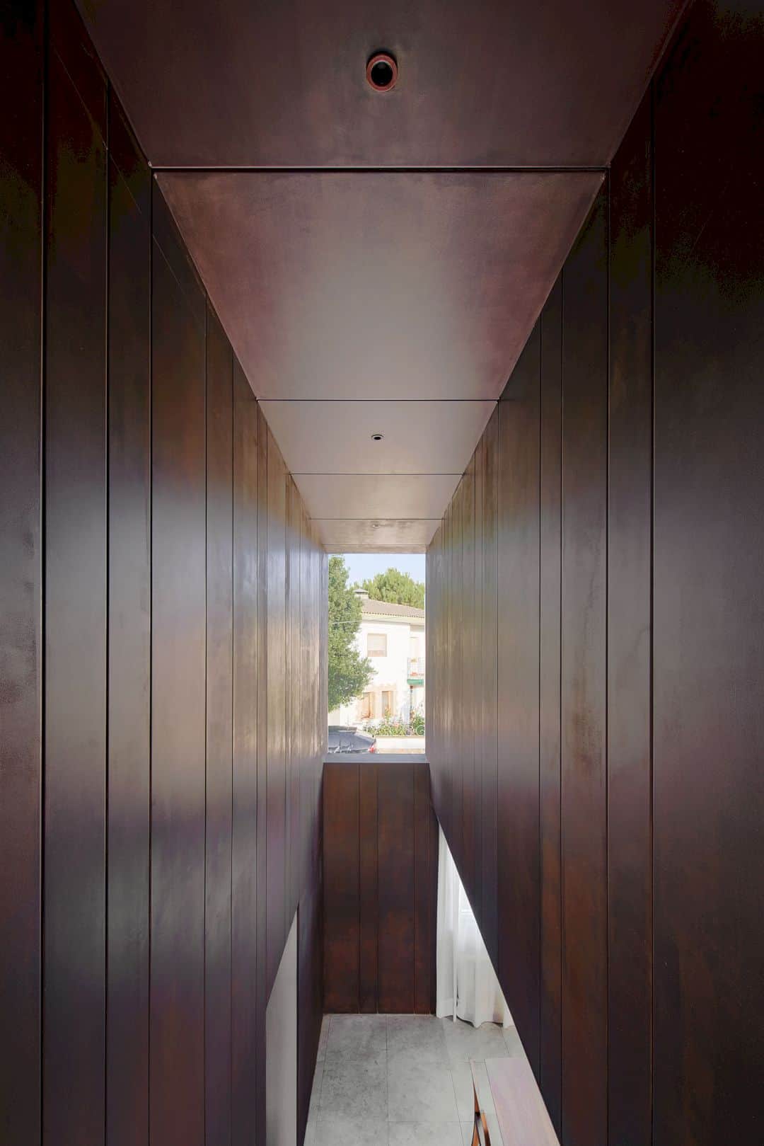
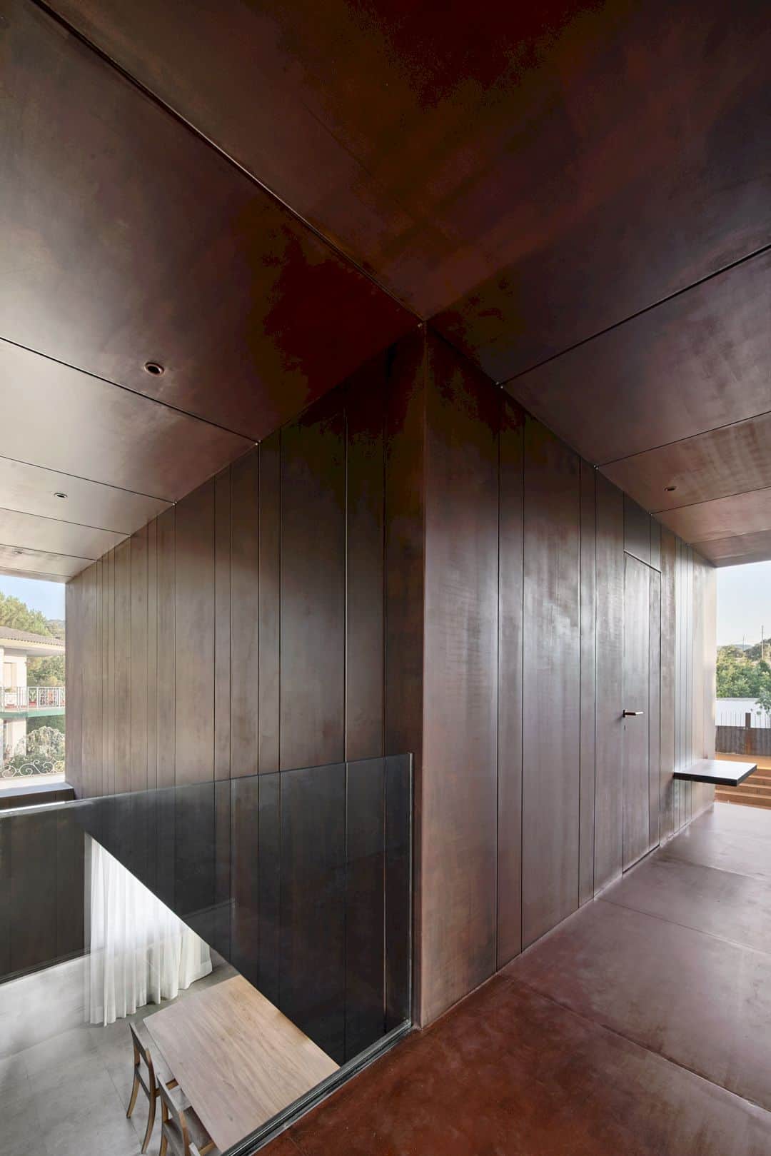
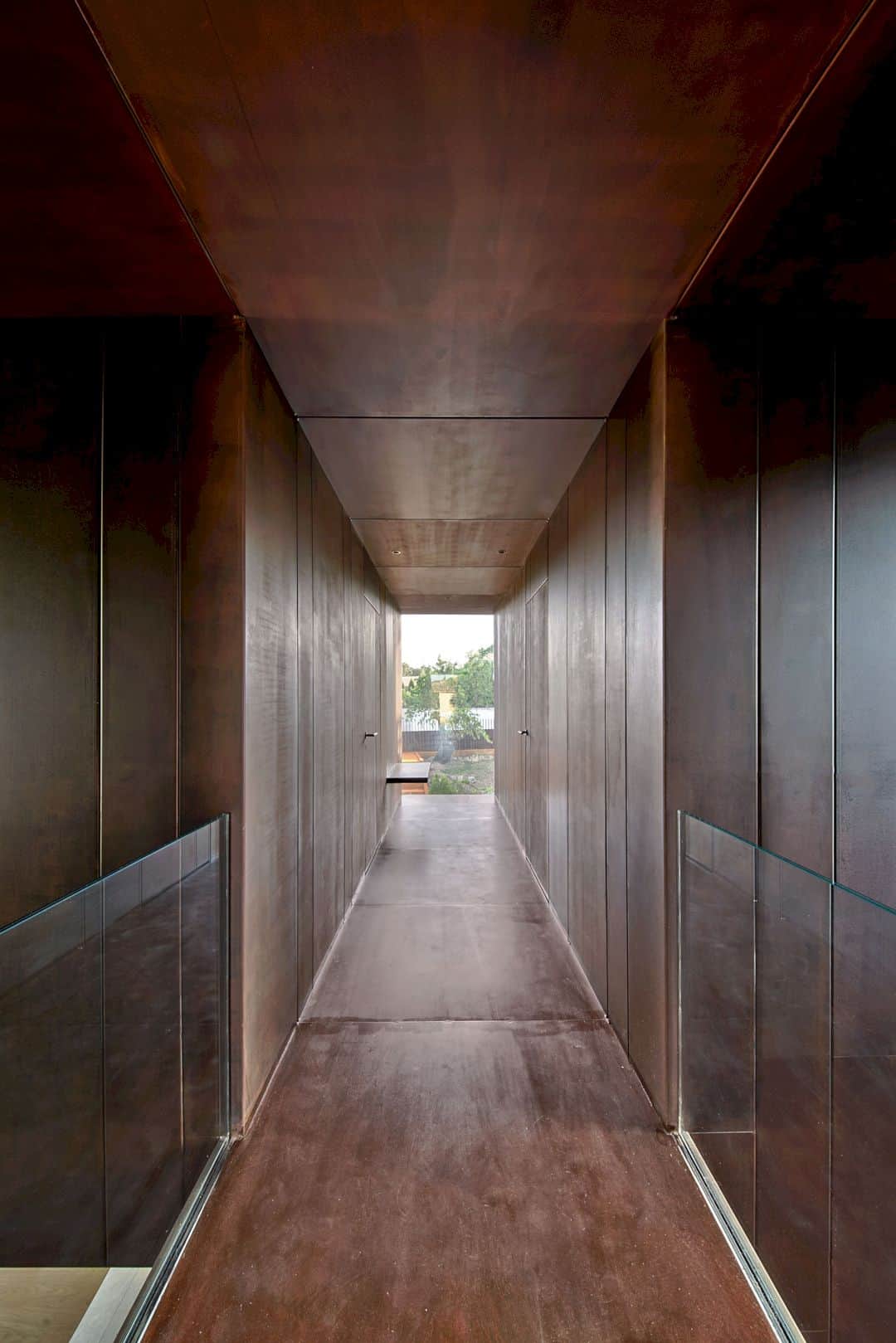
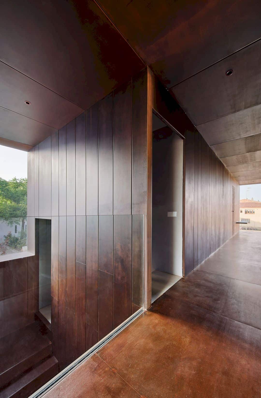
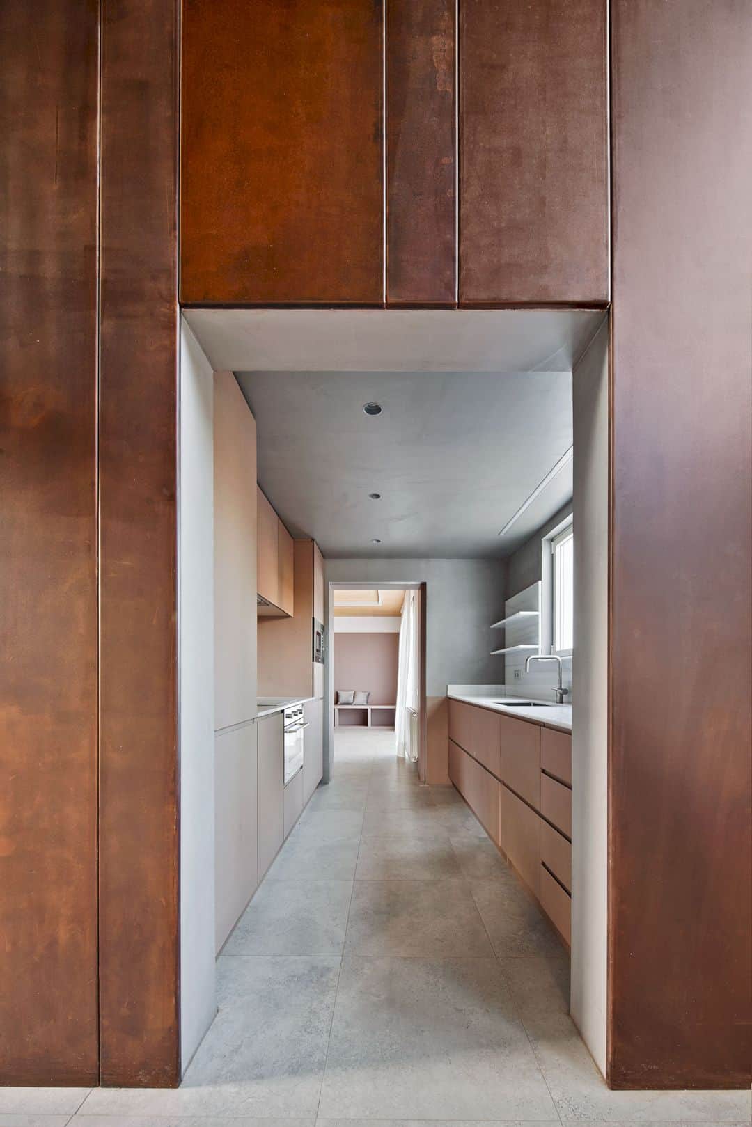
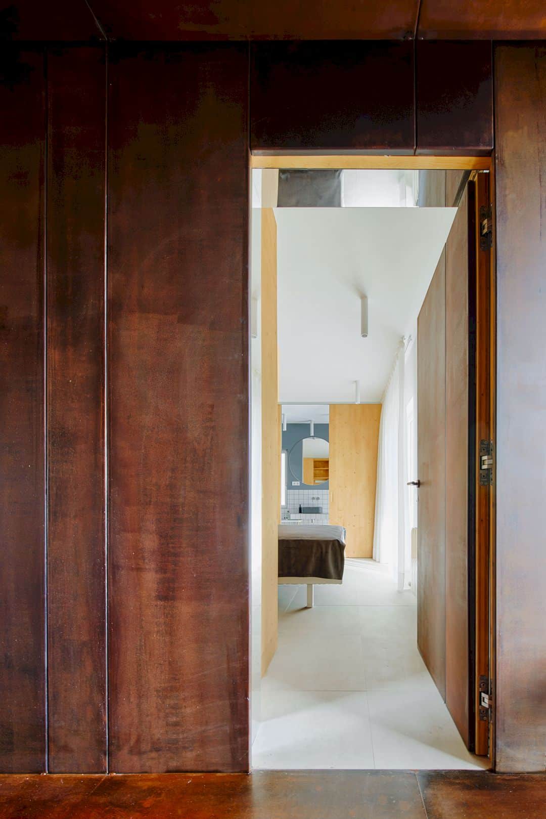
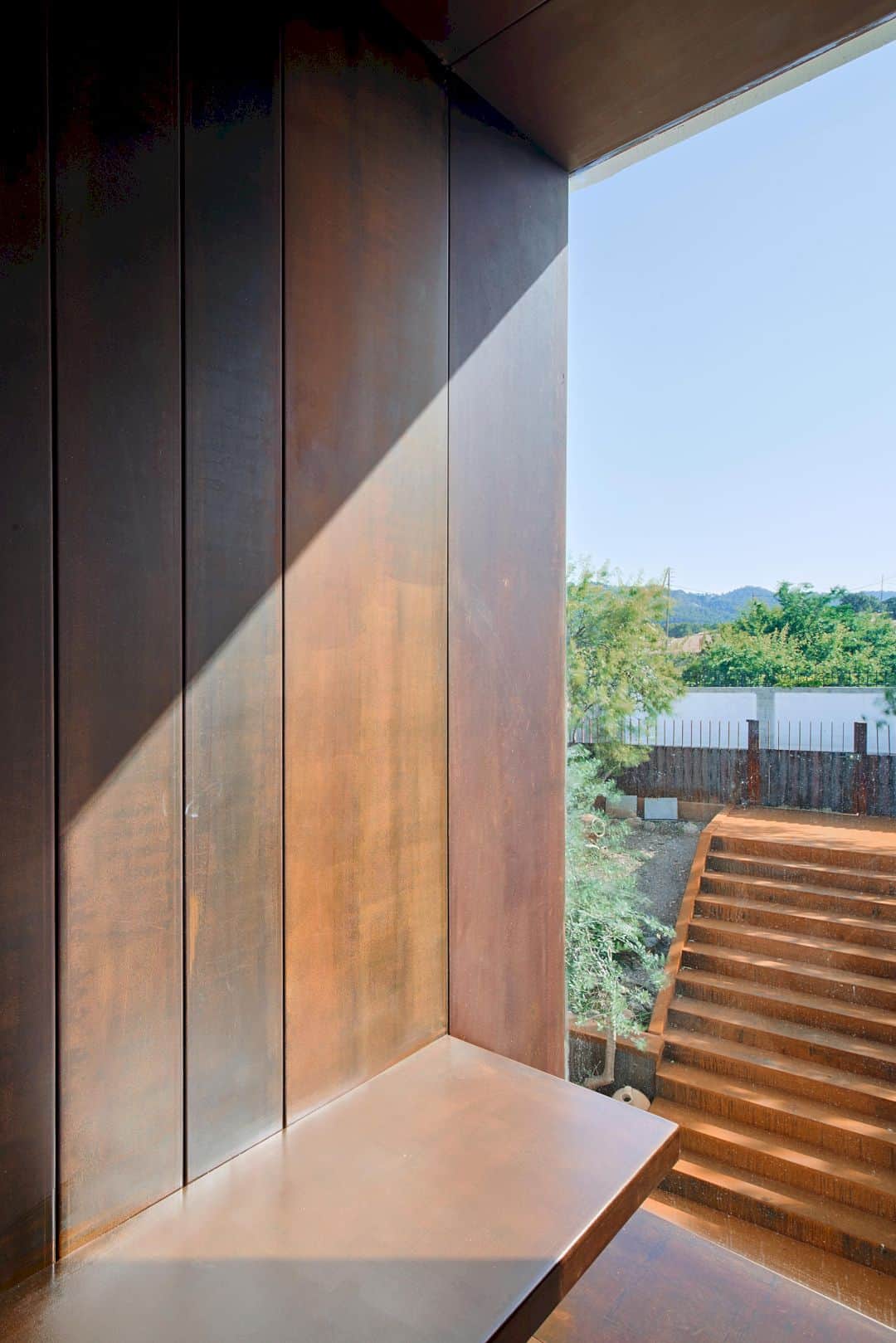
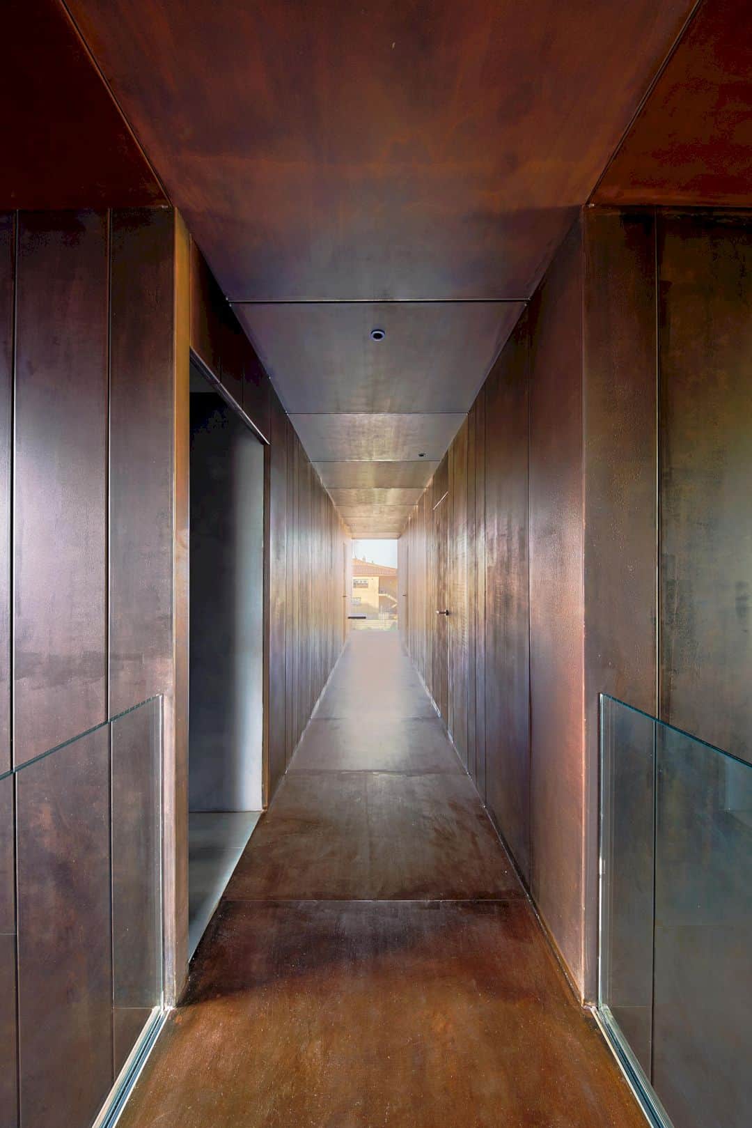
It is an awesome project that proposes an accurate and clear division of a house through a cross established in section and plan which opens some huge windows in every house facade. This cross also resolves and occupies the circulation spaces that widened to give more functions. These circulation spaces are clad with cor-ten steel plates, an identifying material of the winery.
Materials
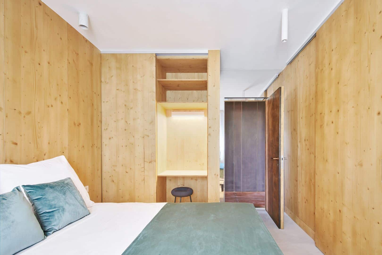
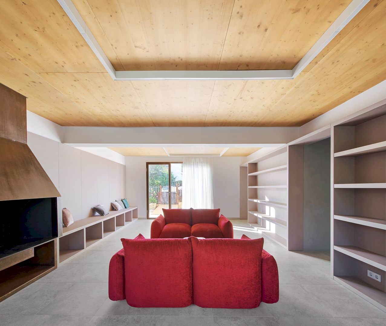
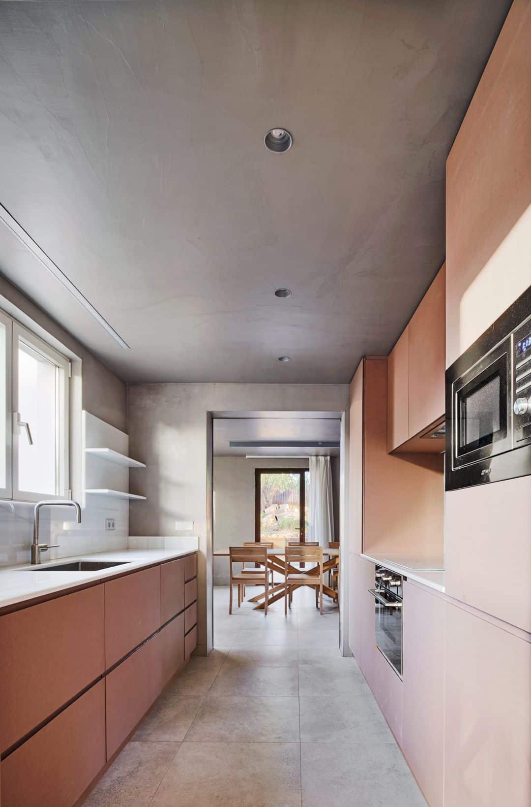
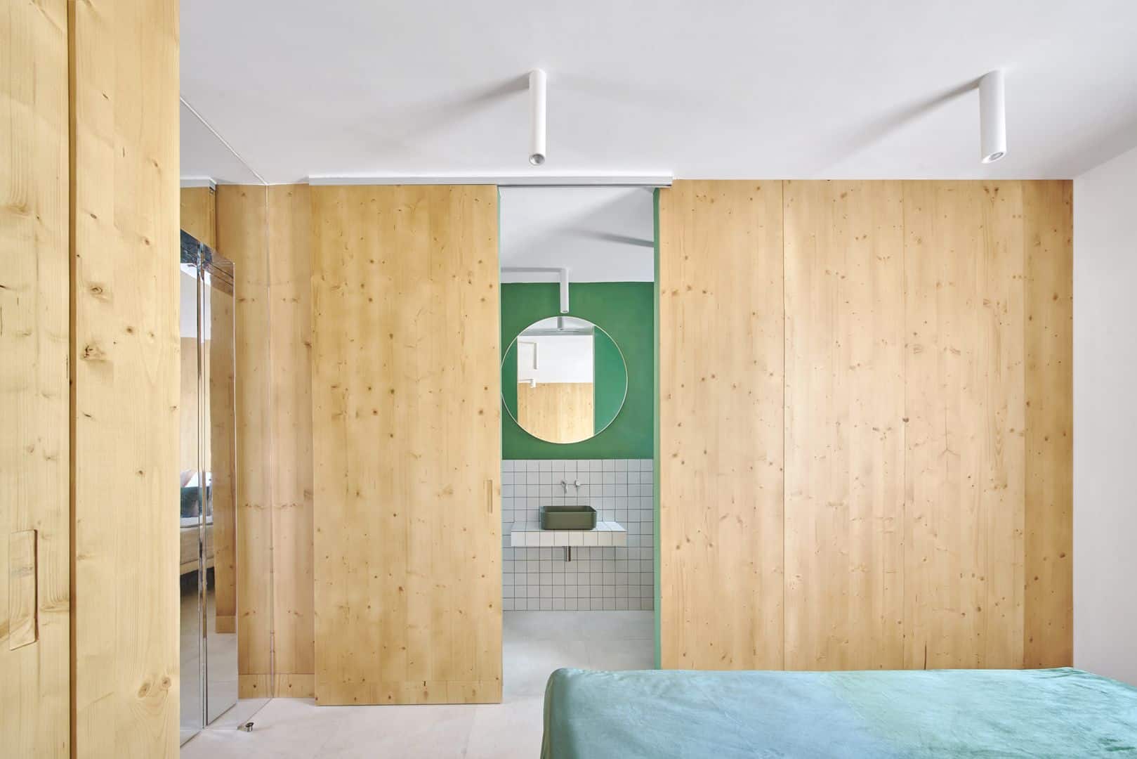
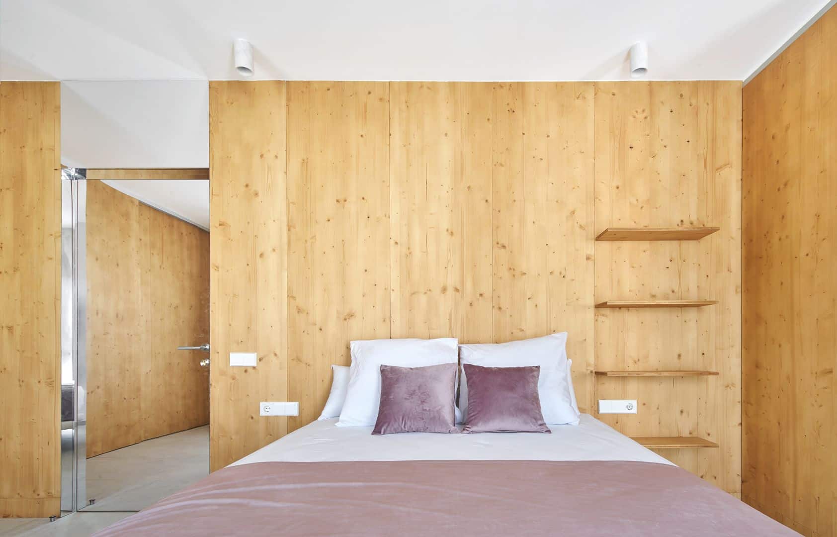
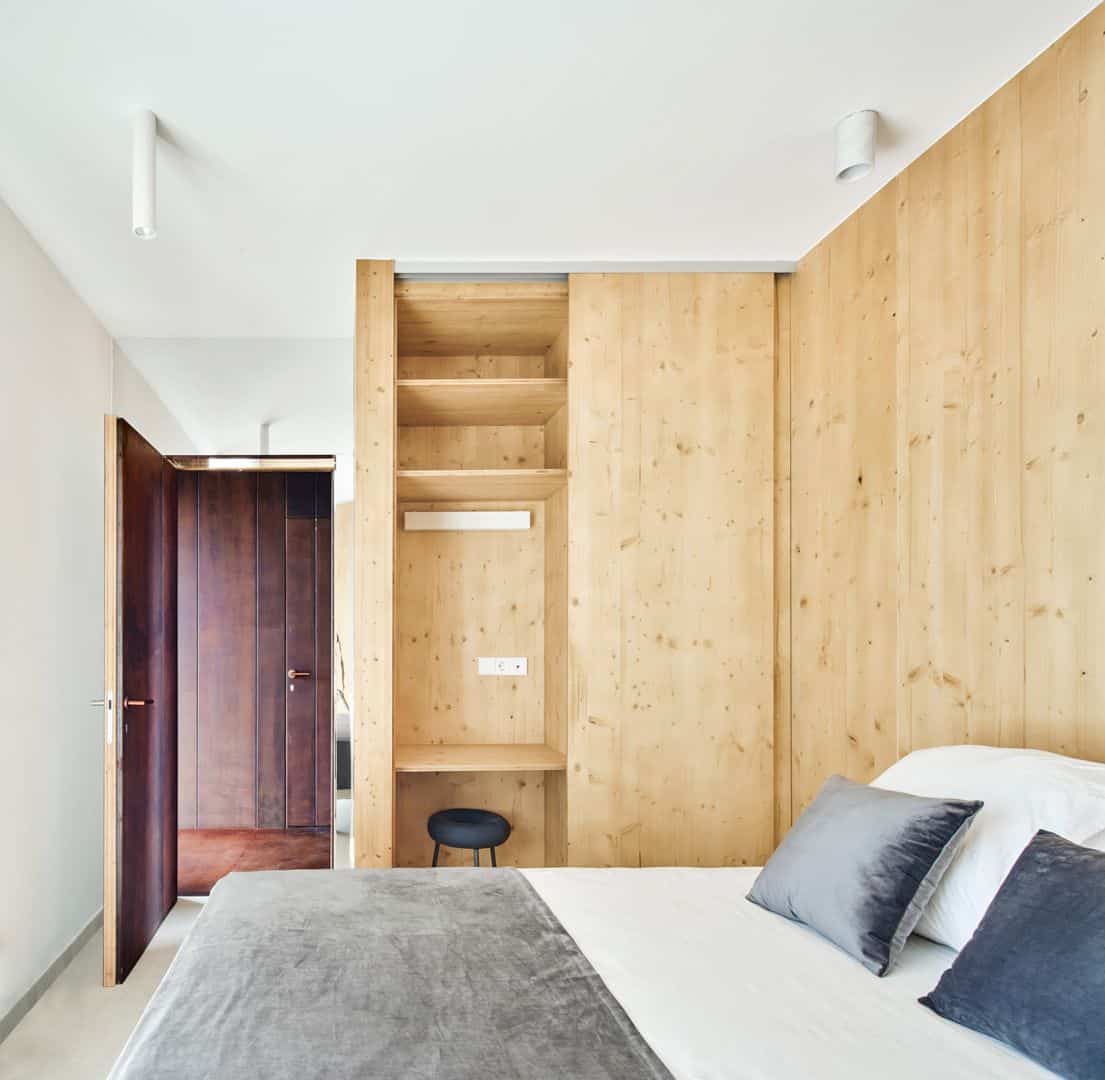
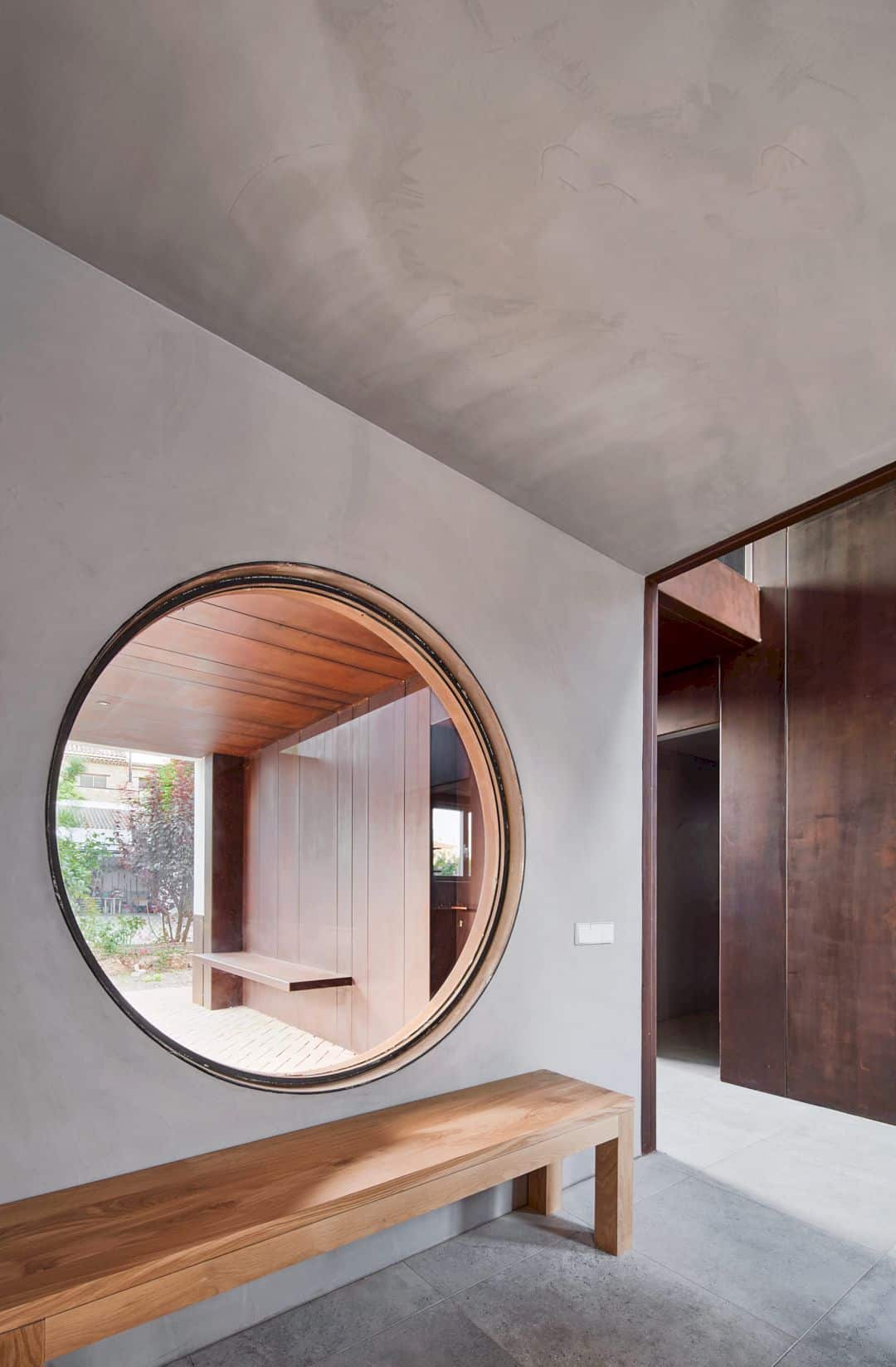
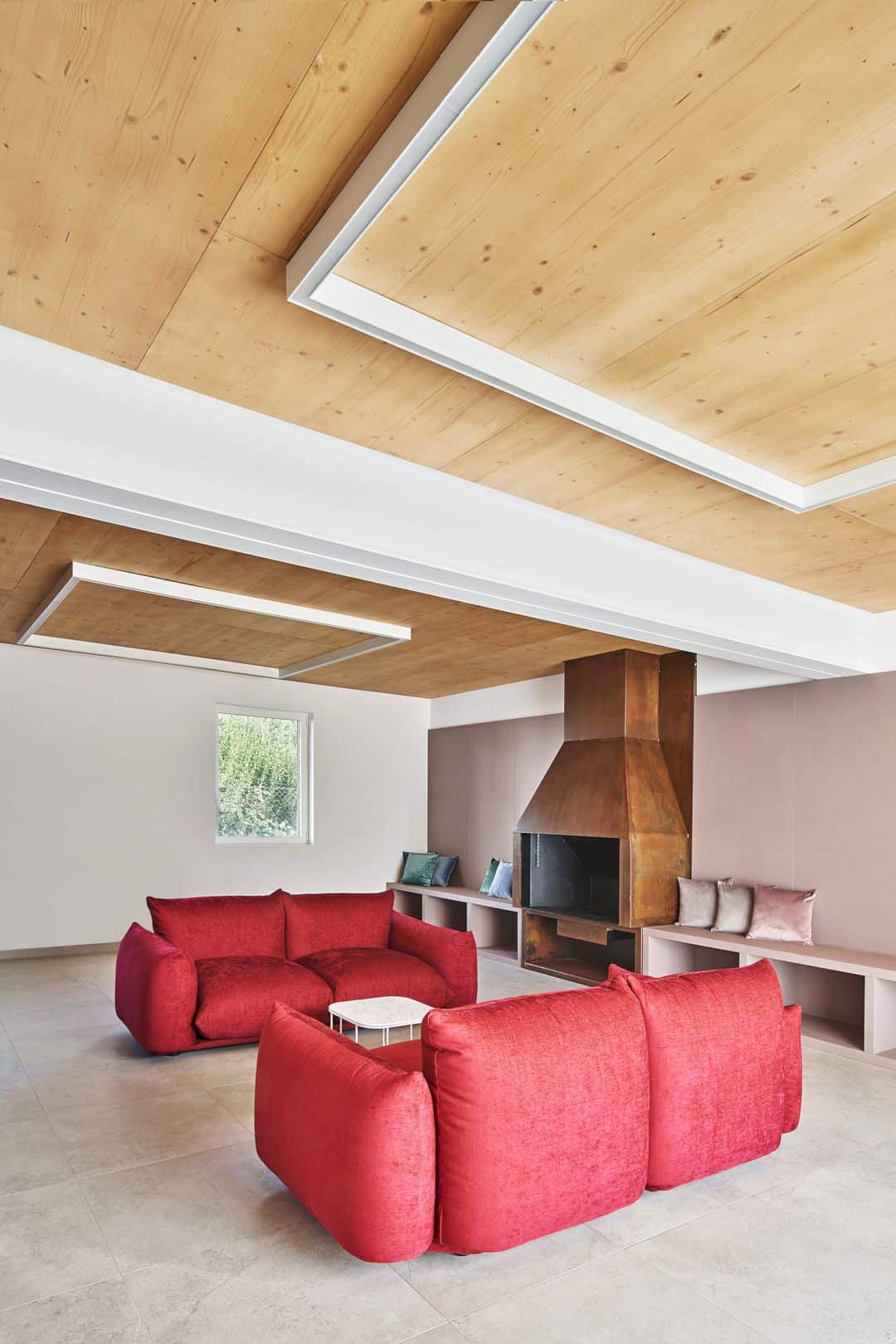
The exhibition spaces in the cross are represented by steel, cold, and not a domestic material. The domestic spaces around it are deployed with opposite materiality such as wood, ceramics, and mirrors in the bedrooms upstairs, and mortars, cement, and gray tones in the common ground-floor spaces. There is a material collision on the upper floor and warm and comfortable wooden environments in the bedrooms.
Rooms


The center of the cross is the house crucial point that solved by a small bridge. This bridge flies over the ground floor from which the four large windows open without frames. The distribution can be found on the ground floor around the warehouses’ block, toilets, and kitchen, connecting all areas, increasing the interior complexity and passing through the spaces with different heights.

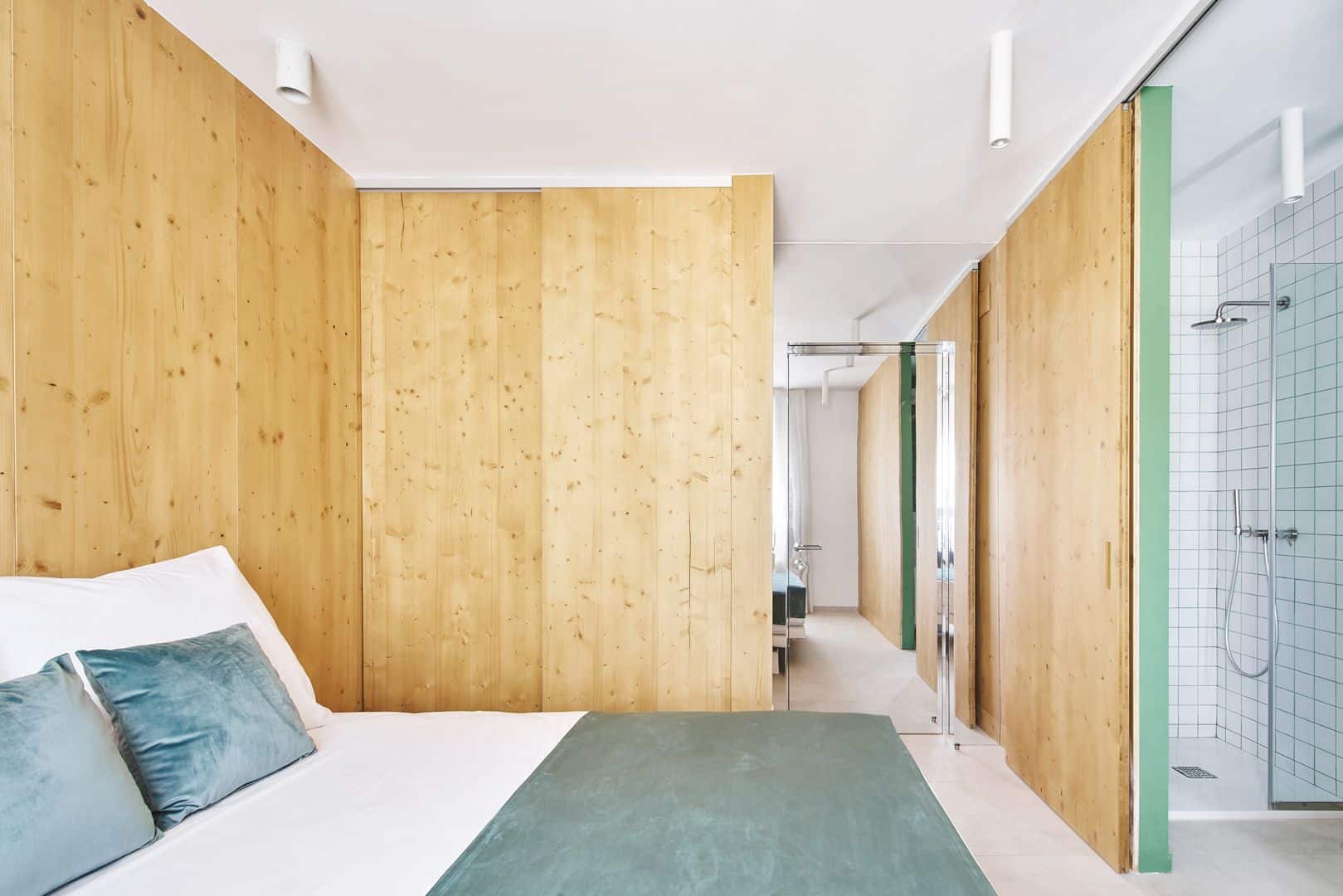
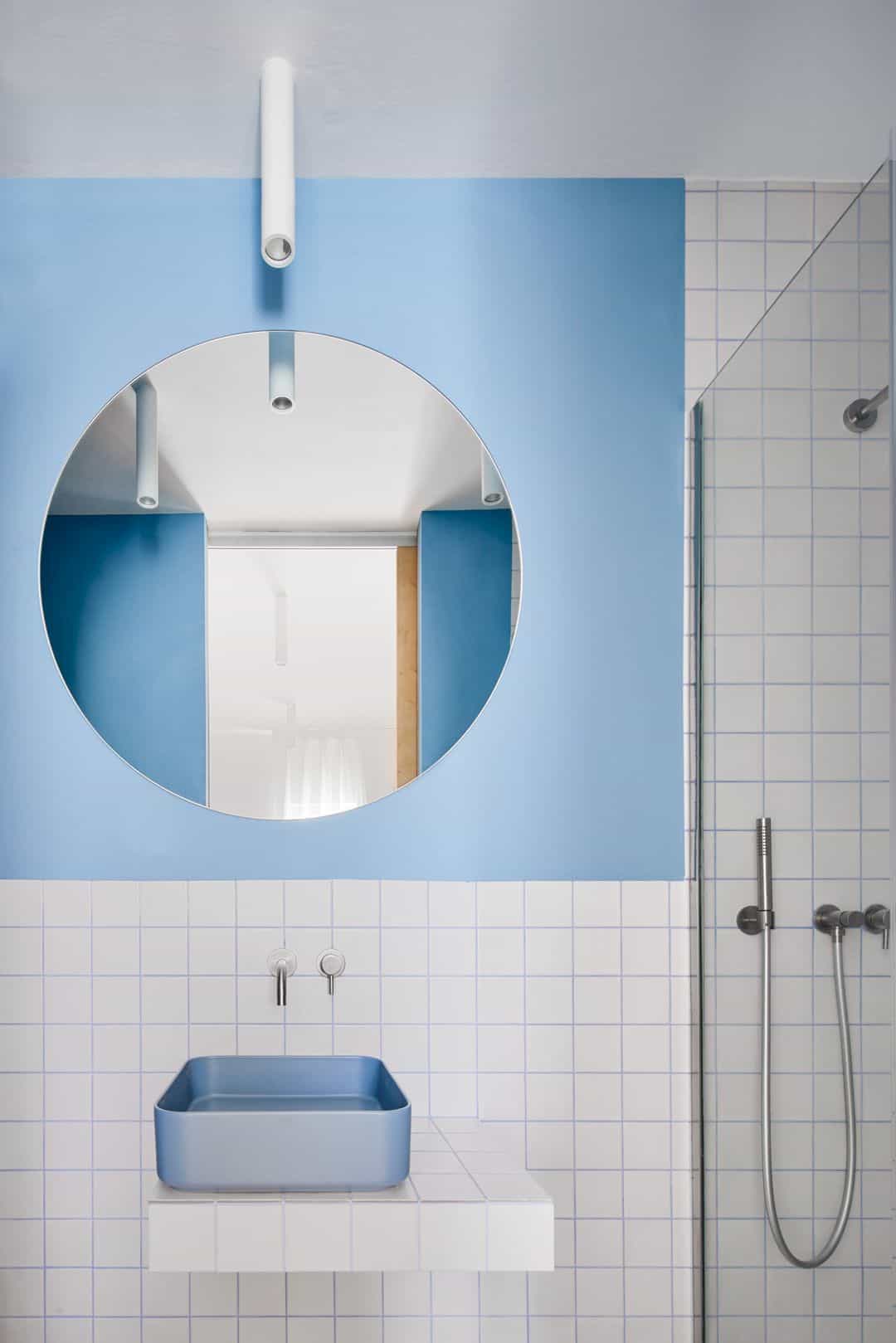
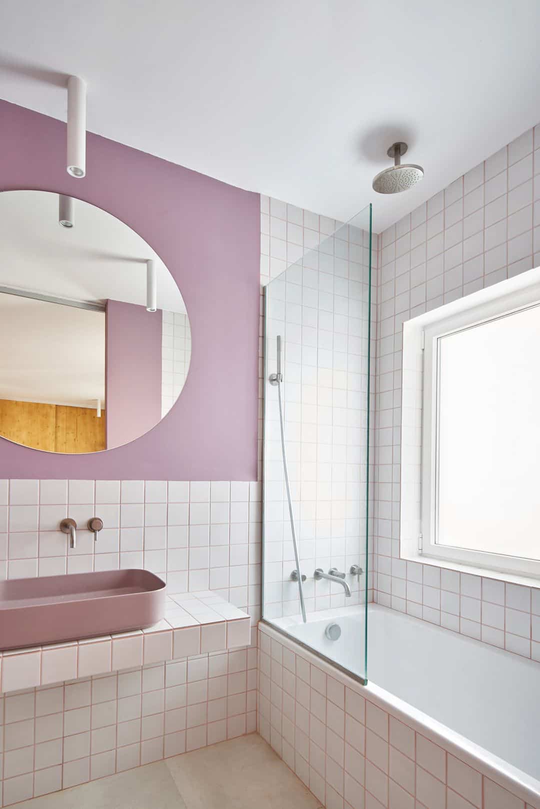
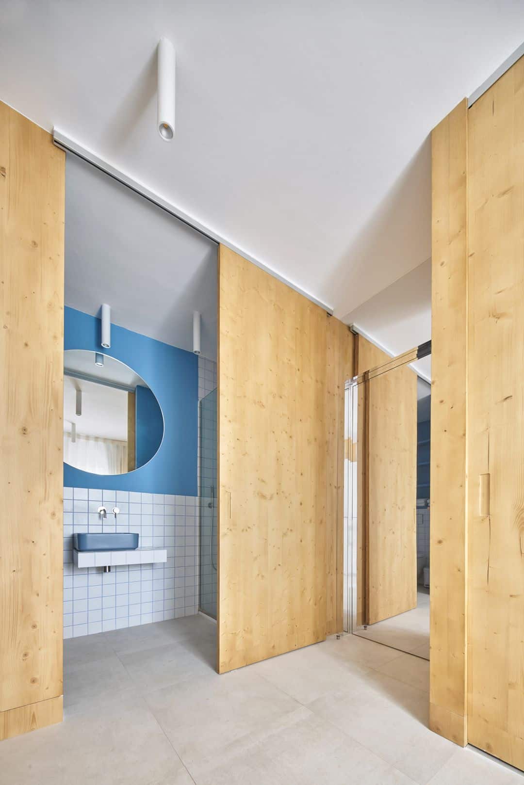
There are five bedrooms on the top floor with their own bathrooms that occupy the four corners. Five variants are also given to the same type of bedroom, especially in the bathrooms with a different color. This color is highlighted by the color of the sinks themselves, the painting of the walls, and the joint between ceramic tiles.
Structure

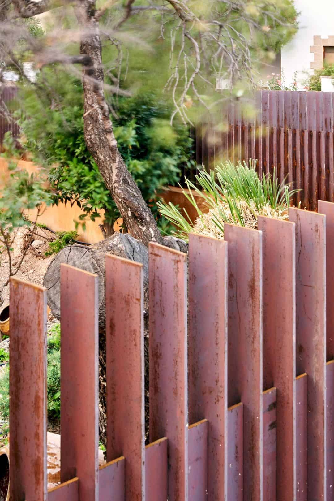
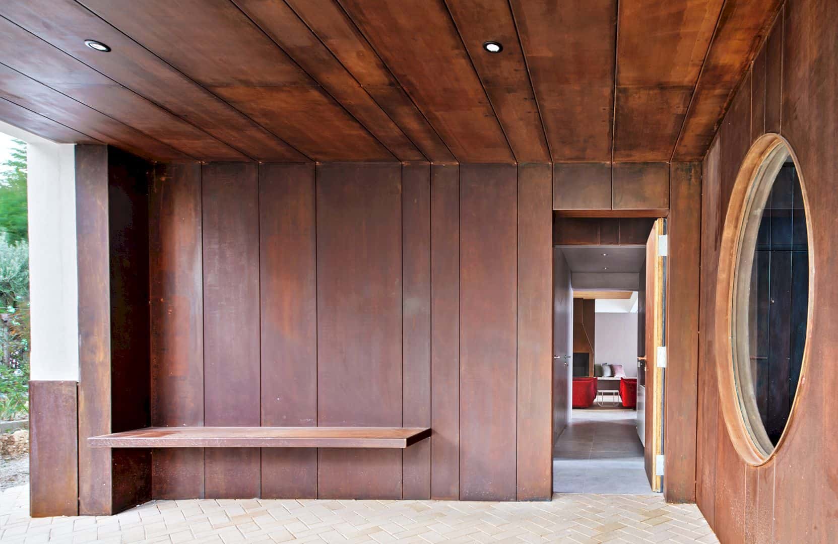
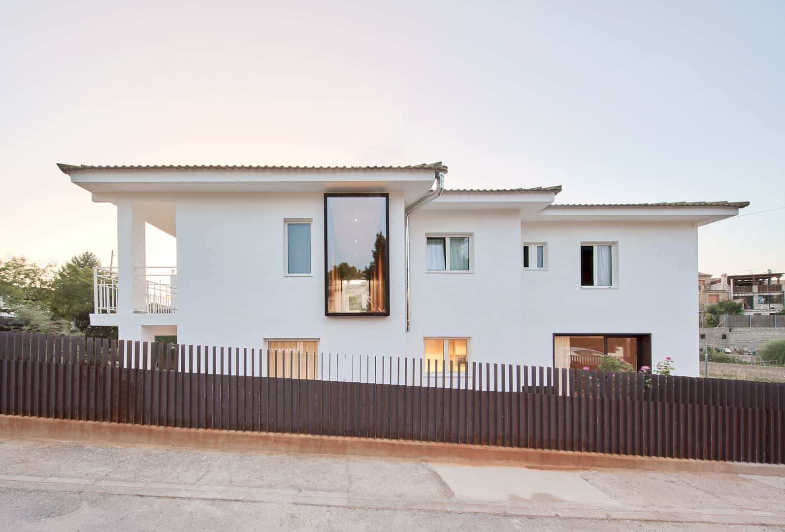
The new character of this house can be seen outside that comes from four new windows with a strange scale to the house itself, the new socles of the same material, the carpet-like cladding of cor-ten steel access stairs, greater homogeneity in the outer finishings, and the porch of the entrance. This house is closed to the outside by the new fence of cor-ten steel plates.
GALLERY HOUSE




Photographer: José Hevia
Discover more from Futurist Architecture
Subscribe to get the latest posts sent to your email.
