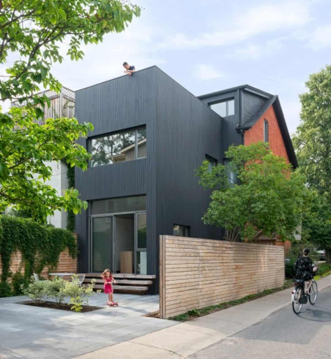
This redesign project of a narrow 125-year-old residence is done by Dubbledam Architecture + Design. Contrast House is located in the Toronto neighborhood, a corner lot of a dense area. The architect uses some contrasts to strengthen the interior natural light, Some spatial and perceptual means are also used to explore the relationship between old and new, light and dark.
Design
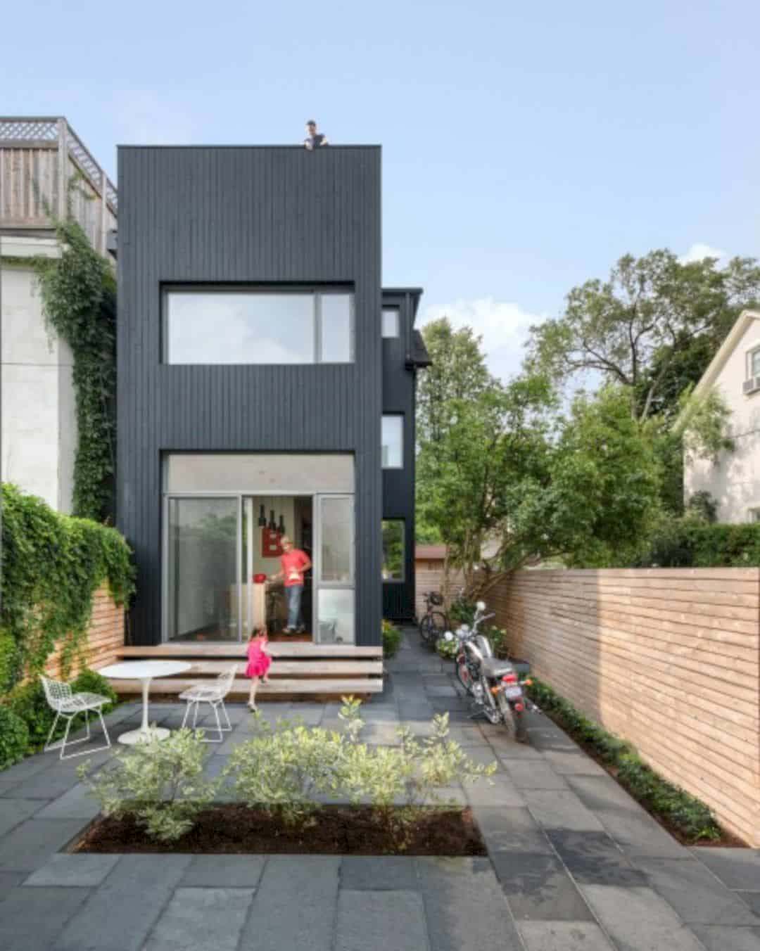
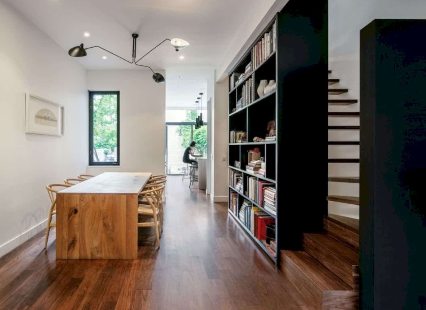
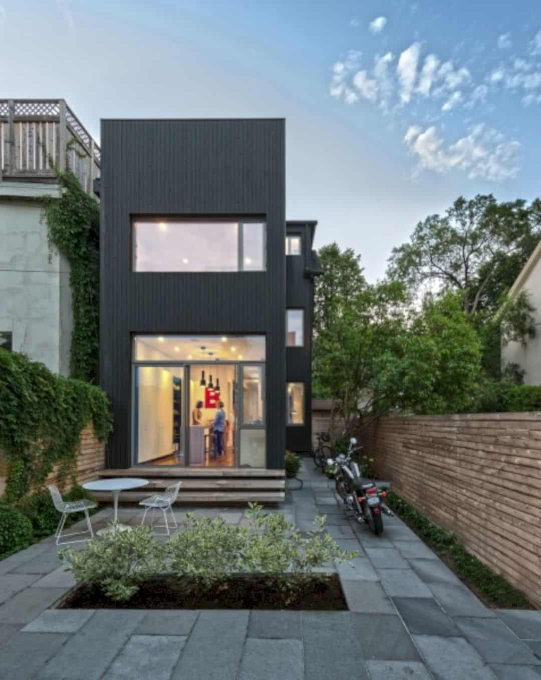
Spatially, this narrow house is only 11 feet wide on the rear facade. It has been reconfigured to open the house and allowing the openings of the enlarged windows. Perceptually, some contrasting elements are used as the best means to make the internal spaces brighter. These spaces are lacked direct access to the natural light.
Elements
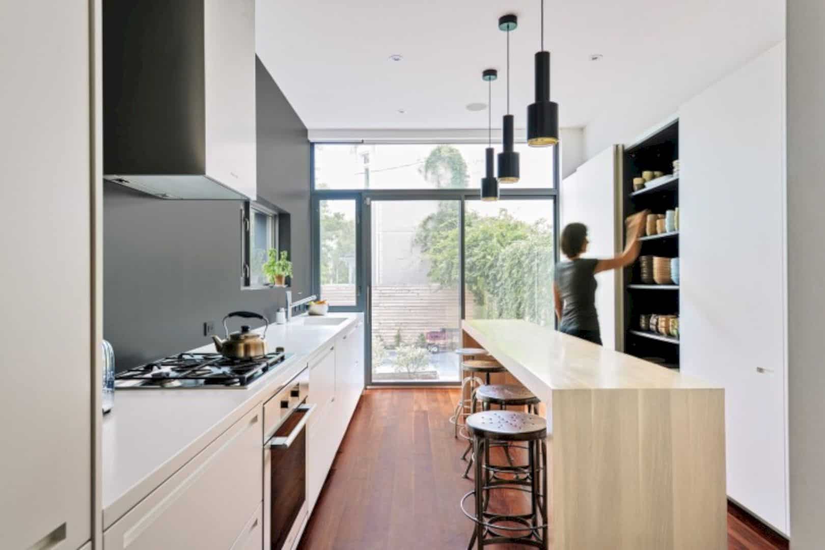
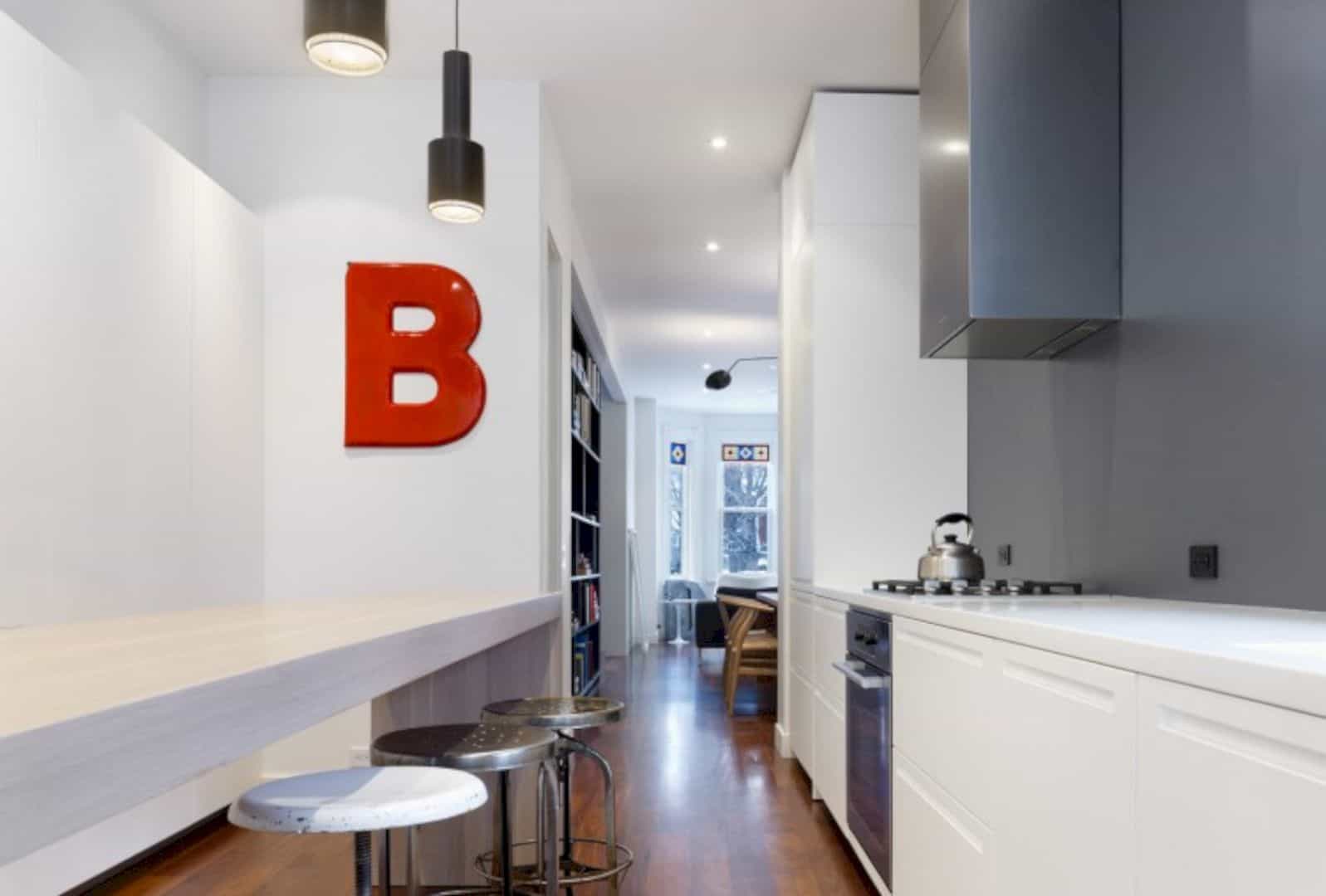
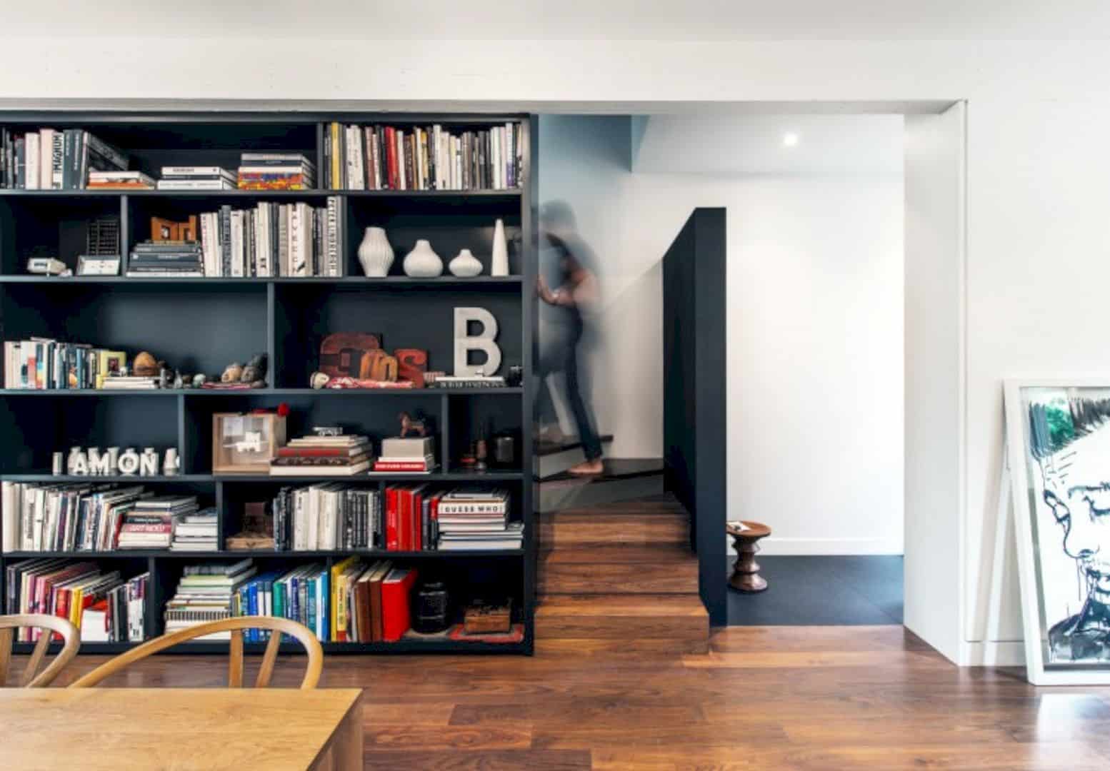
A black element can define the stair at each level of the house, including the floating bookcases for the owner’s collectibles or a chalkboard wall. The contrast look is created and also visually intensifying the natural light that comes down from above. The combination of elements and natural light can create a good highlighted spot inside the house.
Materials
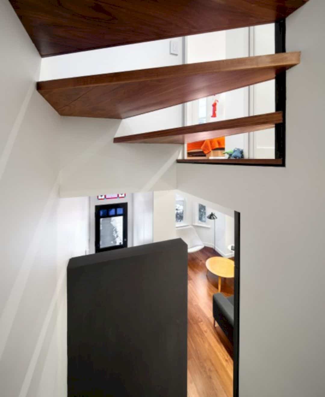
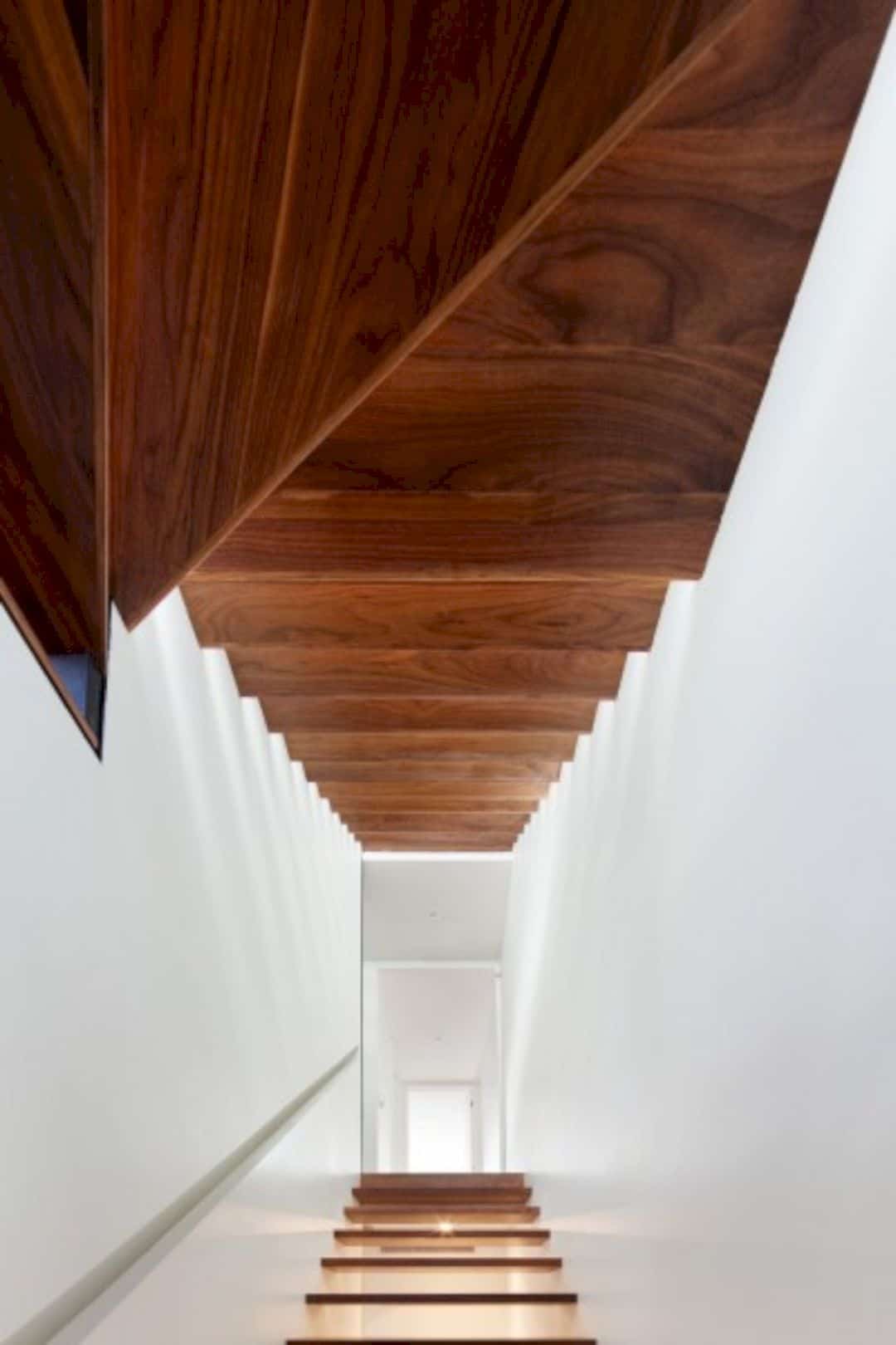
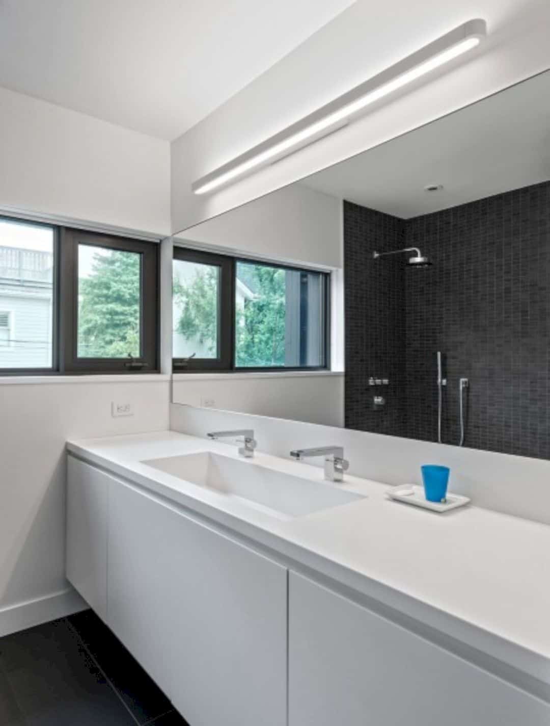
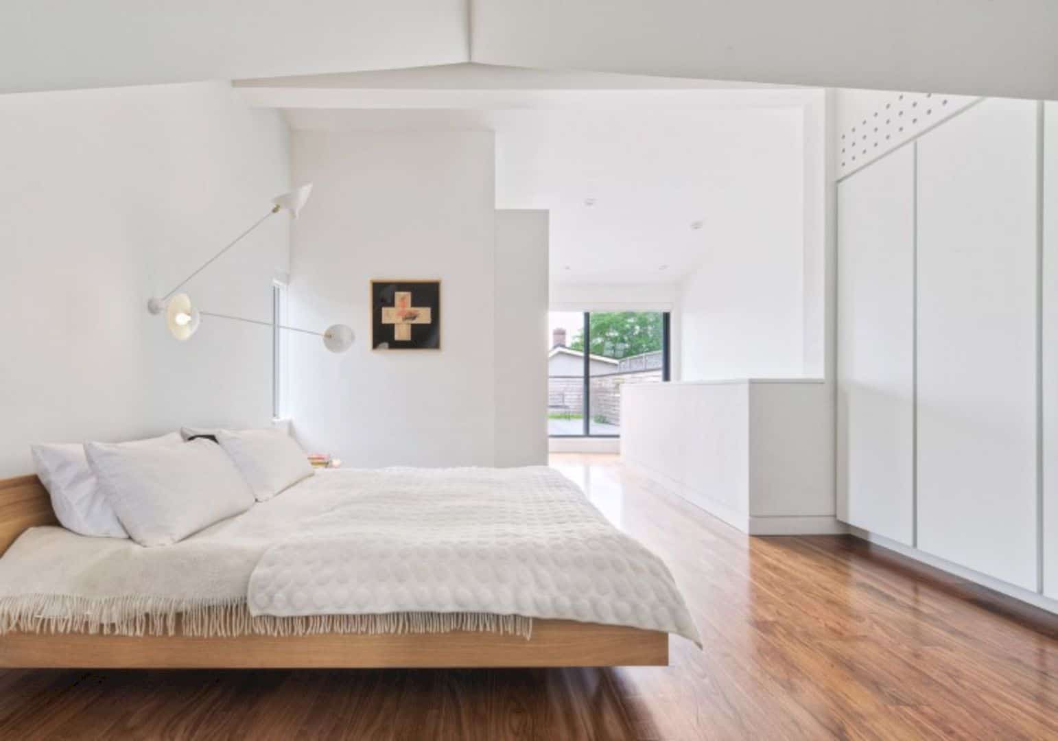
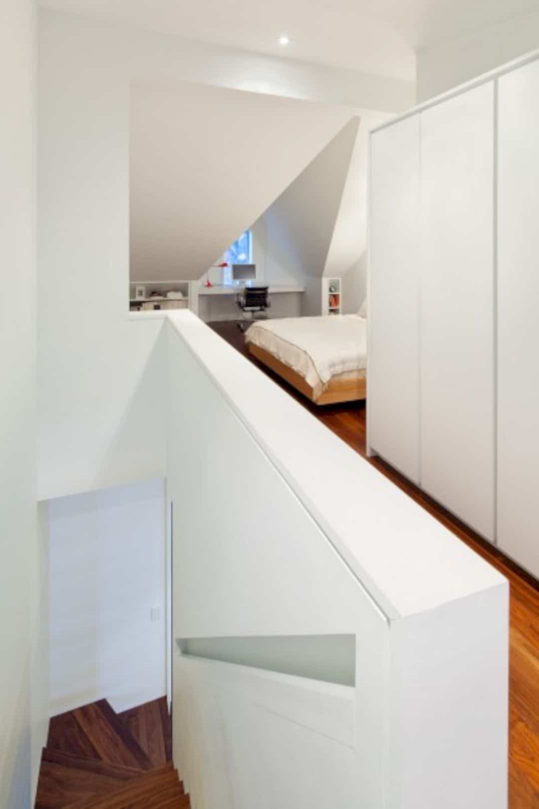
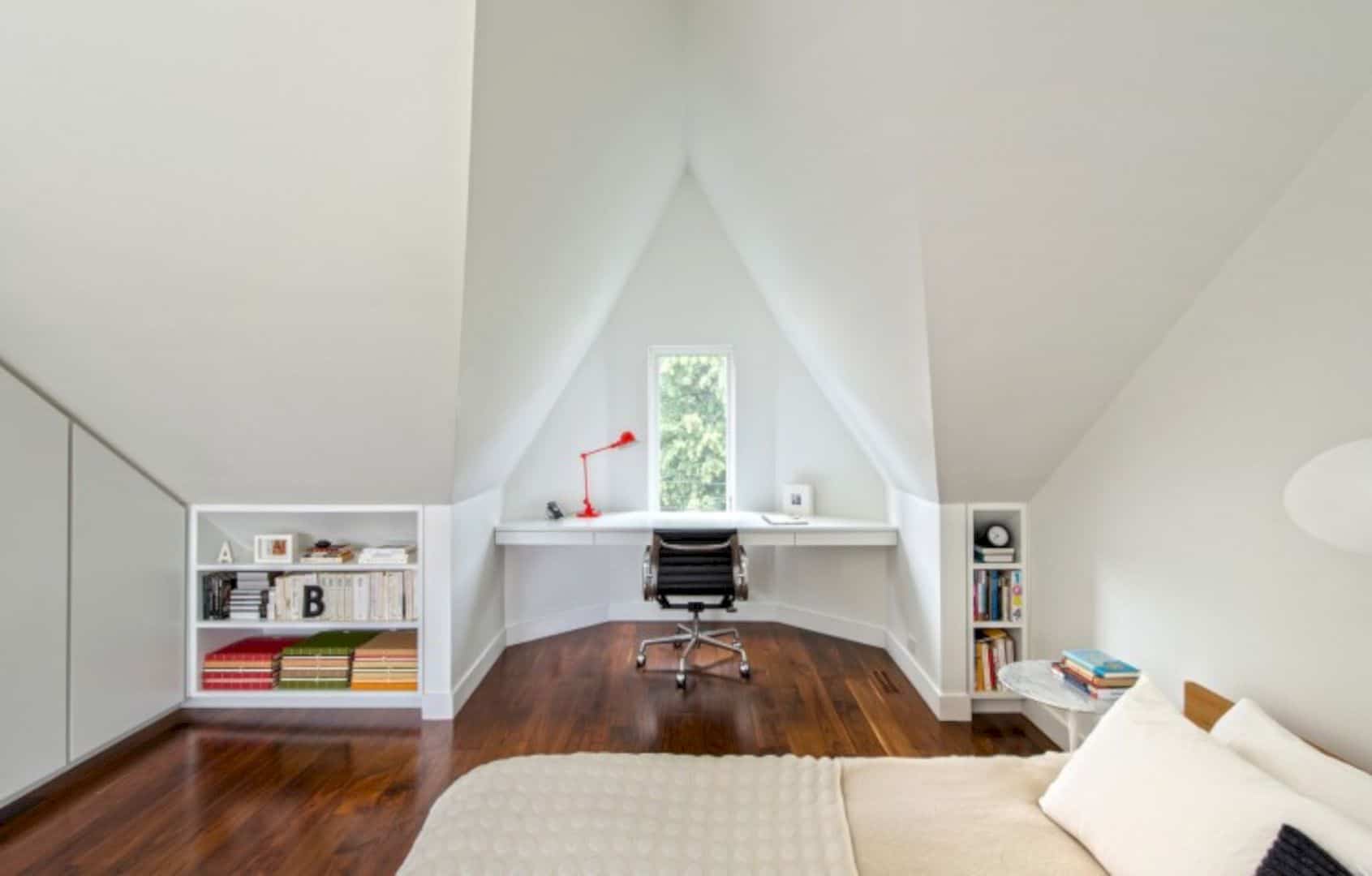
The monochromatic palette consists of dark grey and white walls with walnut floors. Those palettes can highlight the house lines and architectural forms which are animated by the family collection of toys, books, art, and furniture. The modern roof deck behind the house is concealed by the black-stained cedar vertical boards with the red brick Victorian dwelling on the house exterior.
Systems
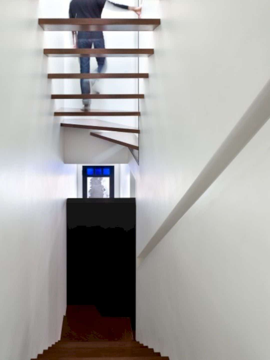
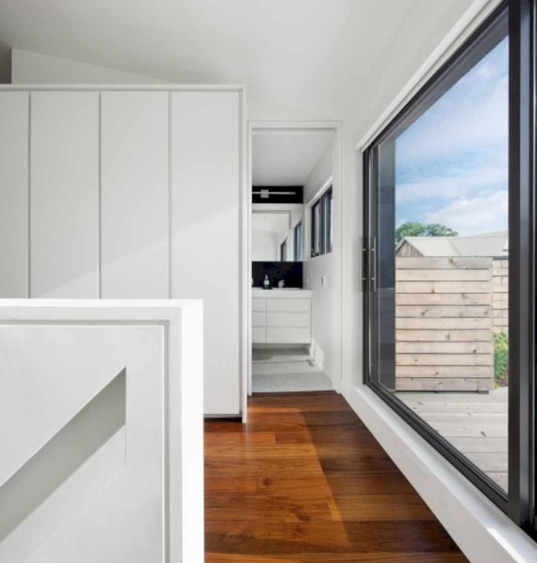
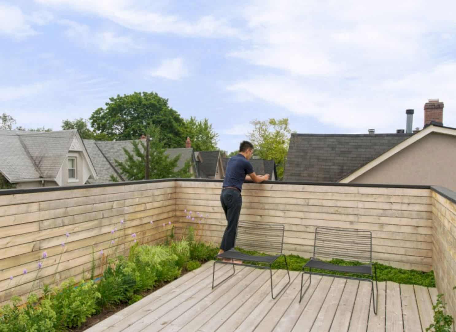
A lot of passive sustainable systems are used to minimize the environmental impact of the house. The layout is also reconfigured with the open riser stair and new operable windows that can maximize the natural daylighting and ventilation. With the integrated roof deck, a green roof can absorb the rainwater on a rainy day and also create a cooling effect on the upper floors.
Discover more from Futurist Architecture
Subscribe to get the latest posts sent to your email.
