Dubbeldam Architecture + Design works with a global internet media company to design a new workspace located in Canada. Travelzoo Canadian HQ is the headquarters with the spirit of the company’s vibrant brand and culture. The design for this workspace is inspired by the travel modes and destinations with a dramatic cityscape feature of Toronto.
Volumes
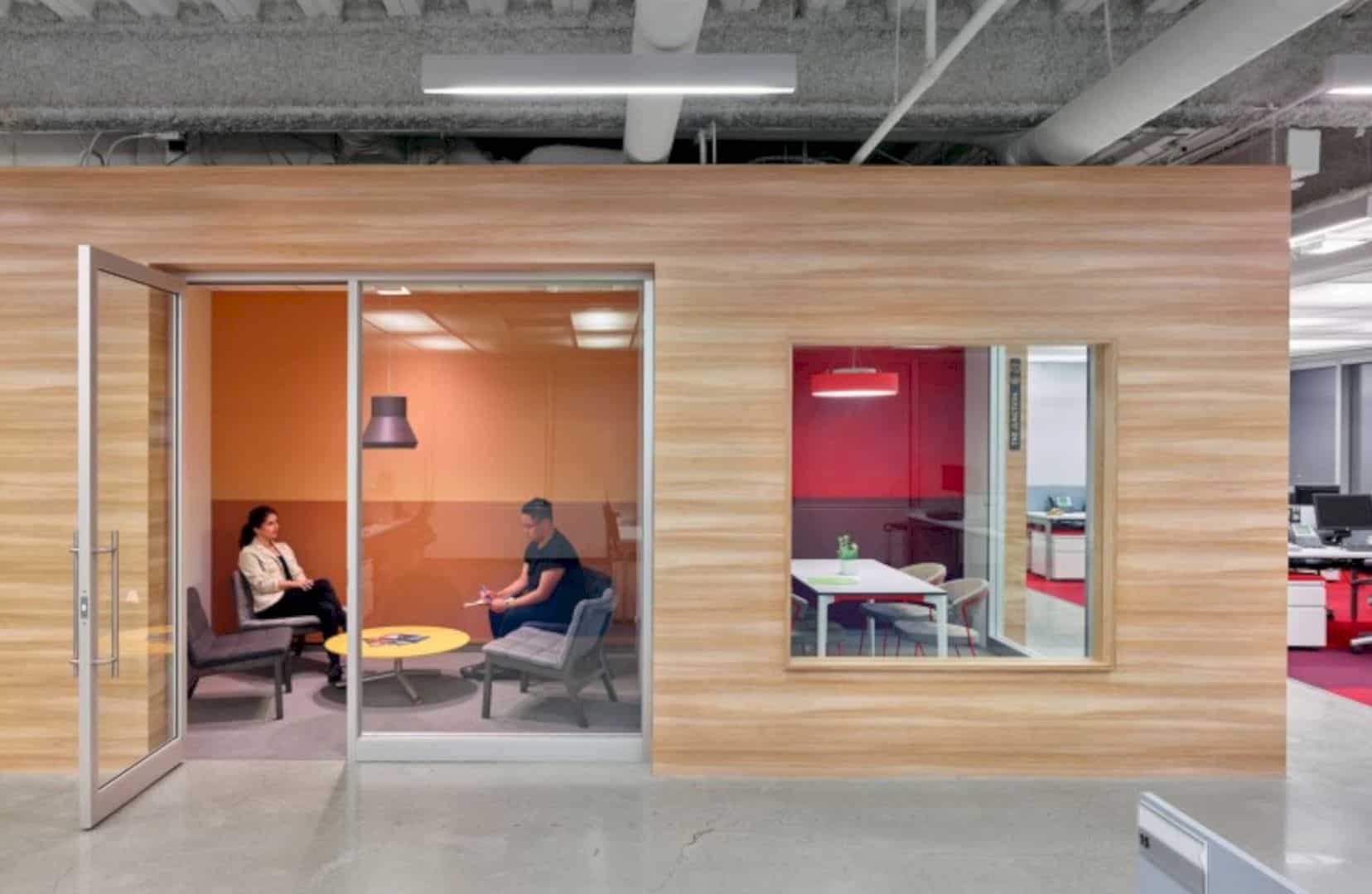
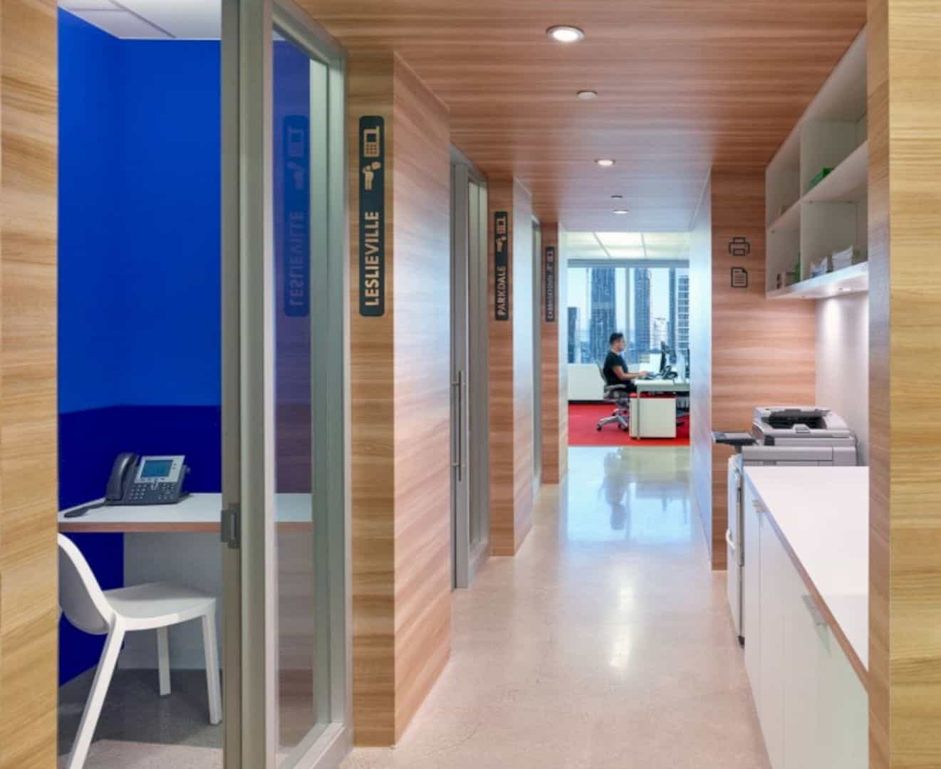
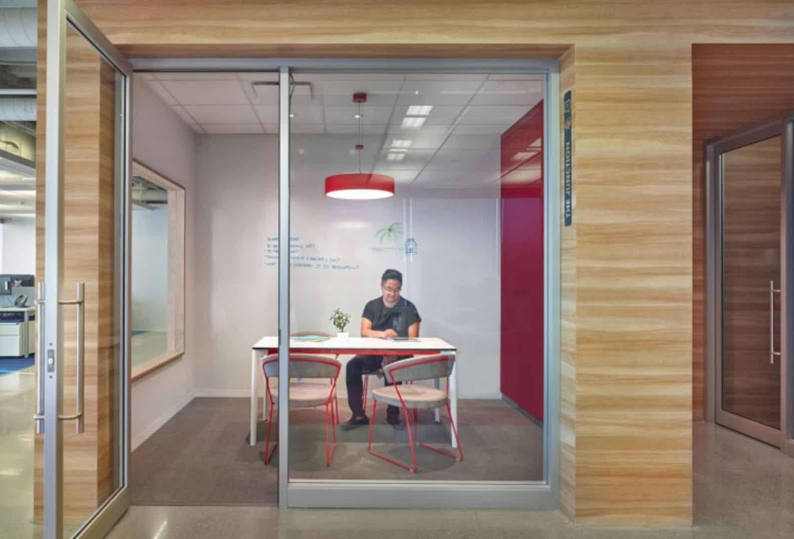
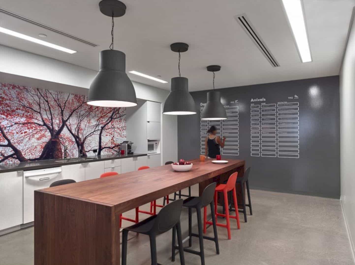
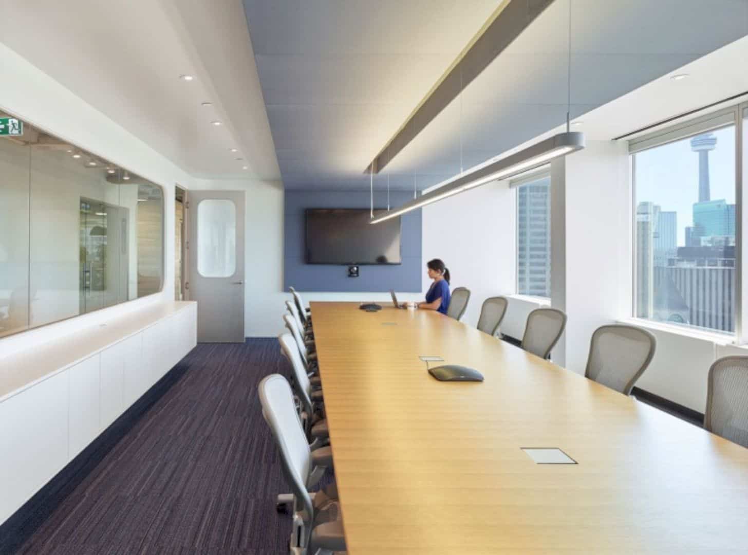
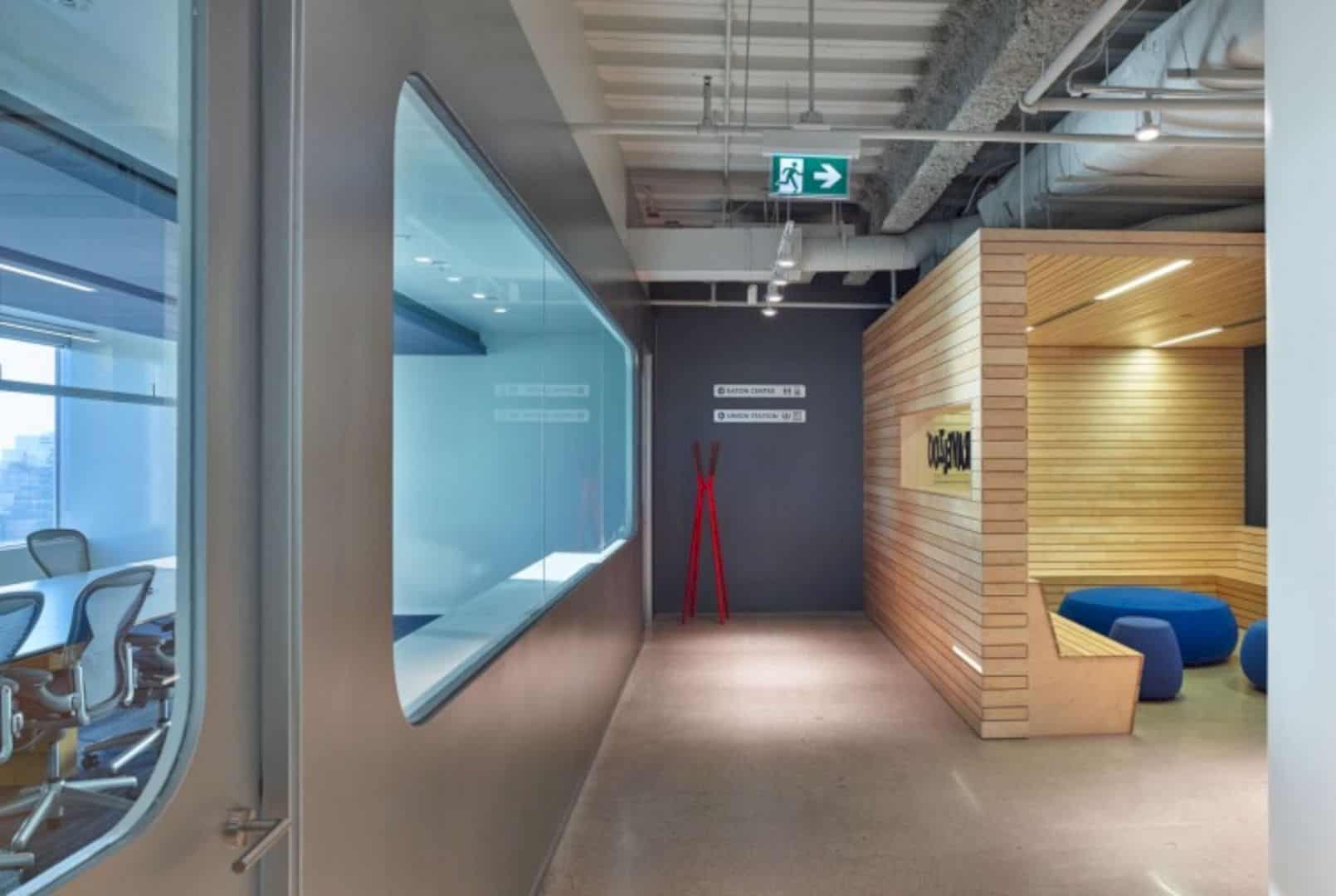
The lunch-room and conference volumes come with high-speed transport nodes and modes like airports and train stations. The lounge areas and huddle rooms offer casual destinations such as beaches, parks, and also cabins. The brand color of this company is blue for tranquility and red for actions. Those colors are combined with contrasting colors to decor the workspace.
Details
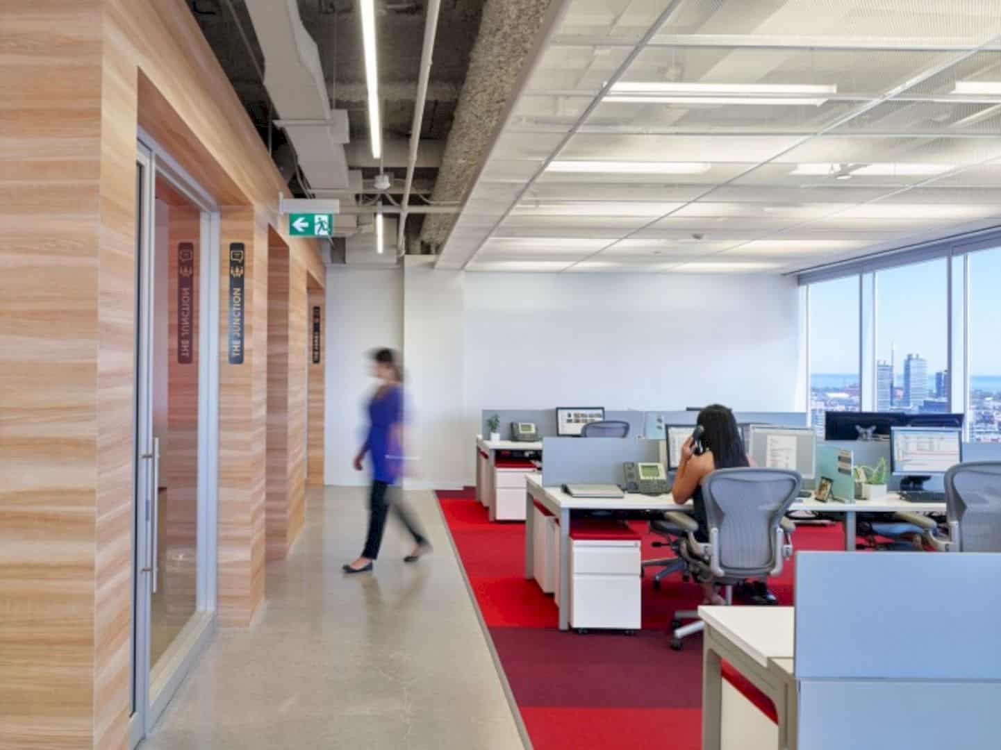
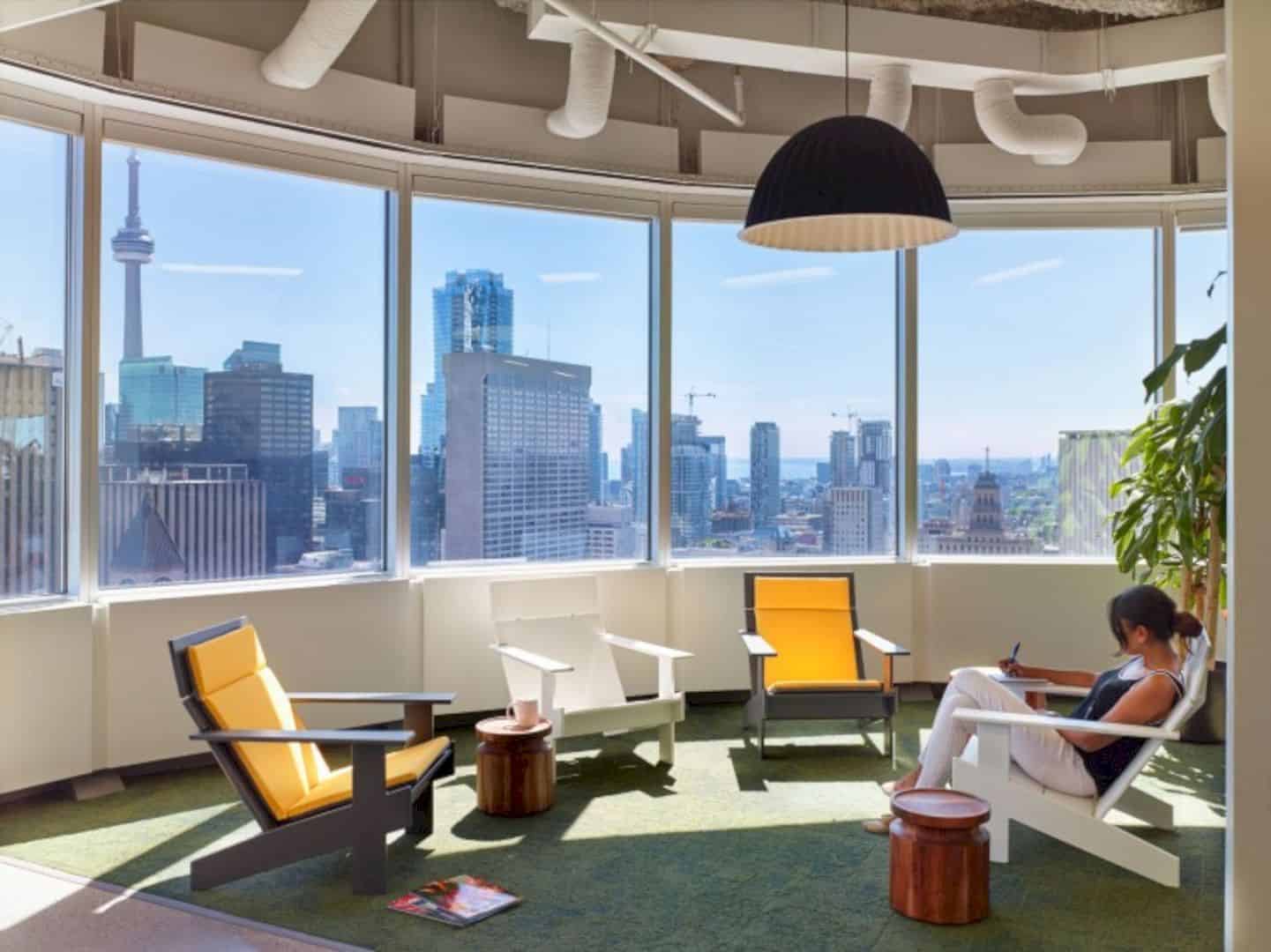
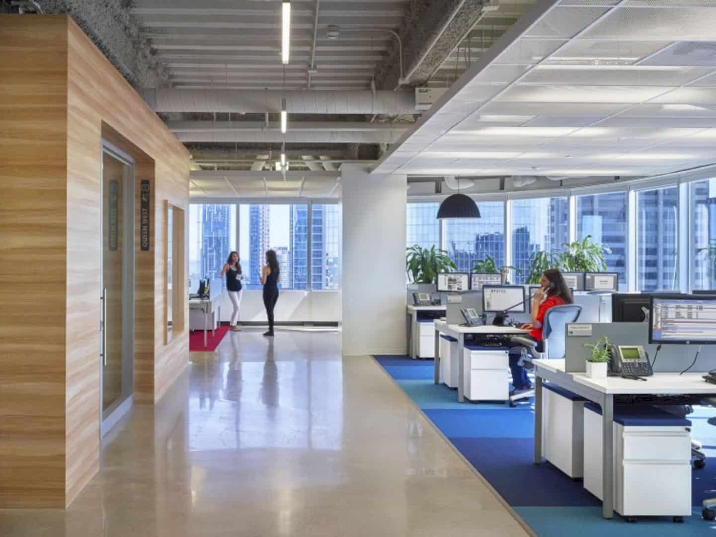
This project has a tight budget that needs a strategic approach for its design and materials. The volume of the cabin is made by a Japanese automotive product in order to create a like-wood look. The architect uses metallic silver to paint the interior of the conference room, creating a unique real metal gleam combined with furniture and lighting.
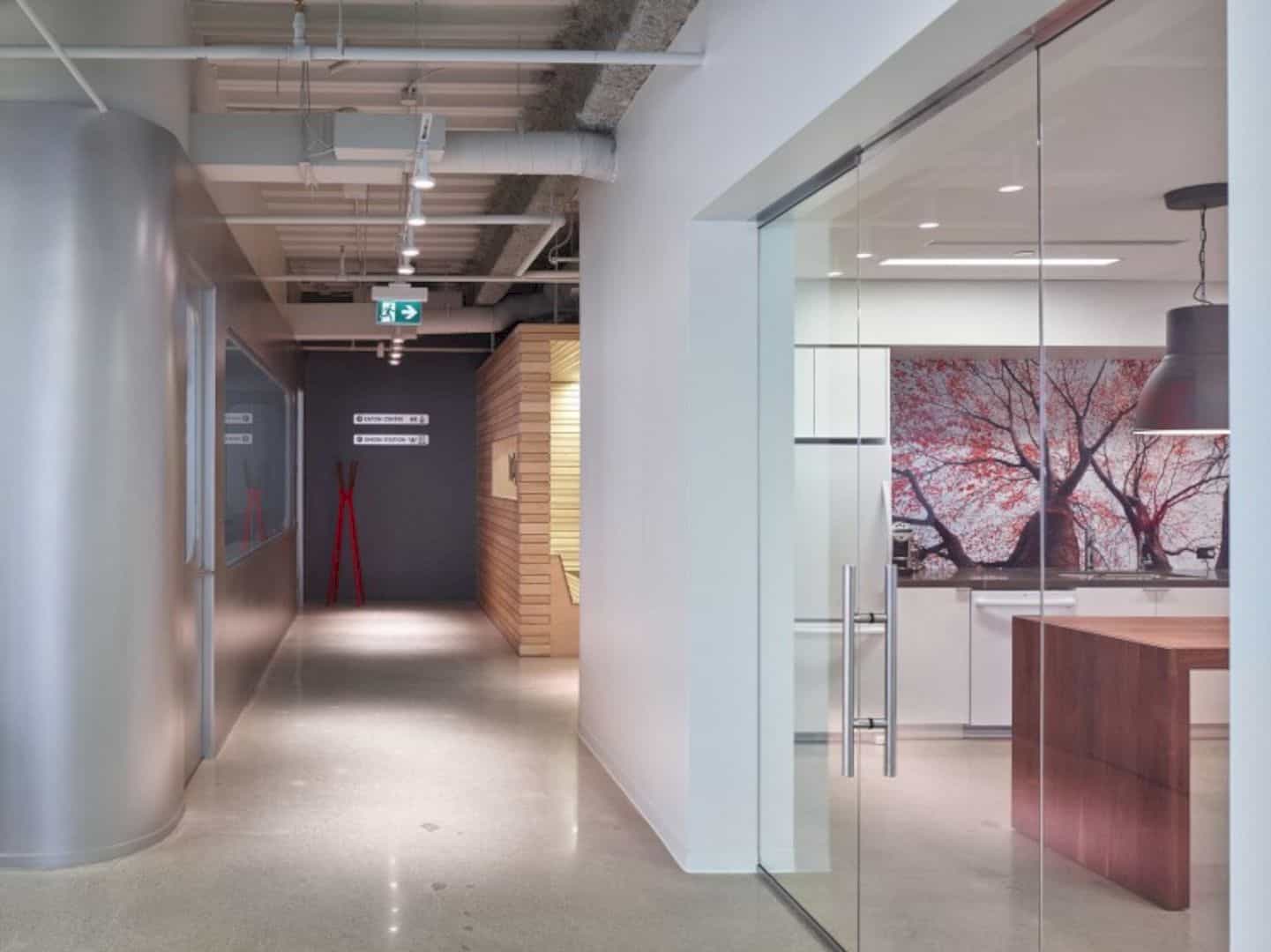
The client wants to have an exposed ceiling that becomes a challenge for the architect to design it. An elegant solution is found by using a metal mesh material, creating a space that feels more open. It also masks the ceiling rough texture of the fire-proofing insulation on it. The result also makes the interior of this workspace looks brighter and larger.
Elements
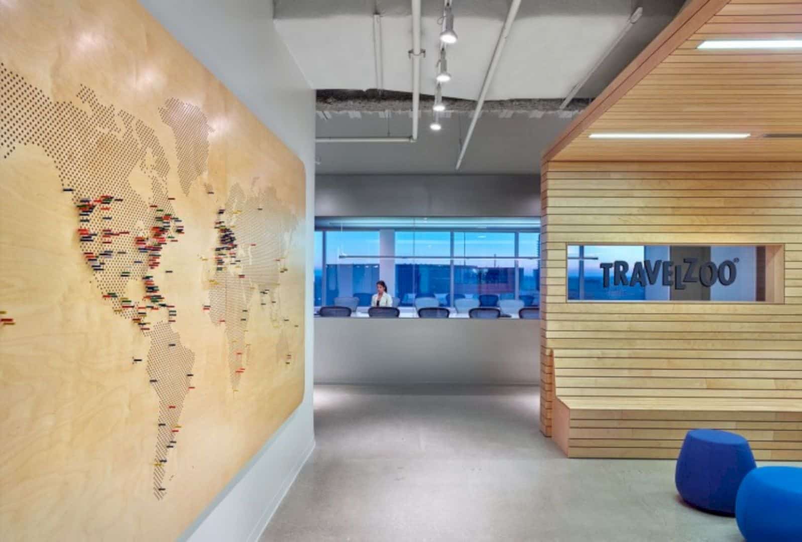
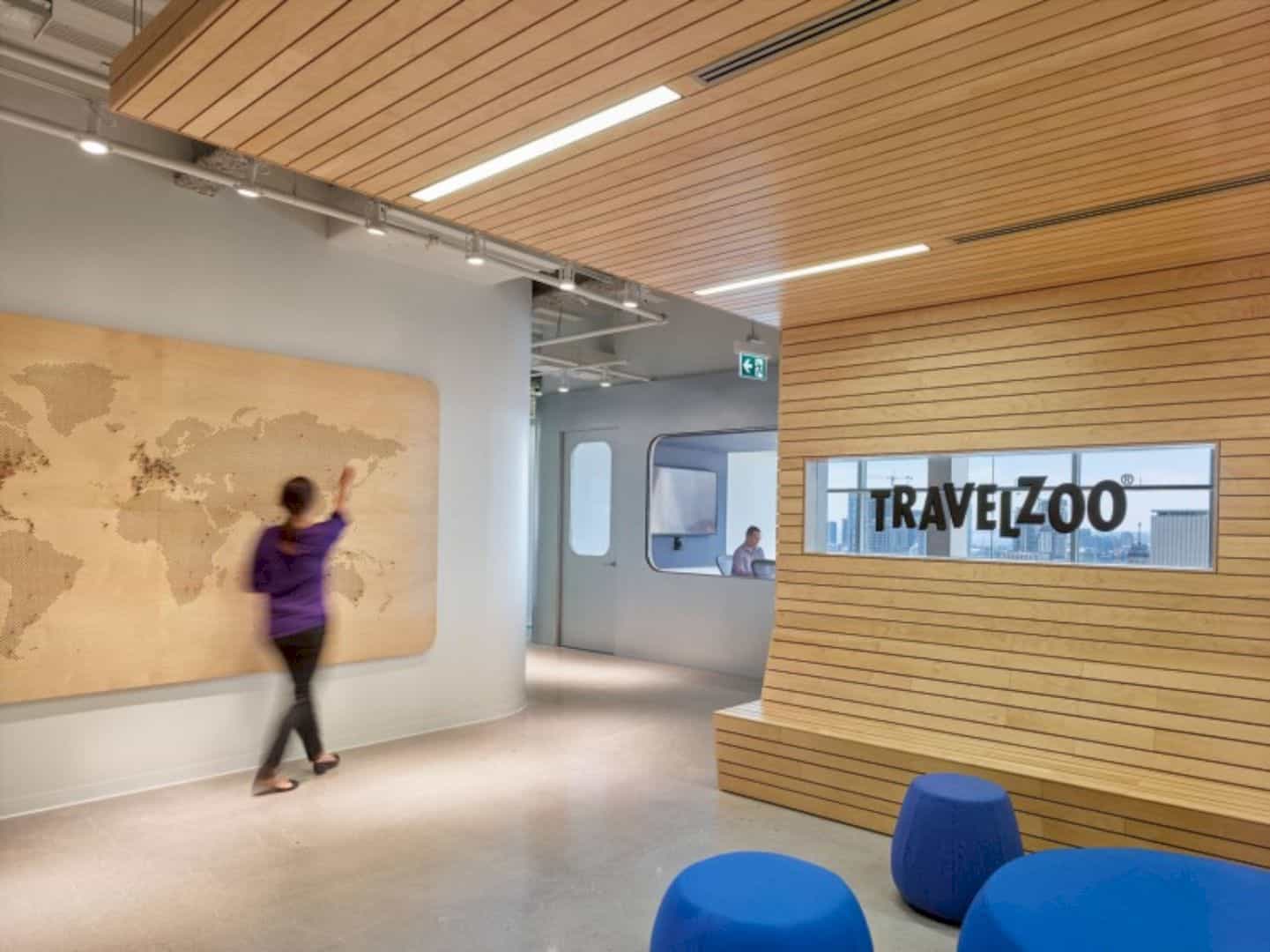
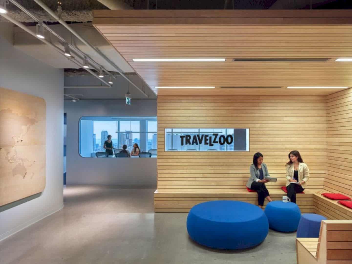
Dubbeldam Architecture + Design uses some graphics interactive elements with a combination of travel-culture motifs for the interior. There is a playful arrivals/departures board in the kitchen, helping to track the globe-trotting of the employees. While in the reception area, the large interactive world map is made from plywood with colored wood pegs.
Discover more from Futurist Architecture
Subscribe to get the latest posts sent to your email.
