This 2016 project is about designing a minimalist apartment with some wood elements and bright atmosphere to create a cozy living place in the middle of a busy city in Brazil. The architect from Tria Arquitetura tries to create a natural look by adding some greeneries and white background too, creating a more fresh and bright interior.
Goal
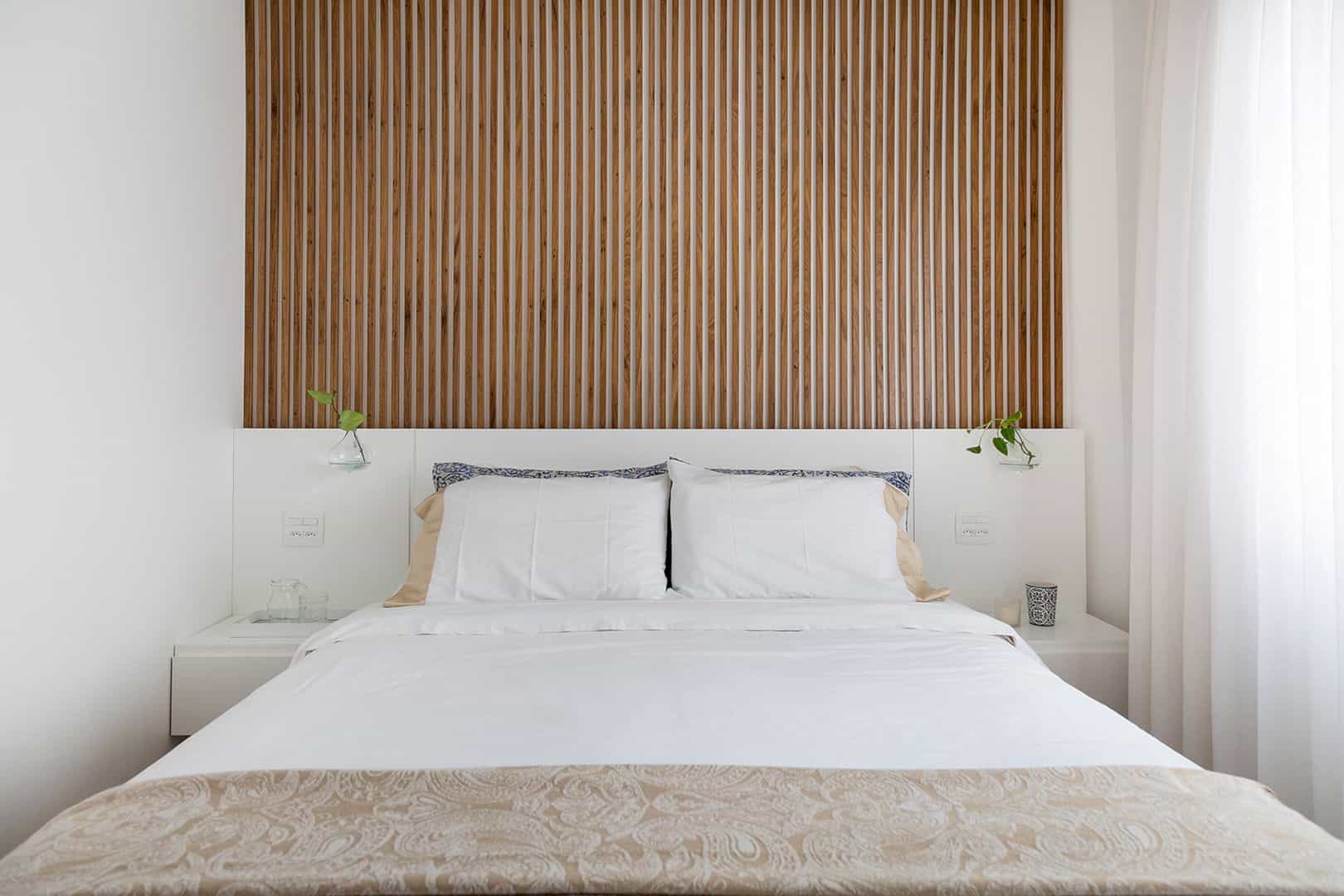
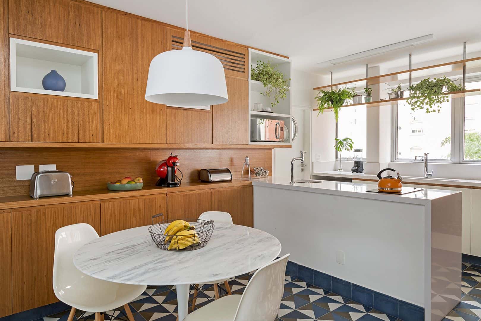
With the compact shape of this apartment, the architect needs to use the space as much as possible to give more functional living place for the residents. The design is also more simple without too many things inside. The goal is about designing a simple interior but still comfortable and perfect for activities in daily life.
Materials
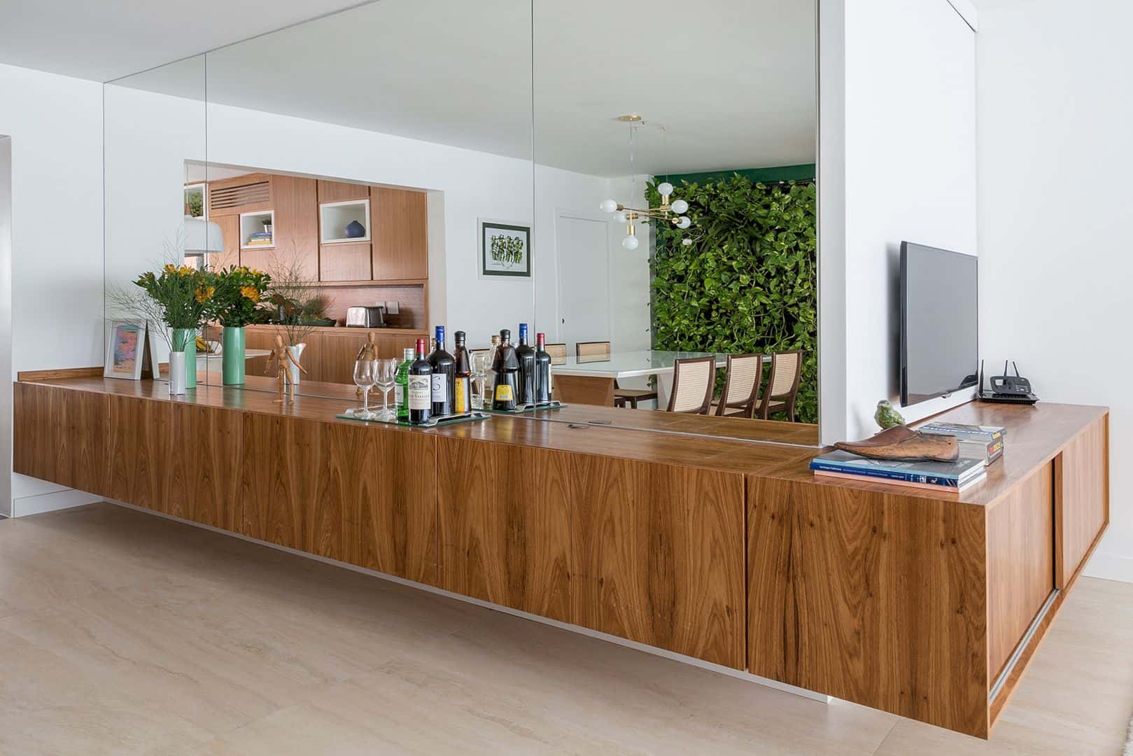
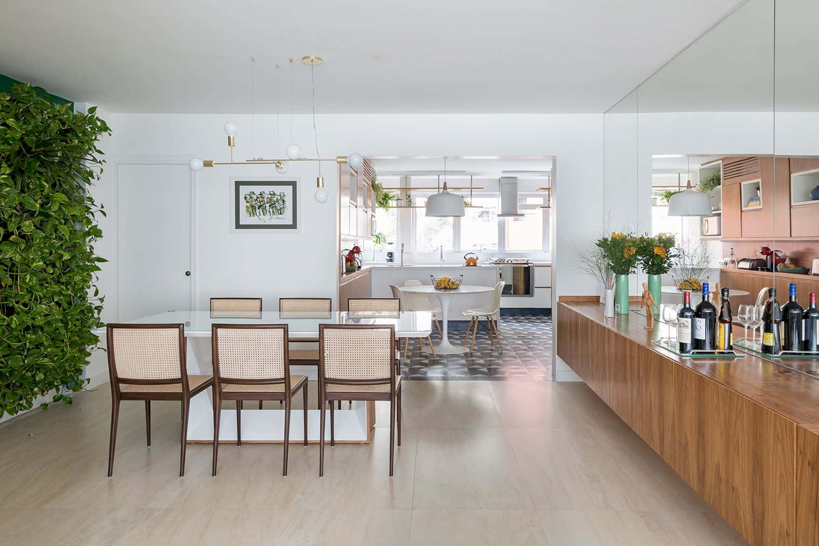
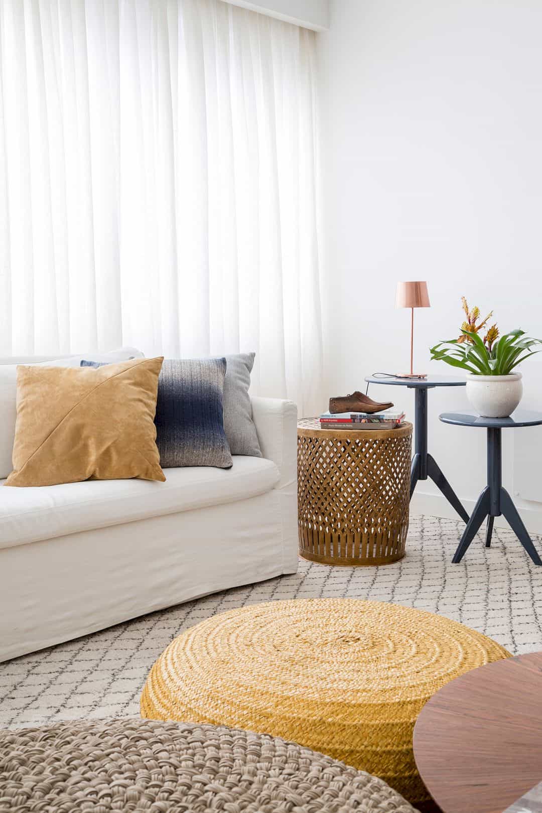
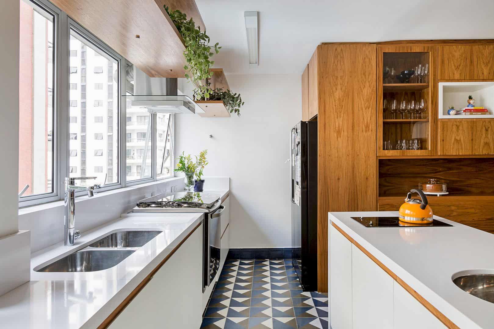
Wood elements dominate the interior of this apartment, especially the furniture such as kitchen cabinet, dining chairs, dining table, living room table and also storage. For the kitchen and dining area, the floor is beautified with blue-white patterned tiles. The warm rug is used to create a warmer feeling in the living room area.
Decoration

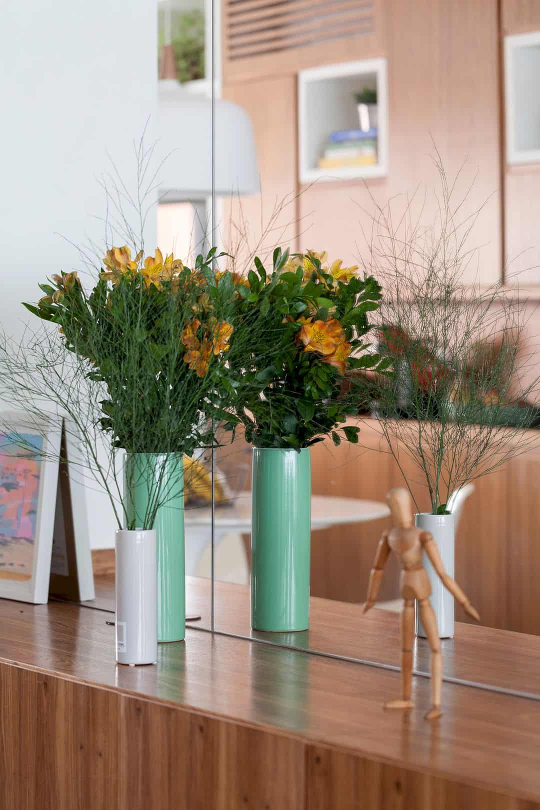
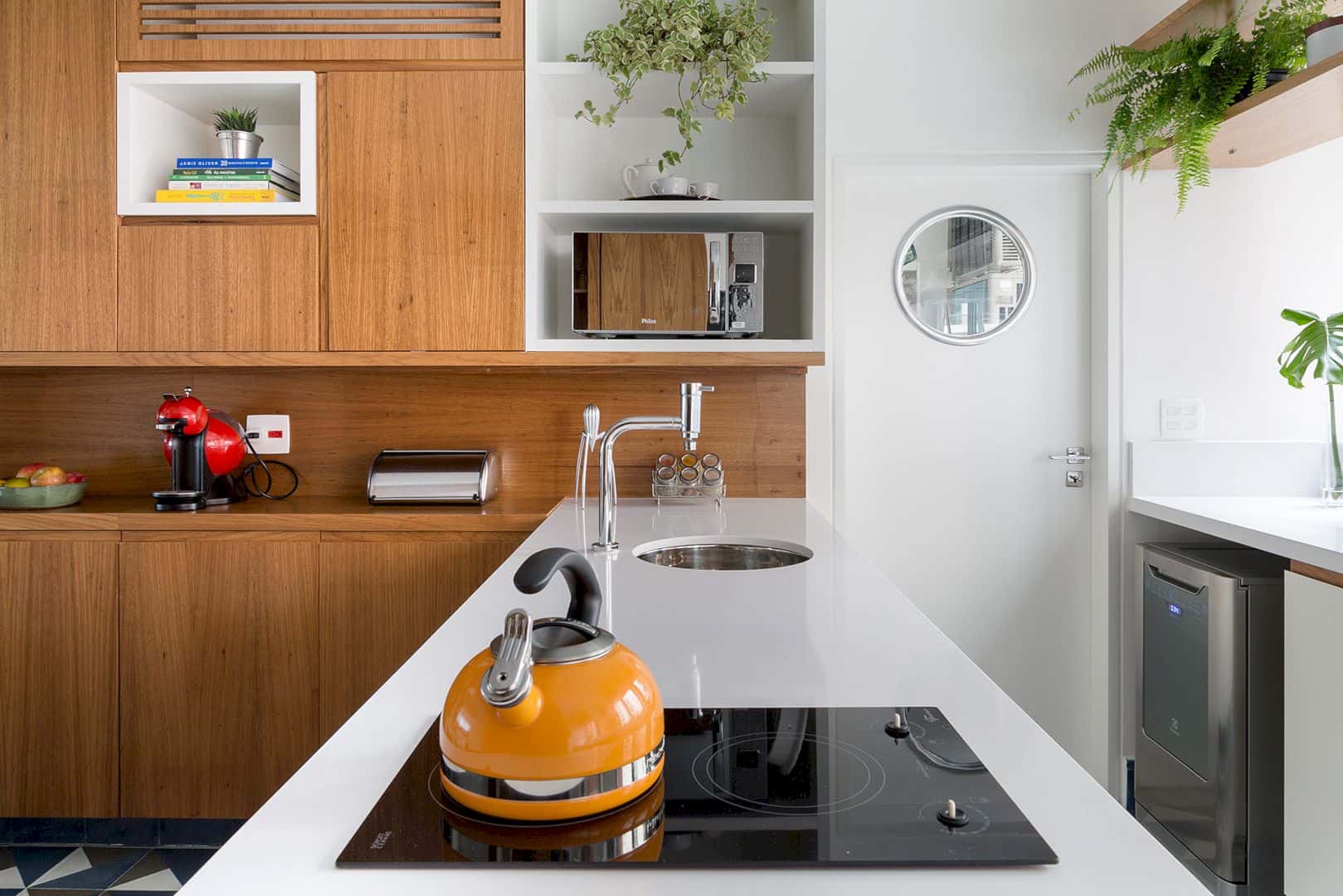
In order to balance the wood material, there are a lot of greeneries that used to decor this apartment. Some greeneries can be found in some spots with the beautiful vase and pot, including in the kitchen rack. In order to reflect the beautiful interior in this apartment, the large mirror is placed on the living room wall.
Furniture
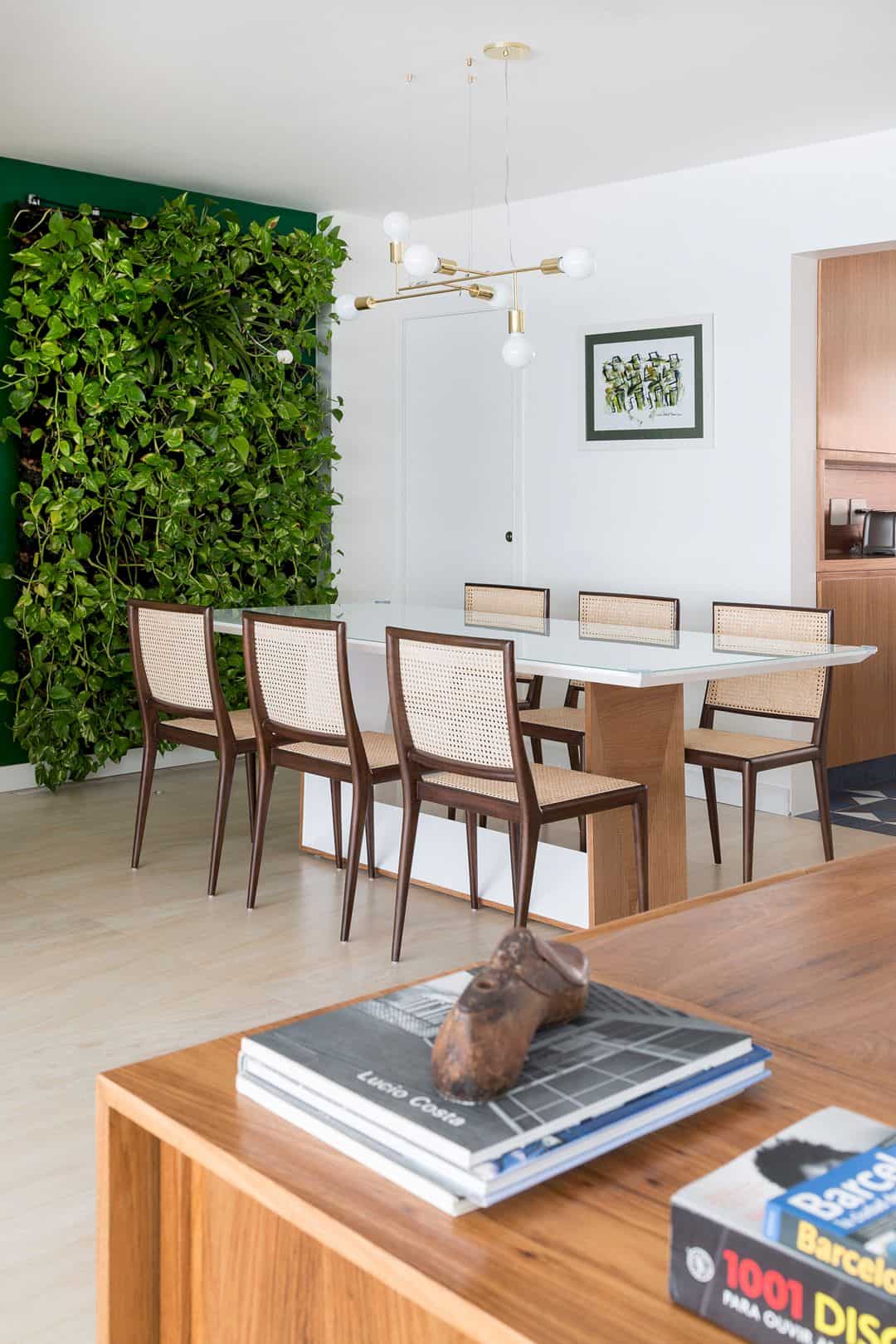
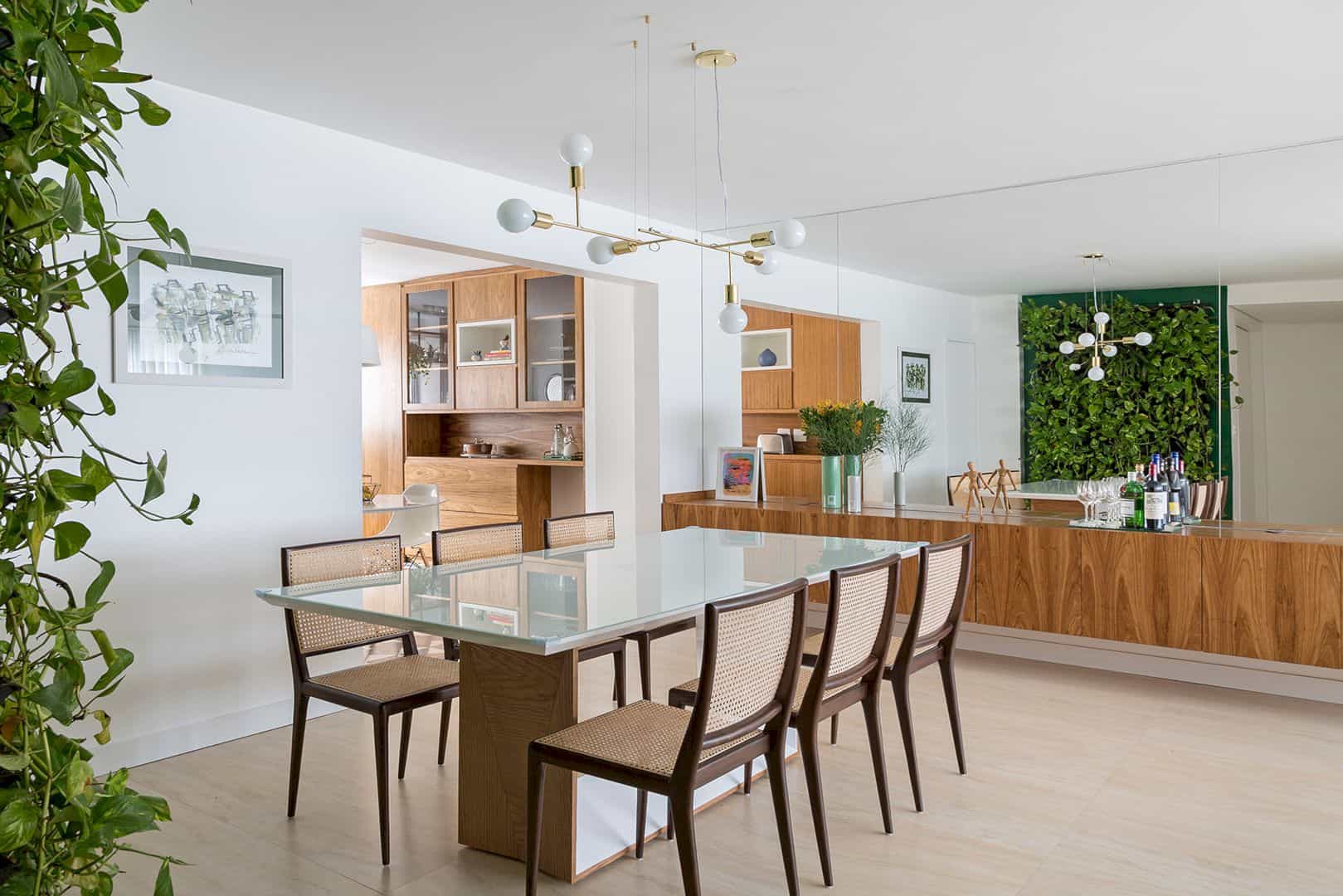
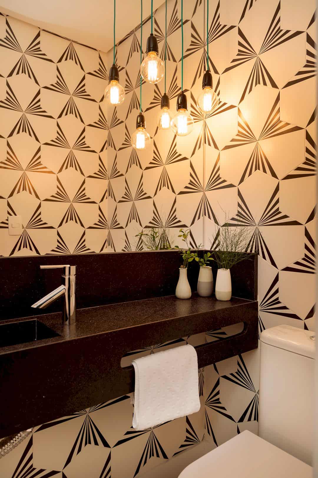
This apartment has two dining area, the main dining area and the small one. The main dining area is designed with wooden chairs and also a glass-surface dining table. The small dining area is located in the kitchen area with a beautiful tulip table. In the bathroom, there is a dark marble used to design the sink and patterned tiles to design the bathroom wall.
Rooms
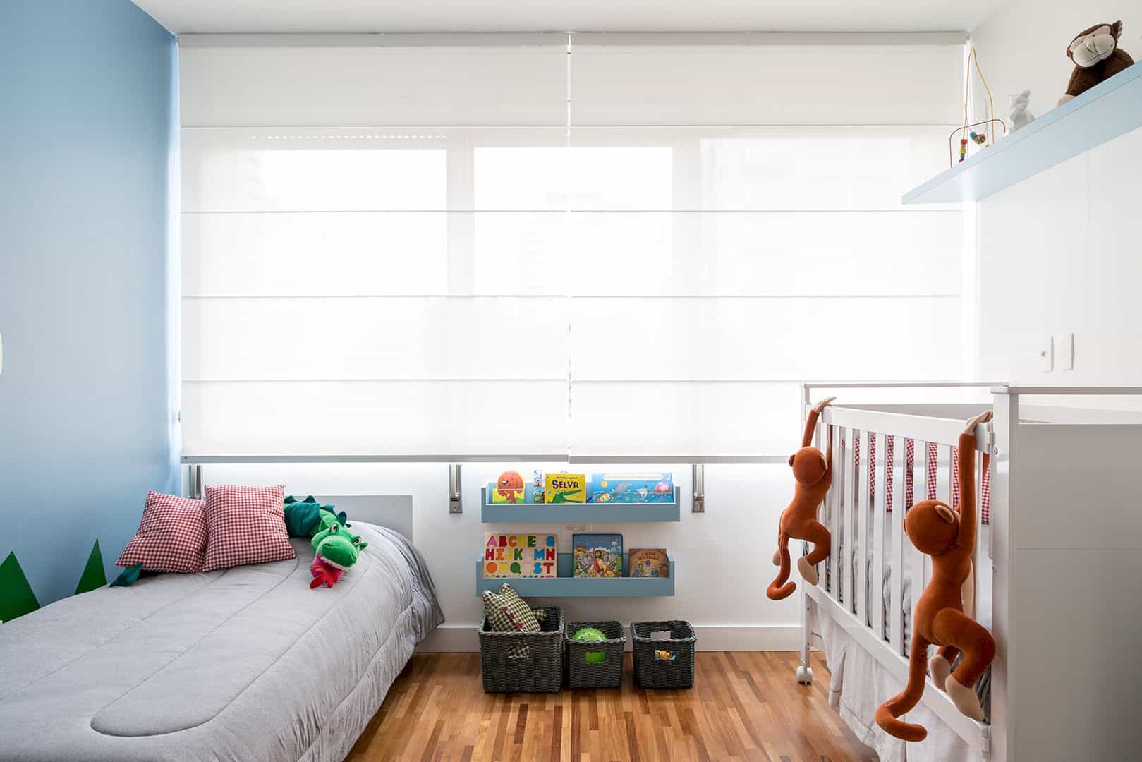
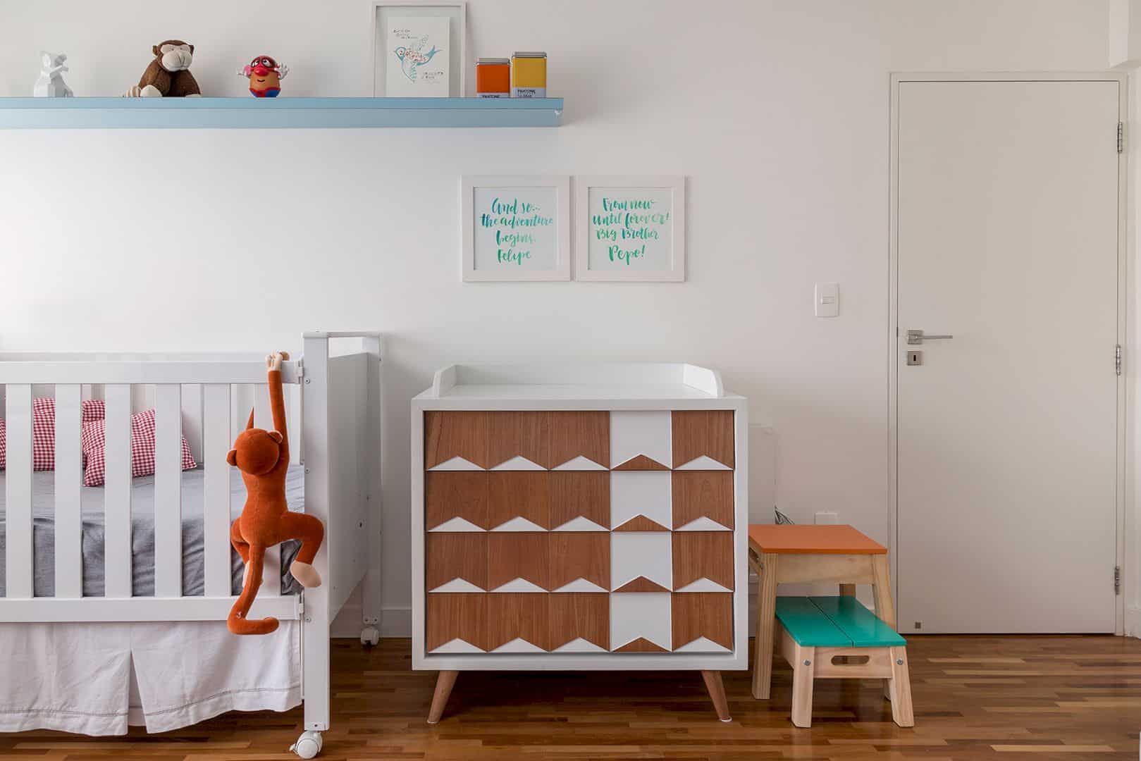
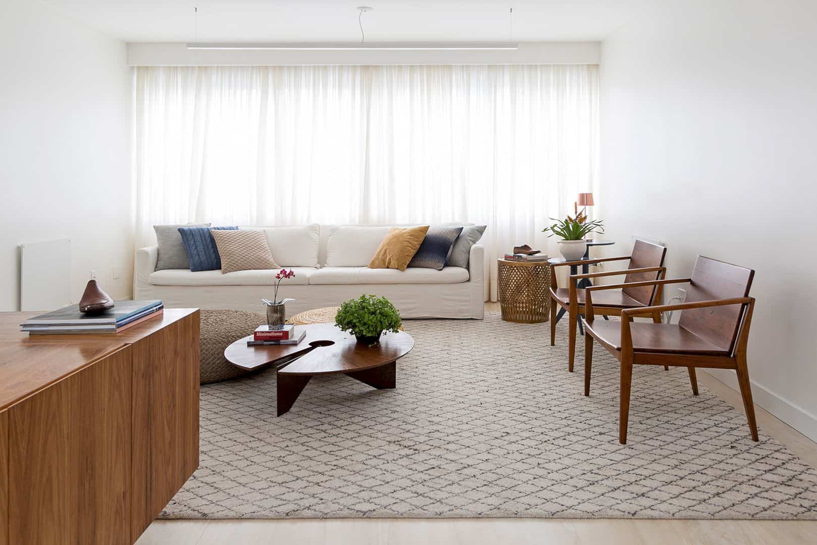
Every room in this apartment has the same background design, including the living room and the nursery room. Both of these rooms have a white background comes from the white wall, ceiling, and furniture. The nursery room is designed in a more colorful look with a blue wall, blue shelf, and also some dolls.
Discover more from Futurist Architecture
Subscribe to get the latest posts sent to your email.
