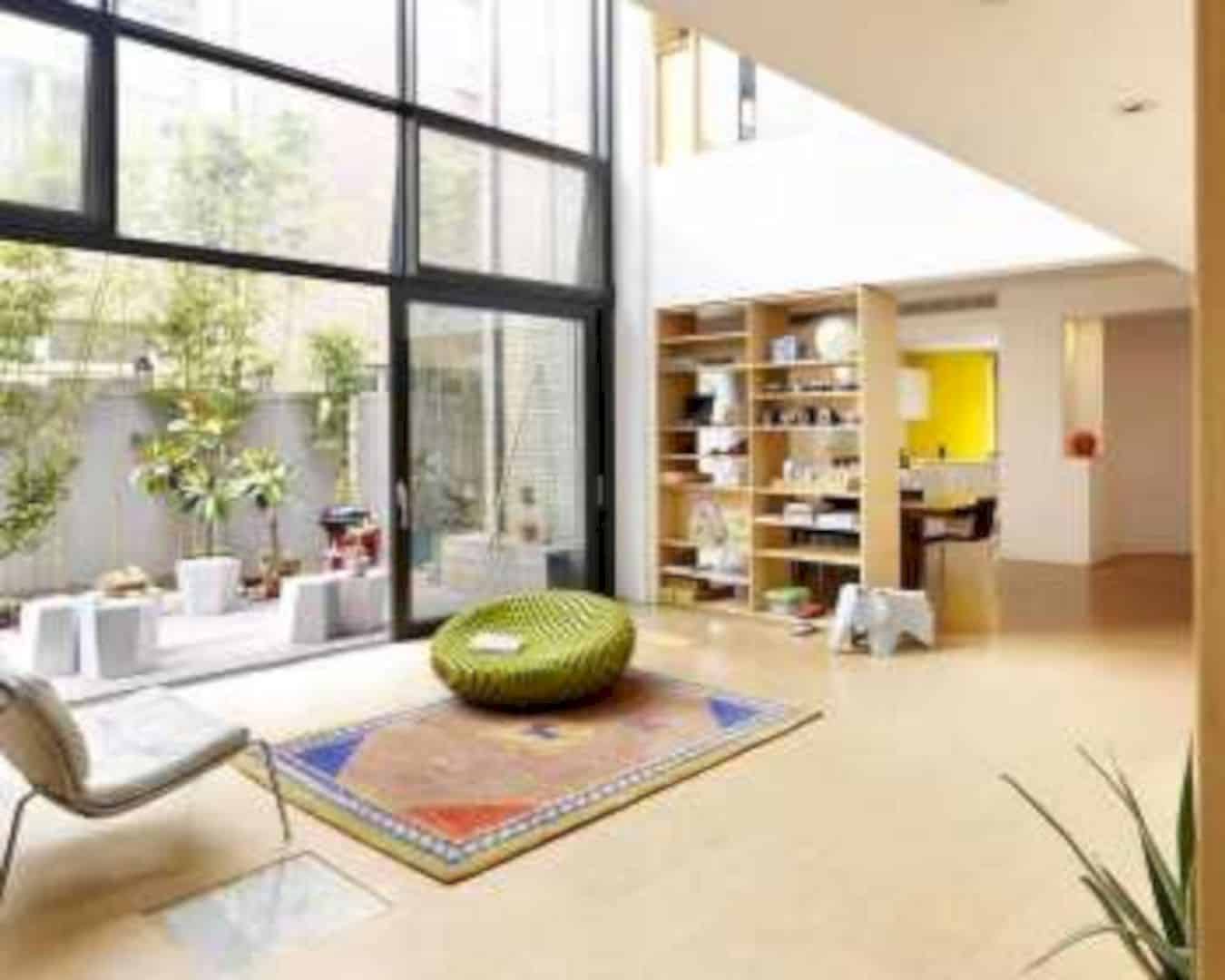
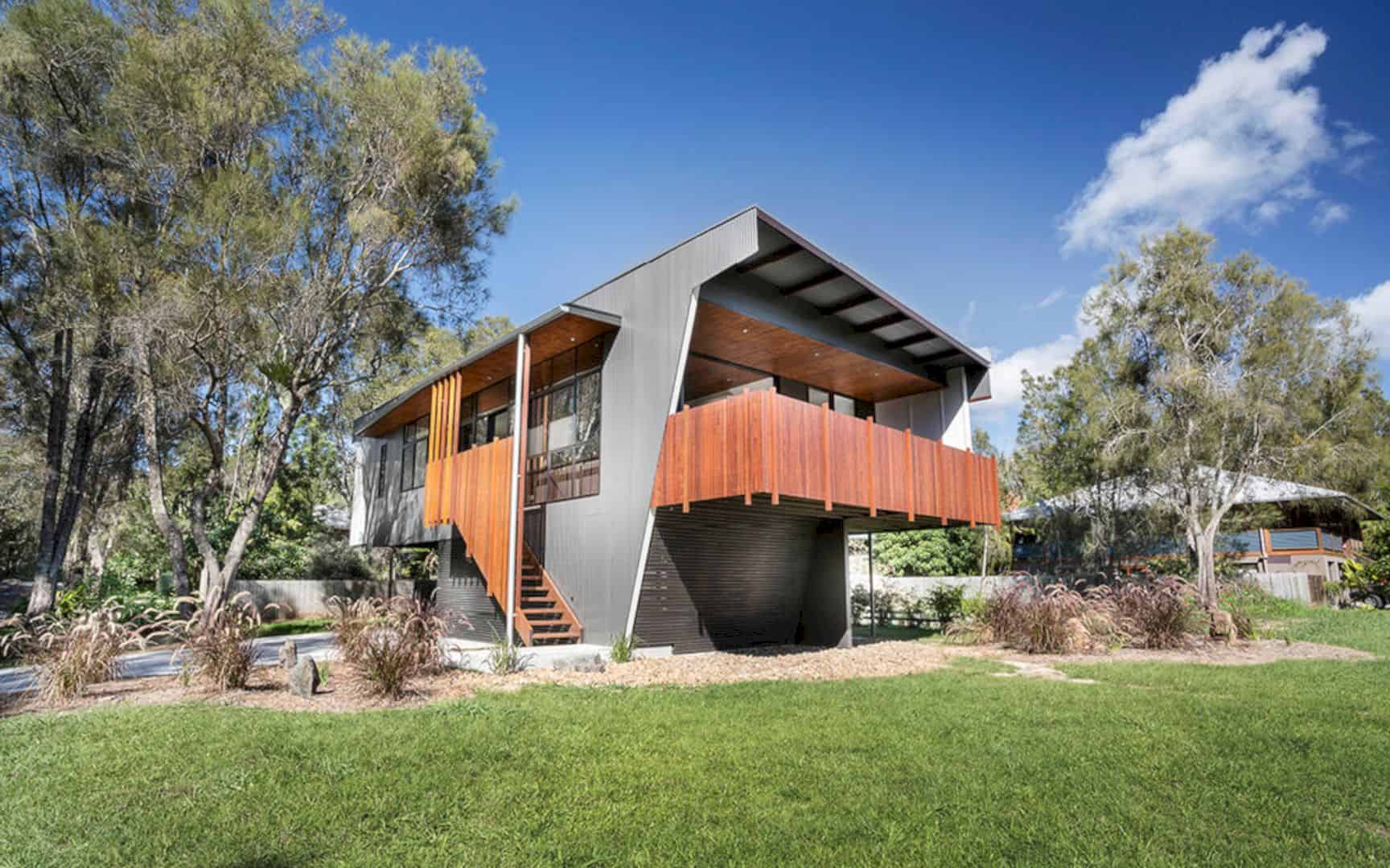
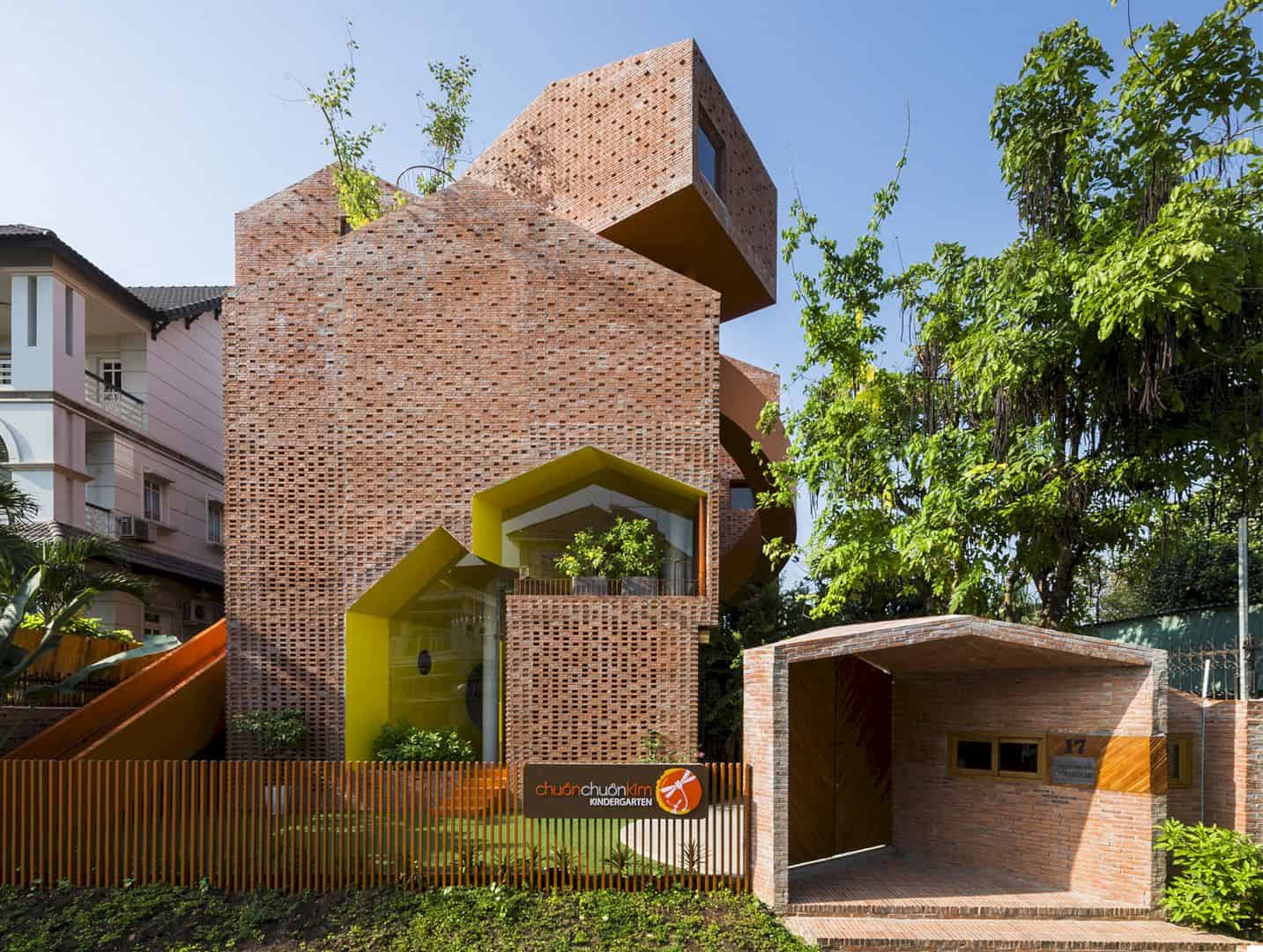
In July 2012, Keren Offner Design has been completed a renovation project of a private house in Rishon Le’zion. K House is a private house located in an old neighborhood. This house turns into a modern and comfortable house with a contemporary interior. The architect from Keren Offner Design also uses a lot of white colors in creating the height illusion.
Interior
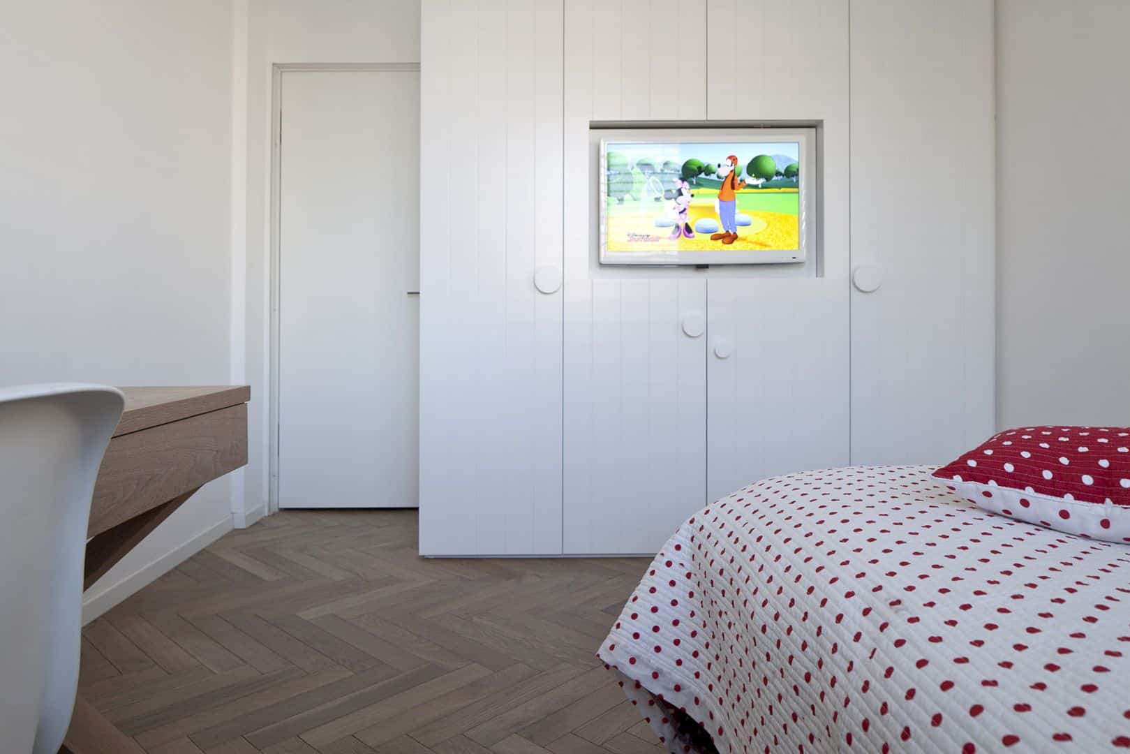
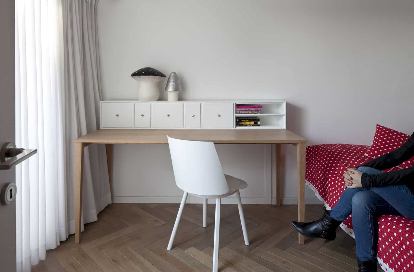
The architect tries to design the contemporary interior in this private house by applying a lot of white colors. These colors can create a height illusion, making the house looks higher than it seems. With 230 meter square of the total area, K House is the best place to stay with family for this house owner.
Materials
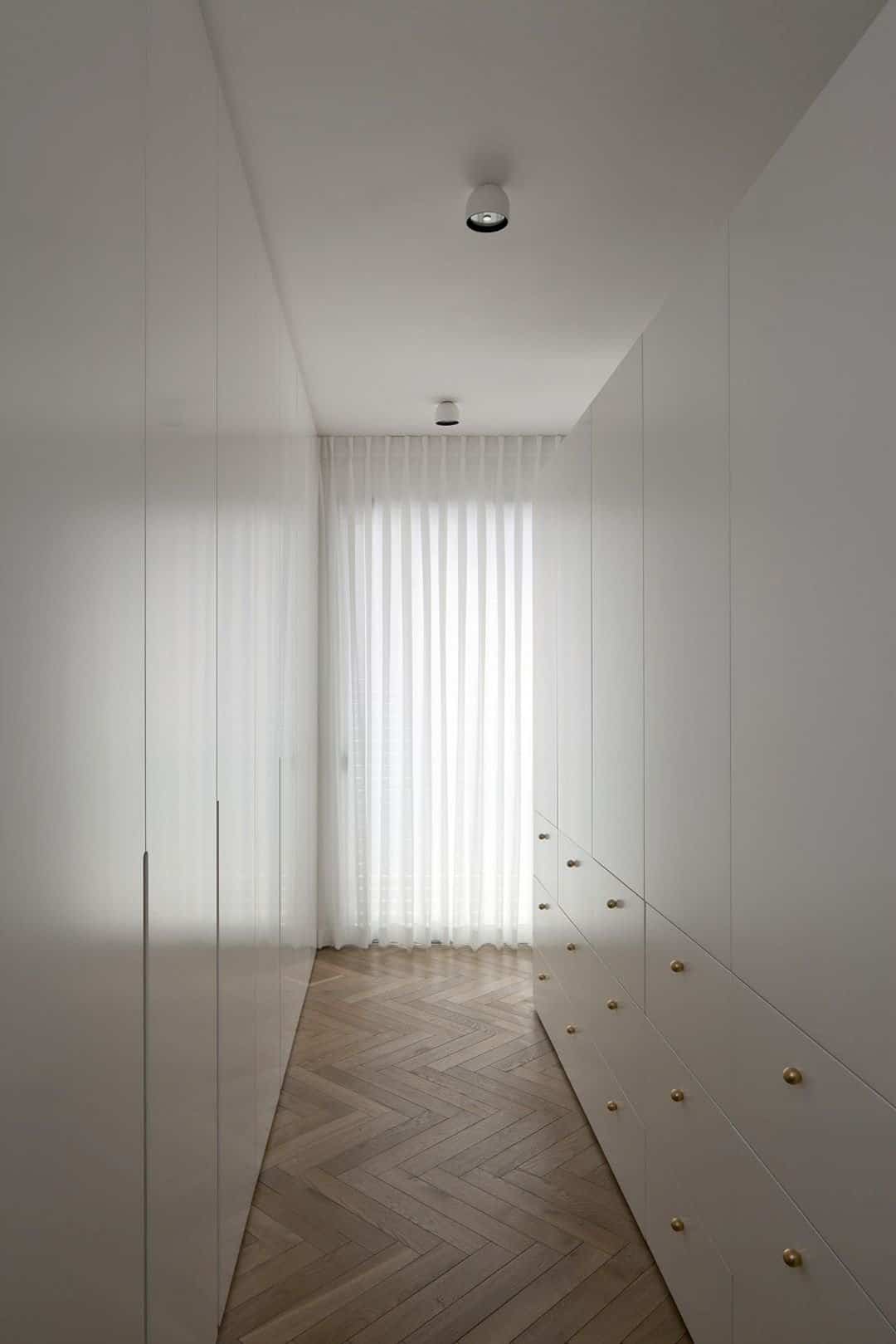
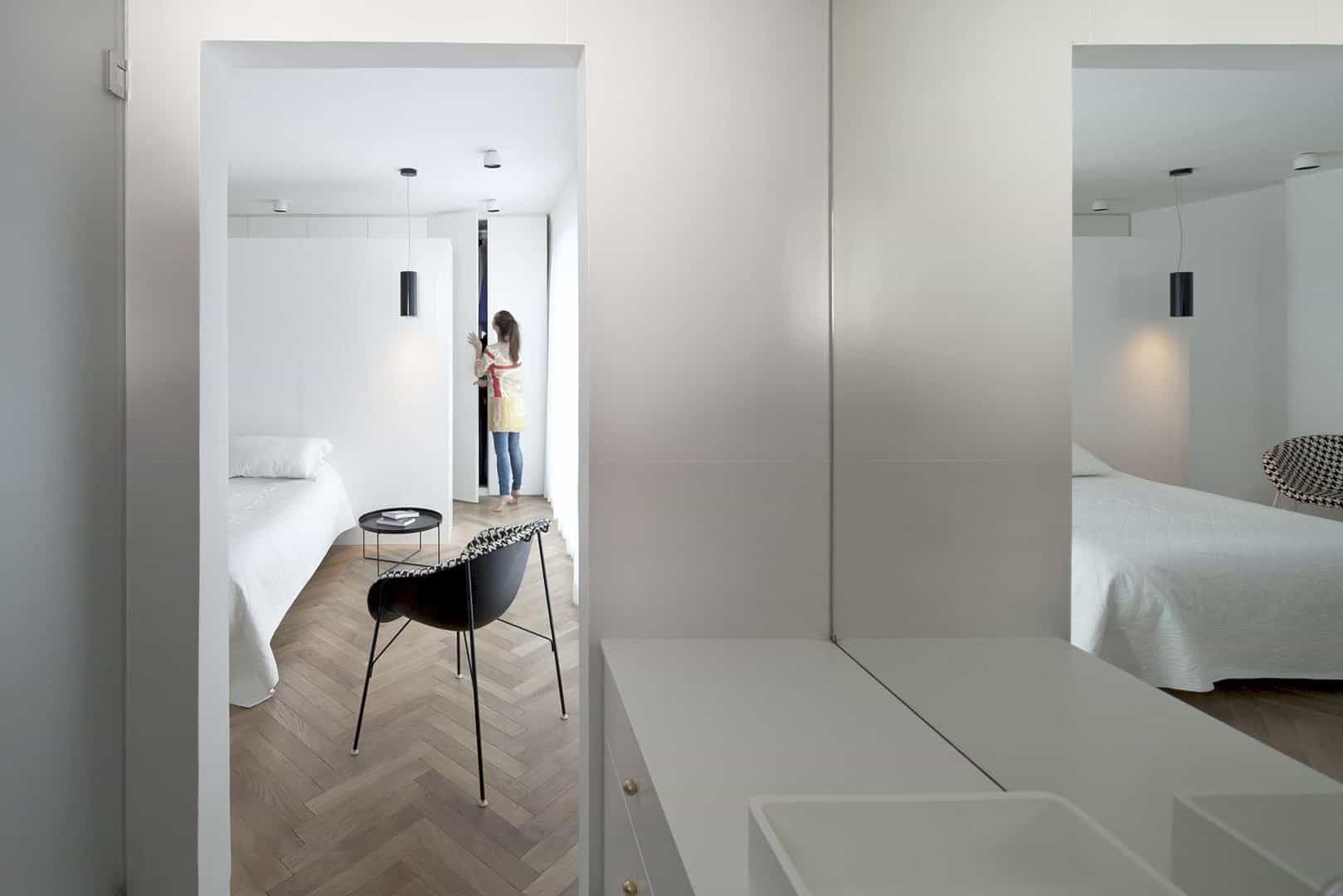
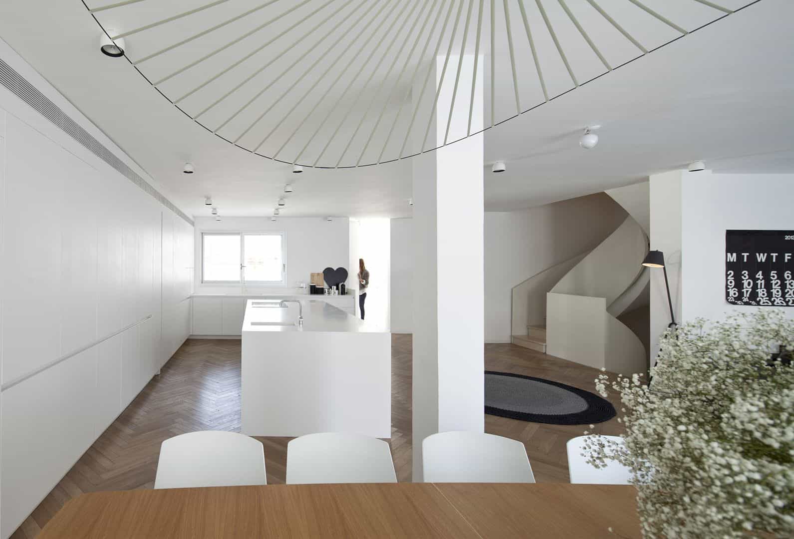
With a ‘Fisbone’ method, the floor of House K is covered with the oak parquet which is very light. This material is used to cover the entire floor of the house, including the floor in the bedroom and its private bathroom. The color of oak looks perfect to be combined with a lot of white colors on the house interior surface.
Bedroom
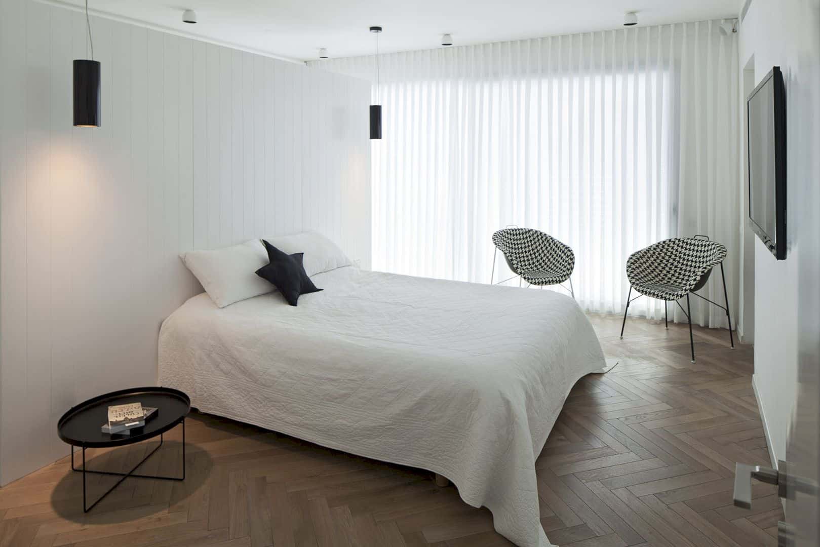
The master bedroom is beautified with a white bed, placed in the middle of the room. There is a special design of woodwork behind this bed, a large cabinet. This cabinet has two awesome functions. It can be used as storage and also as the bed head. It decorates and saves the bedroom space at the same time.
Kitchen
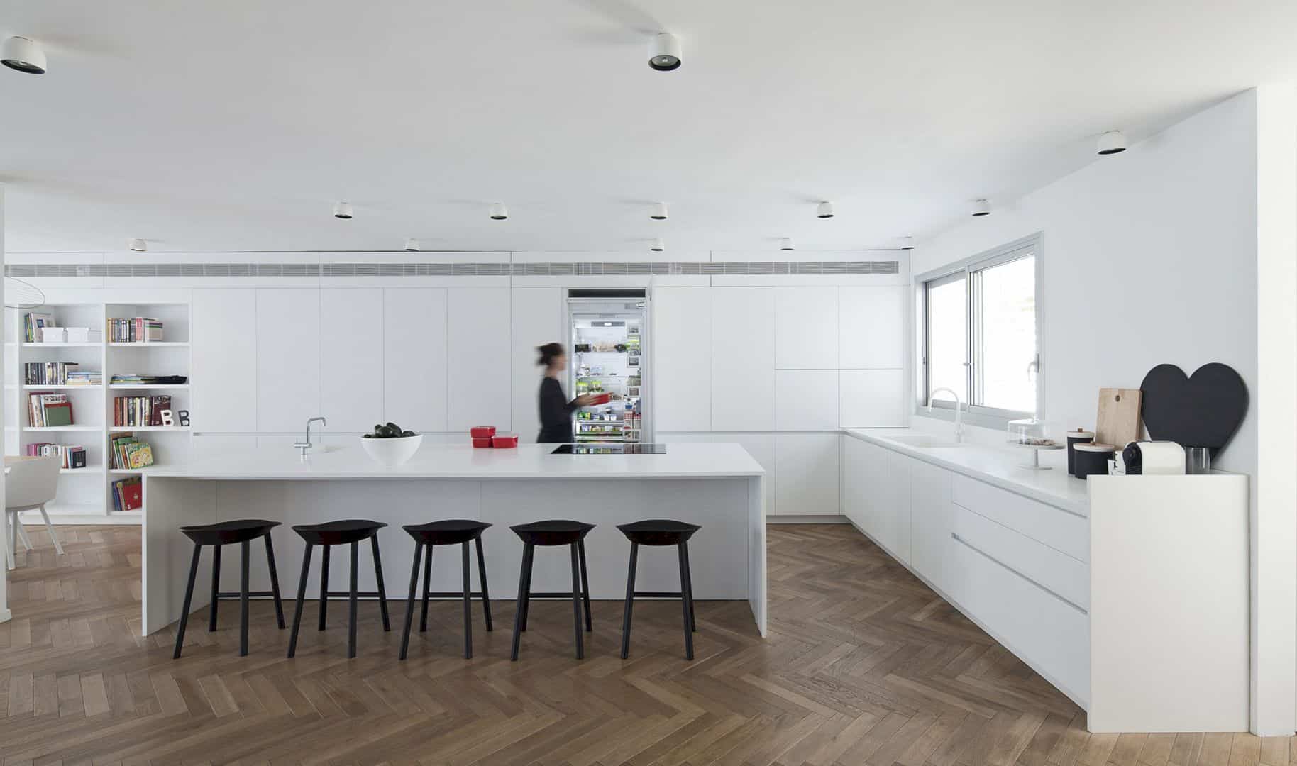
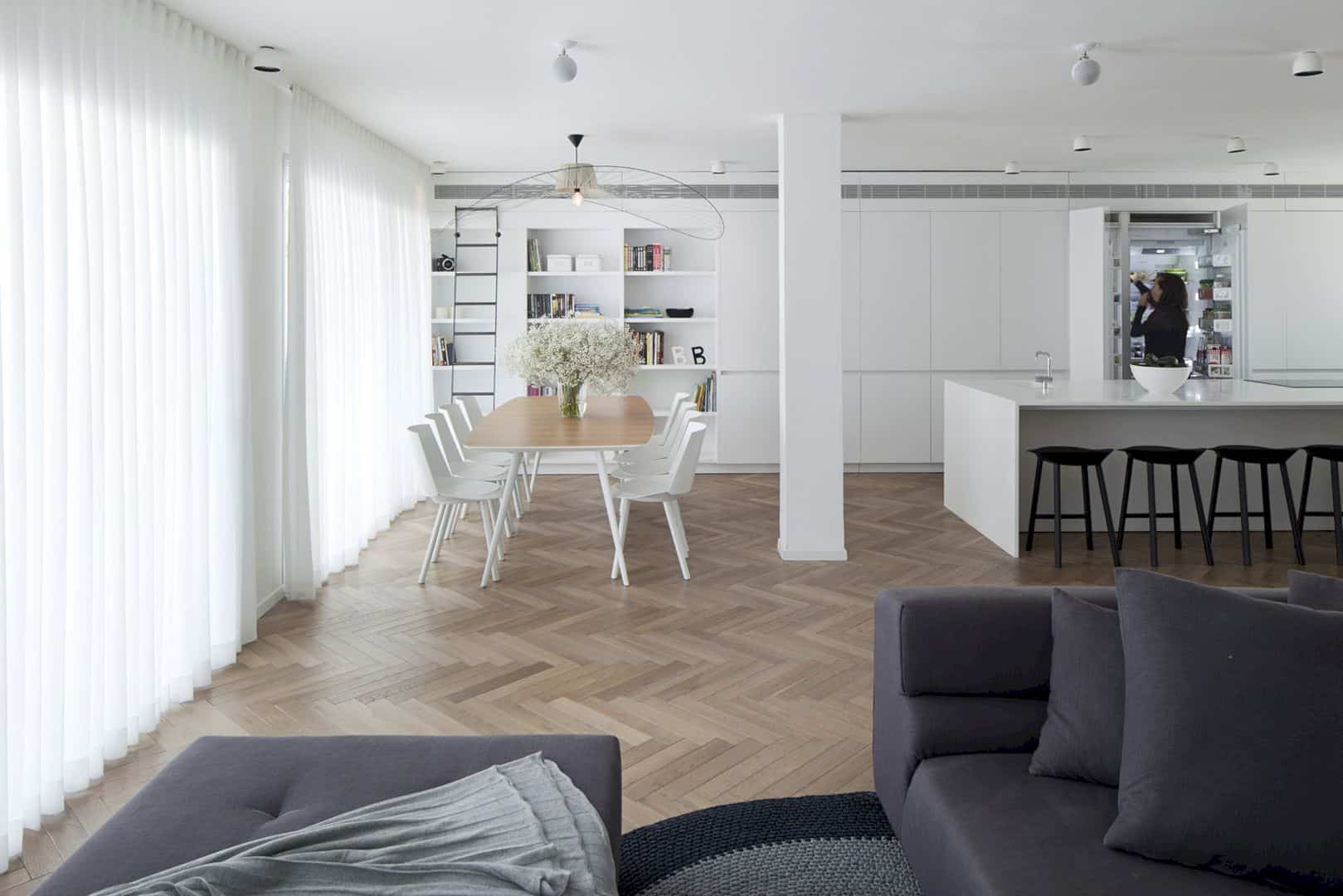
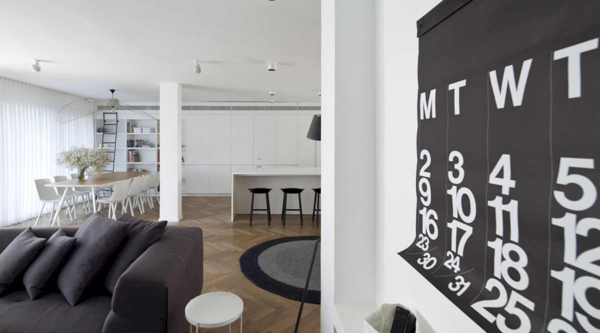
The kitchen is designed in a contemporary interior and also enlarged too. This area is enlarged by expensing the main entrance of the house. The L-shaped design is combined with the cabinets wall, following the house line. And the area in front of the dining room is transformed into a lovely white library.
Staircase
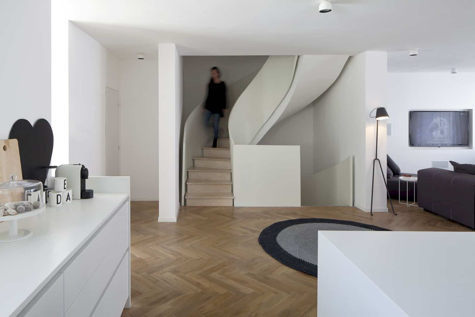
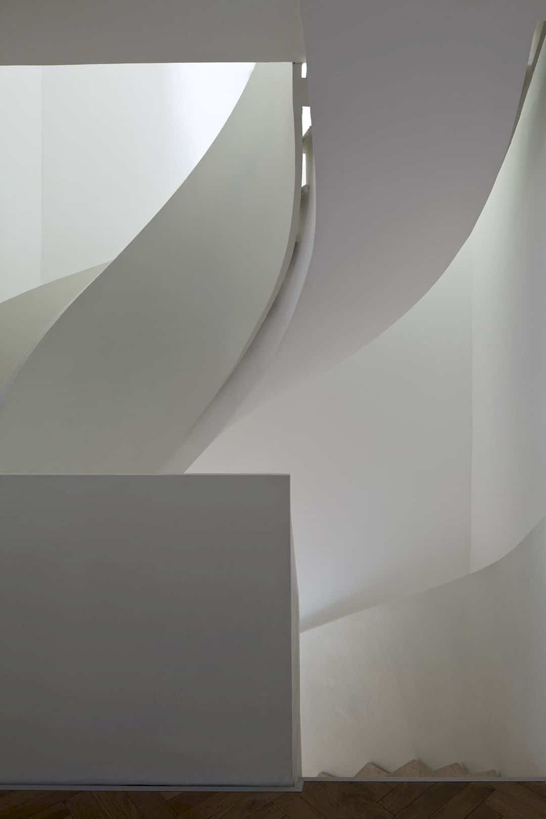
In order to make the contemporary interior in K House looks more interesting, the architect also focuses on designing the staircase. This staircase separates the shelter and living room. It is designed with a tin white railing curving, replacing the metal railing and transforming it into a kind of sculpted interior element.
Via ok-design
Discover more from Futurist Architecture
Subscribe to get the latest posts sent to your email.
