Villarroel Apartment has been renovated completely with a contemporary interior design. This apartment is a project by Raul Sanchez Architecture in 2016 and 2017. Previously, the apartment is a complete lack of functionality and also unattractive. The project is made based on the explanation of the client to have a good way of life by renovating the interior.
Construction
The construction of this project starts from the propose of three large blocks. The first block is a first access-related block, the place of the guest bathroom, entrance, guest bedroom and also a laundry room of the apartment.
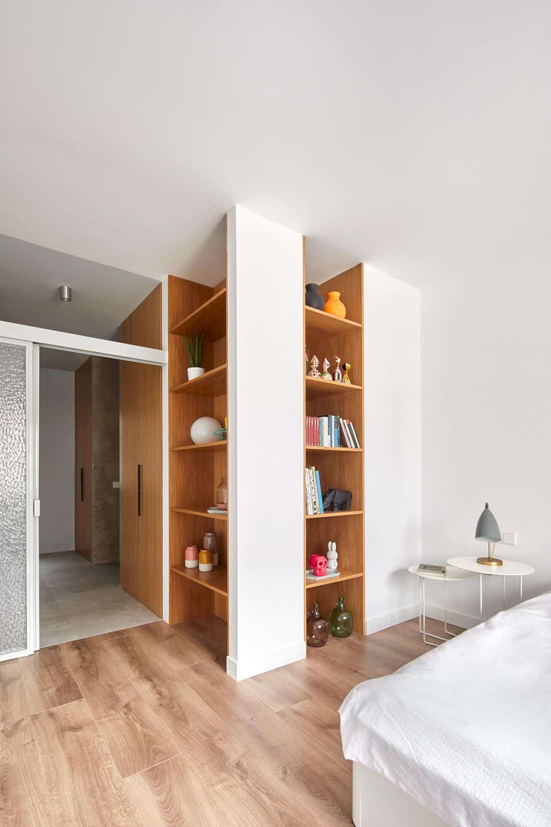
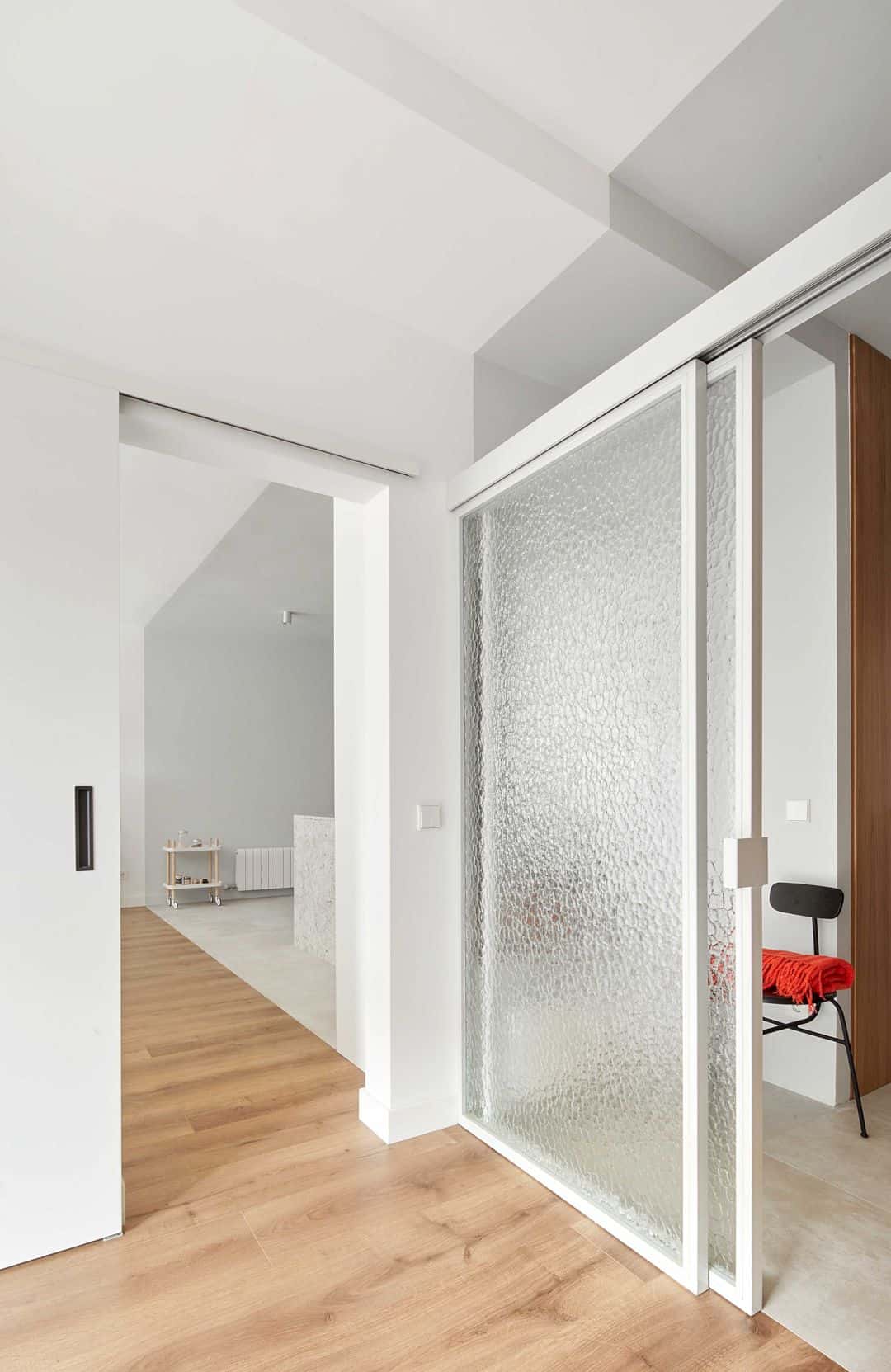
A second block is a place for the bathroom, the adjoining walk-in closet, and also the master bedroom. A third block is a large place for the living room, dining room, kitchen, and a place as a swivel joint for the other two blocks.
Blocks
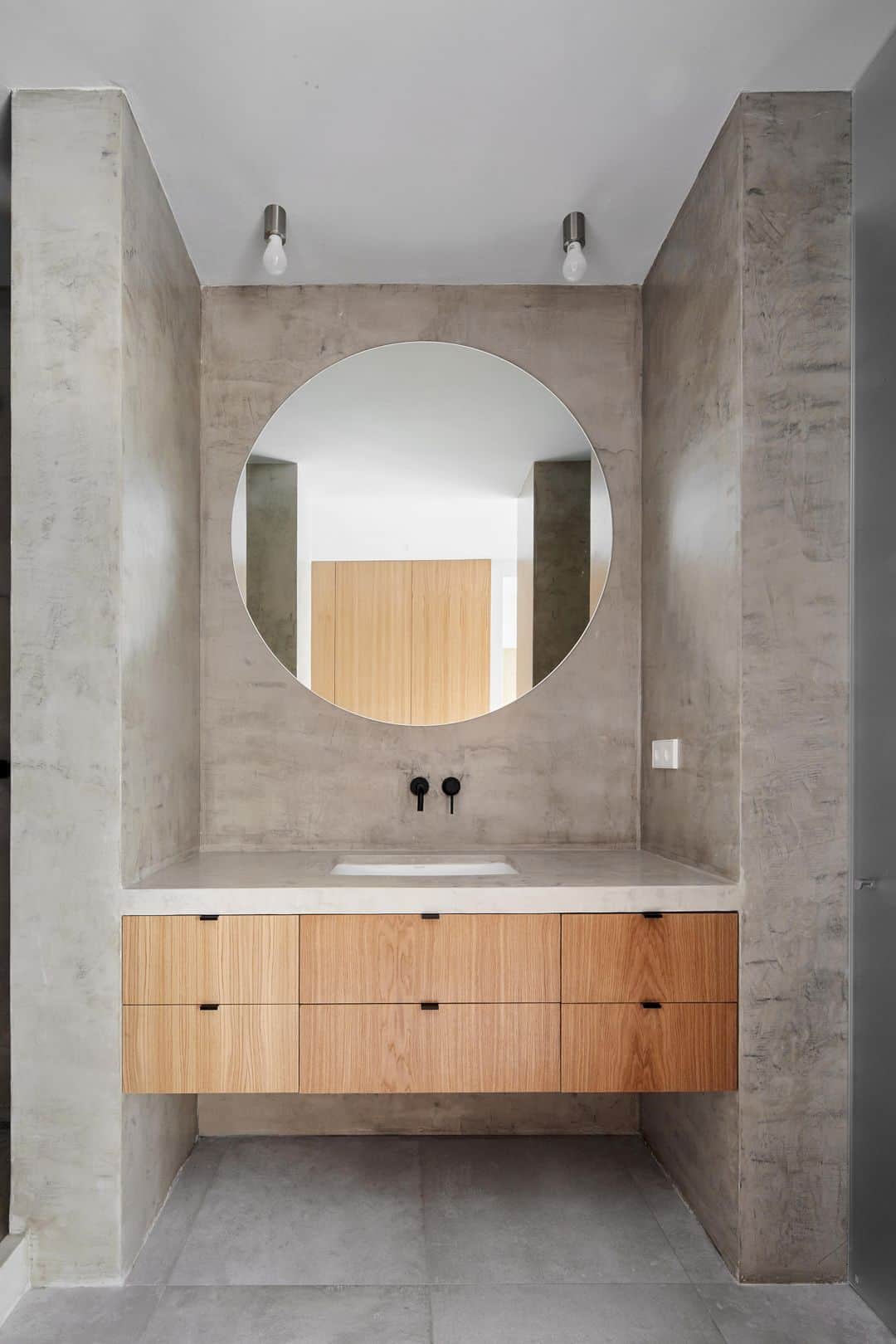
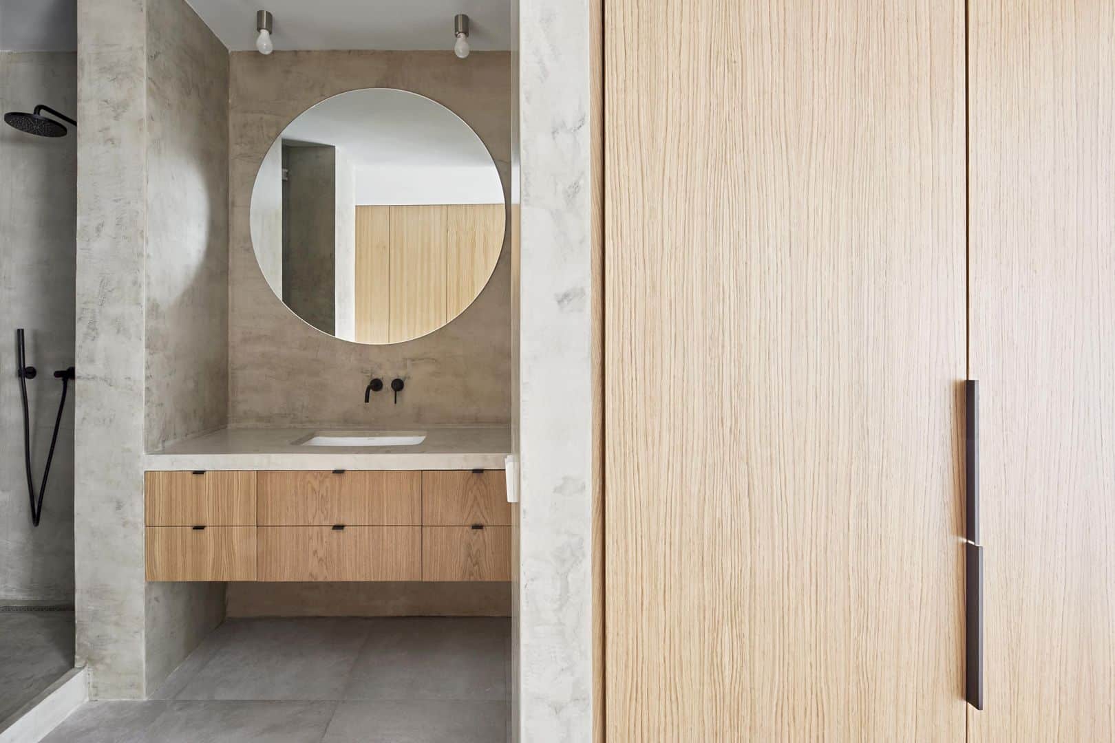
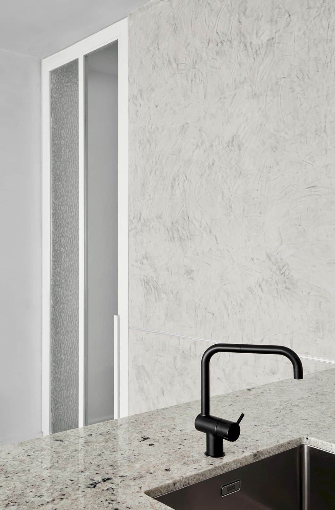
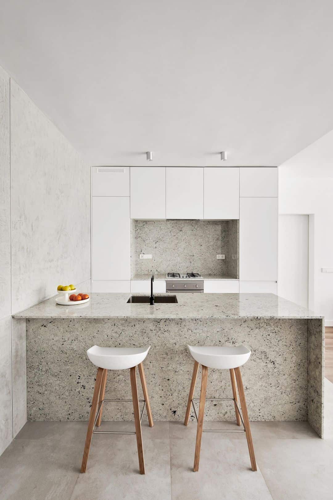
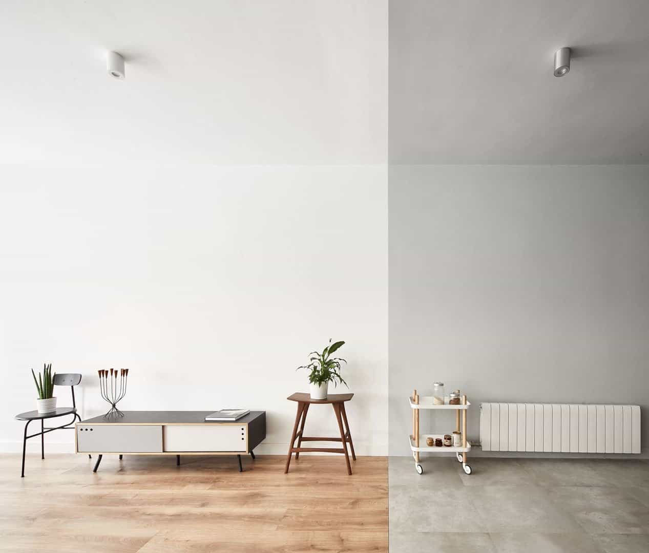
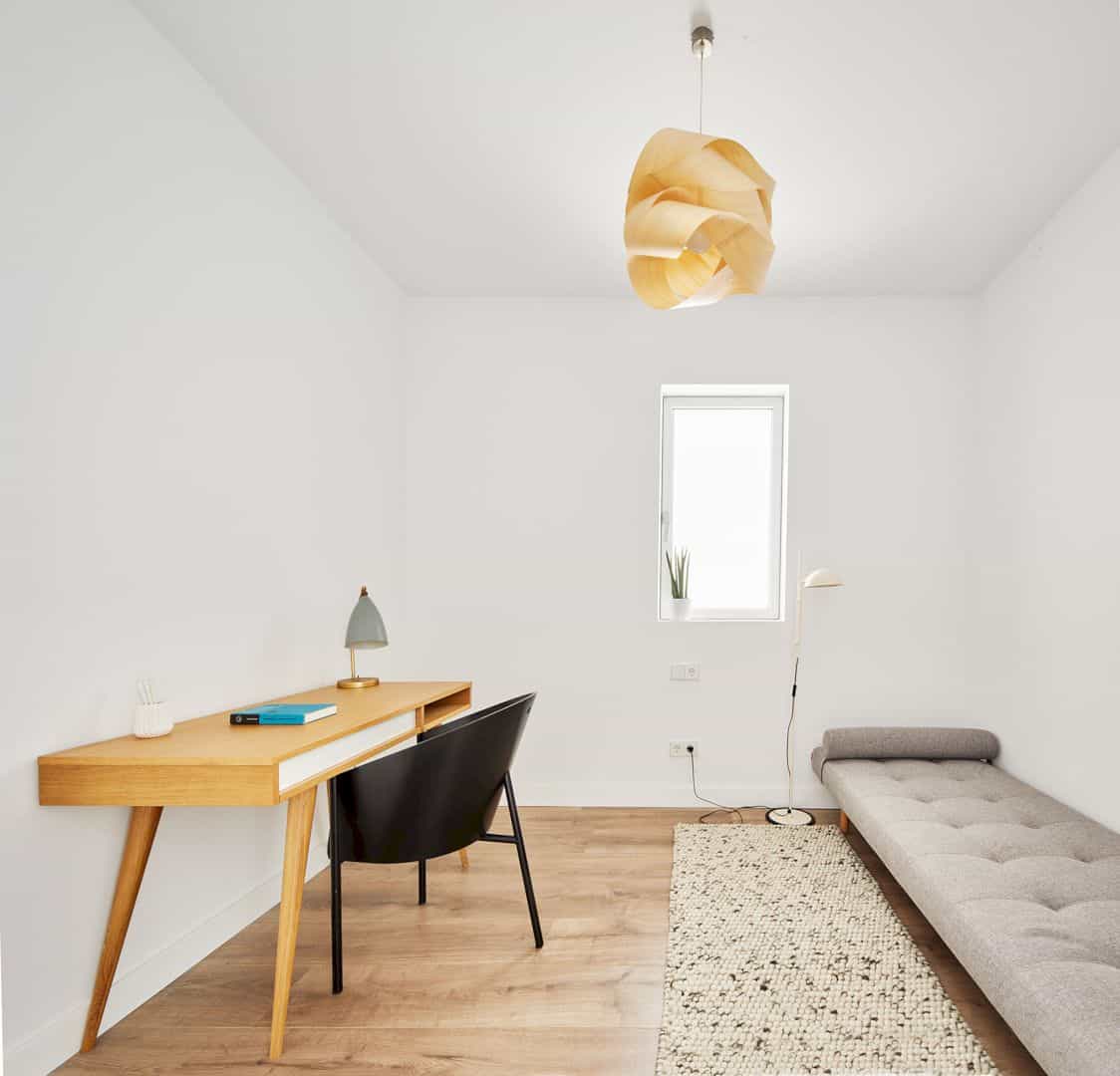
Each of the three blocks in this contemporary apartment includes a living space, a service space, and also a relationship between those spaces according to the material code change. The service spaces are covered in some gray materials on the ceiling, wall, granite, and stoneware floors.
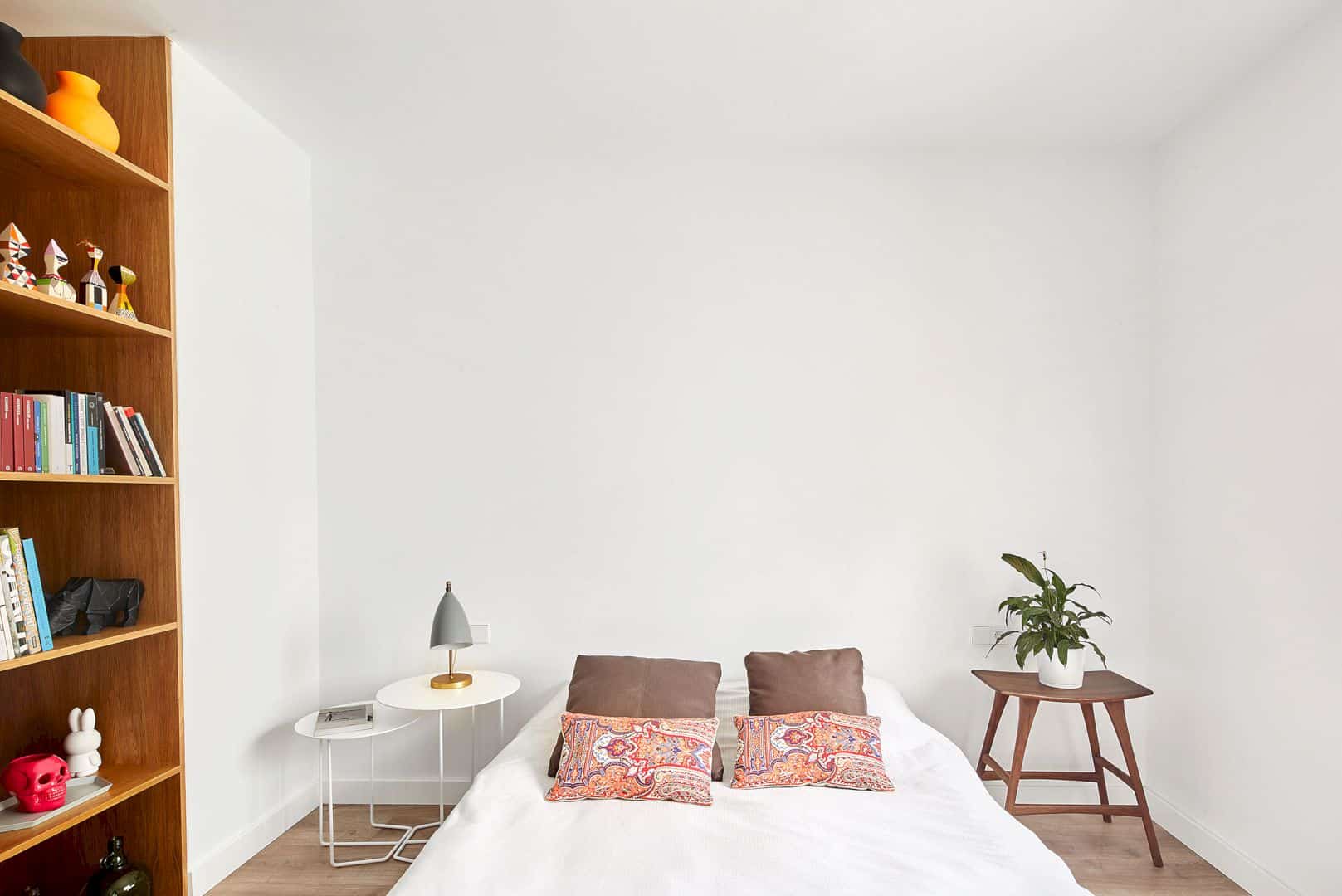
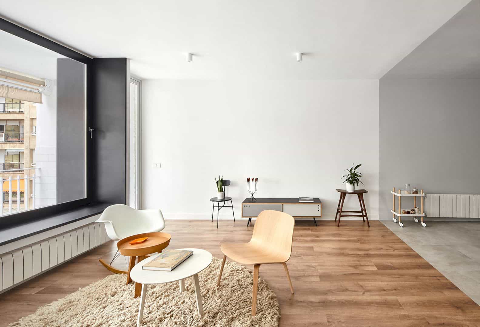
The living space is a contrast with its white color interior and the parquet floors. It becomes a material code that can create a good position for each function, including when the rooms are communicated and open completely just like in a case of the living room-kitchen-dining room in this apartment.
Rooms
The use of the same material code can be found in the master bedroom, separating the bedroom area with the walk-in-closet-bathroom. The material code extends through the living room, dining room, and the kitchen space through a load bearing wall.
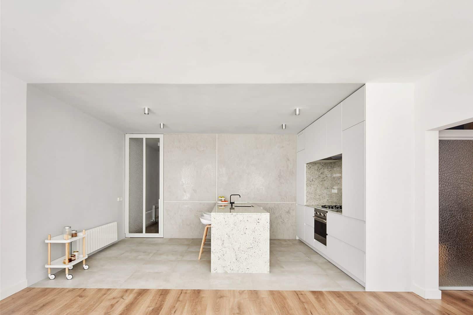
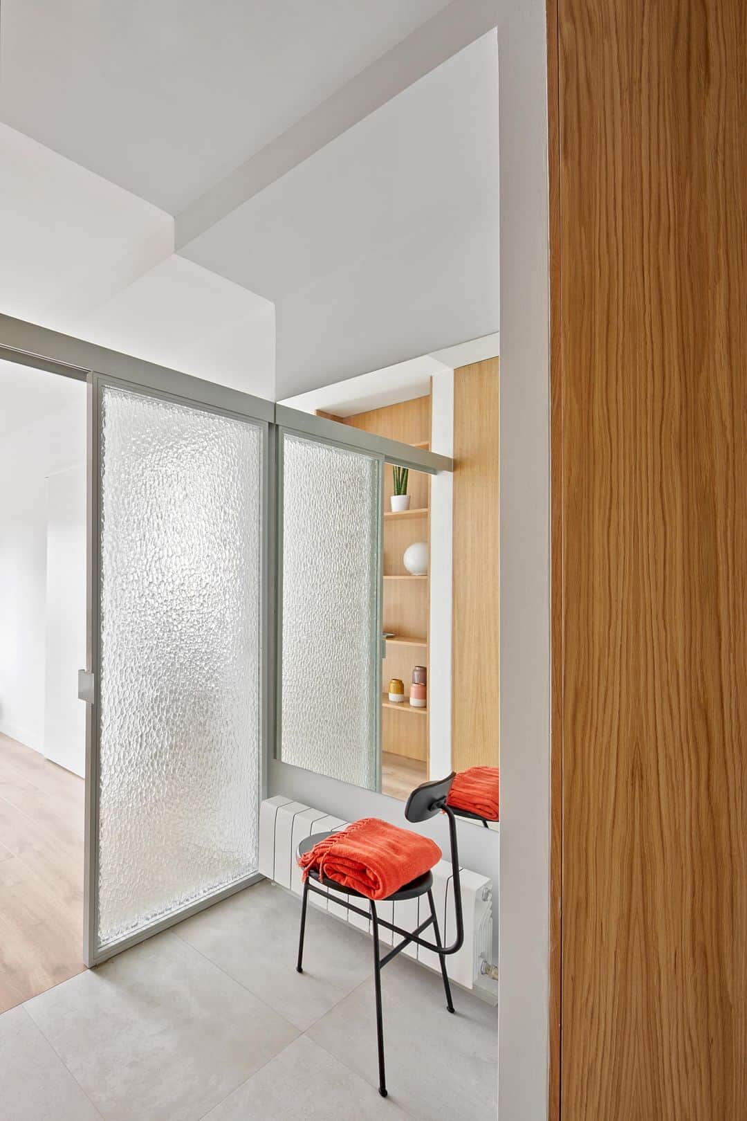
The load-bearing wall is designed together with textured glass sliding doors. The doors are lacquered in gray and placed well, providing a greater privacy without separating the interior. The bathroom and guest bedroom are designed with its own independent access but they are still connected to other rooms.
Details
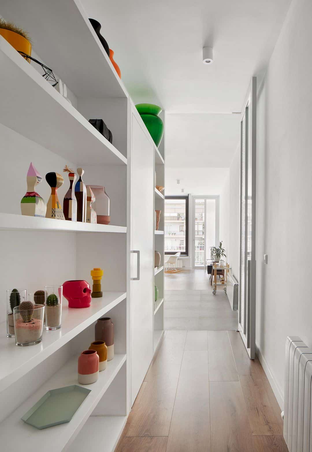
Instead of the materialized paths, this apartment has some circulation areas that suggested. The axis line can connect the balcony with the entrance but it also blends the entrance configuration with the flush doors in a large close and disappears in the kitchen and dining space.
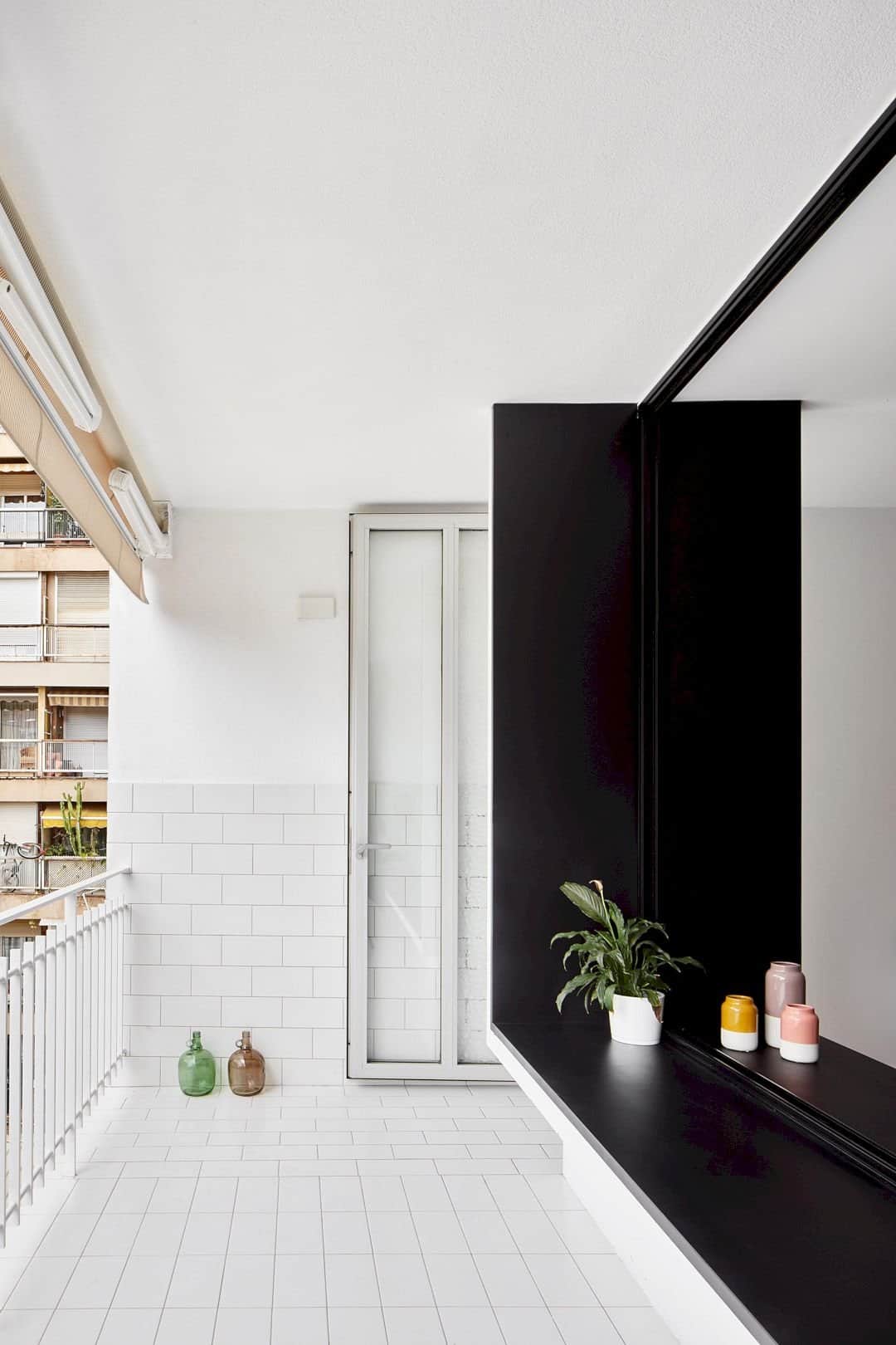
The door that becomes an access to the lobby is also a door to the balcony. The black lacquered wooden bench on the balcony repeats the width of the lobby so it doesn’t need to build an independent corridor. The ceramic tile of the balcony is also changing its direction, following the blurred balcony.
Materials
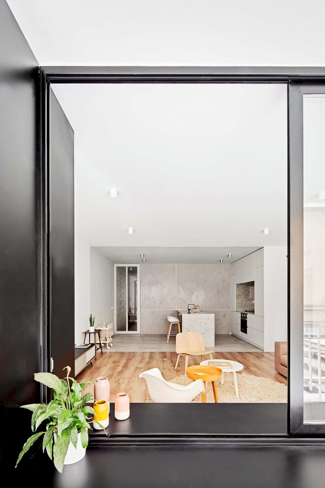
Villarroel Apartment has two large black-lacquered sliding windows, creating a good connection between the balcony and the living room. The black color is used to provide a new space inside the awesome balcony.
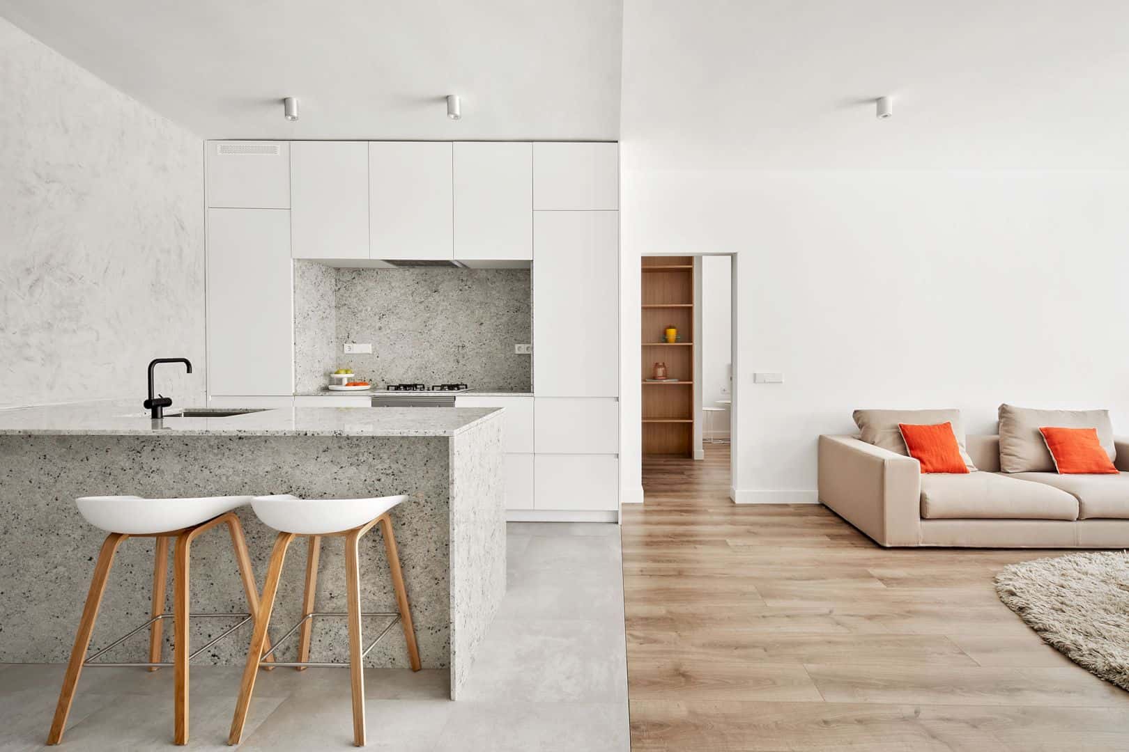
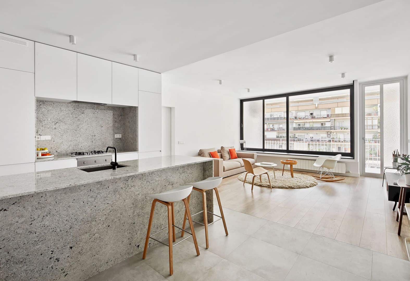
With the same way in and a bench, the balcony and the living room can be connected closely, even when the windows are open. When the windows are closed, they can act as a bookshelf, table, or a bench on both sides.
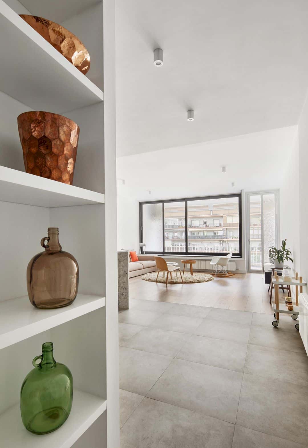
The glass is made from different texture and transparency that combined together. It can blur the interior of the patio which is unattractive. Now the patio has the same interesting look just like other interior looks of the spaces in this apartment.
Addition
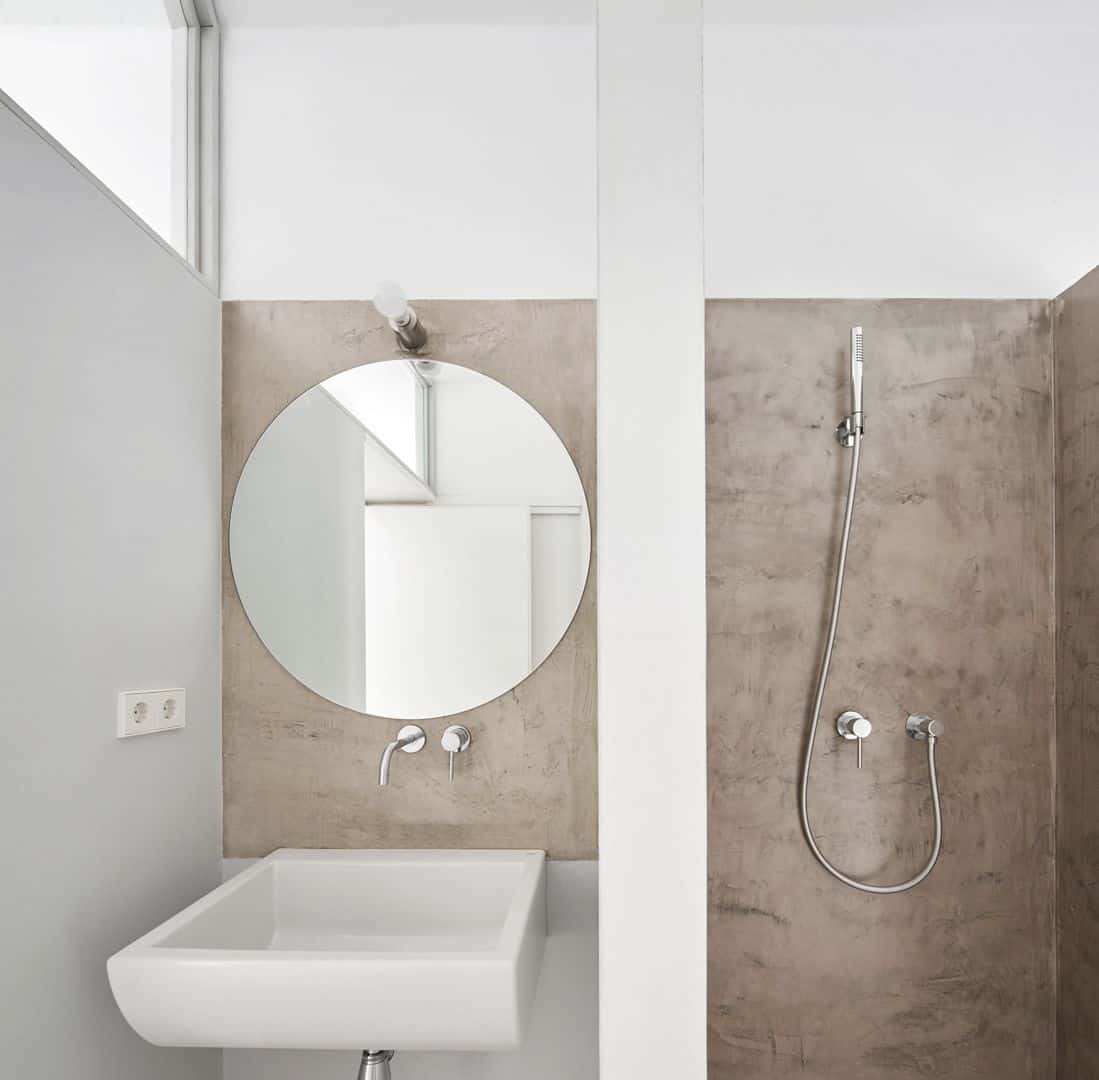
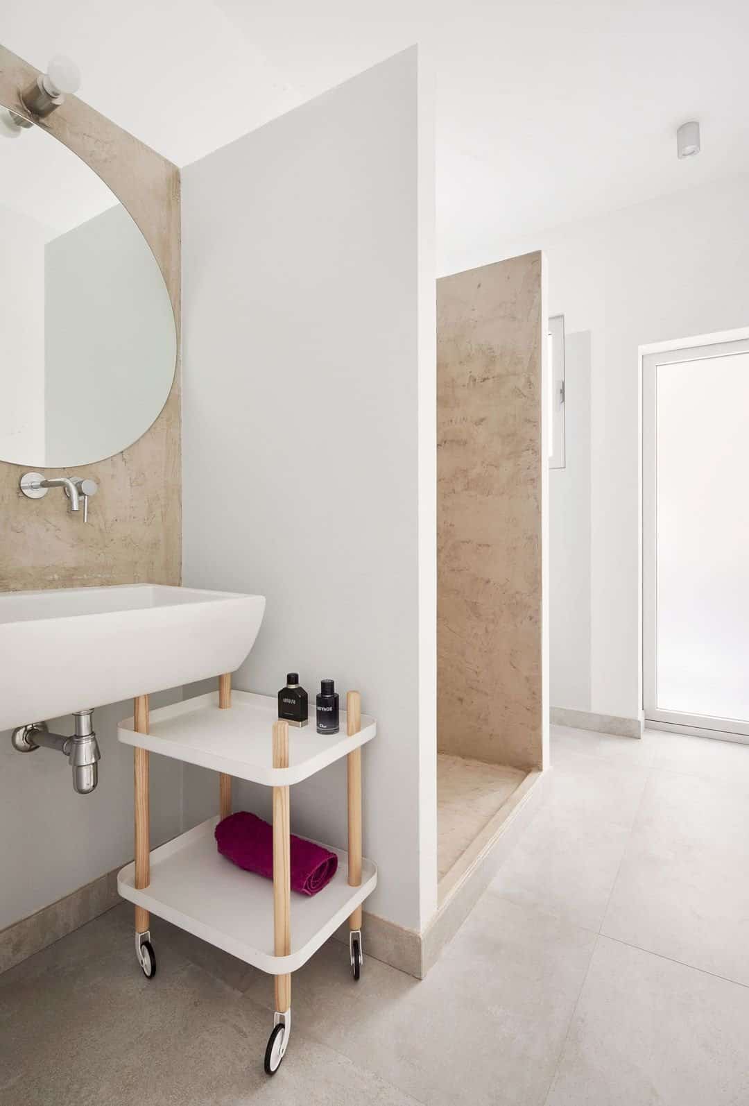
The project is also about additional of the complex layers to the interior. These layers are added to create an ambiguity for the classic labels of each room in this apartment. All final result of the project has been translated into spatial richness which is greater than before.
Discover more from Futurist Architecture
Subscribe to get the latest posts sent to your email.
