Uber, with the help of Assembly 1 CannonDesign, created Uber EMEA Headquarters, an international office based in Amsterdam, the Netherland. The office celebrates and embraces the diversity and culture of Uber’s global community.
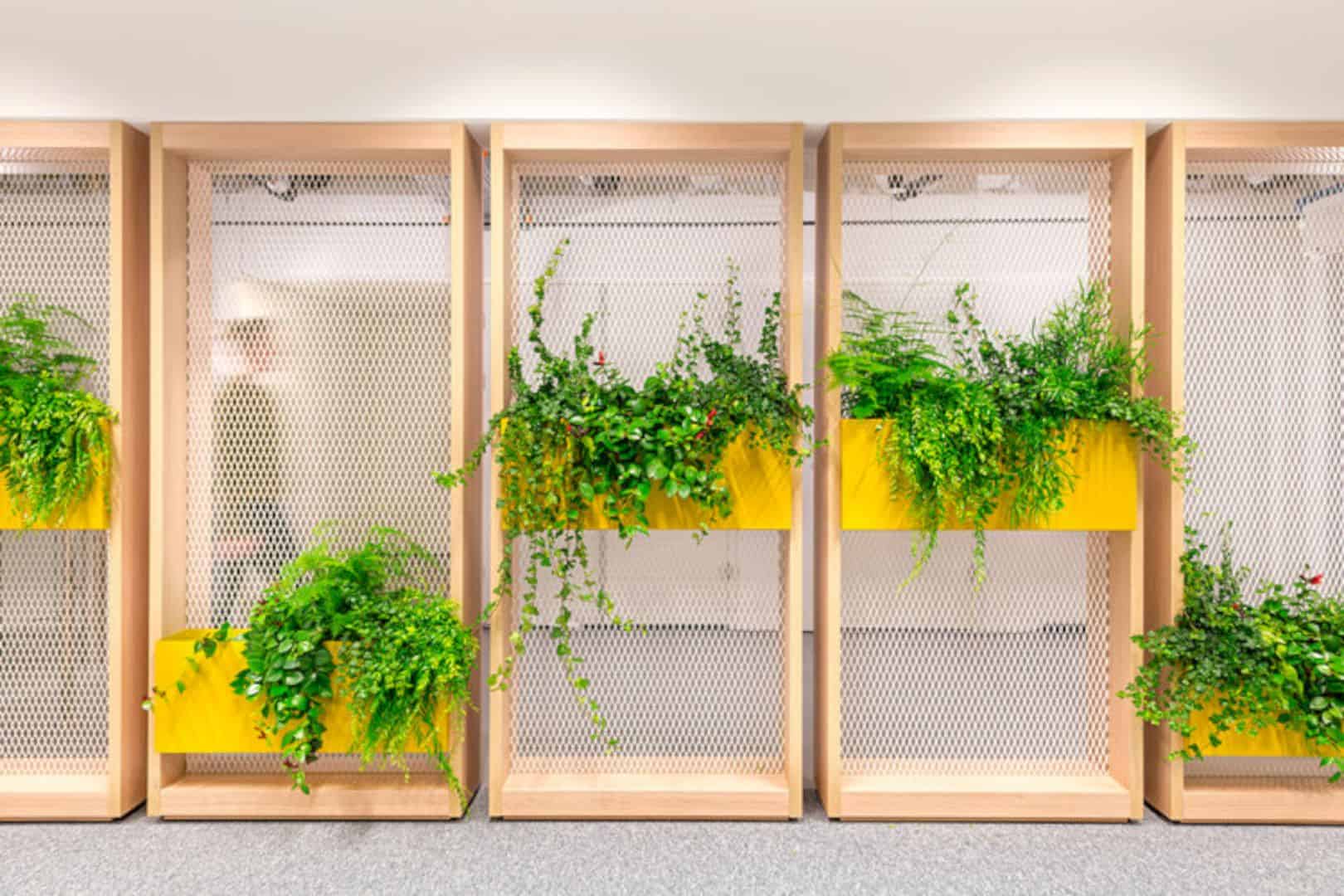
In the project, Assembly integrated Uber’s core values and reflects the influences of the city. They also highlighted the different regions of Europe, the Middle East, and Africa. The end result, the office brings in a fusion of materials, colors, and patterns that express the idea of connecting the people together.
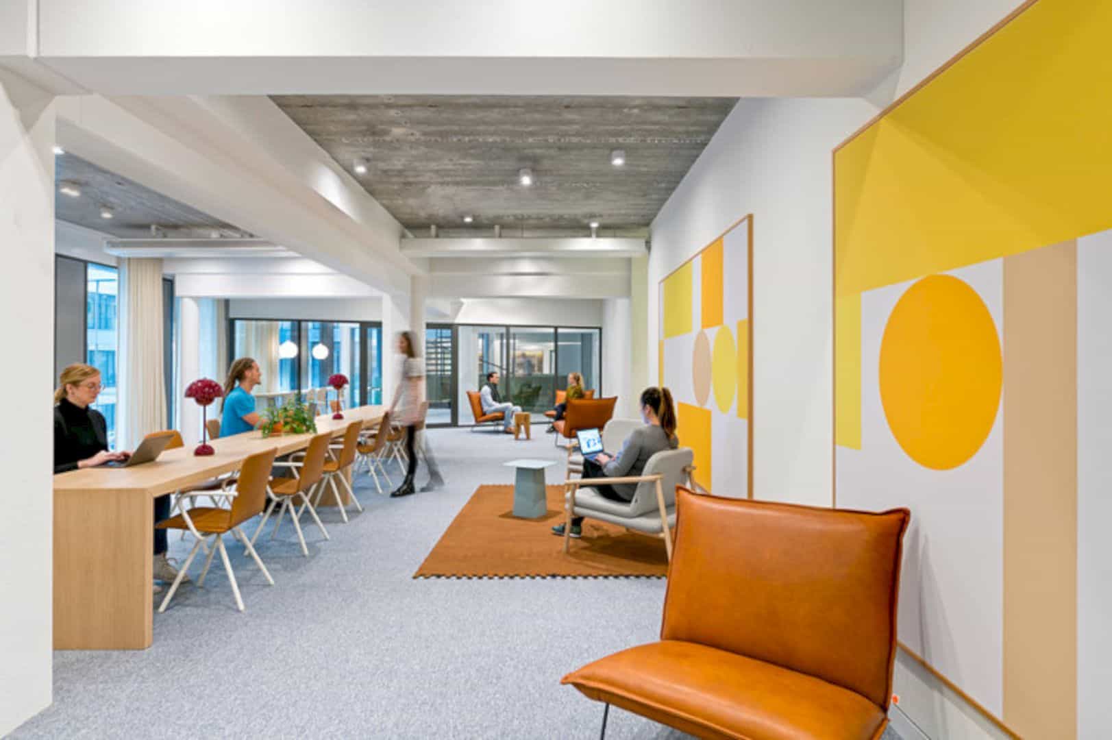
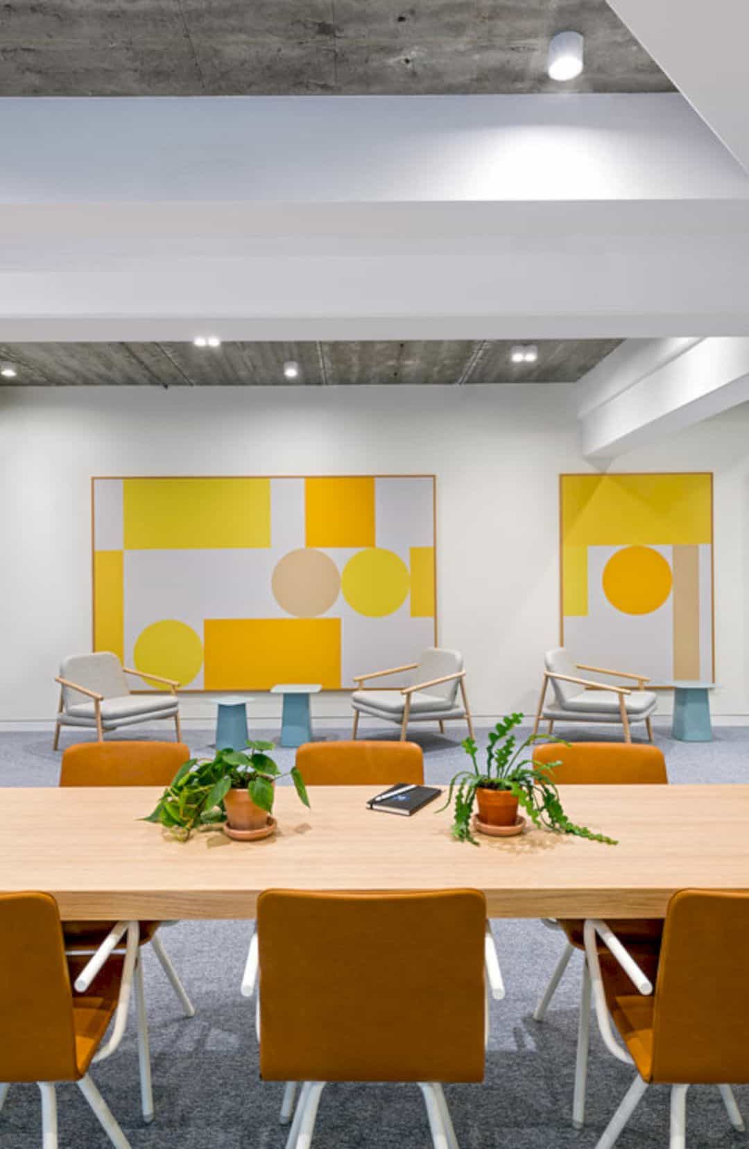
Built from the concept of activity-based working, the workspace contains no assigned seats. Instead, the inhabitants are situated within team-based neighborhoods. Each neighborhood is a small office that has multiple functions. There, the employees are allowed to personalize and come together in a comfortable environment. They can also meet within the open environment in a formal way.
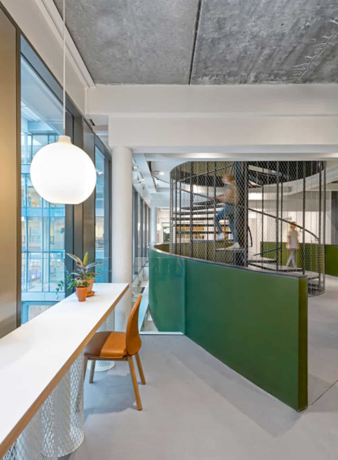
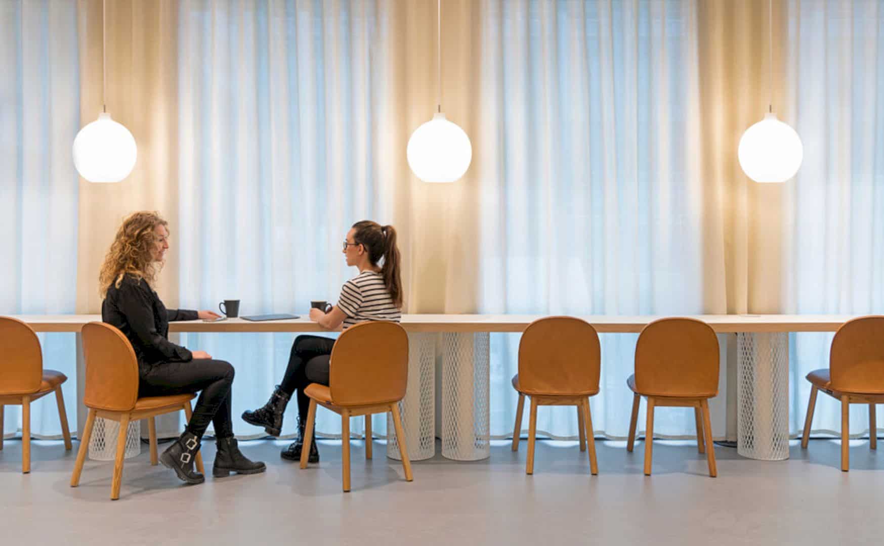
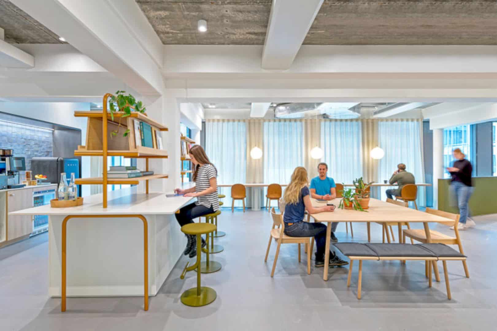
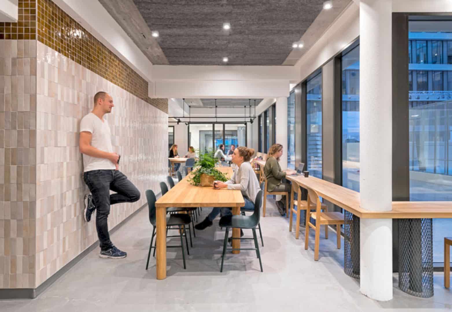
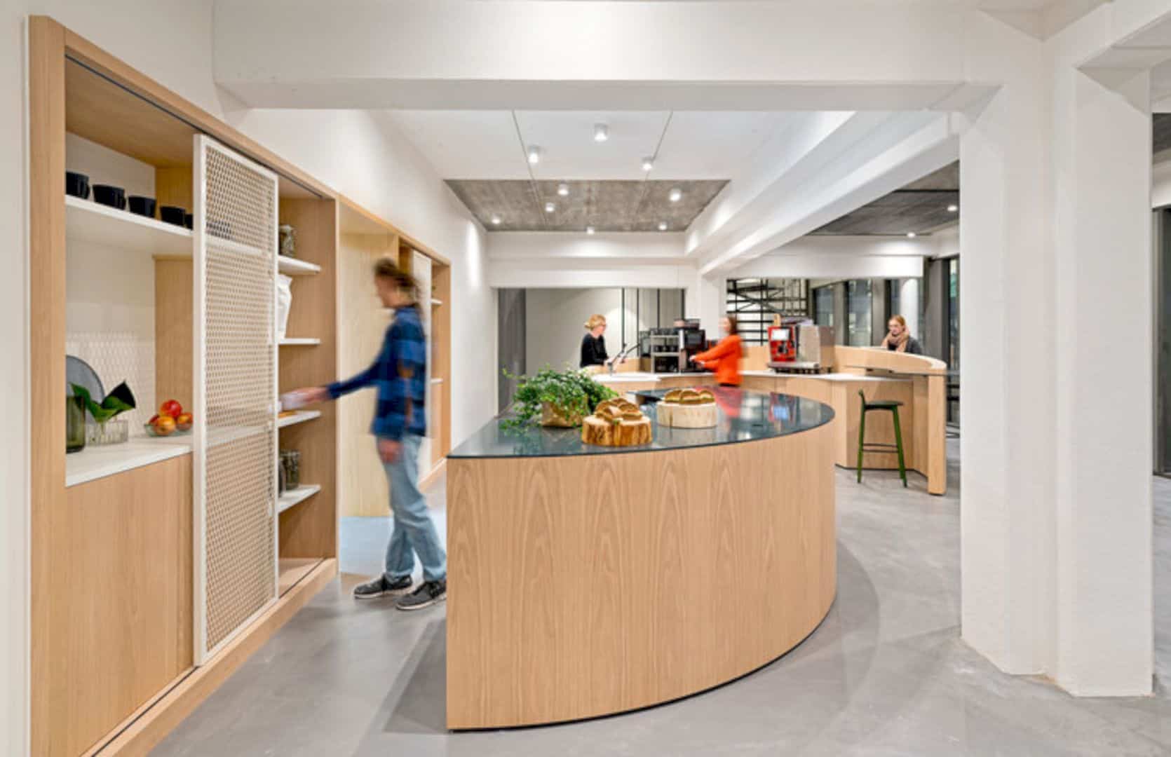
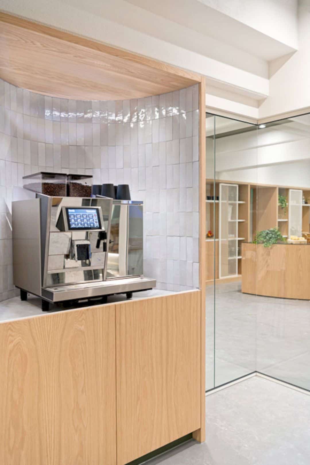
A complex network of places was woven across the space. The places, which are used for both working and meeting, showcase a collaboration style that represents casual lounge space linked to the hubs, from a restaurant to an espresso bar, overlooking the nearby canals. Not only that, the diversity of space also can be found in how the design team incorporated each person works and transitions. They created different experiences and other types of posture while working from standing on worktop tables to semi-private nooks.
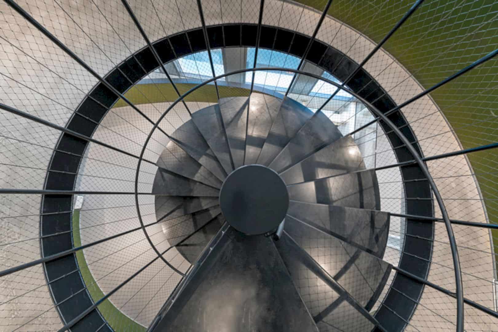
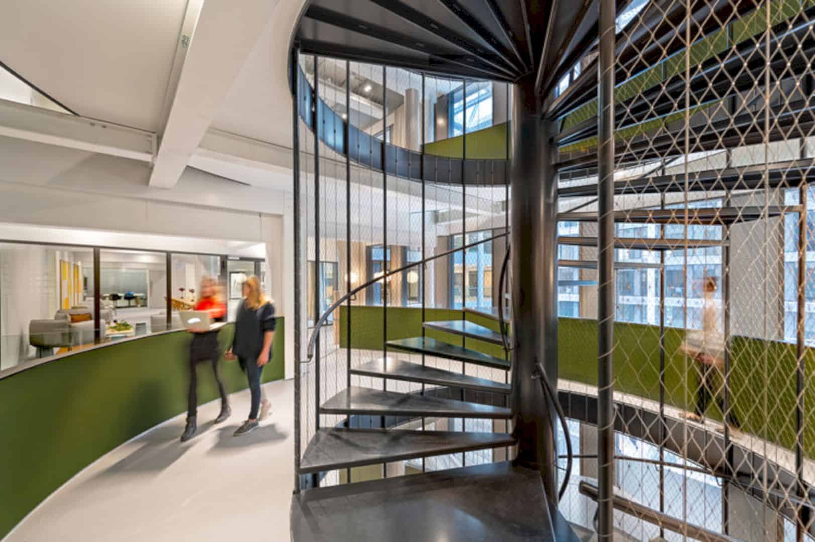
The atrium comes with a central staircase functioned as a connective spine between all four floors. The green and concentric rings in the staircase were inspired by Amsterdam’s canals, becoming a central gathering point at each landing. Clean lines, local products, and timeless materials become the main points of the Dutch design that connect the surrounding neighborhoods and regions altogether.
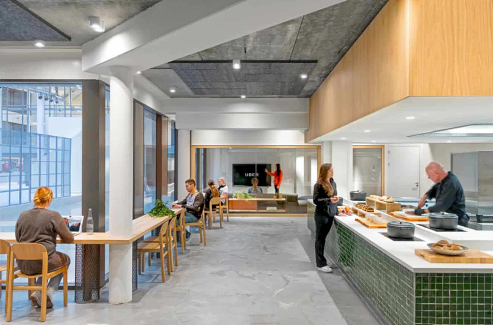
Meanwhile, Uber wanted to build a sense of community in its Amsterdam’s EMEA Headquarters. Thus, Assembly proposed the idea to arrange the existing restaurant on the ground floor to make it visible and the center of the space. The restaurant’s layout is open with different seating arrangements. The used materials resemble the cobblestones. Bricks line the portals and retail shops adorning the streets of Amsterdam.
Via Assembly Design
Discover more from Futurist Architecture
Subscribe to get the latest posts sent to your email.
