An elegant pavilion has been added to London’s Olympic Park called The Podium. It becomes a home of a roof terrace with awesome views, restaurants, event space, bar, and also box office. The building looks bold and beautiful, though it is designed in a simple form. Make Architects intents to build this awesome pavilion continuously.
Design
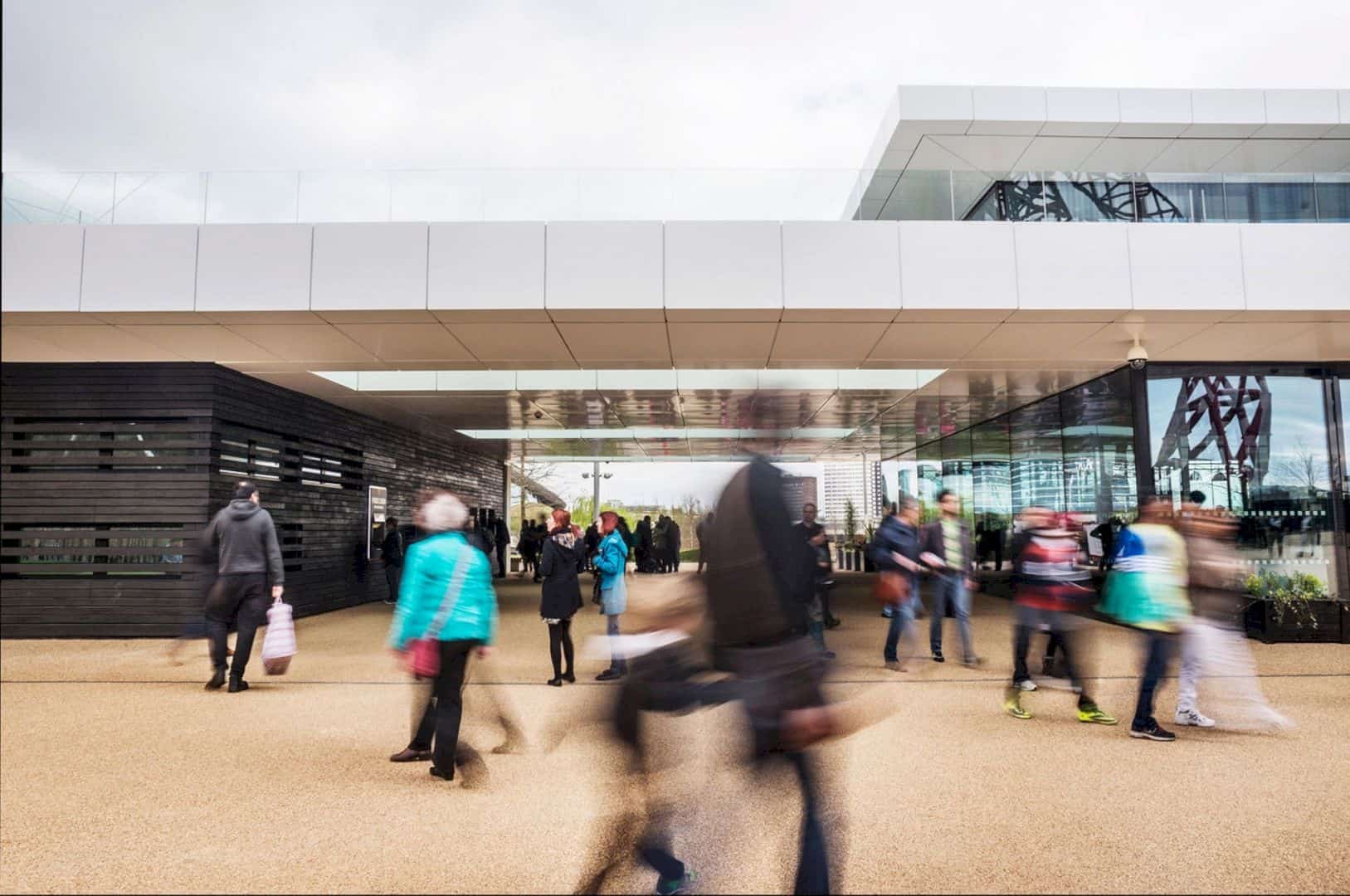
The design of this pavilion won a competition with its sophisticated and simple look. It is also clad in white and black with rectilinear form. The two blocks are connected to each other with the sleek white metal roof and the pedestrian route.
Pixel Wall
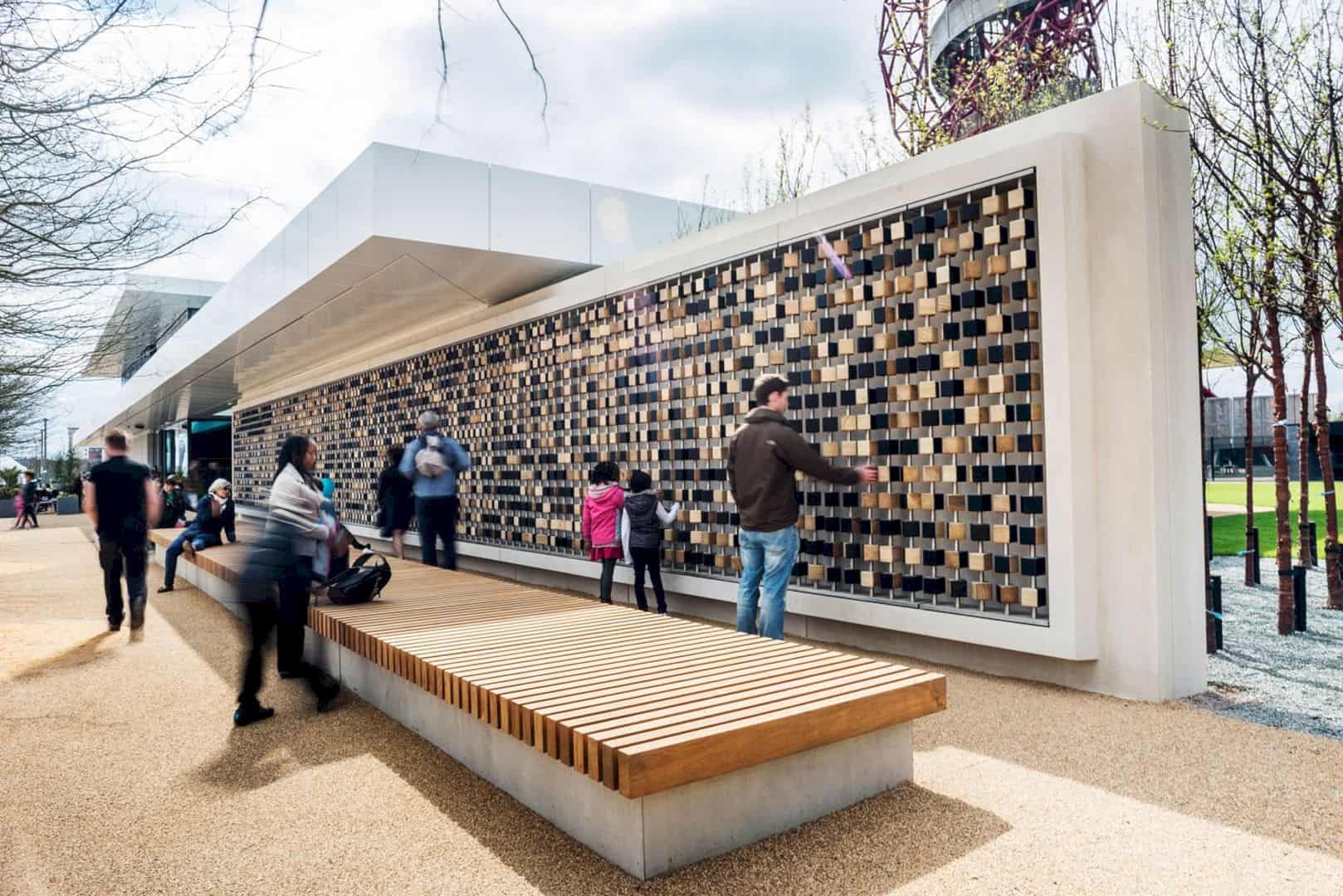
There is an interesting spot in The Podium called a Pixel Wall. This wall is made by London-based design collective Tomato. The whole building becomes very animated with this unique wall. The visitor can also know more about the wall design and texture.
Cubes
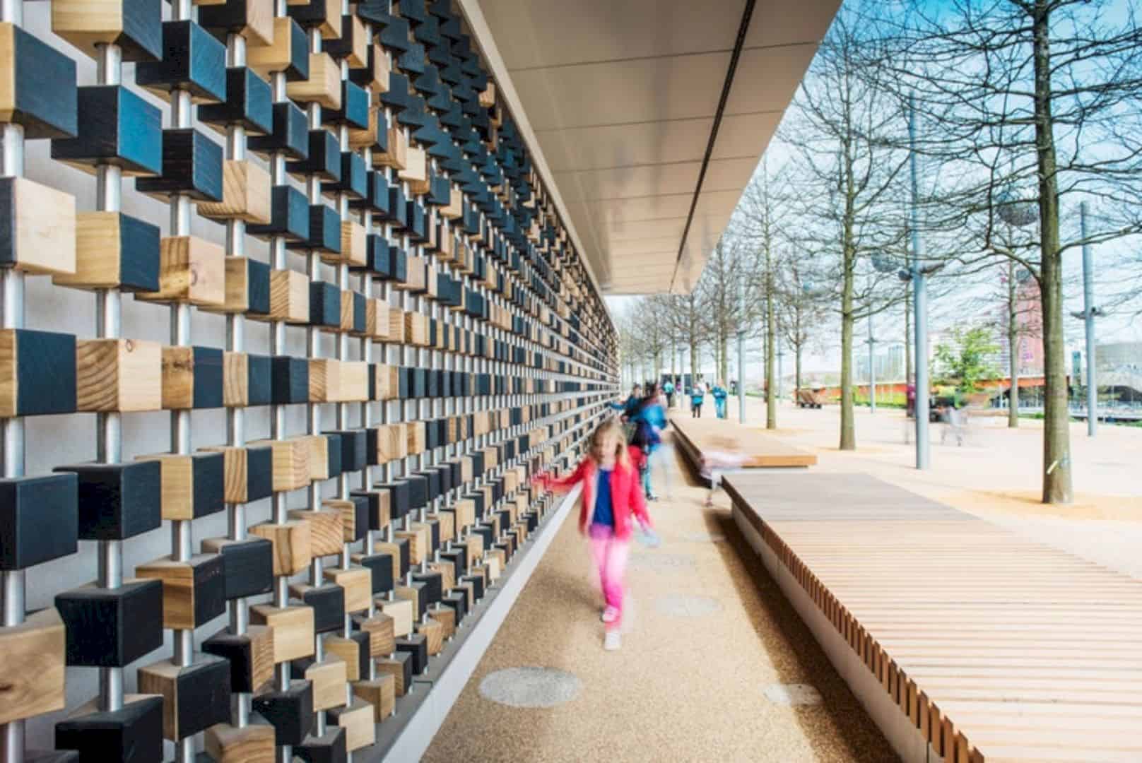
The sum of hand-crafted wooden cubes in this building is more than 2,000 cubes. The cubes are threaded on the steel rods and painted with dark colors.. It becomes a fun thing to be seen by the visitor, especially the children.
Board
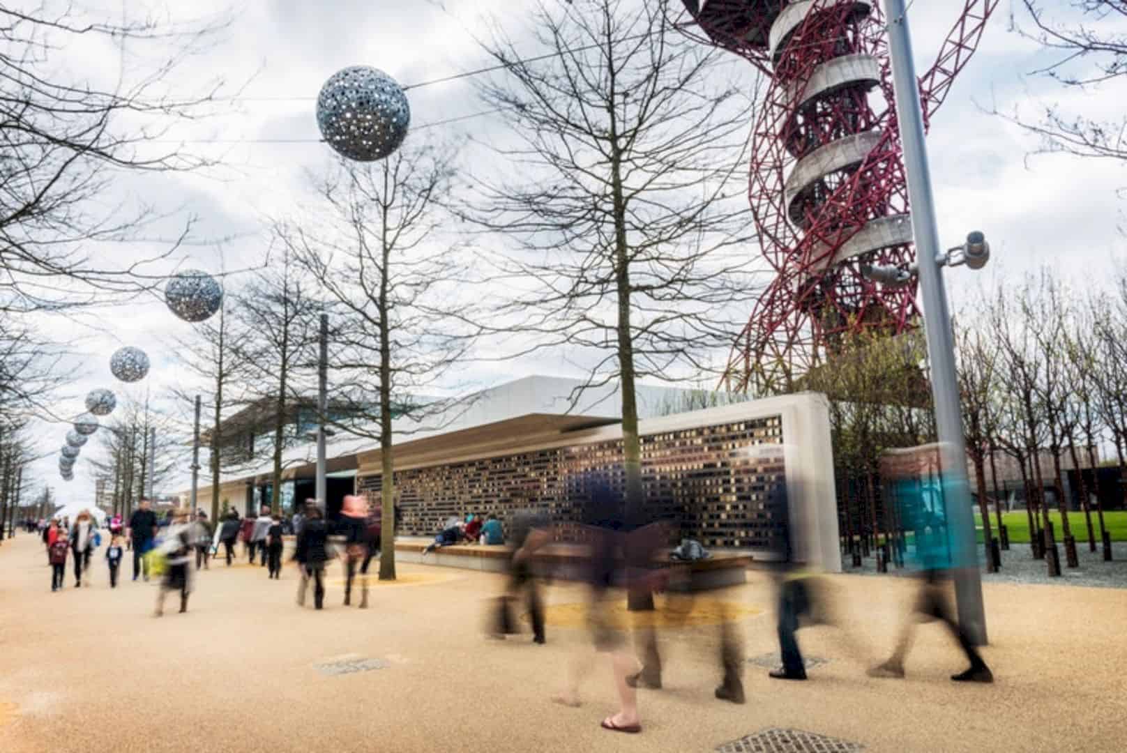
The pixel wall changes into a big message board because of the dark and light surfaces on it. The surfaces also can be rotated, allowing the visitors to make images, text, or patterns. A fun thing that exists in The Podium.
Goal
The goal of Make Architects to The Podium is about creating the best key destination for the visitors to the park in London. It becomes an awesome anchor for the site regeneration. This building has been completed with a great result.
Integration
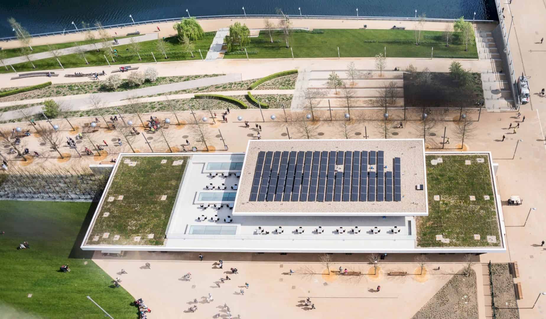
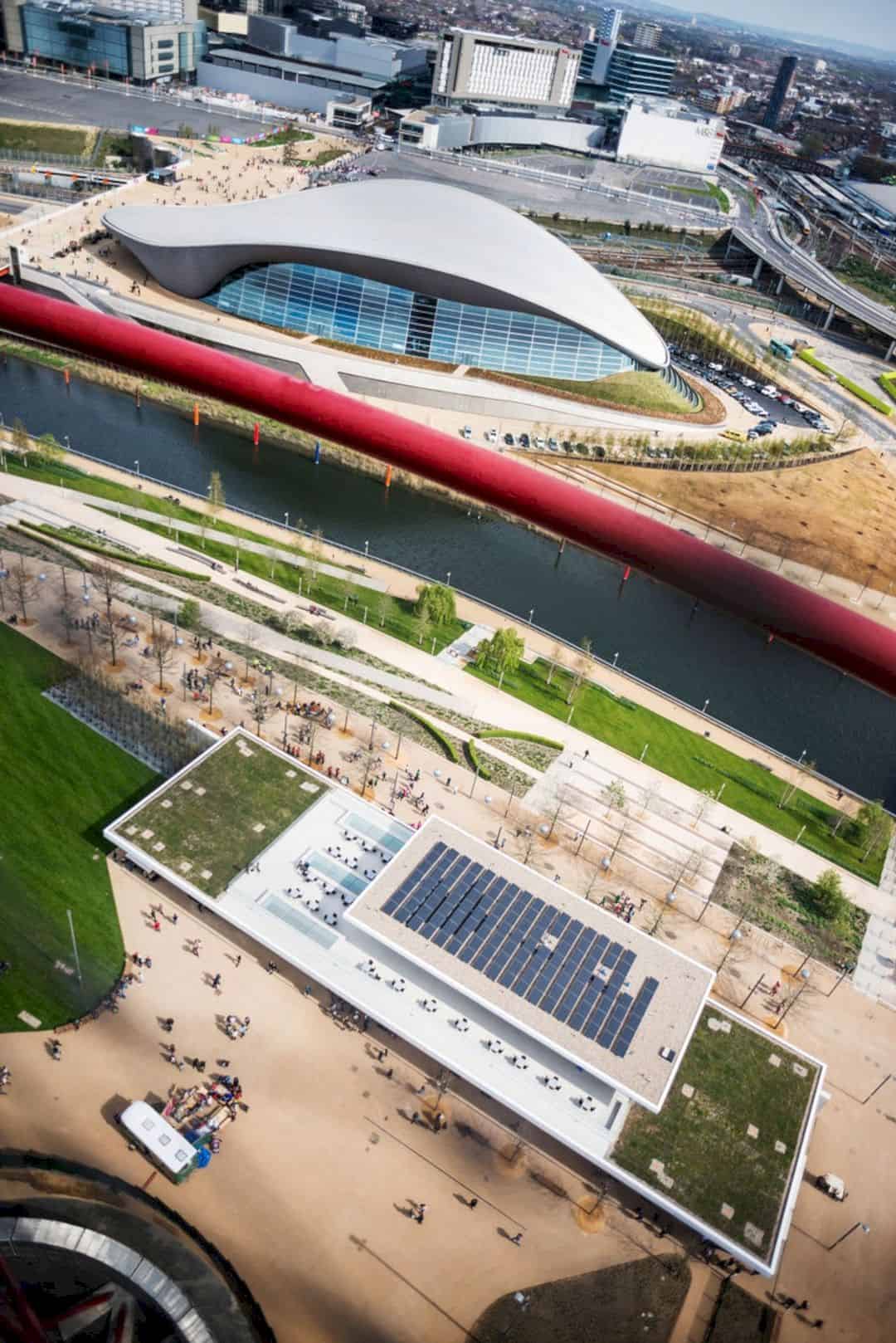
If you see The Podium from above, you can find the careful design on its building. It is stitched into the landscape site as a master plan for the park integration. The design itself is made in a consultation with the best urban designers, James Corner Field Operations.
Development
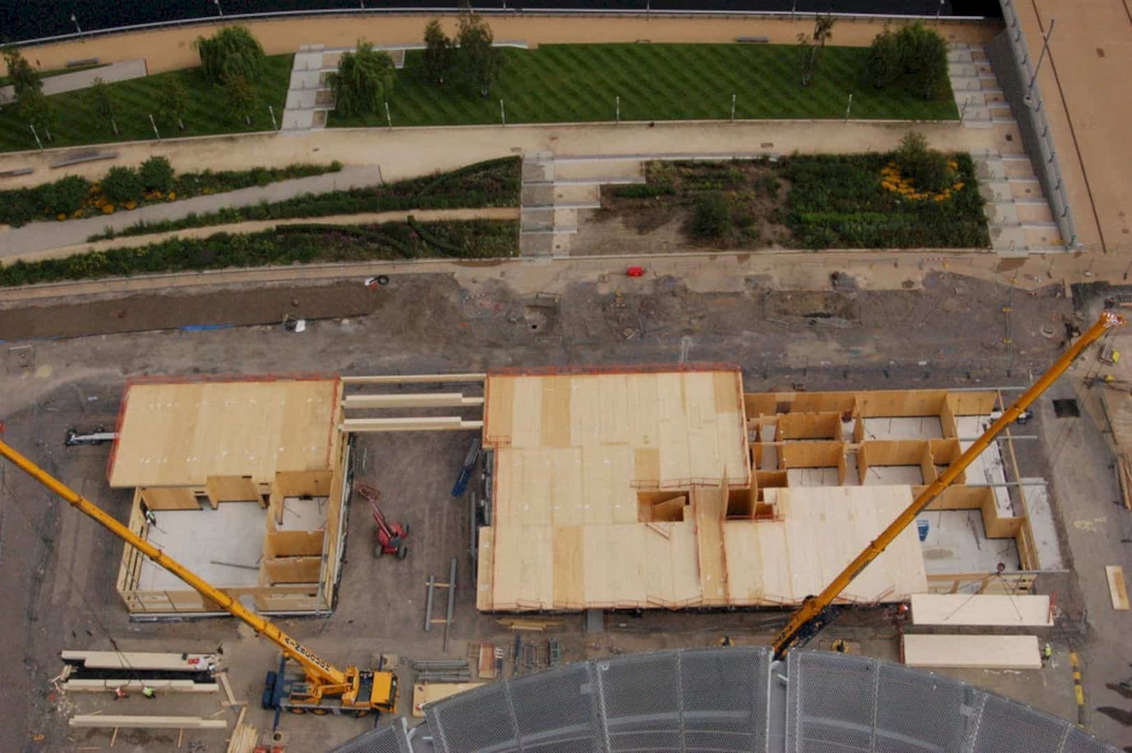
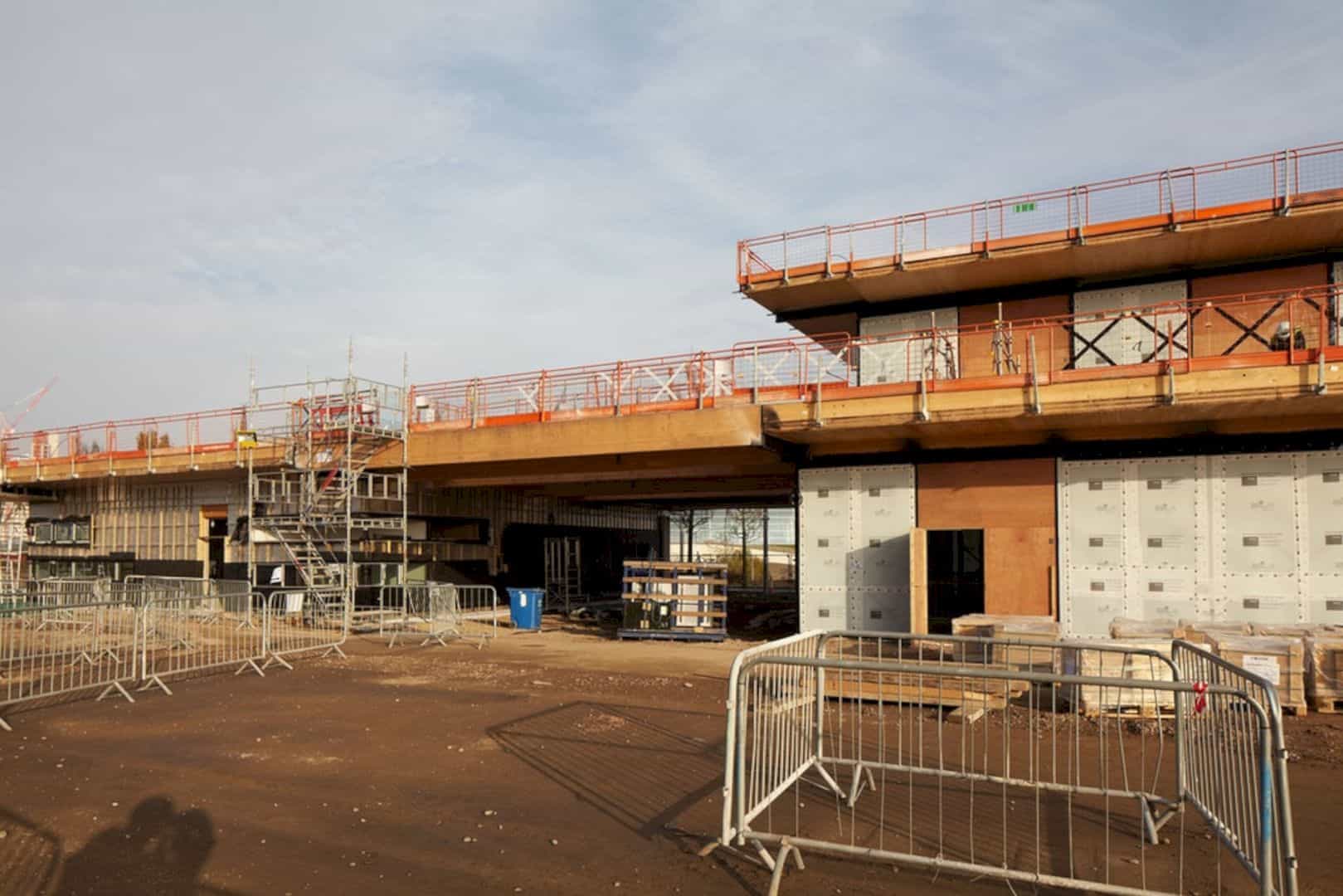
The location of The Podium is in London UK for London Legacy Corporation as a client. The size of the site area is about 1,200 meter square of 12,900 square feet. The 2.4 m of overhang shows the horizontal line of the building. The texture comes from an environmentally and traditional Japanese charring method.
Details

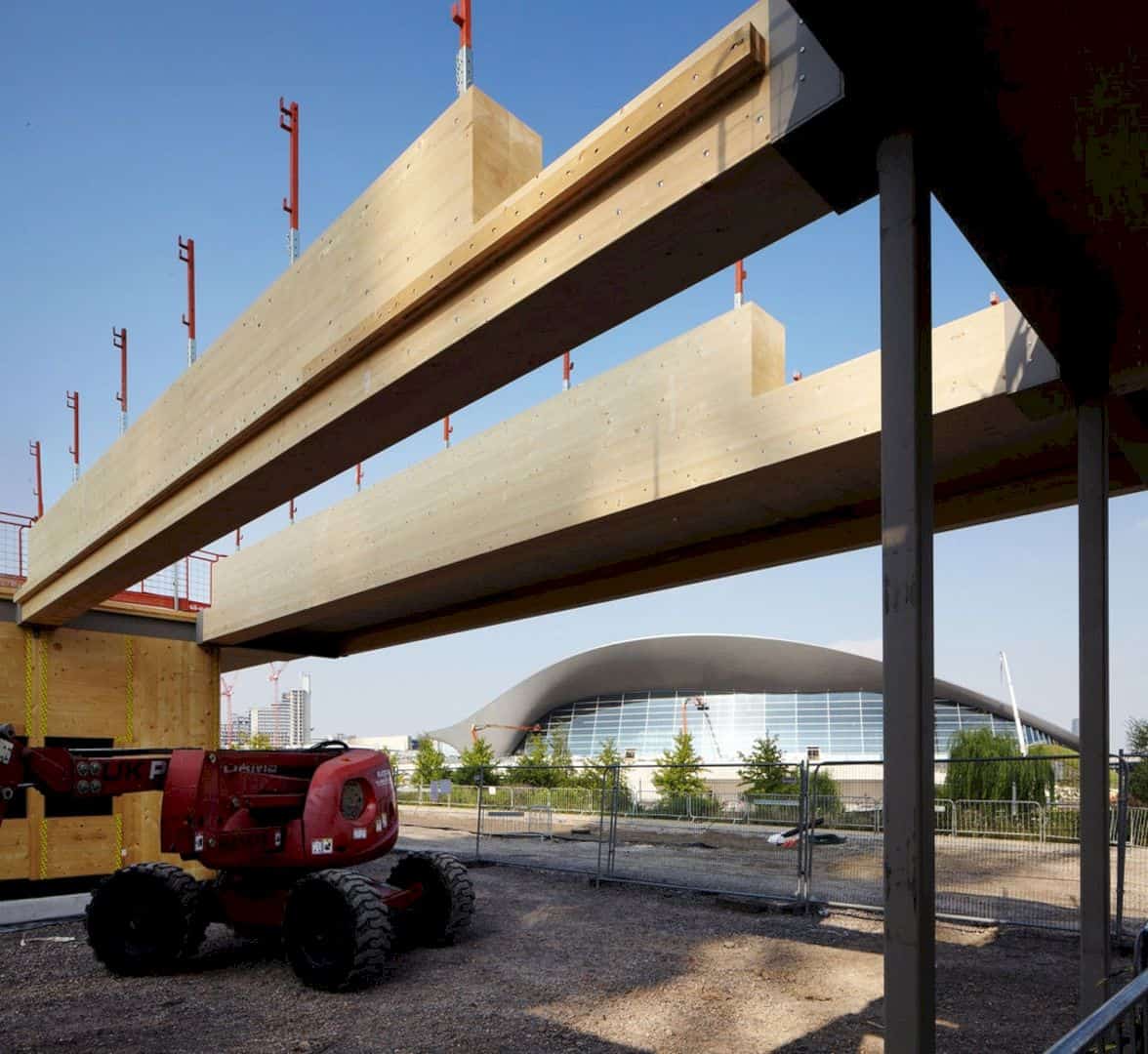
The roof panels, wall, and the floor are made in large sections. It means the building weight is lower and it will lessen the embodied of the carbon and create a cost-effective delivery. The roof is designed with solar panels and covered in greenery and soil.
Via makearchitects
Discover more from Futurist Architecture
Subscribe to get the latest posts sent to your email.
