Anne Carrier was in charge of developing Desjardins Group headquarters located in the city of Levis, Quebec, Canada. The firm used an architectural approach that reflects the cohabitation of the company’s historical value and modernism. Anne Carrier ensured that the layout and the size for this financial firm were adapted to the variable topography of the site and the existing vegetation while affirming the building’s presence at the crossroads of two important axes.
Desjardins Group Headquarters
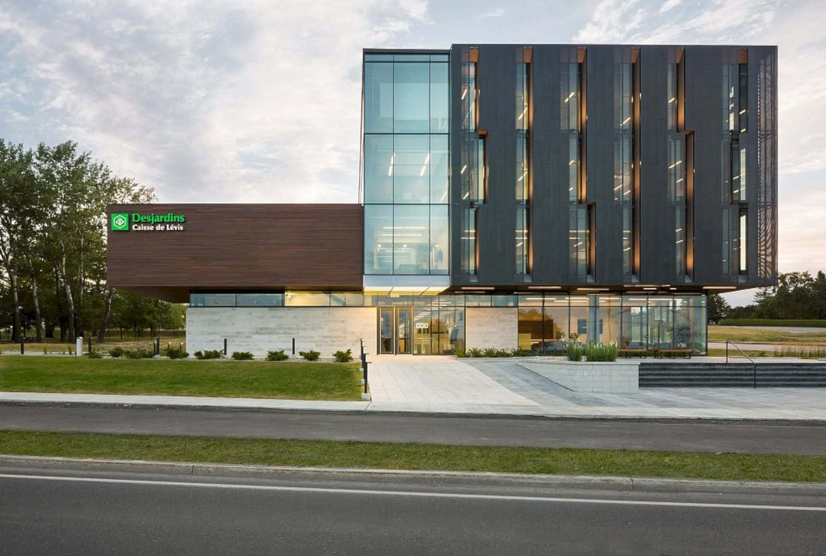
The firm went with the idea to integrate the singular architectural language in continuity with the urban and natural interfaces of the area. Such architectural solution allows the transformation of the image of the entrance to the city of Levis and Desjardins Group on an urban scale as well as a human scale.
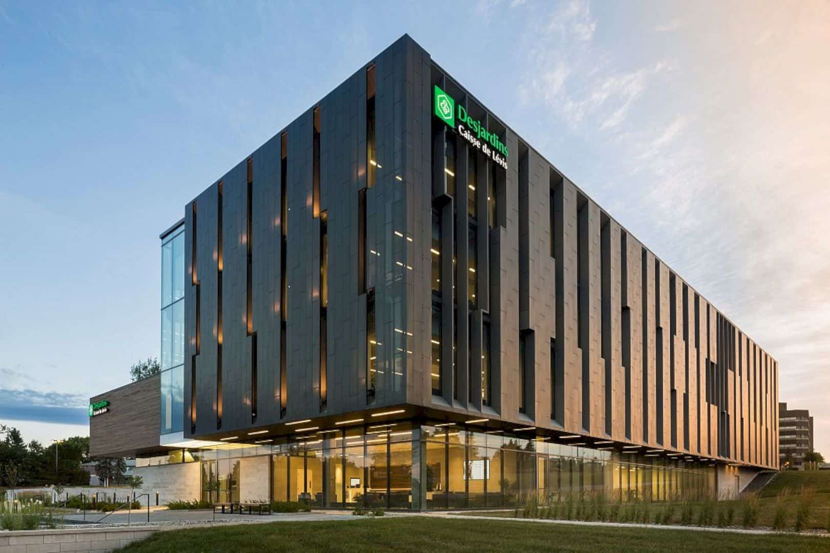
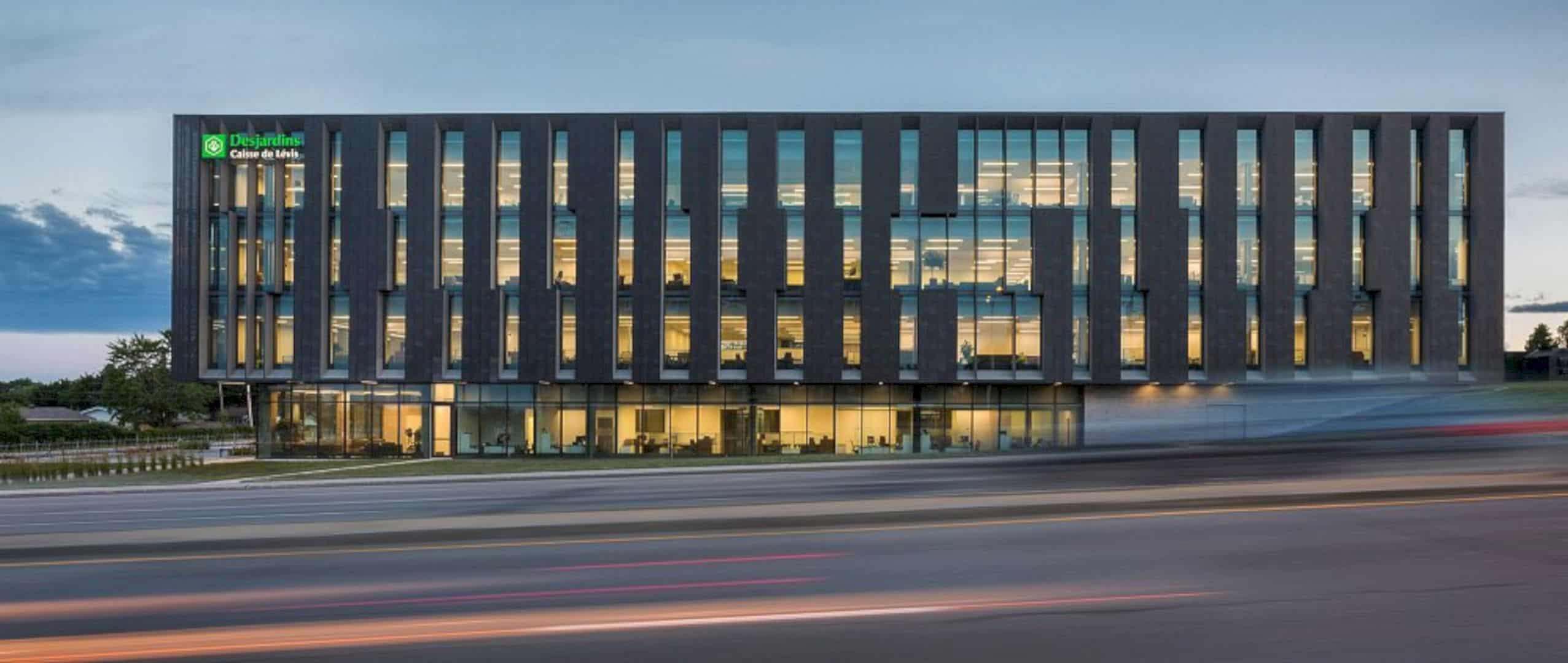
In the east-west axis, an urban zinc façade unfolds while moving in a fast rhythm like the regional scale and the building’s users. Furthermore, the main façade of Alphonse-Desjardins brings you back to the human scale of the city, offering access to Old Levis.
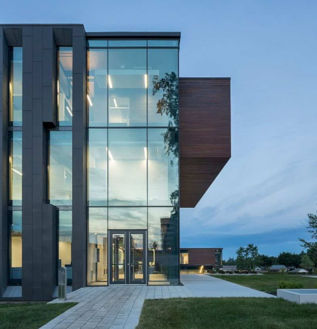
The project itself was distinguished by an architectural composition and innovative spatial organization especially when applied in the financial sector.
Two Circulations
Two circulations comprised interior and exterior, defining experiential and functional itineraries that allow discovering, controlling, and orienting the varying spaces and functions of the headquarters. The firm also opted for articulating the spatial organization to allow abundant of natural light to reach the heart of the building.
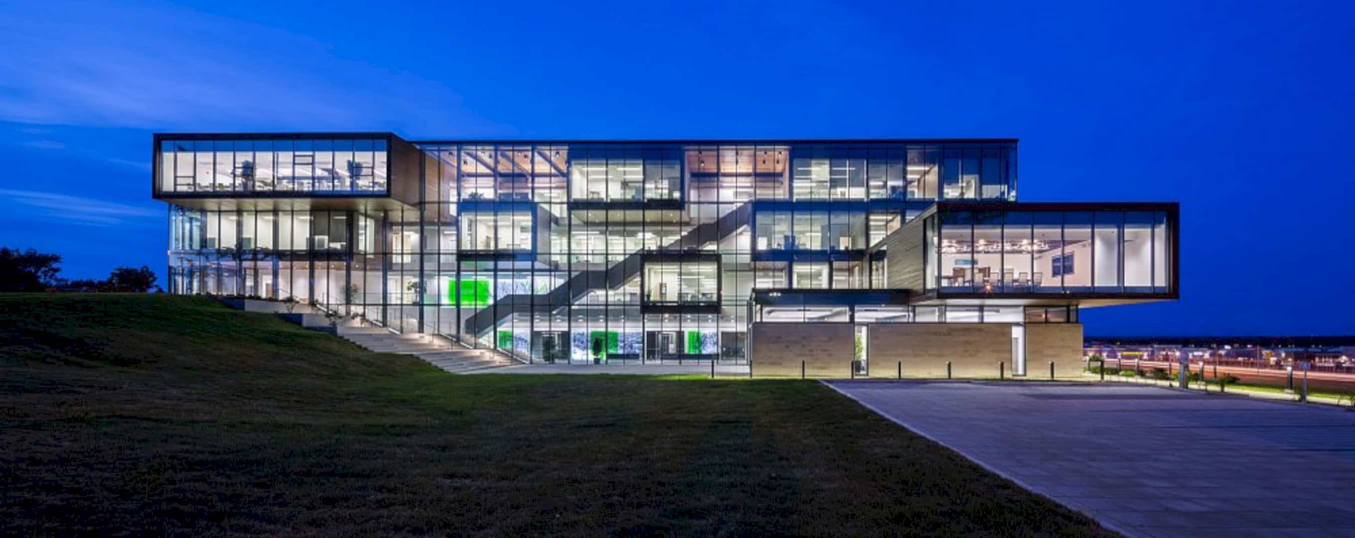
New strategies of office layout and organization of functions were proposed to make it possible to articulate the RDC in multifunctional areas, covering a large foyer deployed towards the suspended park above.
Sustainable Development Strategies
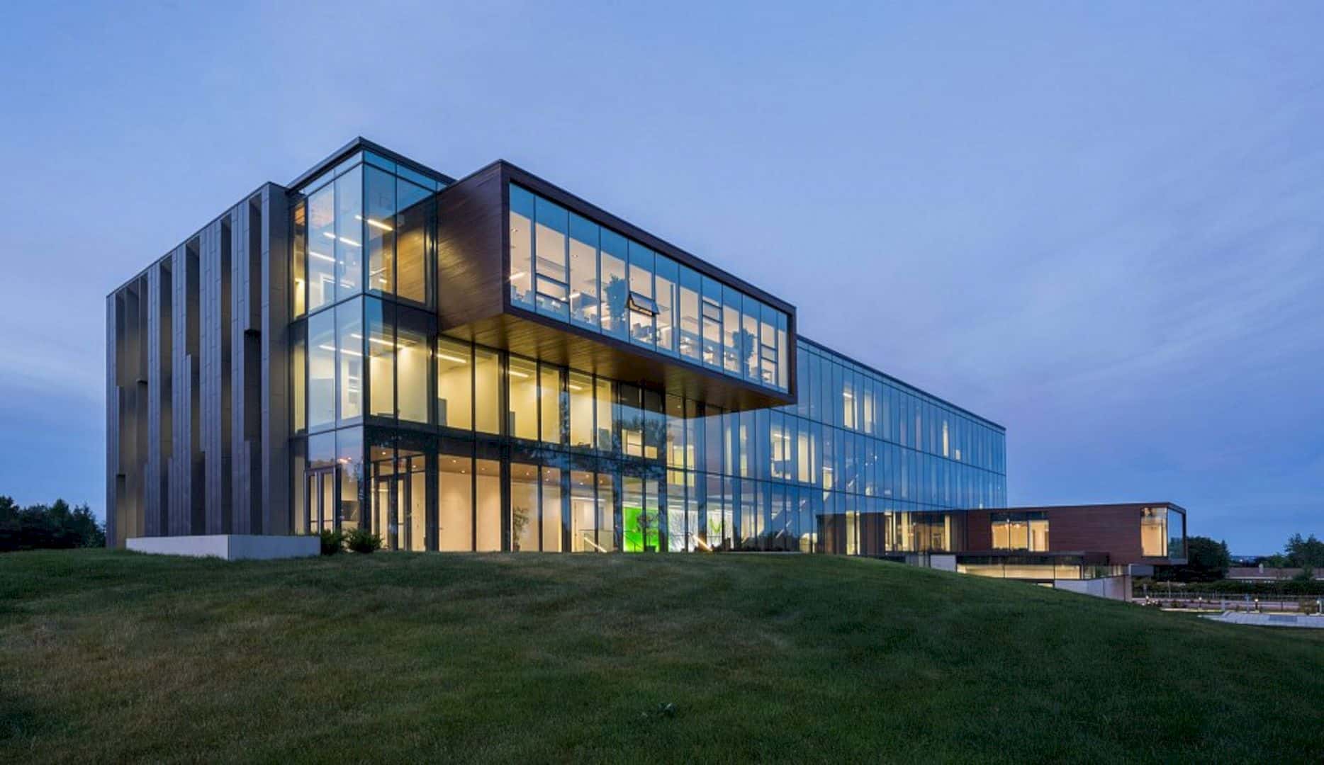
To achieve LEED silver certification, the sustainable development strategies were launched. Also, the quality of architectural concept and technical details are contributed to the sustainability of this living and work environment.
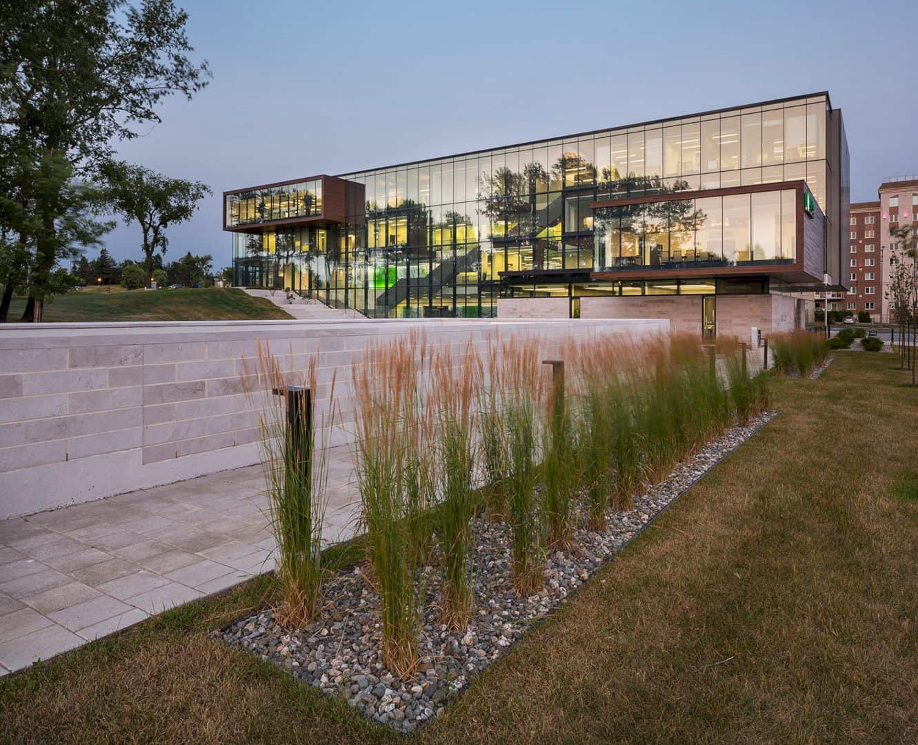
For instance, the use of geothermal and cold beams, the preservation of trees, and the selection of local materials chosen for the architectural design. But, above all, the architecture firm prioritized the comfort and well-being of the users which is why they had the users in mind when designing and choosing the layout.
Open-Plan Workspaces
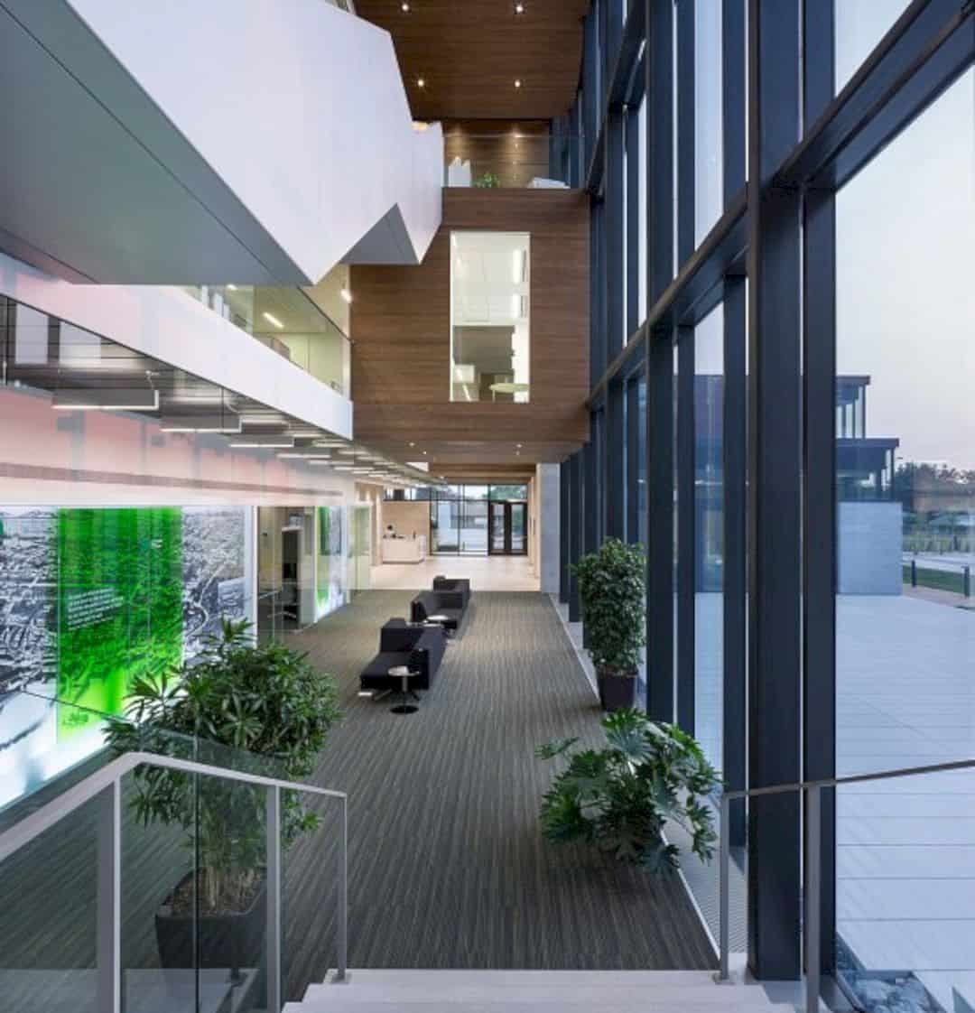
Open-plan workspaces are quite a new concept in the financial sector. However, this layout was chosen for Desjardins so that employees and customers are able to share common spaces and other accessible spaces. The spaces in the main traffic are differed and intended for collaborative work.
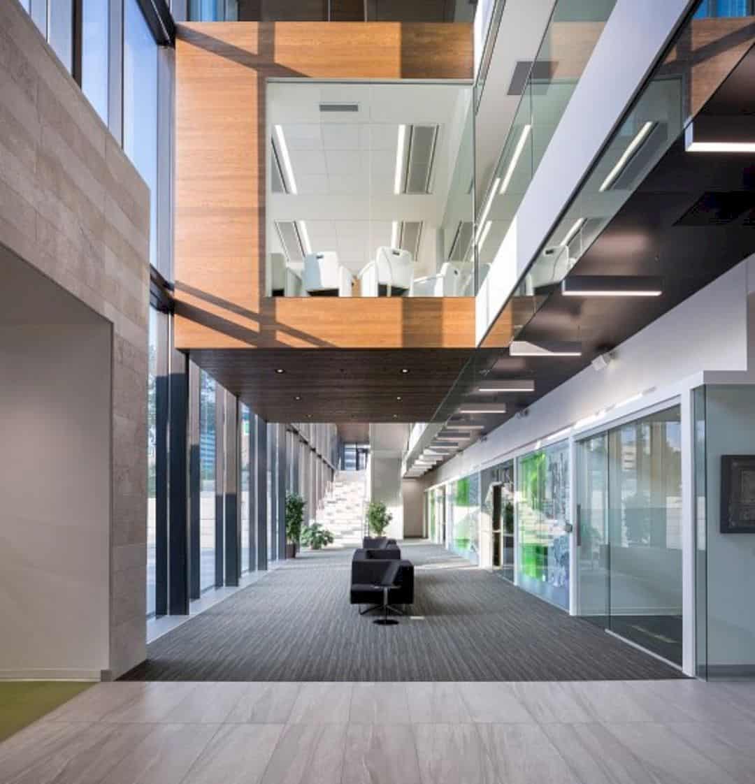
Upon entering the entrance, the customers will be led to the big foyer where it is considered as a gathering and contemplation space. The space is largely open to the park and outdoor square. Oftentimes, the director in charge uses this convergence and multifunctional collective space to reach out to all the employees.
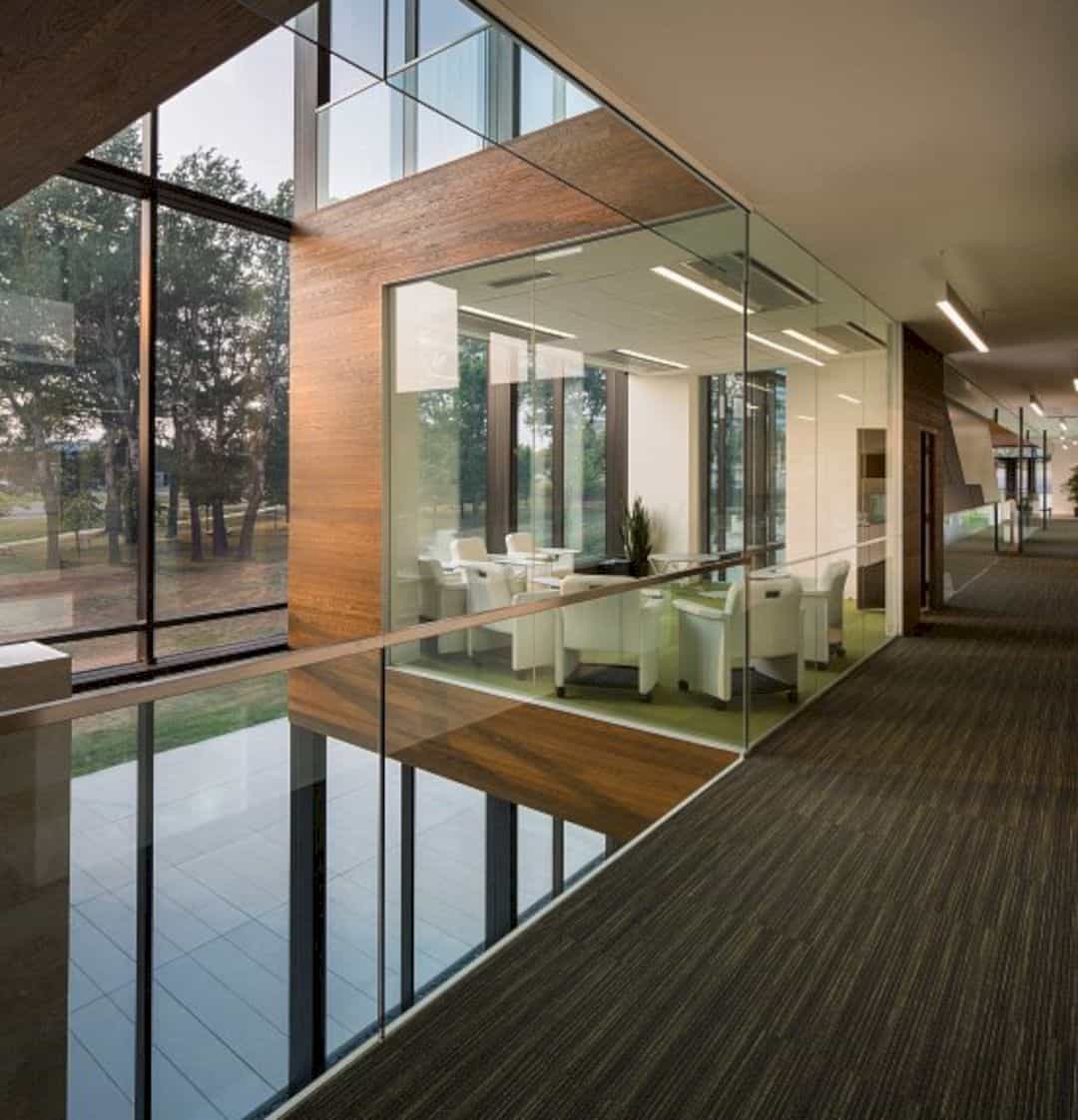
There are also cube-like spaces made of wood materials which are used for different purposes. Several cubes are used for lounge areas where the employees and staff alike can sit around.
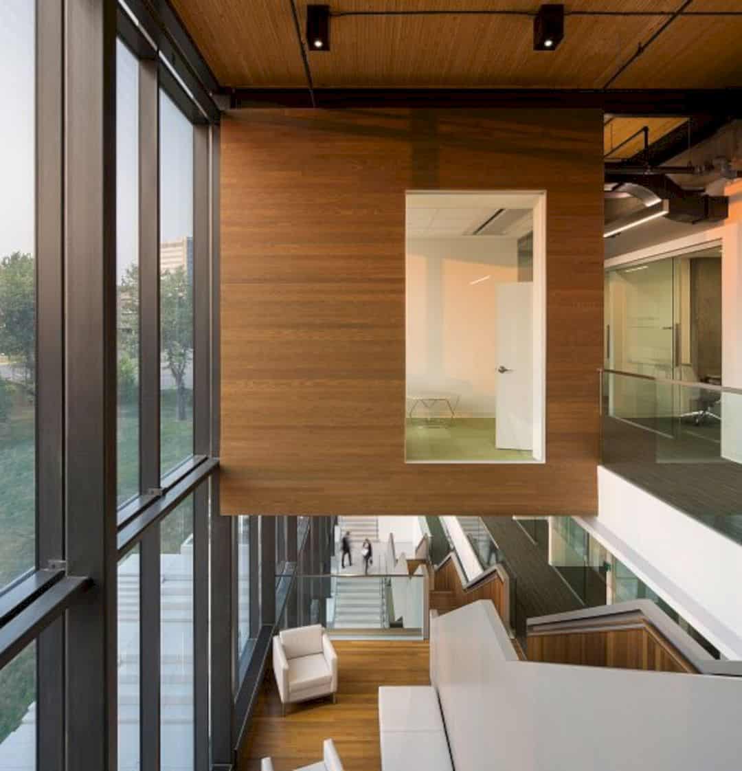
The rest of the cube spaces are set for conducting interviews.
Via Anne Carrier
Discover more from Futurist Architecture
Subscribe to get the latest posts sent to your email.
