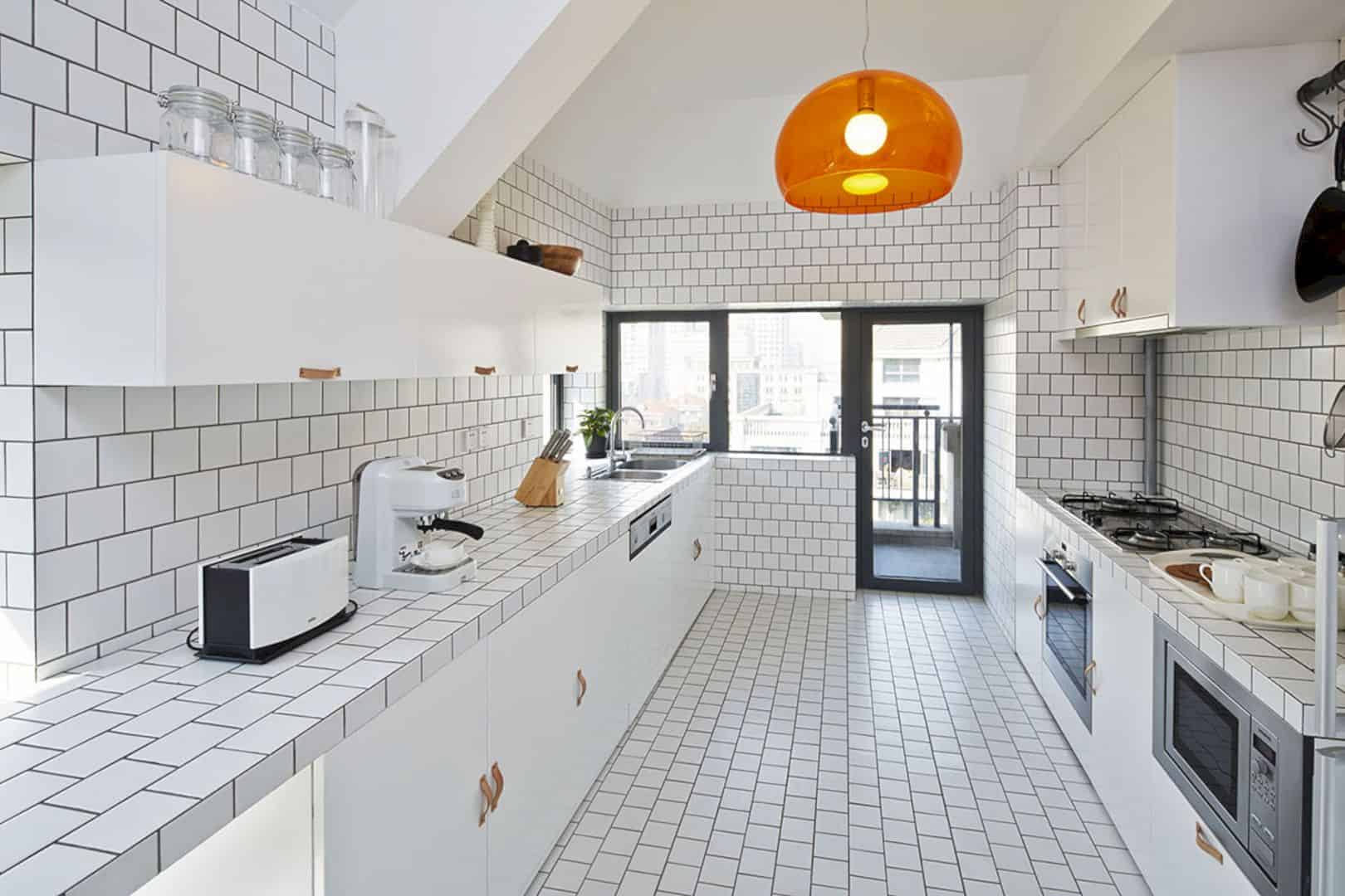
The addition and also renovation on Roxborough Residence is about creating a good living place with modern design in a traditional neighborhood. The design study is not only about contrasts but also about form, style, color palette, dark, and light. Roxborough Residence previously was designed with a bad renovation but today, the building is very interesting to see in Toronto.
Design
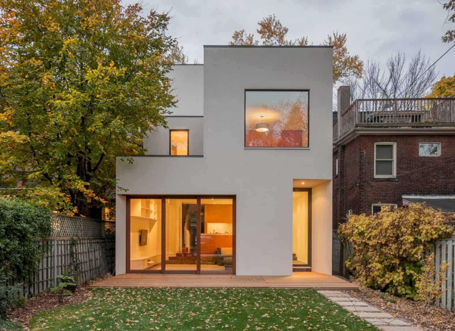
When you see the front elevation, you will find interesting airy family-oriented spaces. The living room can be seen through the clear glass wall with its warm interior. The front rooms were dark but now these rooms are fresh and painted with a white facade.
Stair
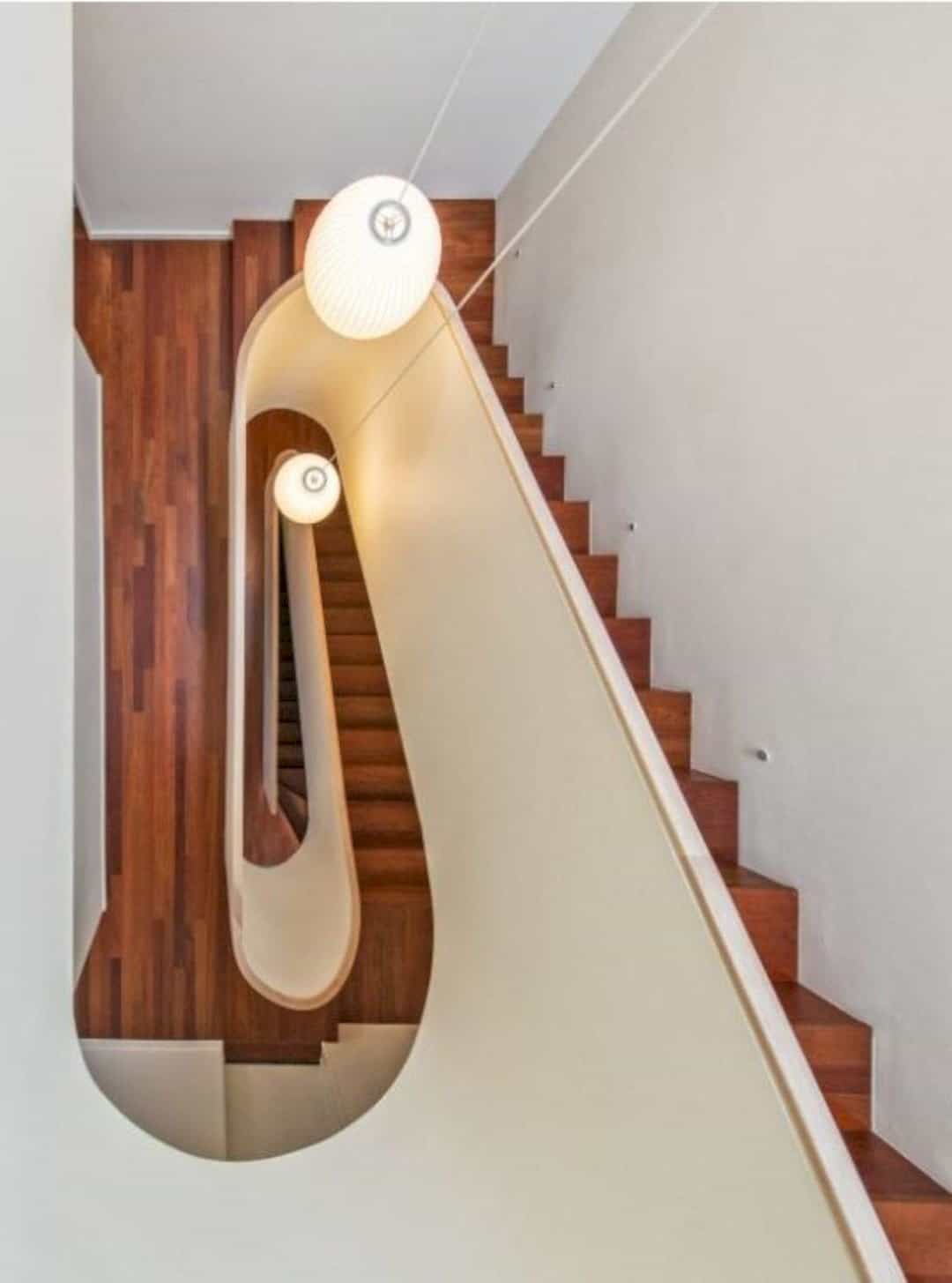
The main star is used to create a new arrangement for the room enlargement. It provides not only light to the center of the room but also serve as a Janus-faced hinge. This stair also operates for the large skylight extension above.
Lighting
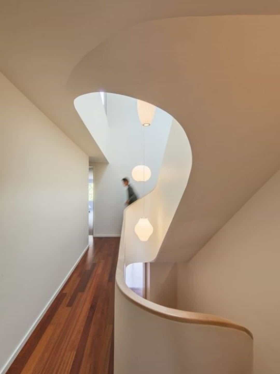
At the third floor, you can see the funneling light. It makes the room becomes a ‘vertical room’ inside the Roxborough Residence. The rooms on this floor do not only allow the air and light to come through the skylights but also creating visual connections.
Space
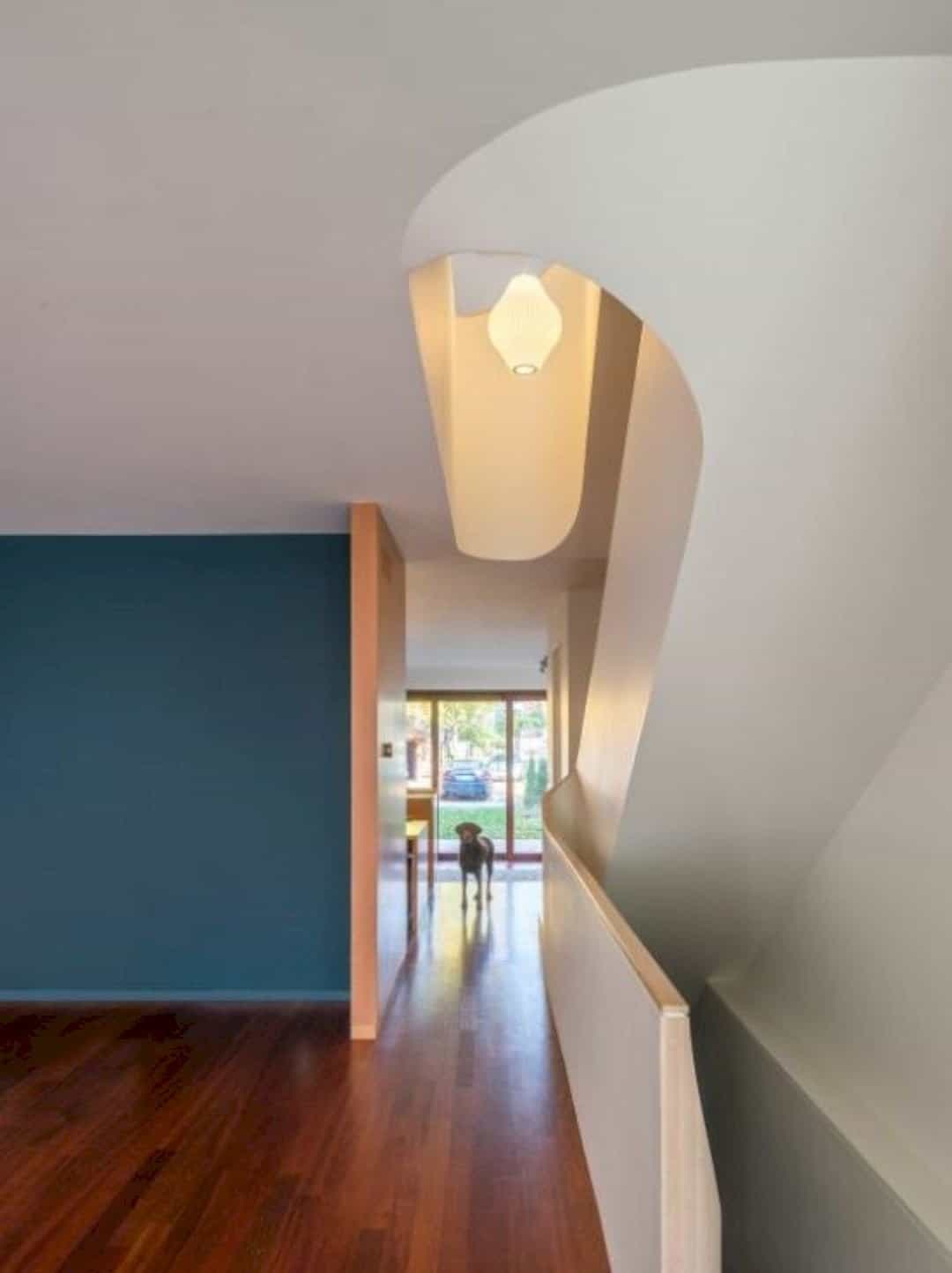
The architect uses cantilevered sheets of flexible plywood for the 5 cm balustrade of the stair’s thin. The plywood is laminated and sheathed with the drywall. The curves create a complex geometry with the flat ceiling plates and the sloped.
Backyard

The backyard of Roxborough Residence is extended to create a family room and also a large eat-in kitchen. Both of the rooms can be operated with glazed exterior wall and a master suite above it. With the enlarged building footprint, this backyard seems larger than before.
Interior
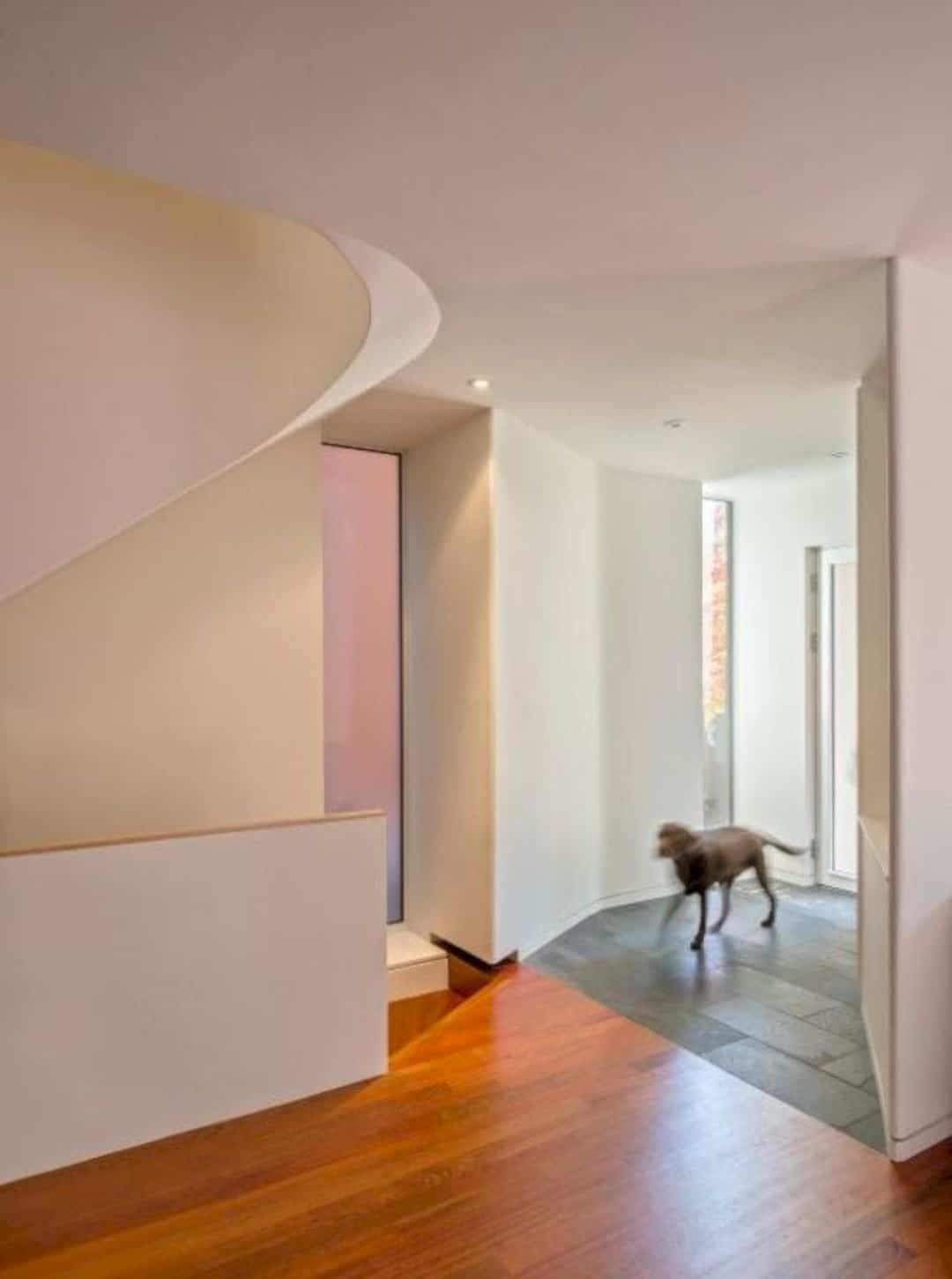
The palette of the building interior is simple with the Jatoba floor. The rich colors contrast with the light woods and the white walls. The bathroom and kitchen millwork use Douglas Fir and Birchwood for the interior. You can see the same palette on the new elevation, at the house back area.
Discover more from Futurist Architecture
Subscribe to get the latest posts sent to your email.
