Invisible Studio was responsible to revamp an originally pretty farmhouse called Starfall Farm. Situated on St. Catherine’s valley, Bath, the UK, the farmhouse is owned by Xa Sturgis and Anna Benn as the clients. The architecture firm was involved in constructing the additions and alterations for the farmhouse.
Starfall Farm
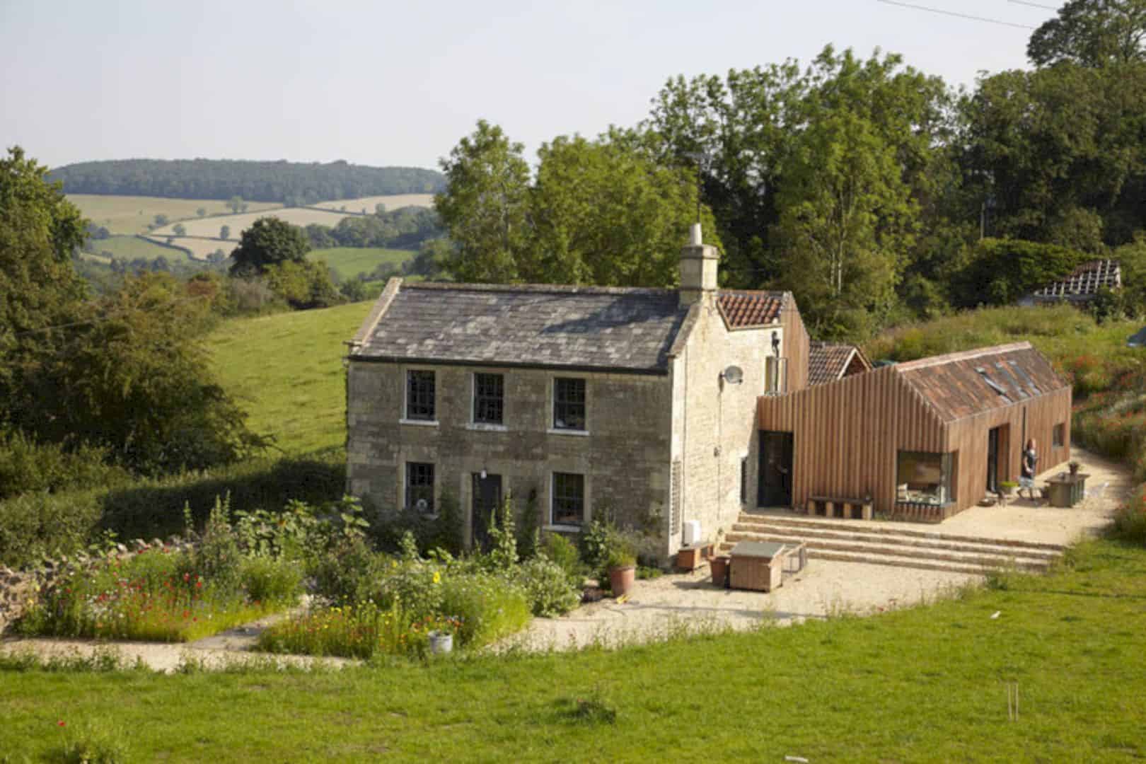
The materials from the demolished barns were used to build the extension. The cladding was design to cover the proportions of the existing extension while pulling apart on the new bit to welcome key views into the landscape. The extension is very modest and vernacular yet it attracts attention.
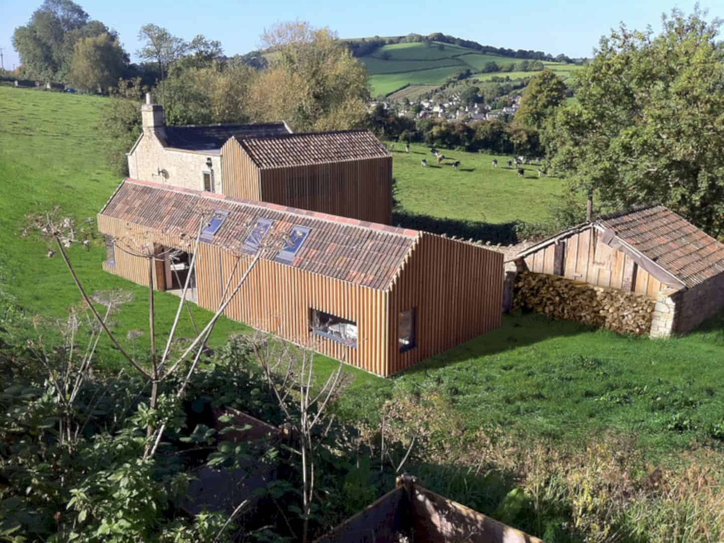
Starfall Farm has an especially simple asymmetric section which allows natural light to penetrate inside the house. This project was conducted as a way to reconcile all the thermal deficiencies of Moonshine, thereby the farm is thermally massive with incredible efficiency.
Timber Cladding
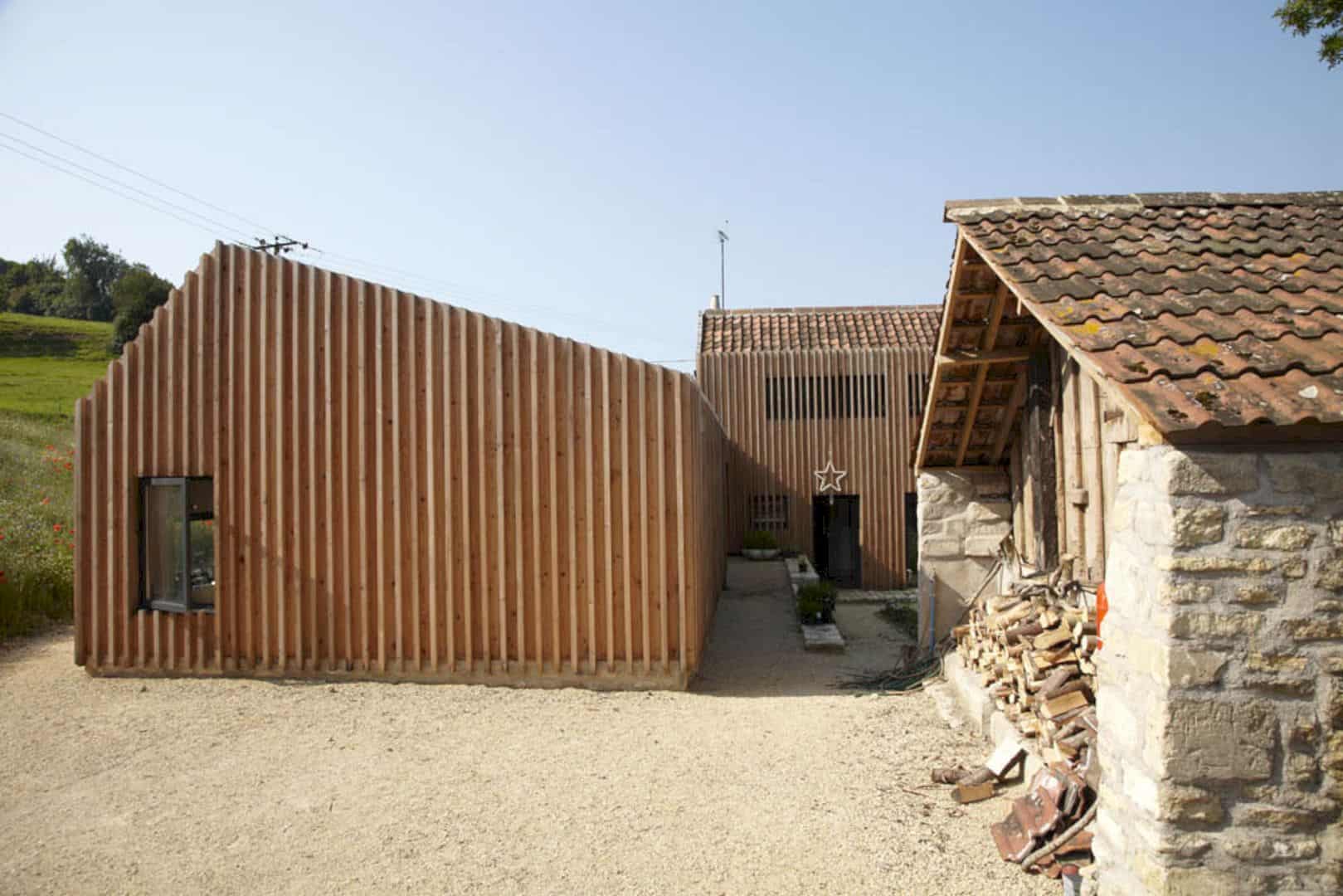
The timber cladding was the key detail in the Starfall Farm. It was designed to conceal the awkwardness of the opening proportions that appeared ugly in the rear extension. The clients wanted to maintain it despite the ugliness due to the limited budget after demolition and rebuilding the equivalent volume after. Meanwhile, the project can be considered as the most conservative planning committee in Bath, UK.
Conceal the Existing Openings
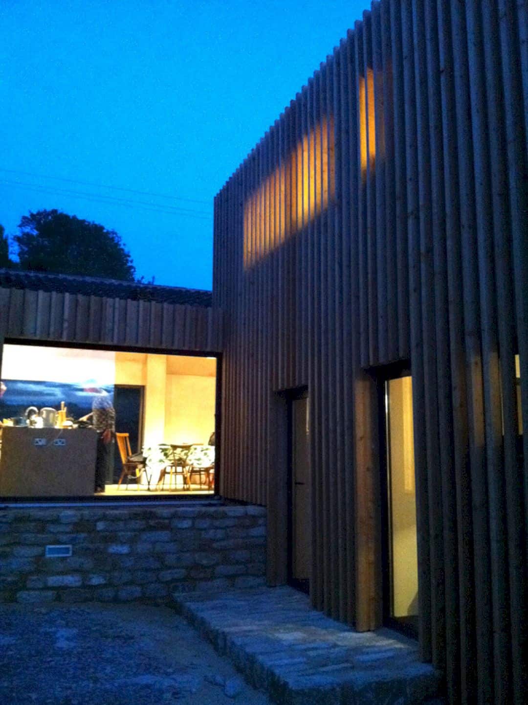
The external cladding was established to conceal the proportions of the existing openings or a board that could run passed the existing opening. It will also allow the privacy when needed and offer integration to the new extension.
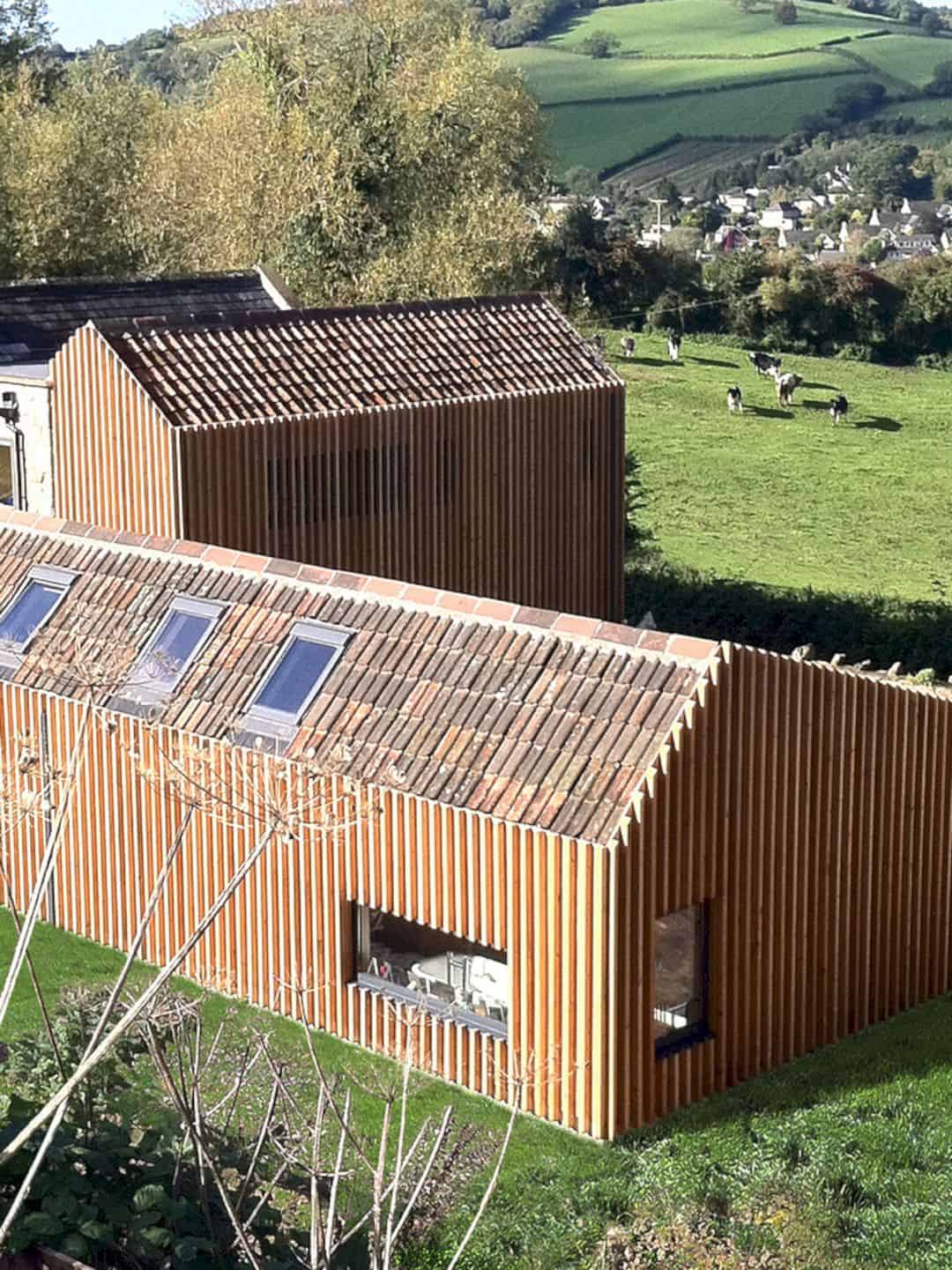
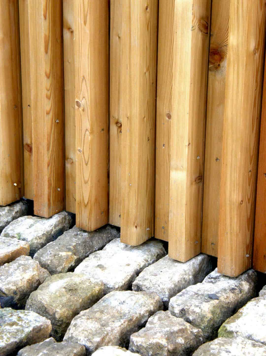
The whole extension was lifted 5 steps above so that the views from the garden wall to the valley and public lane can be seen. Almost all finishes are self-work, such as reused clay tiles from existing buildings on the site, larch with no capping, bare plaster, shuttering ply joinery, exposed concrete, and many more.
Mask and Conceal the Ugliness
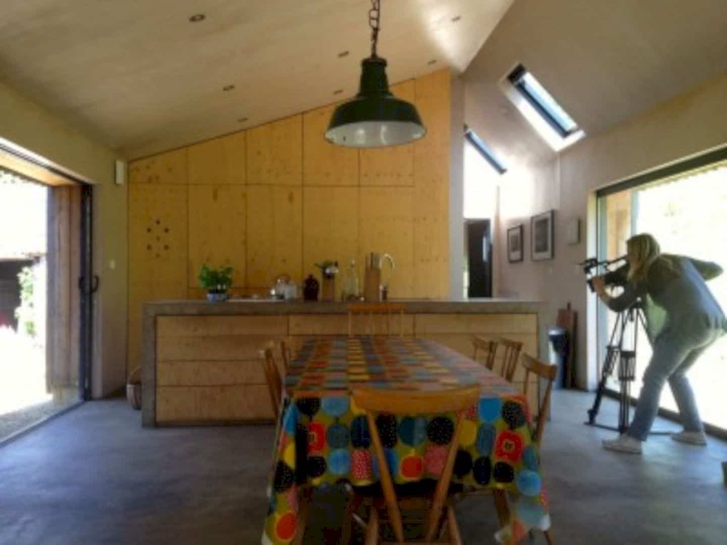
The cladding in the farm was able to create a material language that allows to mask and conceal the ugliness of the existing building while at the same time wrapping around the new extension seamlessly. It intends to optimize the building performance and economical in how and where openings are organized.
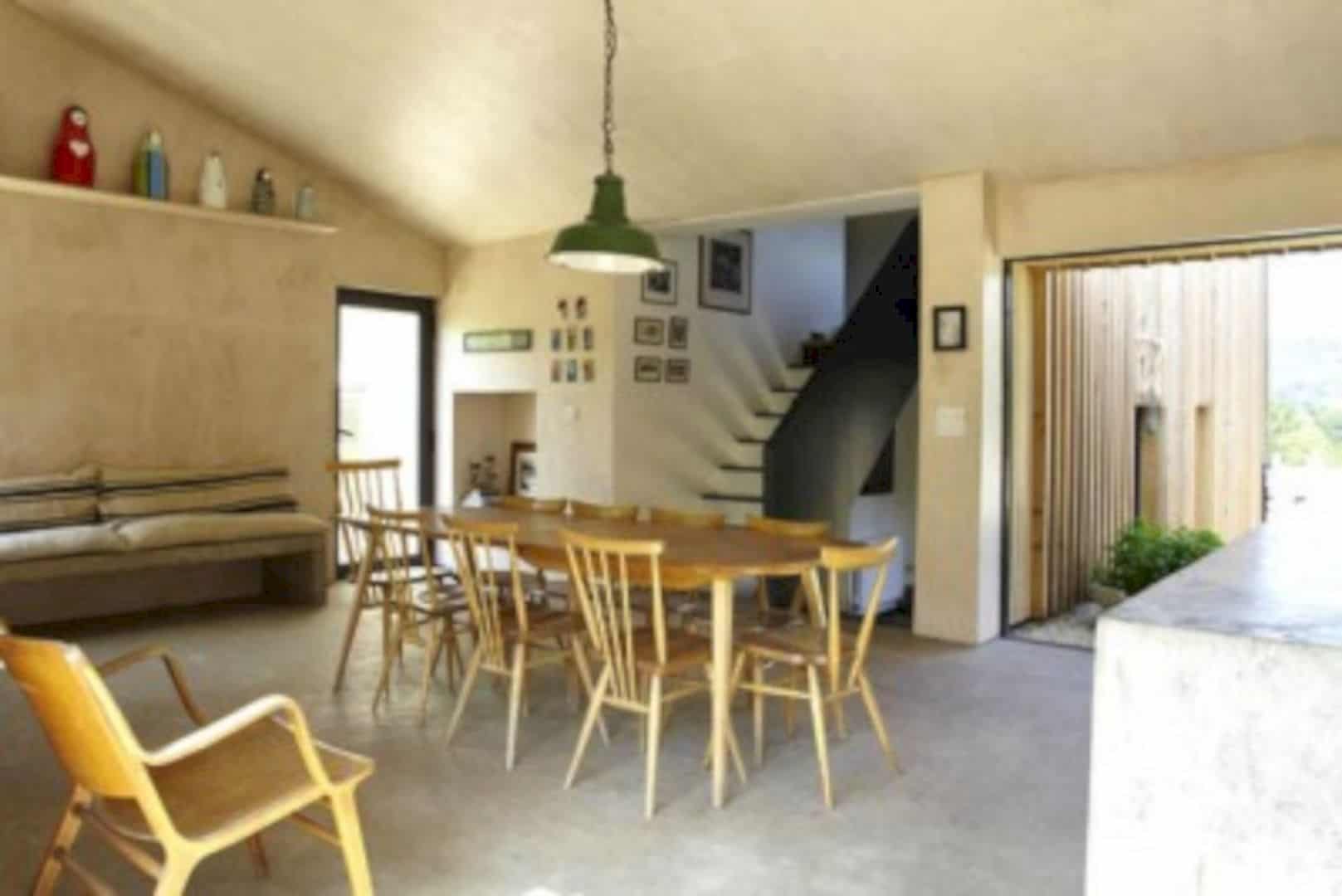
For instance, the complete transparency is adopted in the interior so you will know exactly where the kitchen is and other rooms for that matter. In the kitchen area, there is sliding glass screens that will disappear into the walls to allow the occupants looking at the valley and trigger the feelings as if you were cooking outside.
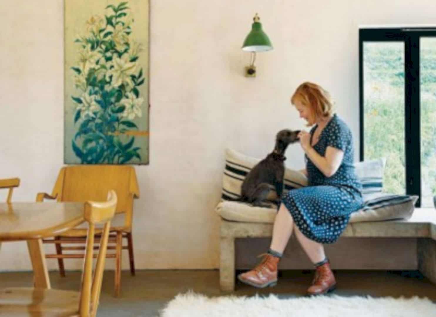
Above an in-situ concrete bench, there is a corner window. It is a perfect place for reading Sunday papers while enjoying the morning sun and a cup of coffee.
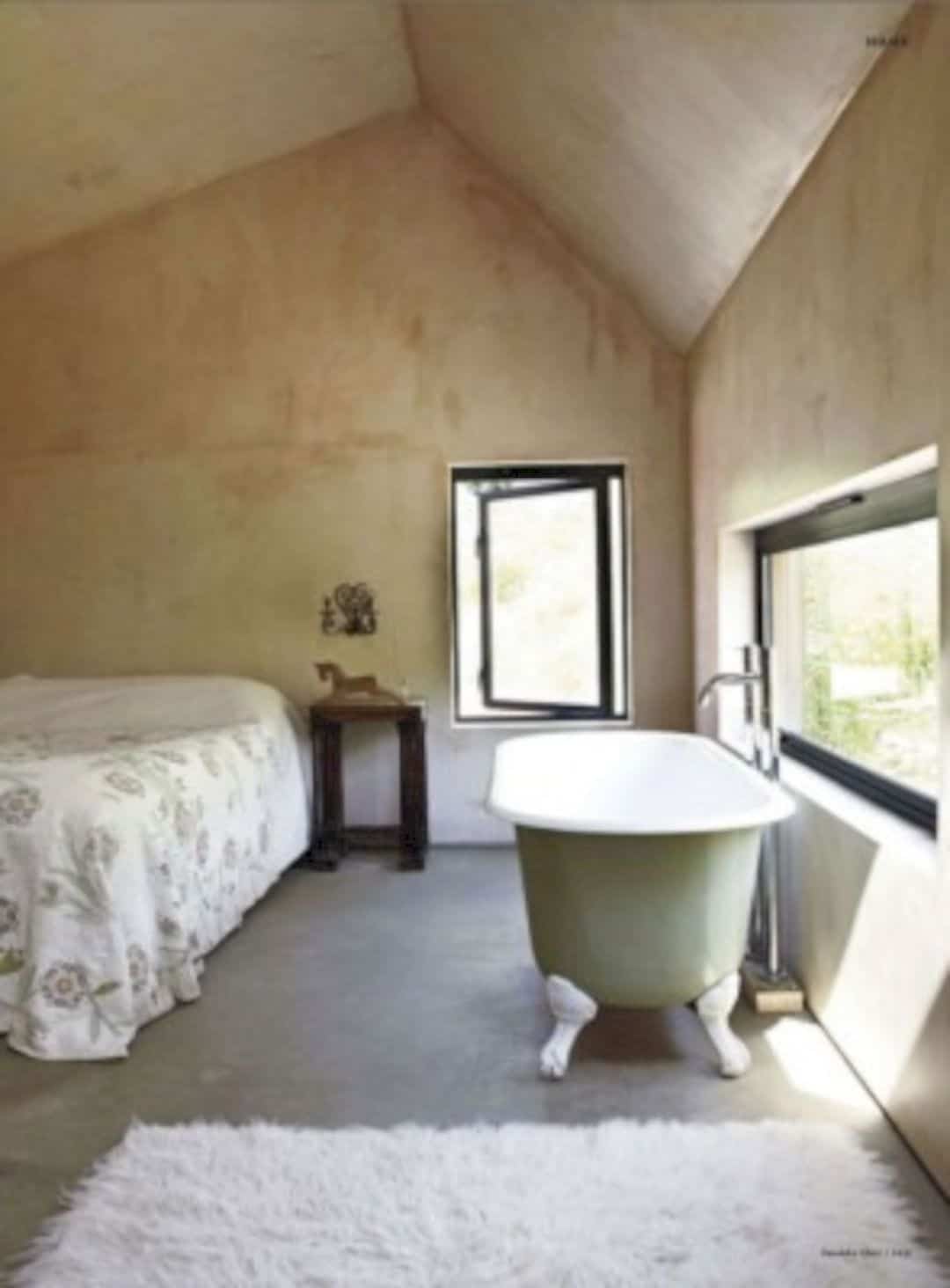
A slot window was installed above the bath, overlooking a wildflower bank outside.
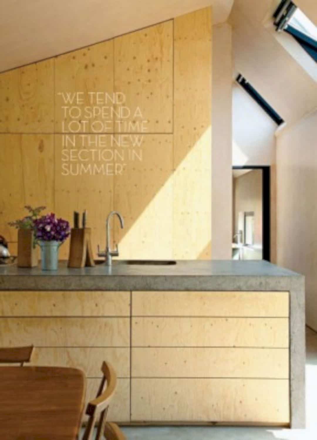
Rooflights on the east side allow the daylight floods the heart of the building thanks to the asymmetric pitch. This design was applied in order to maximize the penetration of natural light into a contained herb courtyard and other space. The house also features exposed thermal mass, concrete kitchen, a few built-in benches, and bare plastered concrete block walls.
Via Invisible Studio
Discover more from Futurist Architecture
Subscribe to get the latest posts sent to your email.
