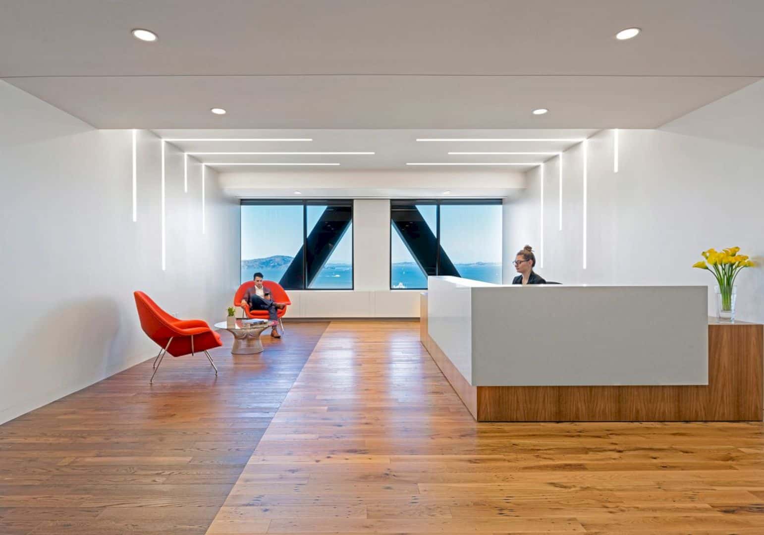
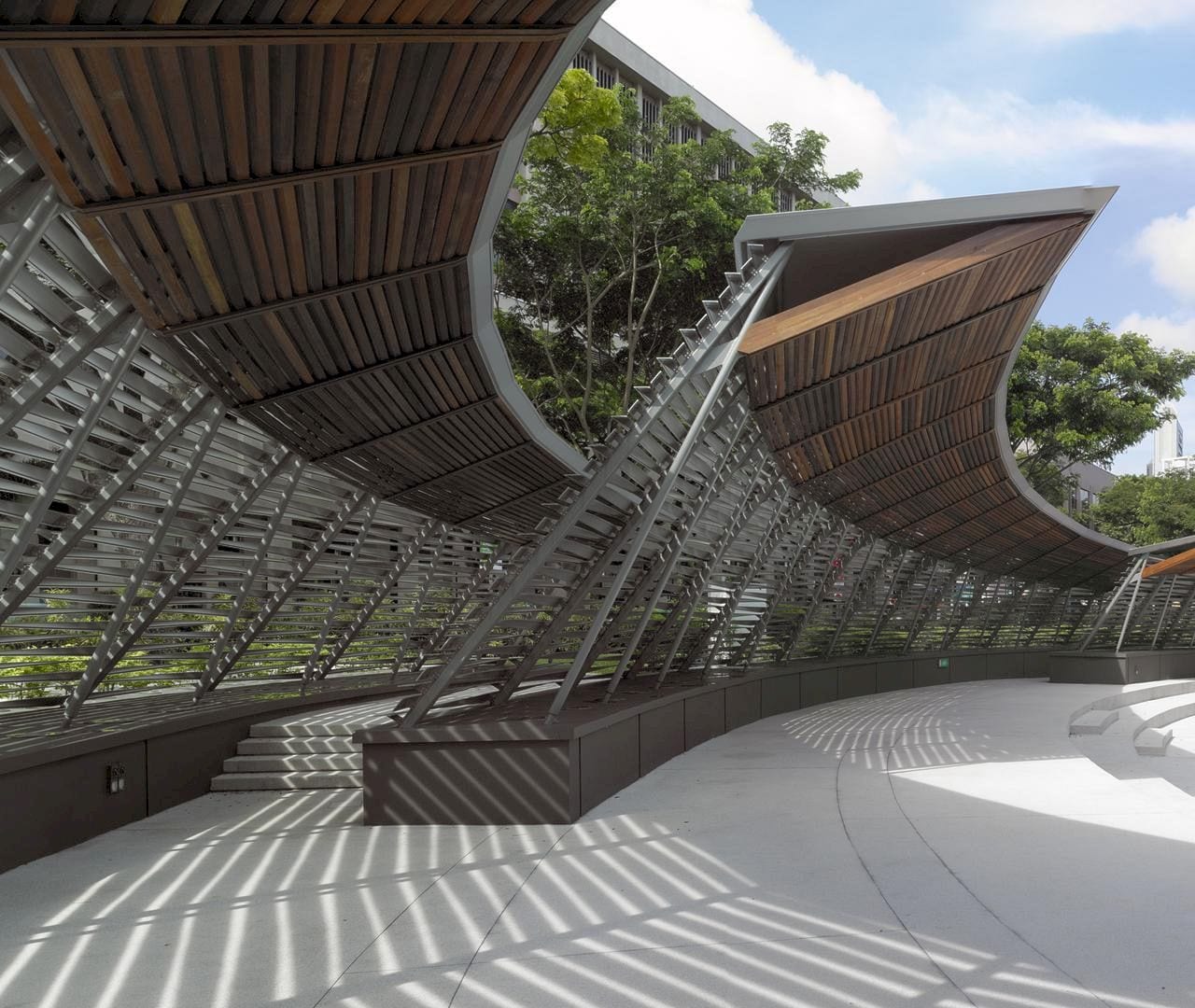
Atlas Garden is designed by Sweco Architects in 2016. This project is about a renovation of an anonymous building in central Stockholm into a modern office building. This building stands on a land where a historic locomotive shed built in together with the adjacent railway. The goal of Atlas Garden transformation is creating a modern building that fits with the row of high-profile buildings along the railway.
Flexible Floorplans
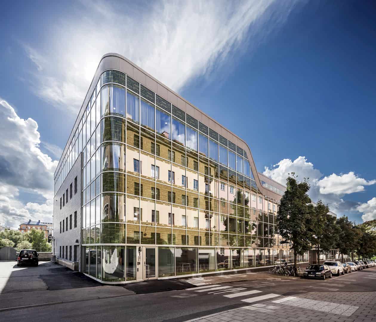
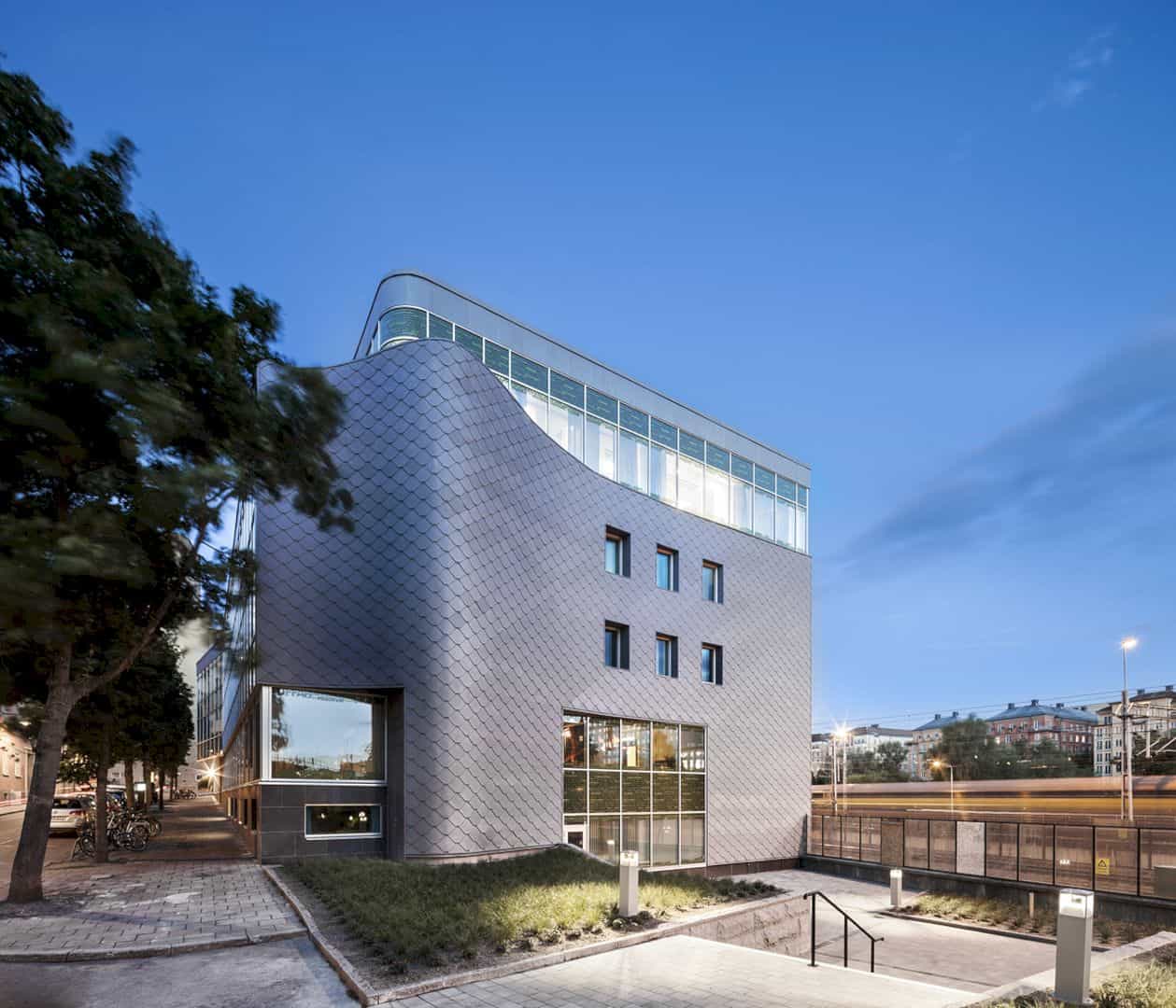
The building is designed with the modern design to get a good balance with the high-profile building around it. It is renovated and also offering flexible floorplans for the tenants. That flexibility surely will help everyone to get the best office space as they need inside the building.
Floors
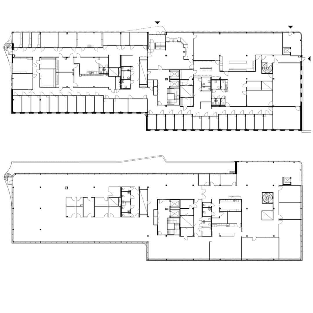
The office floors inside Atlas Garden can be used by dividing them into four leasable units. It relates to the entrances, wet group placement, and also fire doors. The tenants also can have some multiple private offices or an open floor plan. If they need, they also can combine two of them.
Tenant
One of the Atlas Garden tenants decides to have some private offices with a large staff room and a conference room too. It is different from another tenant who has an open floor plan with quite rooms and a conference room. Each tenant can choose what kind of rooms that they need.
Modern
The renovation of Atlas Garden is not only totally modern but also flexible. It is renovated, transformed, and also expanded into a modern office building. With the new technological solutions, this building can give a tenant a lot of possible variations of the leases office spaces.
Glass Facade
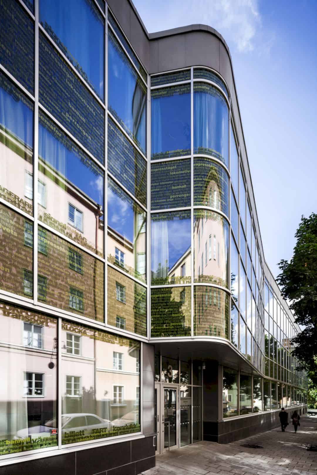

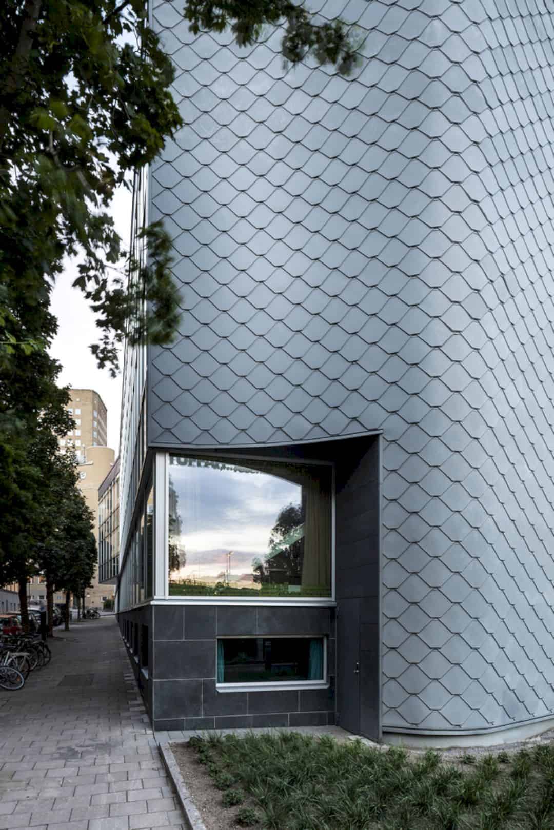
The glass facade of Atlas Garden is designed with some word patterns. Those patterns are selected from poems about the railway. It can be only deciphered if you stand right in front of the building. Another railway-facing facade has additional insulation and it is covered with zing shingles. Atlas Garden also has a roof with green plants cover that can be seen clearly from above.
Interior
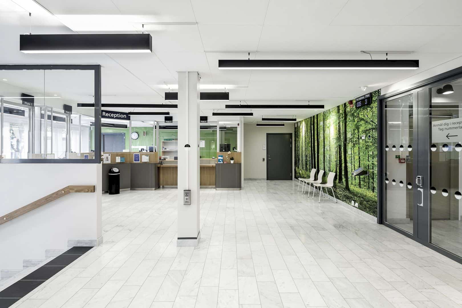
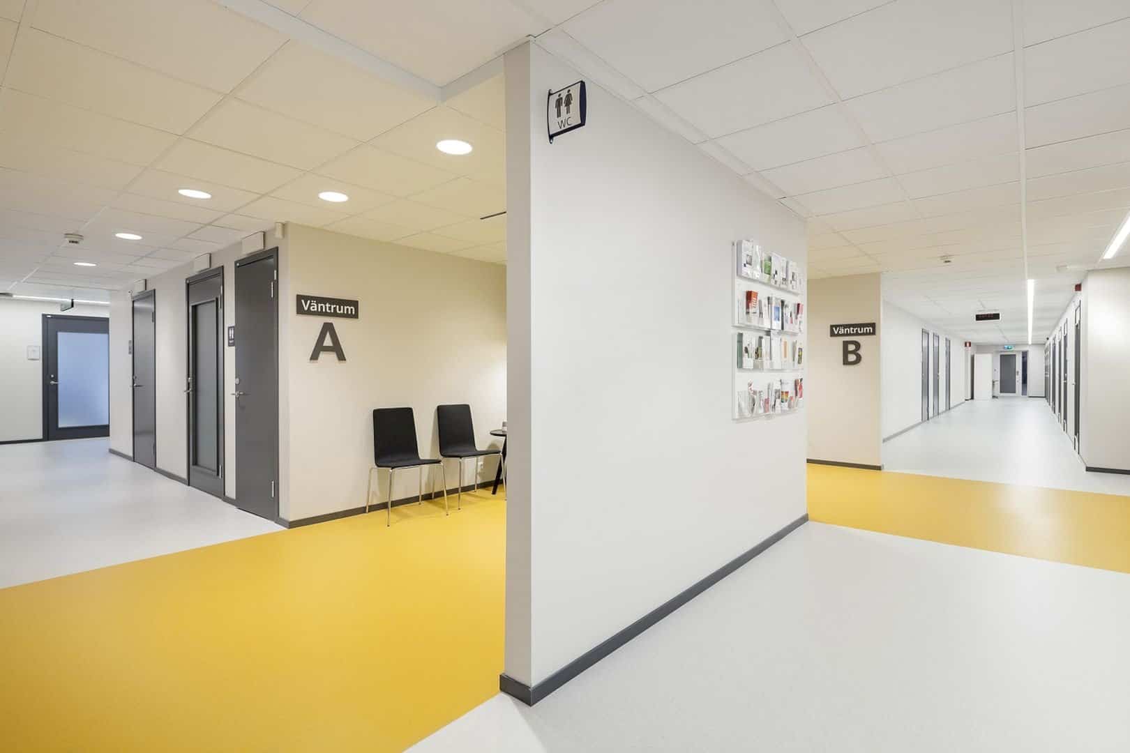
The color scheme is made in simple but also giving a strong accent for the interior. The colors have brightness contrast which is used and selected to give a good navigation throughout the building. It is a useful thing for those with direction impaired sense or impaired vision.
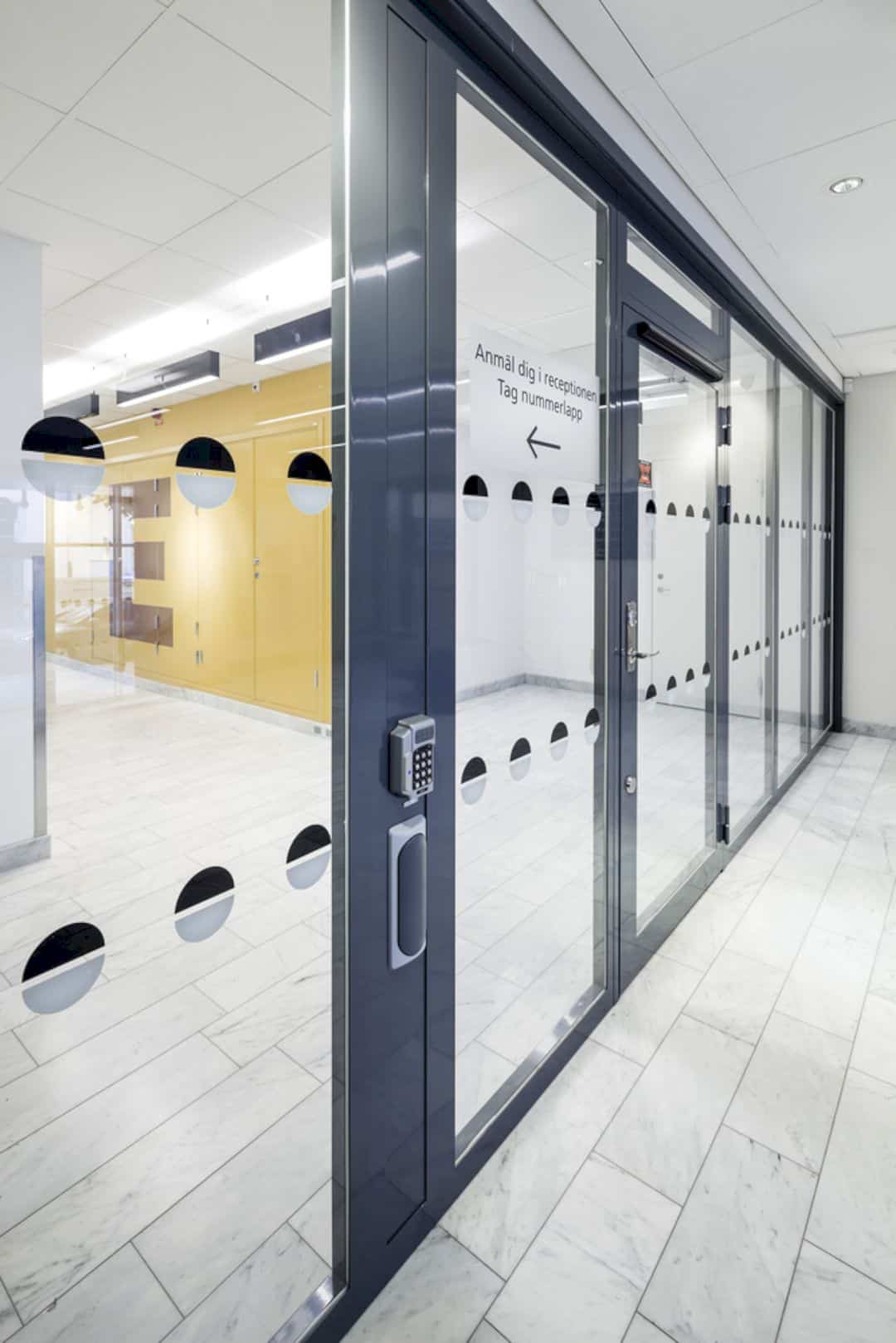
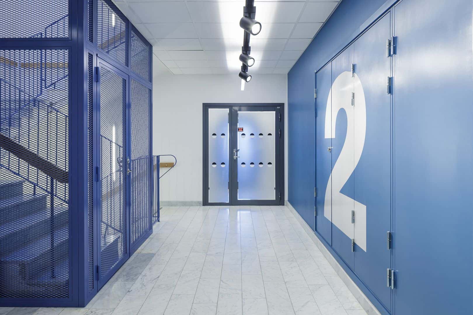
You can see clearly the dark grey doors between the white walls. The waiting rooms are designed with unique wall and floor colors. Some of them are painted in the stairwells. The purpose is about indicating the floor number and each floor has its own awesome color palette.
Via archdaily
Discover more from Futurist Architecture
Subscribe to get the latest posts sent to your email.
