Architecture Initiative built a new school in east London for Tower Hamlets School Ltd and London Borough of Tower Hamlets. Known as Olga Primary School, it has opened for more than 700 primary school pupils and envisions a garden oasis in the heart of England’s capital.
Olga Primary School

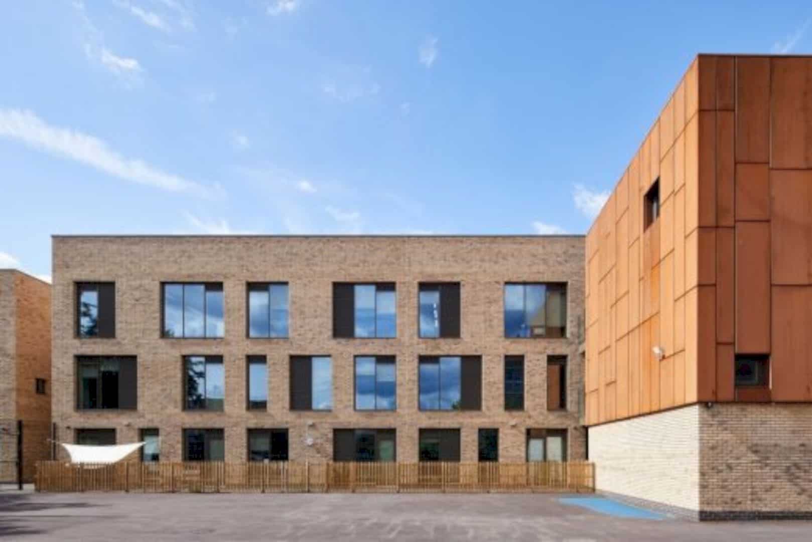
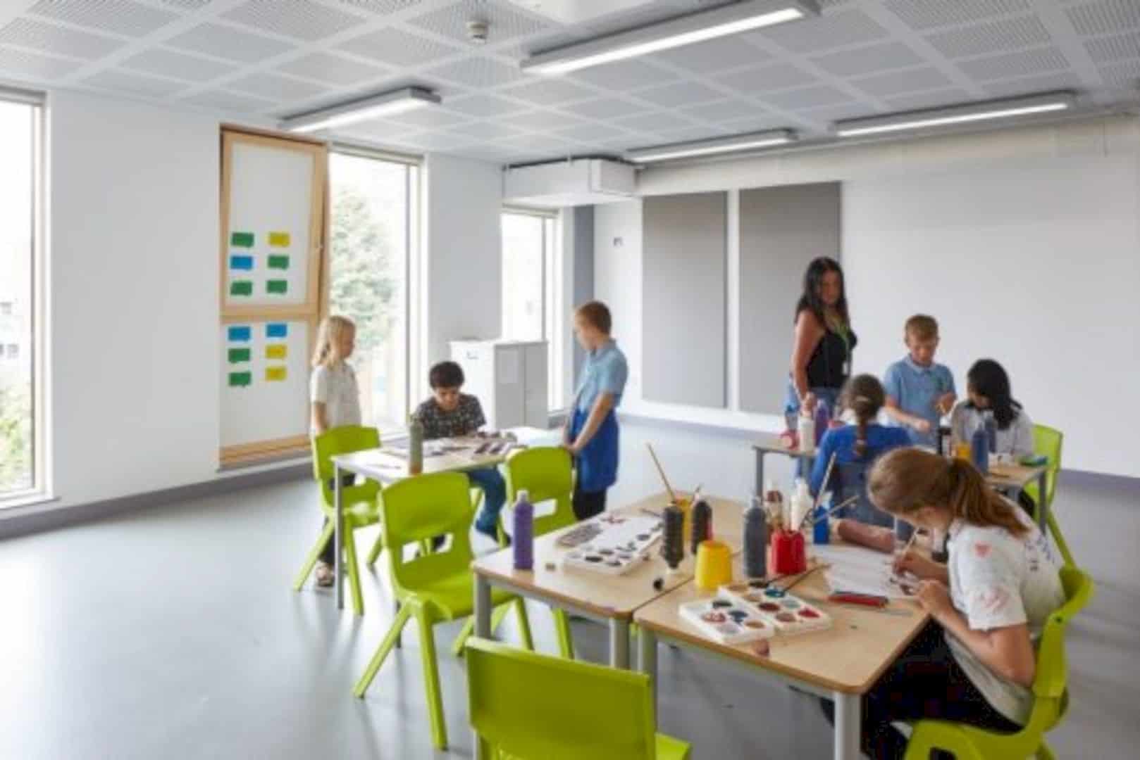
The Olga Primary School came with a vertical design housing 25 classrooms and a light-filled atrium with the age of pupils increasing in line with the building rises. The atrium functions as a circulation core that divides the structure into two different volumes; one for the teaching center while the other for administrative and communal spaces. By dividing the structure, the school can open its facility to the wider community outside schooling hours.
Replacing a Single-Story 1982 Structure

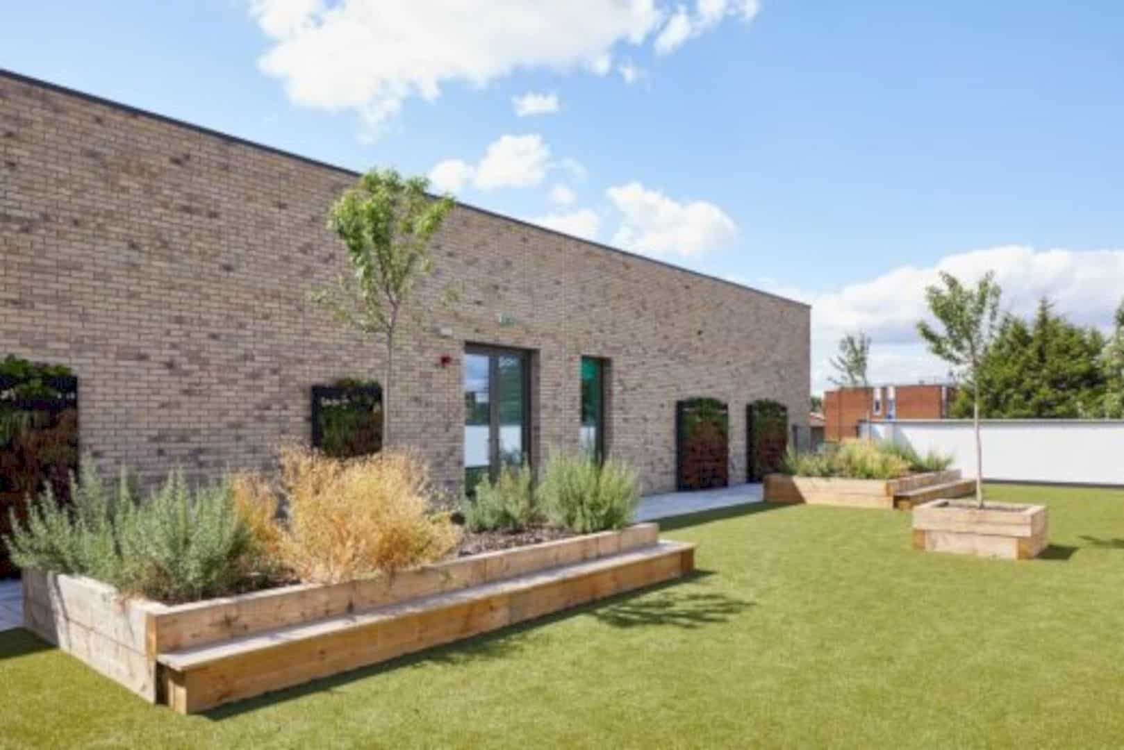
The architecture firm decided to replace a single-story 1982 structure by building upwards to improve the services for the community. The school itself is situated on the edge of the side boundary, providing a ‘buffer’ to separate the outside landscape from the nearby residential blocks. Meanwhile, the surrounding green space plays a crucial role to the primary school, thus, the firm incorporated varying terraced gardens and trees to establish a rare ‘green oasis’ to create an unconventional and exciting environment for the students’ inspirations.
Village Feel

Even though the capacity has increased threefold, the school still maintains the quaint ‘village feel’ by expanding the building vertically in order to avoid sprawling across the site plan and affecting the neighborhood. This architectural concept also means that the groups have easier access to the outside space, such as the second floor to the roof, the first floor to terraces, the ground floor to the gardens. It also allows the pupils to connect with the ecology of the landscape.
A Contextual and Sensitive Design

Architecture Initiatives chose the materials relevant to the surrounding environment in order to create a contextual and sensitive design. That being the case, the teaching center, marked by the London Stock brick, consists of neatly-proportioned windows in accordance with the local vernacular.

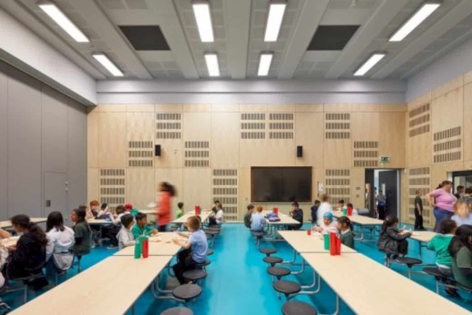
On the other hand, the communal and administrative building comes with Cor-ten® weathering steel that is similar to the warm colors of the woodland in the autumn. The interior also displays a small palette of bright limes and aquas to blend with the raw materiality of the birch ply cladding and the concrete finishes as seen in a contemporary Scandinavian design.

In addition, large graphics allow the greens and teals of the site’s garden to merge with the interior. These graphics can be changed for each year group depending on the course of the building.
Refreshing Respite

The design proposed by Architecture Initiatives offers amazing teaching space and terraces where the amount of mature trees and green spaces are blended with the highly-developed residential area to create refreshing respite
Via E-Architect
Discover more from Futurist Architecture
Subscribe to get the latest posts sent to your email.


