Choosing the perfect color palette for your home is a crucial step in creating the ambiance and atmosphere you desire. The importance of selecting hues not only complements your space but also reflects your style.
Begin by considering the mood you wish to evoke in each room. Soft, neutral tones such as ivory, beige, or soft gray can create a serene and calming environment, perfect for bedrooms or living areas where relaxation is key. For spaces intended for creativity or energy, vibrant shades like teal, mustard yellow, or coral can inject vitality and warmth, making them ideal for home offices or dining rooms.
In addition to mood, it’s essential to think about the interplay of light within your home. Rooms with ample natural light can support deeper and richer colors without feeling overpowering, while spaces with limited natural light may benefit from lighter shades to enhance brightness. A recent study by the Color Association of the United States found that homes with well-coordinated color schemes sell 20% faster than those without.
Lastly, don’t hesitate to experiment with different color combinations to achieve a balanced and harmonious look throughout your home. Utilize color wheels and online resources to explore analogous or complementary hues that resonate with your aesthetic preferences. The most effective color palettes are those that incorporate a mix of both warm and cool tones, creating a dynamic and visually interesting space that feels both cohesive and multidimensional.
We have gathered some best color palette ideas to choose the perfect hue for your home from some best architecture and interior design projects. Hope one of them can inspire you to design and beautify your own home.
Table of Contents
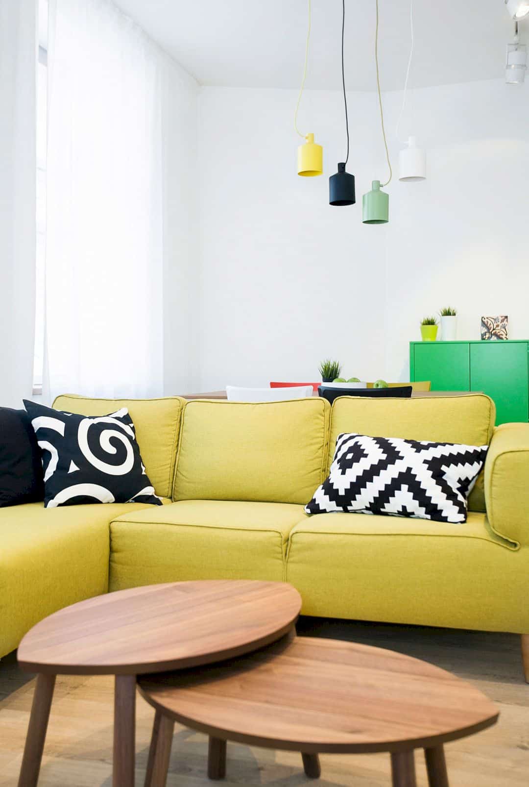
1. Mieszkanie Chorzow by Widawscy Studio
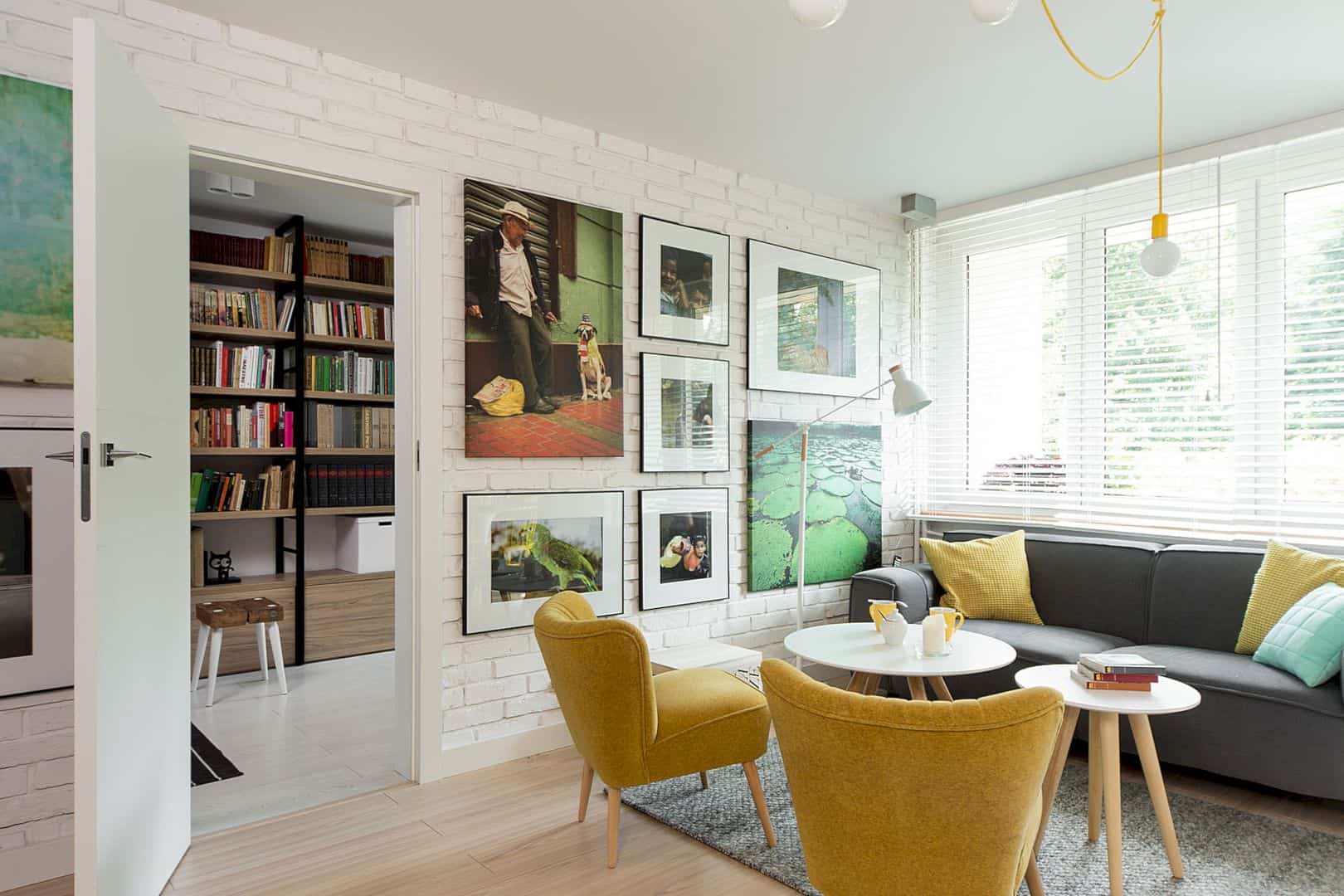
Mieszkanie Chorzow by Widawscy Studio has a color palette idea to inspire you. This house uses yellow chairs and colorful pillows to bring energy and achieve a balanced and harmonious look throughout its living room. A gallery wall is also made as a focal point of the room.
Photographer: TOMASZ BORUCKI
2. Quant 10 by Ippolito Fleitz Group
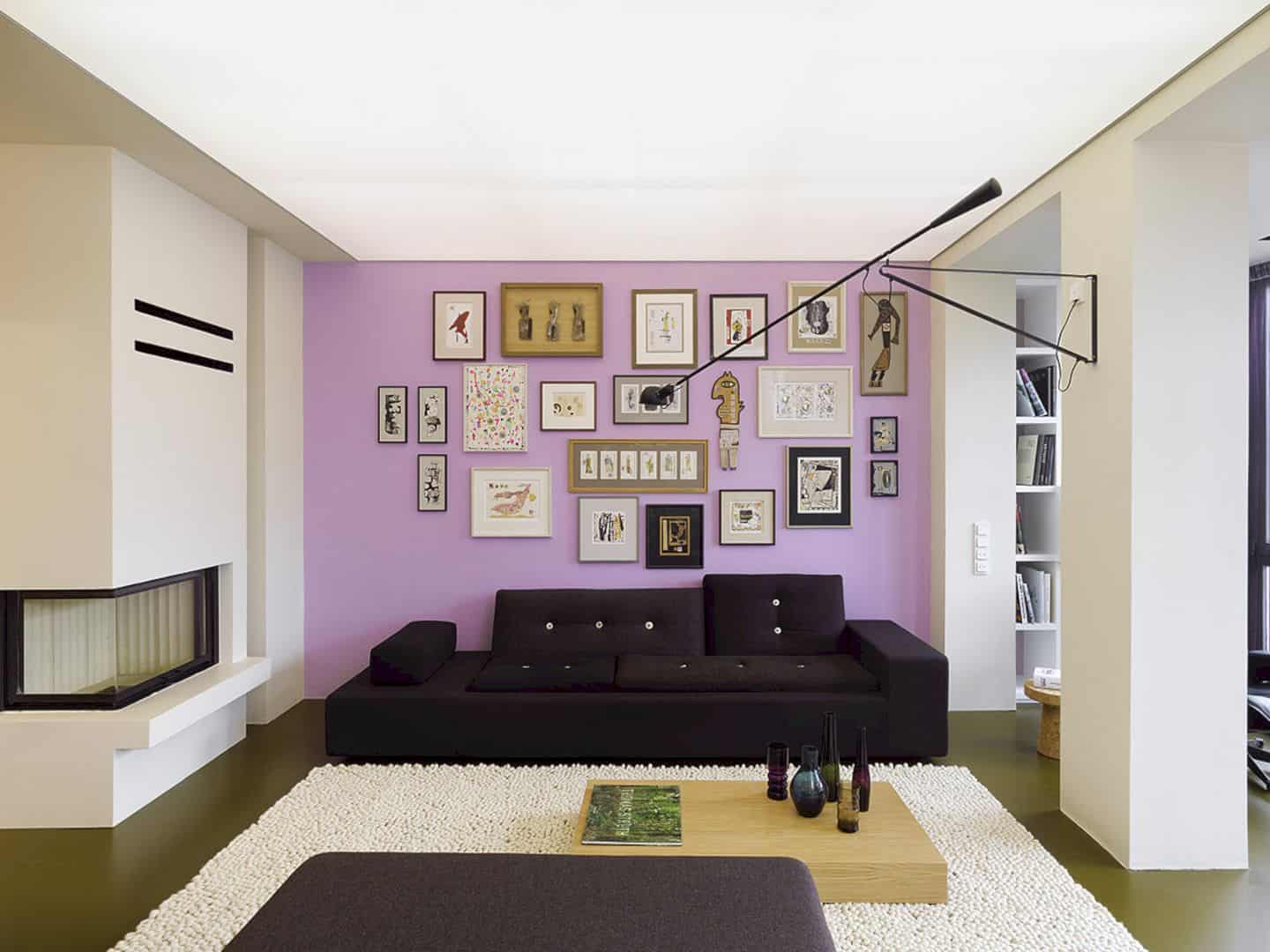
Quant 10 by Ippolito Fleitz Group also has a color palette idea to inspire you. This house uses a soft purple wall as a focal point in its living room. On this wall, a gallery wall is created to enhance the room’s look. A black sofa is also added as a statement piece of furniture, inviting one to sit and relax.
Photographer: Zooey Braun
3. The Moon Box Apartment by Denis Rakaev
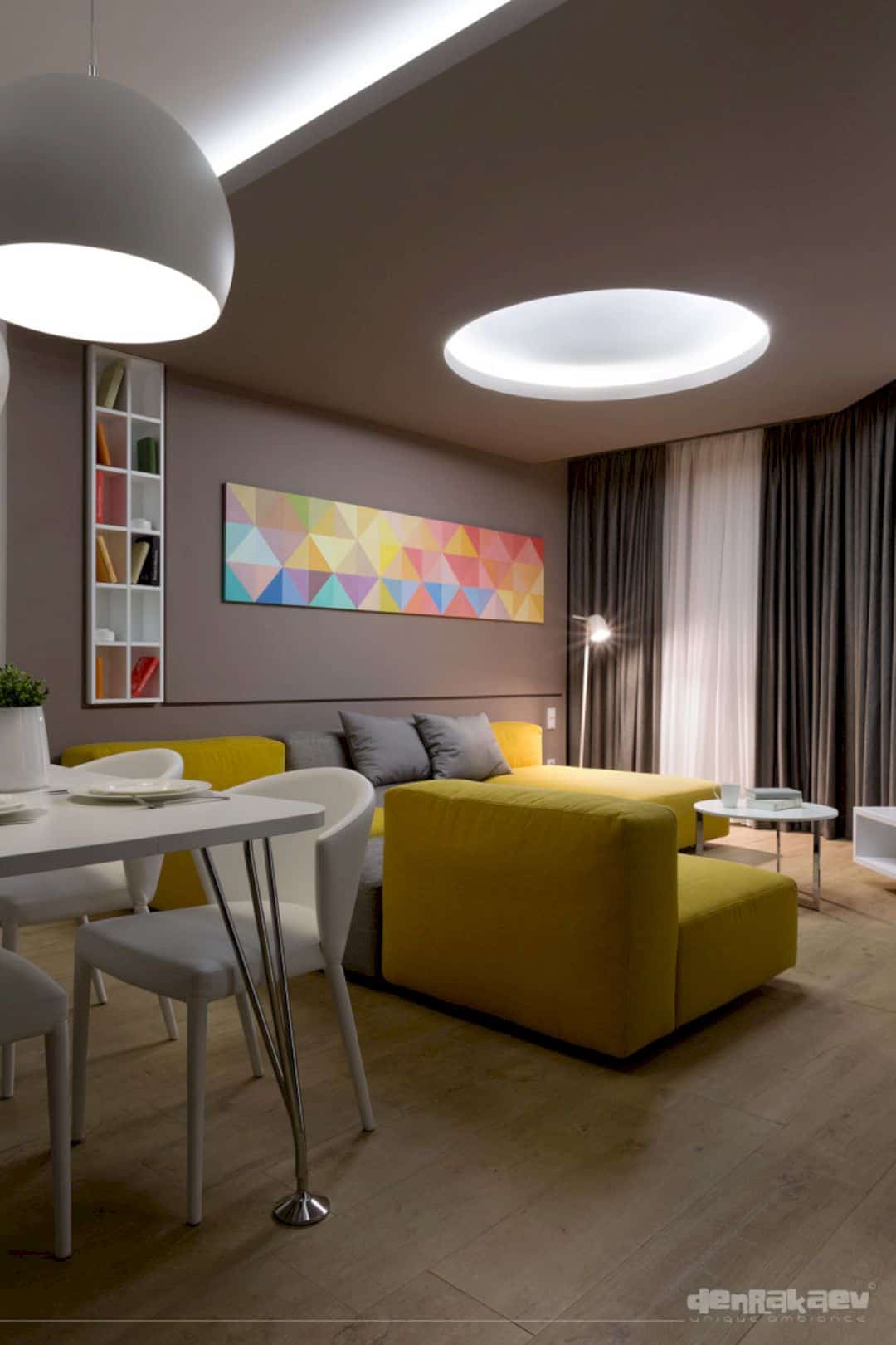
This color palette idea is perfect for your apartment. The Moon Box Apartment by Denis Rakaev adds colorful wall art to beautify its living room’s wall. A yellow sofa brings energy and a fun atmosphere into the room while the lighting highlights all of these elements.
Photographer: Andrey Avdeenko
4. Ne_On Apartment by NestSpace Design
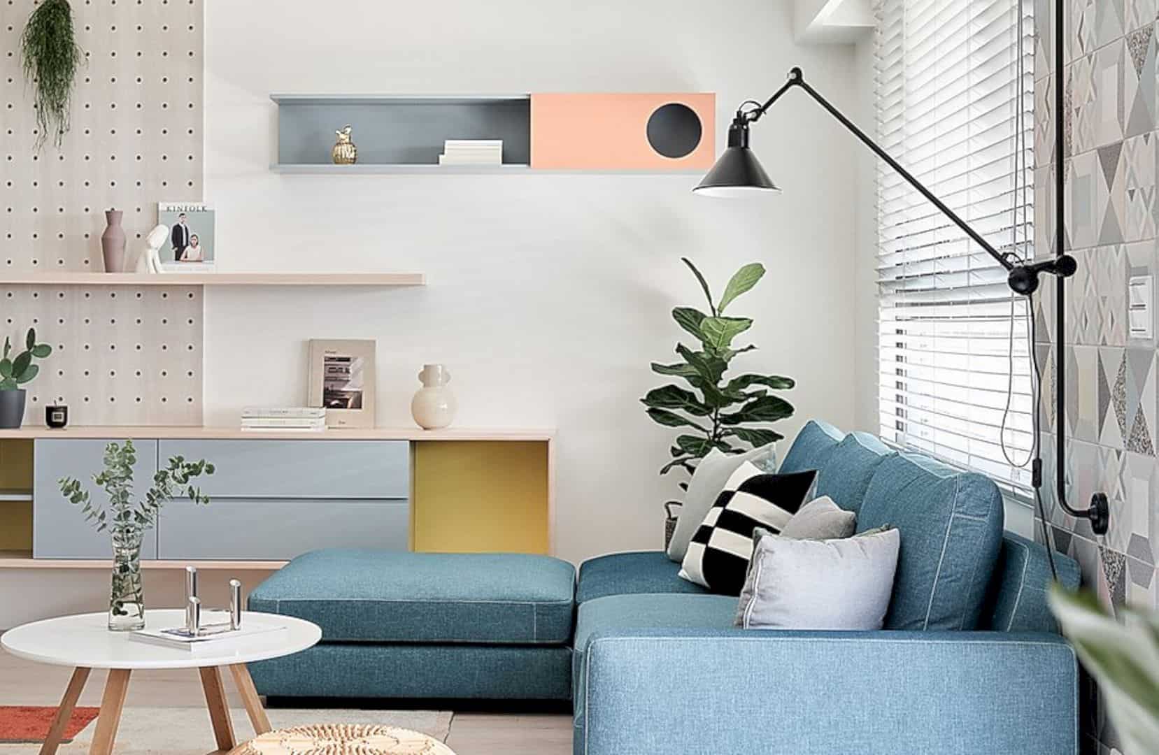
Another color palette idea for your apartment comes from Ne_On Apartment by NestSpace Design. This apartment combines different soft hues to create a cozy, aesthetic, and elegant space in its living room. The blue sofa stands out as a piece statement of furniture that invites one to come.
Photographer: Hey!Cheese
5. V20 Apartment by DA Design & Architecture
V20 Apartment by DA Design & Architecture uses colorful furniture and lighting to design, decorate, and beautify its interior space. It is a color palette idea for you who want to bring your interior to the next level, making it unique and aesthetic at the same time.
Photography: DA Design & Architecture
6. Function Walls by Lookofsky Architecture
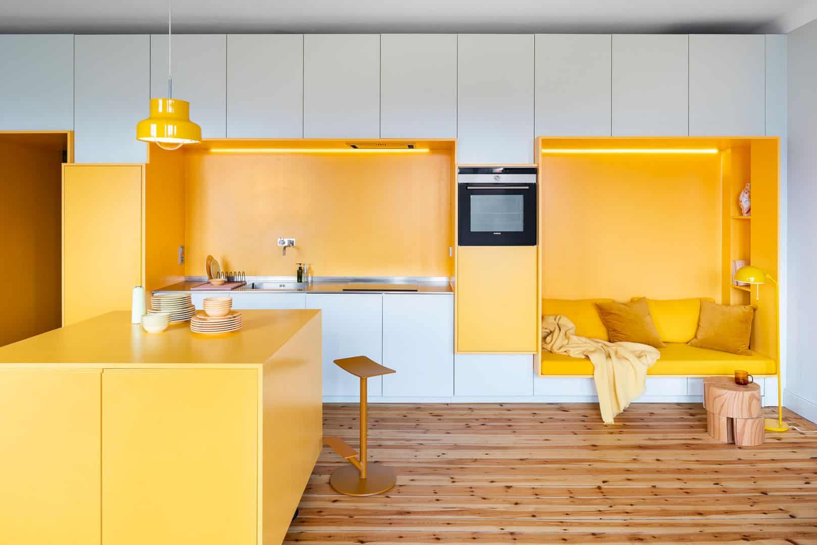
This color palette idea is worth trying for your kitchen. Function Walls by Lookofsky Architecture combines white and yellow hues to design and beautify the interior of its kitchen. The kitchen island, pillow, lighting fixtures, and even standing lamp are accent pieces that complete the whole look oof this kitchen.
Photographer: Mattias Hamrén
7. Mieszkanie W Warszawie by Widawscy Studio
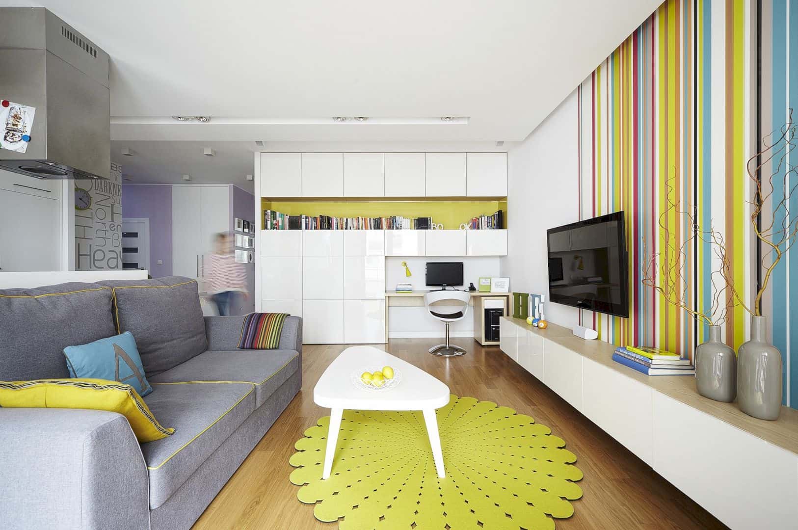
Mieszkanie W Warszawie by Widawscy Studio also has a color palette idea to inspire you to brighten and decorate your interior space. The yellow rug, colorful pillows, and even a colorful striped wall are added to create an inviting, energetic, and dynamic ambiance in this apartment.
Photographer: ŁUKASZ KOZYRA
8. Kamienica Warszawa by Widawscy Studio
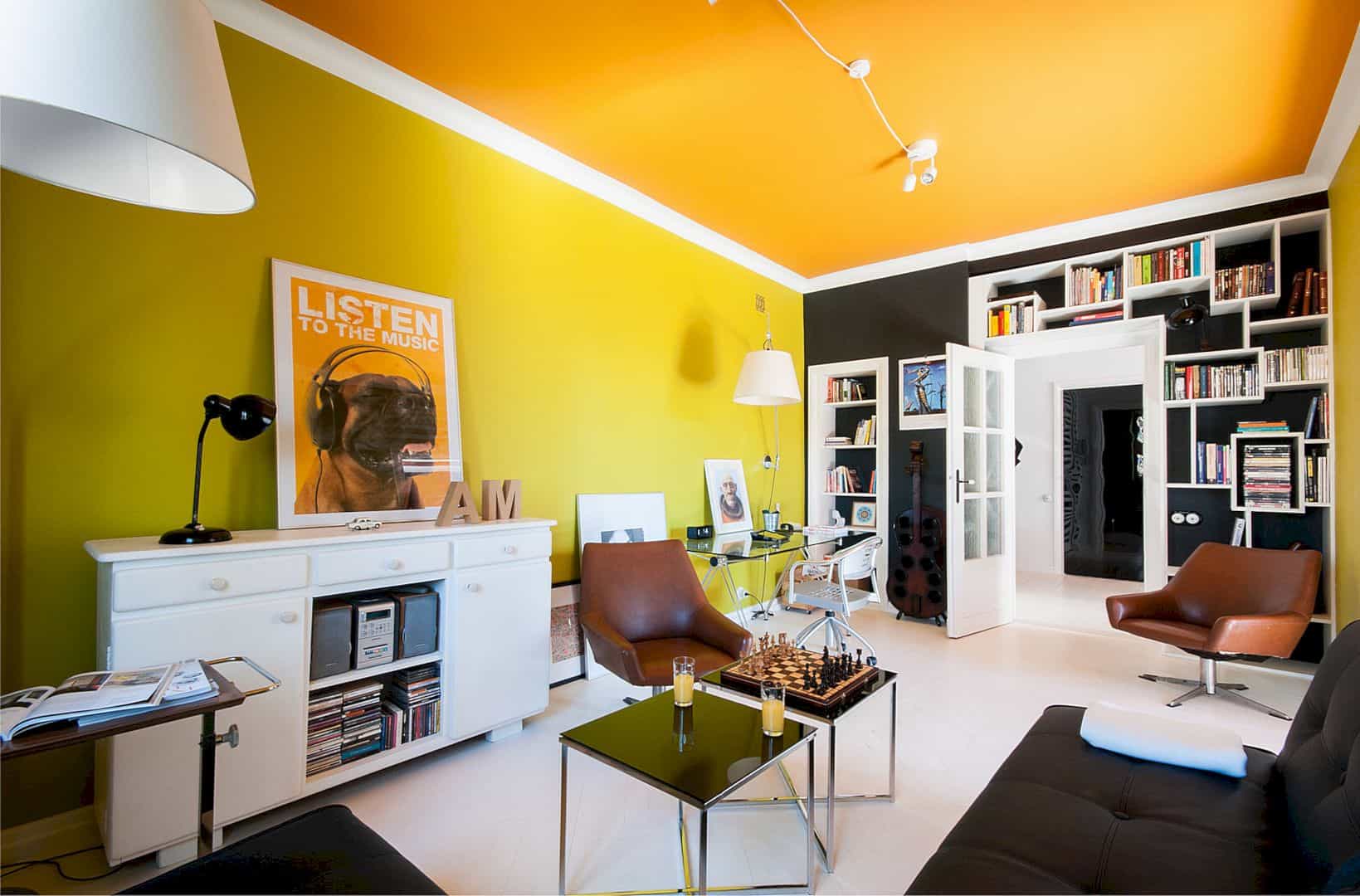
Kamienica Warszawa by Widawscy Studio utilizes the wall and ceiling to design its living room. It is a color palette idea that mixes and matches bright and dark hues to inject unique character. Antique items are also added to create a unique and inviting look.
Photographer: DARIUSZ MAJGIER
9. Chromatic Spaces by Ippolito Fleitz Group
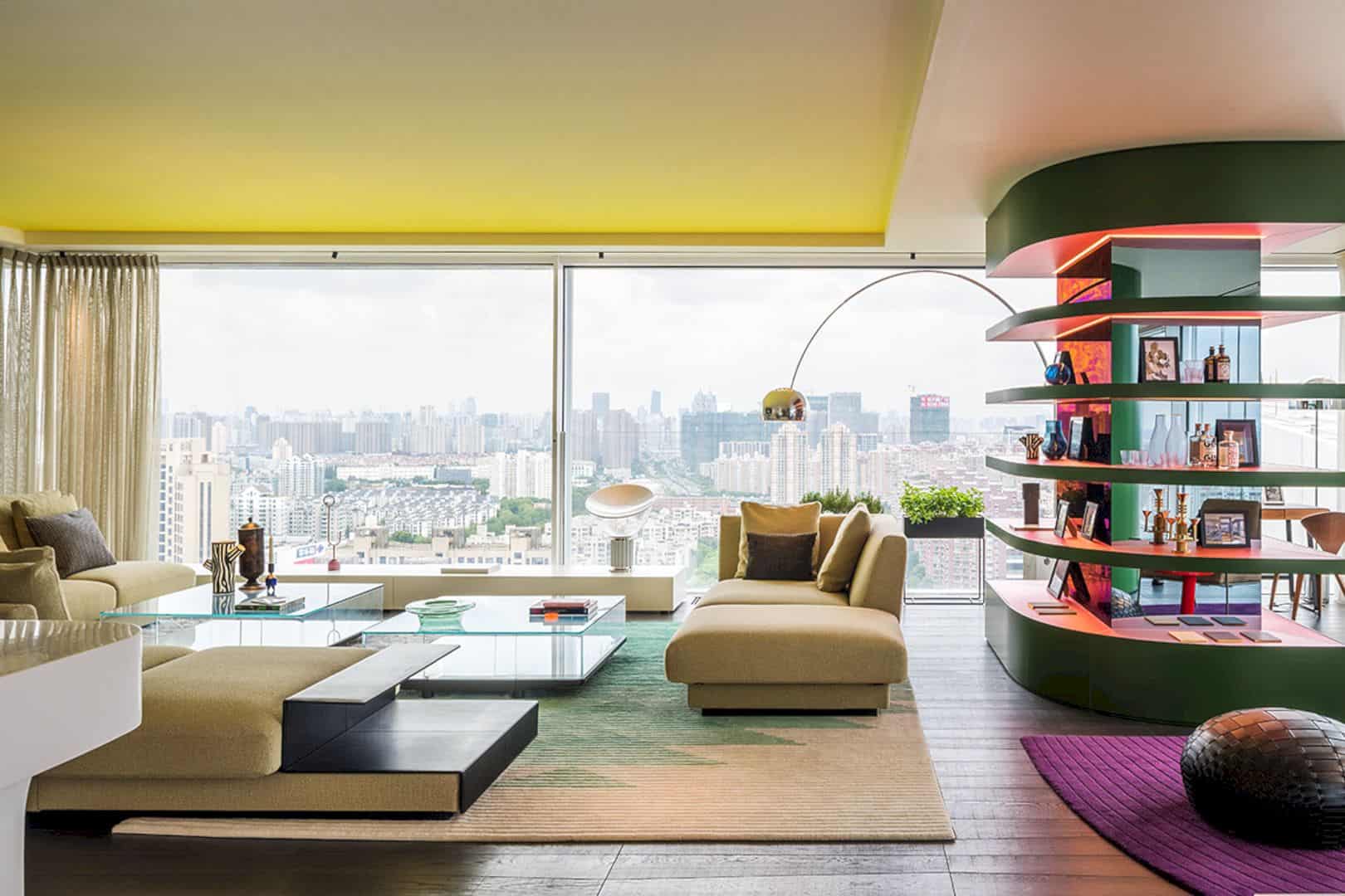
Chromatic Spaces by Ippolito Fleitz Group also uses different colors to design and beautify its interior. Some colorful hues from a few accent pieces like a purple sofa and a red chair are added to create an inviting look. Thanks to the expansive glazed wall, natural lighting can flood easily into the space.
Photographer: Sui Sicong
10. Park Avenue Prewar by Michael K Chen Architecture
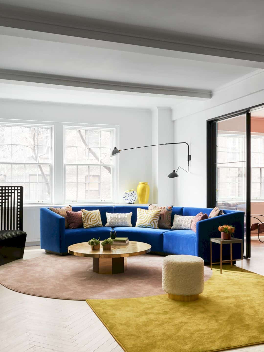
Park Avenue Prewar by Michael K Chen Architecture is a family apartment with a color palette idea to inspire you. This apartment incorporates a colorful rug, a blue sofa, a round gold table, and even a yellow vase to enhance a dynamic and energetic atmosphere in its space.
Photographer: Brooke Holm
FAQs
Q: How do I choose the right color palette for my home?
A: Consider the mood you want to create, the amount of natural light in each room, and your personal style. Use color wheels and online resources to explore complementary or analogous color combinations.
Q: Can color choices affect the perceived size of a room?
A: Yes, lighter colors can make a room feel larger and more open, while darker colors can make a space feel cozier and more intimate.
Q: How many colors should I use in my home’s color palette?
A: A good rule of thumb is to use 3-5 main colors throughout your home. This allows for variety while maintaining a cohesive look. You can then use accents and shades of these colors to add depth and interest.
Discover more from Futurist Architecture
Subscribe to get the latest posts sent to your email.