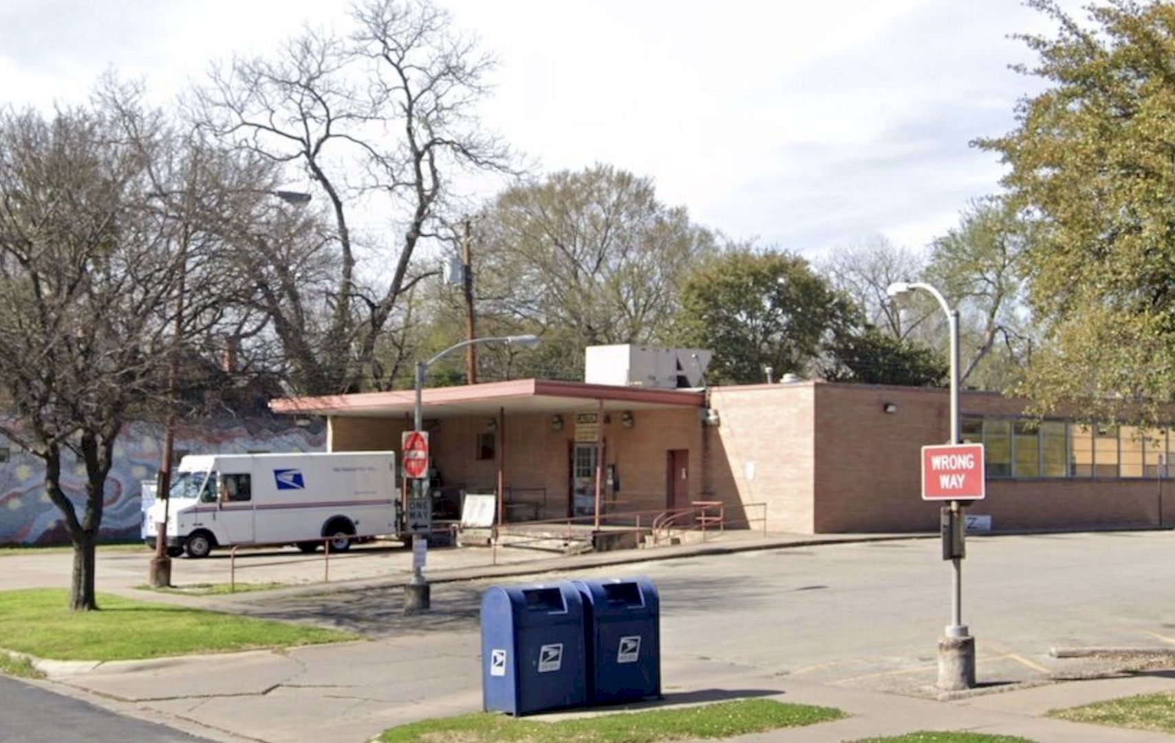
Austin commercial and residential architecture firm Side Angle Side had an awesome collaboration with entrepreneur + developer Steph Steele to transform a shuttered 1960s U.S. Post Office in Hyde Park into a lively community hub. With the use of a mid-century utilitarian design, the interior becomes aesthetic and also inviting.
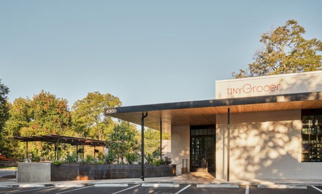
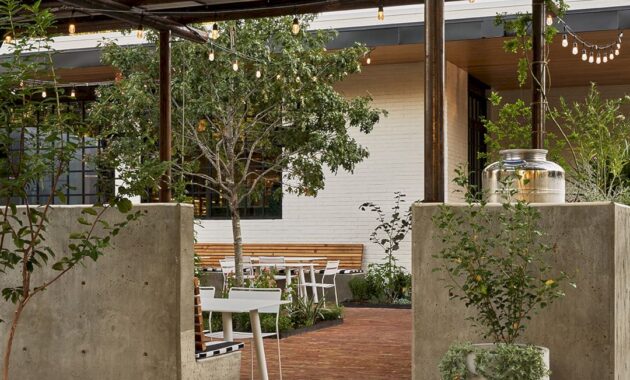
The vintage U.S. Post Office building, circa 1967, was transformed into a community’s beloved specialty market, Tiny Grocer and Bureau de Poste, a modern French bistro led by celebrity chef (and Bravo Top Chef) Jo Chan. The once-abandoned building with an unattractive black tar parking lot and loading dock now boasts a vibrant courtyard adorned with live oak trees, trellises, and greenery. The revitalized space, now a hub for the community, offers a French bistro, specialty grocer, and an outdoor wine garden and café.
The reimagined space spans 3,500 sq ft indoors, with an additional 1,500 sq ft outdoor dining courtyard. While the post office was an essential part of the neighborhood in its prime, it had fallen into disuse before its recent transformation. Inspired by its history, the design team aimed to capture the spirit of the former post office, and the Thought Barn Studio worked on the exterior shell.
The adaptive reuse project was a year-long transformation led by two professional architects from Side Angle Side, Annie-Laurie Grabiel and Arthur Furman. Arthur Furman, the founder of Side Angle Side, said that the Hyde Park U.S. Post Office had been a vital community hub since the 1960s, so his team was careful to preserve the essence of its mid-century utilitarian design. He also said that Tiny Grocer, as the anchor tenant, remained at the heart of the community, offering a place to gather, shop, eat, and drink.
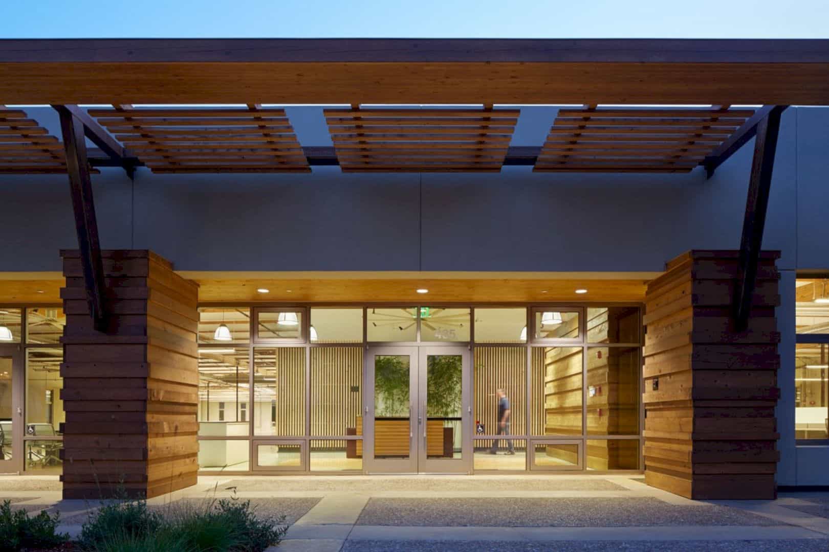
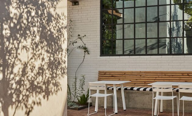
Initially, this project aimed to create a grocery store and cafe. Still, during the planning stage, owner Steph Steele suggested the addition of a 1,500 sq ft dining courtyard. The space, once an unsightly asphalt loading area, is now a vibrant outdoor cafe and wine garden. The architects enhanced it with antique red brick flooring, a cast-in-place concrete banquette, live oak trees, and a steel trellis. They also added a stucco restroom building and a linear steel planter to transform the former loading area into an inviting outdoor space, separate from the car park.
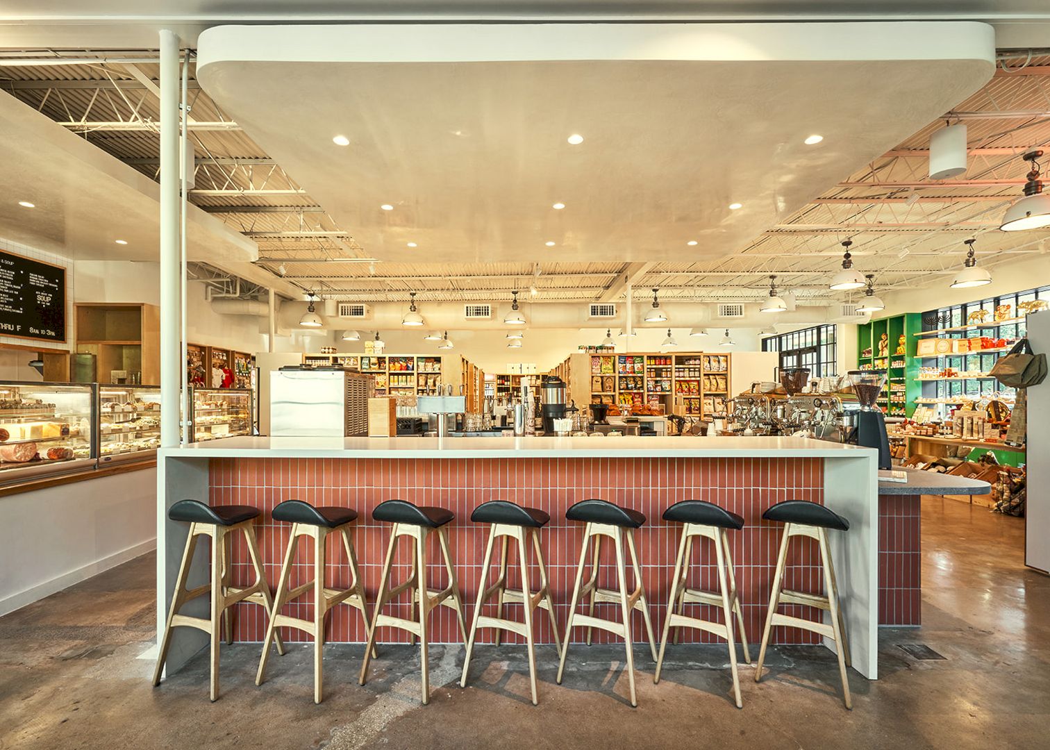
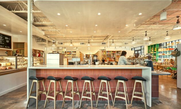
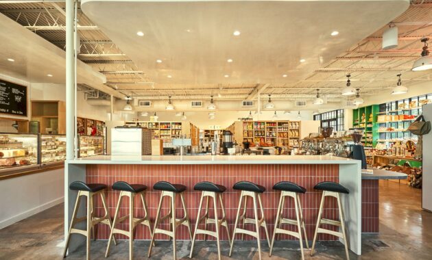
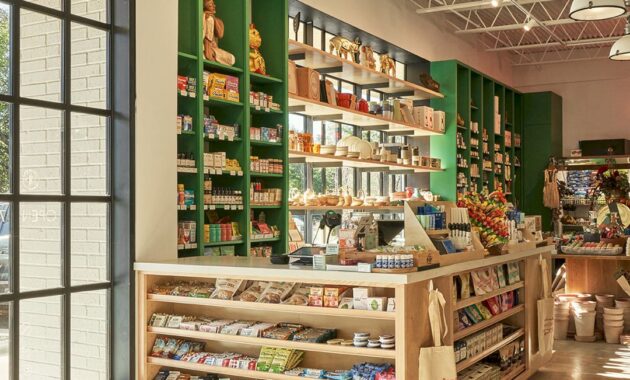
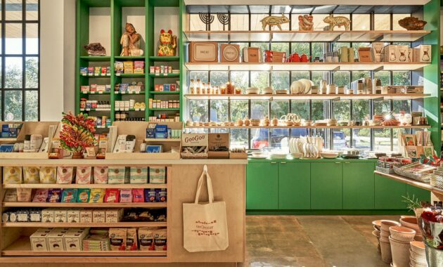
Inside, the interior layout features intricate mercantile shelving and bar millwork. The back of the house includes a kitchen, office, storage, and bar equipment. Working closely with the owner, the design finishes subtly nods to the building’s mid-century past with a large, central bar showcasing terra cotta tiles and concrete gray and white quartz countertops.
Original ceiling elements and open web joists were exposed, and metal decking and industrial lighting were added. The existing concrete floors were polished to retain their weathered imperfections, and a custom-built leather banquette (by Undercover Austin Upholstery) runs along the back wall for bistro-style dining at Bureau de Poste.
Annie-Laurie Grabiel, co-founder of Side Angle Side, said that they truly enjoyed working on this project. Their main role in this project was to bring the clear vision of the client to life. She also said that Steph and Tiny Grocer could not be prouder of the results.
Before Image
Tiny Grocer Gallery
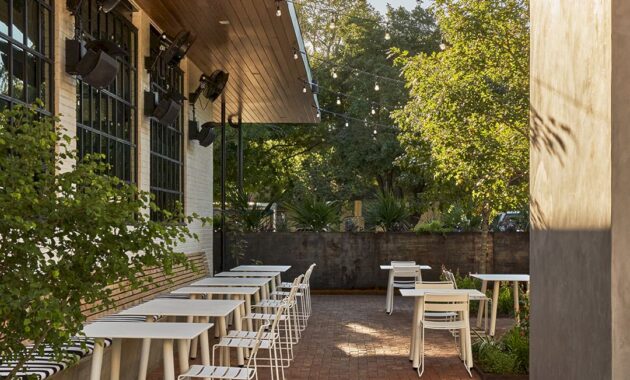
Photos by Likeness Studio
Tiny Grocer + Bureau de Poste Gallery

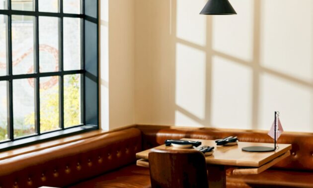
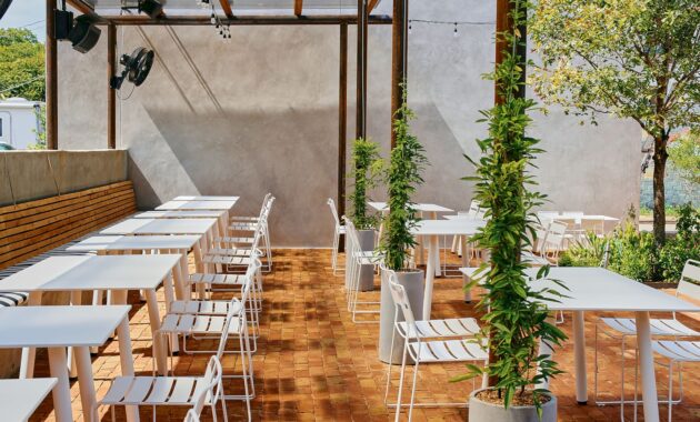
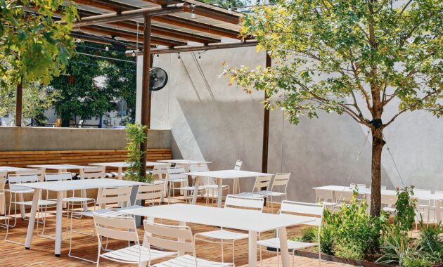
Photos by Mackenzie Smith Kelly
Project team:
Structural Engineer: Creative Engineering
MEP Engineer: ATS Engineers
Builder: Archive Properties
Commercial Interior Design: Side Angle Side
Architects: Side Angle Side
Side Angle Side, architect of record Tiny Grocer and Bureau de Poste
Building shell: Thought Barn Studio
Landscape Design: Side Angle Side & Wild Heart Dirt
Owner: Steph Steele
Sourcing:
Light Fixtures:
- Industrial – AQ Lighting, Italian warehouse pendant
- Black cones – All Modern, Johnston Single light metal dimmable pendant
Chairs/Tables:
- Bar Stools: Wooden Soule, Cilla Chair
- Exterior Dining Chairs & tables: Isimar, Portofino
Custom Cabinet and Banquette Builder: Mike Wallgren
Custom Tables: Second Chance Custom
Build-in leather banquette: Undercover Austin Upholstery
Cabinet paint color: Benjamin Moore, Dunmore green
Terra cotta tile: Seneca, Monrovia Red
Countertop: Quartz, Rough Concrete (gray), Quartz, Fresh Concrete (white)
Discover more from Futurist Architecture
Subscribe to get the latest posts sent to your email.
