Located on the top floor in the Monarch Residential Complex in Moscow, the interior of this 115 sq. m apartment was designed by Babayants Architects. MONARCH is a residential project with several challenges. The architect succeeded in solving those challenges, resulting in a cozy apartment interior with warm wood tones.
Project’s Challenges
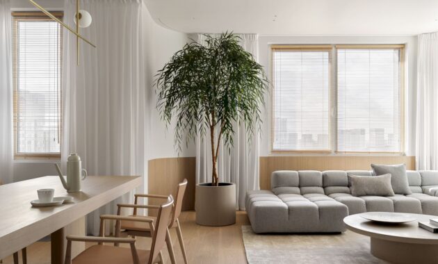
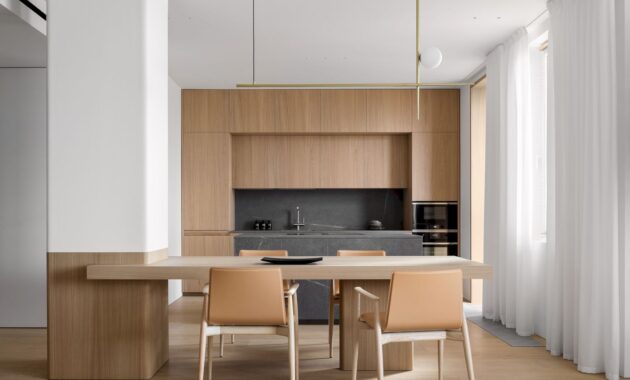
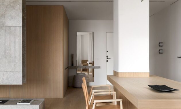
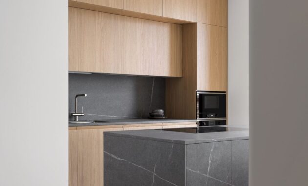
The architects faced the formidable task of incorporating a substantial load-bearing pylon that lacked any visual support in the room. To achieve a seamless composition, architects ingeniously integrated the pylon into the kitchen area by installing a dining table. This served as the project’s starting point of an embracing-walls-with-wood motif as an integral part of the design concept.
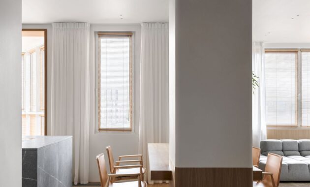
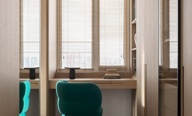
The second significant hurdle in this endeavor was the presence of standard-height windows. Unlike working with interiors boasting panoramic glazing, architects had to meticulously calculate the ingress of natural light in each space and displace the accent from the window frames.
Another crucial aspect was working carefully with the low ceiling height. Typically, this presents challenges in devising ventilation and air conditioning systems without compromising on the already modest height. Nevertheless, Babayants Architects skillfully highlighted the vertical elements and established aesthetically pleasing proportions in the space. As a result, the rooms don’t feel cramped despite the relatively lower ceilings.
Clients’ Lifestyle and Preferences
The clients of this project are a mother and her adult daughter. They are living together and discerning in their taste, meticulous in their attention to detail, and hold a strong appreciation for aesthetics.
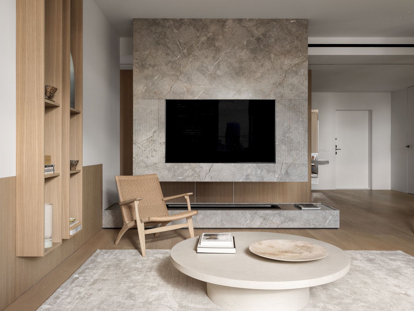
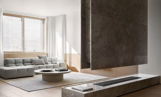
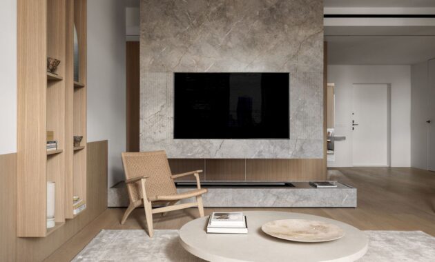
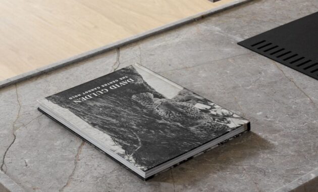
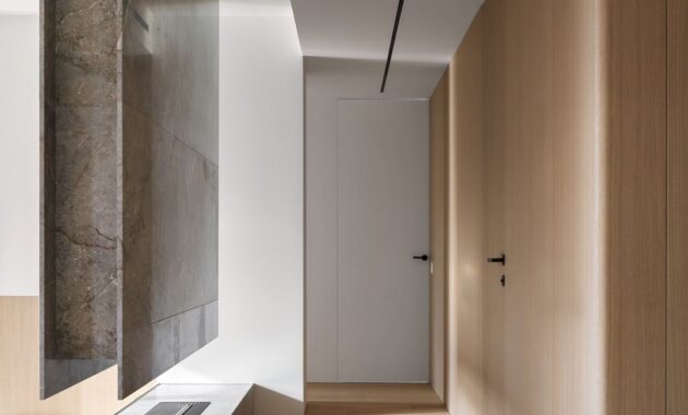
A key priority for them was the inclusion of a bio fireplace. To accommodate this, Artem Babayants devised an innovative solution: a floating suspended structure and a podium crafted from natural stone, specifically Astana Gray. This multifunctional piece serves not only as a visual divider, demarcating the shared area, but also as a television stand and a complement to the bio fireplace itself. It has quickly become the focal point of the entire interior.
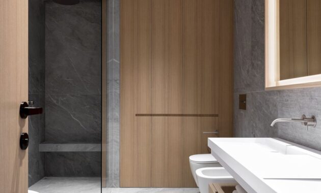
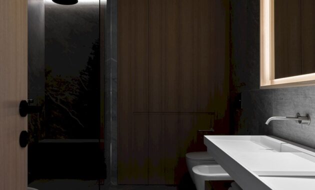
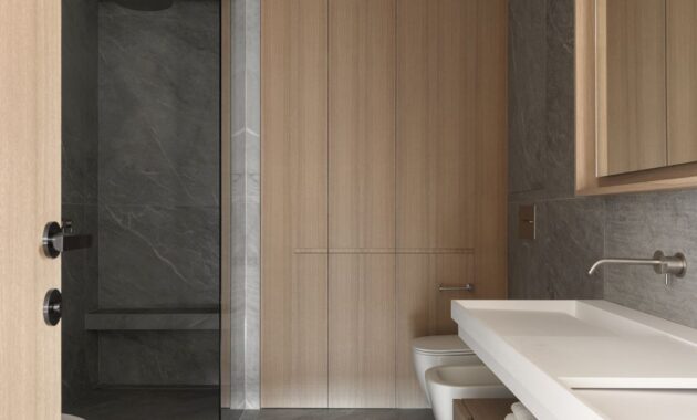
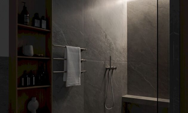
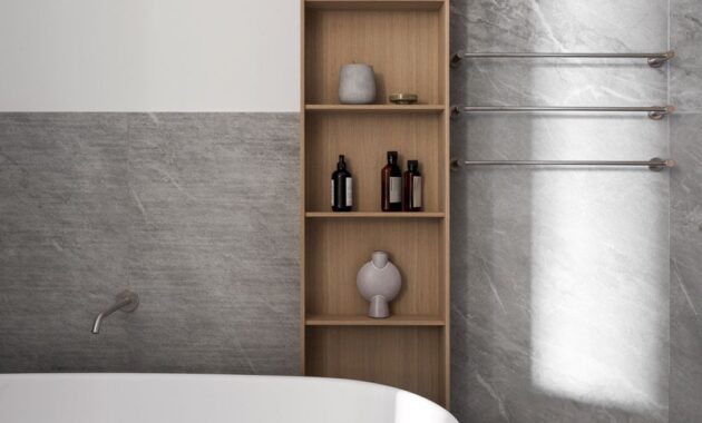
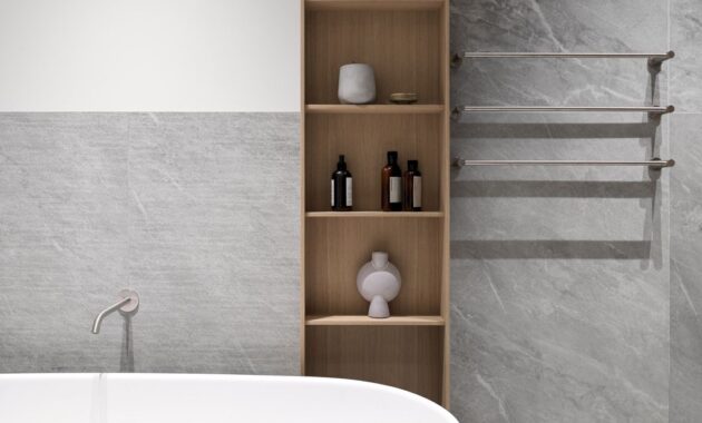
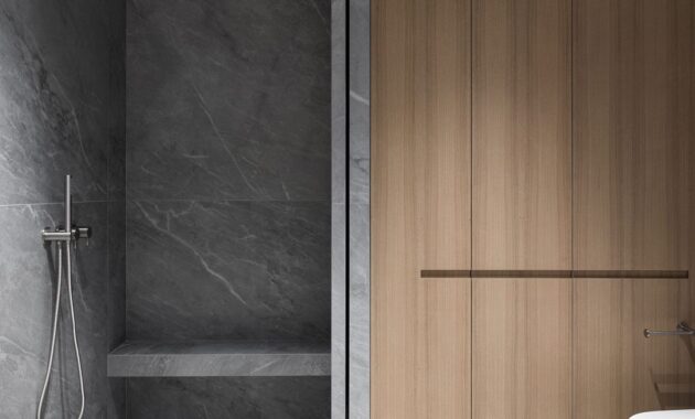
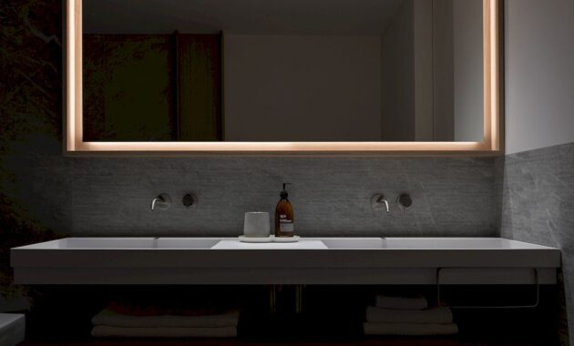
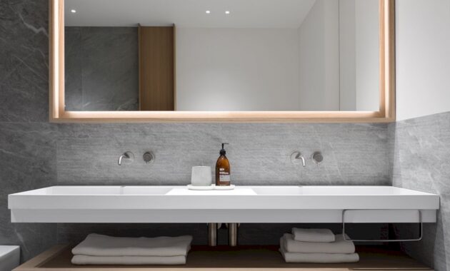
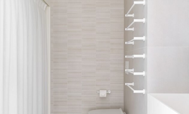
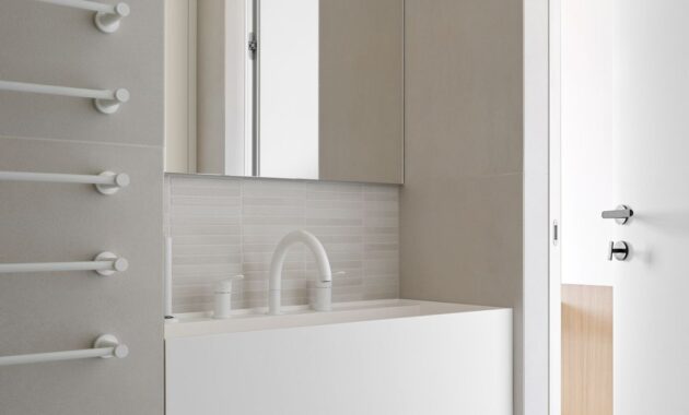
Additionally, the clients wished for a bathroom complete with a freestanding bathtub and a large, well-lit mirror for makeup application. This required careful consideration of lighting scenarios to ensure a comfortable and functional space.
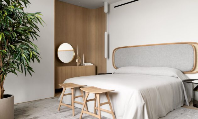
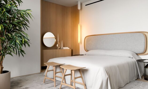
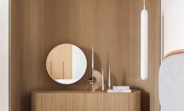
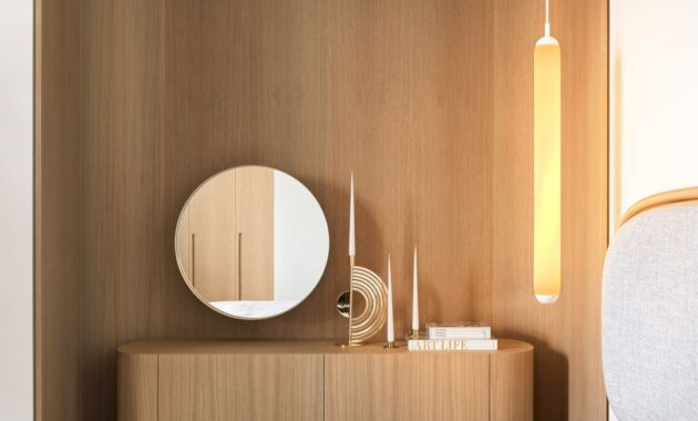
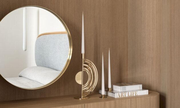
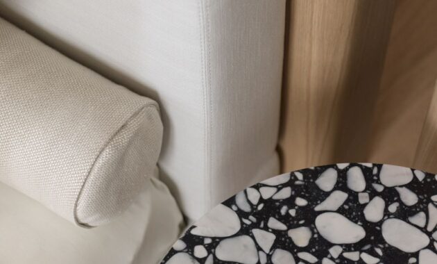
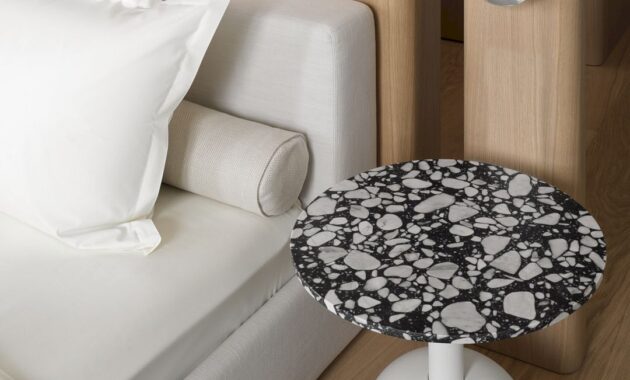
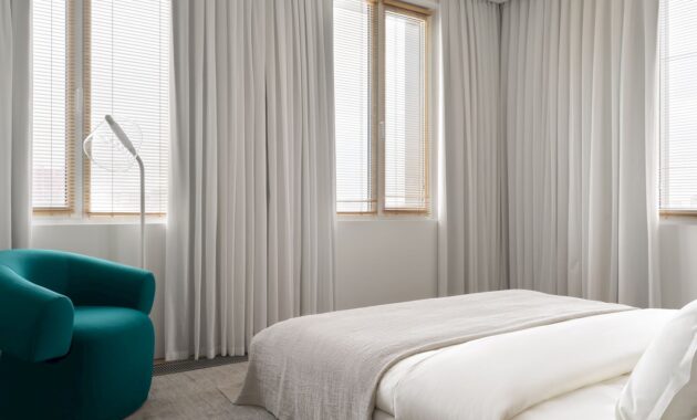
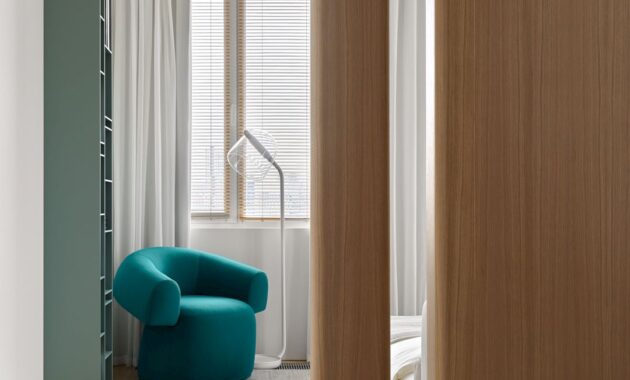
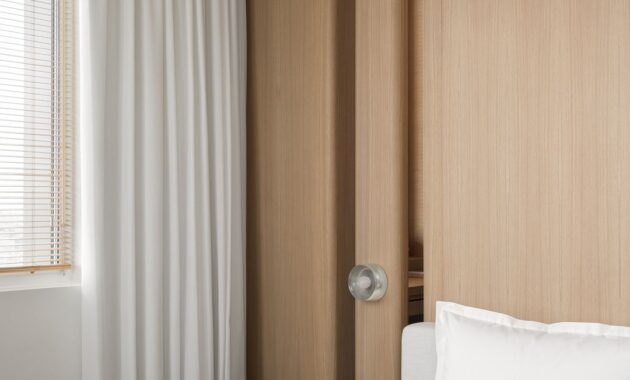
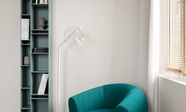
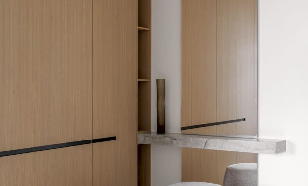
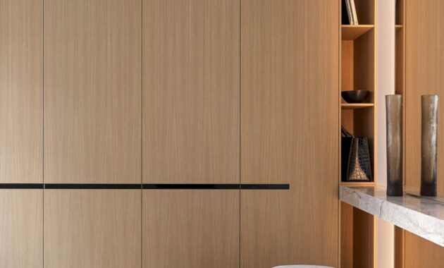
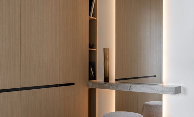
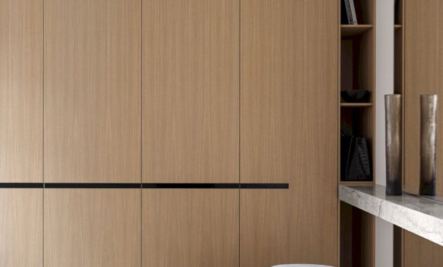
For the daughter’s bedroom, multiple functions were envisioned: a relaxation area, a dressing space with a vanity table, and a cozy reading nook. All cabinetry, including panels, cabinets, and the vanity table with an integrated mirror, was meticulously designed by Babayants Architects. The sleeping area was subtly delineated from the dressing area with the use of round wooden partitions. Thanks to the presence of four windows on two sides, a solid wall was deemed unnecessary. This design choice ensures ample natural light throughout the room, lending a sense of depth and fascination to the entire interior.
Design Concept and Key Features
The base of the design concept is a blend of minimalism infused with distinctive character. The interior boasts clean lines and meticulously crafted proportions, a testament to the architects’ painstaking efforts.
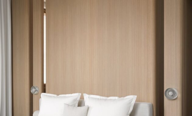
The interior’s main leitmotif are rounded wooden panels. The project concept inspiration came from the architectural features of the building. The building’s external walls have a radius curve and a unique angle. Using veneer structures, this radius was repeated in the living room and master bedroom. This smoothed corners and soft lines, and influenced the space atmosphere as well, evoking a tactile, soft, and feminine ambiance.
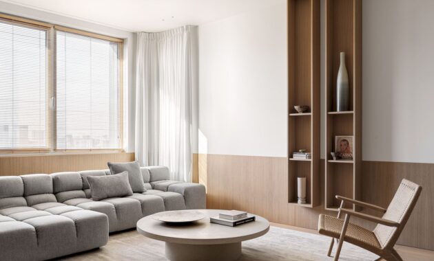
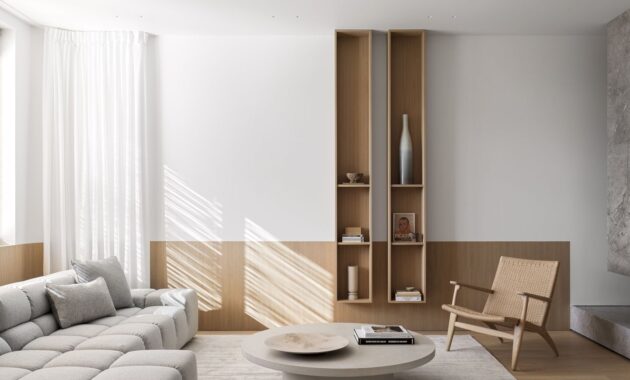
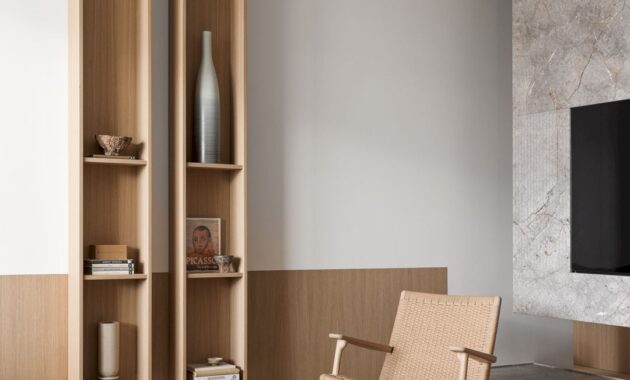
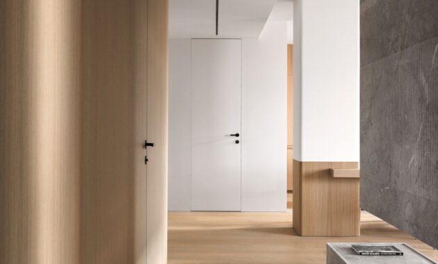
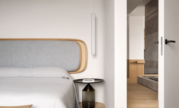
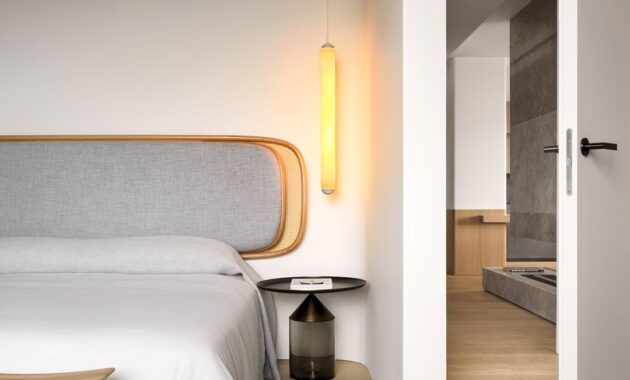
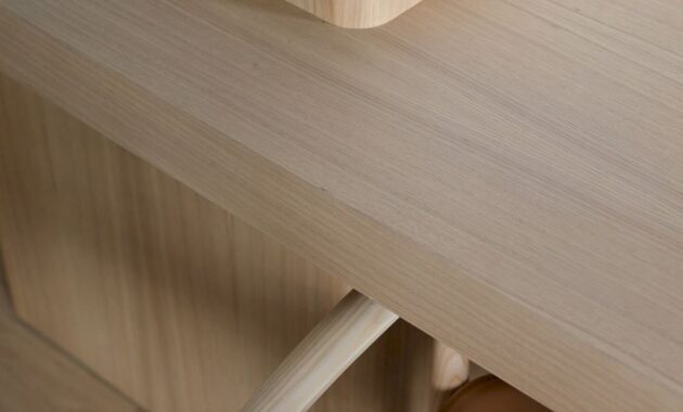
A subtle honey-toned palette dominates the interior. The wood hues adorning floors, walls, furniture, and elements, create an enveloping impression visually.
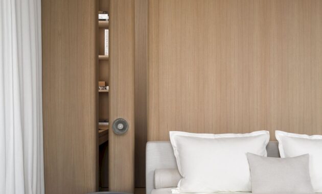
Delving into the intricacies of each area, the architects meticulously selected warm wood tones to weave a cohesive narrative throughout the interior. In the master bedroom, the cabinet and veneer were selected ton-sur-son. This composition invites prolonged contemplation, encouraging viewers to immerse themselves in the interplay of shadows and emerging forms.
Selecting the perfect wall paint proved to be a very long time process, with Babayants Architects dedicating considerable time to finding the ideal light gray shade suitable for various lighting conditions.
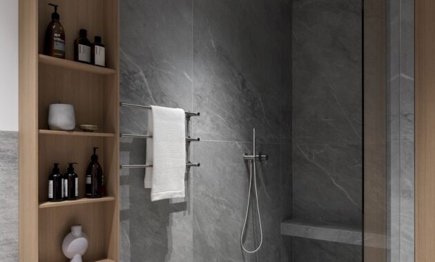
Every detail, from finishing materials, wooden elements, cabinet furniture, wall panels and partitions, structures made of natural stone, and finishing in bathrooms, was meticulously crafted in Moscow workshops according to Babayants Architects’ precise specifications.
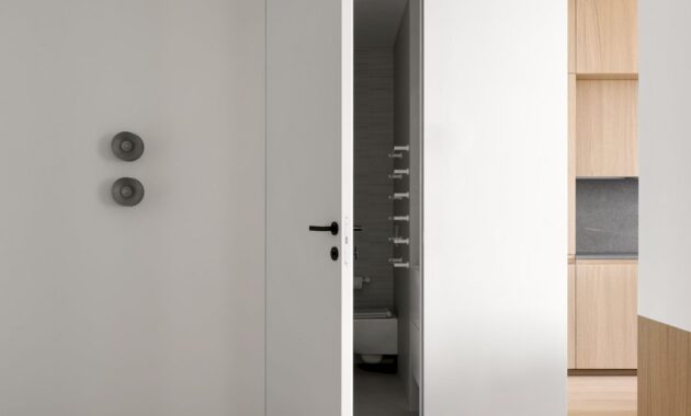
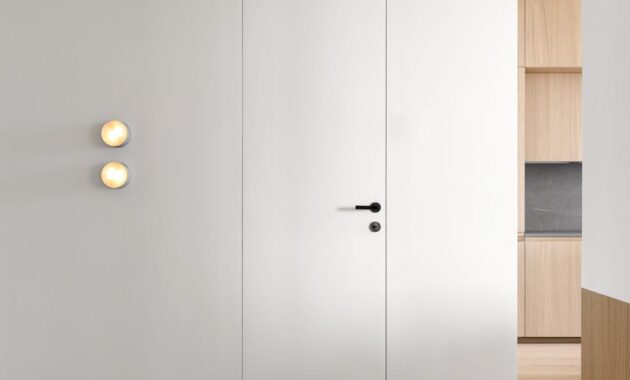
To elevate the architecture of space, beautiful lines, and proportions, the focus is on concealing technical elements and eliminating clutter. These solutions can be implemented with discipline and constant attention on the drawings and on-site.
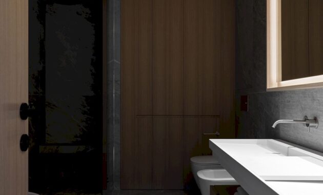
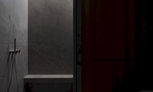
The wardrobe and bathroom are seamlessly integrated into a wooden volume by veneering the cabinet fronts, a wall, and a door with a single material and calculated millimeters to bring all the elements into one plane. With such decisions, the aesthetics of minimalism and its purity can be built.
MONARCH Gallery
Project data:
Size: 115 sq. m
Location: Moscow
Completion year: 2023
Interior design: Babayants Architects
Style: Natalia Onufreichuk
Photo: Sergey Krasyuk
Discover more from Futurist Architecture
Subscribe to get the latest posts sent to your email.
