Julia Andrievskaya, a professional interior designer from Moscow with 10+ years of experience, completed a residential project called PESTOVO Country House. Located in the Moscow region (Pestovskoye reservoir), this country house was designed for a young couple with two small children as clients.
Project’s Advantages and Disadvantages
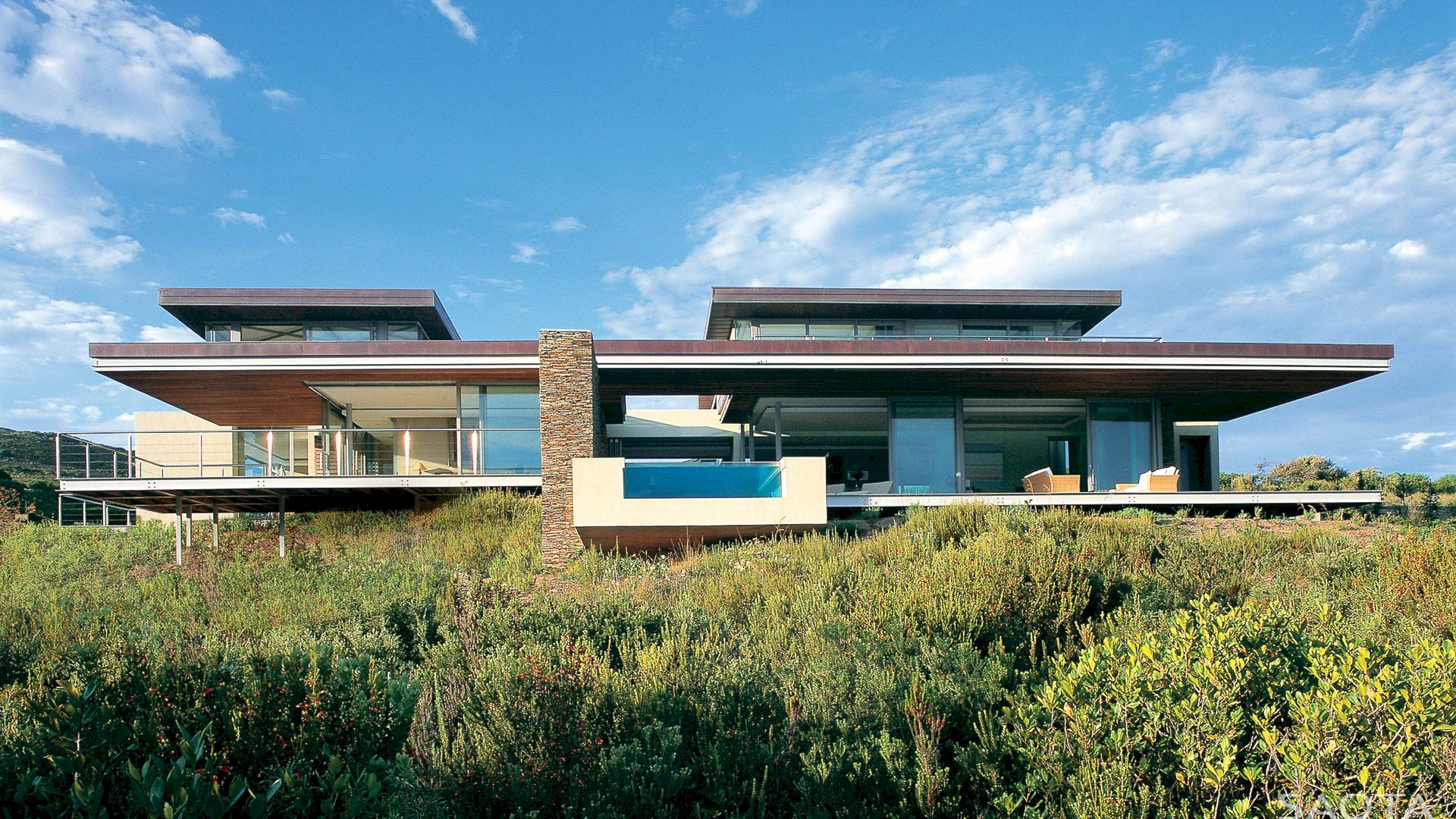
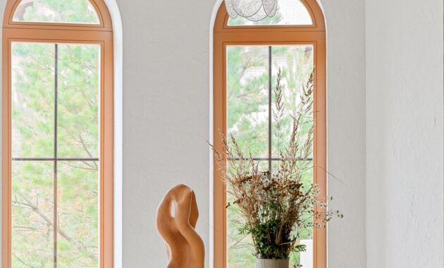
The house’s architecture is made in Italian style. The large arched windows were the advantage. The disadvantages were there was no staircase connecting the floors and walls at all, only the ceiling of the second floor and several load-bearing structures.
About the Clients
The clients of this awesome project are a young couple with two small children. They are very positive and kind people. They came up with some ideas: the walls should be white, the sofa in the living room should be emerald-colored in velour fabric, the fireplace should be decorated with brickwork, the furniture should be in Provence style, and the staircase with forged elements. The only left from their list was the white walls.
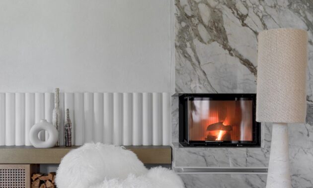
The brick that they wanted to beautify the fireplace moved into the children’s room, replacing it with beautiful, natural, white marble.
It took a year and a half to complete this project and Julia spent almost a year trying to persuade the clients to replace the Provence-style furniture with more contemporary ones. She also managed to gain the clients’ complete trust and subsequently, they agreed with her vision.
As the project was completed, now they are delighted with their home and also are grateful that Julia did not follow their lead and defended her ideas.
The Main Idea
Creating a space for living and relaxation where you can plunge into the harmony of nature after the noisy city is the main idea of this project. A Mediterranean style with modern furniture and vintage pieces.
Color Range
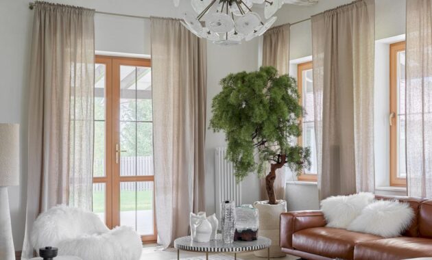
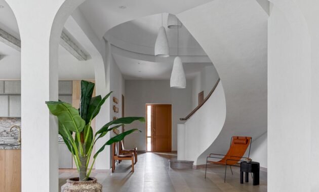
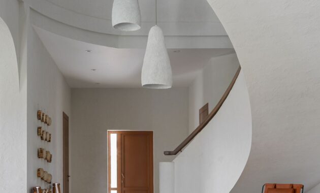
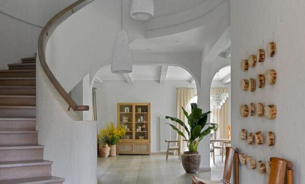
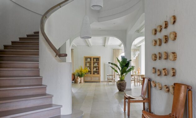
This house has a feeling of spaciousness and lightness thanks to the natural shades with a dominance of white. A radius staircase was created and all the rooms turned out to be of a non-standard shape with a rounded wall, aiming to swirl the space around the center of the house (like a shell in cross-section).
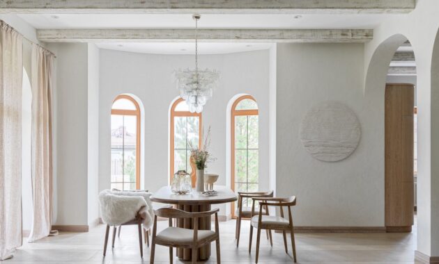
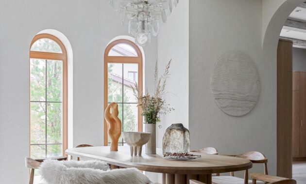
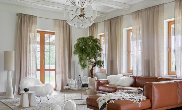
The interior was based on natural textures and light natural shades. All textures and colors in a monochrome interior should overlap and be combined. The ceiling was decorated with wooden beams, adding atmosphere to the living room and kitchen.
Combining several styles was also important for this house. Julia wanted to use modern furniture without patina or age, that’s why she used rough plaster and aged beams. She also hangs a vintage chandelier from the 70s and uses plaster stucco in a modern design at the same time. She loves unconventional combinations of items.
Finishing Materials
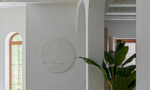
Julia used matte, rough plaster (decorative plaster “mazanka”) for finishing. It takes the clients to the sea coast.
The Color Palette
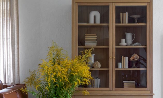
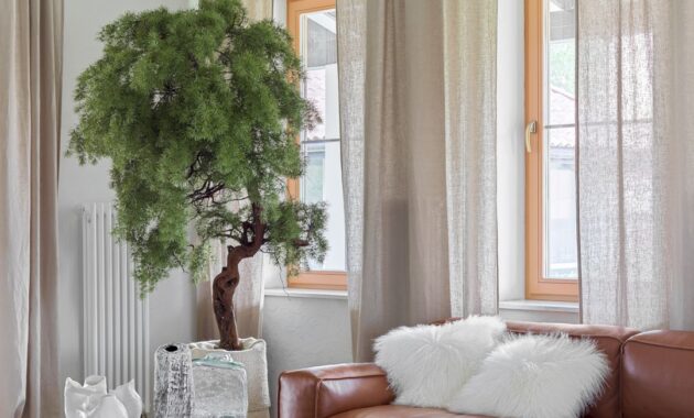
Julia gave preference to bleached oak and light shades of white and gray in furniture and there are only some items made of red leather.
Furniture
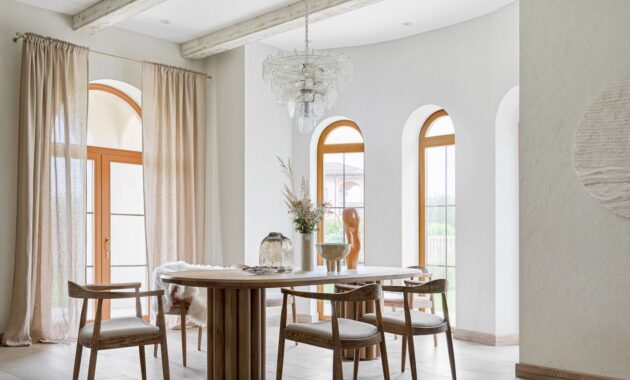
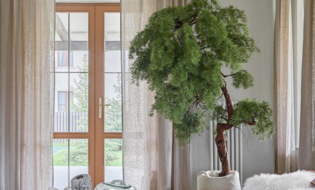
Decorative elements and furniture in this house are made by hand by local craftsmen. The large windows were beautified with light, translucent curtains made of natural linen. In general, only natural materials are used in the decor of this entire house.
Technological Solutions
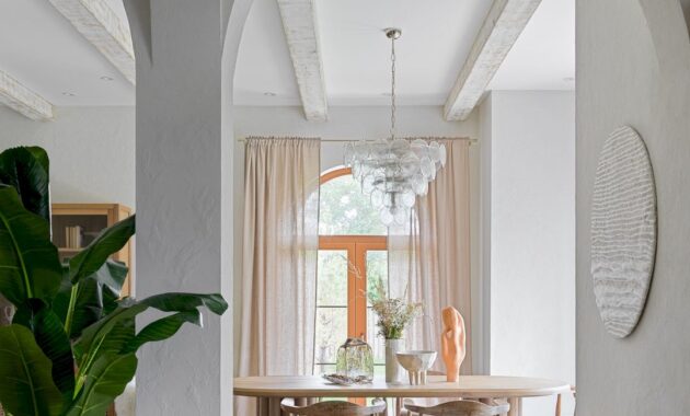
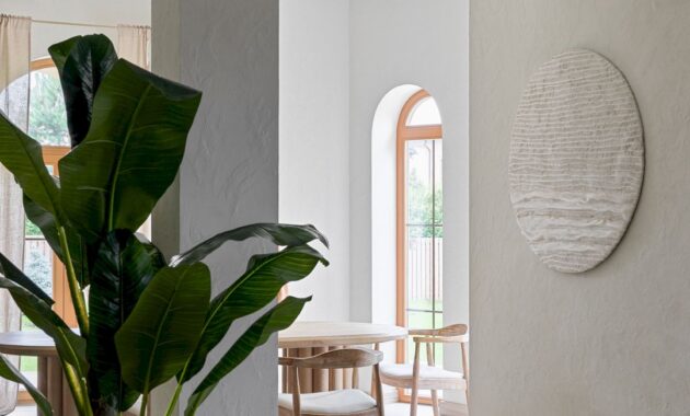
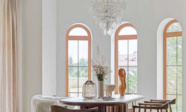
The dining area and its table designed according to Julia’s sketches is one of the interesting technological solutions in this project. The table’s tubular bases and the tabletop are made of solid oak. Clients brought chairs from Spain while the vintage chandelier comes from the 70s (Italy). On the wall, the round panel was made by her from wool and plaster.
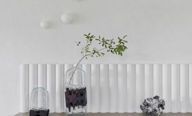
Another interesting technological solution in this project is the fireplace. This fireplace is made of natural marble of Italian origin. Tubular plaster molding echoes the table bases while a large tan leather sofa acts as an accent in a white space. Whitewashed beams break up a large area of the ceiling visually, giving dynamics, and creating the atmosphere of a typical country house. There is also a silk carpet with an interesting pattern that gives a feeling of softness.
Kitchen
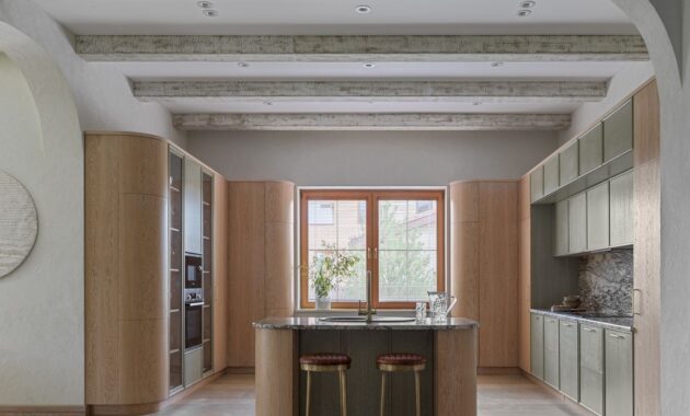
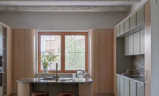
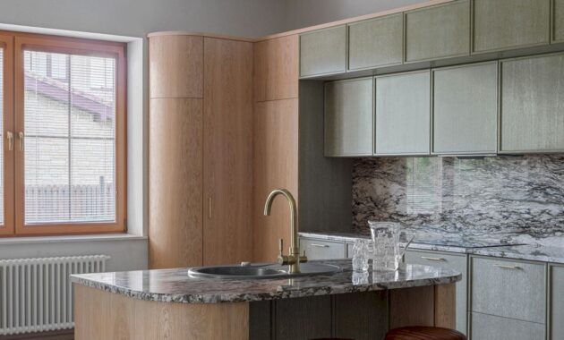
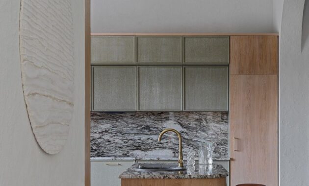
The ceiling of the kitchen is also decorated with beams just like the living room. The use of radius facades near the kitchen and island aims to soften the space and the erected arches in the passages echo them well. The result is a large kitchen with modern facades made of natural oak veneer and soft olive with a thin frame.
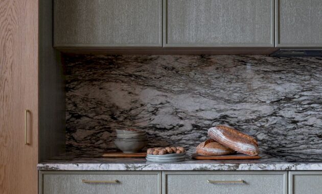
Beautiful natural granite Blue Flower (Italy) on the countertop and backsplash beautified the kitchen’s color scheme.
Hall
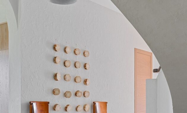
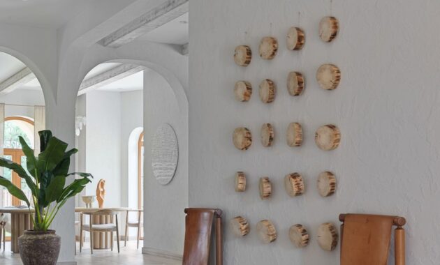
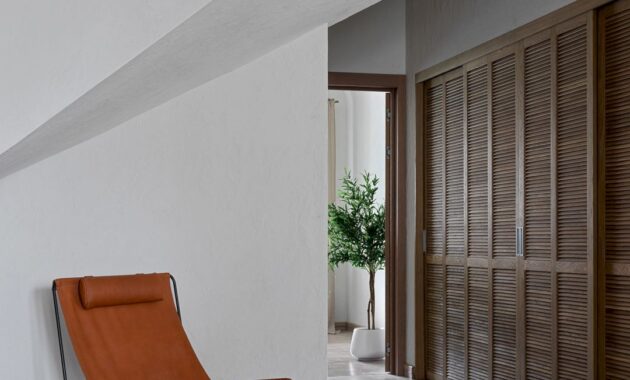
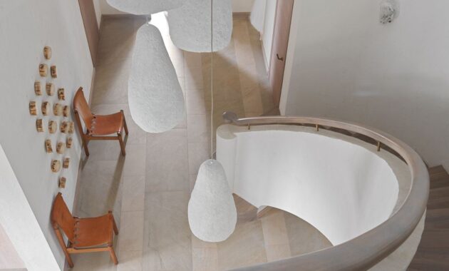
The white hall with a staircase trimmed with oak steps is beautified with handmade sconces and large lampshades on long pendants of different heights. Above the vintage chairs, the wall was decorated with sawn hemp. There is also a large wardrobe made of oak slats creates a maritime atmosphere.
Bathroom 1
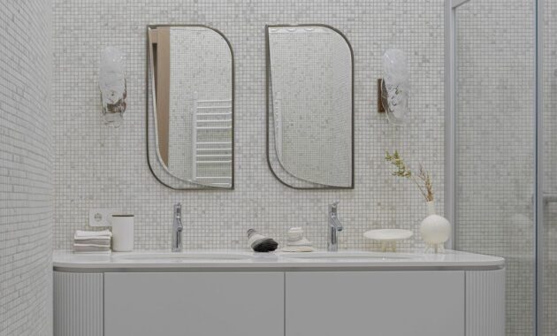
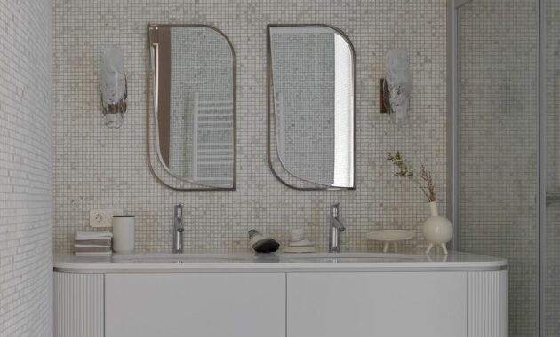
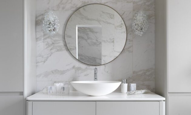
Fine mosaics made of natural marble beautify the walls in the bathroom. The plaster elements were created from drawings to match the circles on the floor tiles. Bathroom furniture according to designer sketches, handmade sconces.
Guest Bedroom (Red)
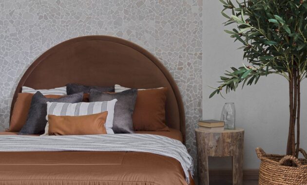
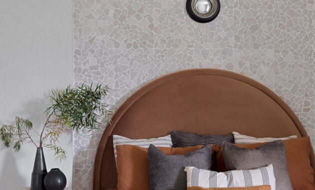
An arch trimmed with stone at the head of the bed can be found in this guest bedroom. Stumps serve as bedside tables while a jute carpet is a great addition to them. The color of the bed and bedding looks bright against the background of a monochrome interior.
Bathroom 2
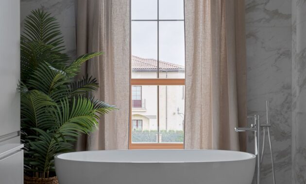
This bathroom is divided into two zones. The first zone is for a shower and toilet while the second zone is for a large oval bathtub standing by the window. The furniture in this bathroom is also according to Julia’s sketches, as well as sconce interspersed with pieces of white and milky glass.
Master Bedroom
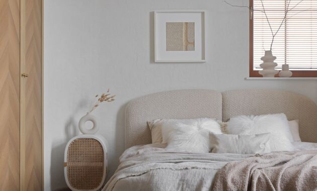
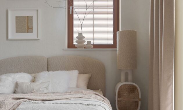
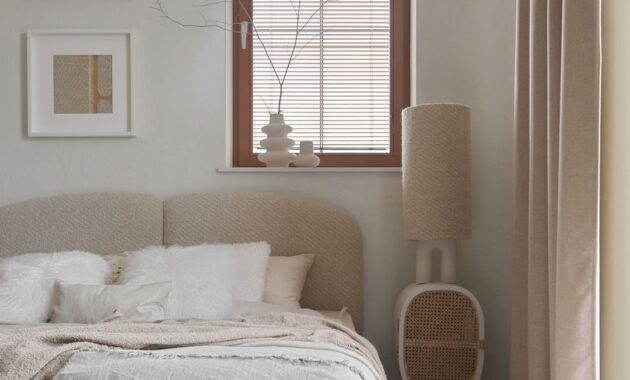
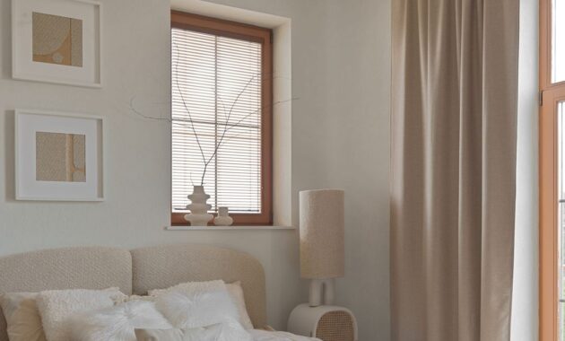
Julia wanted to smooth out the space in this master bedroom so she suggested rounding the corners. The result was an enveloping room. The doors to the dressing room were made according to her sketches. The veneer was laid out like a Christmas tree while a beautiful vintage pearl chandelier was brought from Spain.]
The “Serenity” bed was also made according to Julia’s sketches. There is also a puffy headboard in a modern trend and Italian wool bouclé fabric in this bedroom. She made two pictures from the same fabric as the headboard to complete the space and also draw the eye away from the asymmetrically placed window.
Children’s Rooms
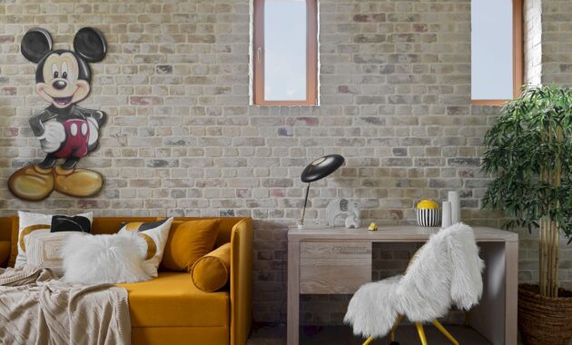
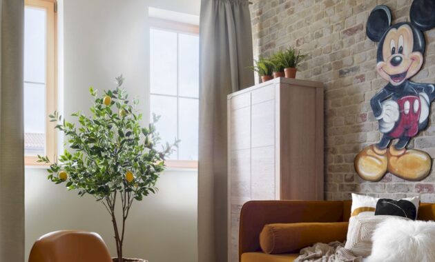
Julia suggested making a brick wall with Mickey Mouse graffiti in one of the children’s rooms. Why brick? Because a brick wall is always a convenient and practical option. The yellow sofa is according to her sketches. Oak furniture is in perfect harmony with the brick and floor of this room.
Children liked the Alky chair from the 60s.
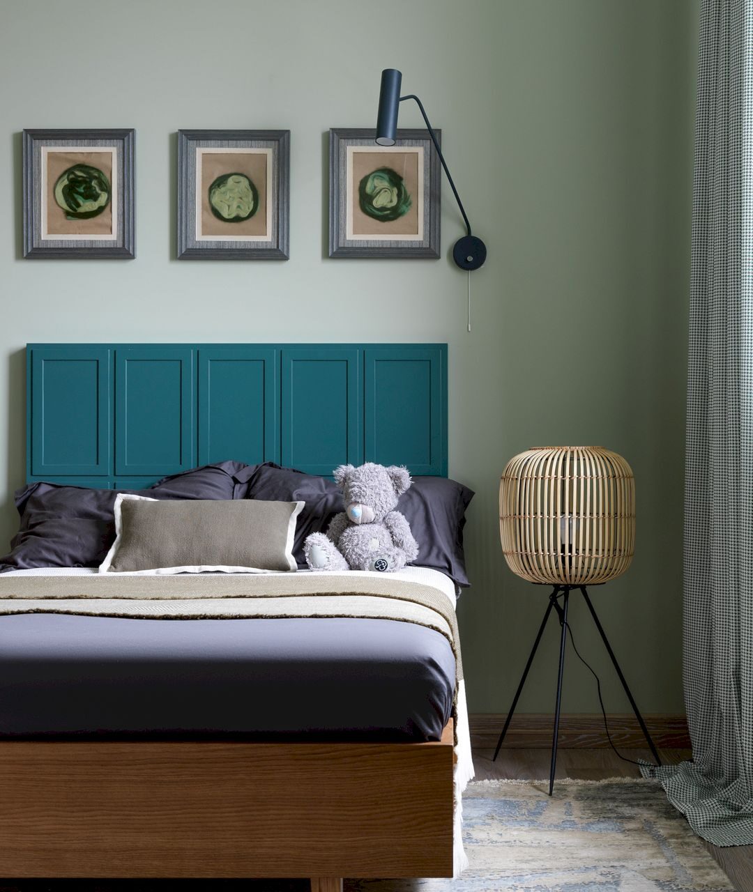
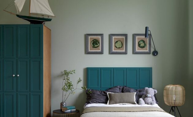
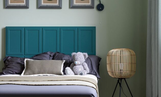
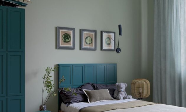
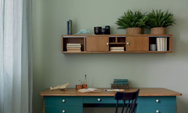
Another children’s room is in green tones. Fun circles are made of plaster and painted to match the color of the wall and add atmosphere to the room. With the right selection of decor, it is possible to combine several shades of green.
The wall decor balanced out the circles and squares in the room’s elements. The carpet with all the color spots was the final accent.
The Greatest Success
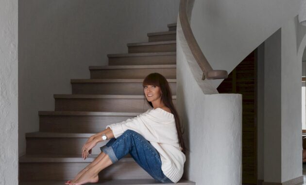
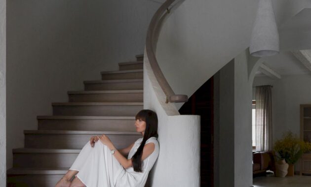
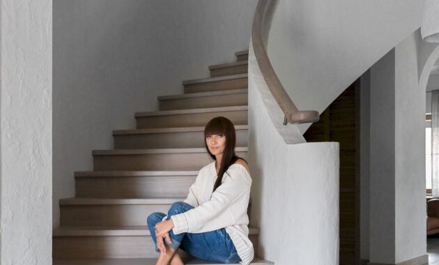
Ladder is the greatest success of this project. The clients liked the idea of a radius staircase, but they couldn’t imagine a concrete fence at all. They finally decided and even in the concrete construction version fell in love with it after several months of Julia’s persuasion. The whole stage of her persuasion was completely completed when they added the oak handrail and steps.
The staircase is decorated with handmade sconces based on Julia’s sketches, her joint collection with Alexey Drozhdin. There are crystal elements with a vibrant texture on an aged brass base. From the same collection, there is a ball chandelier in the living room, where glass on brass tubes pierces an oak ball.
PESTOVO Country House Gallery


Julia Andrievskaya
Designer: Julia Andrievskaya, @andrievskaya_design, https://www.andrievskayayuliya.ru/
Photo: Sergey Krasyuk
Style: Julia Andrievskaya @andrievskaya_design
Area 500 sq.m
Discover more from Futurist Architecture
Subscribe to get the latest posts sent to your email.
