Aliya and Artur Chulakov are the founders of Latu Salon. They took a symbolic approach to name this salon. In Somali, LATU means precious stone. Their names were also woven into this salon name: LA is Alita and TU is Arthur. For this salon’s interior, they adhere to the basic concept: premium quality.
All elements are chosen carefully to reflect the salon’s high level of service. The interior and design of this salon were developed by Kazan architect, Ksenia Evstafieva (@zazzak). She is a professional architect with a portfolio that includes design projects for apartments, houses, and commercial spaces: the Artel bistro, the Izin-Dom beauty salon, the Branch restaurant, the frwl showroom, the Art de Vivre carpet salon (together with Angelina Borodkina within the framework of the Artists Collaboration bureau).
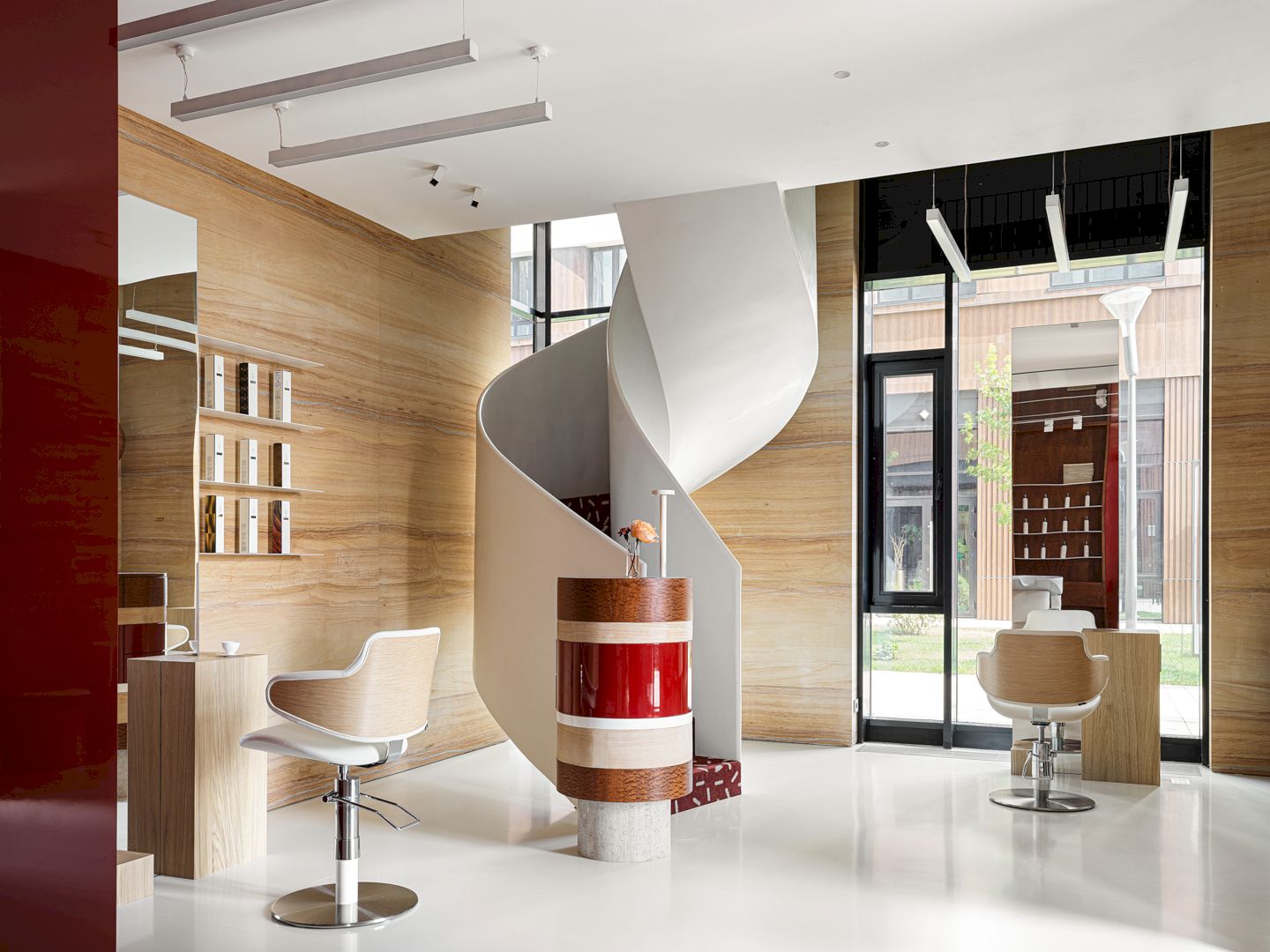
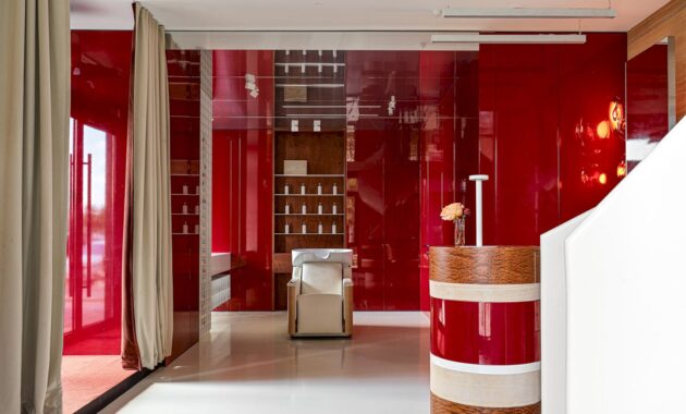
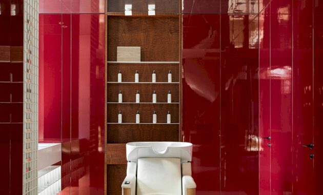
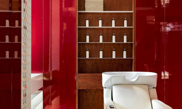
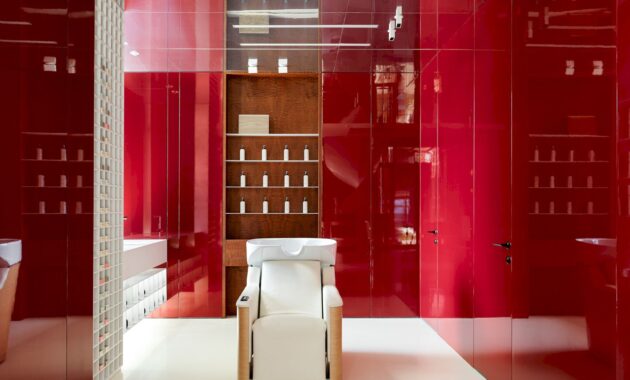
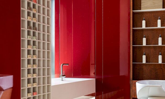
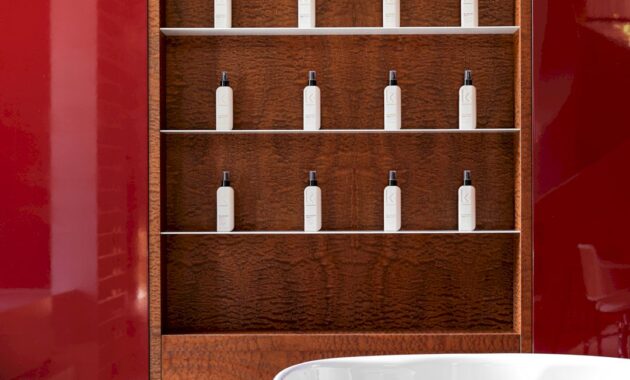
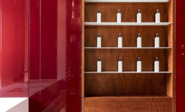
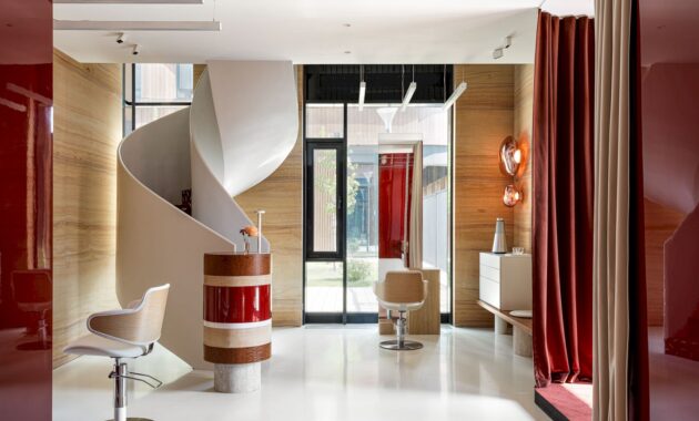
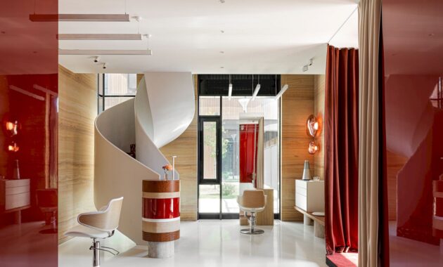
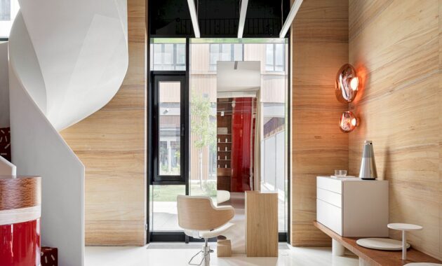
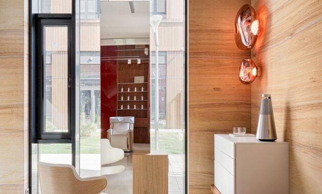
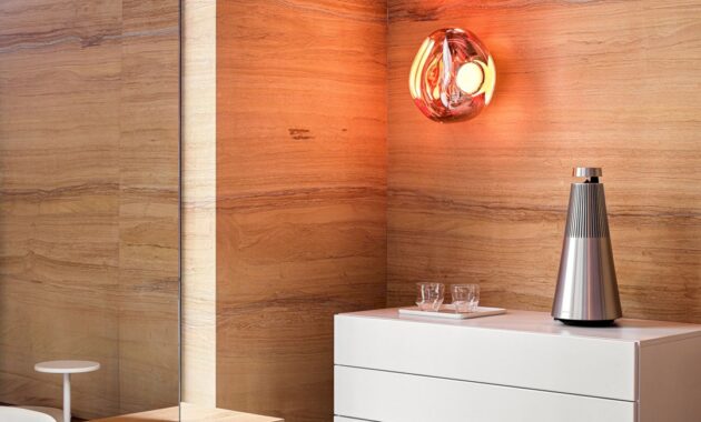
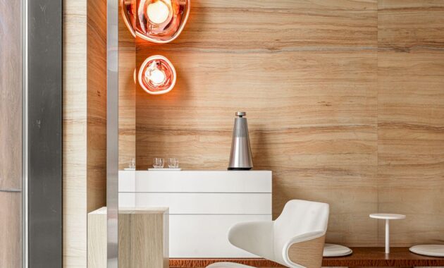
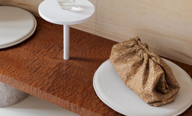
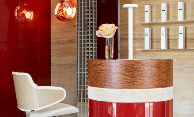
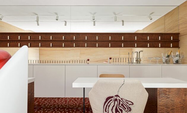
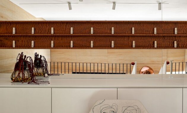
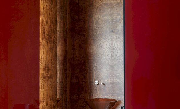
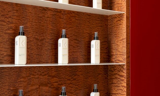
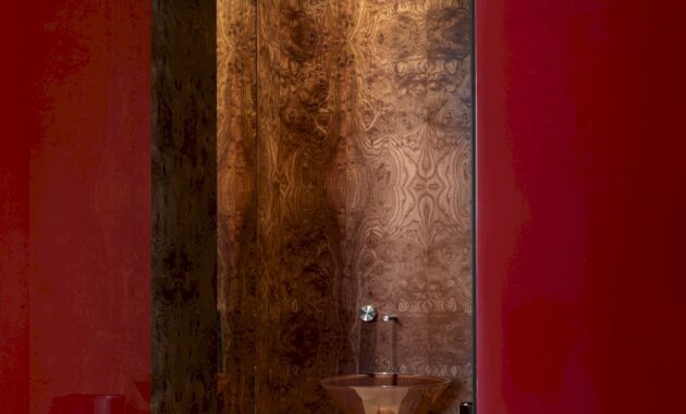
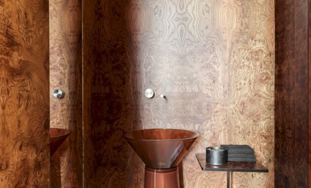
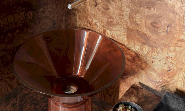
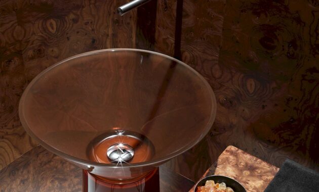
Creating the most thoughtful and comfortable beauty place in a small area of 63 sq.m with a focus on the details to attract the guests’ attention is the main idea of this project. A minimalist color scheme with the addition of bright accents beautifies the interior, completed with the use of natural stone, elm root veneer panels, and furniture from European brands (Tom Dixon, Antonio Lupi, Cea Design, Saba Italia, Bang Olufsen, Maletti, Becara, etc.)
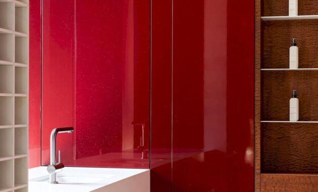
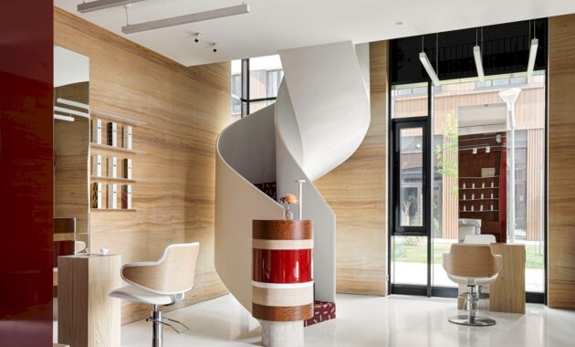
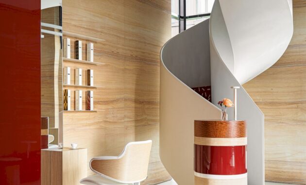
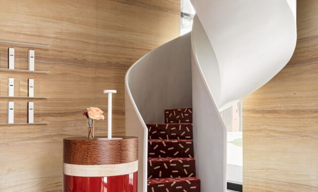
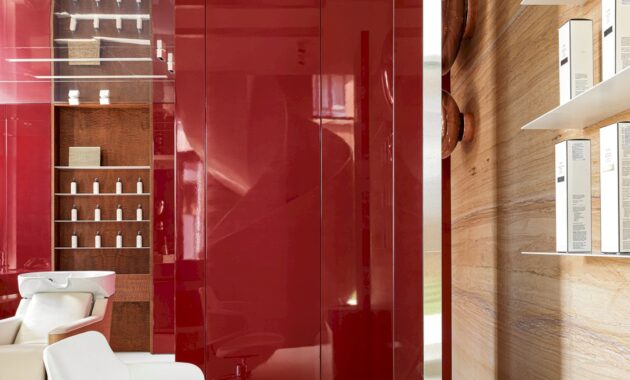
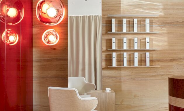
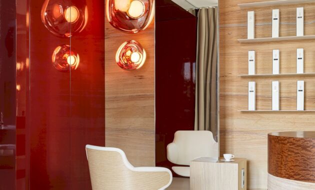
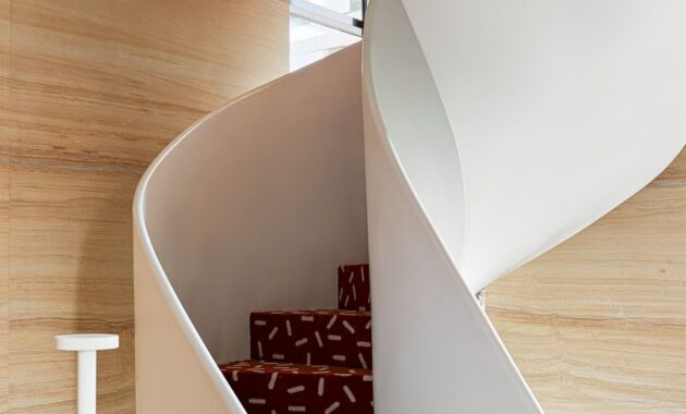
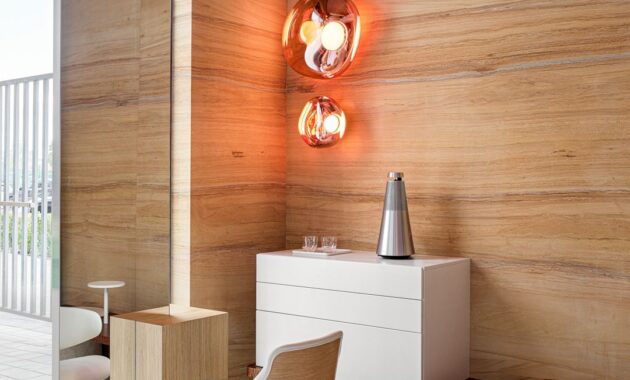
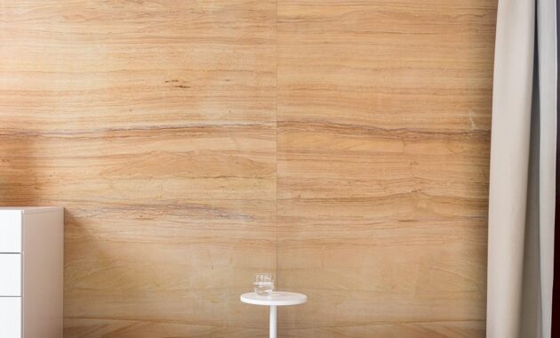
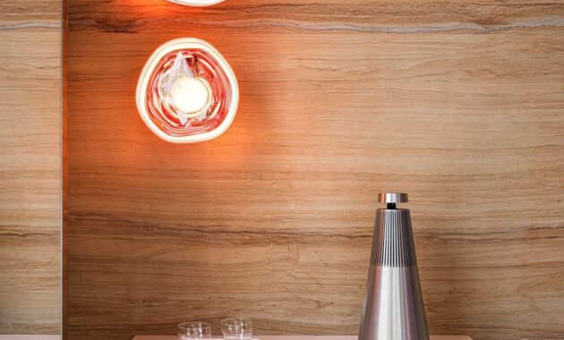
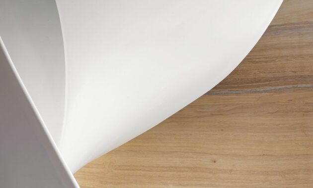
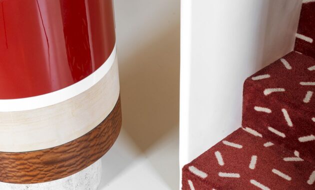
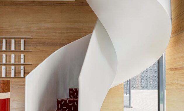
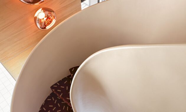
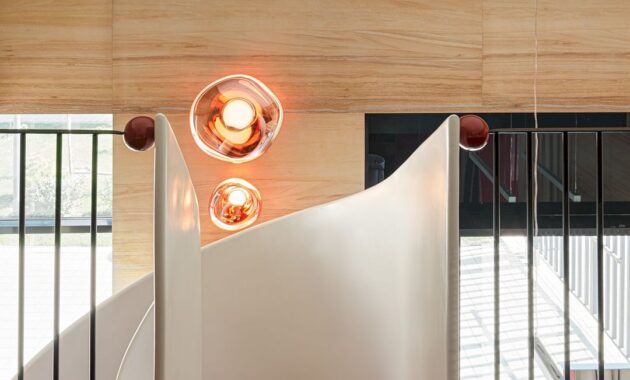
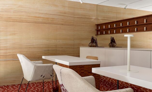
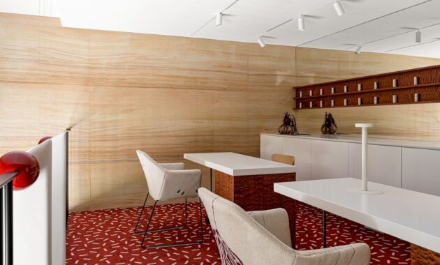
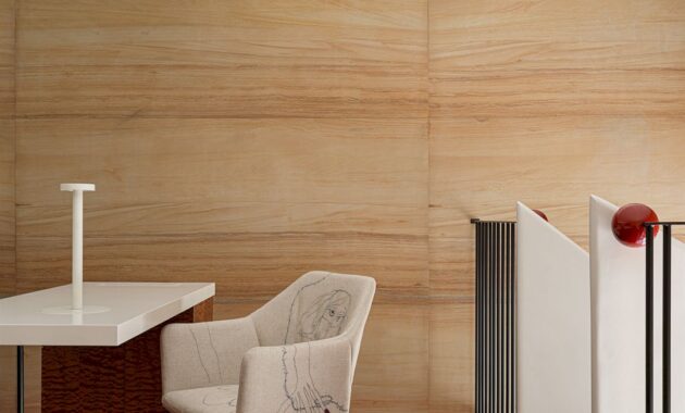
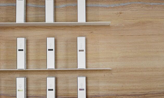
The brown walls are made of natural sandstone, brought especially for the project from India. Inside, there are white armchairs, chests of drawers, and staircase elements that complement these walls perfectly. Burgundy details such as soft carpet with white splashes, decorative elements, and glossy wall panels add individuality to the interior.
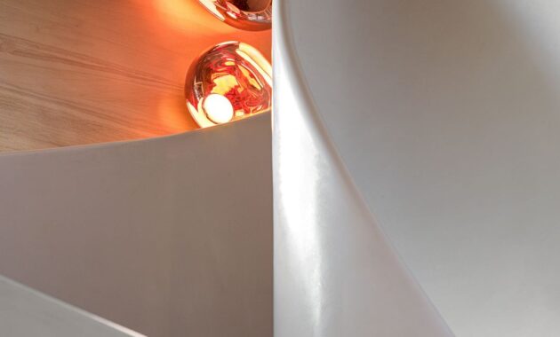
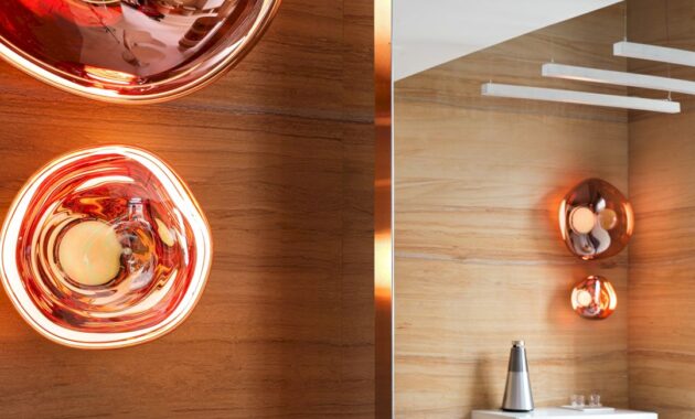
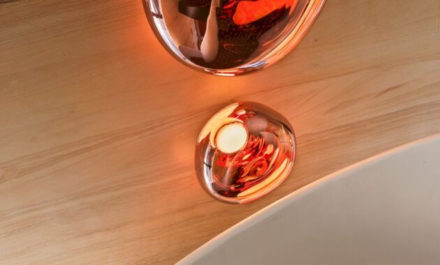
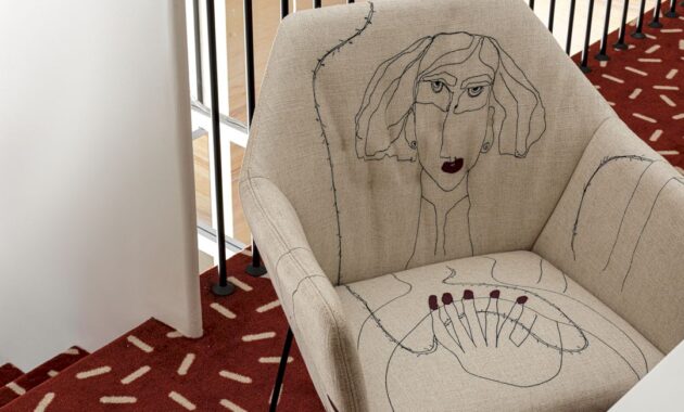
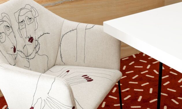
Lamps, armchairs, and a spiral staircase were designed according to the author’s order. There are Tom Dixon lamps that look like futuristic sculptures made of molten glass, echoed by Antonio Lupi glass sinks. Armchairs from Saba Italia are the main element of the interior of the manicure area on the second floor, decorated with hand-embroidered images of girls with burgundy manicures (designed by Antonia Marras).
The result of this project is a comfortable salon that conveys the same special approach to each visitor through the emphasis on textures and their combinations, making them feel like a special and welcome guest.
Latu Salon Gallery
Photographer: Sergey Krasyuk @skrasyuk
Discover more from Futurist Architecture
Subscribe to get the latest posts sent to your email.
