Whether you are moving to a new home or trying to freshen up the arrangement of your older house – making the change can be difficult.
After all, you simply can’t think about maximizing the space you have in this aspect. There’s a lot more than you need to do to ensure that you’re arranging everything perfectly.
While arranging a room, the first thing you should focus on is its functionality of it. It doesn’t matter how good it looks; if a piece of furniture is blocking a part of a door – you’ve failed.
So, in this article, we have tried to talk about how you can organize your house’s furniture and make your room look spacier than ever. Let’s get started with it, then.
How to Organize Your Room?
Last year, when we were moving to a new house, we ended up buying a lot of furniture from Bandpass Design. Well, we needed them, and the products are amazing too.
So, can you blame us?
However, the problem was – our new house was much smaller than the previous one. Thus, it became a little difficult for us to organize everything properly. But we were successful.
Let us share how we did it.
1. We left a lot of space for the traffic.
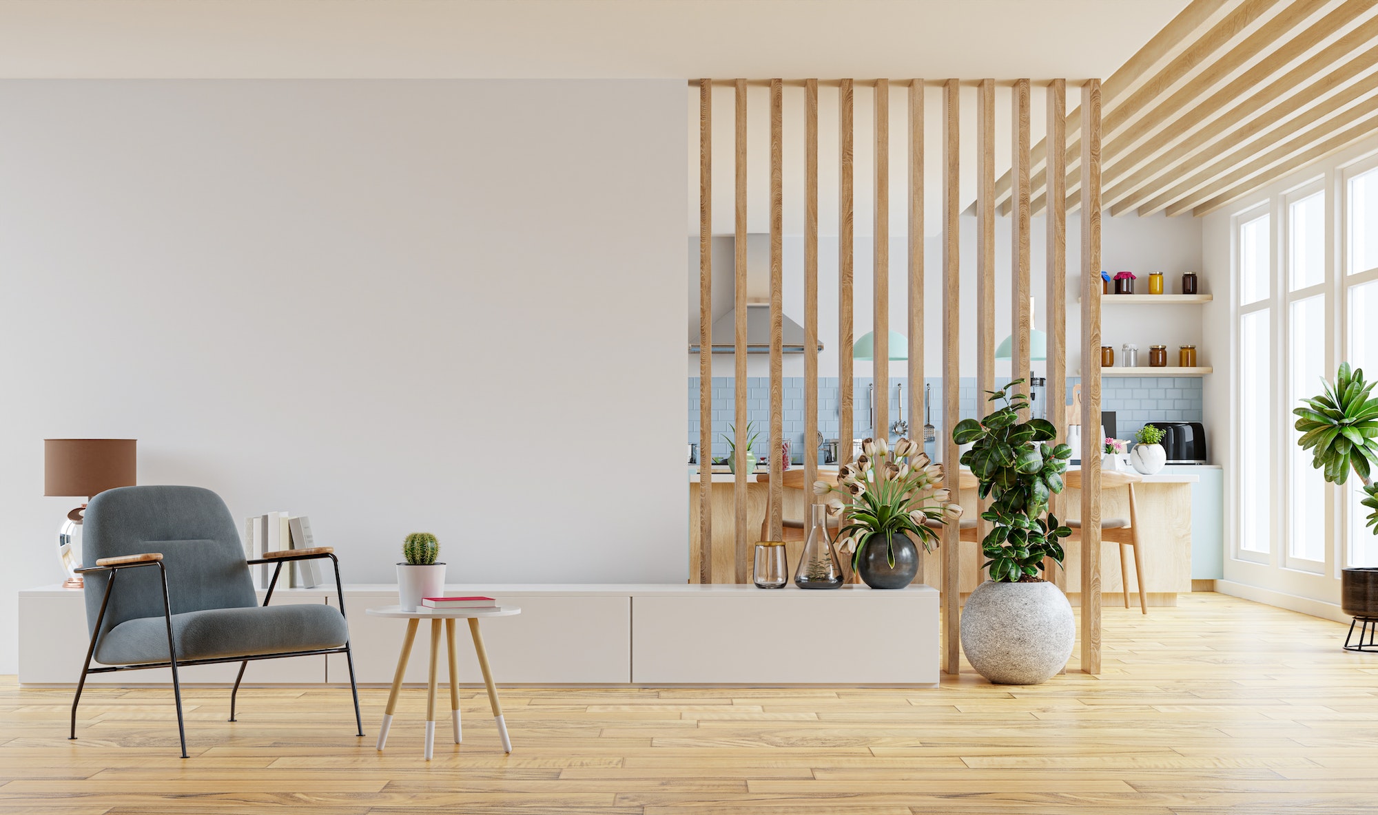
While addressing our living room, we tried to keep as much space as possible. And we did so by putting the TV near the north-side wall of our room and keeping the sofa five feet away.
This, in turn, gave us enough space to keep a small coffee table in between for convenience. It also became easier to organize the rest as we arranged the core components before.
2. The sofa was placed parallel to the wall.
Our newer sofa was larger than the previous one. Hence, we kept it directly against the wall to ensure that we were using the space accordingly.
After all, we didn’t have to keep any kind of wiring behind the sofa. Therefore, we saved a lot of space with it. If we put it in the corner, we could easily use the rest of the space properly.
3. We found the focal point at the earliest.
Almost every room should have its own focal point. It‘s the place that will come in front of an individual’s eyes whenever they get into the room.
So, we decided to put up our television there and hung a painting behind it. It, in turn, made it easier for us to make the place look pretty while using the space properly to keep the TV.
4. The natural light is there, too.
Our living room has one huge window on the right side, and we open it daily in the morning. It helped us get as much natural light as possible while making the room look larger.
Finally, we also put in a lot of lighting in the same room to keep it well-illuminated during the nighttime. A decent amount of effort was put into leaving some space near the door too.
5. We opted for round-edged tables.
It might sound like a weird decision, but a round-edged table can save a lot of space due to the round shape they come with. And that’s not all, either.
A round-edged table can also lower the risk of getting struck at a sharp corner. Yes, they may not look too well with the design of our room, but they are still doing the job perfectly.
6. We kept a large area rug in the bedroom.
Yes, the rug took up a lot of space in the room. But, it gave us a place to rest our feet after walking for hours and hours on the cold hardwood.
Besides, as we went for a rustic design, the area rug also fit right with the design of the room. Nonetheless, it did cost quite a lot, if we’re being honest.
7. The lighting in the room was varied.
For some reason, we ended up choosing the largest room to be our bedroom. Thus, we had to install a lot of lighting there to ensure that everything was bright and beautiful.
But we also put in some dimmed lights there to make the environment look a bit calming and peaceful. It did help us with our sleep quite a lot as well.
8. The window was far away from our bed.
Our bedroom is located on the eastern side. So, the room literally lights up during the morning and noon. Hence, we decided to keep our bed as far as possible from it.
However, as we wanted to keep the natural light coming, we kept the almirah away from the window. Instead, we kept the mirror right beside it to dress better.
9. The dining room is small and compact.
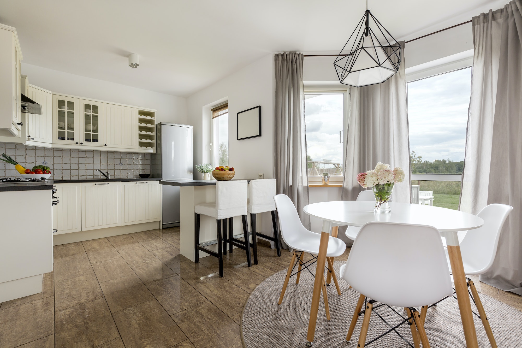
Our dining room is pretty small and compact. So, we kept the fridge near the door and placed our dining table in the middle of the space. We didn’t focus too much on lighting here.
There is a hanging light kept in the middle of the room – just over the table. But, the kitchen is well-lit. Hence, we can easily avoid unnecessary accidents because of that.
10. Yes, we kept plants.
We used the rest of the space by keeping plants throughout our rooms. It made our room look a lot fresher and prettier than before due to the greenery.
The plants were kept near the walls of the rooms to ensure as much space as we could.
The Bottom Line
Apart from what we did, we would ask you to use multi-use furniture too. It would help you a lot in saving space and offer a better outlook to your room as well.
Anyway, that’ll be all for this article. We have tried to offer as much information as we could here. However, if you want to know about anything else, make sure to let us know.
Discover more from Futurist Architecture
Subscribe to get the latest posts sent to your email.


