There has never been a more crucial time to be comfortable at home. Our houses must give us a positive feeling because many of us spend more time there than ever before.
Making our living environments and interior design decisions conducive to positive thinking is crucial since studies have shown that our surroundings may have a significant impact on how we think and feel.
However, a pleasant house may foster and support joyful and rewarding relationships as well as foster and support your welfare. Additionally, by choosing the right materials, home ideas, and interior design trends, you can contribute to the preservation of the environment.
How can you decorate your home to represent your sense of style while making it appear at its best? You’ll have a lot more success if you do a little planning and adhere to the procedures utilized by qualified interior designers.
Allow the Sunlight to Enter Your Kitchen
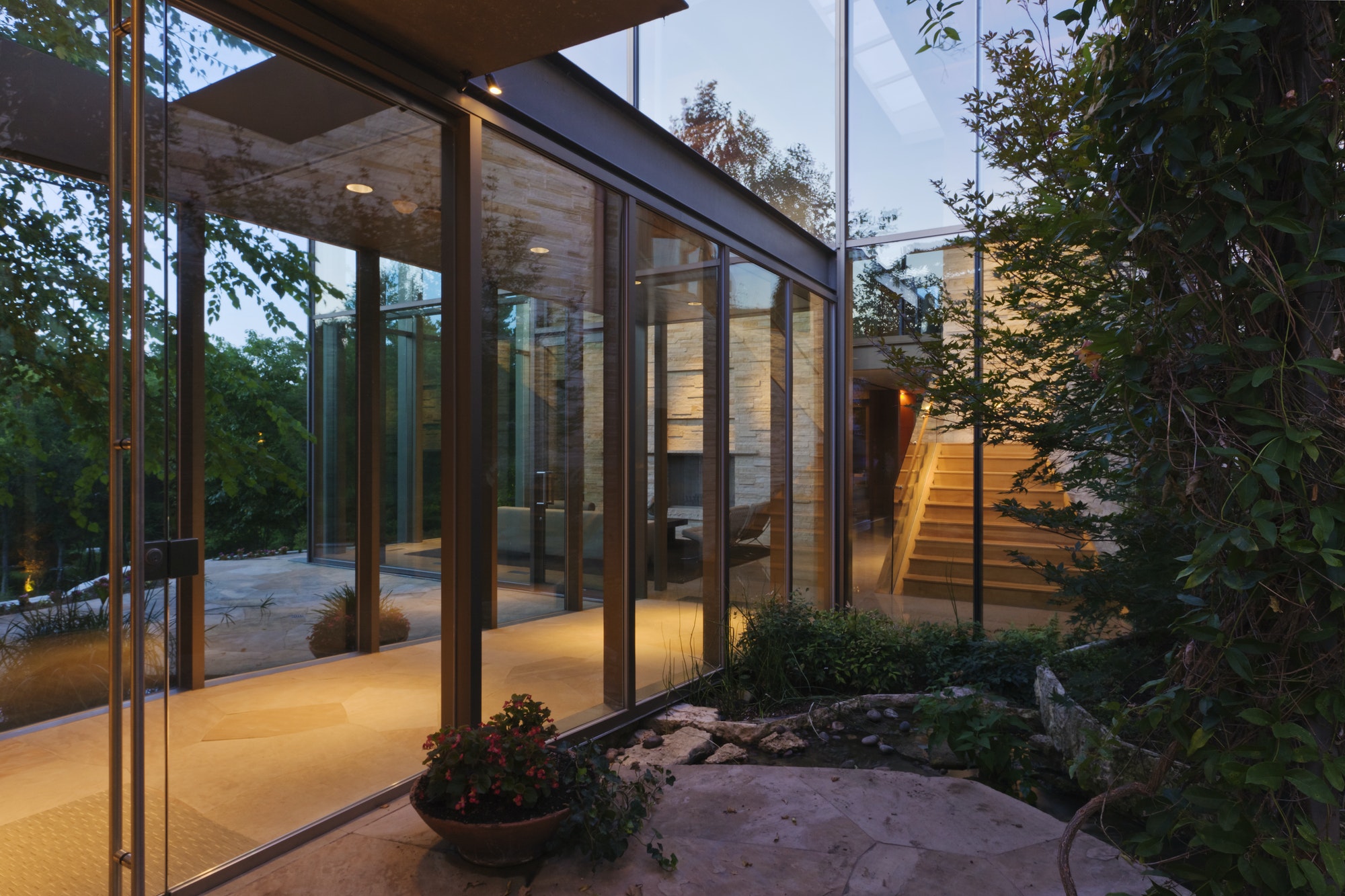
According to experts, a bare bank of windows is preferable to an unattractive one when it comes to heavy, outdated draperies. Window curtains and drapes have to be both stylish and practical. Think of combining sheers with long panels.
Choose bright, non-fading hues if your space receives a lot of sunlight. Cotton, linen, and silk blends are the most suggested lightweight materials for panels because of how beautifully they hang.
Paint Walls with Light and Neutral Colors
Keep the first level in neutral or gray hues, preferably. Avoid abrupt, sharp turns. The most decorative versatility is provided by neutral walls, which make it simple to change up your accessories.
Additionally, painting adjacent tiny rooms in the same neutral shade makes them appear bigger. Move up or down a few shades on a paint strip to create a subtle change from room to room.
Make Sure Your Sofa Talks to Your Chairs
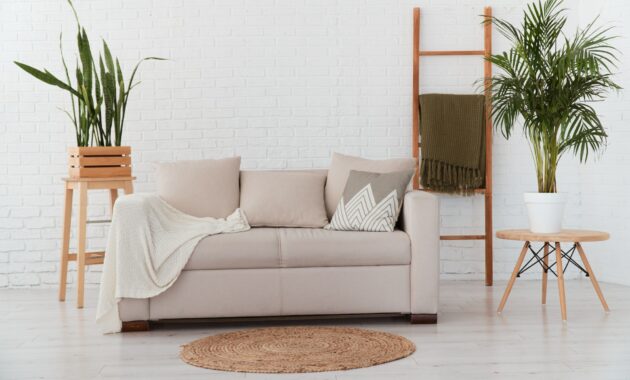
Think of a well-planned hotel lobby where the furniture is arranged in groups that encourage discussion. In your living room, try to achieve a similar sense of harmony and closeness while placing the furniture.
The best discussion areas are those that are either H-shaped with a couch directly across from two chairs and a coffee table in the middle, or U-shaped with a sofa and two seats at either end of the coffee table facing one another.
Pushing all the furniture up against the walls is a typical error to avoid. People do it because they believe it will make their space appear larger, but floating the furniture away from the walls makes the area feel bigger, says the expert.
Every Room Should Have at Least One Mirror
Isn’t it amazing how a mirror gives a room volume and depth, completely enhancing it? Mirrors with custom designs may significantly alter the appearance of any space, adding vitality, richness, and optical trickery. Aside from that, we’ll take the liberty of saying that mirrors are seriously underestimated items of interior décor given how handy they are.
Mirrors may increase the perception of brightness in a room by reflecting light. Moreover, mirrors should not be placed directly across from windows but rather on parallel walls.
The light may be reflected out of a window by hanging a mirror exactly across from it.
Build Up Your Lighting
Good lighting in the house is crucial for a better lifestyle since it, among other things, lowers stress. Colors and brightness are known to alter our moods, even though we are typically unconscious of this. It is established that areas with less light tend to have higher rates of melancholy and despair.
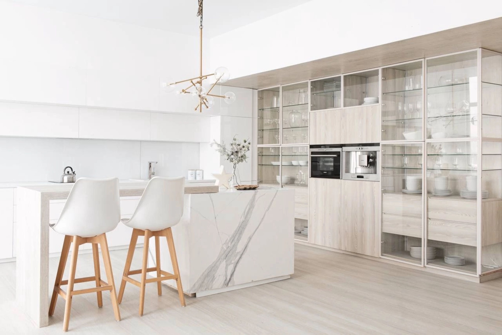
Each room has to have three different kinds of lighting: ambient, or general lighting, which is typically provided by ceiling fixtures; task, which is frequently found over a reading nook or a kitchen island; and accent, which is more visually pleasing and draws attention to things like artwork.
A living space requires a minimum of 3 watts (42 lumens) of illumination per square foot. Professionals swear by one visual technique: the use of uplights. The ceiling will illuminate when a canister uplight or torchiere is placed in the corner, making the space appear larger.

Scale Artwork to Your Wall
Few things look more absurd than hanging little, low-quality paintings too high on the wall.
A picture should hang at eye level in the center. If one person is short and the other is tall, take an average of their height.
Don’t forget to consider scale; if you have a vast wall, go big with one giant piece or combine smaller pieces gallery-style. Avoid placing the pictures too far apart; 2 to 4 inches between each item often looks the best.
Finally, keep in mind that decorating should be enjoyable. It will be substantially less stressful if you approach it methodically from the beginning and apply the same techniques as the professionals. And perhaps you’ll get the ultimate reward—the house of your dreams—in the end.
Discover more from Futurist Architecture
Subscribe to get the latest posts sent to your email.


