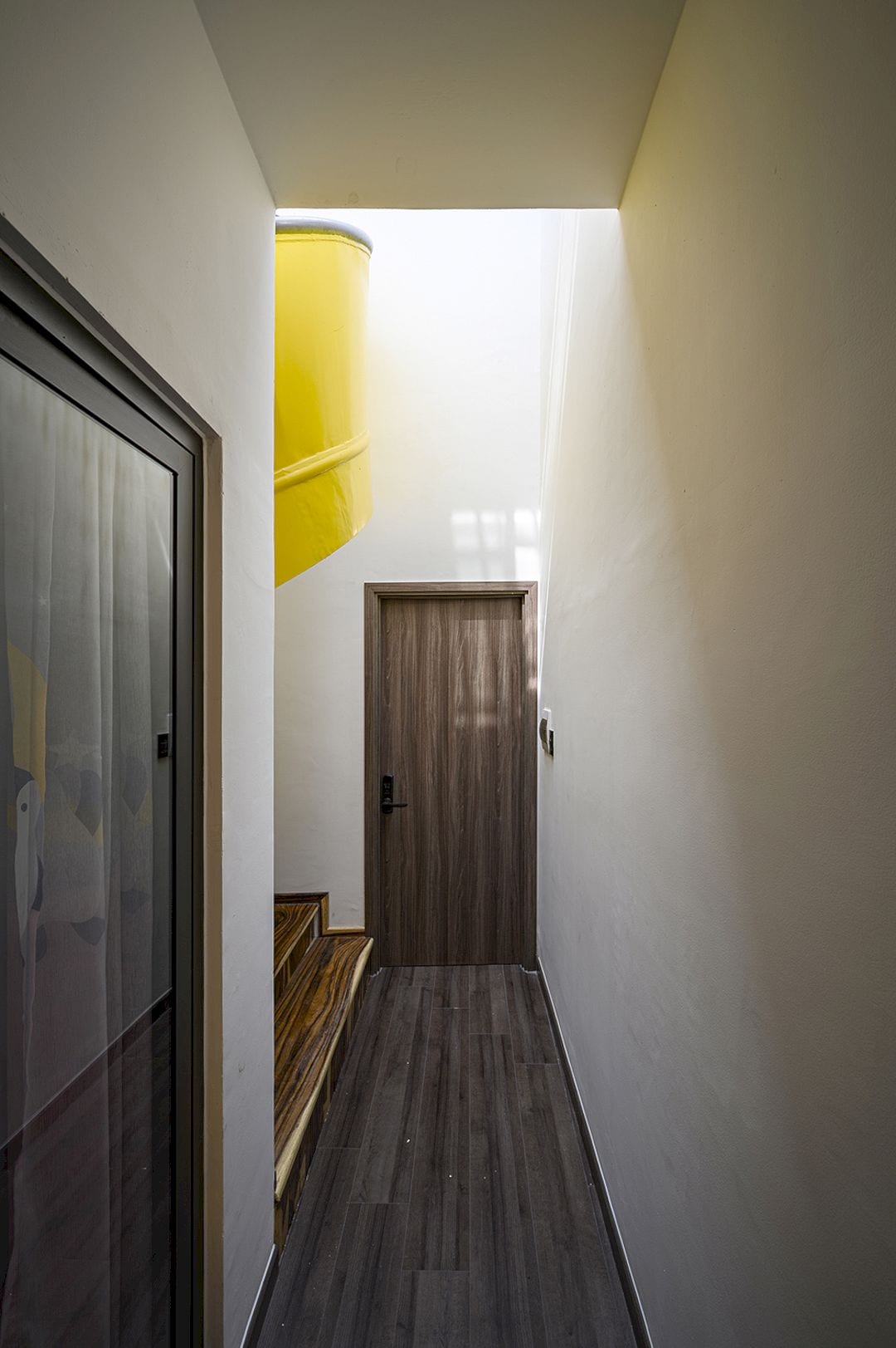
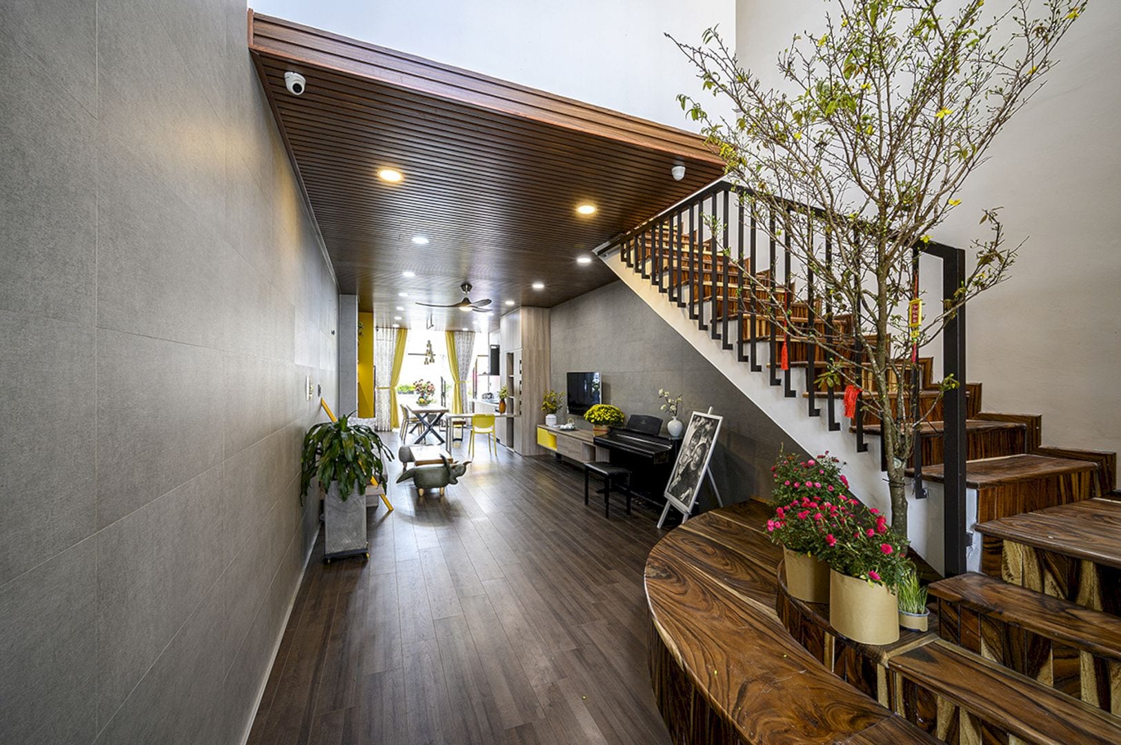
Located in Tan Phu District, Ho Chi Minh City, Vietnam, this project is a combination of working space and living space. Office and House becomes a solution for many people with a small budget living in Ho Chi Minh City. As this city develops, the land becomes more expensive. For the interior, Story Architecture uses yellow as the highlight on the gray and white background.
Design
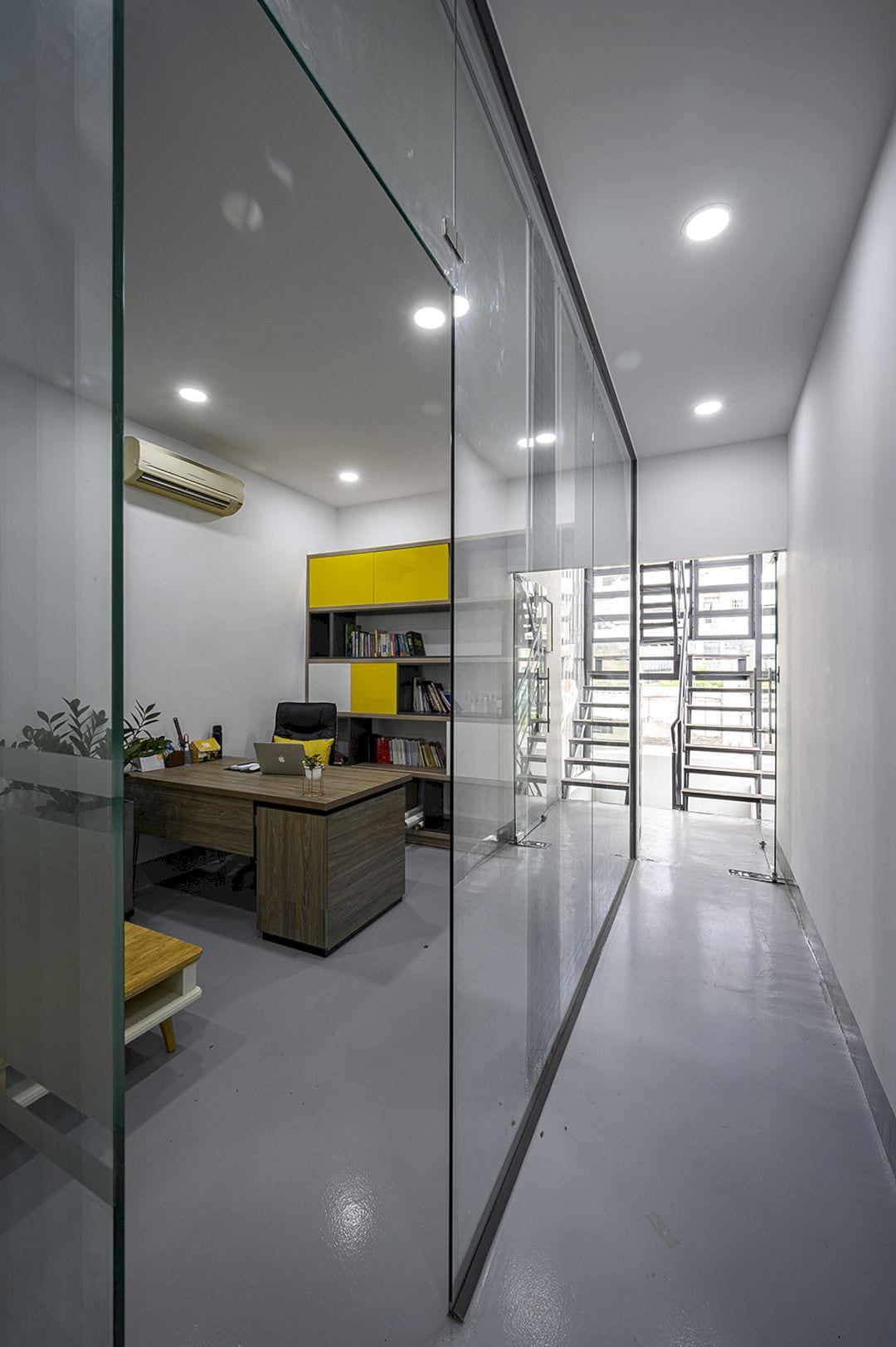
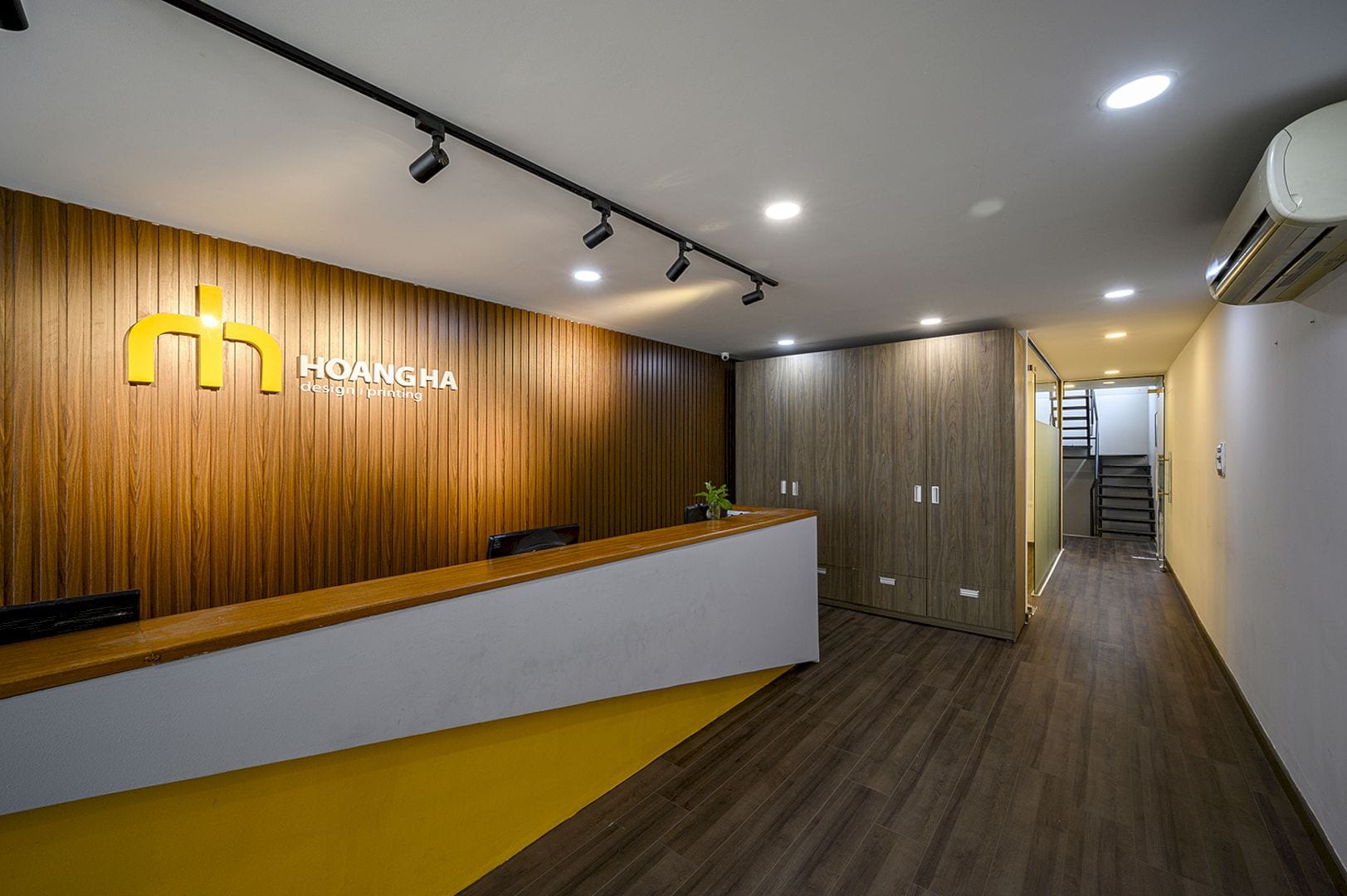
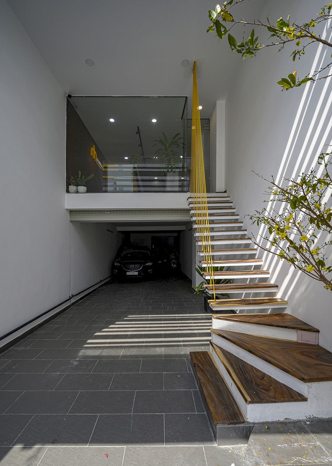
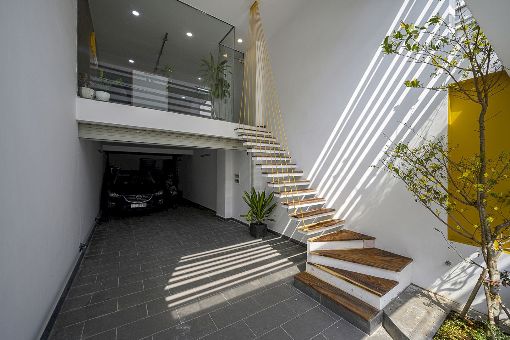
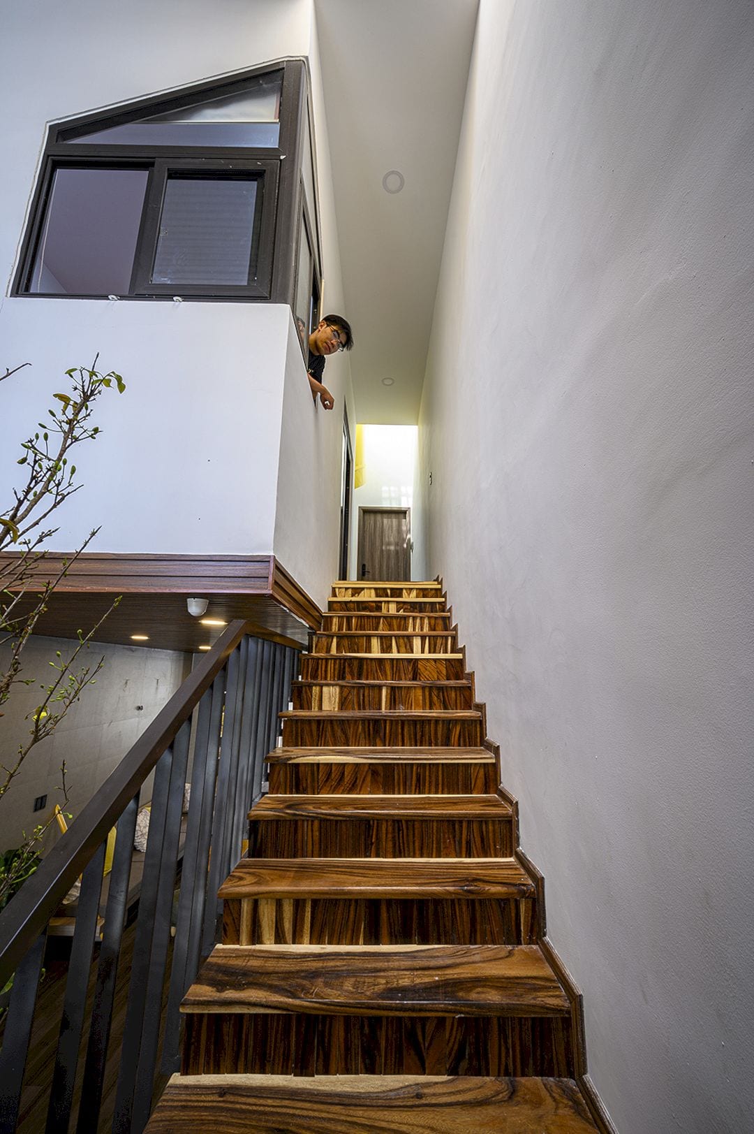
The office and house in this project are located in the same building. Two separate traffic flows are created to ensure safety and privacy for the living space. Traffic in the living space includes a separate staircase system for the living area to create vitality and safety for the common space and a specially installed elevator for the homeowner to use.
Structure
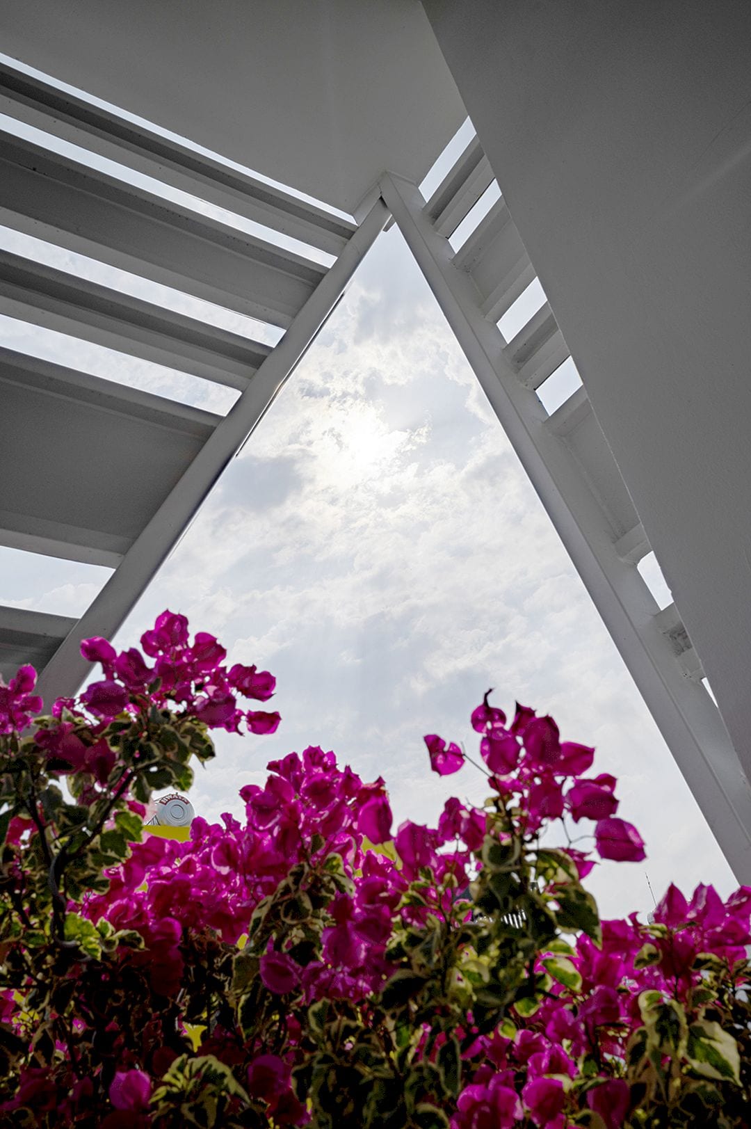
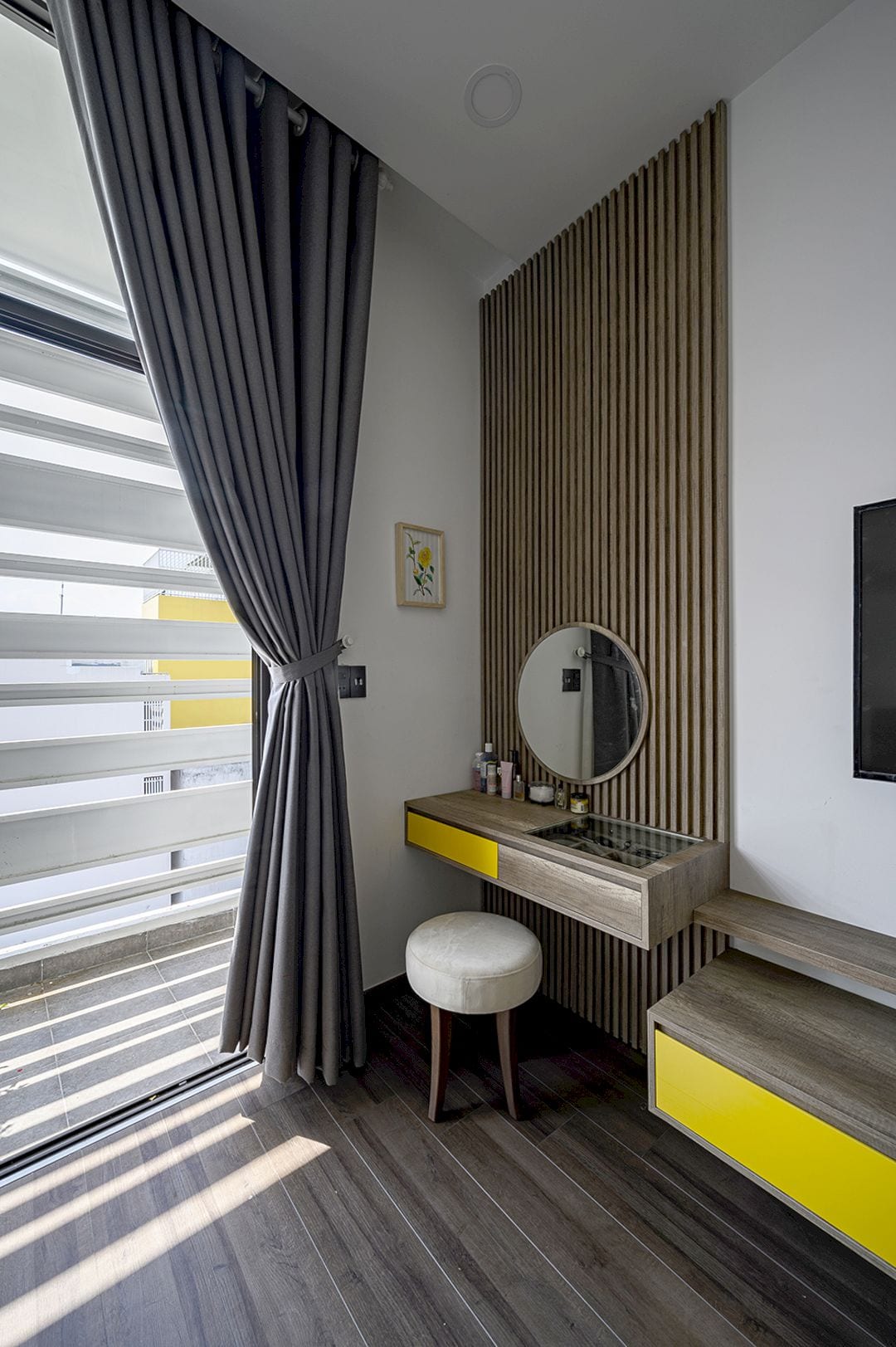
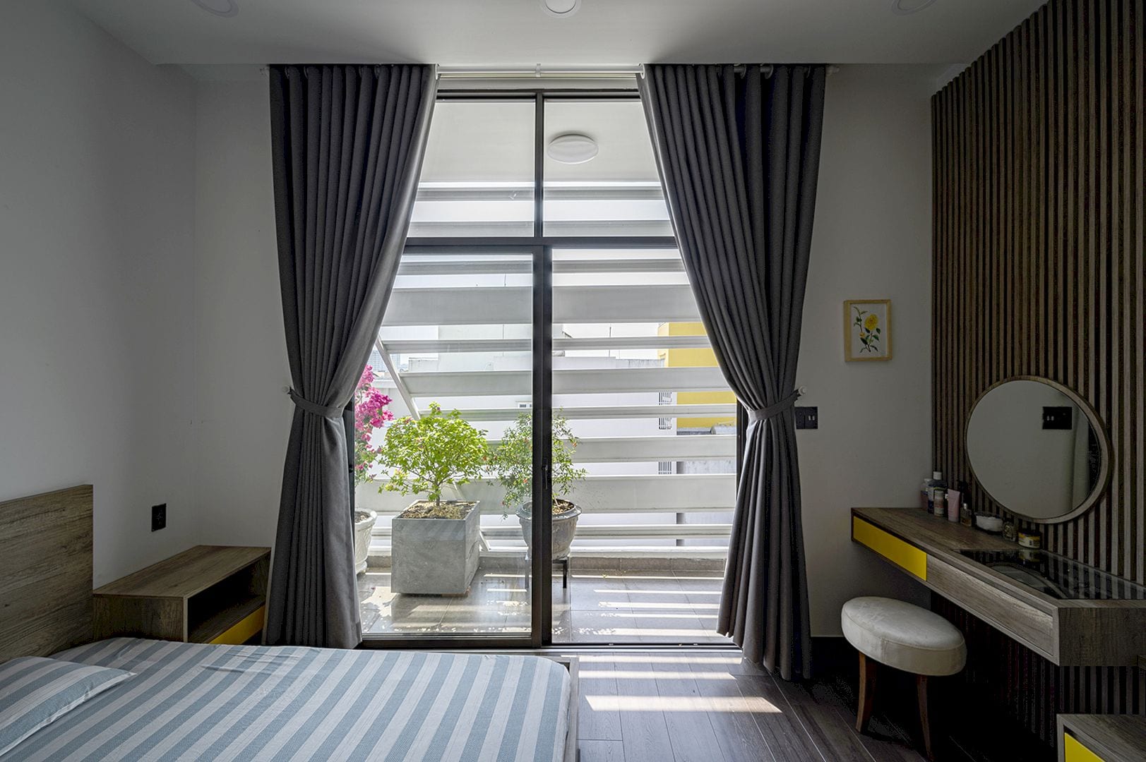
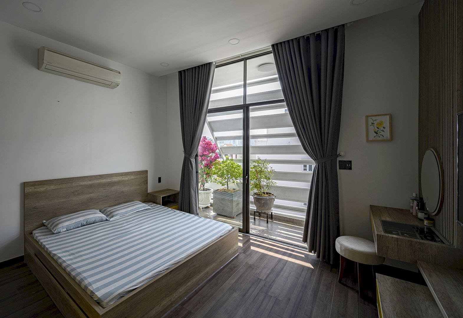
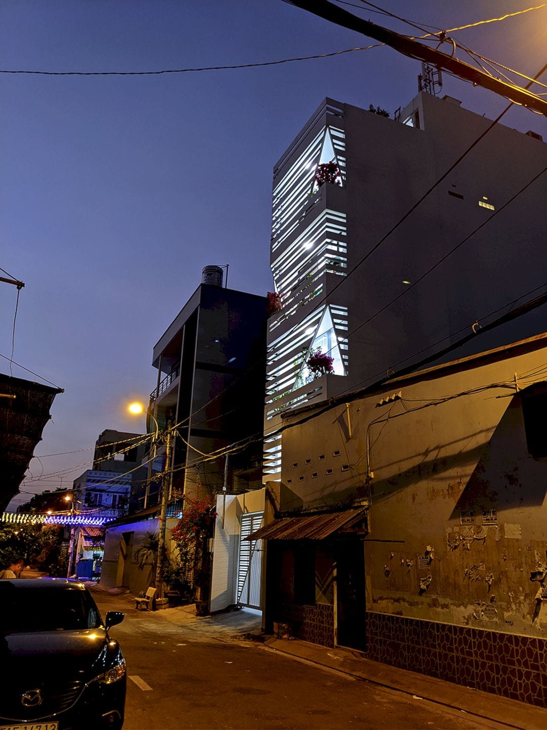
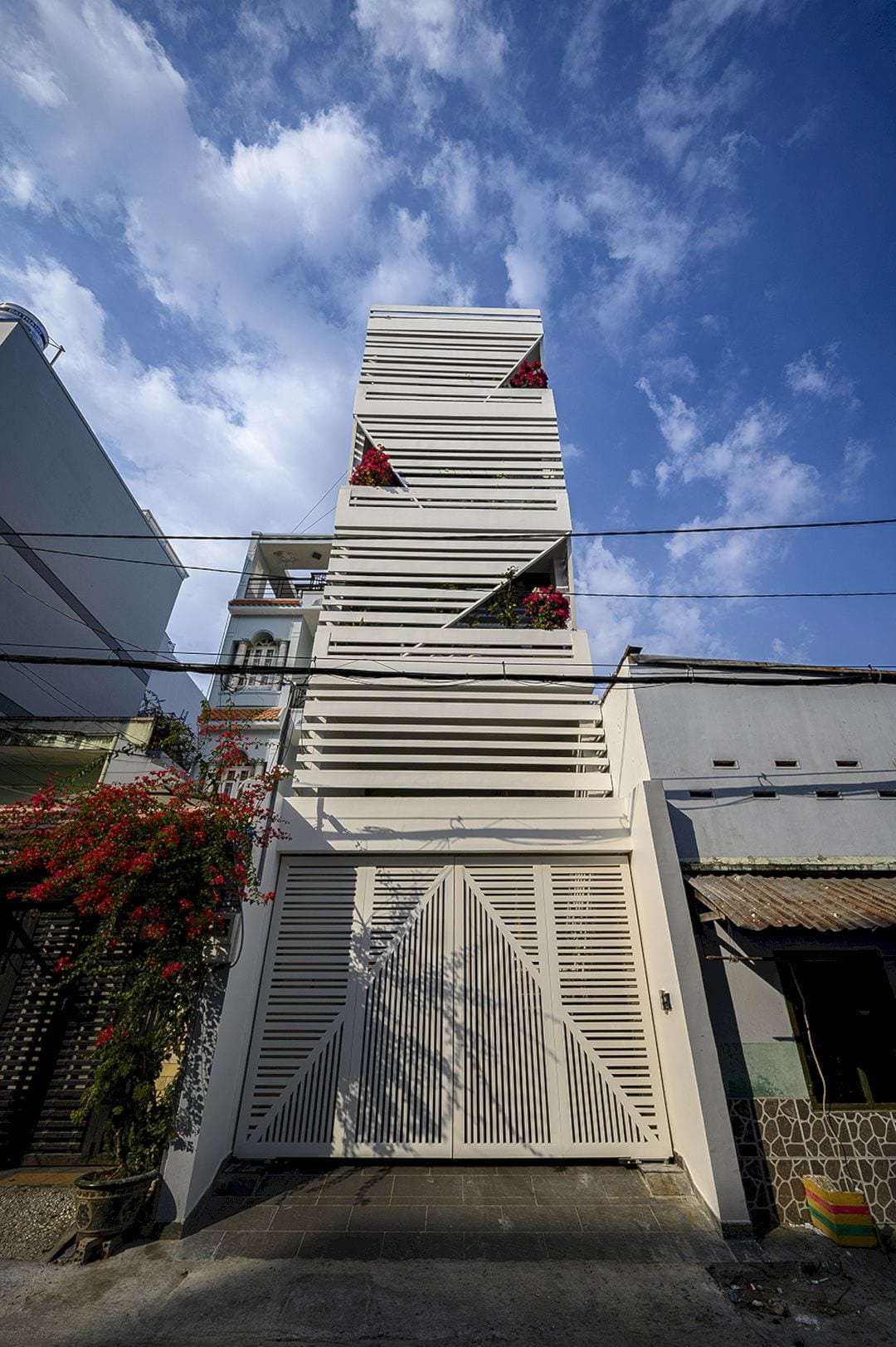
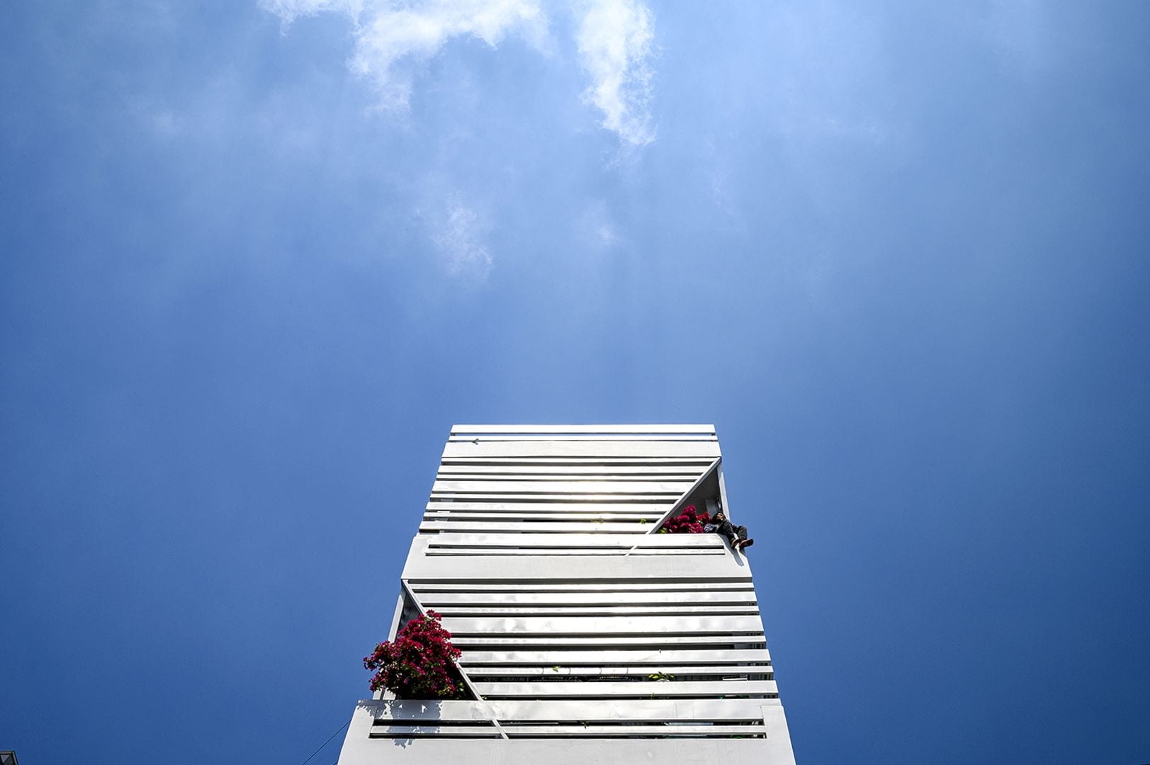
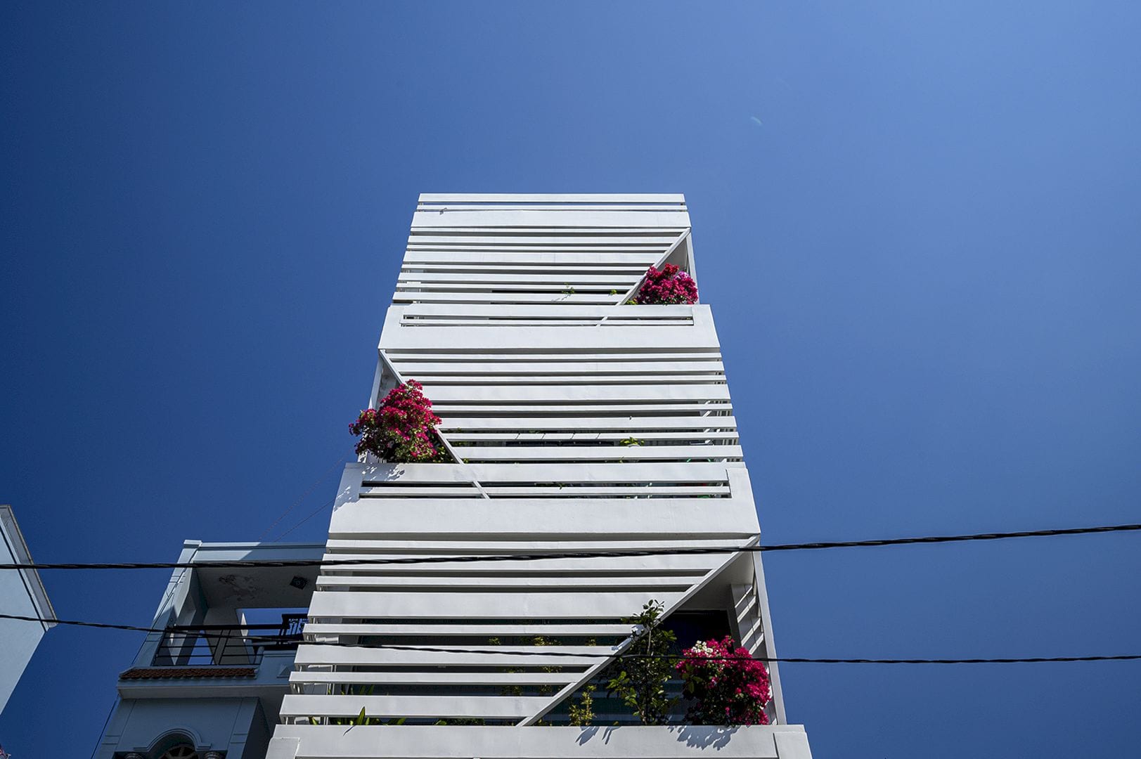
This house has a facade located in the west. Due to the tropical environment of the city with hot sun and high temperature, horizontal louvers and green layers have been designed on the front of the building. These can reduce the sunlight amount that enters the building while ensuring transparency at the same time.
Spaces
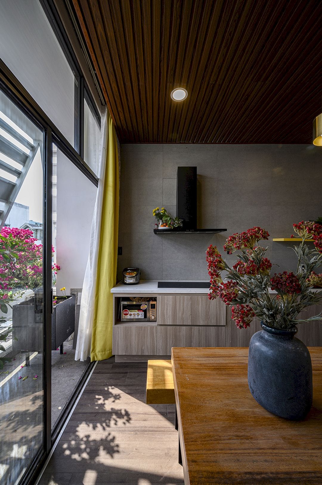
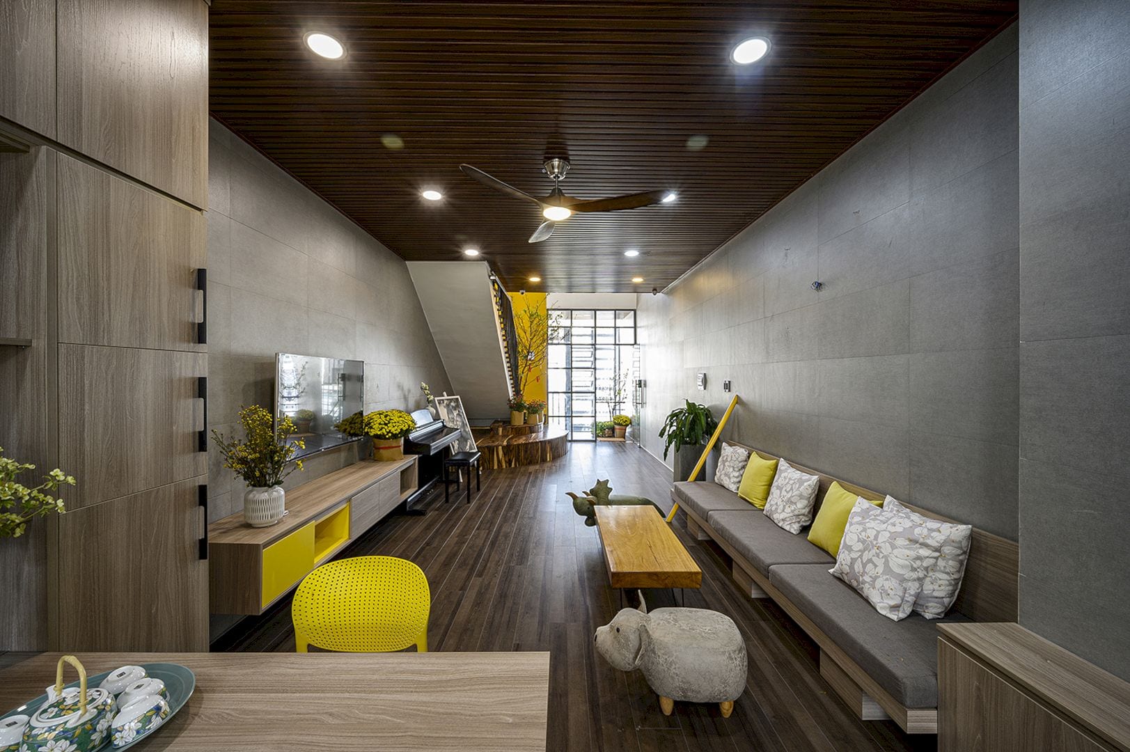
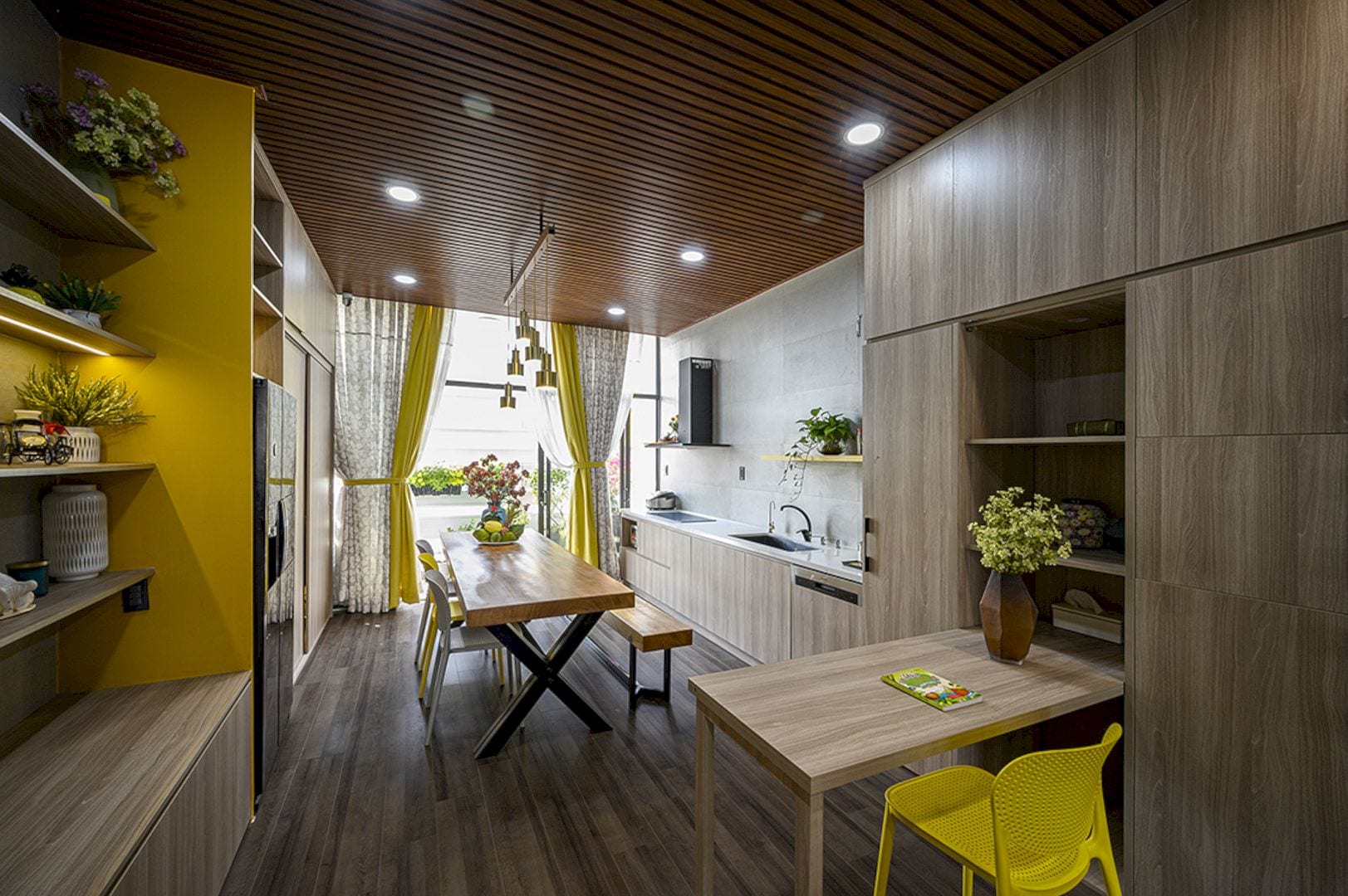
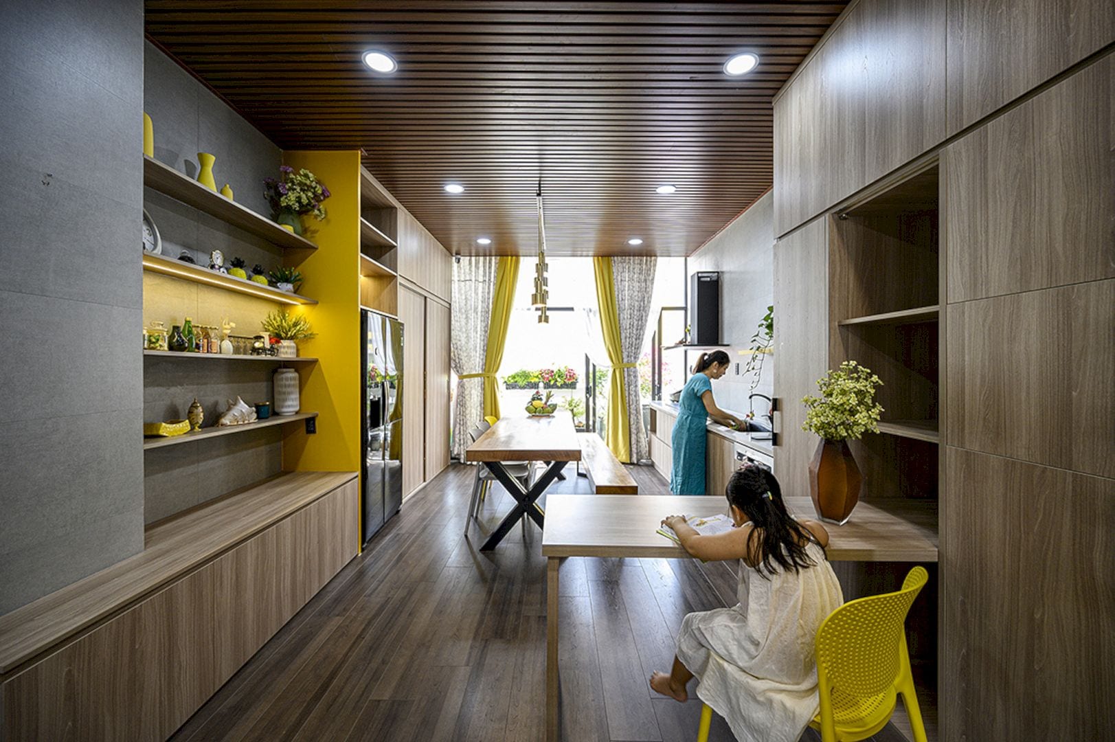
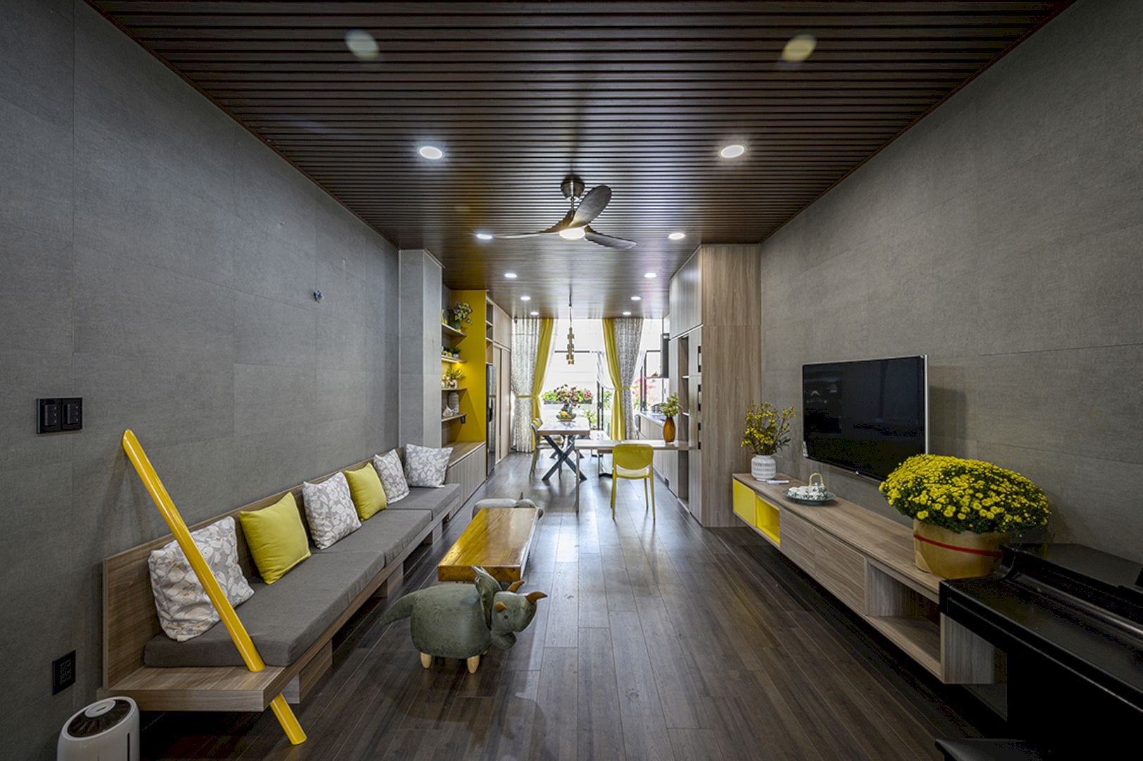
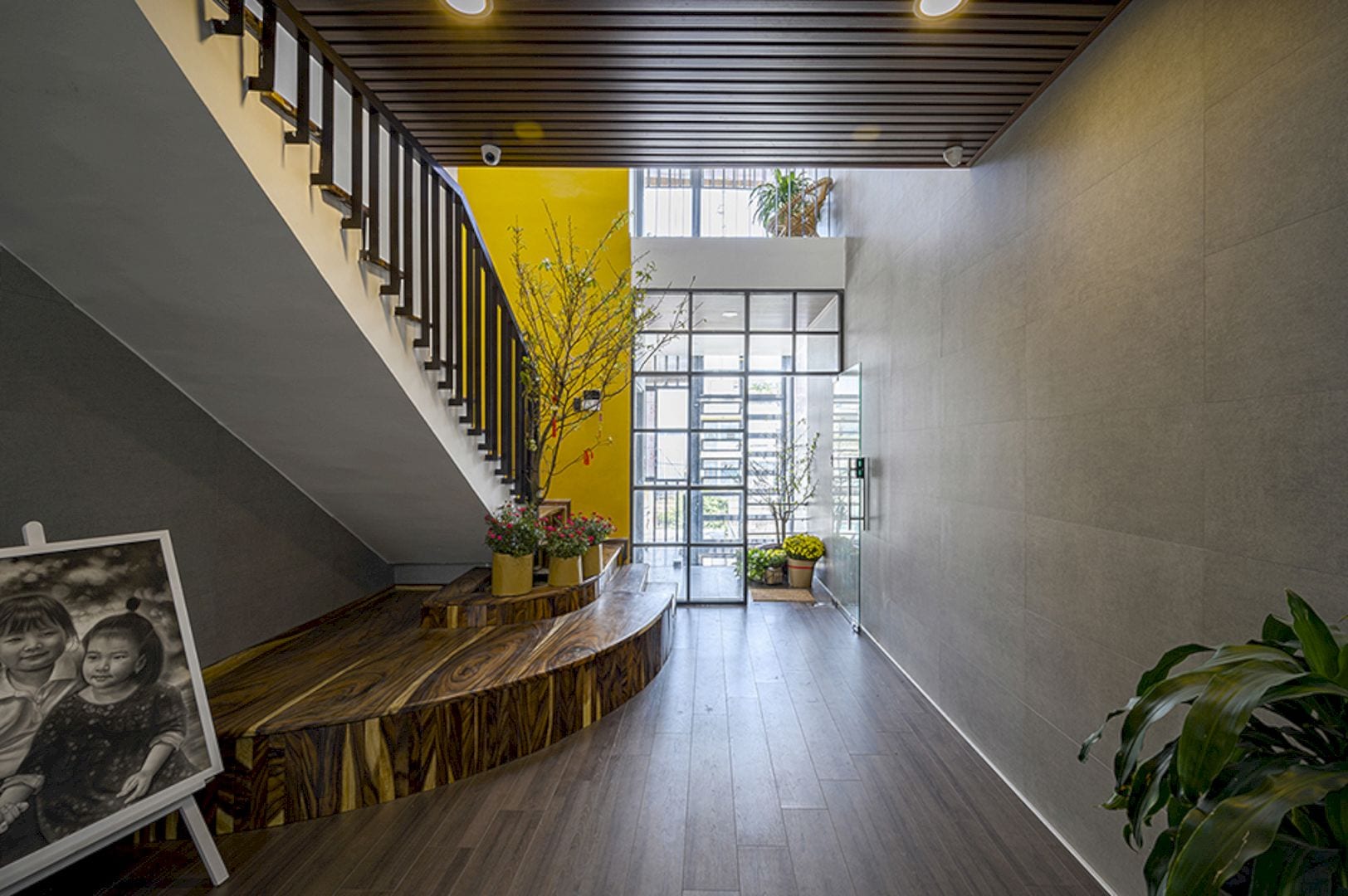
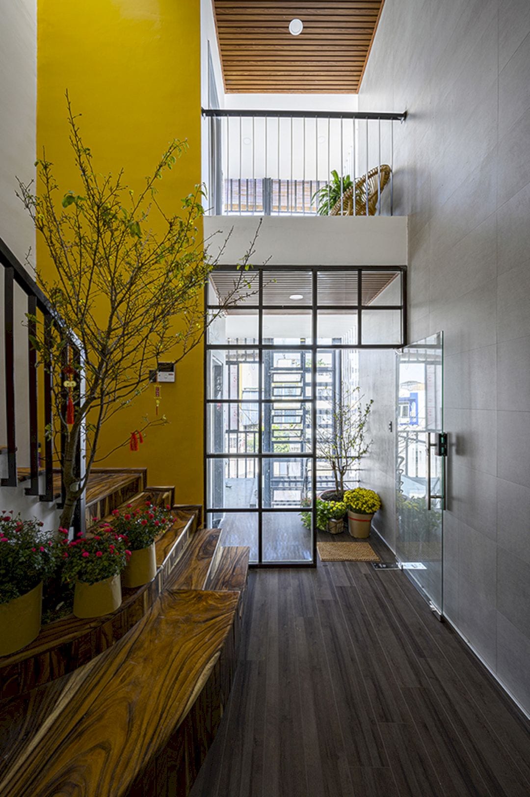
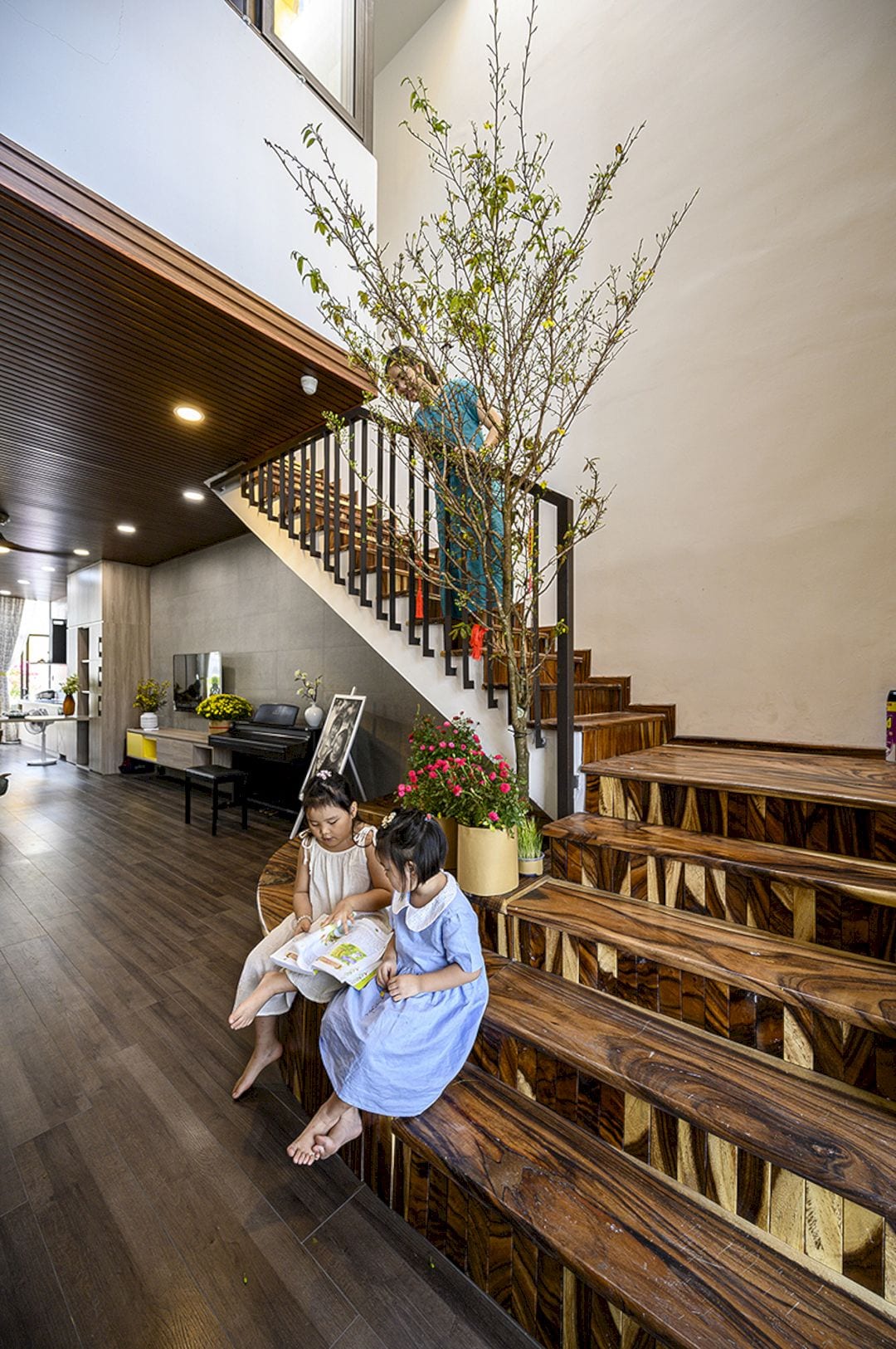
The living space in this building consists of two girls and parents so the children can have a fun place to play. The architect also uses the “dead” spaces to create a play area for reading books and relaxing for the children.
The back and front area of the building has large glass doors that used to get wind and sunlight into the building. There are also a lot of floor holes at the top of the roof that cut to get more natural light into the building.
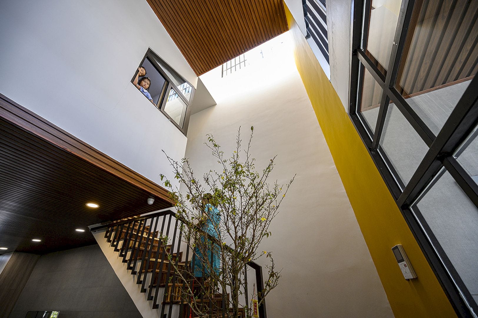
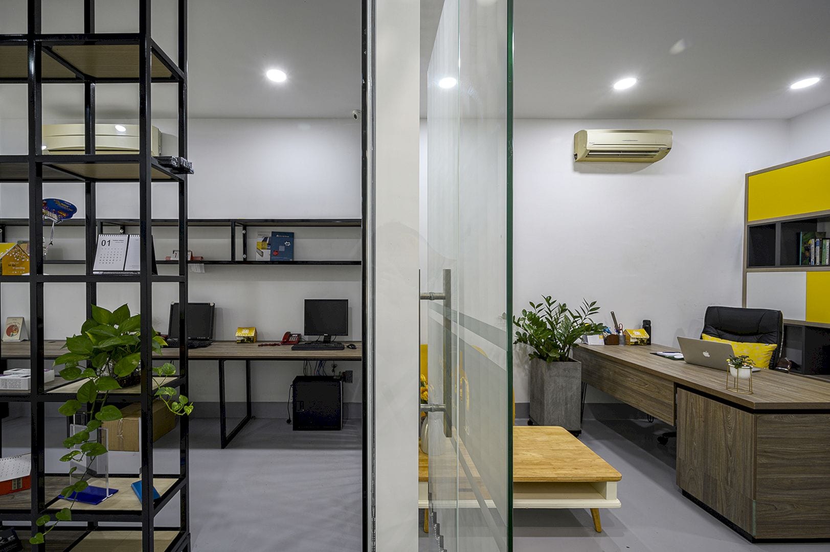
A reasonable space is arranged in the office area to take advantage of the shelves, chairs, and tables of the company. A lot of glass and green patches are also arranged in front of and behind to get more natural light, creating a relaxed feeling when working.
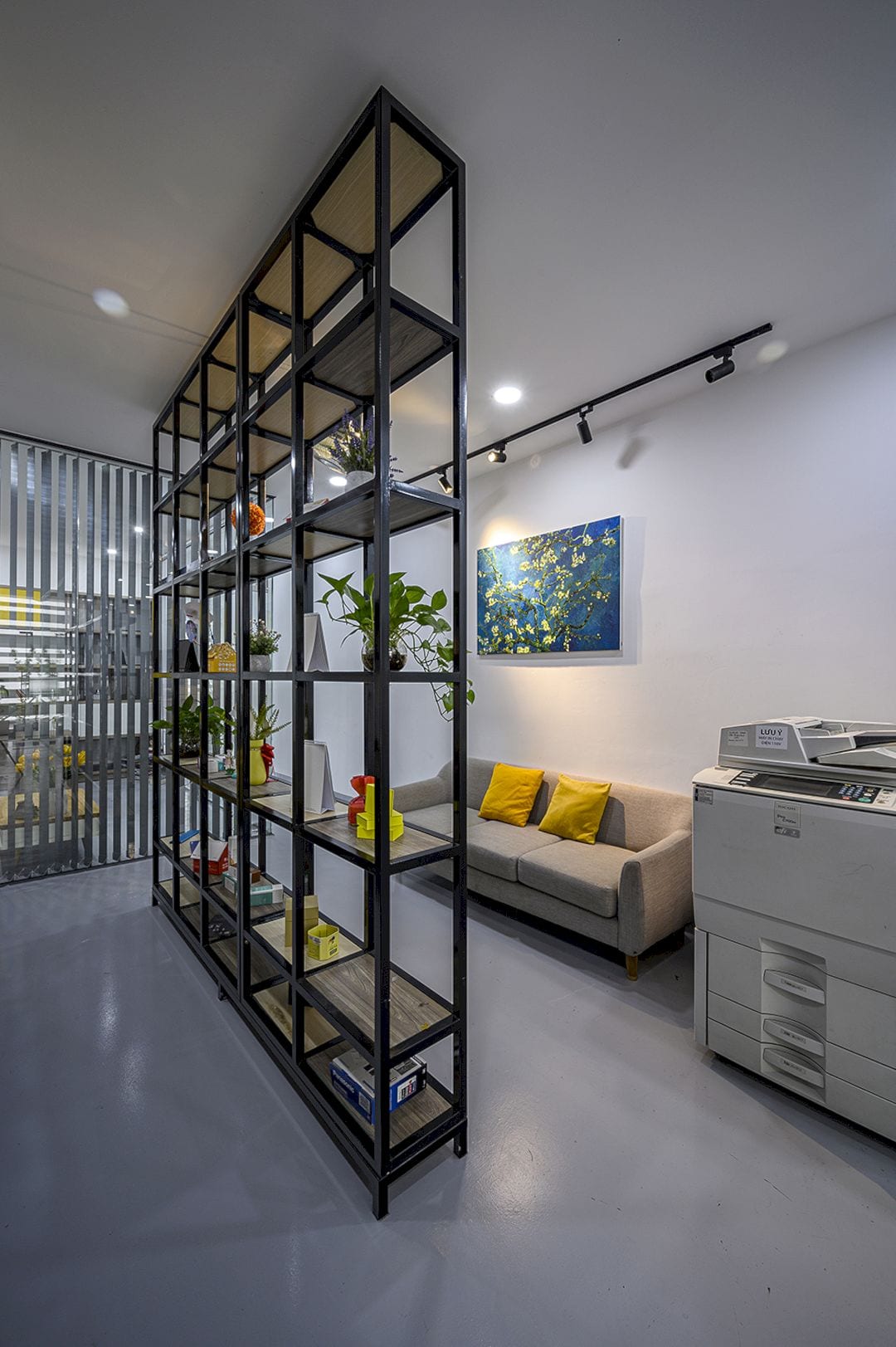
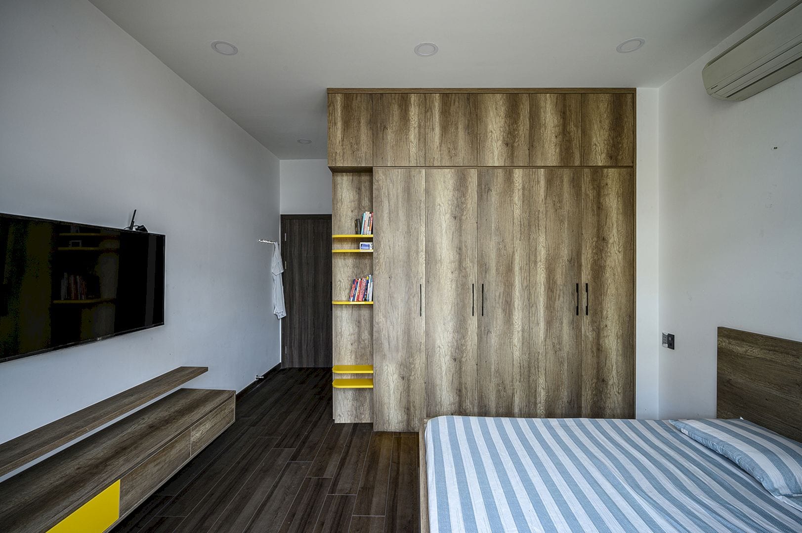
For the interior, the architect is inspired by the iron color of the office’s brand identity logo. Yellow is used as the highlight on the gray and white background, coordinating the house’s interior awesomely.
Office and House Gallery
Photographer: Tomqast
Discover more from Futurist Architecture
Subscribe to get the latest posts sent to your email.
