This pair of the factory additions is a 2009 project located in Queretaro, Mexico, designed by Rojkind Arquitectos. Nestlé Application Group is built for the Nestlé Company with two commissions: a vestibule for one of its chocolate factories and a laboratory for the development. This project is 776 square meters in size, characterized by different colors of paint.
Design
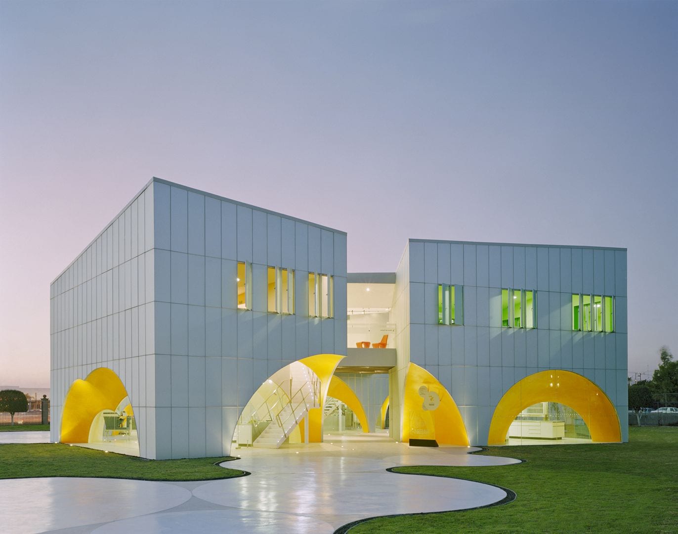
The first commission of this project is located in the outskirts of Toluca, near Mexico City, which consists of a vestibule for one of its chocolate factories while the second commission is a laboratory for the development of new products, a packaging center, and a satellite office for its product technology center in Queretaro’s industrial zone that focuses on new drinking products’ development.
The second commission offers an additional challenge with the UNESCO’s designation of Queretaro’s historic city center as a World Heritage Centre in 1996 that expand to the city’s industrial periphery. Due to this designation, the new building in this project has an arched porch. In response to this challenge, the architect offers a reinterpretation of the arch and the porch.
In the same vein, if this arc is a fragment of a copula, this copula is an amplified arch when it rotates on its own axis. This copula also meets the arch’s reference criteria without turning it into a cliché. A series of spheres multiply and intersect just like foam that forming a continuous open space’s origin in this case. This open space expands while another one is made of orthogonal boxes.
Colors
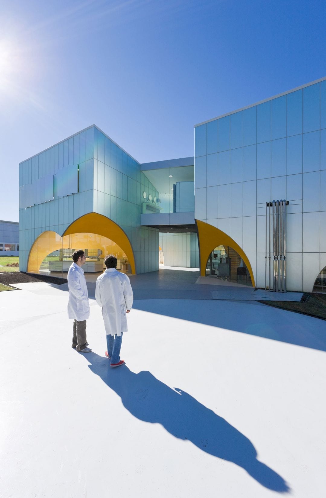
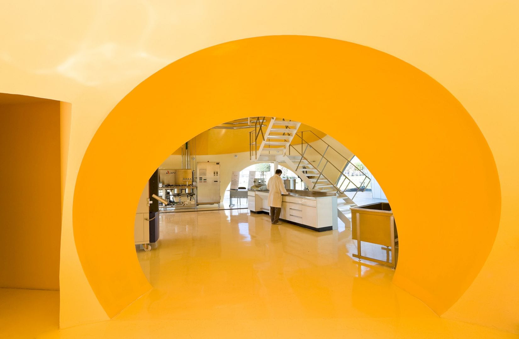
The exterior is impenetrable, metallic, and opaque while the interior of the boxes is painted in different colors. Due to these different colors, it appears as if the researchers wear white robes that floating in a continuous flow of blues, greens, and yellows. When one of the metal panels that cover these boxes opens like a window, they can be seen clearly from the outside.
Details
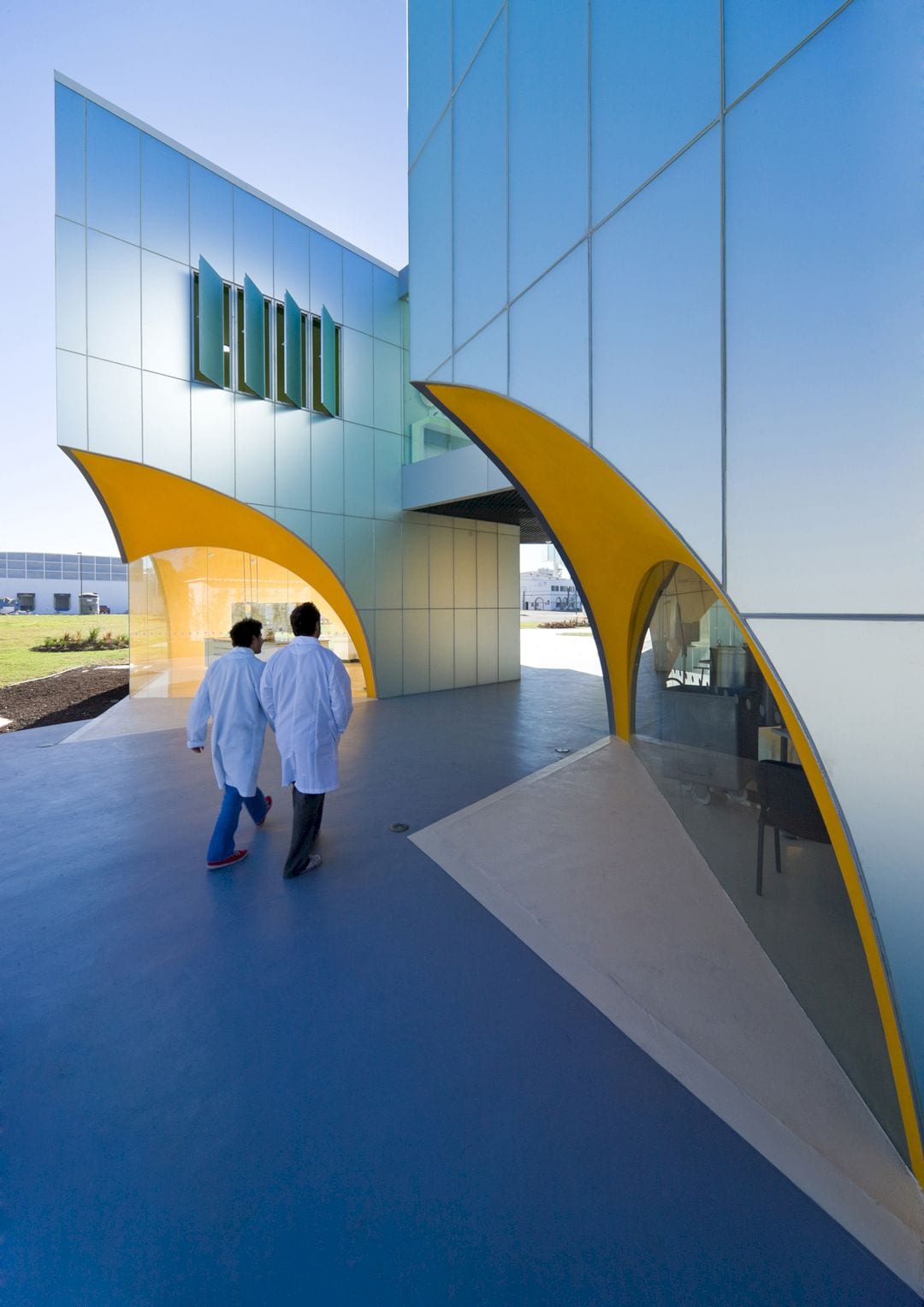
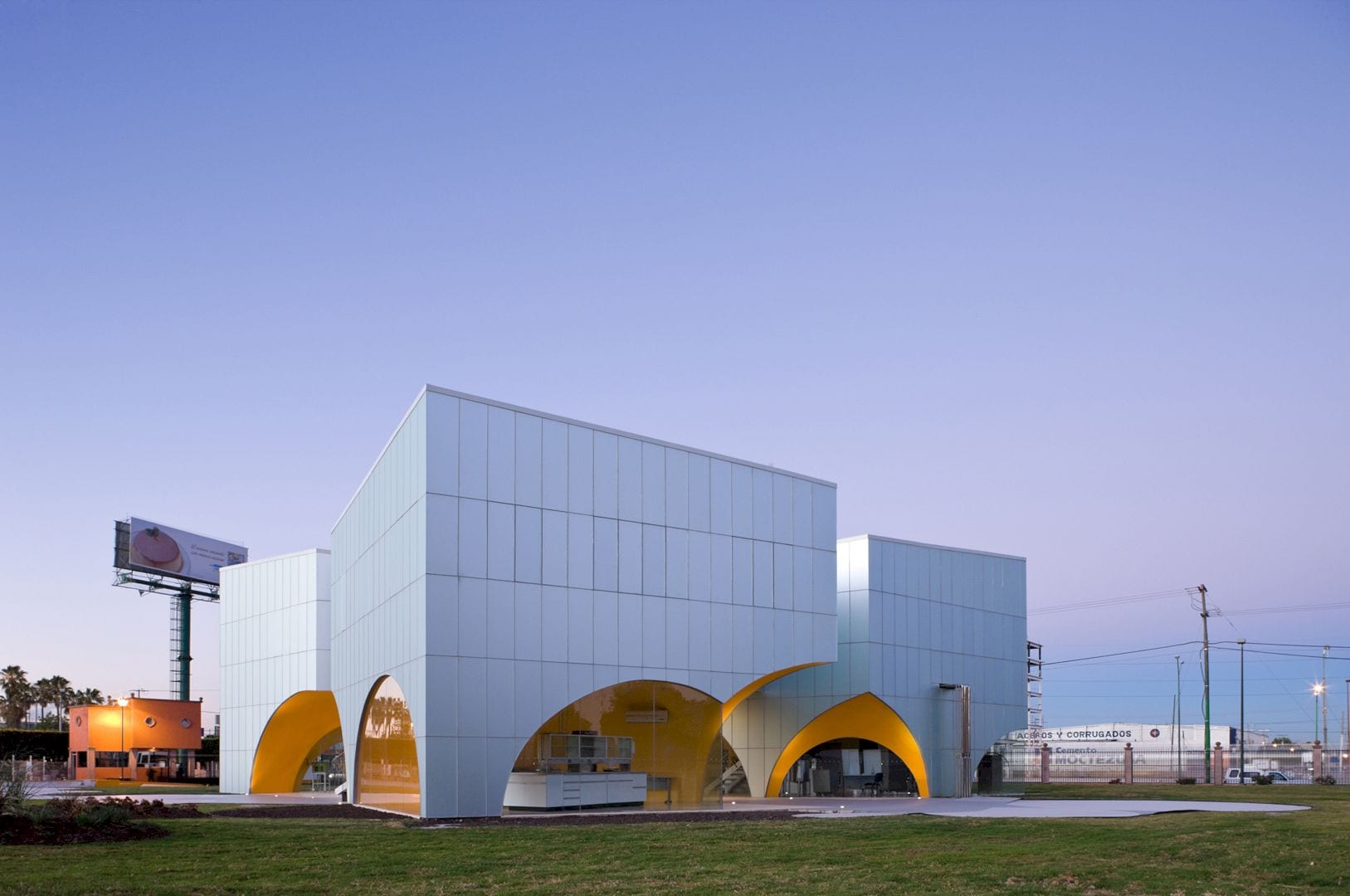
The construction implies that the translation of spatial forms needs to be done in a simple almost colloquial way and in a different constructive manner. This way allows the local workers to fabricate the foam-like spherical space from the spherical cupolas’ physical intersection that made of rebar rings and arches.
The final result of this project is a series of contrasts with apparent simplicity that has been unified: the bright and satin colors of the interiors with exterior metallic that is a slightly reflective satin color.
Nestlé Application Group Gallery
Photographers: Iwaan Baan and Paul Rivera
Discover more from Futurist Architecture
Subscribe to get the latest posts sent to your email.
