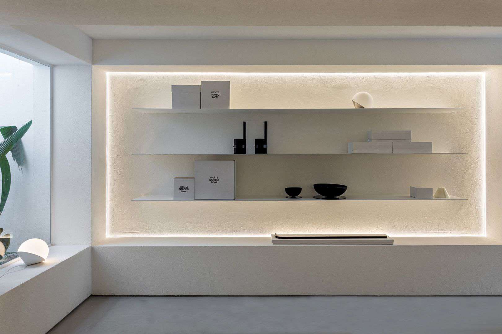
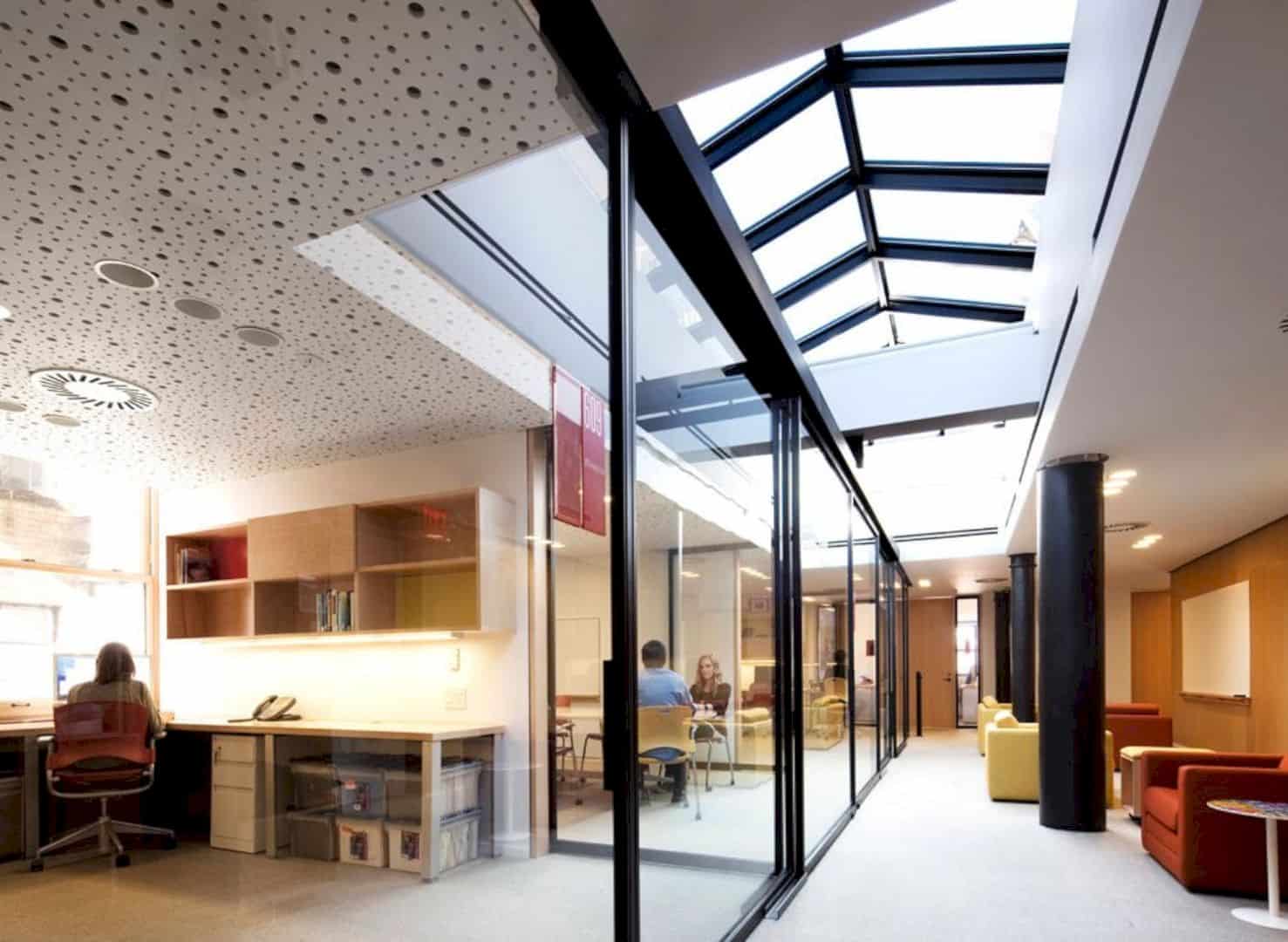
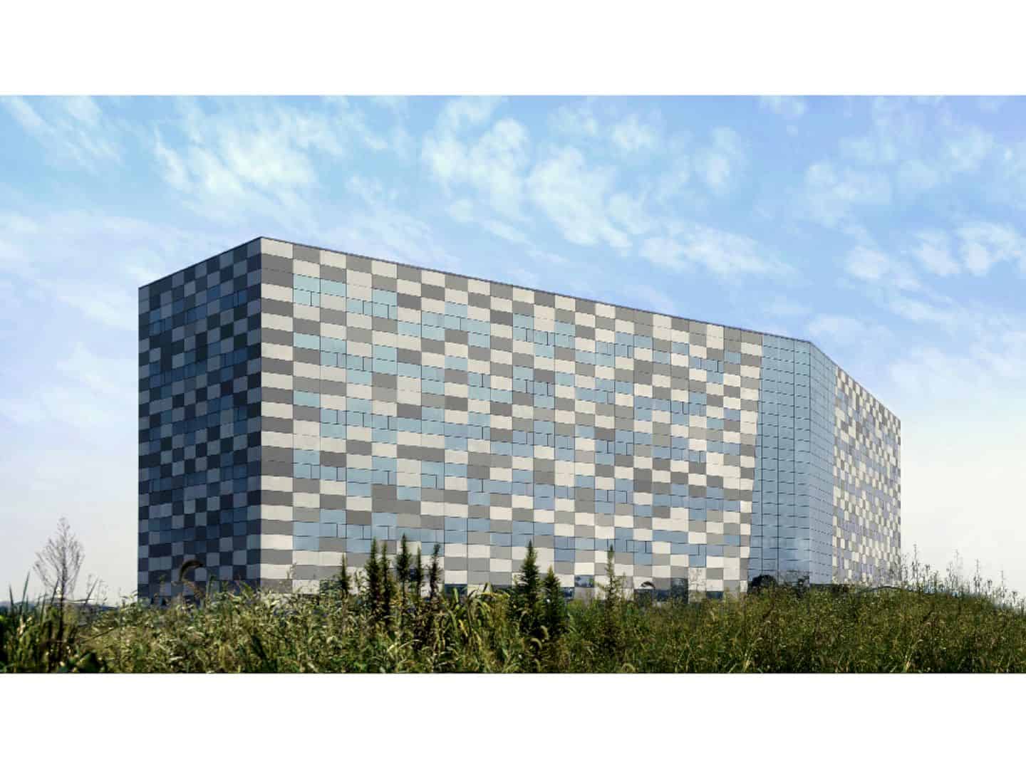
For Marchesini Group, Local Architecture Network (LAN) Paris tries to explore the relationship between the building users and the landscape, and the building and its surroundings through this headquarter building. Saint Mesmes is a 2006 – 2008 project with 1250 m2 in size located in France. The interior is beautified by concrete and white walls while the structure is simple with a mixed steel/concrete technique.
Design
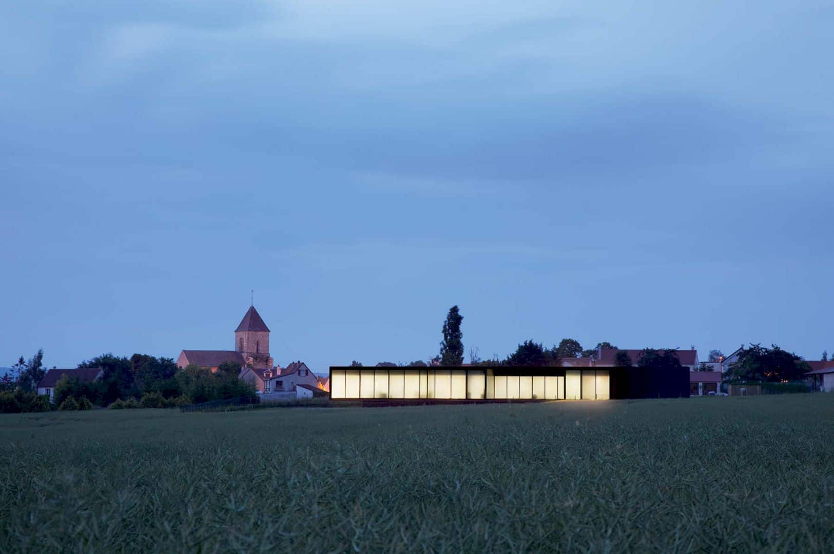
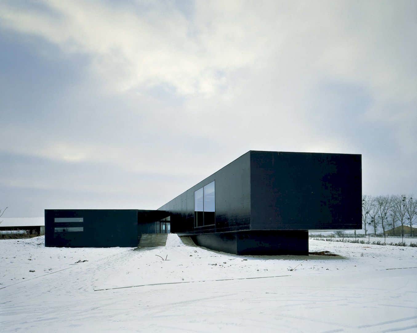
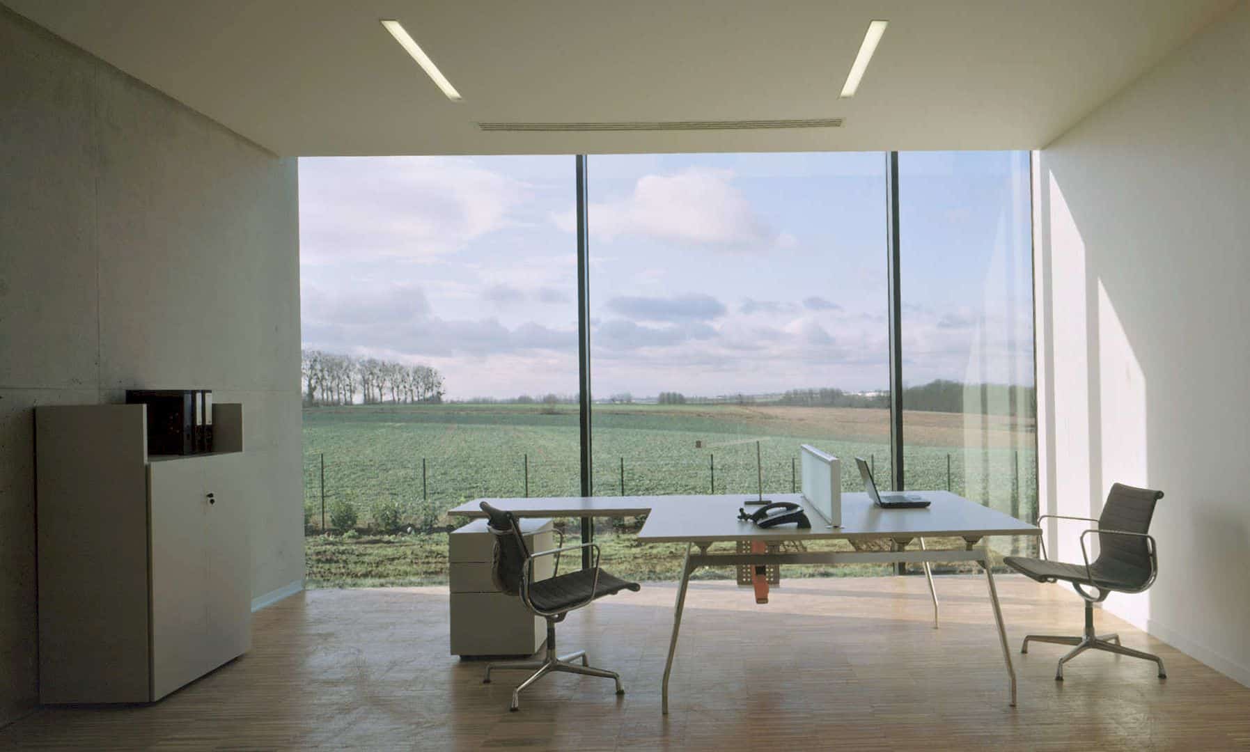
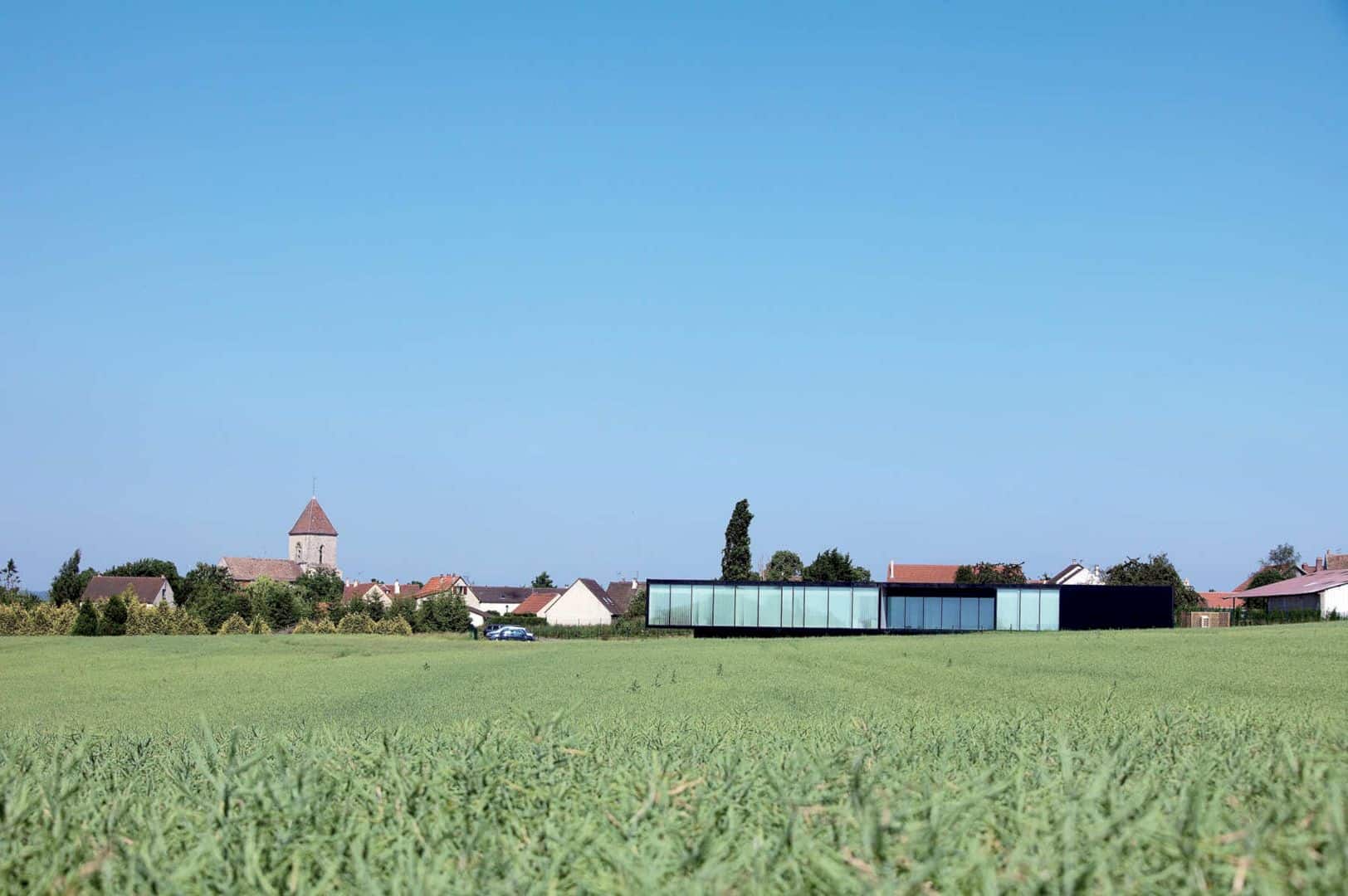
The building’s environmental adaptation and appropriation are one of the main design concerns in this project. The relationship between the building, its surroundings, users, and the landscape is the primary intention of the project program. This headquarter building sits on a sloped site that down three meters towards the west with awesome views over the neighboring hills.
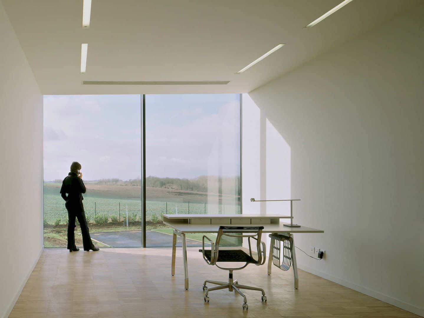
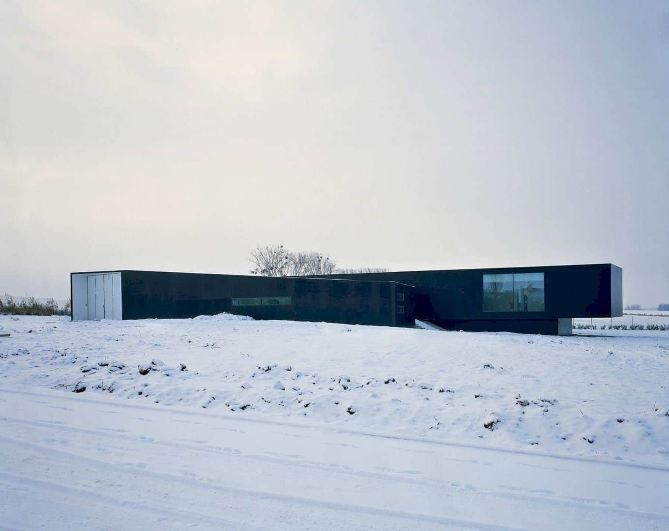
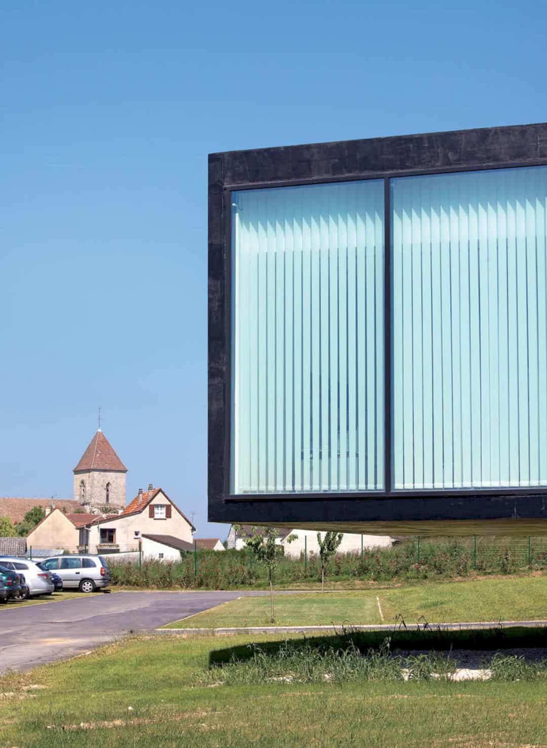
The architect wants to create an opening in the office environment to the outdoor green spaces to get more benefits from the colors, lights, and nature. This opening also respects the landscape while inserting a newly constructed “object” at the same time. The building is imagined as a sort of line that follows the ground and skyline.
Volumes
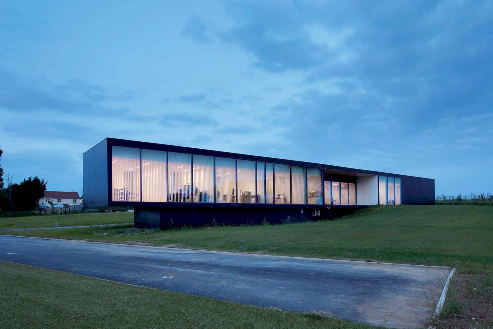
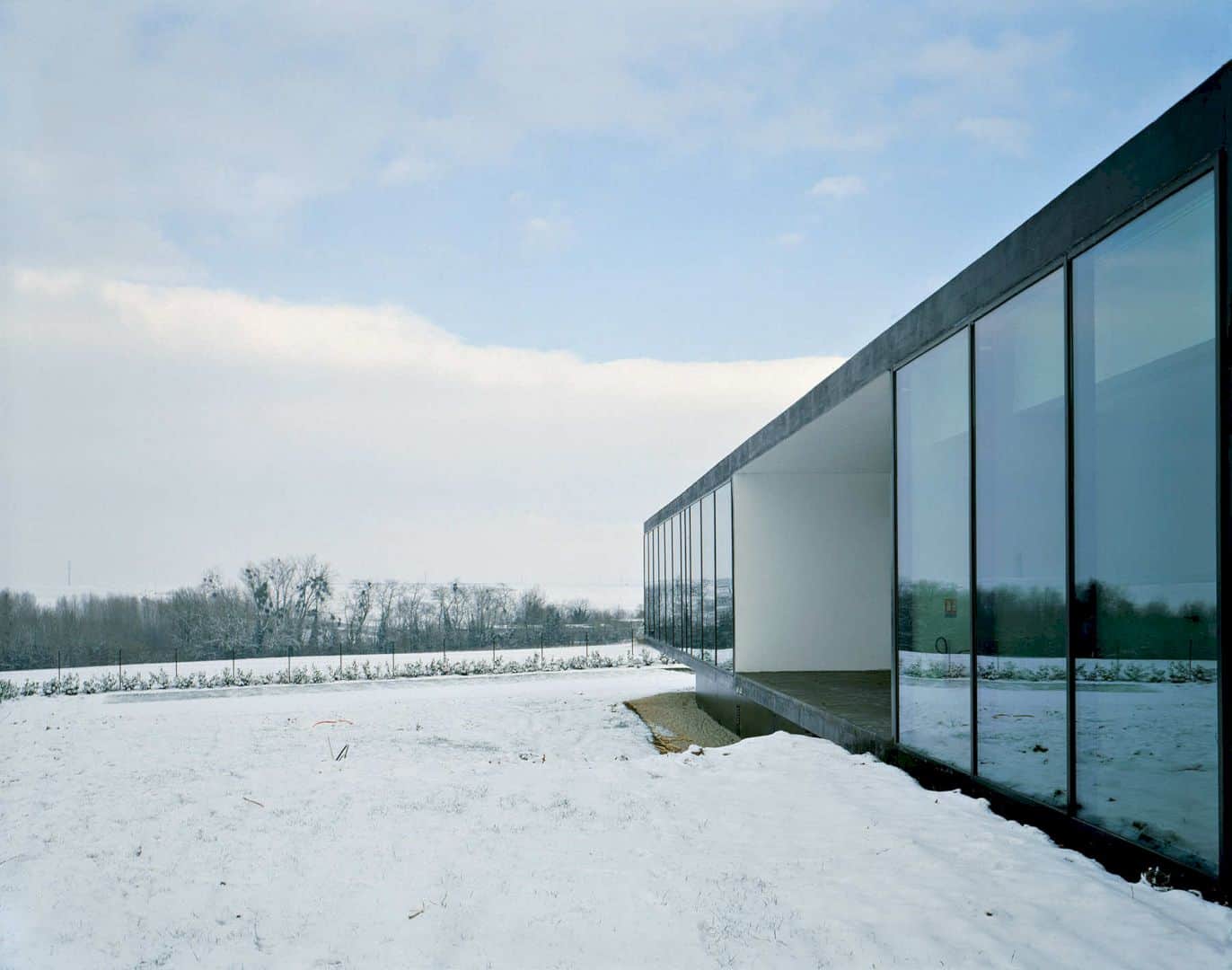
The two distinct volumes are separated, the workshop volume anchored to the ground and offices in the upper area. This separation can meet the different needs of the two areas in terms of finishing qualities, spatial capacities, and lights. Flexible workspaces are located in one of the building volumes while the other encloses storage areas, maintenance space, and a showroom.
Rooms
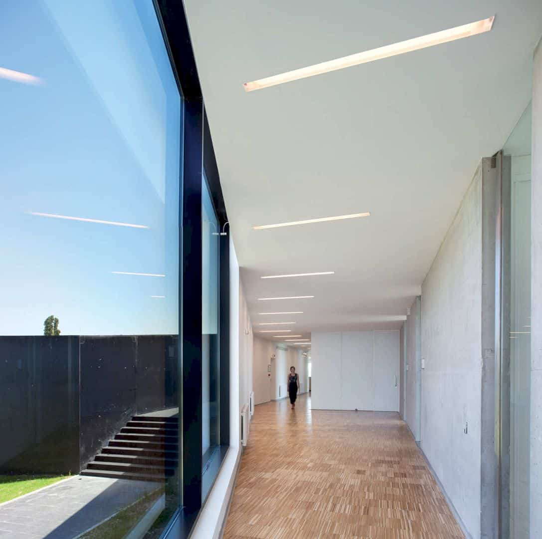
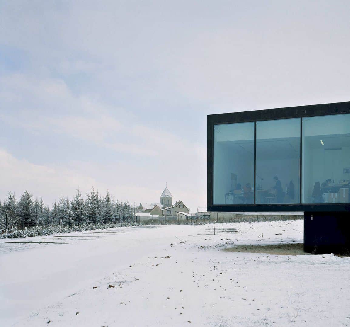
The upper area of the building is occupied by the offices that raised to provide an impression of lightness above ground level. At the lower level, the workshop volume gives the appearance of being solidly anchored to the ground level. There is also an intersection between the two volumes, serving as an entrance with a sloped ramp.
Interiors
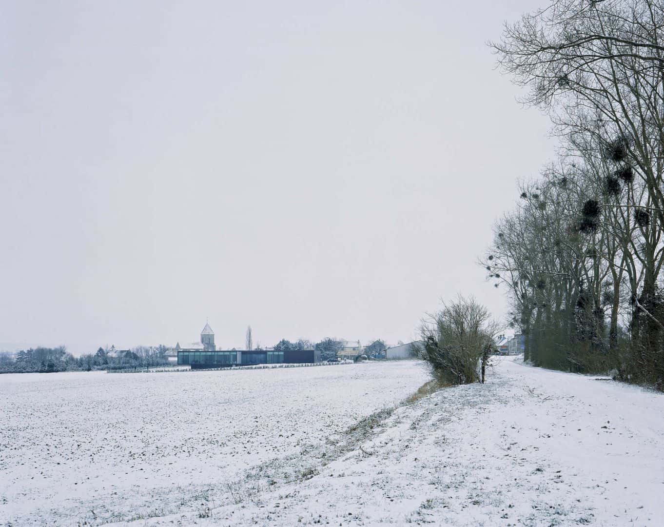
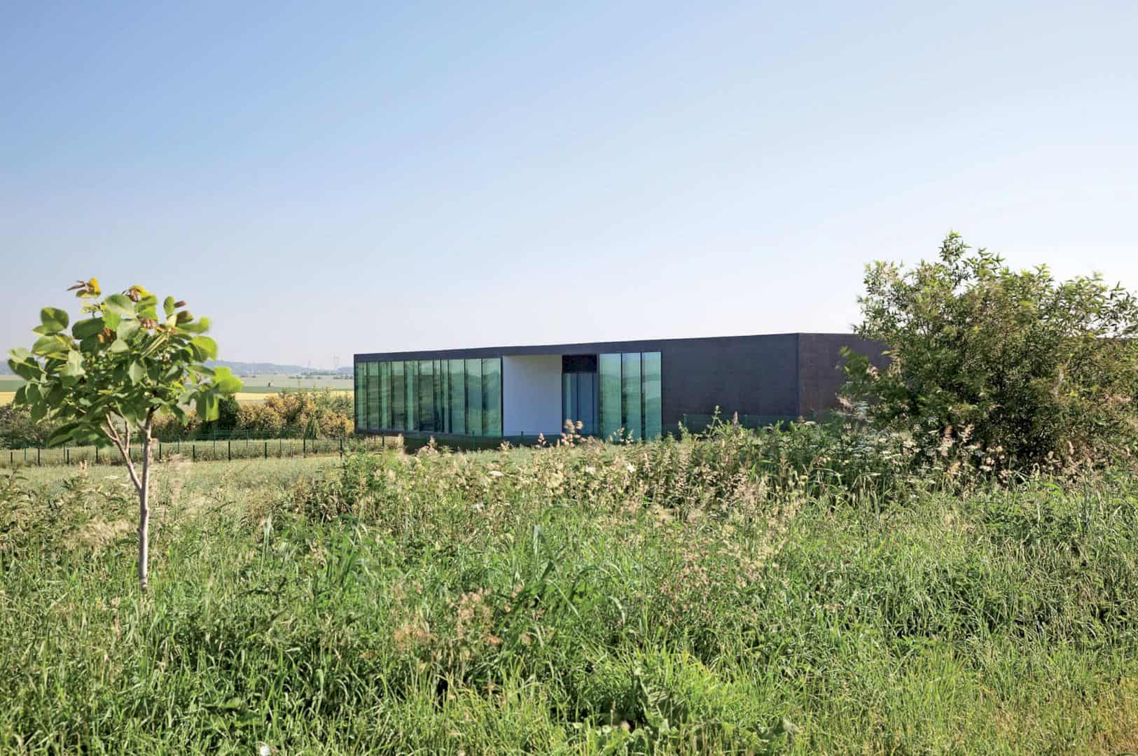
There is some kind of formal clarity inside the interior of the building due to the transparent doors for the offices and the use of concrete and white walls. The building space is accentuated by the regular artificial lights and overall industrial wooden floor. The building openings towards the outside are used as elements, participating in the interior spatial composition that maintained voluntarily intentionally.
Structure
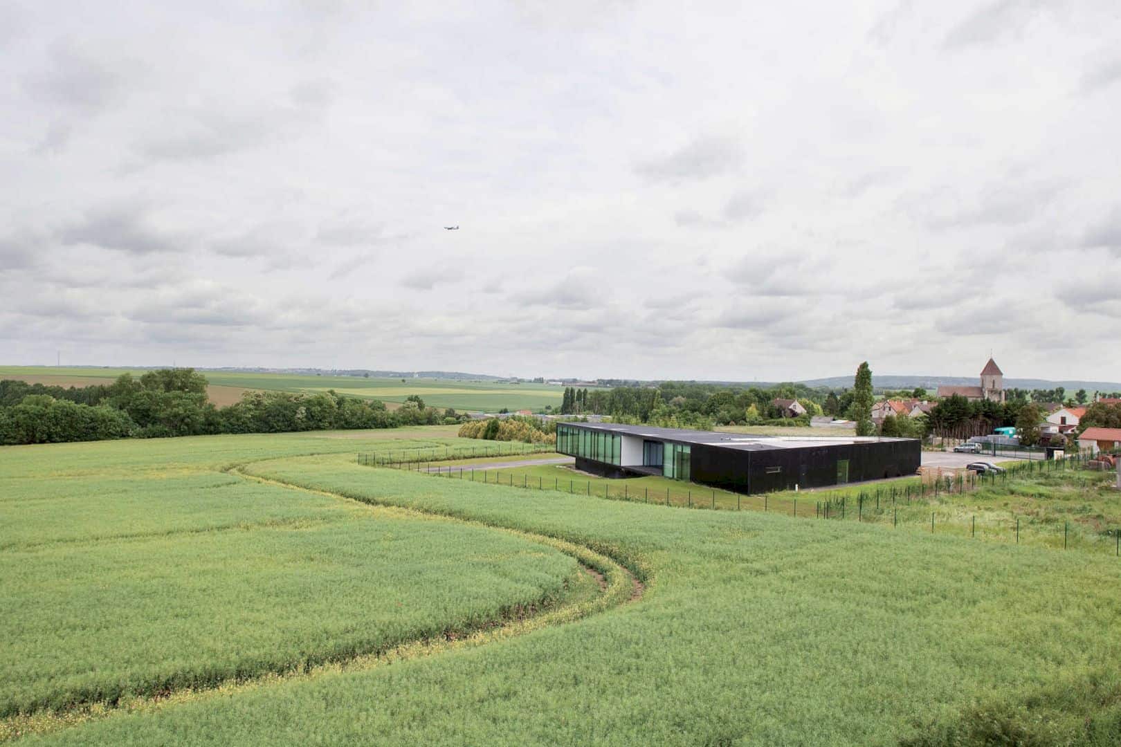
A simple structure is added to this headquarter building with a mixed steel/concrete technique. The cantilever is suspended by a steel beam and the central concrete wall can balance the construction. The most interesting architectural details come from those allowing the volumes drawing such as the large areas of glass in the concrete treatment and workspaces facades, and the connection between elevations and the roof.
Discover more from Futurist Architecture
Subscribe to get the latest posts sent to your email.
