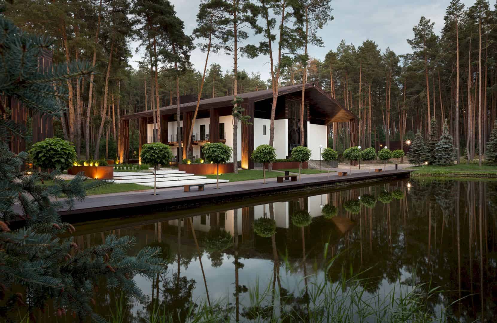
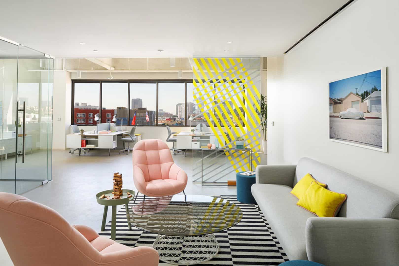
As one of the largest independent companies in Europe, Turbo Tec has a string scope of the company’s activities. That scope becomes the main base for Widawscy Studio Architektury to design the company’s office interior. With modern interior design and color identity, the interior can reflect and strengthens the ‘branding’.
Interior
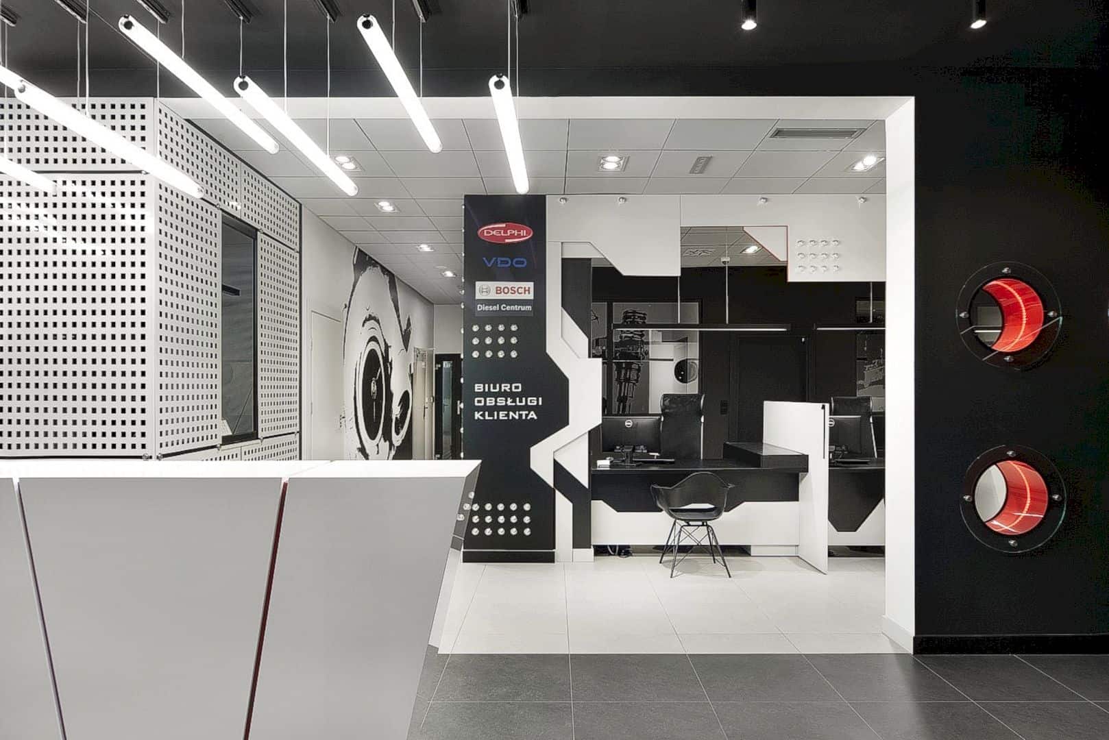
With the spatial forms, the modern interior is designed with a technical nature based on the automotive and dynamic parts. The identity of the company is also shown through the basic colors, dominated by grey, black, and red
Design
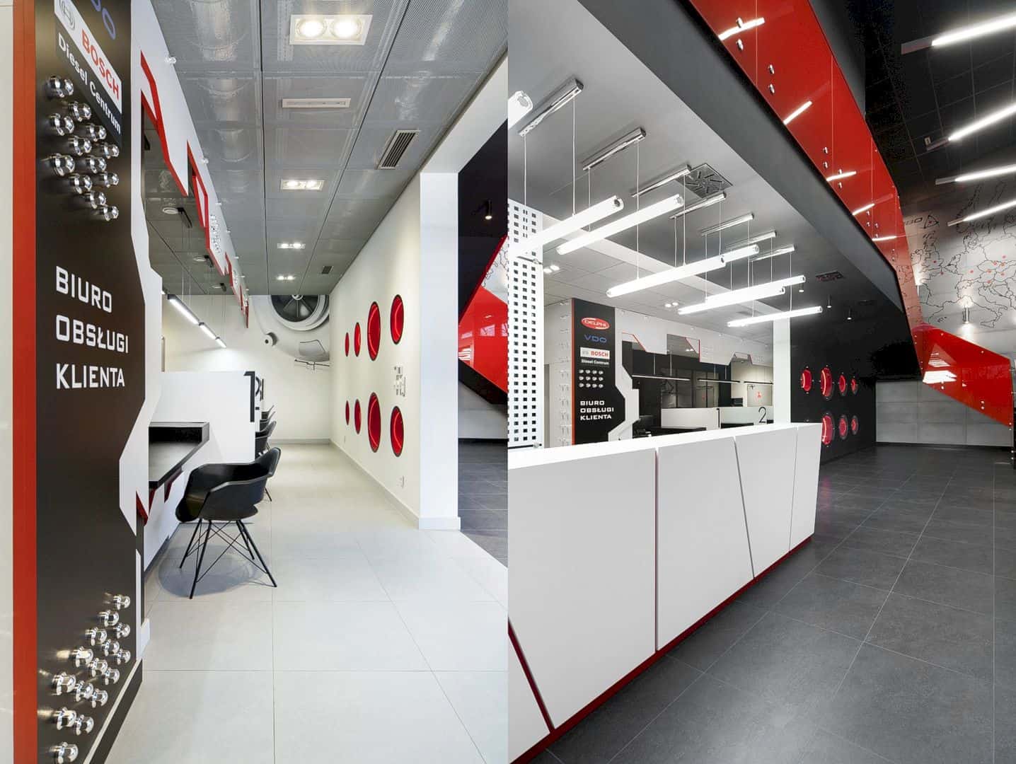
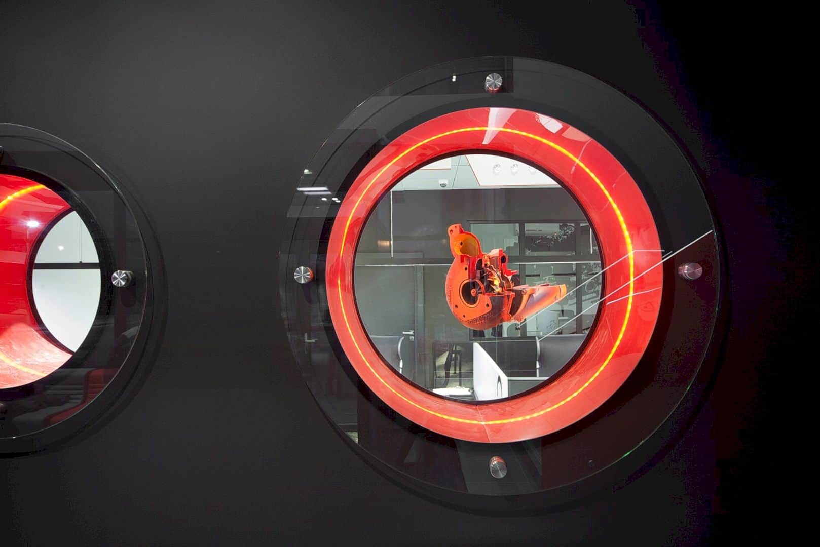
The red holes are designed on the wall, it is the characteristic of the company’s logo. It is related to the injectors and turbochargers, the specialize of the company in professional regenerations of fuel systems and turbochargers for diesel engines.
Materials
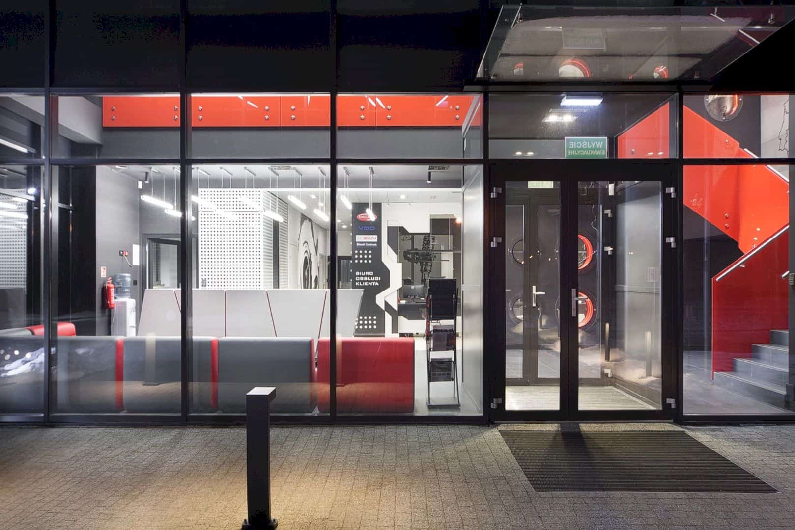
The entrance area is designed with some different materials such as chrome technical elements, glass, concrete, and steel. Those materials are also used to create an awesome modern interior design in the customer support and reception service area.
Details
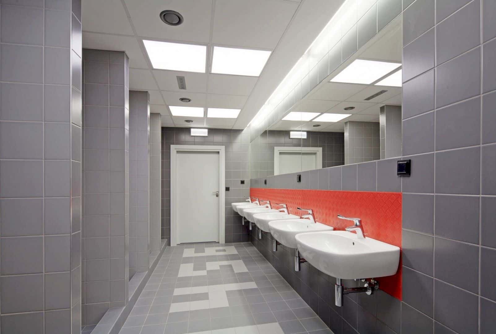
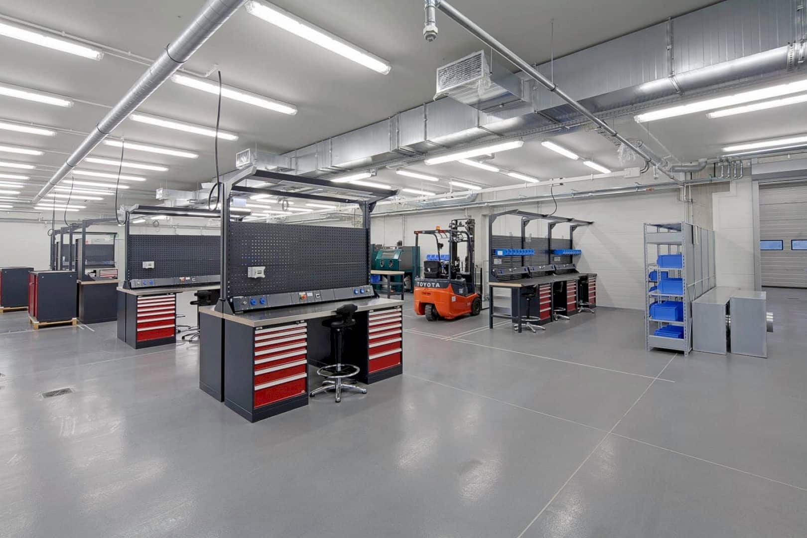
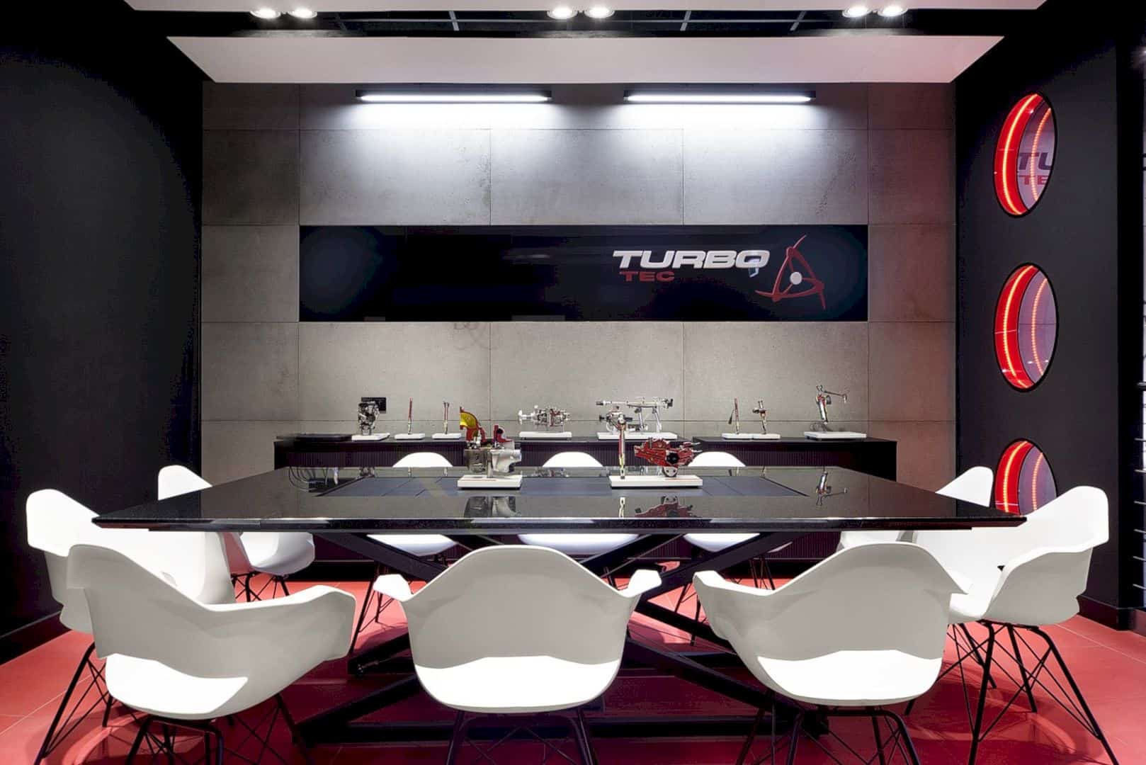
The conference area and offices are located on the first floor. The architect designs a big black table special for the company, the legs are made from steel and the top part is made of black granite. The modern interior also becomes more strong with the open conference room design.
Rooms
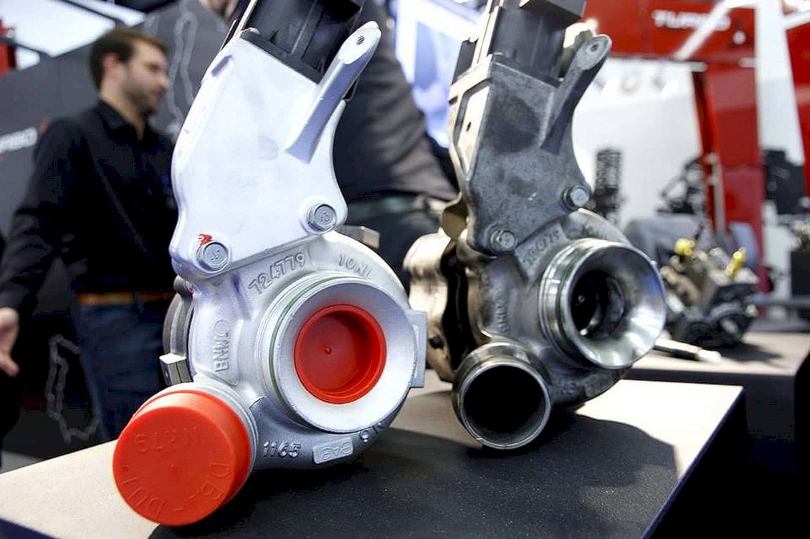
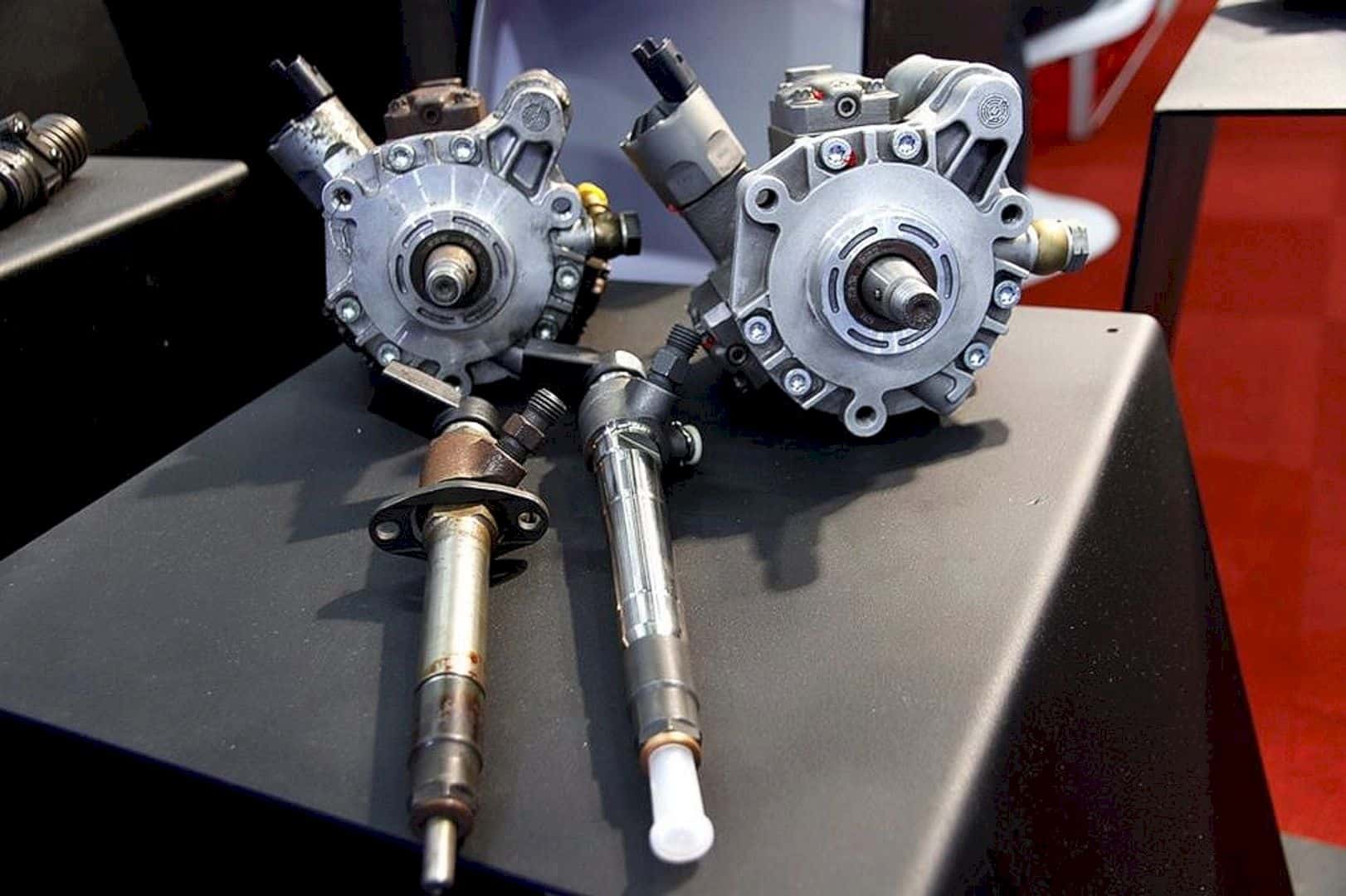
The architect divides the main hall into two black spaces. One space has a reception desk and sofas while another space is designed with the grey sofa and customer support service. Those two black spaces are used to display and present the motor parts.
Via widawscy
Discover more from Futurist Architecture
Subscribe to get the latest posts sent to your email.
