Heathfield Primary School is located in Ayr, Scotland, United Kingdom, and designed by Holmes Miller Architect. It is 2010 project in 4183-meter square of an area. The modern and also contemporary architectural can be seen in this school building with a simple form. It delivers elegant, crisp, and clean lines to compliment the original Victorian school.
Route
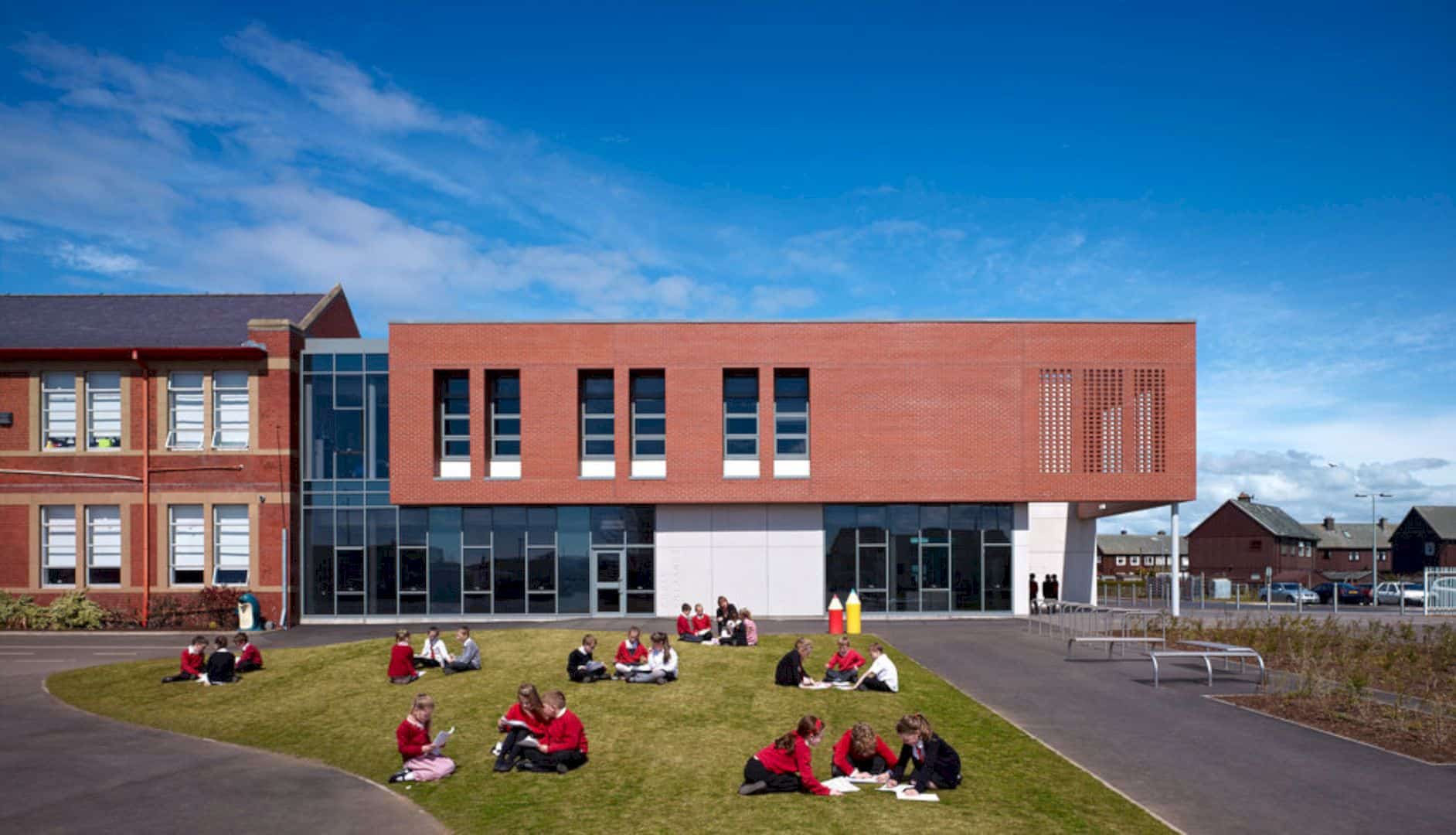
Holmes Miller Architect creates a new a pedestrian landscaped route at this awesome school. This route will give an easy access to the playground areas and also arrive at the new feature entrance concourse. The route design is the part of a positive civic presence of secure and welcoming design.
Design
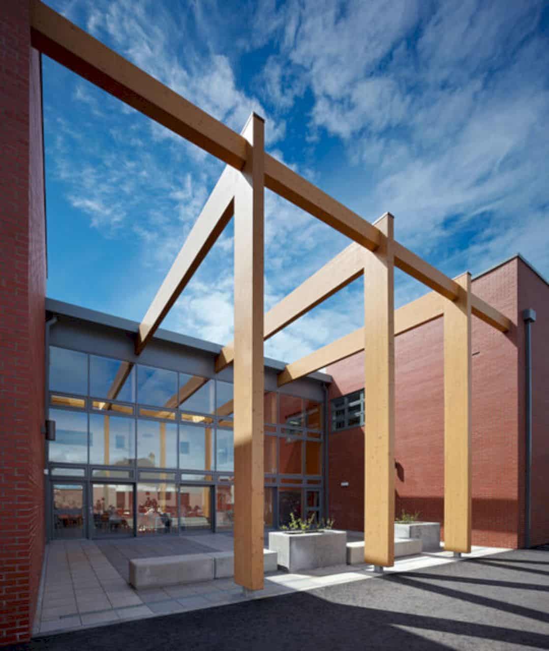
The design of Heathfield Primary School is about creating a relationship for the resulting palette of the materials, volumes, and the original school building. It shows the aspiration with the simple brick element that abutting the building form.
Material
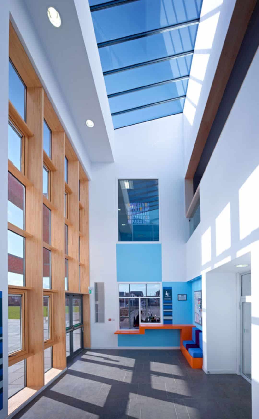
The architects choose some appropriate materials for this school project. The new building is designed with the red brick volume and light color stone string courses, window decorations, and also the stone clad projecting bays. The key to this success design is about keeping the materials and selecting the location of use carefully.
Highlights
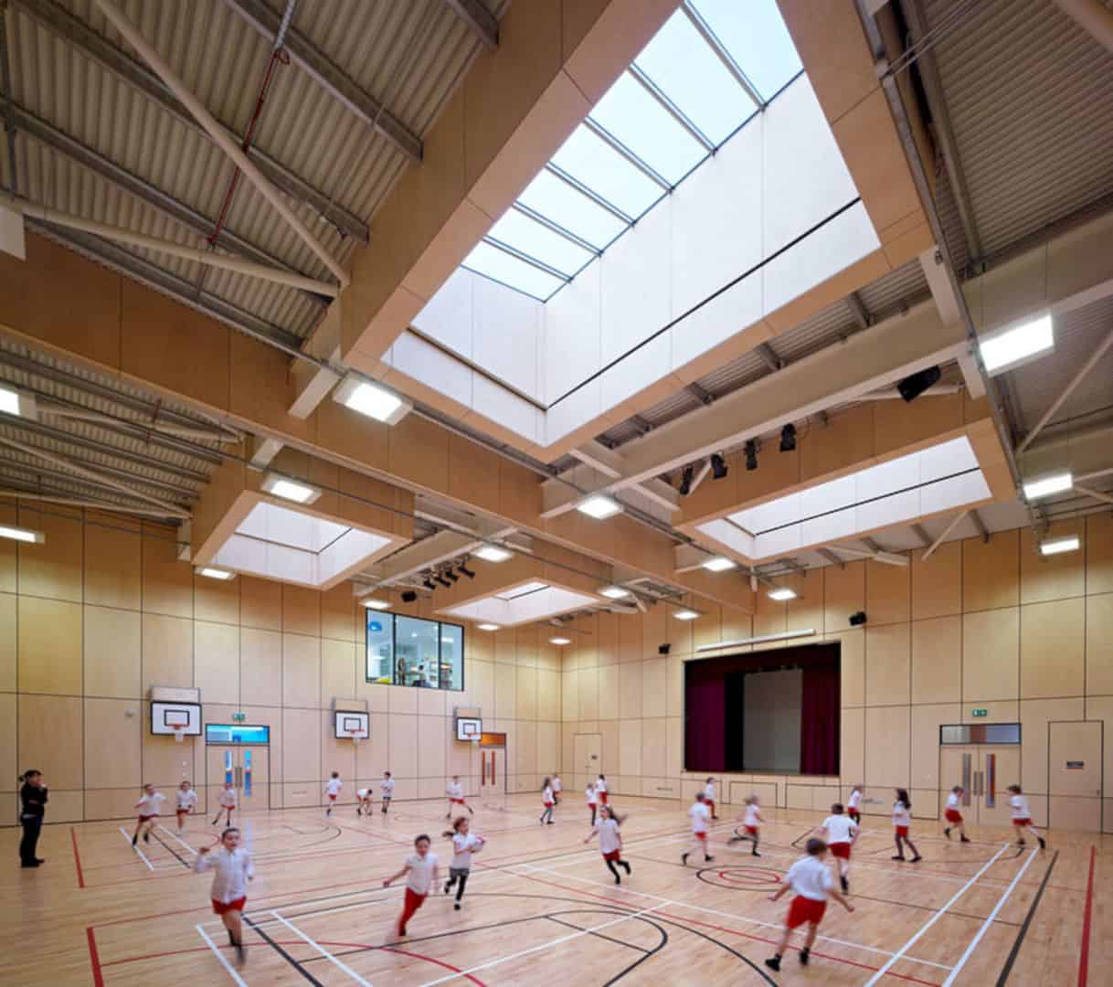
The project highlights of Heathfield Primary School includes the new double gym hall, new dining room, an open plan flexible learning resource area with the IT facilities, a new staff accommodation, and also some upgrades to the finishes and the fabric.
Interior
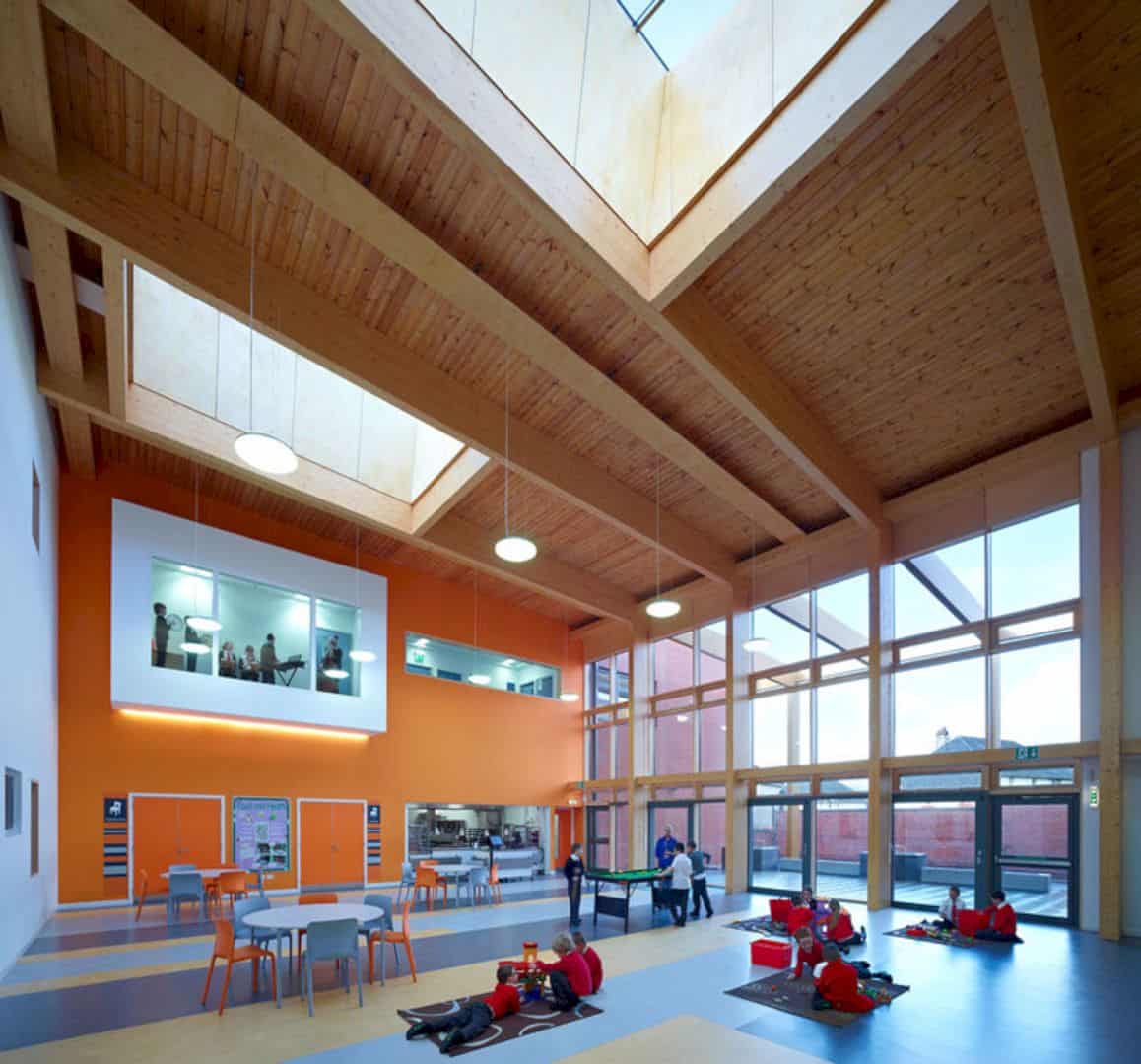
Besides the best materials, this school is also designed with some different colors which are interesting to be seen by both adults and kids. One side wall in the dining room area is painted with orange and white color. The floor is a combination of dark and light blue tiles.
Facade
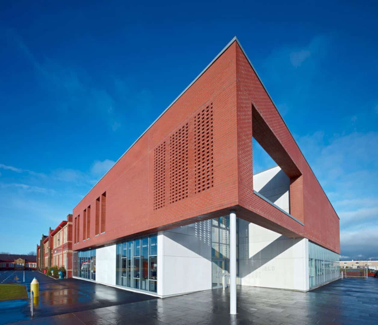
The brick facade offers an awesome architectural concept for this school building. The lines of the clipped roof and the deep brick soffits can keep the simple design of the building form. The main entrance is designed with a large oversailing brick corner feature to emphasize experience from it.
Via holmesmiller
Discover more from Futurist Architecture
Subscribe to get the latest posts sent to your email.
