The key concept of ST Nursery is about “connection”. This nursery is located in Saitama, Japan, and a winner of 2016 Kids Design Award for its awesome designs. The building and the area are designed with a good environment for the children, so they can feel and communicate with each other better. The floor planning design is also used to set a communication space for the people with nature and also the local community.
Concept
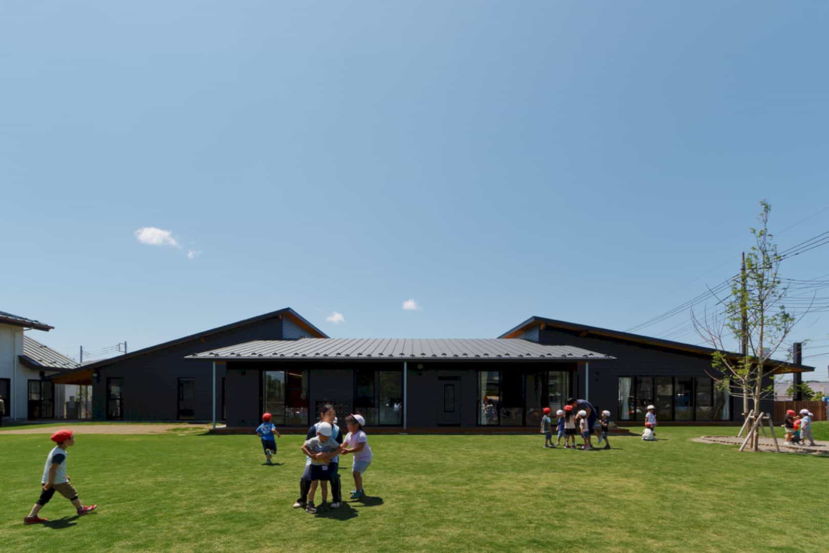
The reason why “Connection” becomes the main concept of ST Nursery is the decreasing numbers of children. The decreasing number of sisters and brothers make a bad connection between them, especially in their different ages. They can’t communicate with each other well.
Dining
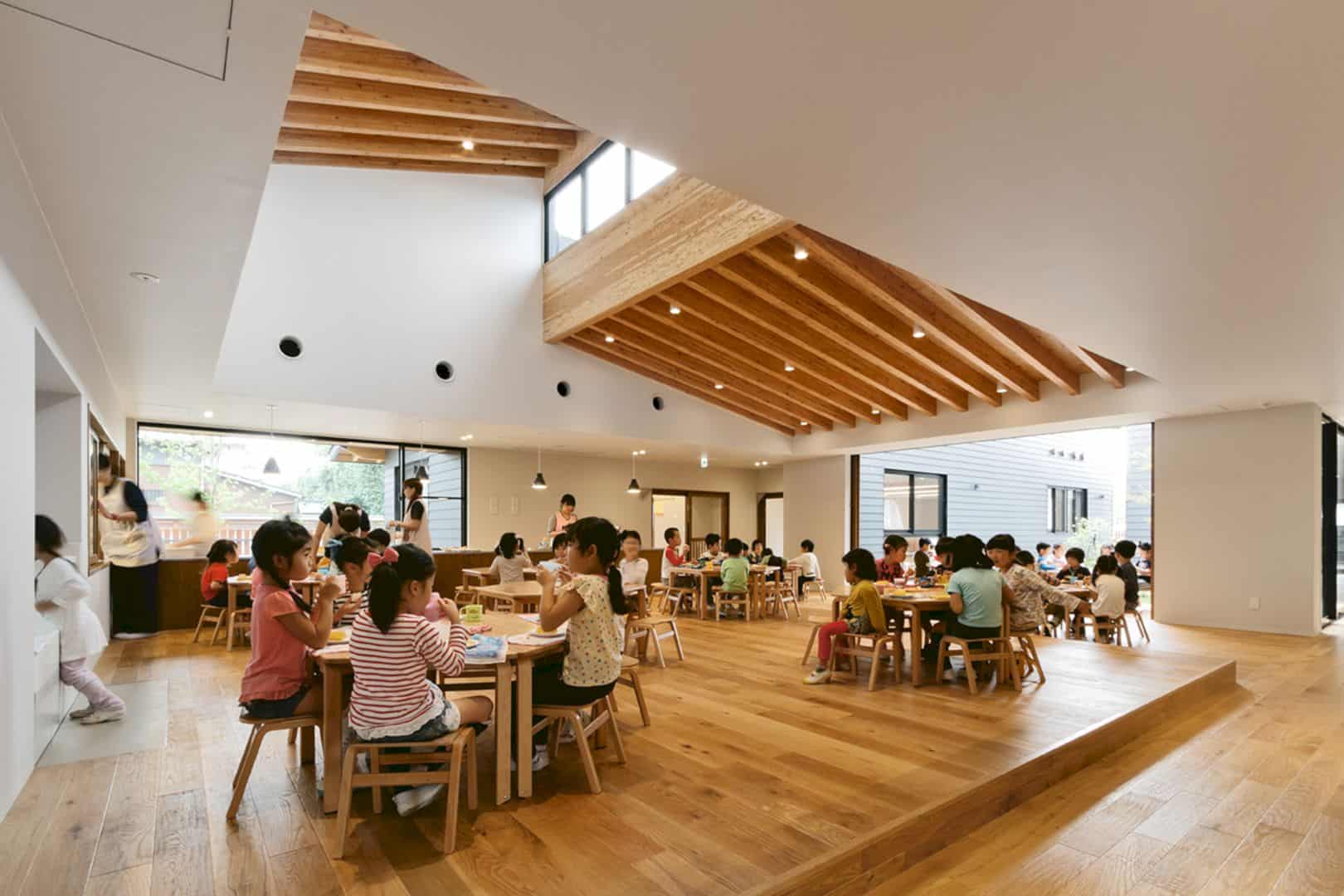
The dining space is decorated with the inclined roof. This roof is inspired from the boat sheds along the rivers near the nursery site. Both the roof and the floor are designed with wood materials, keeping the children warm even when winter comes.
Entrance
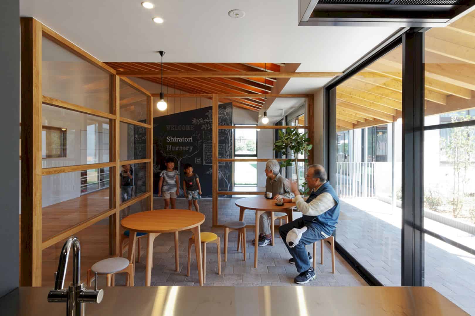
The entrance of ST Nursery is a perfect place for the adults. They can wait and drink a cup of tea while waiting for their children. The entrance offers an awesome view through the large glass wall. The wooden furniture makes the entrance interior looks beautiful.
Courtyard
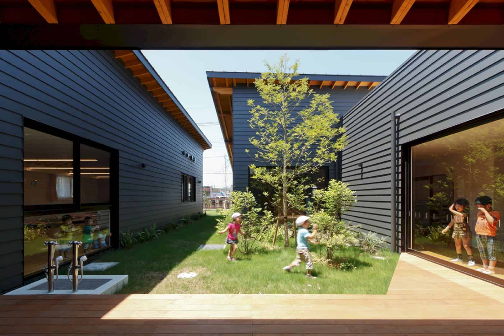
The courtyard of ST Nursery is not only a place for the children to play. They also can feel and enjoy the nature well in this area. This courtyard is designed with green elements like trees and grass. It is also a good connection that ST Nursery has for them with nature.
Via e-ensha
Discover more from Futurist Architecture
Subscribe to get the latest posts sent to your email.

