Barker Freeman Design Studio designed this brick Windsor Terrace on one of the leafiest blocks in Brooklyn. The house itself comes with few original details and the clients expected an open, connected living place for their daughters with lots of color and pattern.
Sherman St. Rowhouse
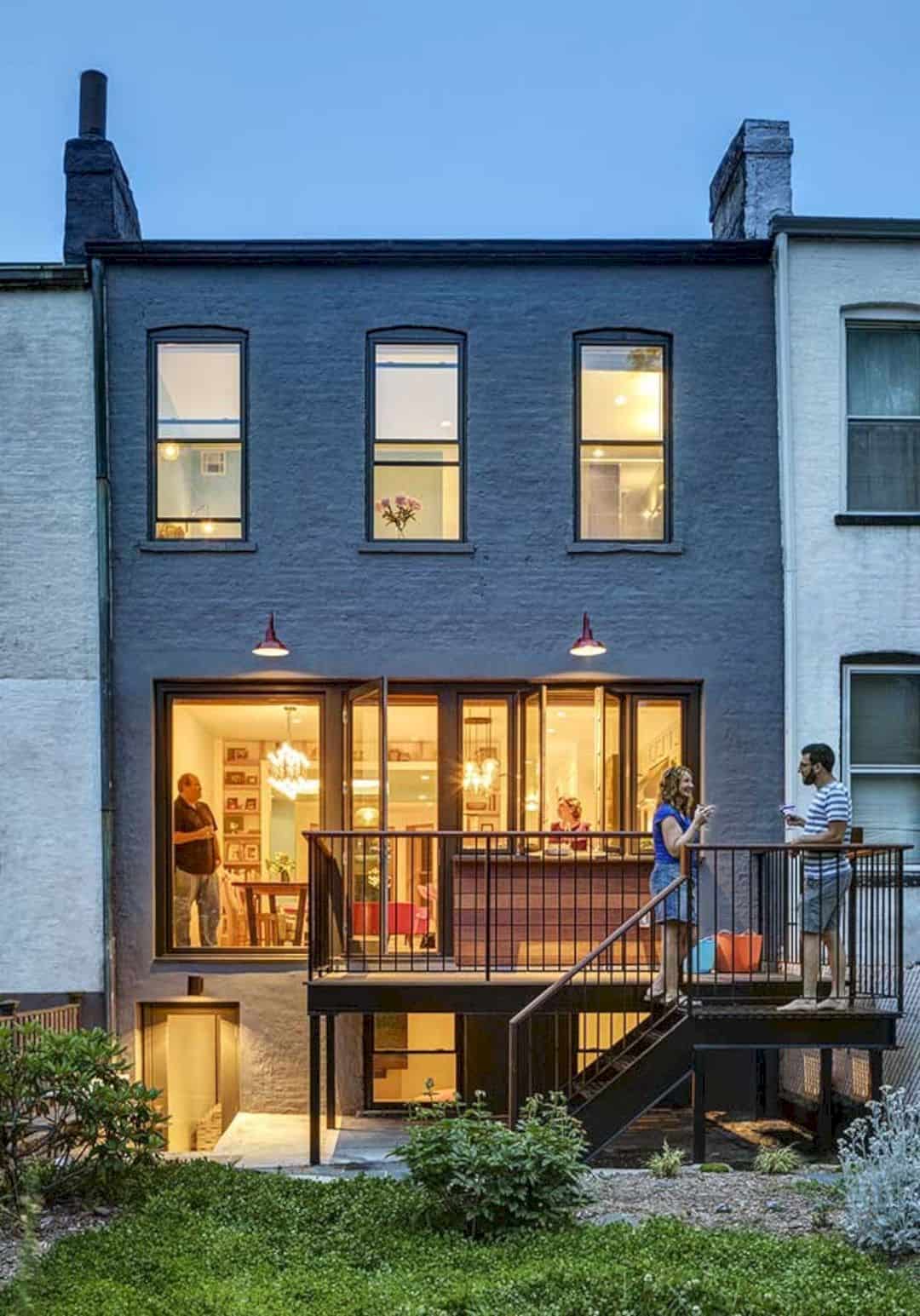
When you see the back view of the Sherman St. Rowhouse, you can see large windows open out onto the house’s rear deck and yard. This area is connected to the kitchen, offering an easier transition for easy serving.
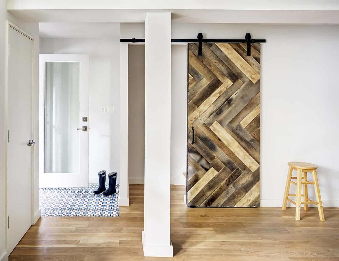
Upon entering the house from this area, you will be directed to the lower level family area and see a reclaimed wood barn door to separate this level from the staircase that directs you to the second level of the house.
Open Layout Interior
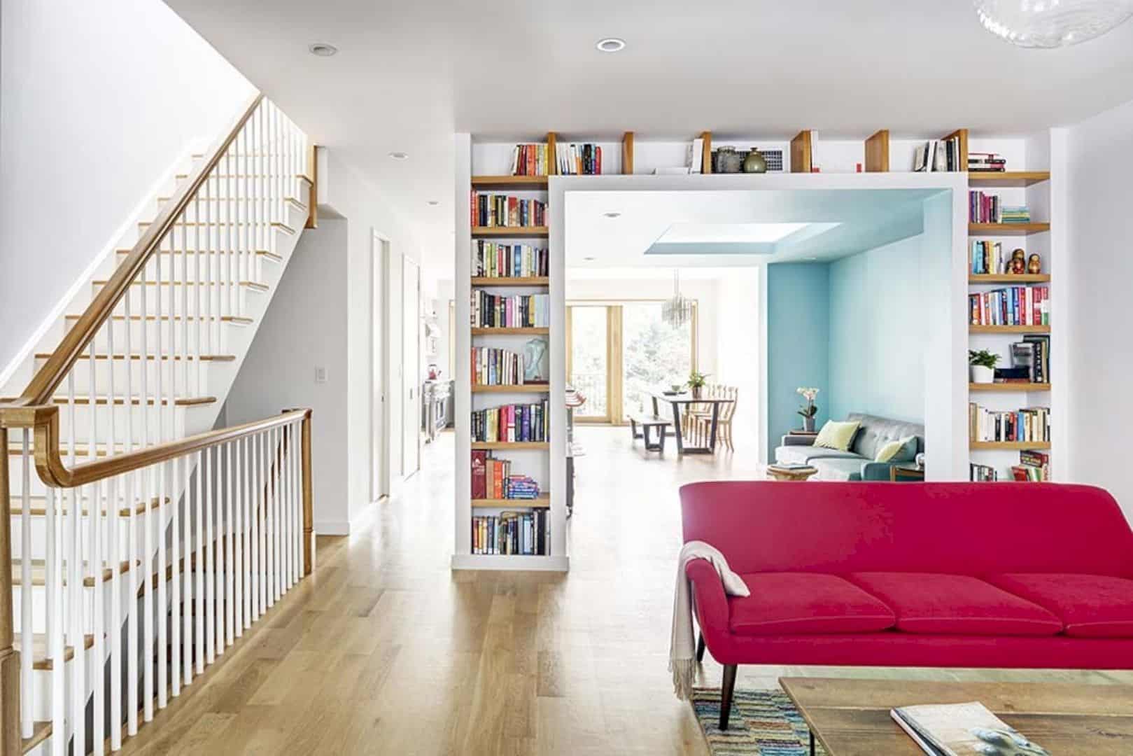
The layout displays a bookshelf-clad interior volume to house the TV watching area that separates the living room at the front of the dining room and kitchen at the back. The volume itself is painted in Tiffany blue and defines a zone for a coat closet and powder room. Meanwhile, the dropped ceiling in this open layout interior covers a set of a minisplit air conditioner.
Contrasting Kitchen
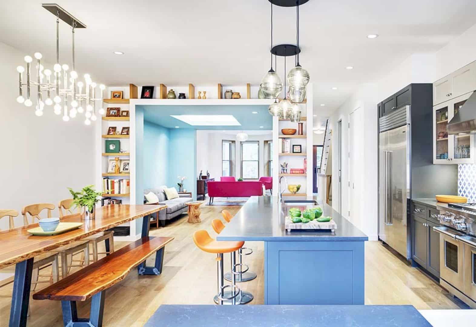
The kitchen displays a white and blue patterned cement tile backsplash and white upper cabinets. This set up offers a contrast to the all-gray lower cabinets and countertops. In addition, white oak was incorporated throughout the house in shelf details, flooring, the stair handrail, and windows.

Barn style dining area is being displayed in the kitchen area. You can also access the house’s rear through the pass-through window, allowing easy serving from the kitchen.
The Bright Bedrooms
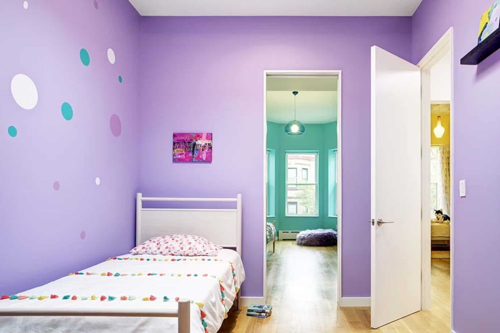
The second level houses three bedrooms, one is the master suite while the other two are dedicated to the clients’ twins. Focusing on the children’s bedrooms which are located in front, the firm used saturated hues for the finishing touch. Inside, there is an interconnecting door to allow the children access each other’s rooms.
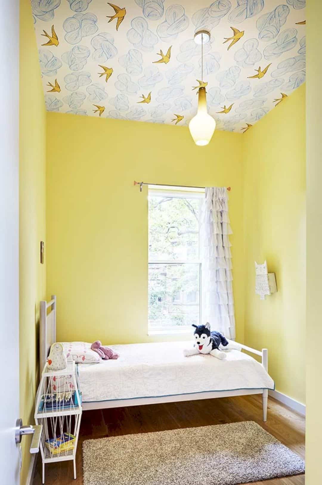
To add a distinctive touch to the bedrooms, the firm used bird wallpaper on the ceiling for the youngest child’s bedroom. In addition, the blue and white palette was used to paint the children’s bath.
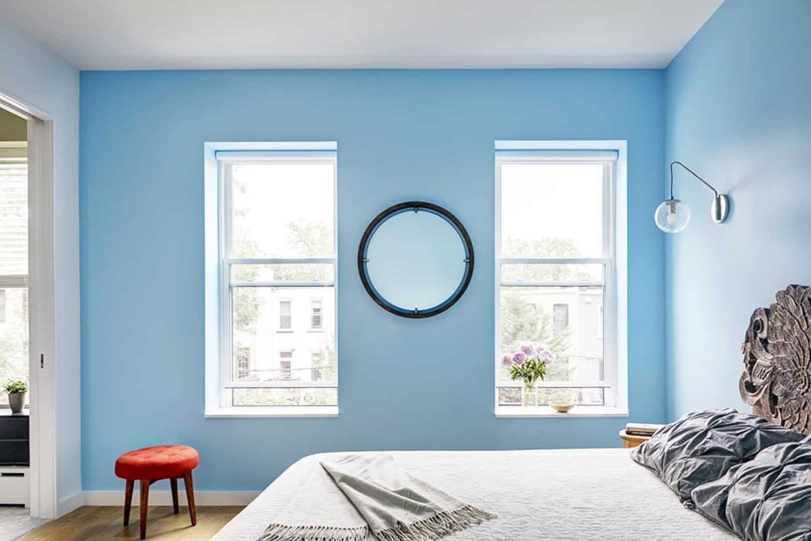
Meanwhile, the master suite is located at the back and painted in paler and calming tones like gray and blue. The same goes for the clients’ marble and green bathroom.
Via Barker Freeman
Discover more from Futurist Architecture
Subscribe to get the latest posts sent to your email.
