Known as the brand of children’s apparel, Qimoo comes with a flagship store located in China. Finished in 2016, the architectural firm chose a seed-like concept in the space to enhance the children’s shopping experience. With the design, Qimoo is absolutely not your typical shop.
Qimoo Children’s Apparel
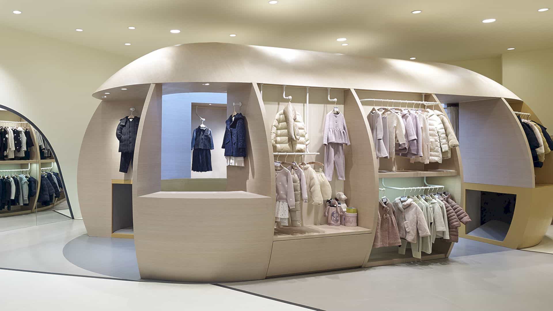
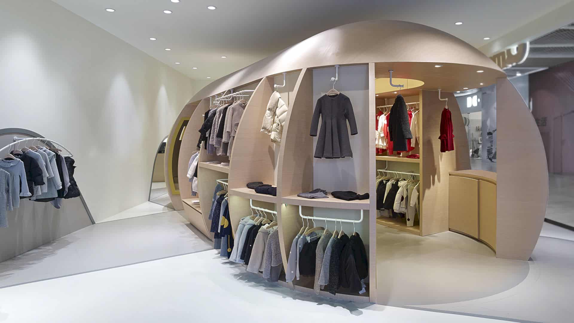
Crossboundaries include the ‘seed’ which houses all the functional elements required to enhance children’s shopping experience in Qimoo. With the seed, the customers can move around and through while realizing the shop’s vision to direct the kids in adventures of their fantasy and imagination.
Cave-Like Spaces
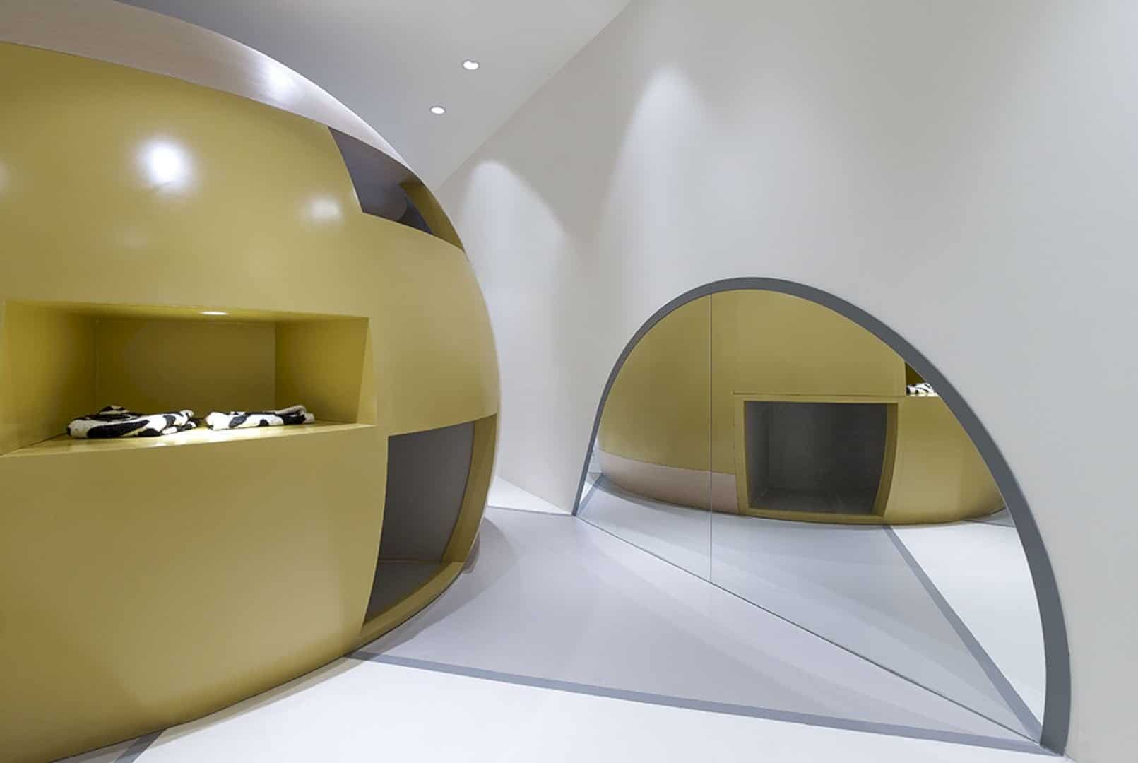
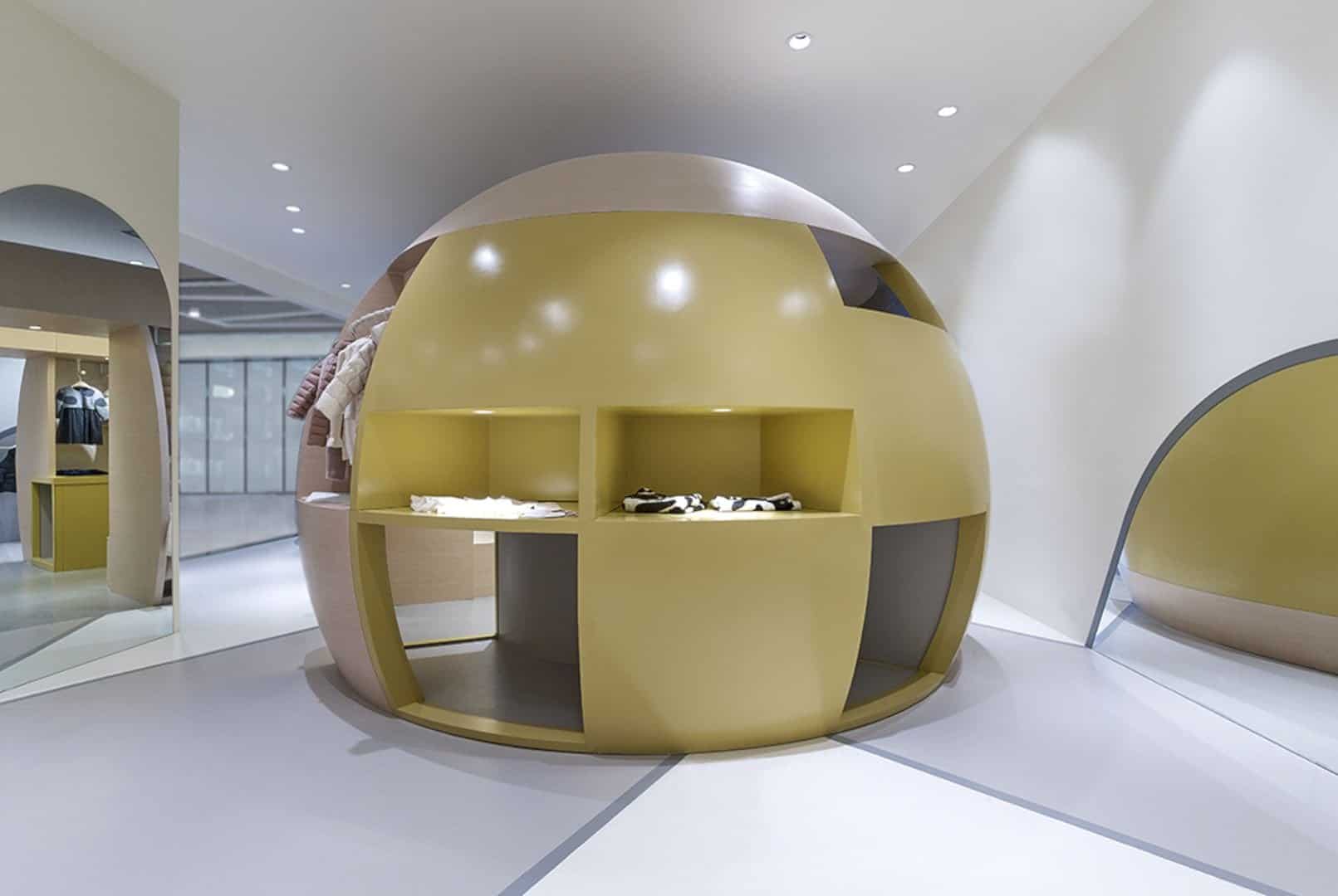
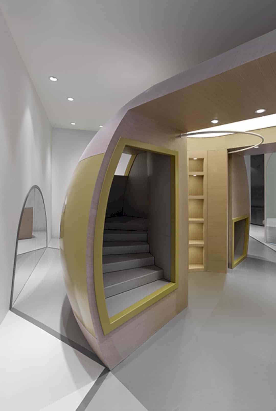
The shop offers a number of cave-like spaces that the children can use to explore multiple directions provided. The shop also provides soft chairs, spilling out on the edges and expanding the landscape for children’s exploration.
A Strategic Relationship of Two Parts
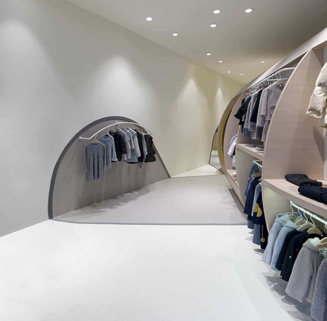
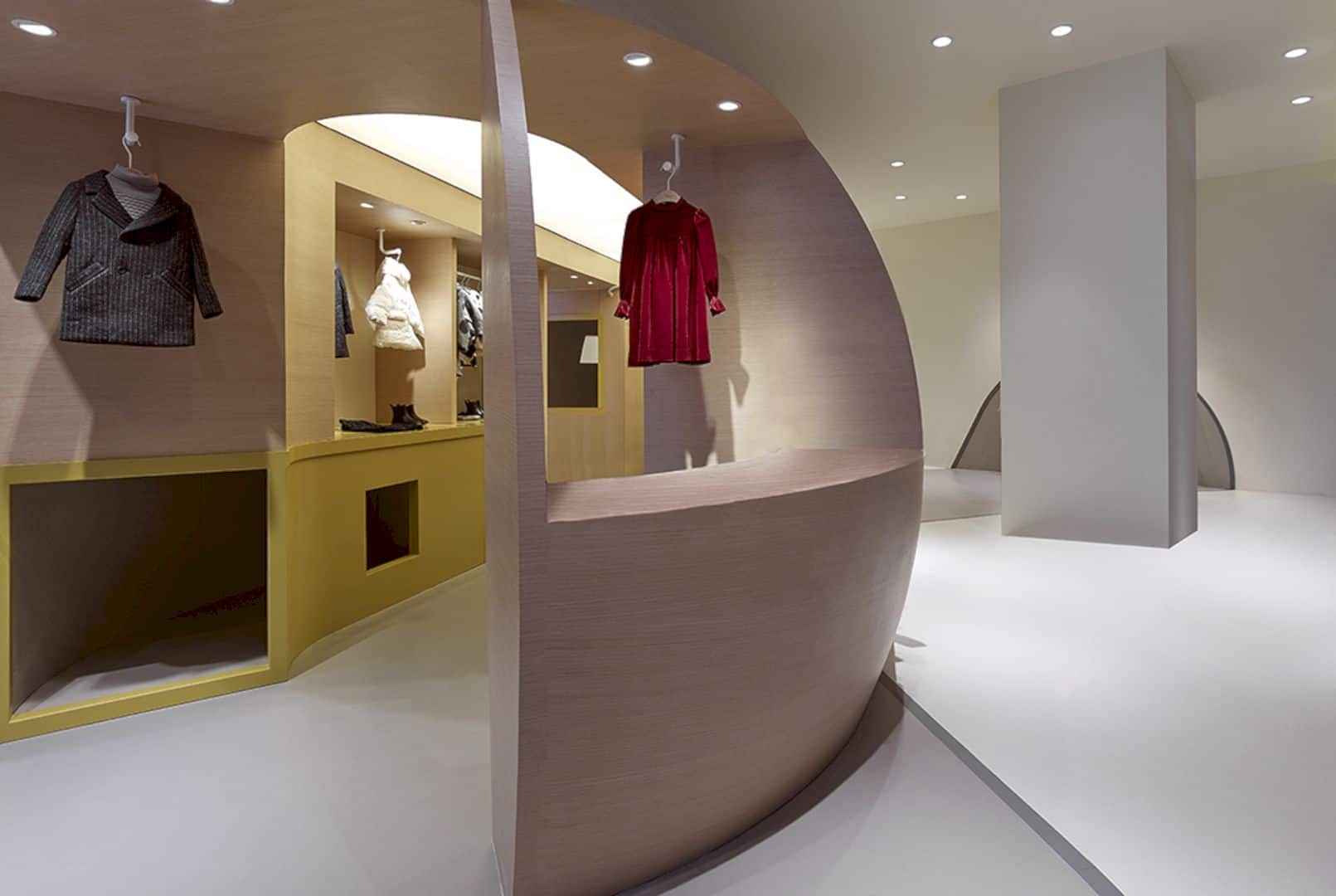
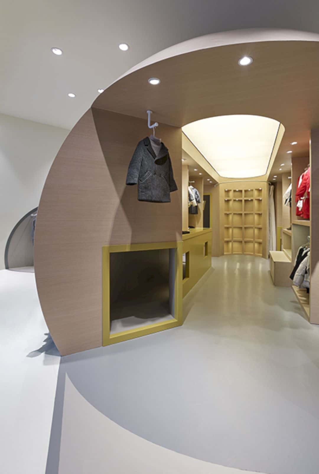
At first, it looks like a simple volume within a space, but the fact is that the architectural firm developed a strategic relationship of two parts which are the seed and its space. The form of the seed showcases the patterns that spread out on to the floor and up on the walls, making some spaces for the logo, mirrors, and other functions. In conclusion, the design allows these two parts to be more adjustable in multiple locations inside the shop.
Via Crossboundaries
Discover more from Futurist Architecture
Subscribe to get the latest posts sent to your email.
