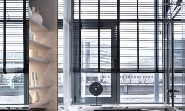
The FIOLET CLINIC, a Center of Aesthetic Medicine, has a 117-meter space on the first floor of a 25-story building in Minsk built by a private developer. Upon the design team’s initial visit, they encountered a large, white space with stunningly high ceilings reaching 4.2 meters. However, they also noted some significant drawbacks: the ceiling was cluttered with technical pipes, and the windows were of irregular shapes.
The client is a young woman who is a leading expert in injection cosmetology. As the founder and head of her own aesthetic medicine center, she is an active plastic surgeon and a renowned cosmetologist in Minsk. Tatyana had an open-minded approach to the design of the space. She has been a long-time follower of the studio’s Instagram page and trusted the studio to be creative and create something unique and beautiful. She allowed the studio to carry out their work with complete creative freedom while focusing on her professional responsibilities, without getting involved in the construction details.
The studio undertook the task of redeveloping the space, focusing on incorporating the following facilities: three offices, a staff room, a medical supplies storage room, a utility room, a visitor bathroom, a corridor, a reception area, a waiting area, and a small vestibule for customers to store their outerwear seasonally.
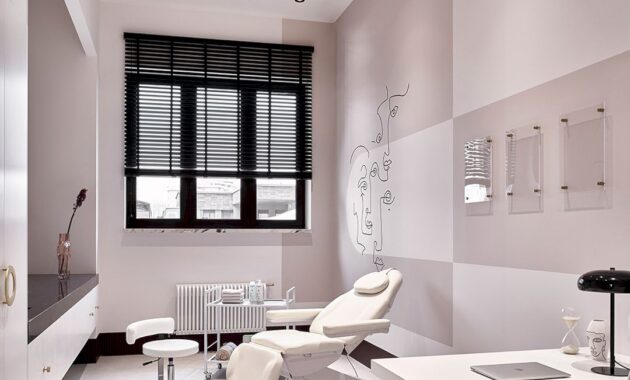
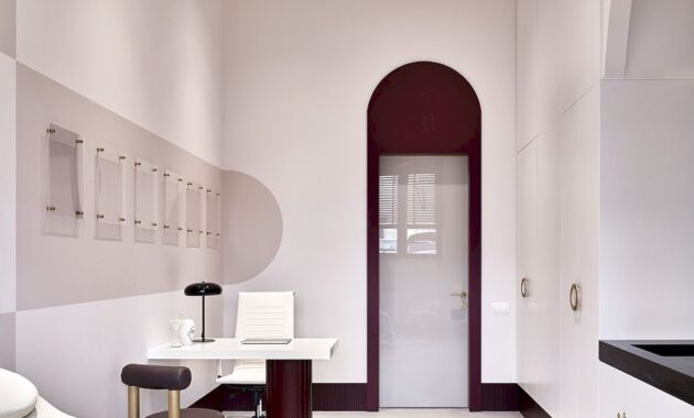
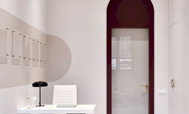
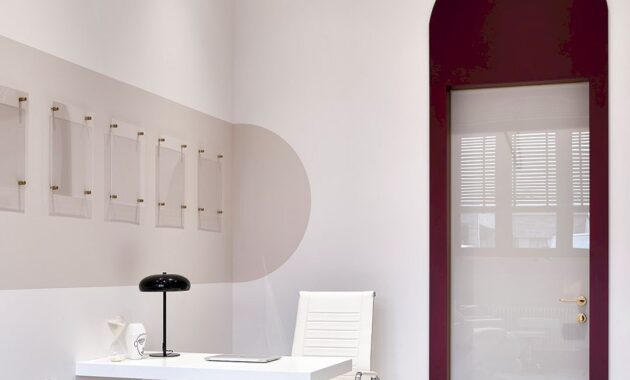
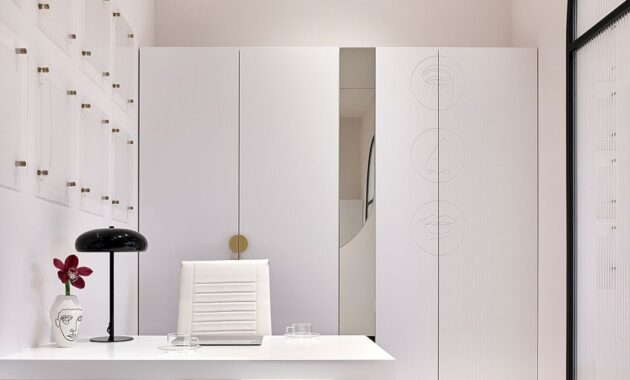
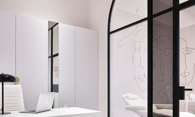
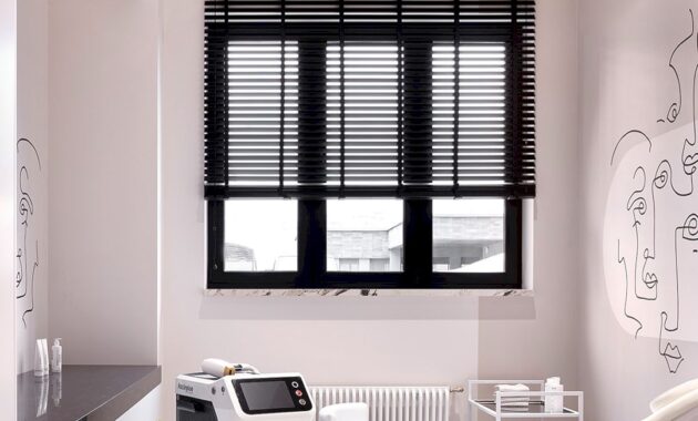
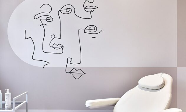
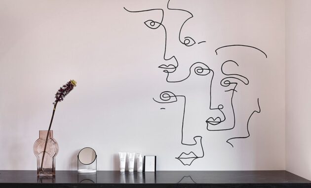
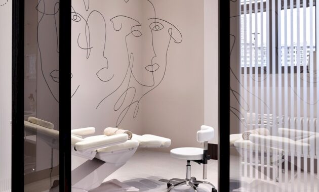
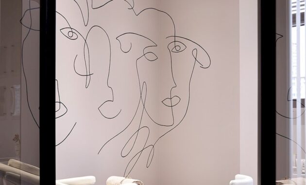
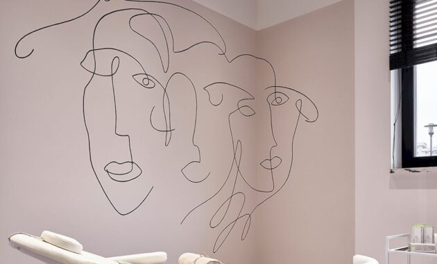
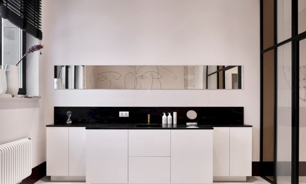
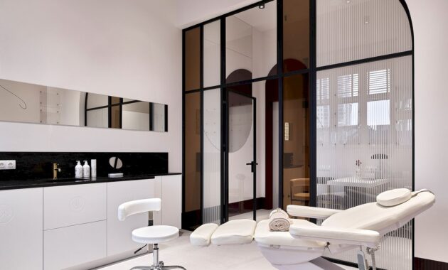
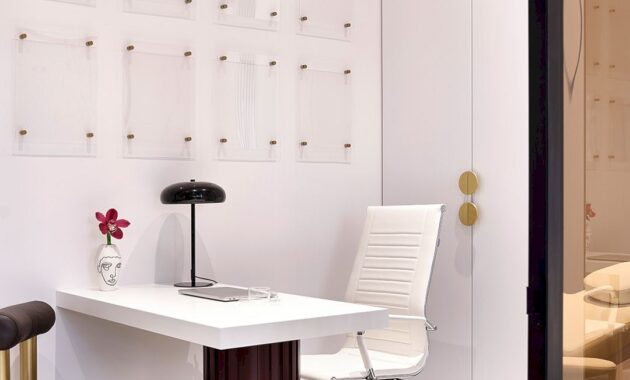
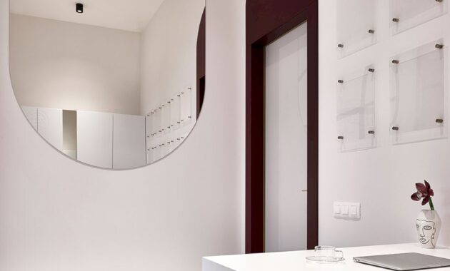
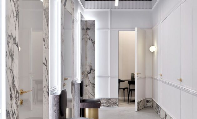
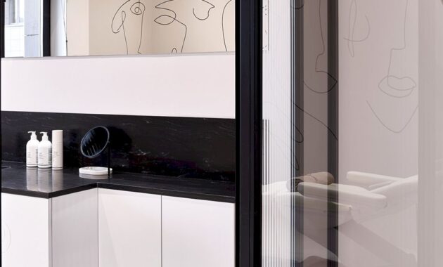
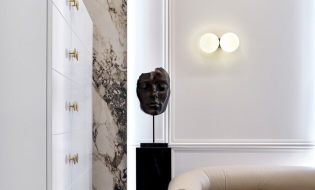
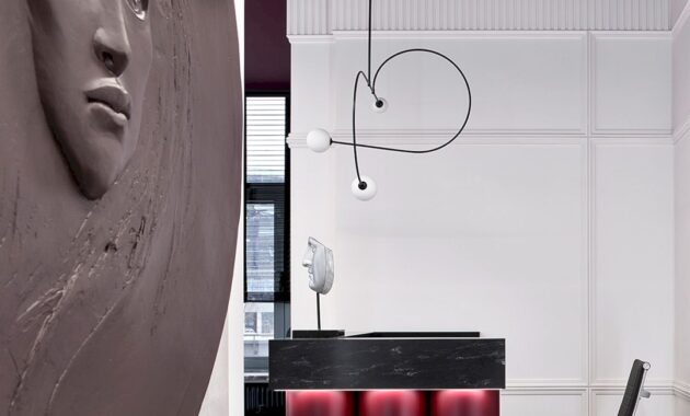
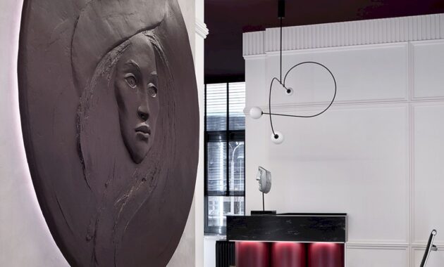
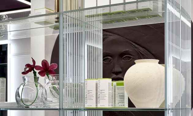
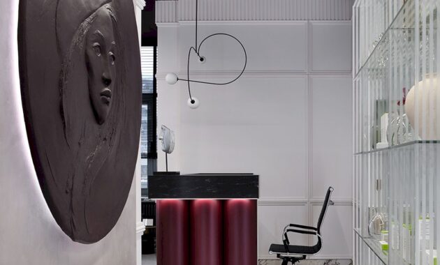
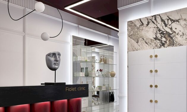
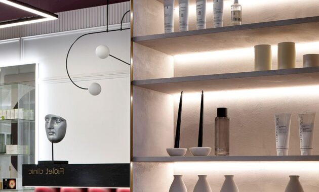
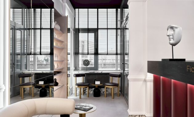
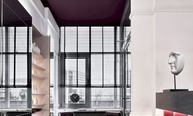
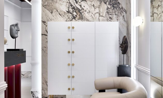
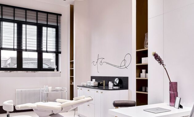
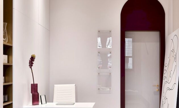
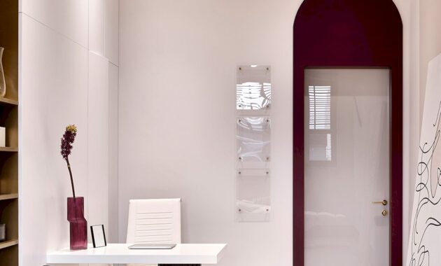
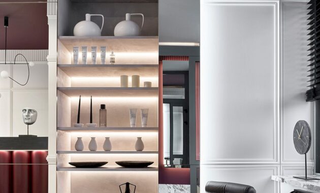
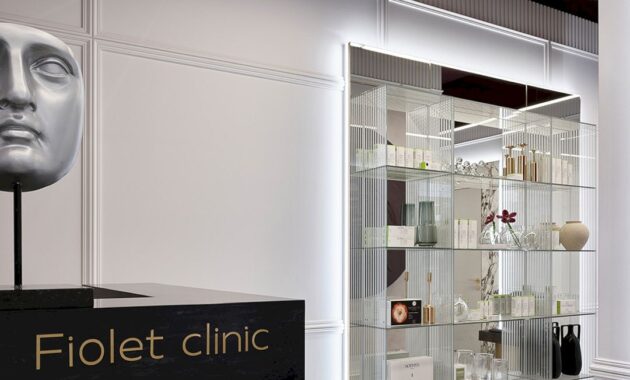
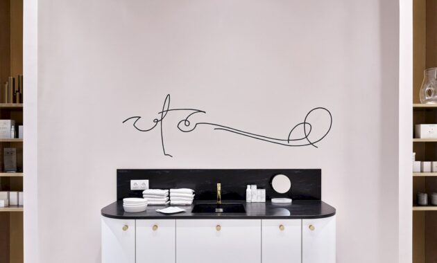
The primary objective of the project was to ensure the clinic adhered to SES (sanitary-epidemiological station) standards, achieving maximum sterility, while also creating a welcoming and comfortable atmosphere for clients. As a beauty clinic, the inspiration drawn from the features of a woman’s face is evident throughout the space. Upon entering, visitors are greeted by two sculpted masks, one in the reception area and another in the waiting area. The corridor features a large custom-made plaster panel that highlights the aesthetics of a beautiful female face. In the three doctors’ offices, whimsical line drawings of faces inspired by Pablo Picasso’s sketches adorn the walls, with all decor items reflecting the project’s theme.
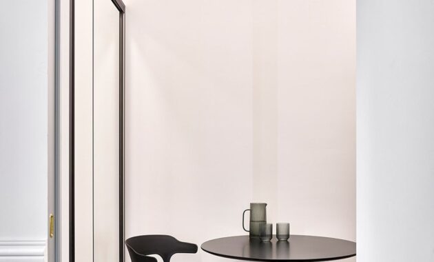
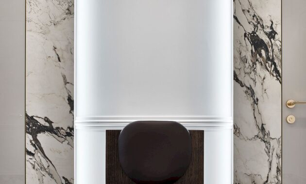
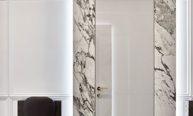
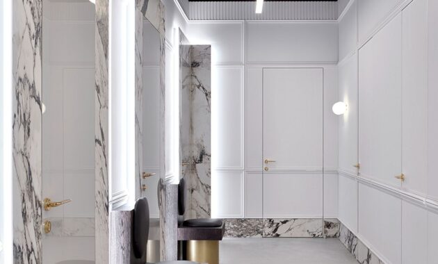
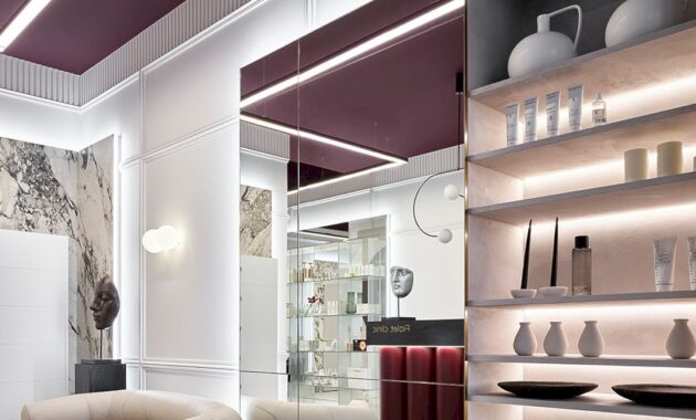
Given that it’s an injection cosmetology clinic, it was essential to adhere to all sanitary and epidemiological station regulations and use materials exclusively from their approved list. Despite the limitation of using only paint in the offices, the studio strived to make each one unique. They chose continuous concrete flooring to maintain a clean look. In the hallway, reception area, and waiting area, they incorporated creative elements like moldings, replacing traditional skirting with decorative edging made of large-format tiles, and using 3D plaster panels as a decorative trim instead of a cornice.
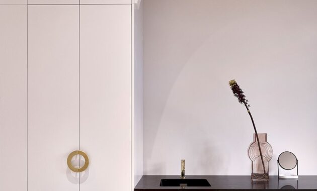
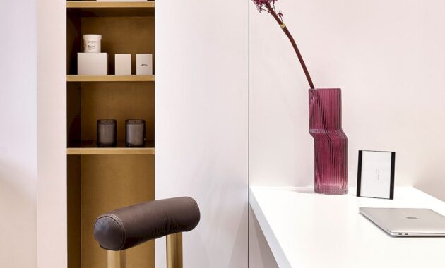
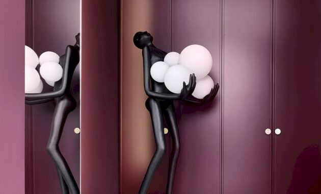
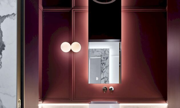
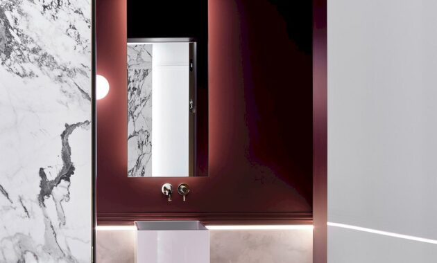
Selecting the color scheme for the project was straightforward, as it was naturally dictated by the clinic’s name, Fiolet (violet) Clinic. Therefore, the task was to find the perfect complement to the purple color scheme. The studio successfully paired a rich, deep eggplant hue with ash-white, gray, black, soft nude tones, and brass accents. While adhering to SES standards was a primary consideration in selecting furniture, the studio also embraced creativity and customization. Each piece of furniture was custom-made from the studio’s sketches, allowing them to experiment despite the limited selection of materials, which included leather, metal, and coated MDF. Every item in the project, from chairs and cabinet furniture to door handles and custom engravings, was uniquely designed by the team of the studio to meet the client’s needs and align with the overall concept.
Key technological features implemented in this project include video surveillance, an alarm system, and the latest cosmetology equipment available on the market. The studio takes great pride in this project and is immense to the client for their complete trust in the team, allowing them to bring their vision for the clinic to life. It was an absolute pleasure that the studio’s ideas were embraced even before they were formally presented and ultimately carried through to completion.
Another intriguing feature the studio incorporated was a sculpture of male hands holding a vase of fresh flowers, designed as a tribute to the beautiful women visiting the clinic. Major furniture pieces, joinery, and the bathroom sink were custom-made based on the studio’s sketches by local craftsmen. The studio also utilized Kaufmann concrete continuous flooring, Omnires (Poland) faucets, and Porte Richi doors, complemented by décor from Zara Home and local shops like Skvirel, Dom Décor, and Kiara Home.
FIOLET CLINIC Gallery
Discover more from Futurist Architecture
Subscribe to get the latest posts sent to your email.


