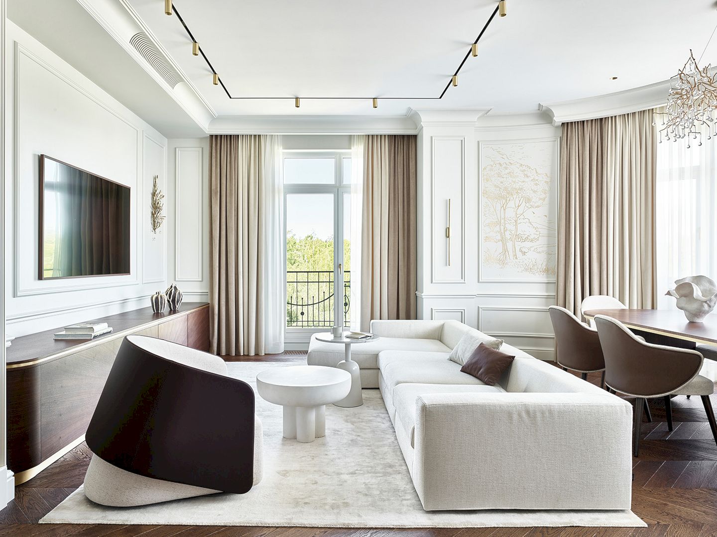
Interior designer, Alisa Shabelnikova, has an awesome residential project to share with you, called A Bright Apartment with A Classic Base and Modern Furniture and Art.
It is a 120 m2 apartment designed for a young couple, located just a minute’s walk from the beach in a residential complex on the banks of the Moscow Reservoir. Acquiring a residence in this area is quite challenging, hence upon the property’s availability, the clients promptly proceeded with its acquisition.
The owners of the apartment reached out to interior designer, Alisa Shabelnikova, seeking her expertise in crafting a light, airy space with a classic foundation and modern furniture and art.
Alisa said that the original layout was illogical, with lots of skewed angles, bulky ventilation boxes on the ceilings, and a living room divided by doors into two separate parts. Hence, she decided to undergo a complete re-planning unanimously.
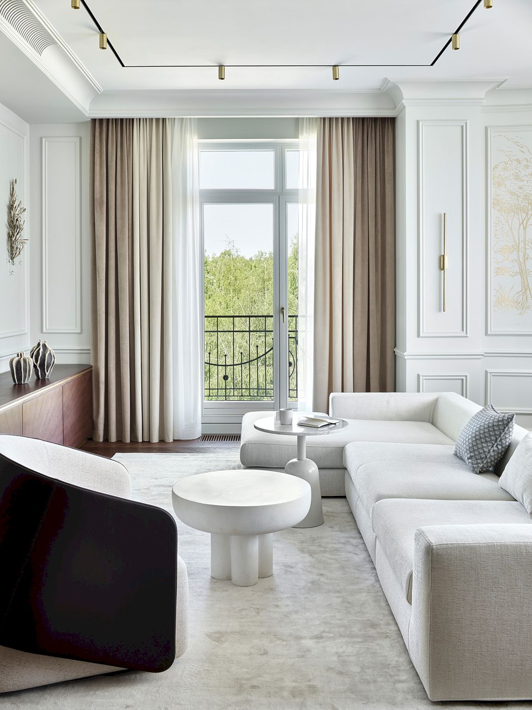
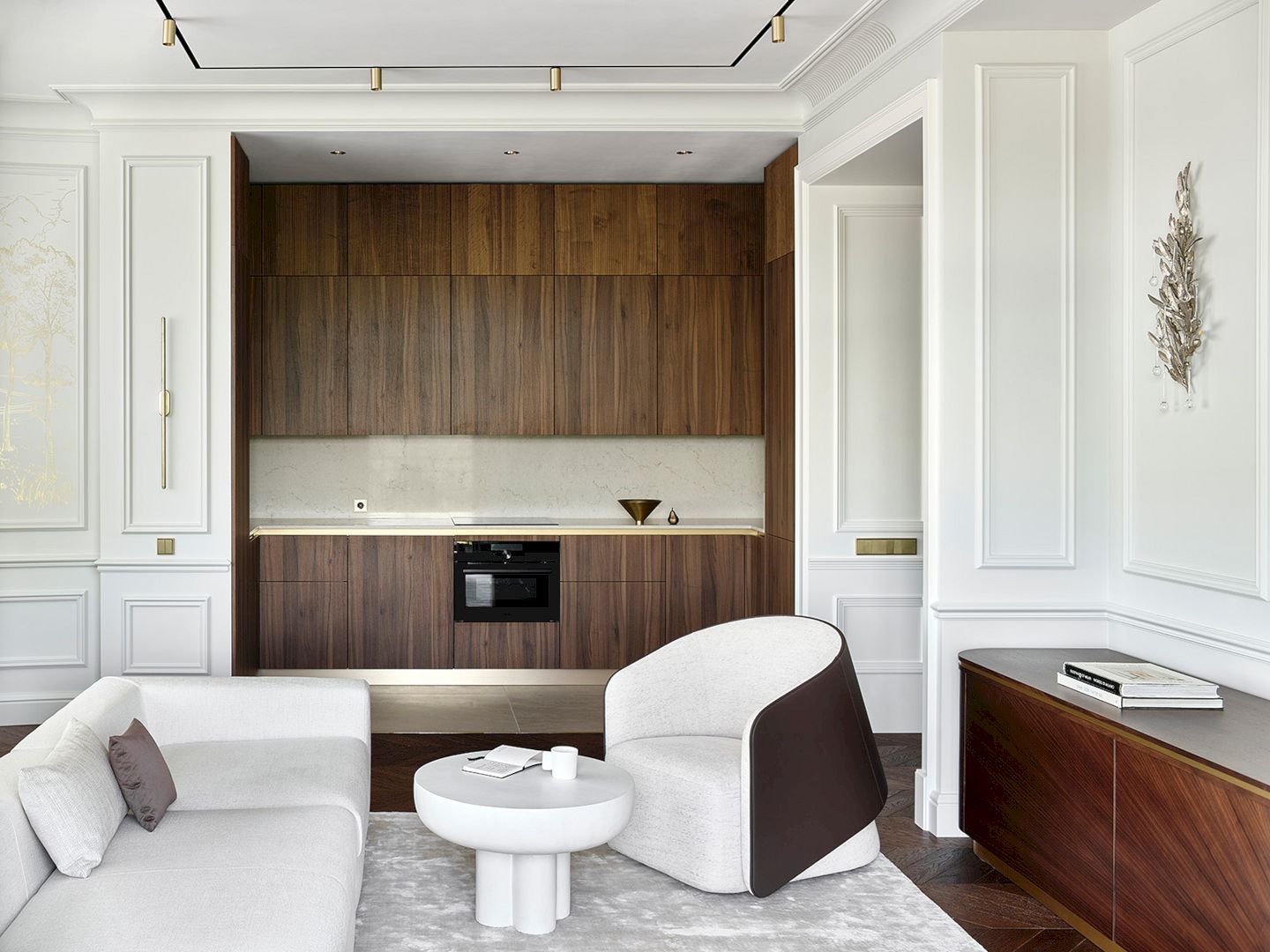
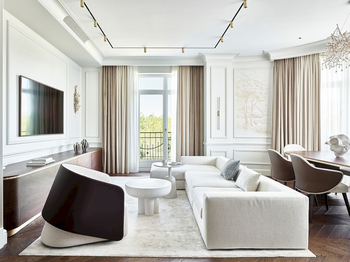
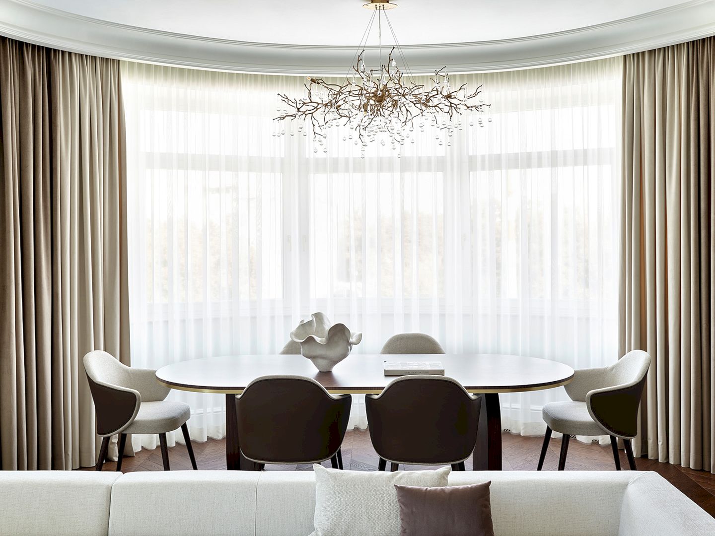
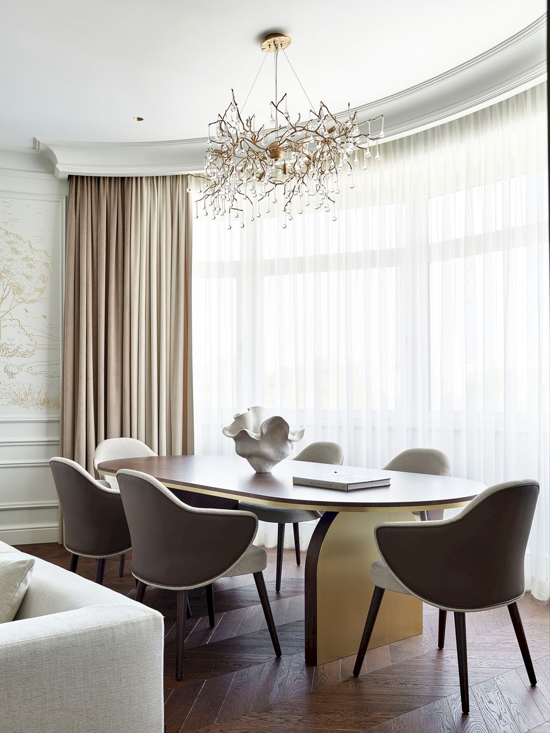
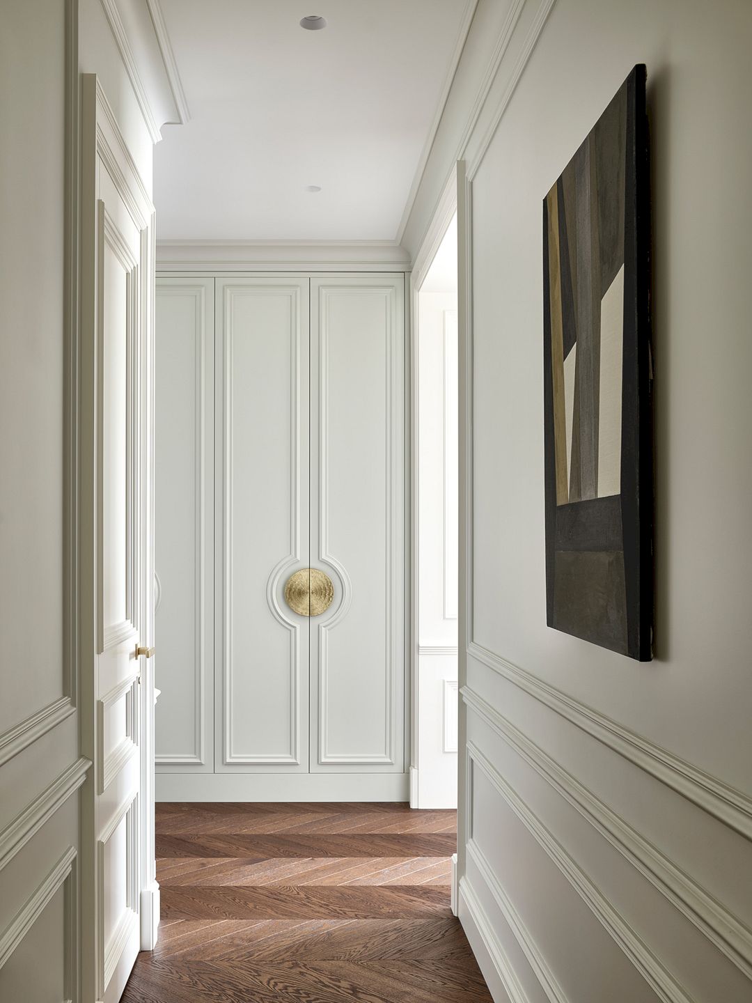
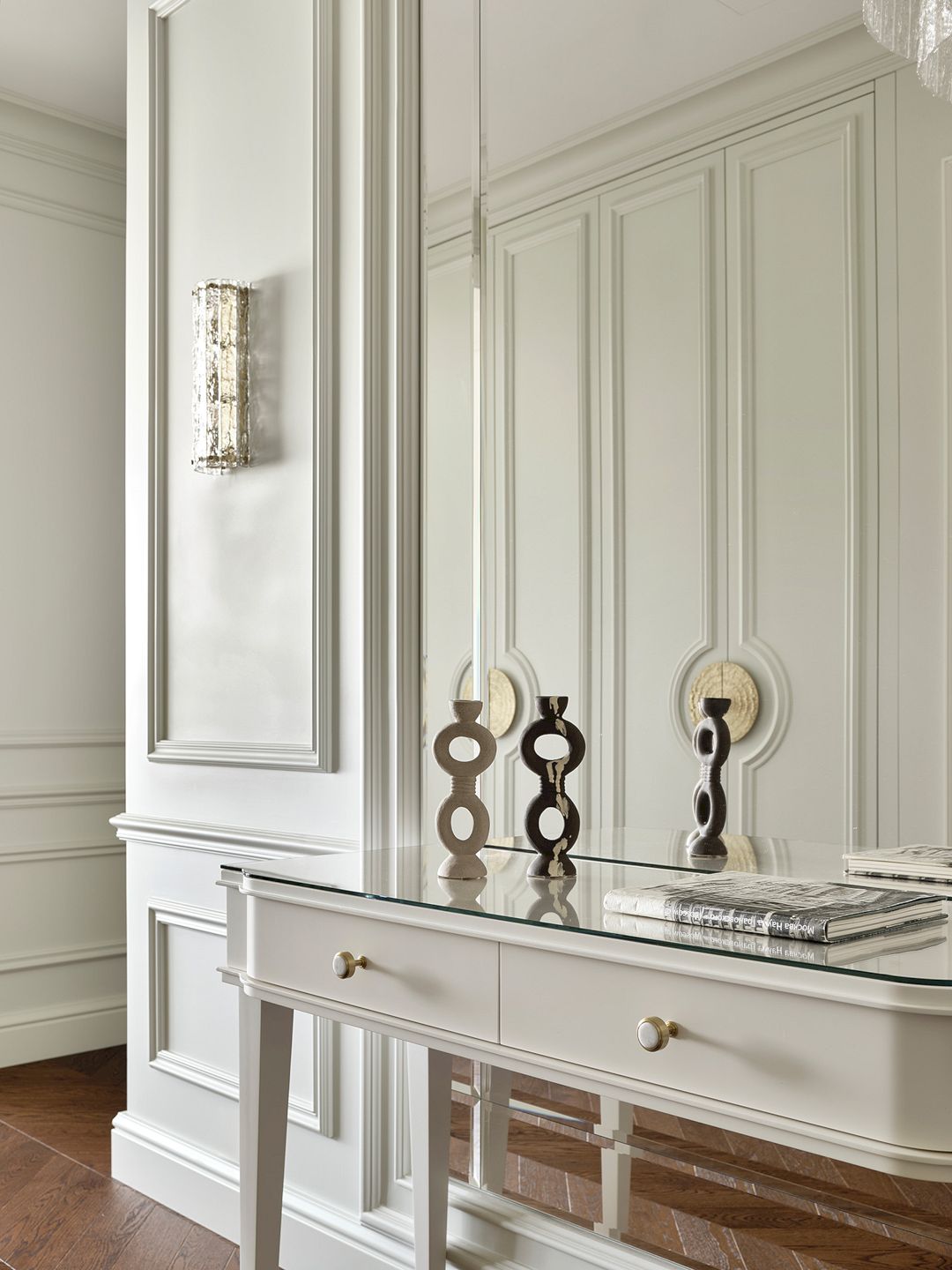
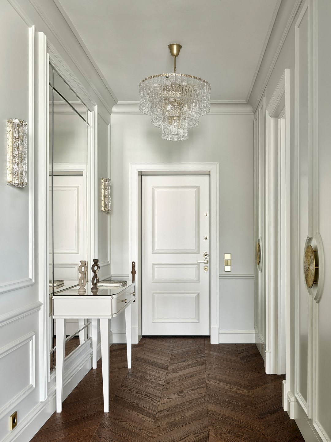
The enfilade principle was used to design the new layout, where one room transitions into another smoothly. Starting from the capacious and harmoniously proportioned hallway, the living room’s expansive panoramic window showcases stunning vistas of the encompassing scenery. “The first impression of the apartment is always very important, and I strive to conceive the most effective composition,” emphasizes the designer. The communal space of the apartment encompasses a generously sized living area with a dining area and a kitchen situated in a niche.
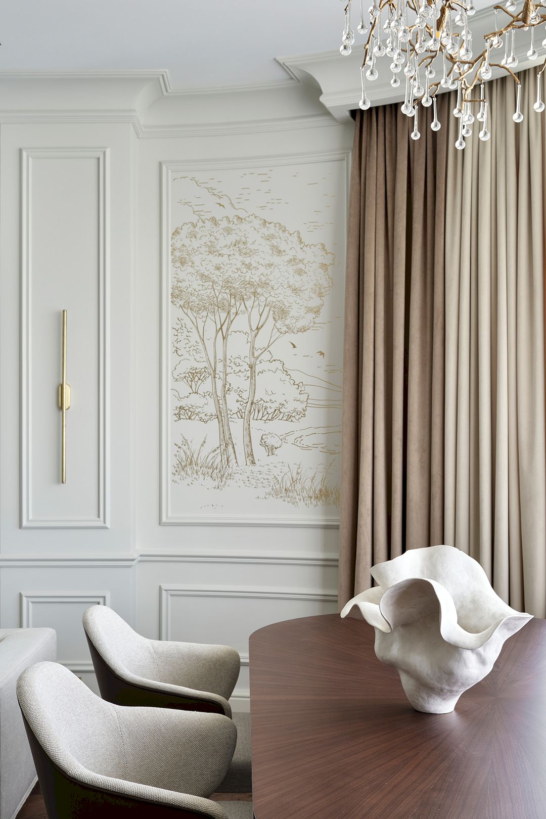
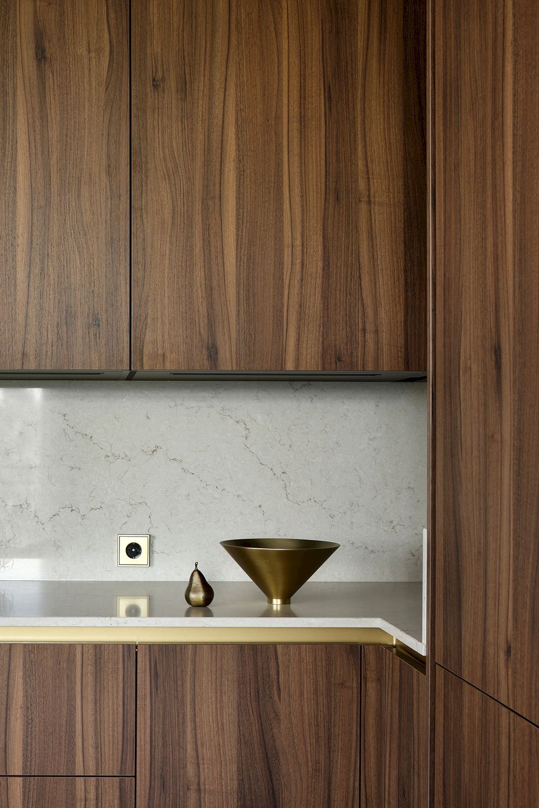
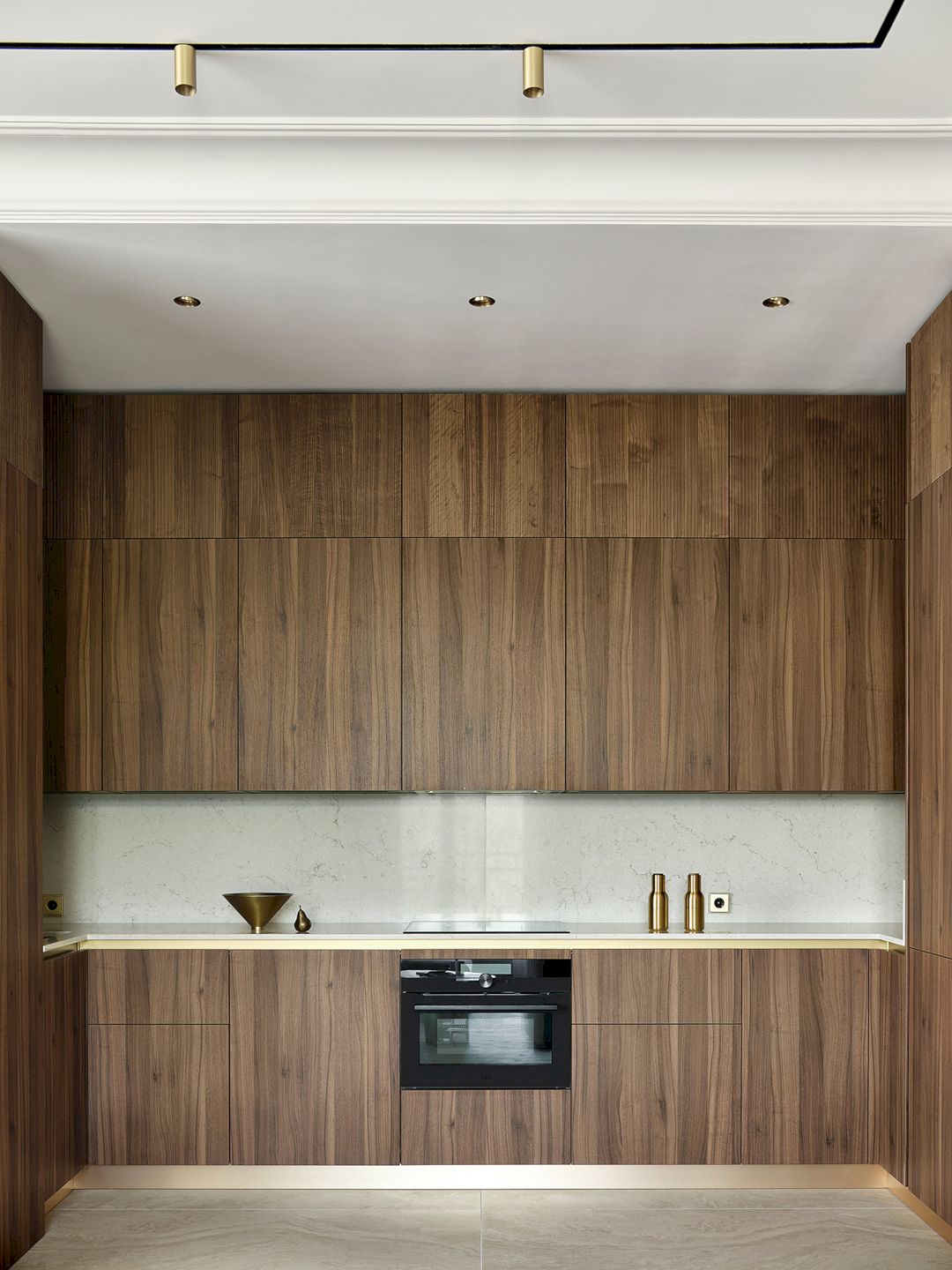
“One of the apartment’s drawbacks was the awkwardly placed and bulky ventilation and sewage boxes in the kitchen area. We concealed them behind panels, lowered the ceiling in this area, and created a niche where the kitchen furniture was placed. Some of the panels were veneered with the same walnut veneer as the kitchen cabinet fronts, creating a cohesive, organic ensemble,” says the designer, Alisa.
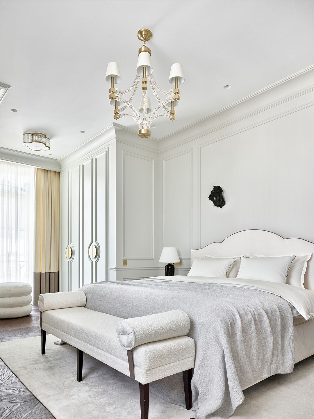
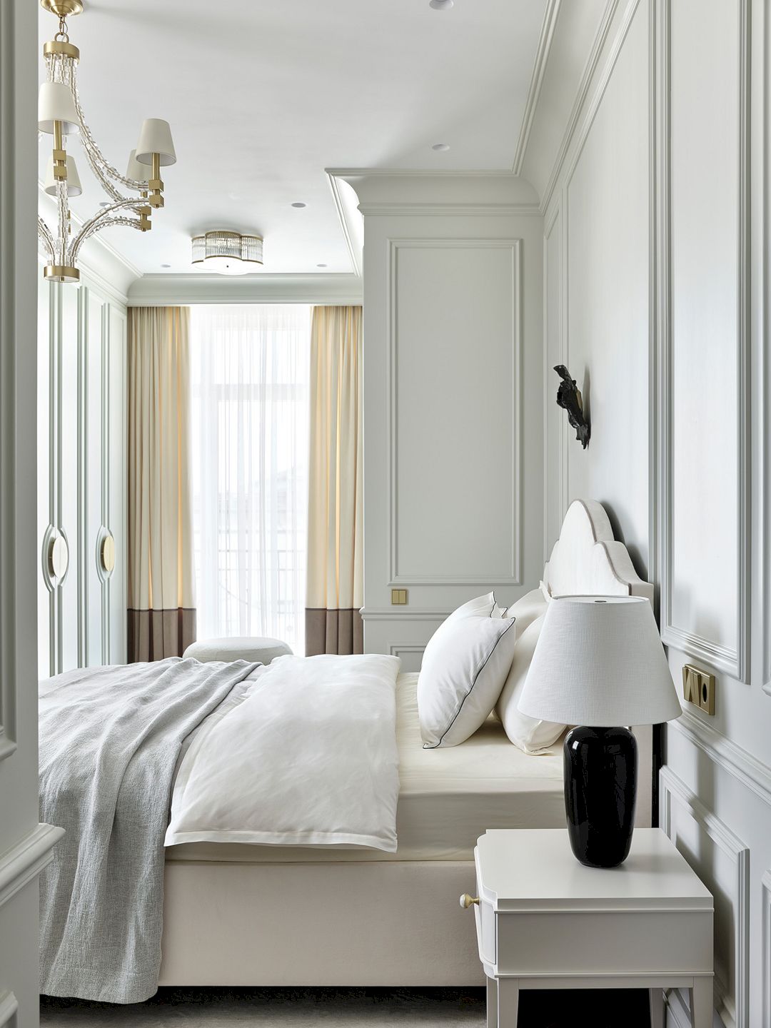
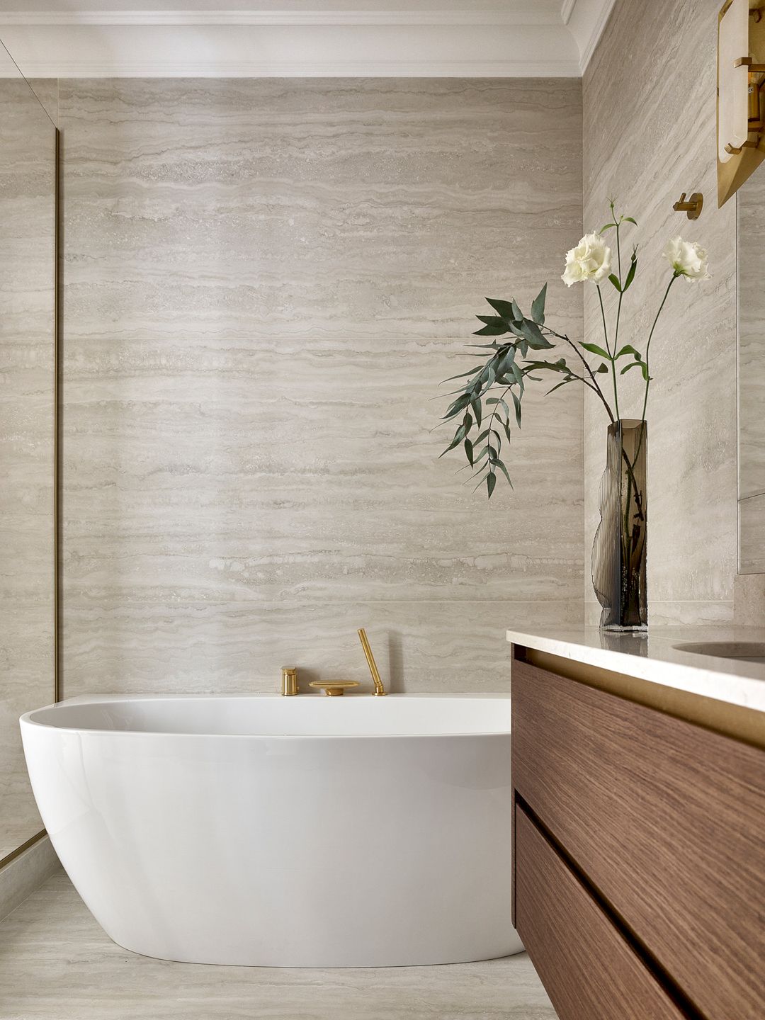
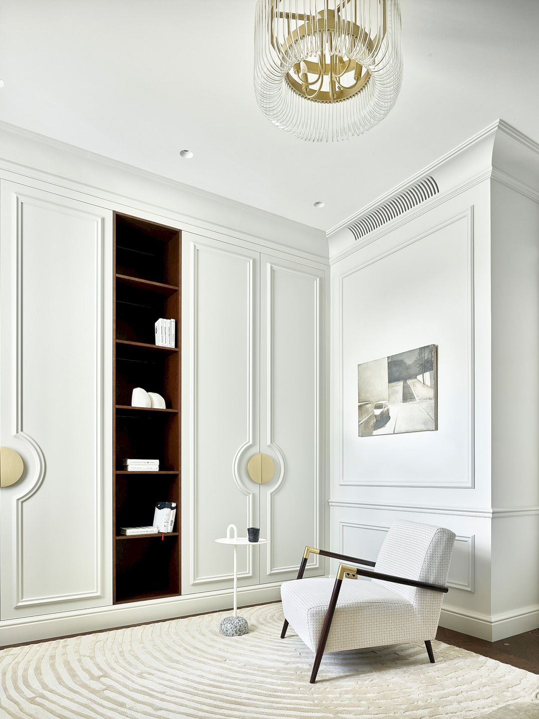
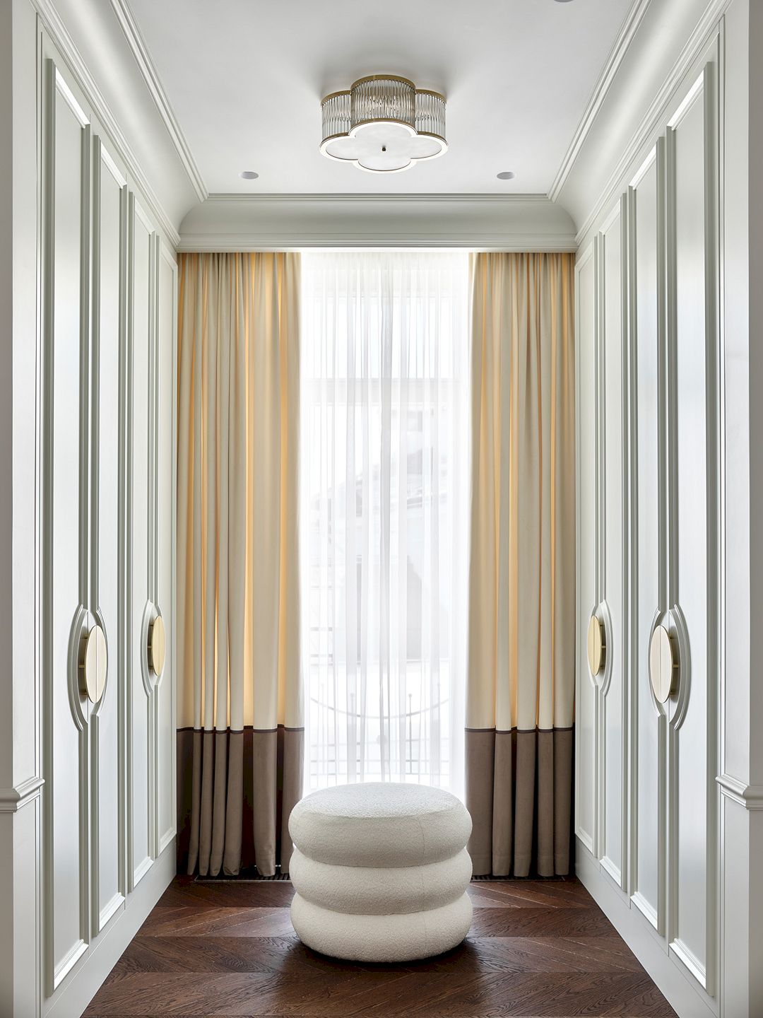
Within the secluded section of the apartment lies the primary bedroom, complete with its own en-suite bathroom and a dedicated dressing area. Custom-built wardrobes featuring facades matching the wall color are strategically positioned by the window. Adding to the convenience, a secondary dressing room and a laundry facility are discreetly positioned away from the master suite. Additionally, a guest room offers versatility, with the potential for future transformation into a nursery if desired.
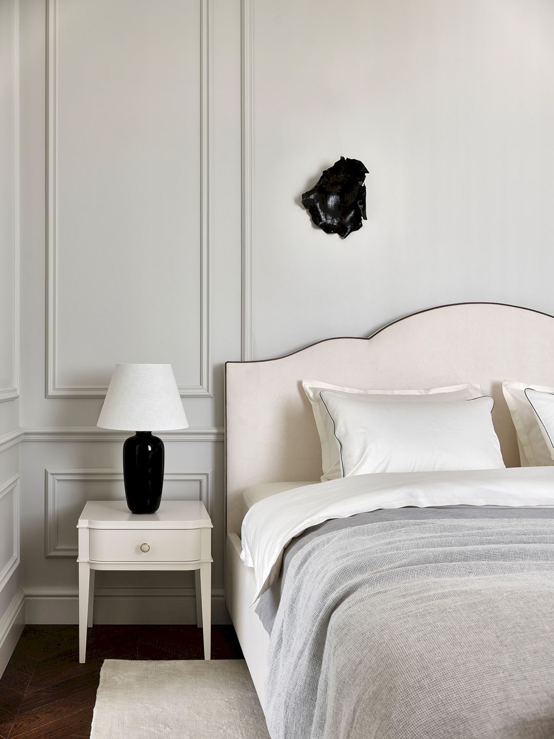
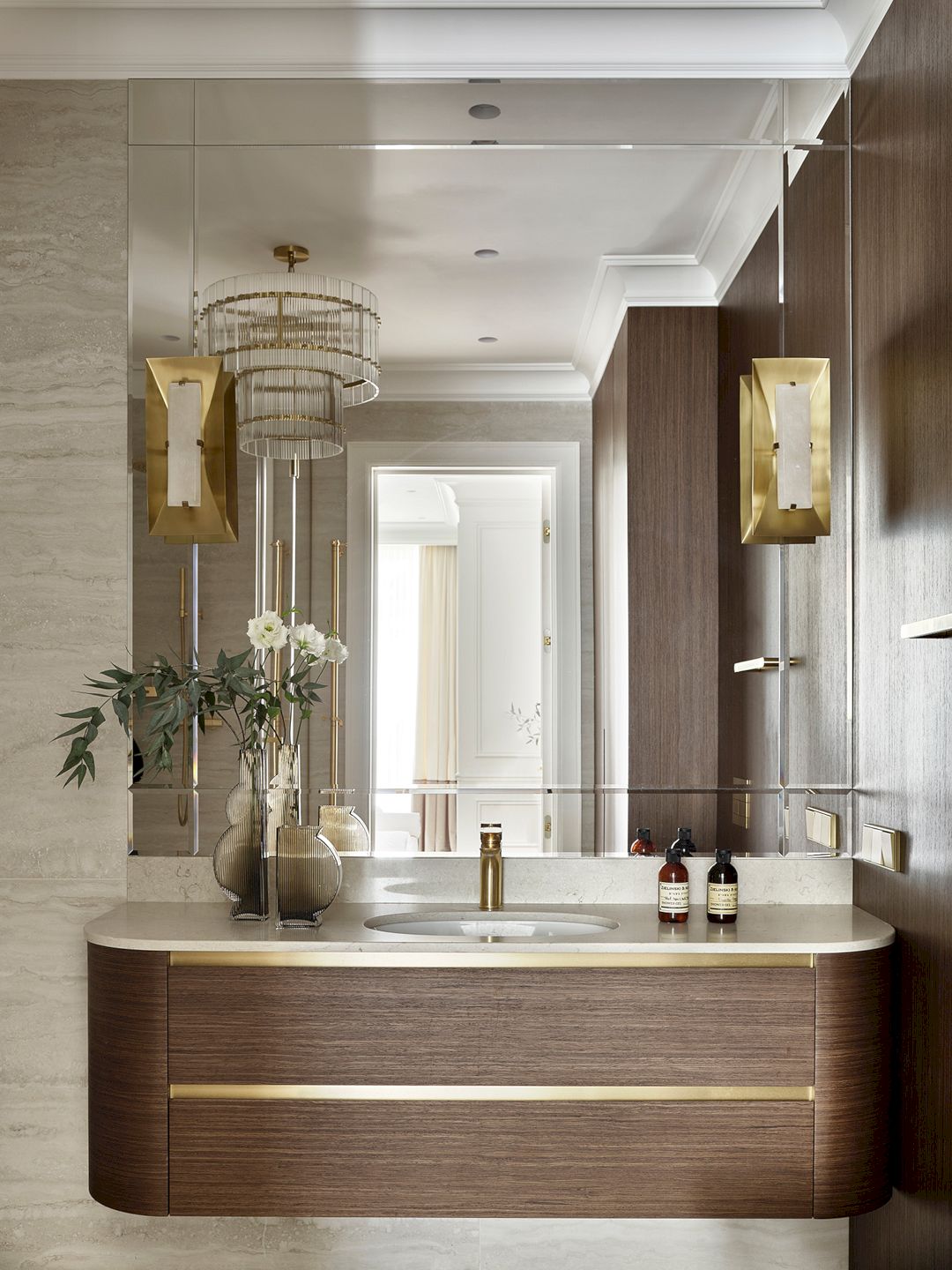
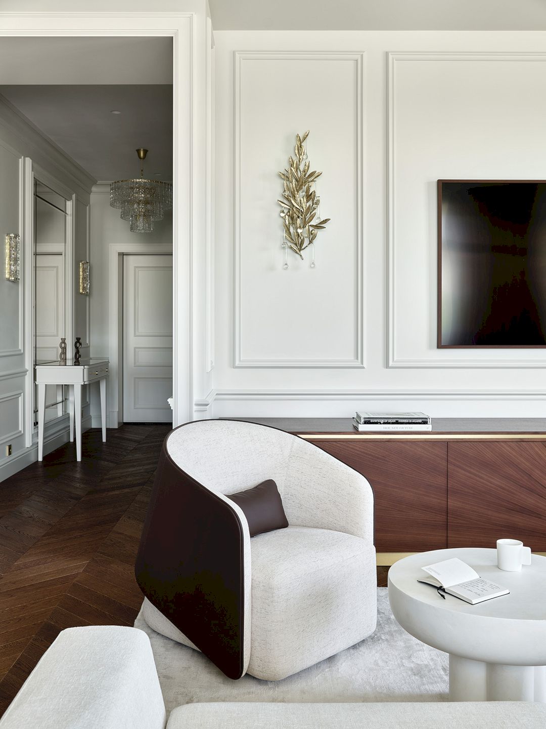
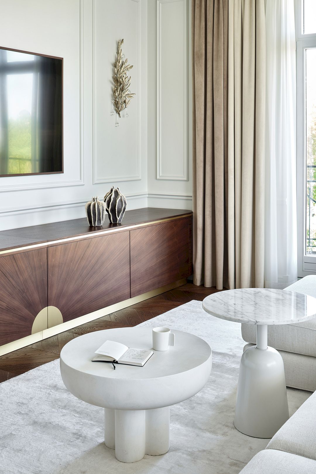
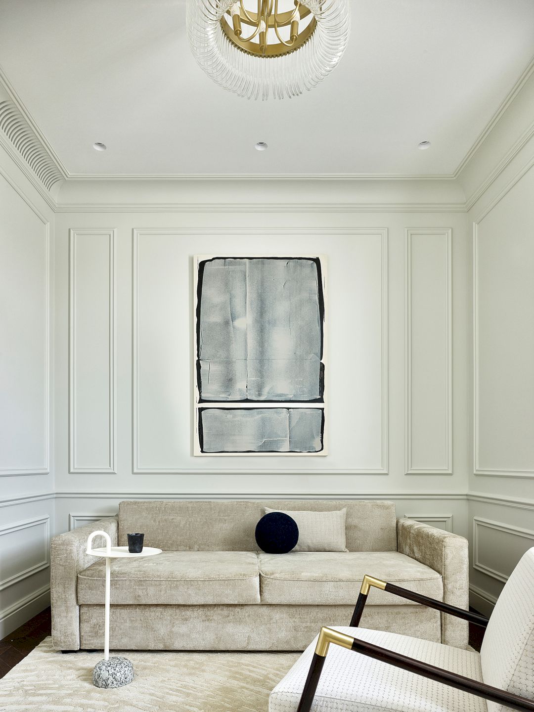
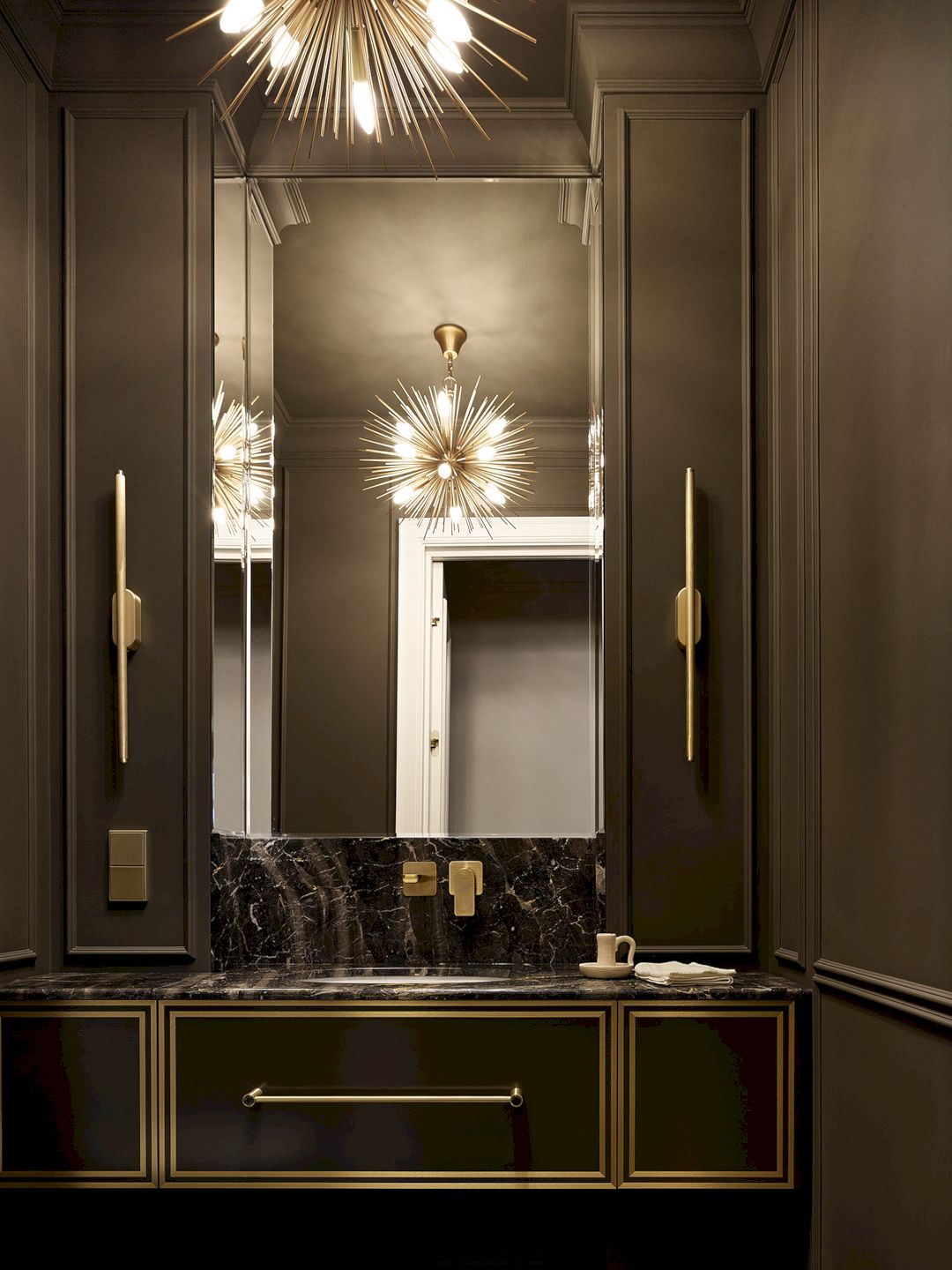
“In this space, there is only one warm white shade, very comfortable for the eyes, which is contrasted with dark walnut veneer. The guest bathroom is an exception, where the color of bitter chocolate predominates,” notes Alisa.
Every wall and built-in piece of furniture throughout the apartment dons a consistent hue, while the kitchen, living room, and master bathroom boast identical veneers. This commitment to uniformity in the finish of all surfaces and monochromatic space fills it with air and light, visually expanding its perceived size.
“Working on this project was very enjoyable. The clients quickly agreed on all stages, and in the end, everything was exactly as we envisioned, down to the smallest detail,” concludes the designer.
A Bright Apartment with A Classic Base and Modern Furniture and Art
Interior designer Alisa Shabelnikova, founder of Art simple studio
Architect Aleksey Lisovsky
Designer Olga Shipkova
Photo credit Sergey Ananiev
Style by Darya Ishkaraeva
Discover more from Futurist Architecture
Subscribe to get the latest posts sent to your email.
