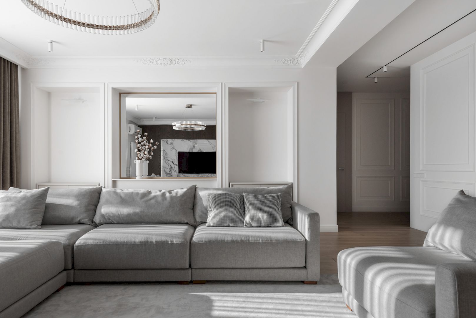
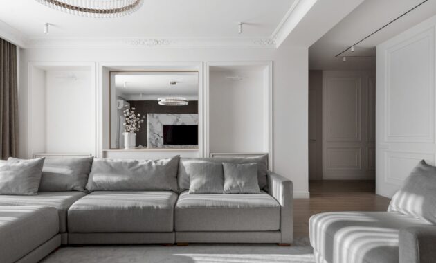
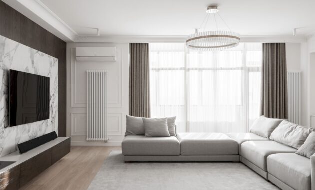
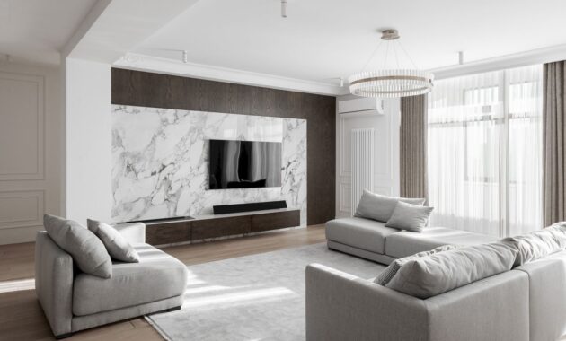
Rustam Minnekhanov and Sergey Bekmukhanbetov from Kvadrat Architects Design Studio recently completed a 180 m2 residential project located in the capital city of Kazakhstan for a married couple with a child. A Modern Apartment with Neoclassical Touches is a 2022 project situated in a residential complex surrounded by two beautiful parks.
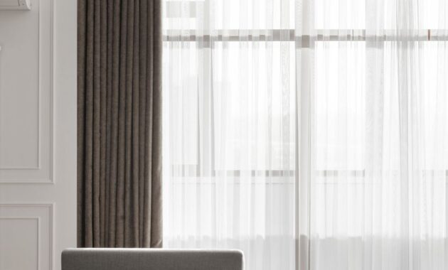
The architectural approach is the uniqueness of this apartment, with a sense of balance and the combination of natural materials and textures.
After experiencing the déjà vu, the apartment’s owner appealed to the interior design studio. She saw her neighbor’s apartment interior and it turned out to be a mirror copy of her own with the same layout, the location, the paintings’ size on the walls, and other similar elements.
In fact, the developer of this business-class residential complex rents out apartments already with a fine finish, furniture, and appliances. Therefore, the main task of the design studio team in this project was to express the owners’ individuality, desires, emotions, and worldview through the interior of the apartment.
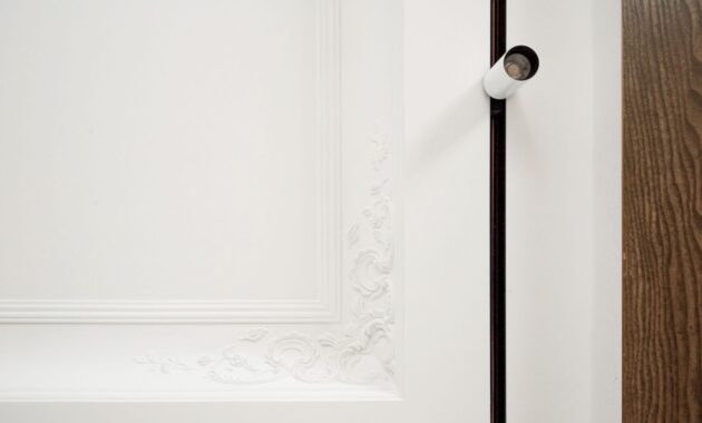
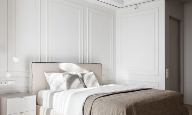
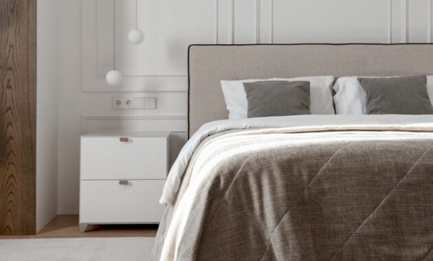
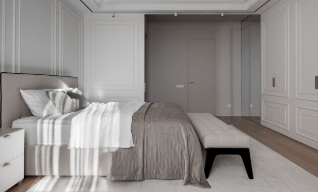
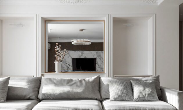
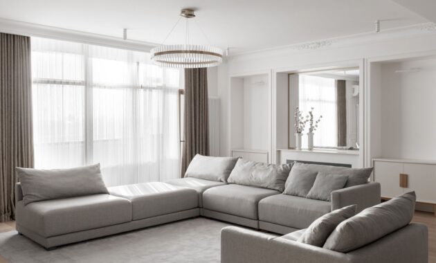
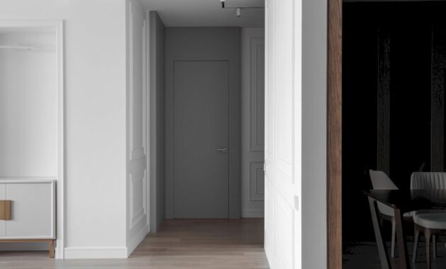
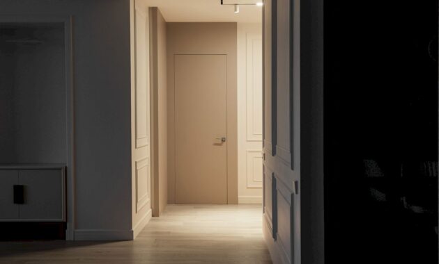
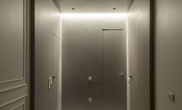
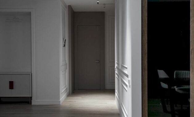
At first, all was set up for a classic interior. During the dialogues, it changed towards a modern interior with neoclassical elements. The ergonomics and geometry elements of this apartment are completely in the spirit of the time with visible classic elements. These are the owners’ wishes.
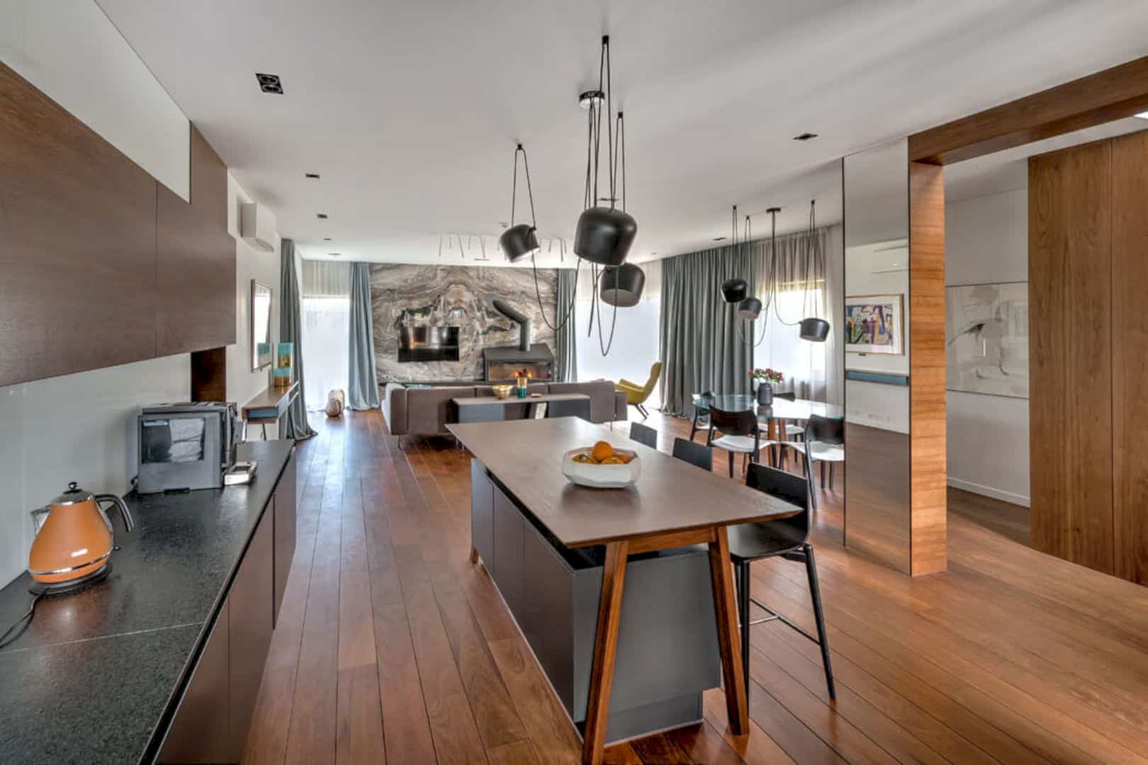
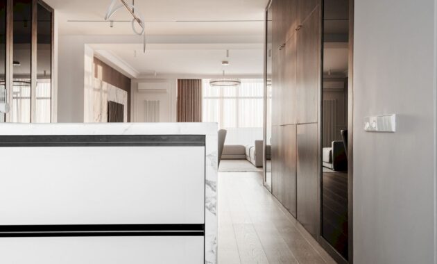
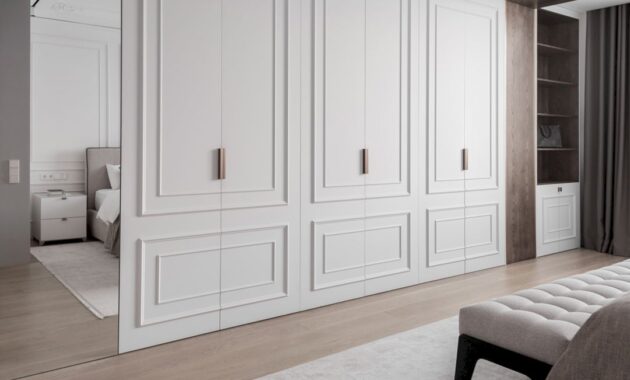
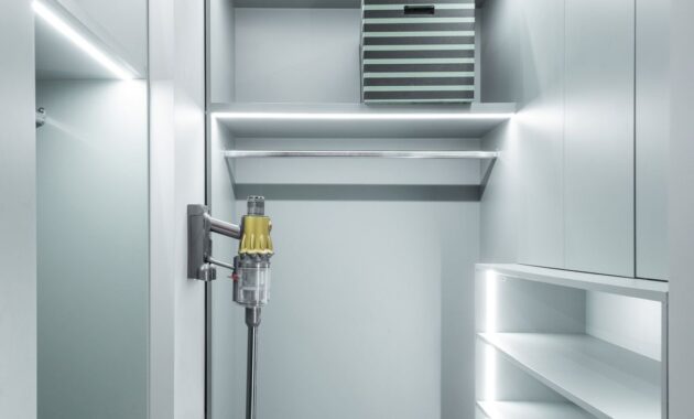
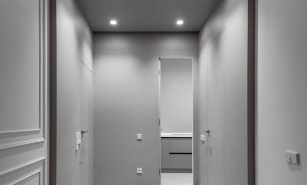
The success of this apartment layout allows for space reorganization. After removing some rooms that interfered with the overall concept from the layout, the design team then organized a technical kitchen and internal storage systems. A circular movement in the space of the apartment was formed to solve the problem of the absence of zones interacting with each other.
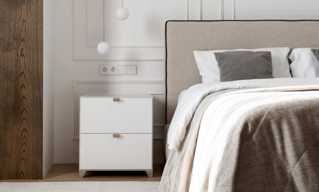
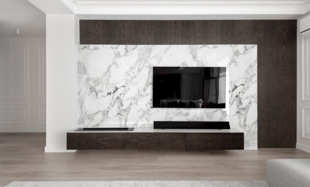
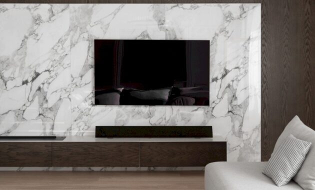
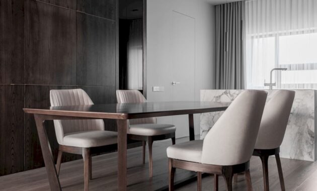
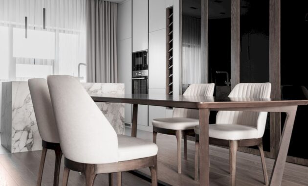
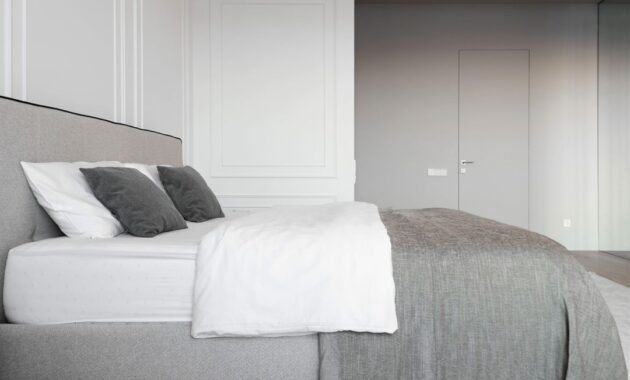
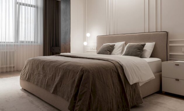
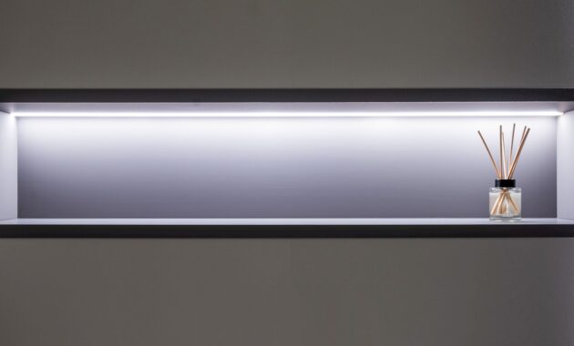
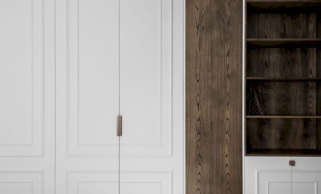
The light shades palette beautifies the central area of the apartment, the bedroom, and the owners’ bathroom. Inside, nature comes in the form of textures, materials, and their combinations. Veneered panels in the central space on the walls are the main element of visual zoning. In the office, this solution is shown in the details of the storage structures and on the desktop. It is amazing how single objects can balance the entire space and emphasize the general atmosphere of harmony.
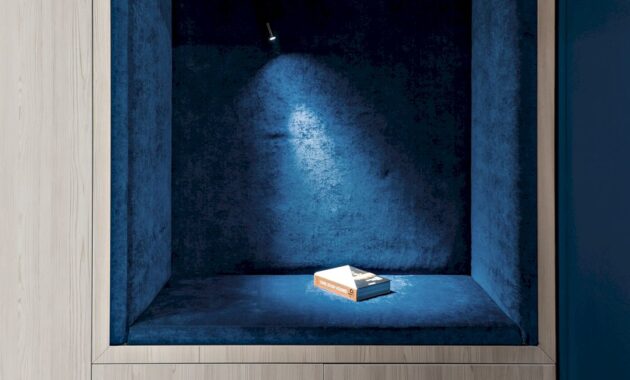
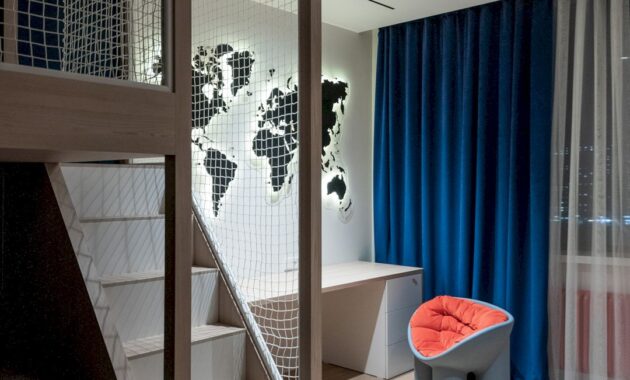
From the general conceptual range, it looks like the children’s bedroom is the only room that stands out. The couple’s child is a ten-year-old son who loves niches and hiding places for playing, therefore, a bunk bed with a net and tatami mats was set up for his bedroom. There is also a convenient niche on the wall for reading.
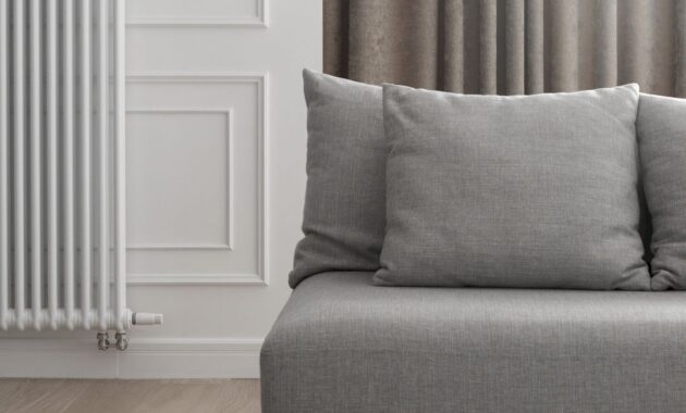
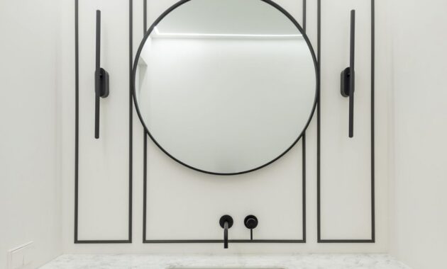
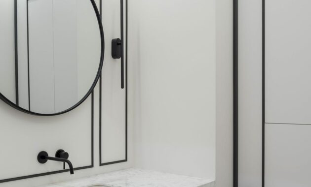
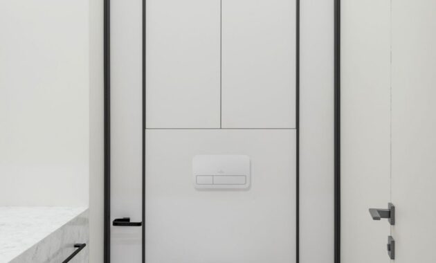
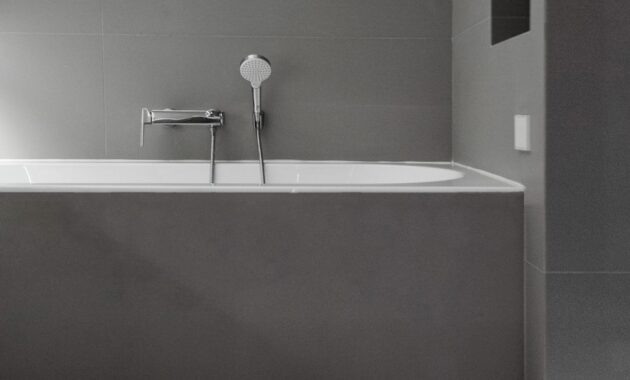
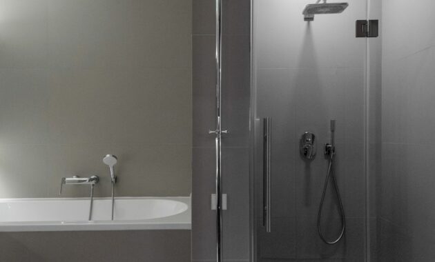
Some brands used in the project are Poliform sofa, Centrsvet lighting, Villeroy & Boch sanitary ware, and Tubądzin porcelain stoneware.
A Modern Apartment with Neoclassical Touches
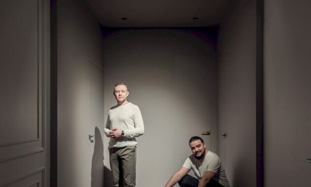
Designers: Rustam Minnekhanov and Sergey Bekmukhanbetov (Kvadrat Architects Design Studio)
Photographer: Gleb Kramchaninov
Discover more from Futurist Architecture
Subscribe to get the latest posts sent to your email.
