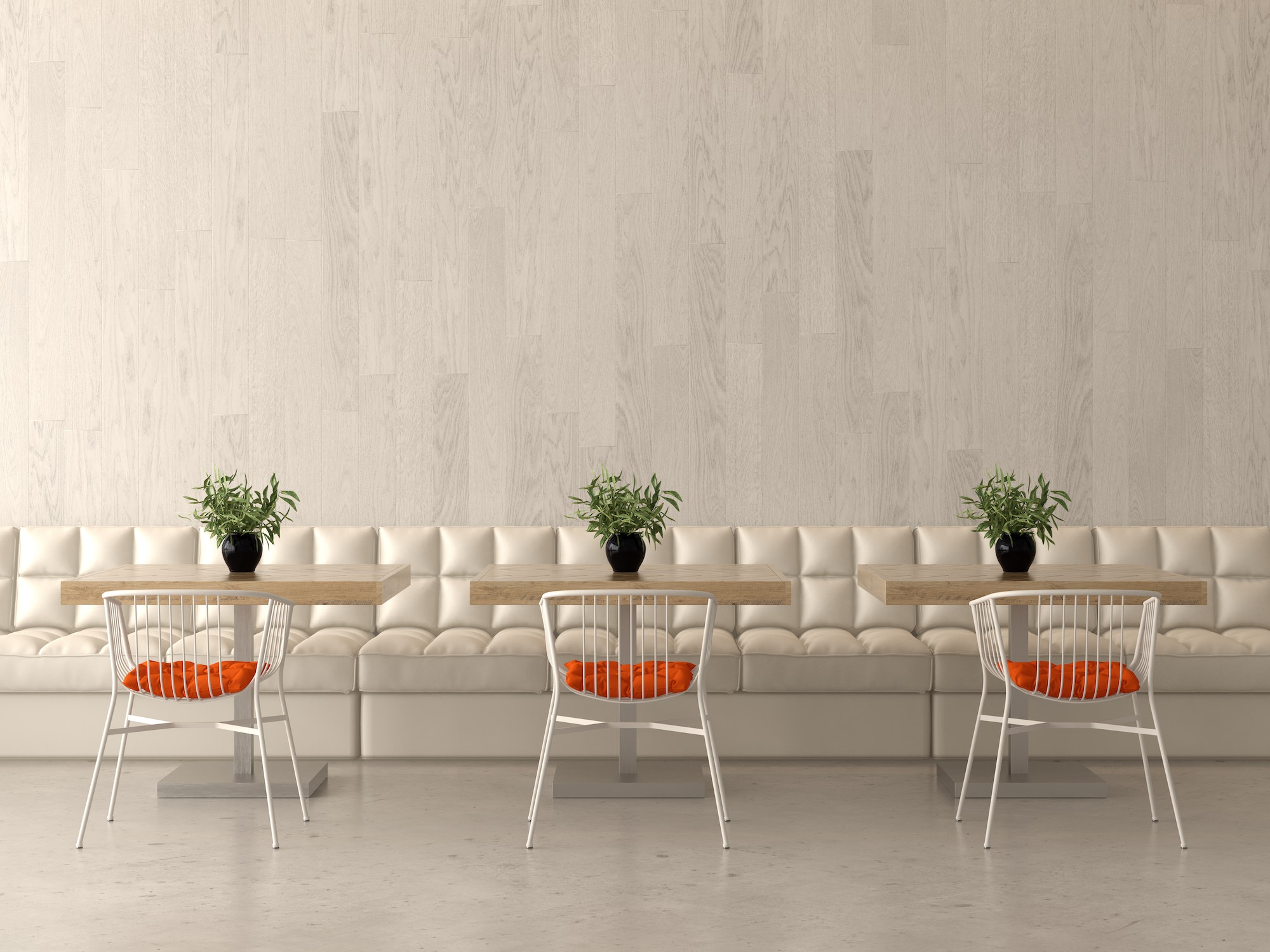
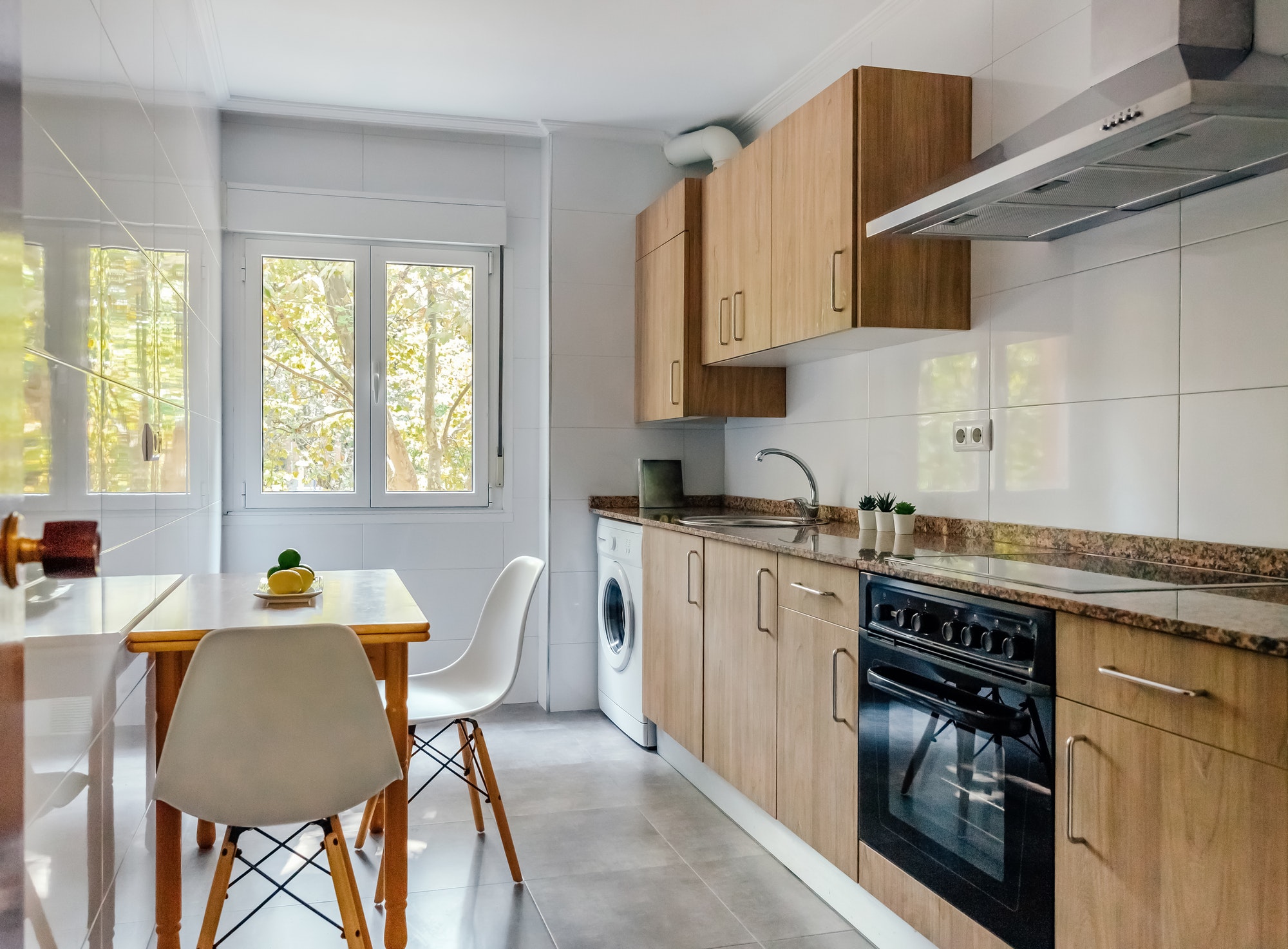
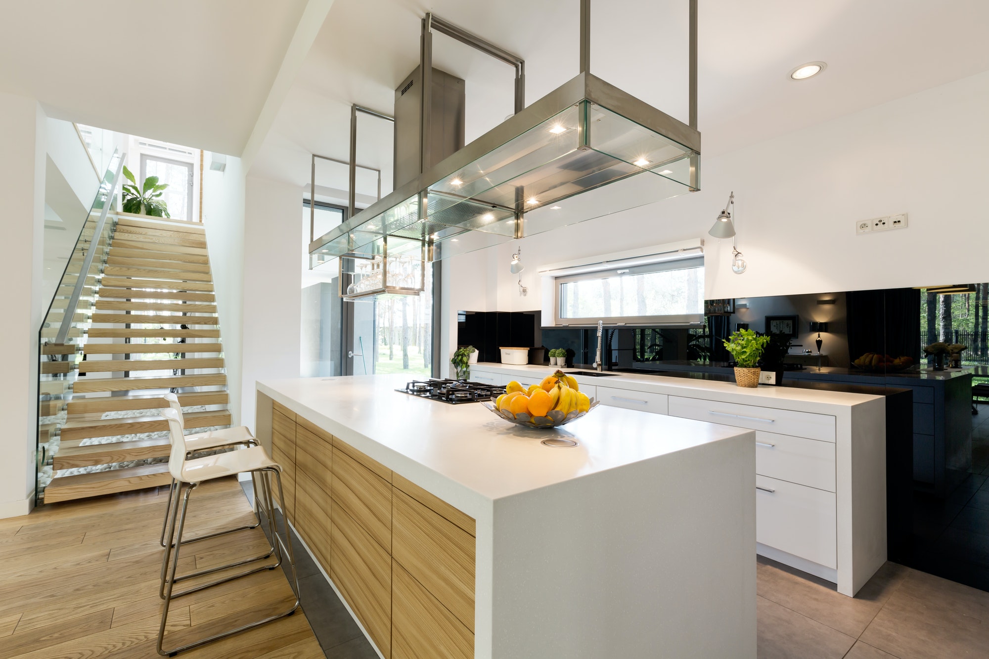
Commercial interior design is unique from other types of design in that it’s important to the success of a business and its function. Residential interior design is about homes, but commercial interior design is a way to conceptualize business spaces like hotels, restaurants, retail spaces, multi-family properties, theaters, hospitals, and more.
The commercial design has to focus not only on functionality and style but also on how these are going to play into the financial success of the business. The scope of work is going to almost always be larger than with residential projects.
Safety is also much more of a consideration with commercial interior design. With all those things in mind, the following are seven of the key elements of commercial interior design.
1. Space
The space is the initial element of any interior design project, whether commercial or residential. Space is what grounds and controls the whole design plan.
In commercial spaces, a designer has to think about not just the space and dimensions but also the utilities. There’s the two-dimensional space of the floor, which is essentially the length and width. Then, there’s three-dimensional space, which includes length, width, and height.
A commercial space needs to meet the needs of all the people who will use it, but it needs to be done in a way that’s balanced. The space shouldn’t feel like it’s too cavernous for the furnishings it contains, nor should it feel like there’s too much overcrowding it.
Space is largely considered during the pre-design phase of a project. The pre-design phase is when a designer gets information from their client, and depending on the situation, maybe the targeted customers of their clients as well. They learn more about what the client hopes to achieve with space and what employees and customers need.
2. Branding
During the initial phases of a commercial interior design project, it’s a time when there should be a consideration of how a space might reflect the general brand image of the company.
With the commercial design, if it’s memorable, it can reinforce your brand and create an impression as soon as someone steps inside the doors of the business.
A good commercial designer will consider your brand pillars if you’re the client. Brand pillars are the values that your company embodies every day. Maybe the business itself has a brand that’s meant to be energetic and vibrant, as well as a bit fun. On the other hand, the brand could be more traditional or, by contrast, modern. All of these are things that can be conveyed in commercial interior design.
3. Lighting
In commercial design, lighting has to be utilitarian and support whatever activities will happen in the space, which can often be varied. The lighting needs to support the productivity of employees as well.
A lot of businesses require overhead lighting, so it’s important that a commercial design is able to place those fixtures and overhead features for enough brightness but without them being too glaring or intrusive.
Light largely includes task, mood, and accent lighting.
4. Color
Colors evoke a lot of feelings and a sense of energy that we might not even realize. The colors of commercial space should go with the branding and should support the function of whatever the space is.
For example, colors can create energy and buzz, or they can lend to a sense of tranquility and trust.
As well as color, texture, and pattern are core elements of any interior design project. Texture adds depth to any space, as well as mood and ambiance. It also creates a sense of comfort for employees and customers of the business.
Patterns can bring office space to life. They tell a story, and you’ll often see restaurants use patterns to create a certain “vibe.”
5. Lines and Forms
Lines indicate interior space. There are three types—horizontal, vertical, and dynamic. Horizontal lines might include furniture, while vertical lines are the windows and doors, and the dynamic lines are what add action and dimension, such as a well-placed set of stairs.
Forms are shapes that a commercial designer uses to create balance. There are geometric shapes and natural shapes, which are organic.
6. Purpose
Maybe one of the biggest differentiators between residential and commercial design is the sense of function and purpose you have to adhere to in commercial design.
A commercial designer has to start each project with an in-depth understanding of how every space will function. Then, their design has to fulfill that purpose. It could be something as seemingly simple as a decoration, but in commercial design, nothing is included only for aesthetics. There is always a purpose, even if it’s just to reinforce the brand.
7. Accessibility
There are more regulatory and safety requirements a designer has to meet in a commercial space than in one that’s residential. This includes accessibility since commercial spaces are used by the public. A design may need to integrate accommodations for people with special needs, like handlebars at particular locations or wheelchair ramps.
A commercial designer will have to be careful about local building codes because they will indicate the type, number, and location of accommodations that are required.
A commercial designer is going to be heavily involved with renovation or construction, making sure everything in the physical structure is up to code and safe. They work very closely with contractors and manufacturers, and they’re key decision-makers as far as all architectural details, the design of the floor and ceiling, lighting, window placement, and even the integration of technology.
After the actual construction of commercial space is complete, a designer then turns the physical structure they’ve worked on into something that’s brought to life.
A commercial interior designer has a lot of responsibilities and plays a big role in not just how a space looks but how it’s perceived and used. They also play a role in the success of the businesses they work with going forward.
Discover more from Futurist Architecture
Subscribe to get the latest posts sent to your email.


