I29 Interior Architects was commissioned to revamped National Museum of Ceramics Princesseholf. Located in Leeuwarden, the Netherlands, the museum is involved in 100th birthday celebration of the European Capital of Culture 2018. This has become the reason why the museum is in need of some transformation to increase its appeal and accessibility to visitors. Through the project, the firm proposed a modern interior that appears contrasting in the monumental 18th-century monumental buildings in the neighborhood.
National Museum of Ceramics Princessehof
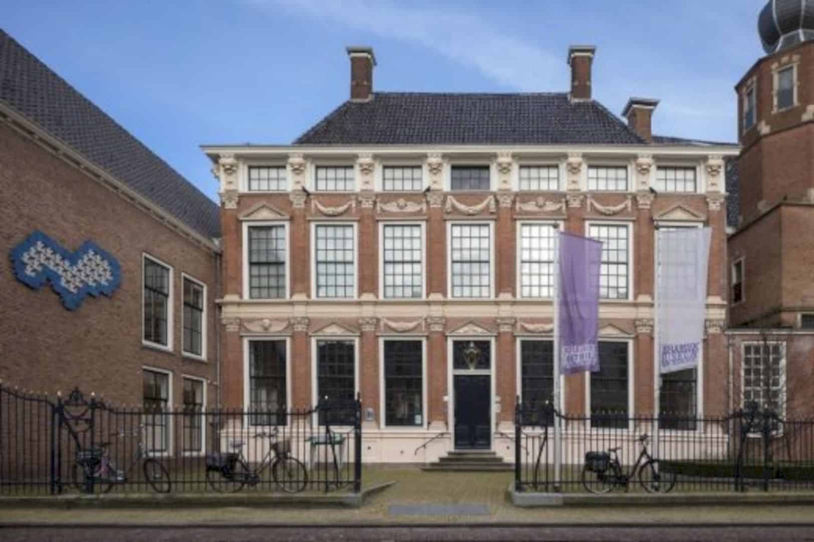
The project included designing an entrance hall along with the museum store and tearoom. There are also the museum square and exhibition areas to showcase the museum’s vast collections. During the designing process, the interior design team found the challenge in designing a contemporary and welcoming entrance area in closed monumental buildings.
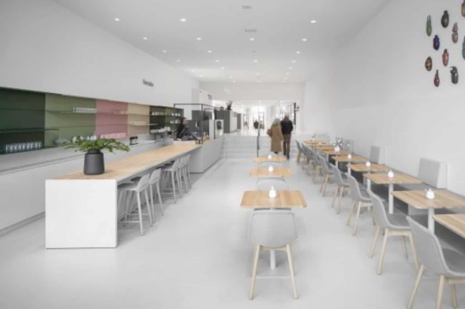
Regardless, they had succeeded in presenting a timeless interior that blends harmoniously with the overall design of the National Museum of Ceramics Princessehof which is seen as a place for inspiration and full of surprise.
On another important note, the museum wanted to reorganize their comprehensive collection with the intention of offering a clear yet surprising customer journey. Sadly, the financial resources to realize such ambition was rather limited, so the interior architects opted for translating this vision into reality instead.
An Open and Flexible Space
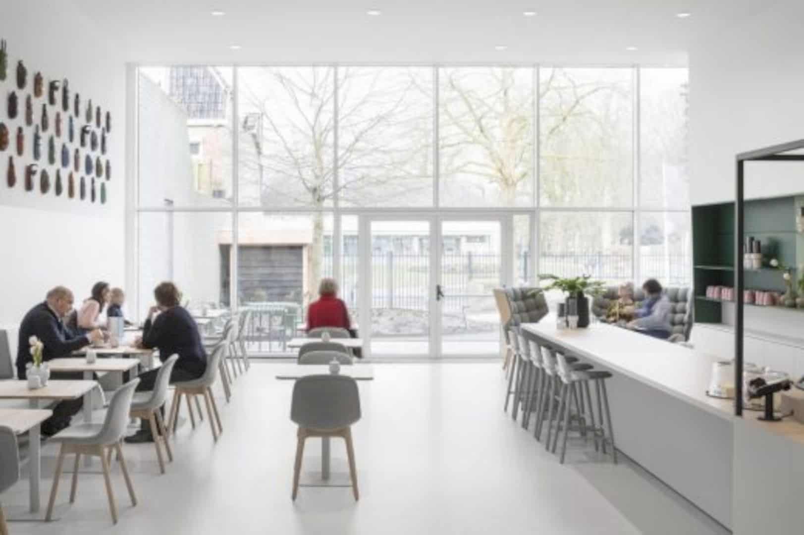
To attract a wide range of visitors and offer them the option of perusing the museum store and its tearoom, the entrance area is totally opened up. Therefore, the visitors now can access the museum from both the front and back entrance.
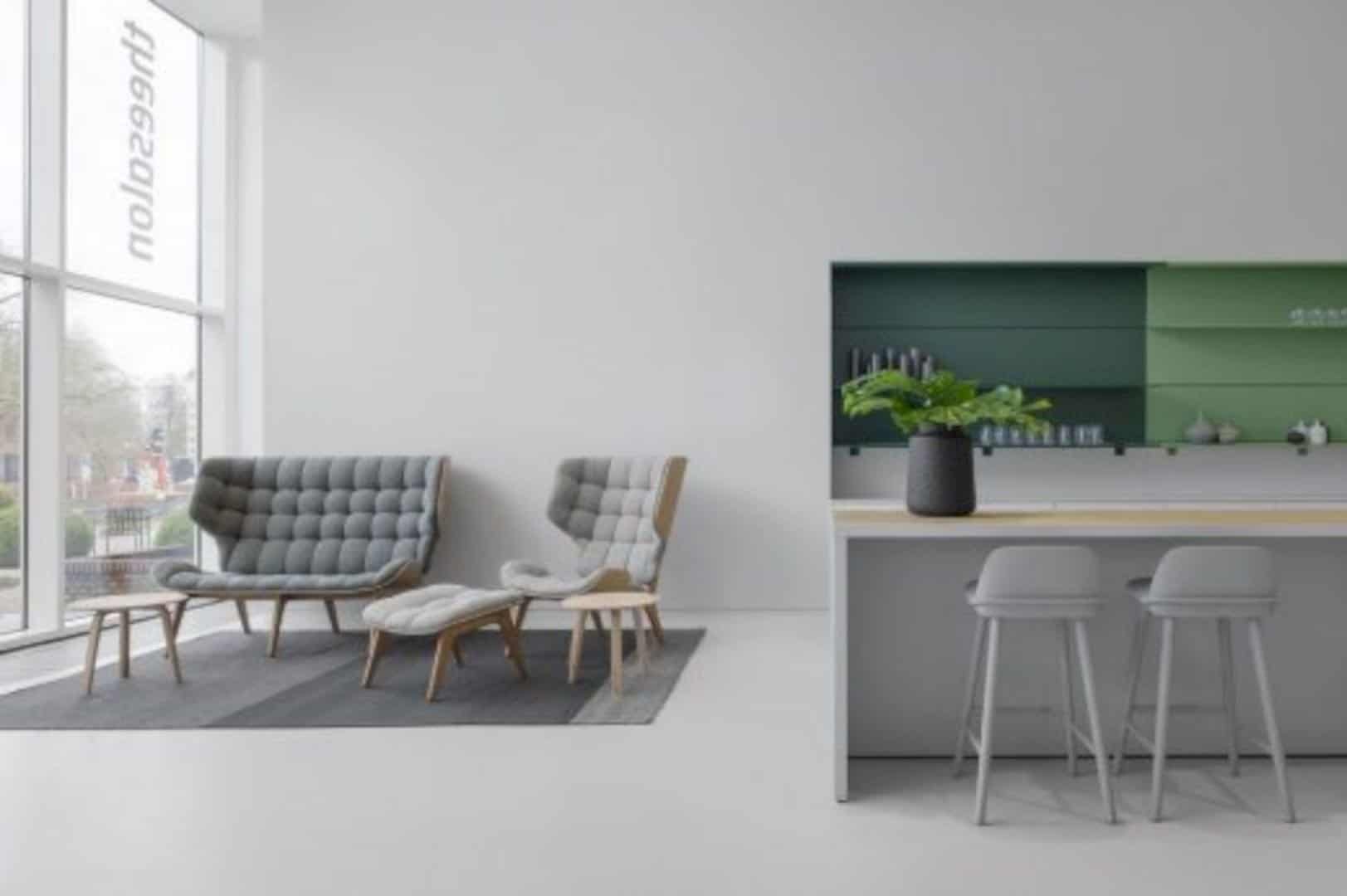
There is a new area that will welcome them in a spacious entrance hall with abundant daylight. This space links the museum store, the tearoom, and cash register area. Integrated ramps were attached behind the counters to make it possible to disable people to access the museum. Now, a large garden adjacent to the tearoom can be accessed by the public in general.
When it comes to displaying the collections, the museum went with horizontal alignment and differences in level to establish a subtle reference to layers of earth and the natural resource of ceramics.
Impactful Contrast
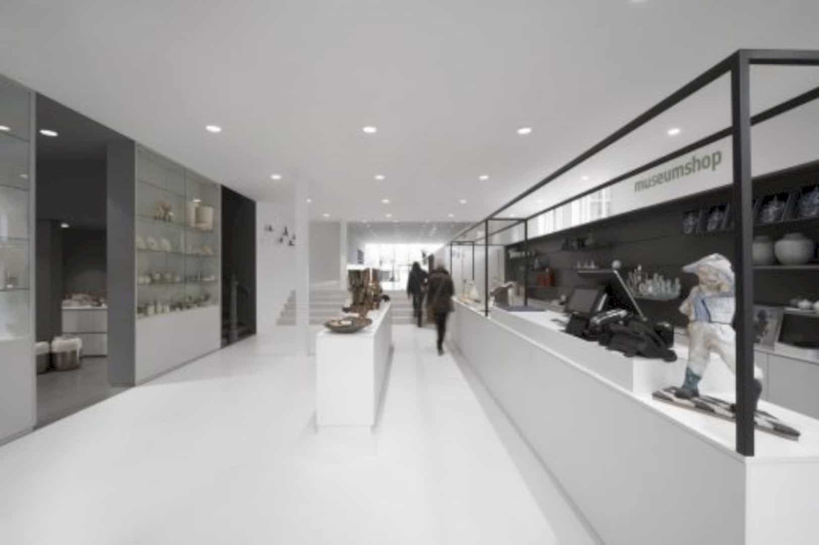
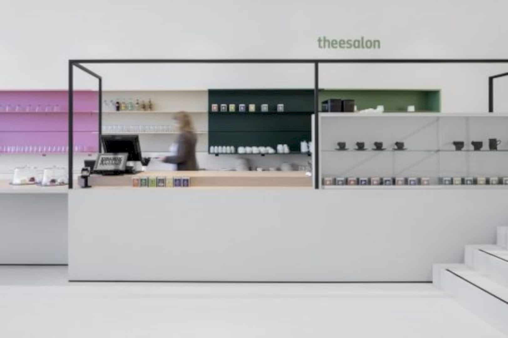
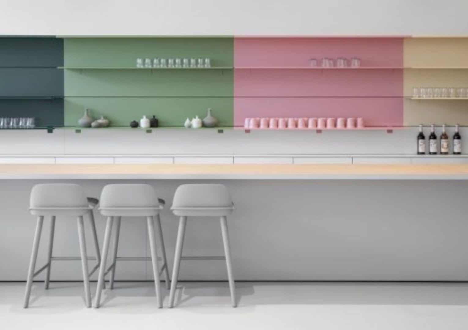
i29 made clear contrasts to offer an intensive experience across various spaces in the museum. You can instantly pinpoint the contrasts even from the passage areas. For instance, in the tearoom, the designers feature vibrant and fresh colors as opposed to the museum store that comes with tranquil grey tones.
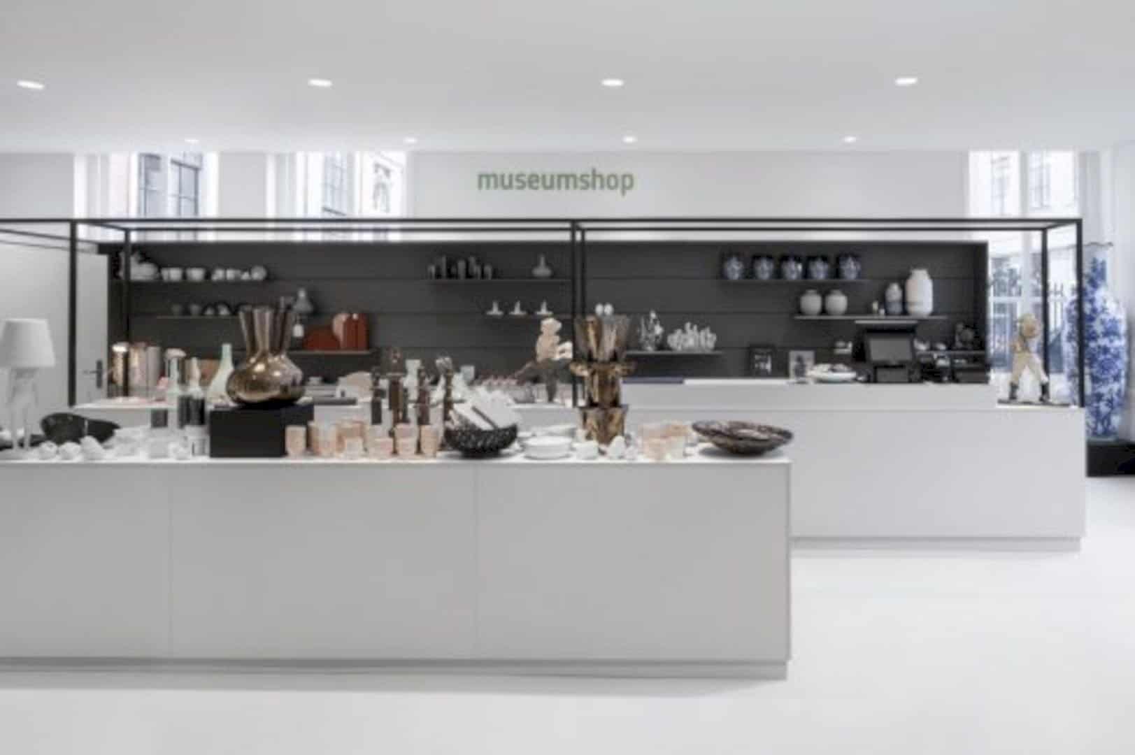
The contrasts also help the visitors to focus more on the displayed products. The transition from the contemporary entrance area to the monumental museum showcases a surprising metamorphosis.
In this area, the walls of the museum square display the work of hand-painted wallpaper with a sleek graphical installation. This also equips with information screens and seating elements. Other spaces were restored in their original colors after the Ambassadors of Aesthetics conducted a historic research.
Brightly Lit, Stacked White Boxes
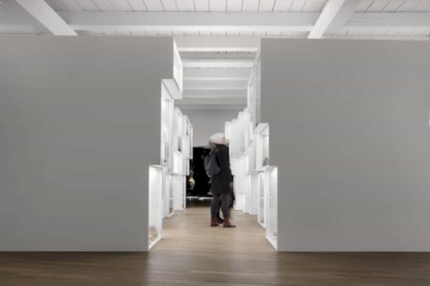
Focusing on the ‘Mass Production’ area, the interior architects installed stacked, brightly lit white boxes, emerging the feeling as if the visitors were enclosed by ceramics.
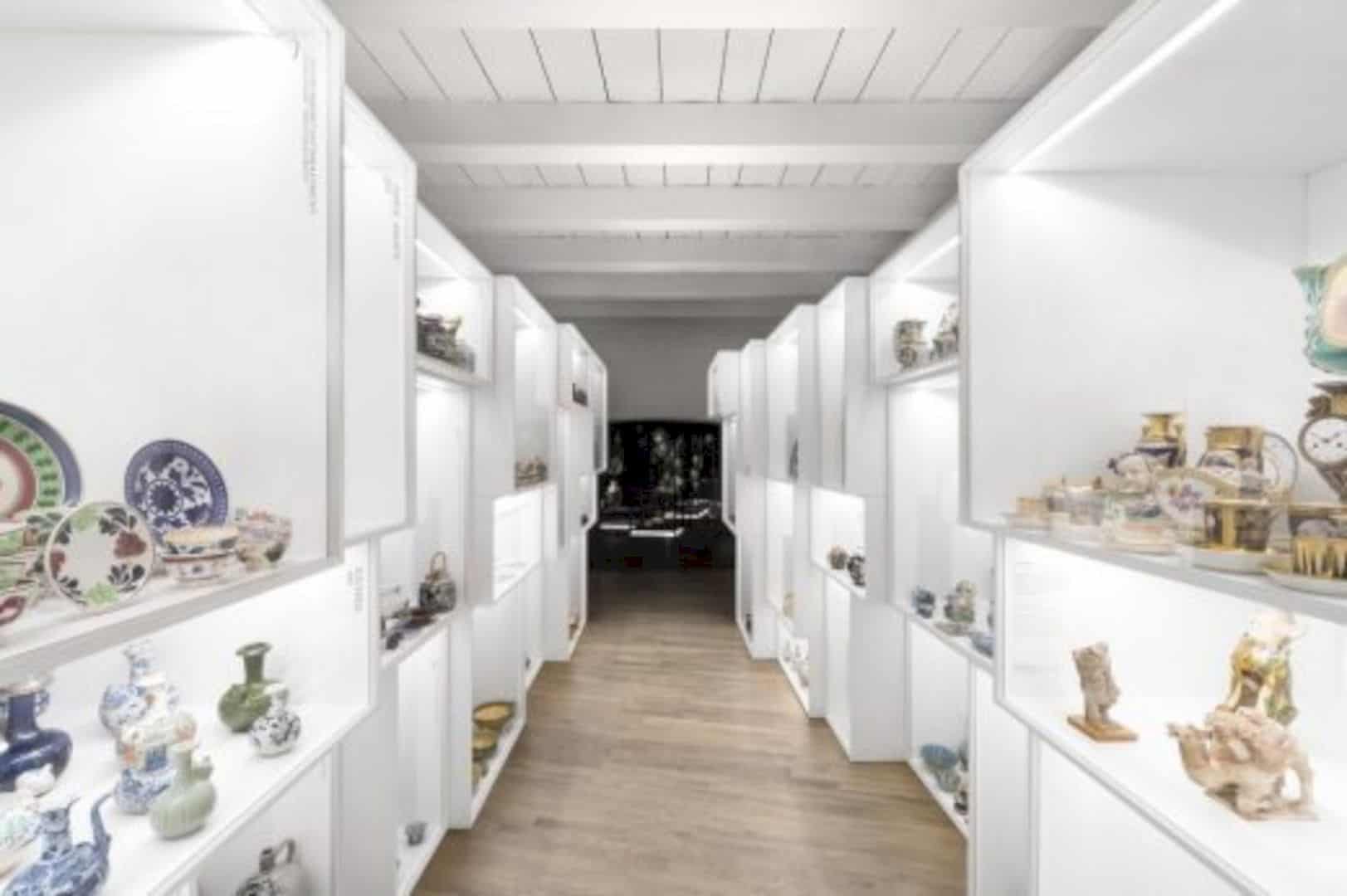
This installation will direct them to the ‘Art Nouveau’ room in which the visitors will experience the opposite vibe.
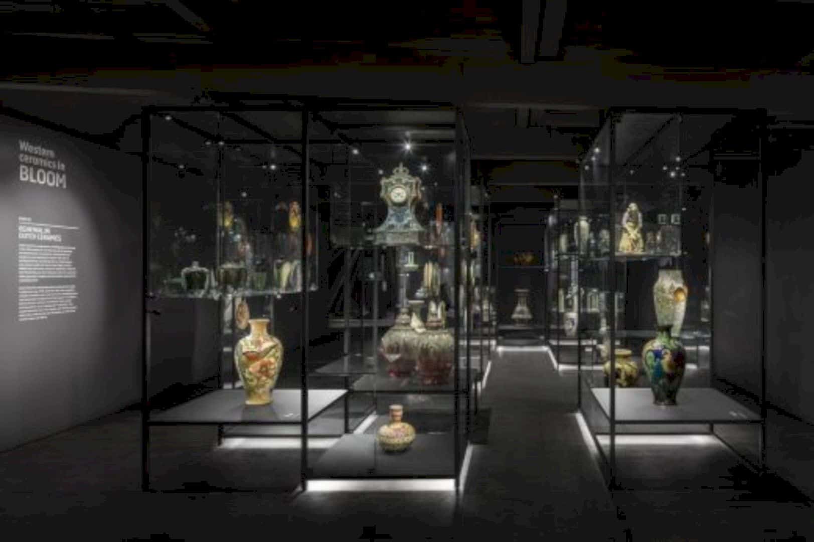
The room is completely dark and isolates the exhibited collections, making them appear like they were floating in the air. The simplicity of the design also creates contrasts with the monumental shell. In short, all these old vs new and monumental vs contemporary design are able to complement each other to form a surprising and powerful building as a whole.
Via e-Architect
Discover more from Futurist Architecture
Subscribe to get the latest posts sent to your email.
