Hafele Shanghai Showroom is 2014 project by Wendy Saunders, Vincent de Graaf, Alejandro Felipe, German Roig, Nancy Deng, and Weizhong Wang for Hafele as a client. The designer teams want to show the strong concept that Hafele has on its every product through this showroom. The showroom has some essential accents in every area, it makes the visitor gets a lot of new experience of entering a showroom.
Red Color Exposed
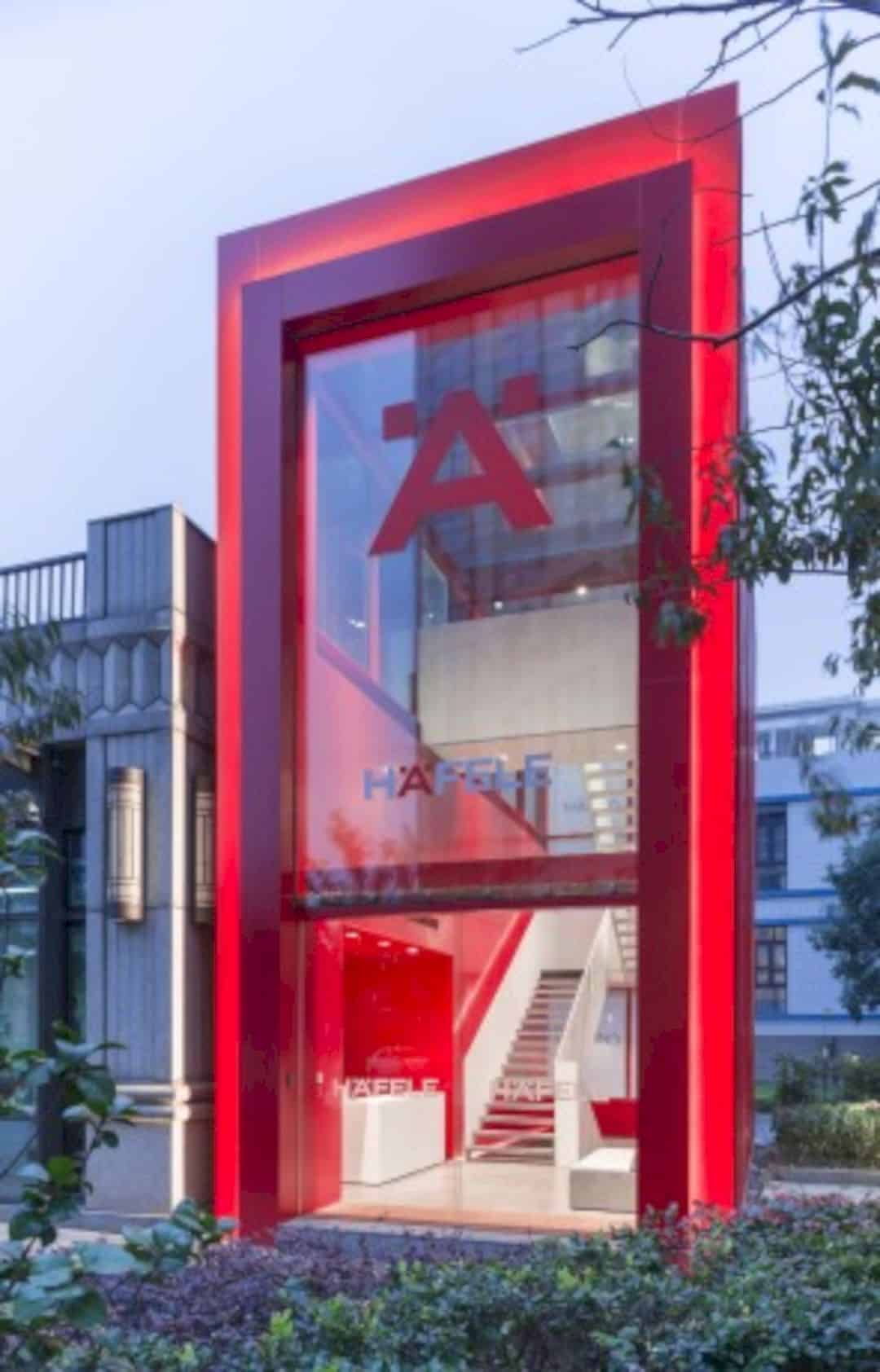
With the red color exposed at the front of the building, this showroom attracts all people eyes around the office area. The huge skylight makes it as a perfect place for a showroom. There is an 8 m tall glass entrance tower as a Hafele landmark brand.
White Steel Staircase
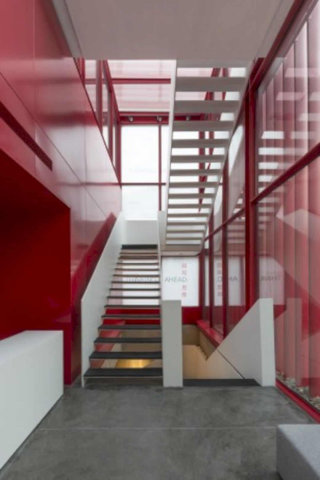
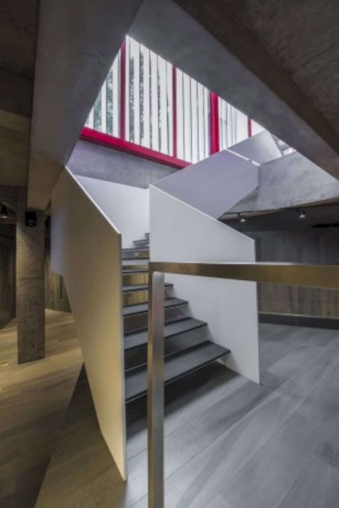
The white steel staircase makes the showroom interior looks elegant. It leads you to the showroom at the downstairs and also connects the terrace at the roof above the office rooms. The strong steel element fits well with the podium inside the showroom empty space.
Stairs View
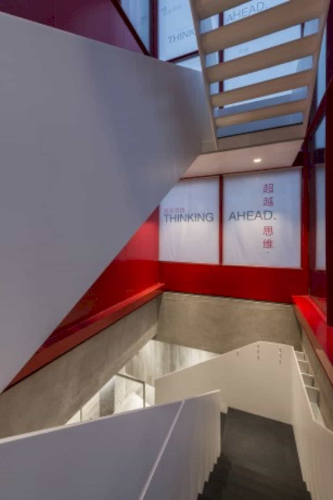
The designer team wants to show the Hafele world clearly inside the showroom, even at the stairs view. Once you step on the stairs, you will see beautiful Hafele word accents on the wall complete with the Chinese language. The red color still becomes the main color for it too.
Space under the Stairs
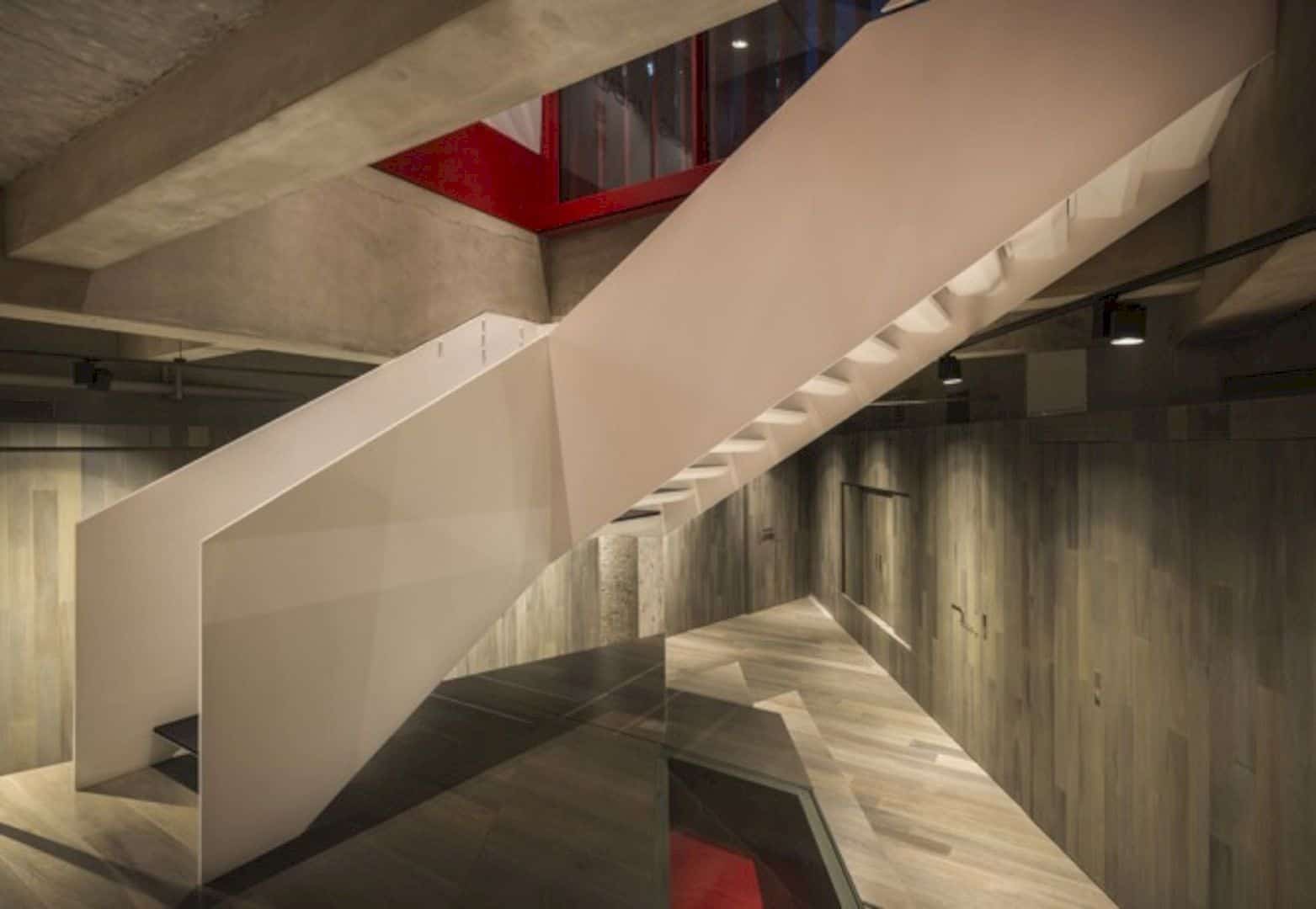
The designer team also doesn’t want to waste every space inside the Hafele Shanghai Showroom. That’s why you can see a lot of empty and free spaces inside this showroom even under the stairs. The steel element and the wood element for the interior mixed so well.
Red Furniture
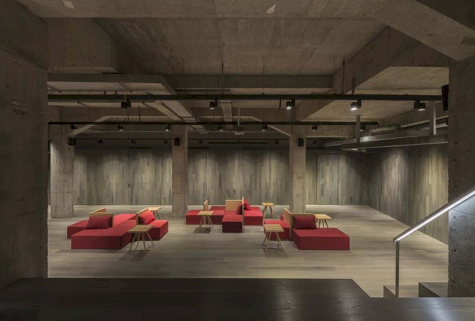
The red furniture goes well too with the wooden elements inside the showroom interior. The color surely matches the main color of the showroom idea. With some wooden tables and also the large space in the building, the interior design style makes this showroom is very prestige.
Different World
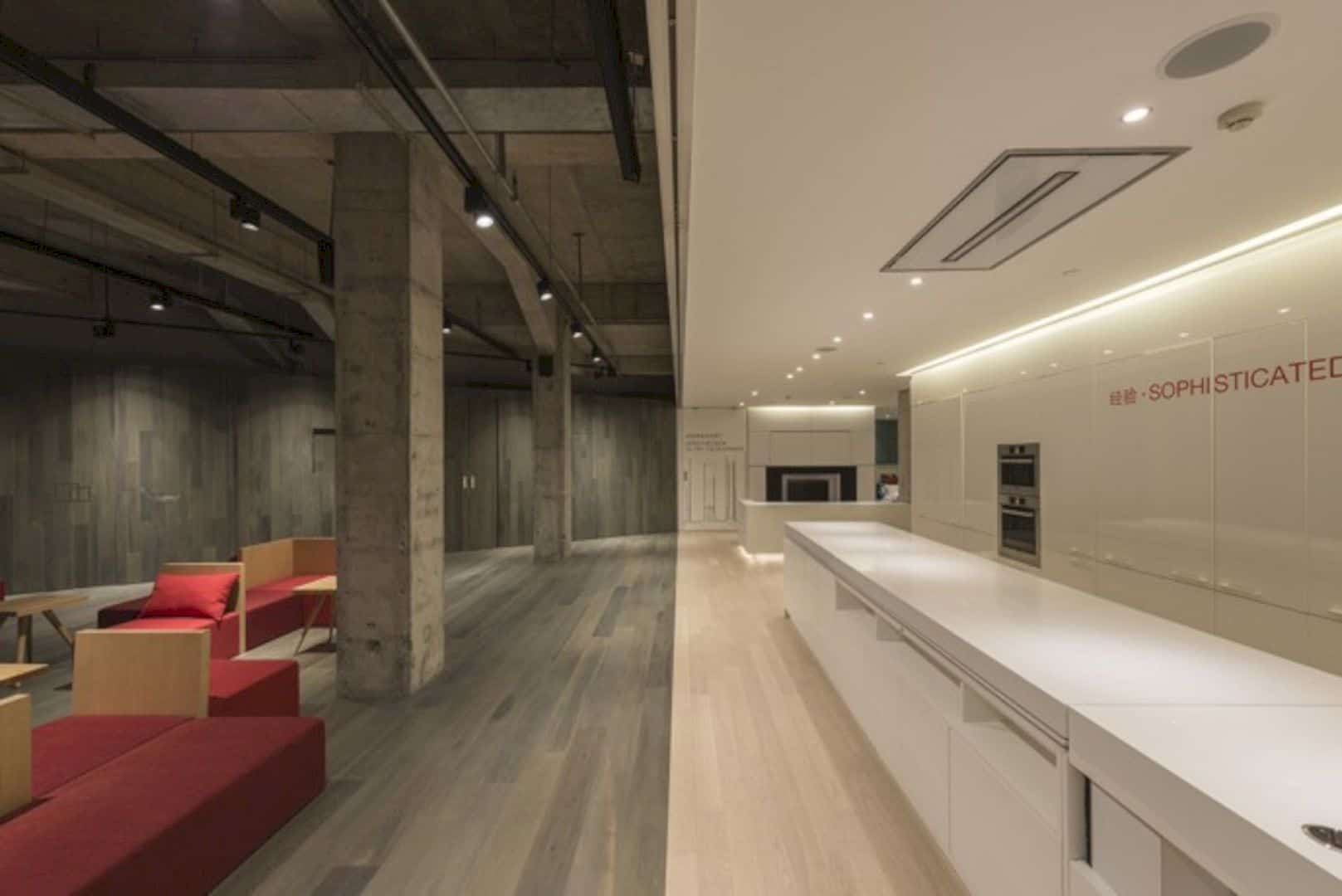
The interesting thing about the Hafele Shanghai Showroom interior design is its different world. If you see the main large space and the kitchen has a very different design. The main space is designed with gray wood paneled walls but the kitchen gets a brighter interior design with its white elegant kitchen island.
Treasure Box
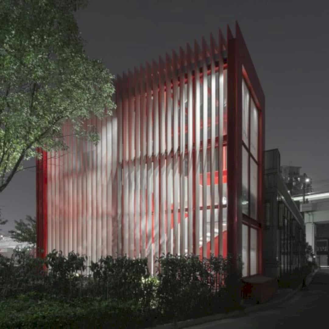
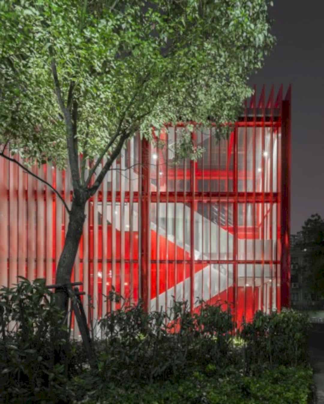
The whole building design and architecture of Hafele Shanghai Showroom looks like a treasure box with a lot of hidden rooms inside. With the red color and the lights from inside the building, the showroom shows its world awesomely.
Showroom Interior
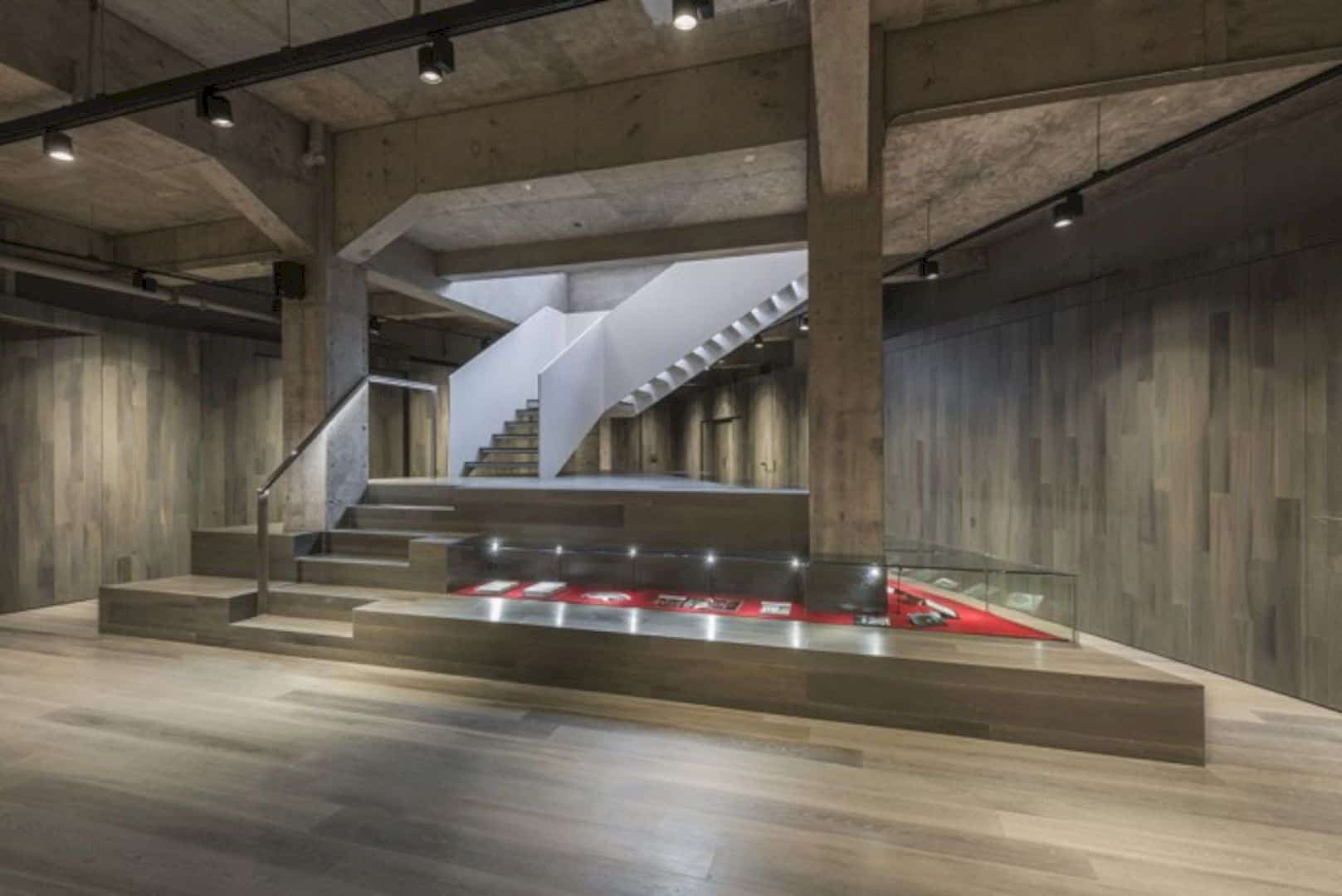
The gray wood paneled walls on all over the showroom wall are kind of showing how it can be used well for a modern building. The floor gets the same thing too with a beautiful reflection of the concrete ceiling in the showroom interior design.
Hidden Spaces
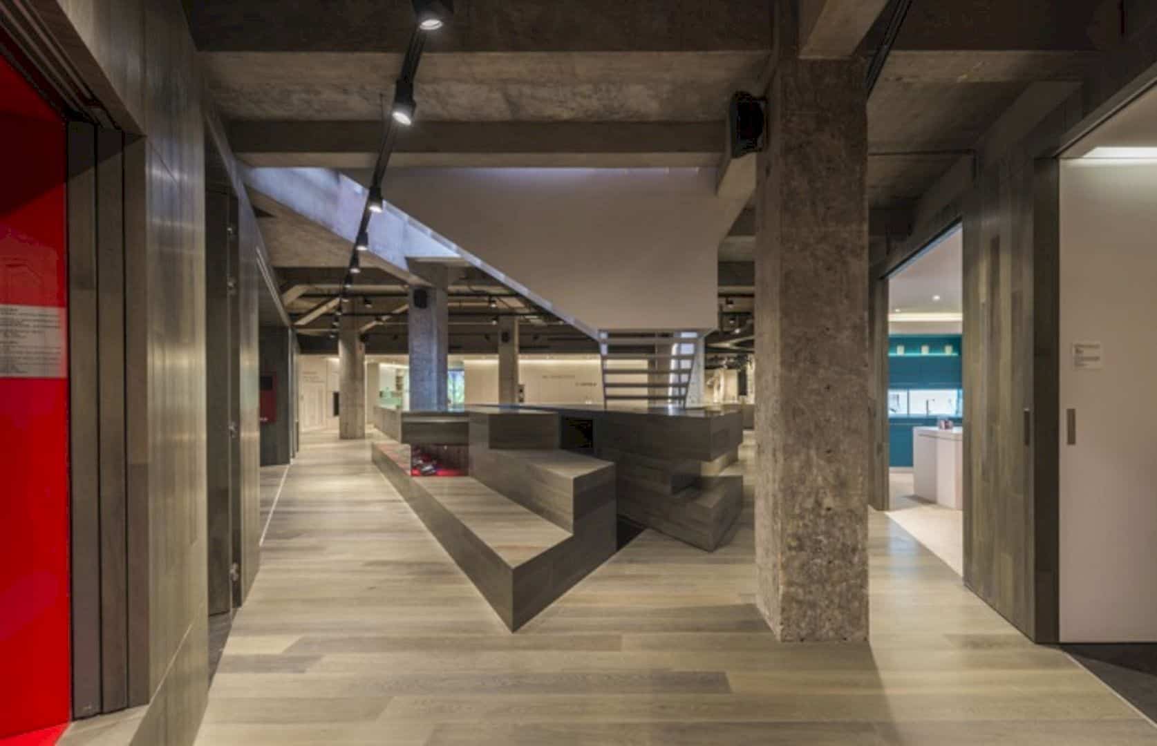
Hafele Shanghai Showroom is designed with full of hidden spaces. Once you open the secret doors, you will find a different space with a different interior design in it. The secret doors are also decorated with colors too like red and white colors.
Showroom Plan
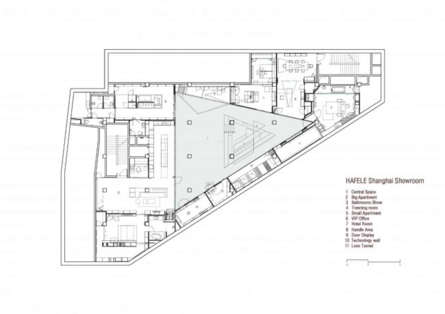
The plan idea of Hafele Shanghai Showroom building is making a big showroom with a lot of hidden spaces inside it. The large main space is located in the middle of the building and it is also completed with some facilities too like a VIP office and technical areas.
Via aim-architecture
Discover more from Futurist Architecture
Subscribe to get the latest posts sent to your email.
