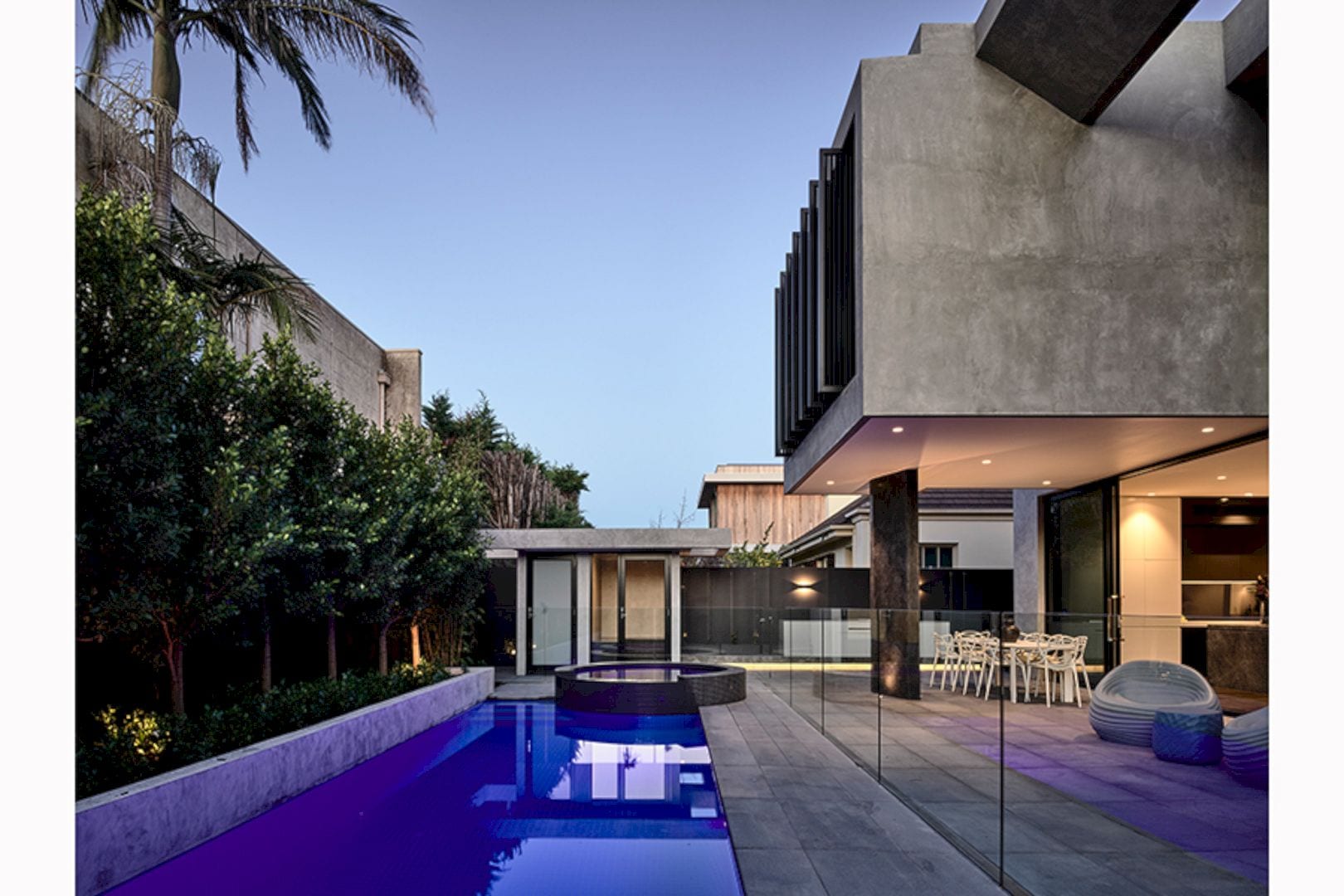
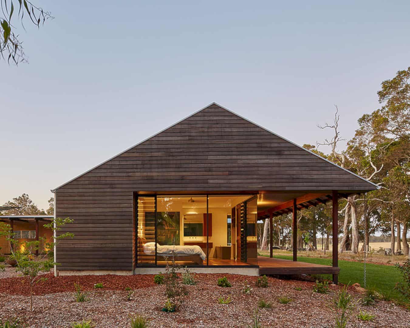
The mid-century home of Hudson Valley is the 1800-square-foot size of a home in the middle of Hudson Valley. That’s why this home is called by the name of the valley. Once, this awesome property is made in 1962 by Roberta Thrun for her family as the best family place. After some years, the last owner wants to make another beautiful memory in this house. Mehta and Schori from GRT Architects are the main people who in charge to restore the memory of the owner’s family. Both of them make a lot of redesigns in a simple way but gives the best effect on the architecture. Here are before and after pictures of this beautiful home.
Before: Living Room
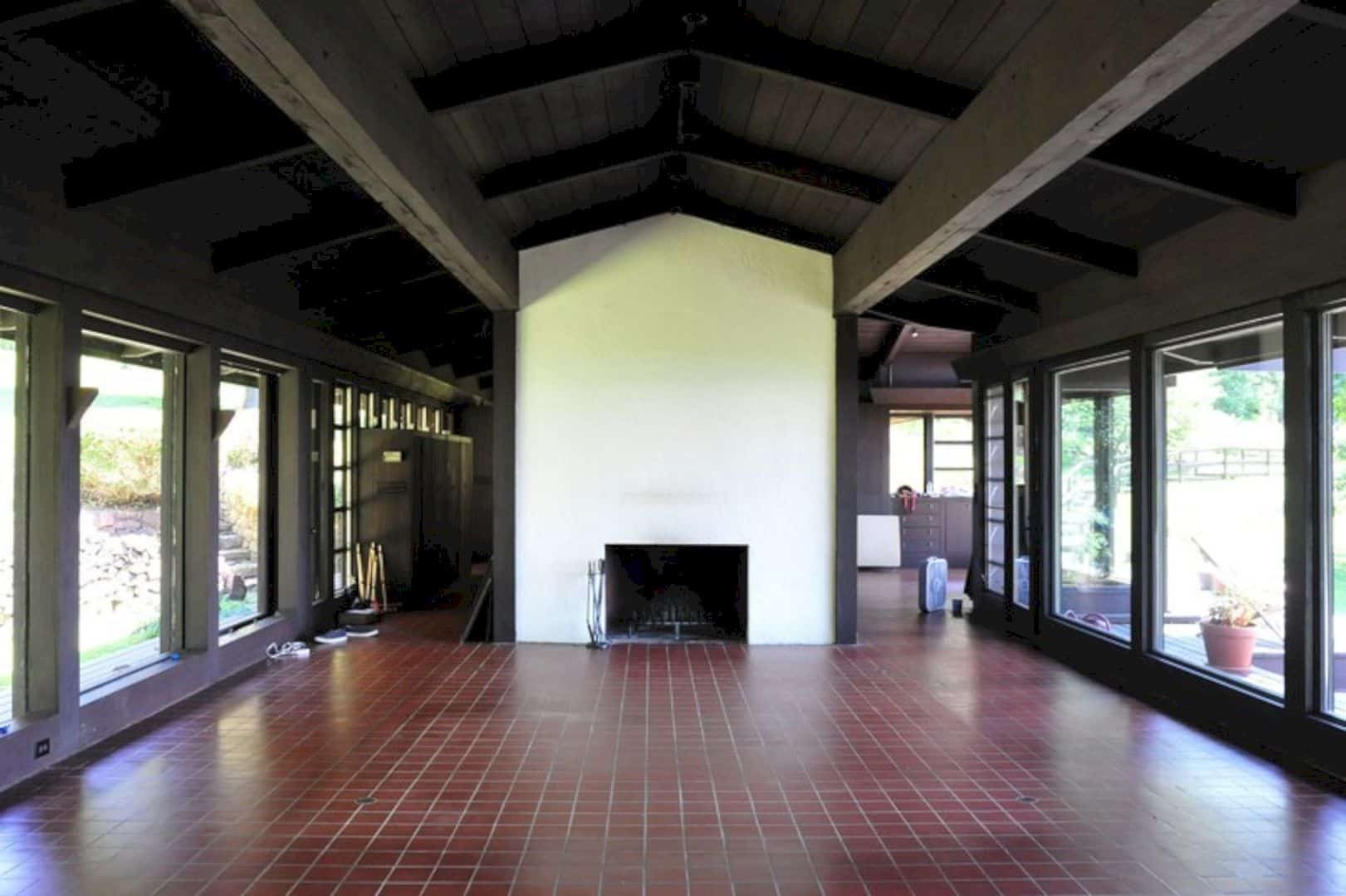
As you can see, the living room of this home is large. It has architecture details already but some of them can’t be seen clearly. The dark brown beams and the ceiling will be the main keys to this room.
After: Living Room
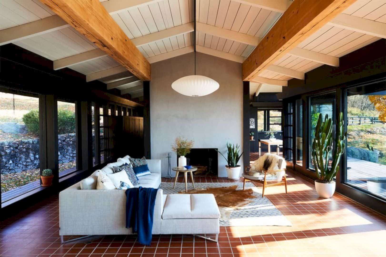
The architects make the brown ceiling turn into a beautiful white ceiling complete with the beams too. The black wall with the large glass door and windows give some different look too for the interior.
Before: Kitchen
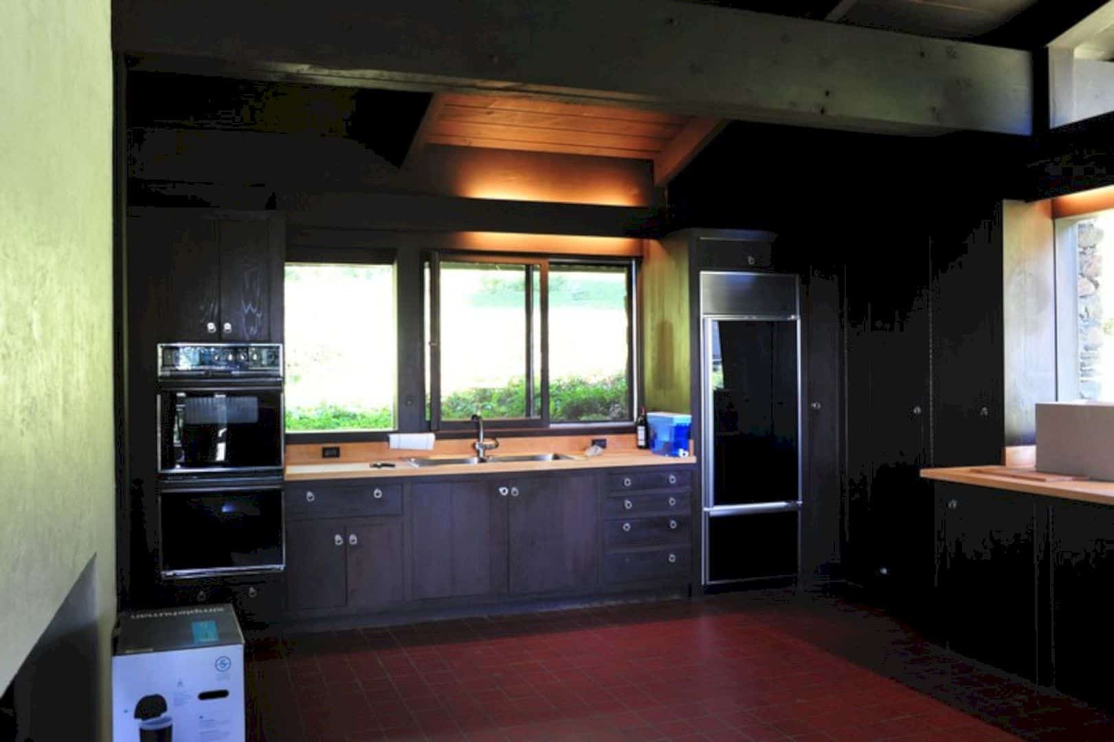
The kitchen of this home is kind of one space only with its utility design. It looks simple but it doesn’t look entertaining at all. If you cook in this kitchen, you will not feel comfortable surely.
After: Kitchen
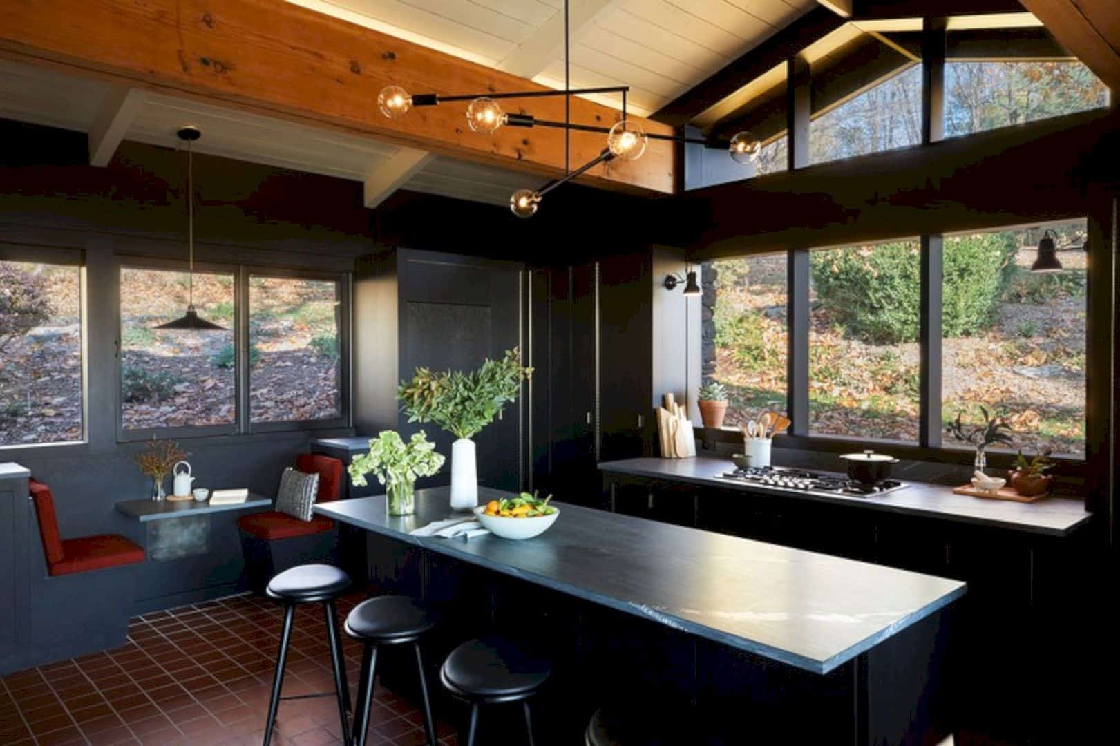
Now, look at this kitchen after some makeovers. The architects want to show the beautiful view outside the kitchen with some large windows. The countertop has a grey and black accent which is cool for the entire room.
Before: Sitting Area and Nook
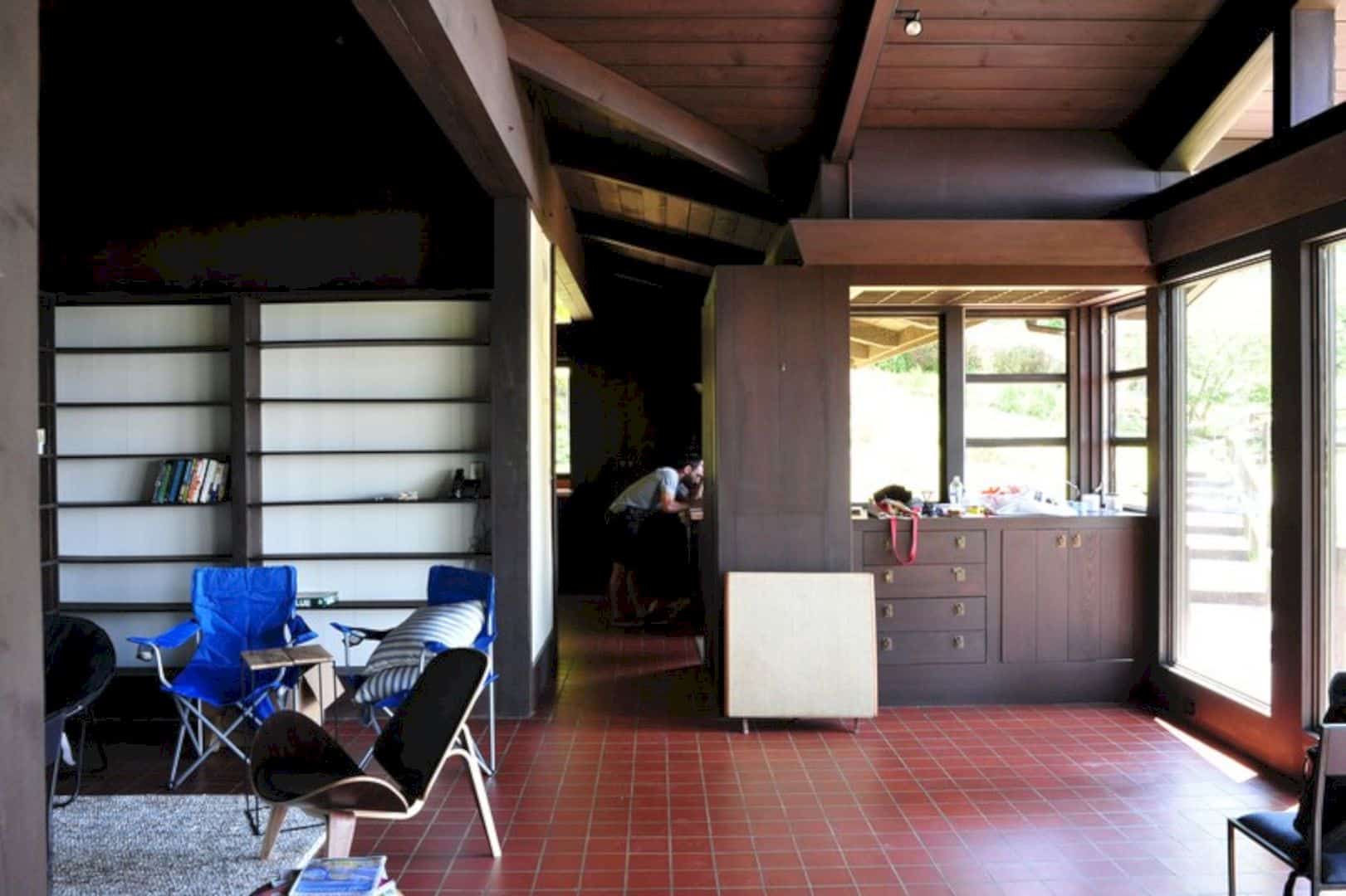
The sitting area and the nook look perfect together in one area but it looks too simple and not stylish. The storage for the book doesn’t look good for this room.
After: Sitting Area and Nook
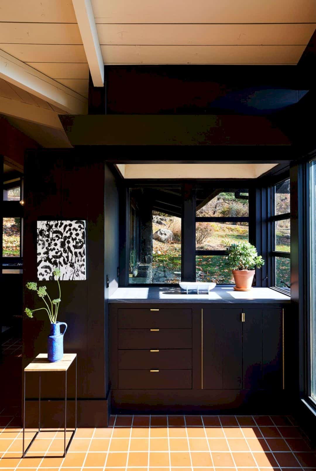
The design of the nook now is more stylish than before with the cool black-and-brass design and complete with the sitting area too. The cabinet and the plants are just perfect with the sunlight that comes through the window.
After: Bar
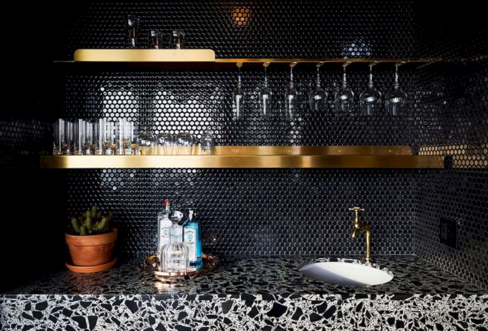
The bar has a beautiful pattern for the counters. The backsplash is also interesting too. It is designed with the small white sink. The golden shelves just fit well with all things around it.
Before: Bedroom
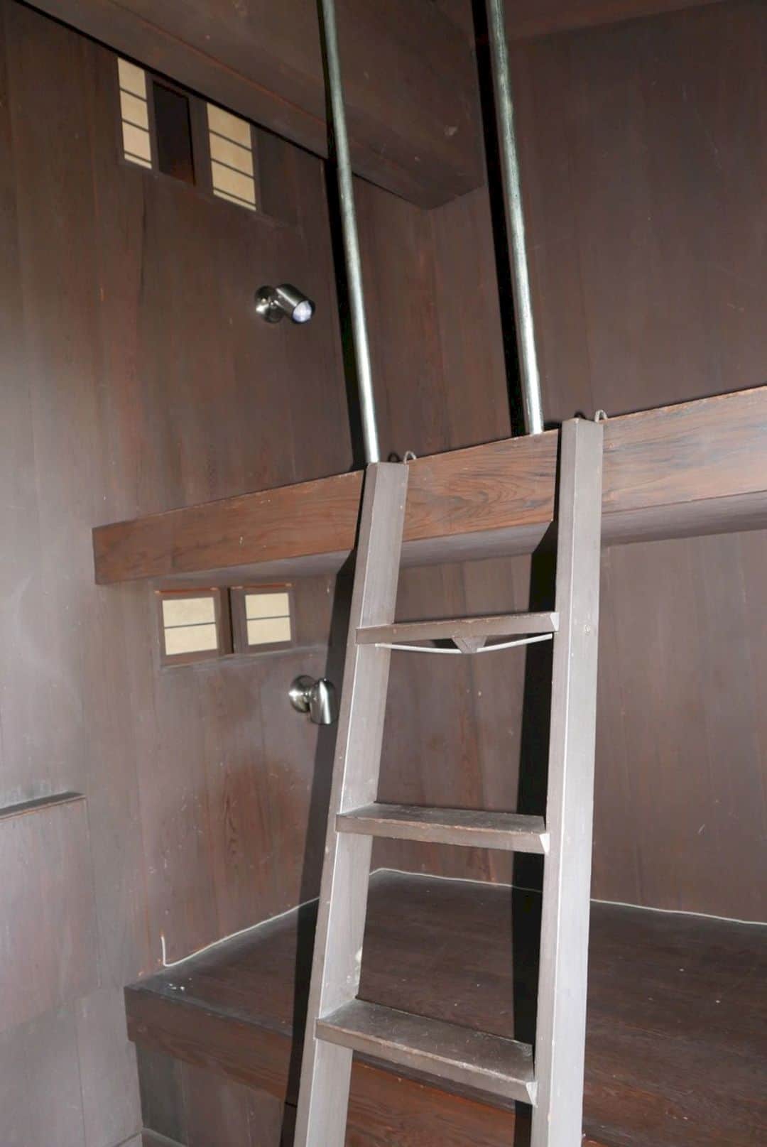
The Hudson Valley Home had a bunk area in the bedroom. The looks of the bunk bed are not cozy. It will make you have a nightmare when you go to bed.
After: Bedroom
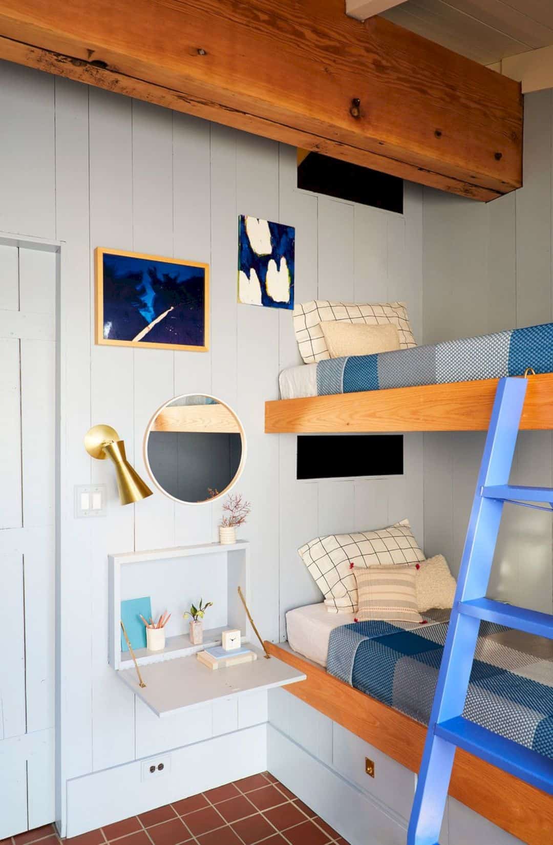
Just look at this bedroom now. The white and blue color of the bunk bed is so beautiful and cute. It becomes a fun place for the kids to play and sleep. It is decorated with some cute frames and a modern round mirror too.
Before: Bathroom
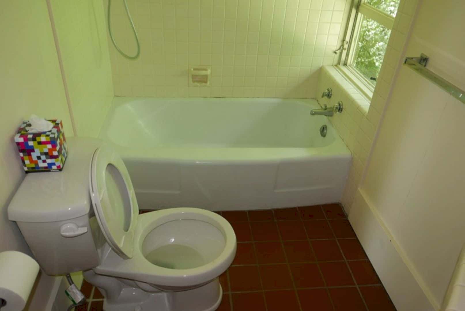
The old bathroom has a simple bathroom interior design with a small bathtub and toilet next to it. It looks too simple and plain with the white colors.
After: Bathroom
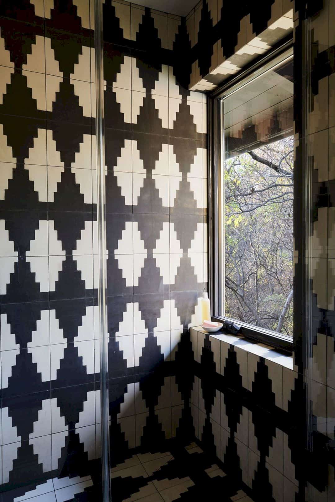
The architects of this home prefer to make an awesome bathroom with awesome tiles too on its wall and floor with more space for the shower area.
Before: Sitting Area
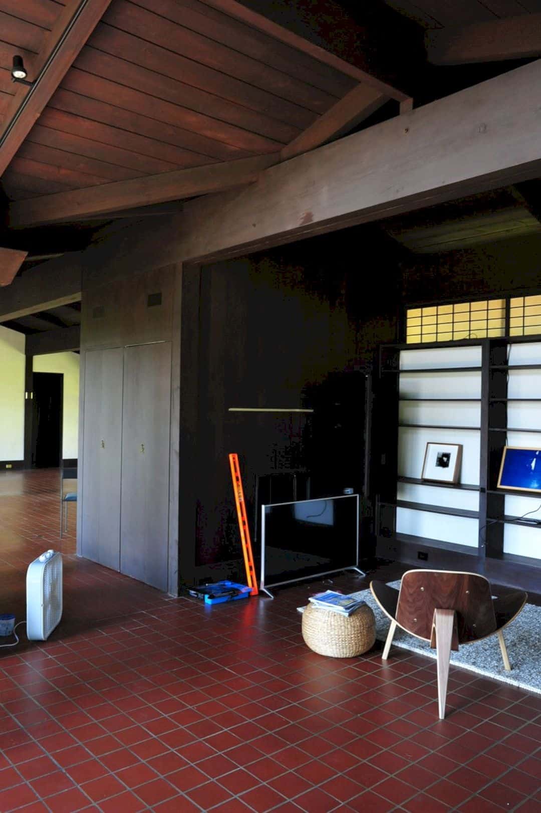
This house has the best sitting area with a TV spot and some racks. It is the best but it also needs more things to be done. Because the sitting area should have the cozy atmosphere for all people.
After: Sitting Area
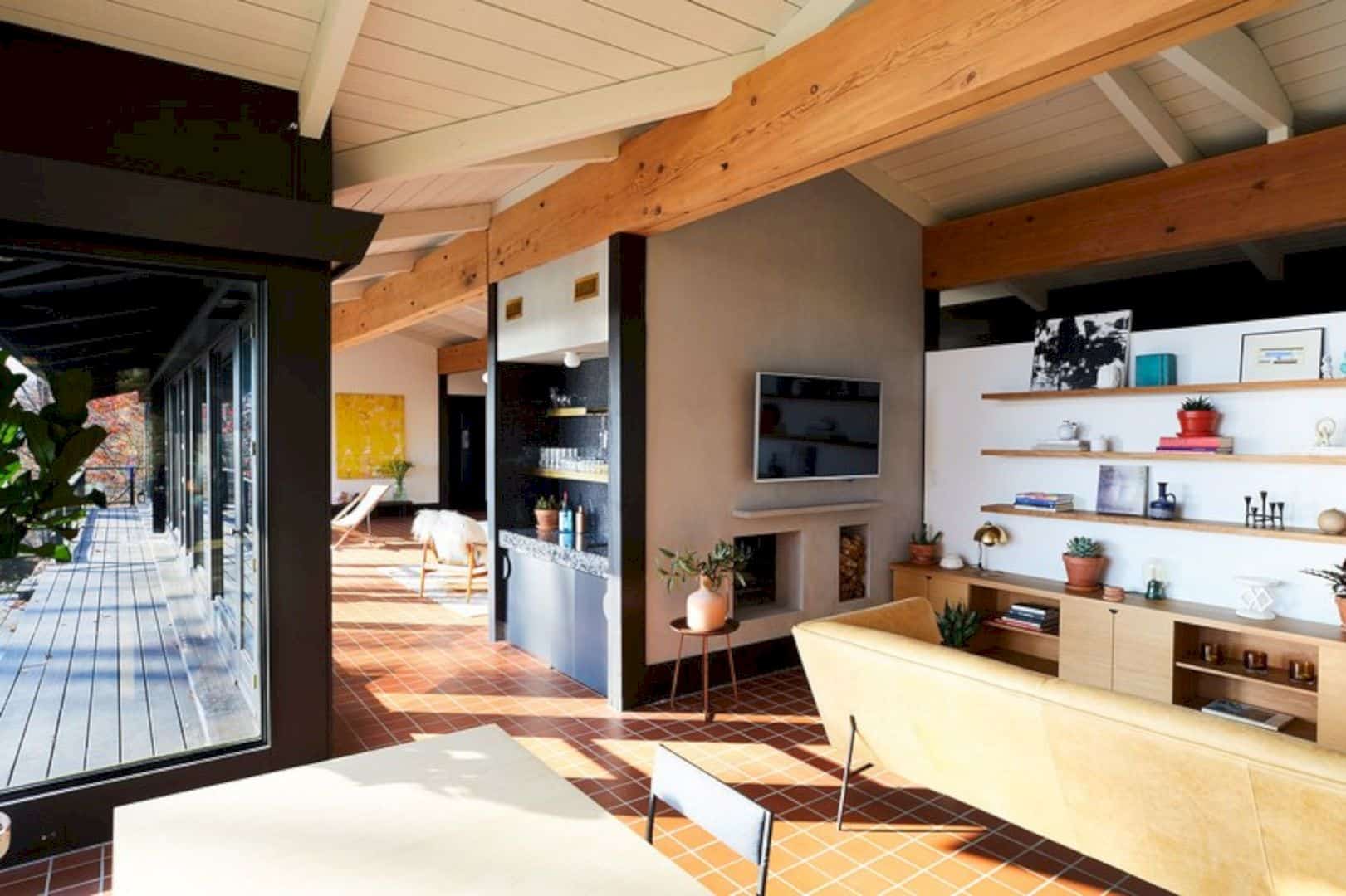
Now, the sitting area has a lot of pretty texture for all parts especially the wall and the furniture. It gets a cabinet below the wall shelves and a small fireplace below the TV.
Before: Hallway
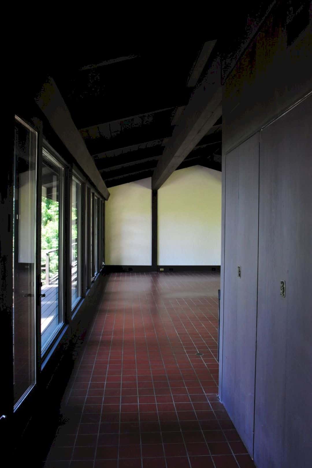
The hallway of this Hudson Valley Home is too dark. It doesn’t have a strong design too with the dark accent on the beams and walls.
After: Hallway
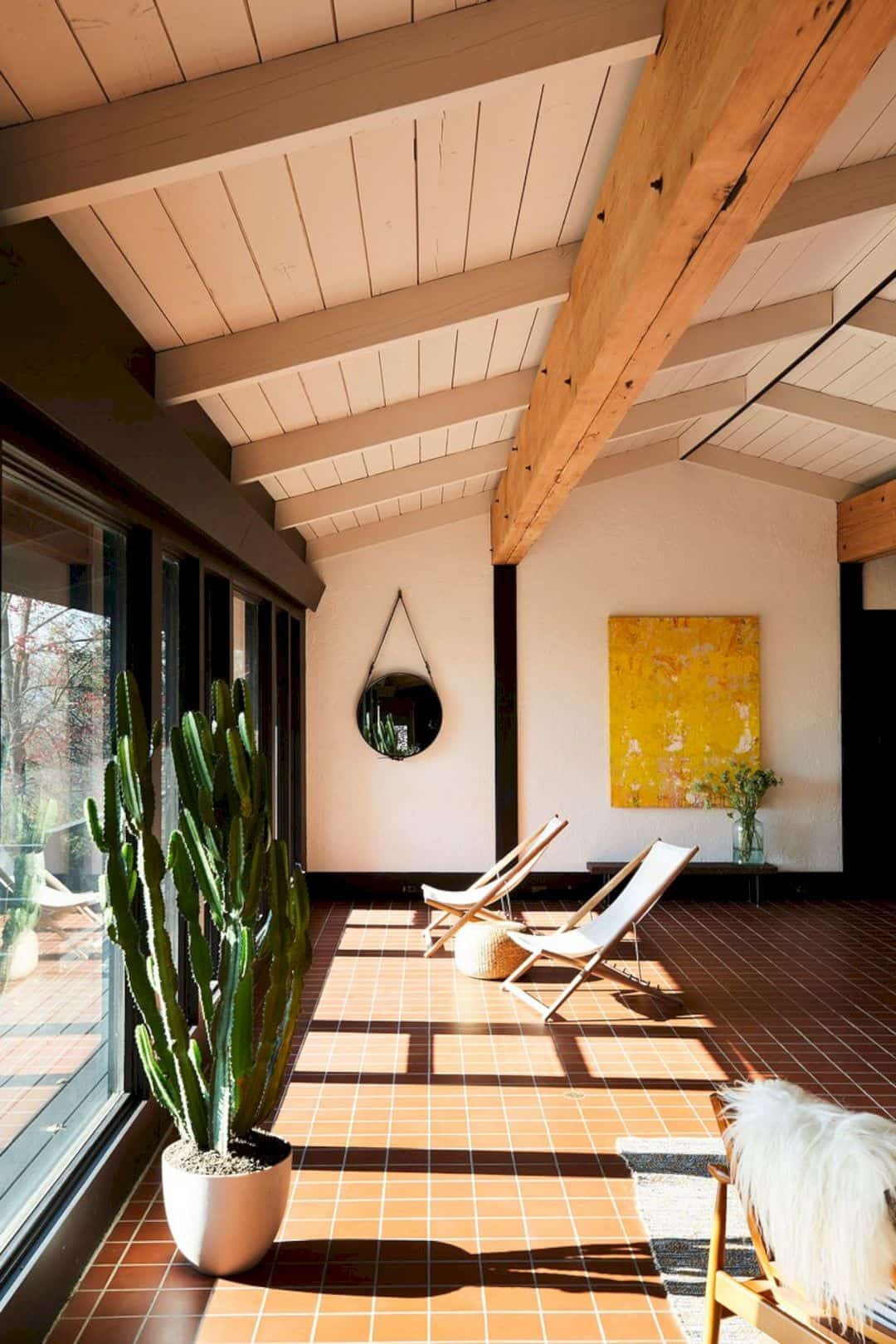
It just the same as the living room and another part of the home. The hallway now has a beautiful view complete with the furniture that the owner chooses by themselves.
Discover more from Futurist Architecture
Subscribe to get the latest posts sent to your email.

